If you want to earn a living designing type, understanding trends is an important part – Kimmy Kirkwood
Kimmy Kirkwood is an American typographer, currently living in Seattle, Washington. She founded her foundry, Kimmy Design, in 2010; but she officially left her job as a graphic designer to pursue a typographer career in 2013.
She started developing the skills needed to create a working font completely self taught, until she got her masters degree in Typeface Design in 2017. Since then, she created many fonts, currently offering more than 30 font families for licensing, from skinny hand drawn to bold and rustic, most of the time also including ornaments like banners, borders, corners, line breaks and more. Some of them even include full Cyrillic and Greek alphabets!
Kimmy typically creates 3-5 variations of each letter and offers stylistic alternatives for users that have Opentype programs, like small caps or stylistic swashes.
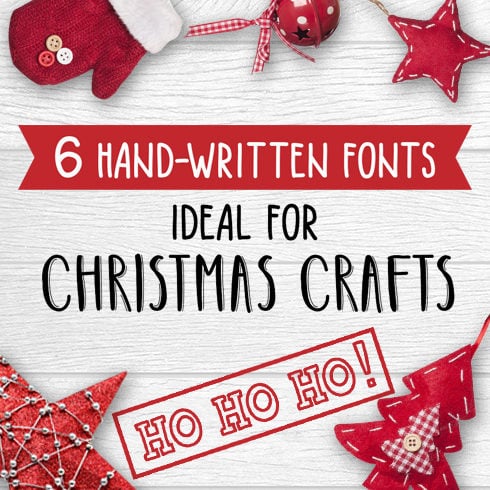
The “imperfections” of a hand written font make them look truly hand crafted. The fonts are so incredibly customizable that two projects could use the same family and yet create a completely different style!
Learn more about this prolific young typographer, what inspires her and how she organizes her workflow in this interview she kindly agreed to do with us.
How did you decide to become a professional designer or typographer? How long have you been doing this?
I started design type out of undergrad while I was working in the film industry in LA. It got to the point where I was spending all of my free time making fonts, early in the morning before work, late into the night, and on weekends.
I officially left my graphic design job in 2013 and began working for my foundry full time.
What inspires you or motivates you to create?
I am most inspired by vintage types, either lettering on storefronts, lithography or wood/metal types from the 19th and early 20th century. I have always loved display typography and finding ways to make fonts look and work like lettering. I lived in England for nearly 3 years and was so inspired by the history of type and typography of Britain.
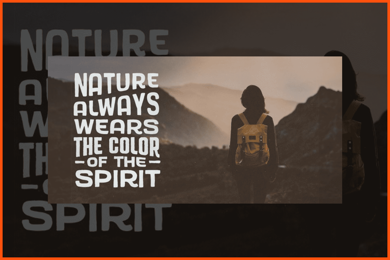
Madley is a contemporary slab serif typeface. The type family goes from a delicate Hairline weight to a heavy Black weight, perfect for both text and display text settings.
A designer:
I love the lettering work of Jessica Hische and Martina Flor.
A book:
Andrew Henry’s Meadow, a children’s book and one that I’ve had since I was a kid and have taken everywhere with me.
A city:
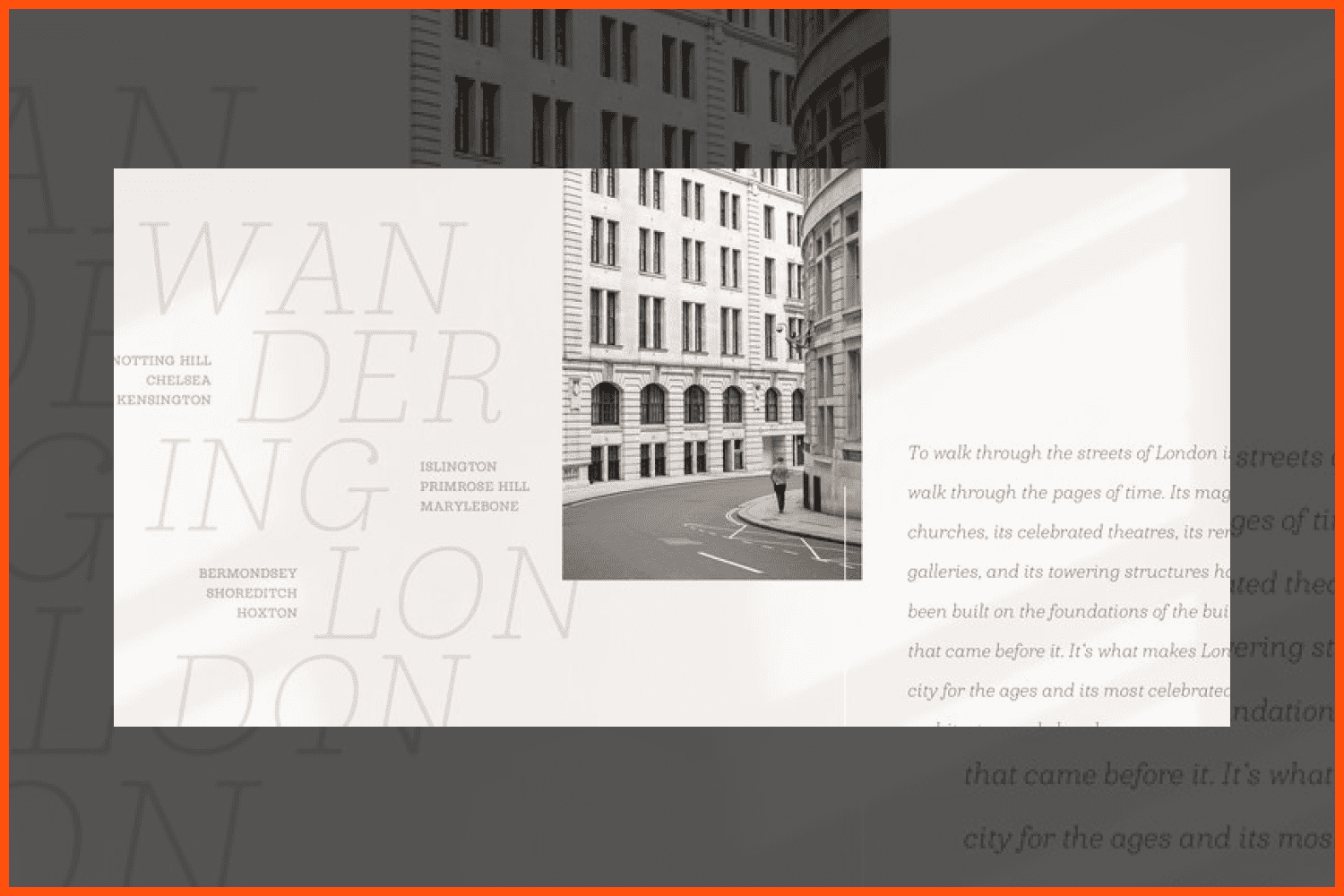
London
Your favorite font:
This changes a lot based on what I’m working on and the style I’m interested in. At the moment I would say it’s a typeface by American Type Foundry.
What techniques or tools do you use in your work?
I usually begin with sketches. I find it so much easier to draw shapes from scratch using a pencil and paper. I tried an iPad but there is something about the scratchiness of a worn pencil on paper that is hard to replicate. Then I scan and clean up images in Photoshop and bring individual letters into Glyphs. I draw the base characters that give me the basic shapes that make up the typeface, and the standalone shapes, then I start applying the shapes to other characters. For example, a capital I gives me the vertical stem and serifs. Drawing the O offers the base shape of curves. After months or years of tweaking and reworking things, I use Illustrator, InDesign and Photoshop to test my fonts.
How important is typography in graphic and web design?
Typography is one of the foundational elements to graphic and web design, as it’s how messages are conveyed through text. Without solid typography, a message can fail to reach its audience.
How do you determine which typeface is right for your project?
I examine the style of the design and the message it’s trying to convey. Is it modern or historic? Bold or delicate? There are also trends in typography that dictate what audiences are responding to. Understanding the market and design trends is obnoxious, but important.
Is there a blog, magazine or social media account that you follow to keep up with these trends?
I have several websites I visit to see what’s trending, Pinterest, DesignInspiration.net, Behance, Dribble as well as marketplaces like Creative Market, MyFonts, etc.
What are key moments in your professional career?
In 2016 Bourton was named one of the top fonts of the year. It has been my most successful typeface I’ve released and is still used constantly today.
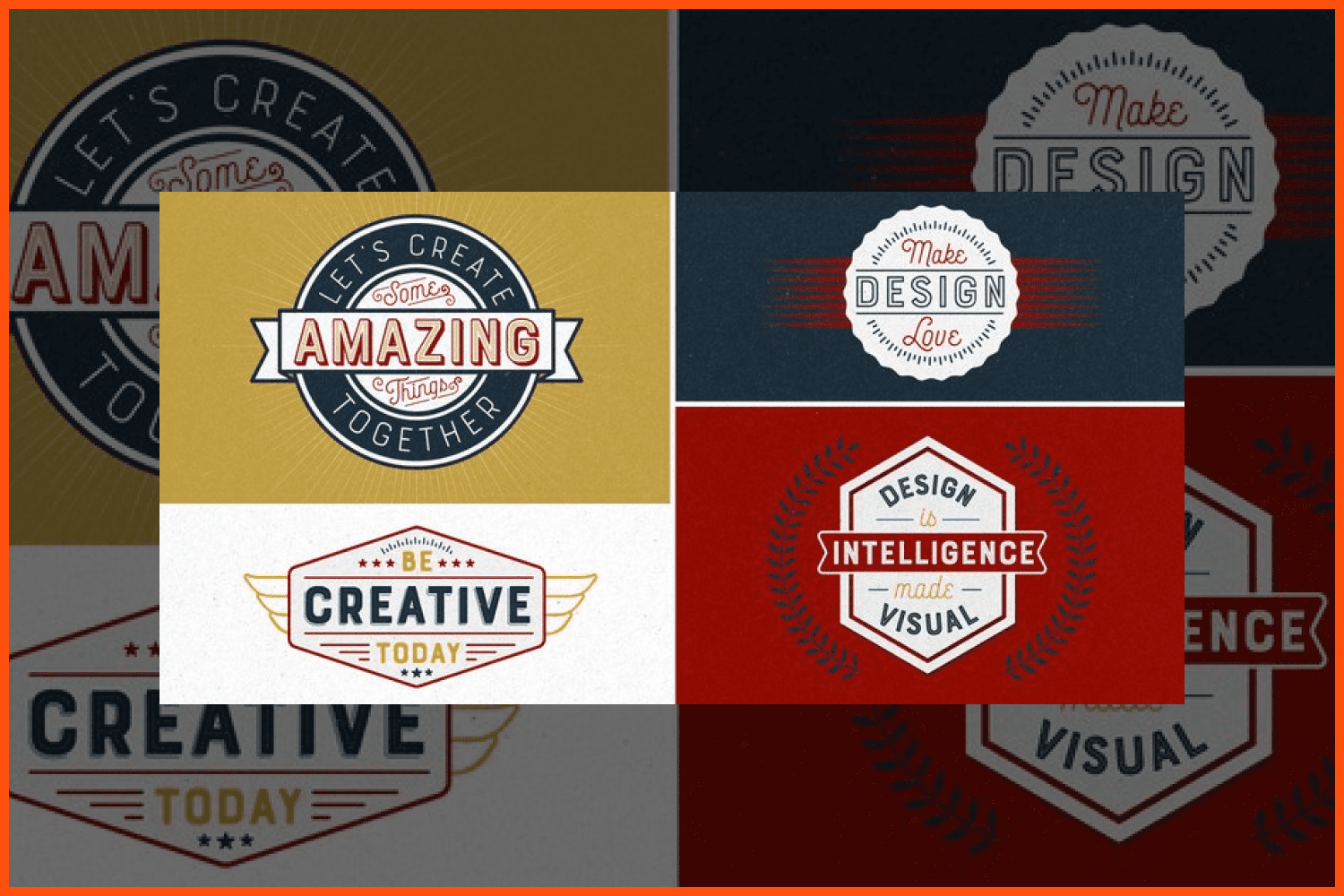
Bourton is a sans-serif family with many layering options, stylistic alternatives, graphic extras and even comes with its own script font!.
What are the fonts that come to your mind when you hear each word?
Elegant: Didone
Modern: Avenir
Bold: Bourton (just the first thing that came to mind)
Casual: Northwell by Sam Parrett
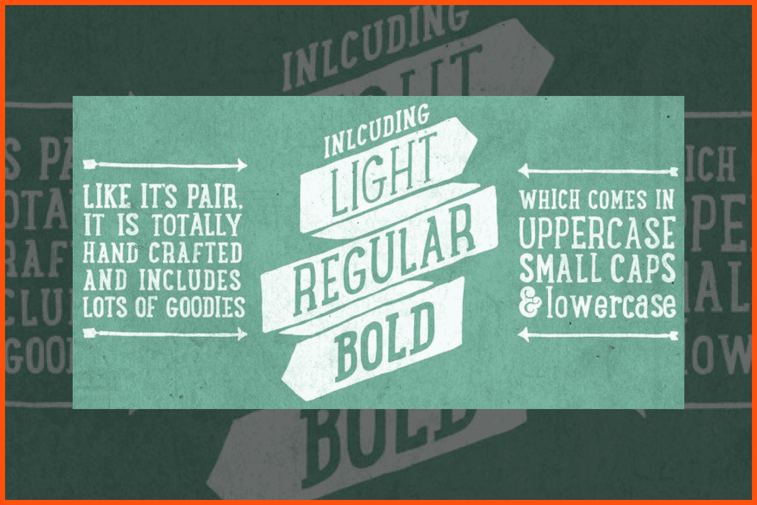
LunchBox Slab is the pair of LunchBox, a uniquely hand-drawn typeface that includes nearly 200 different ornaments.
Have you ever found that someone has copied your work or used it without your proper permission? What do you think should be done in this circumstance?
It’s not so much that someone copies my work, but online marketplaces that offer my fonts for free that is the bigger issue. They typically operate in other countries and it’s nearly impossible to get them to stop.
Were you ever worried about how people would react to your work?
Every time I release a new font! It’s a scary thing to have put so much time and effort into something and then release it and see how the market responds.
What were the skills that have been most useful to you in your career?
I was a marketing major in college, and while I don’t work in advertising or marketing at an agency, I have found that thinking about my work from a marketable standpoint has helped me a lot with owning my own foundry. I am part artist, where I get to make something exactly how I want it without being told by clients or bosses how it should be, but I’m also an entrepreneur and need to find a way to monetize the work I do.
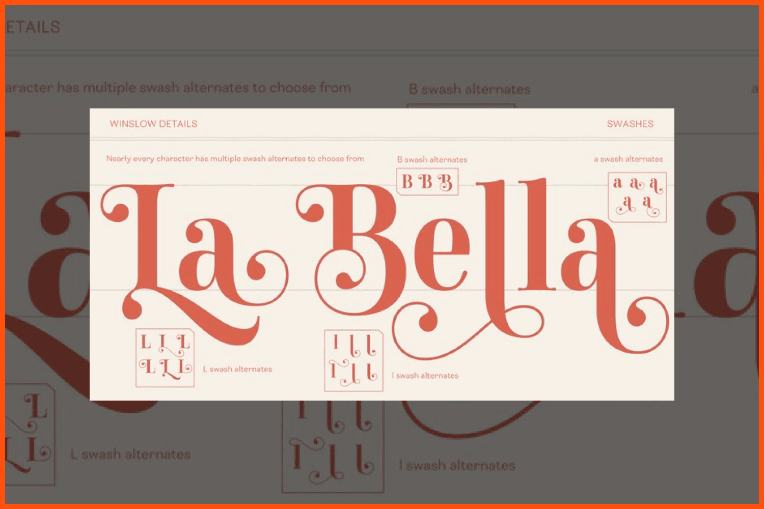
Winslow Title is a high contrast modern type family that comes in two styles and a monolinear script family.
What work do you most enjoy doing nowadays?
I love designing type. I realized that it will be difficult for me to grow my business as I love doing the actual work myself too much. I don’t love the business side as much, so I will probably remain a 1 or 2 man show for the foreseeable future.
I love working with type, and using type in mediums outside the computer. I have a 1 year old and have found my working out cut back drastically so I have picked up other hobbies that keep my creative side going. I started taking up punch needle, focusing on type in yarn!
I also love to build things. I live in a tiny house with my husband, daughter and dog. I had to build a studio in our garden to work from. I’ve also made a dining table, my stand up desk and a few other things.
Are you currently following any design world trends? Do you feel it’s necessary to do so? Is it difficult to keep up?
Yes as mentioned before, if you want to earn a living designing type, understanding trends is an important part to type design. You don’t have to follow every single one, for example calligraphic brush scripts were in vogue for around 4 years and I am both terrible at calligraphy and have no interest in it, so I didn’t partake in that trend at all. So make sure it fits within your brand and style.
How has your practice changed over time?
In 2017 I got my masters degree in Typeface Design from the University of Reading in England. Beforehand I was completely self taught. I knew no one in the industry and was kind of working completely in my own little bubble. Since getting my masters, I have had a small community of designers I talk to on a regular basis. I hired one of them to work with me. I also switched from FontLab Studio to Glyphs and learned a lot about working efficiently and setting up systems to make design type better and faster.
What features of Glyphs do you find most useful versus FontLab Studio, which you previously used?
When I stopped using FLS 5 it was archaic compared to Glyphs, which had continued updating and improving its software. Honestly I couldn’t believe it took me so long to change over. I used to have to code everything independently, kerning in groups was a nightmare and just the program had a very 00s feel to it. Now FLS is updated and great I hear, but I have my workstream in Glyphs that I use and am used to.
It’s very common for typographers to be solopreneurs, but you’ve hired a designer to work with you. How do you divide the work?
I create the typeface and he helps with diacritics, lining up anchor points, combing through issues, and production work.
How do you form prices for design products? It’s usually a pain point for designers who are just starting out.
I try to find a price that doesn’t break the bank on customers but also allows me to earn a living. Offering fonts for free is bad practice considering the amount of hours that go into creating type, and will bring the market down.
Hawkes is an extensive handmade typeface family that is formed by 14 fonts, in a variation of weights, widths and styles, all designed to work cohesively.
Have you heard of MasterBundles before? What do you think about this project? Do you think it is a good way to start selling your work?
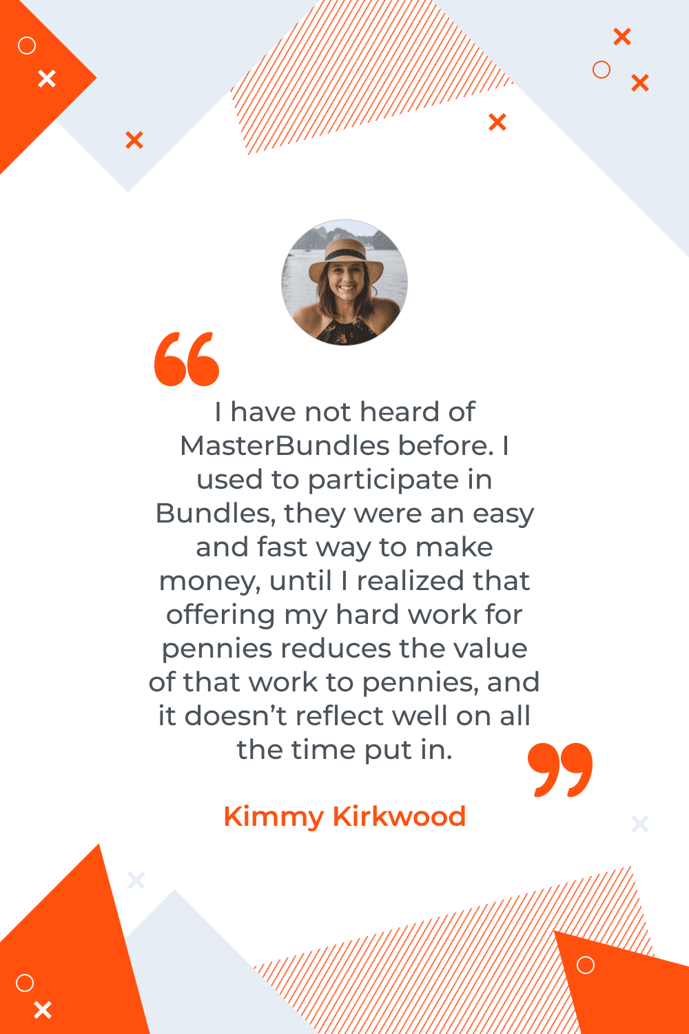
I have not heard of MasterBundles before. I used to participate in Bundles, they were an easy and fast way to make money, until I realized that offering my hard work for pennies reduces the value of that work to pennies, and it doesn’t reflect well on all the time put in. I find that a bundle should instead be ONLY a couple fonts from different typeface families to create a collection of types, allowing people that want an entire typeface to still pay for it.
- Connary Fagen
- Kostas Bartsokas
- Cina Catteau
- Adam Ladd
- Lucian Radu
- Mark Anthony Rudder
- Mario Zucca
- Jessie Maisonneuve
What are your concerns?
Thanks for your response!
Disclosure: MasterBundles website page may contain advertising materials that may lead to us receiving a commission fee if you purchase a product. However, this does not affect our opinion of the product in any way and we do not receive any bonuses for positive or negative ratings.