The best skill I have is constantly questioning what I know and constantly questioning my skill set – Kostas Bartsokas
Kostas Bartsokas is a Greek type designer and typographer. Born in Thessaloniki, after spending the years between 2012 and 2019 living in UK, Norway, and Germany he moved back to his home town where he is currently living. He defines himself as a lover of good food, a travelling aficionado, and a collector of experiences.
During his freelance career in Greece, UK, and Norway, he specialised in graphic design, illustration, web design, packaging, and animation. As a senior designer at Definitive Creative (part of the FDP group), he also managed and mentored junior designers.
He finally chose to pursue his passion with typography, studying an MA in Typeface Design in the University of Reading. Currently, besides having his independent foundry, he is part of Foundry5: a group of specialists in type design and production for world scripts that offer bespoke solutions for an ever-expanding global context of type and typography.
Foundry5’s first release, Jali (designed by Mo Dakak, Greek extension by Kostas Bartsokas) won Type Directors Club Certificate in Typographic Excellence 2019 and Granshan 1st Prize 2019 in Arabic and Latin Category.
How did you decide to become a professional typographer? How long have you been doing this?
I’ve been a professional graphic designer since 2003 and have always worked with type in some form. My last position was designing magazines, so I was pretty immersed in fonts and styles. This helped lead me into experimenting with designing my own fonts.
How did you decide to become a professional typographer? How long have you been doing this?
I had been working as a graphic designer since 2005. I always enjoyed working with letters as part of some project and this eventually led me to design my first typeface. From then onwards I gradually spent less time doing graphic design and more time designing typefaces. Letters won me and I ended up joining the MA in Typeface Design in Reading in 2015. That was the turning point when I stopped taking any graphic design work and became a full time type designer and typographer.
How would you define yourself at work?
What I really like in type design is the fact that usually my projects are not tied to very demanding tight deadlines as it was with graphic design. This gives me ample time to explore ideas and go back and rethink and change things. That slow process allows for the ideas to grow organically and allow me the space to develop alongside my work. I can’t say I am hard working; I think what best describes me is being efficient – or at least trying to be.
You mentioned that your typography projects don’t have such tight deadlines as when you were a graphic designer. Is this because in general you develop the font, at your own pace, and then license it? Or sometimes you also work with clients developing a specific font for a project?
Yes, when I say this I refer to the fonts I design and publish myself. Client work, whether it is a custom font or a Latin font that needs extension to support Greek, do have tighter deadlines but I usually try to give myself adequate time for the final delivery when quoting for the job.
Key moments in your professional career (or the projects you are most proud of):
The most important decision in my career was dropping everything and going to Reading, UK for the MA in Typeface Design. It was a very intense year. I met lots of wonderful people that helped me expand my cultural horizons and I learned so much from the course that I can easily say it re-defined me as a person, both personally as well as professionally. Regarding my work, releasing Averta in 2015 was a key point. It has been a very successful font, a success that I did not anticipate when I was working on it.
Another project I am very proud of is Oi, a TDC awarded typeface. It started as a creative playground to get me through a tough period in life and that is why I chose to offer it for free. Recently it’s made its way on Google Fonts and I am happy that it is open source and anyone can use it or build on it as they wish. Lastly, I am proud of recently launching Foundry5, a joint endeavour with Pria Ravichandran, Mohamad Dakak, and Jason Harcombe.
We are a multicultural and diverse group of individuals, each one bringing skills, experience, and expertise together to cater for the needs of global typography.
How would you define yourself at work?
I try to be thoughtful of the fonts I’m making and how they might be an asset to a customer. I consider if they are unique and useful.
Where can we find your work? (publications, exhibitions, products, etc.)
My personal fonts are available on most of the big retail channels and websites: Fontspring, The Designers Foundry, Monotype, MyFonts, Fontfont, etc. Foundry5 fonts are available on our website, foundryfivetype.com. And you can find Oi and Commissioner on Google Fonts.
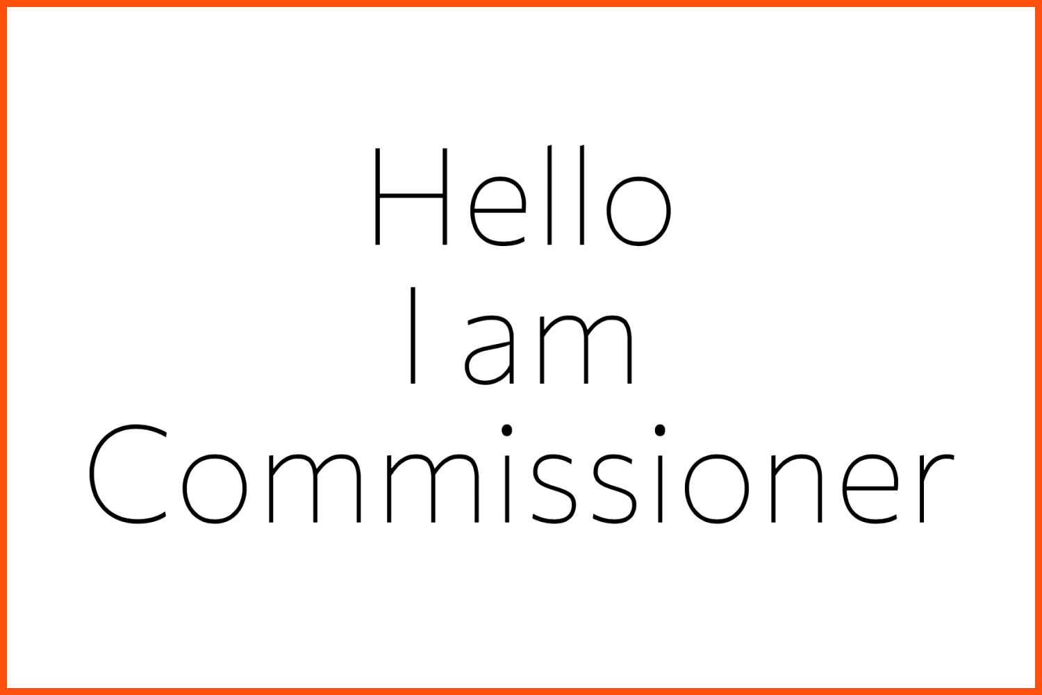
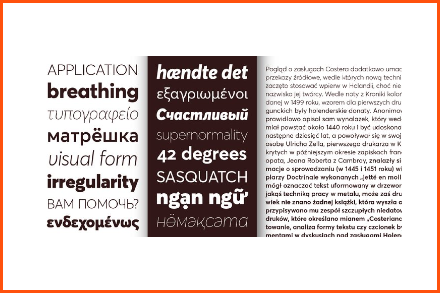
Commissioner is a low-contrast humanist sans-serif with almost classical proportions.
What inspires you or motivates you to create?
Usually I am driven by a brief. I don’t consider what I am doing as art. In fact I appreciate that my work needs to be applicable as a solution to a problem. So most projects start with a specific scenario in mind, a specific problem that needs to be addressed. Some few cases start with a “what if” moment, a random idea that I feel I have to test. If the test looks good then it develops gradually.
I seek inspiration in what is already out there, from past specimens to contemporary designs, in order to understand how I can create something that is personal and push the boundaries at the same time – even just a little bit.
A Song:
Only one? Such a difficult question! For today I’ll choose Flashback by Fat Freddy’s Drop. Tomorrow I will have a different answer though.
A book:
The Dispossessed. By the one and only Ursula Le Guin.
A city:
Thessaloniki. I wish it could be torn down and rebuilt from scratch. But there is a clear love and hate relationship with someone’s birthplace that can’t be easily explained.
A happy memory:
The day me and my classmates handed our dissertations and completed the most amazing year of our lives.
What techniques or tools do you use in your work?
I mostly jump straight on the computer and start working there. I design all my typefaces in Glyphs. I am not great with sketching so I keep it to the bare minimum. A few letters to roughly illustrate an idea and give me a visual guide for what I want to do. I like doing writing exercises, especially when I am working on any non-native script in order to understand how the ductus of the letters behave.
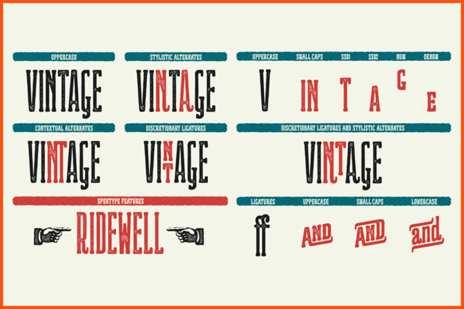
Ridewell typeface has a wonderfully warm and letterpress vintage look.
How important is typography in graphic and web design?
The web is a place cluttered with an overwhelming amount of written and visual information. Most users nowadays spend just a few seconds scanning the contents of a website. That first glance is important. Typography – as well as proper copywriting – needs to assist in order for this short user experience to be as comprehensive as possible and part of the typographic elements of a page is a good font.
A font that needs to be on brand as well as respond to the needs of the text it carries. This applies of course to graphic design in general. Our lives are full of letters. Good typography is the messenger that takes a message from a source and makes sure it is delivered to the recipient.
How do you determine which typeface is right for your project?
It is a combination of many factors. The brief, the language and script support, what attributes from the branding apply to the typeface – which can vary for the same typeface depending on the project -, who is the audience, the clients budget, and many more.
What are the fonts that come to your mind when you hear each word: elegant, modern, bold, casual?
Ah! It is hard for me to think that way. As mentioned in the previous question it all depends on the project. But if I was to blatantly promote myself, if you want a combination of elegant, modern, bold, and casual take a look at Averta. It may be what you need.
Averta’s purely geometric rounds, open apertures, and its low contrast strokes manage to express an unmoderated, straightforward tone resulting in a modernist, neutral and friendly typeface.
Have you ever found that someone has copied your work or used it without your proper permission? What do you think should be done in this circumstance?
I haven’t had anyone copy my work so far. But regarding improper use it happens a lot. Every time a font is published it is available on some shady websites for free within the matter of a few hours. Lots of people download fonts from these websites. We send DMCA reports and links are usually taken down – only to reappear on some other website shortly.
I think that graphic designers are gradually understanding and appreciating fonts for what they are and are more keen on properly licensing them. Most licensing fees also apply to the western big markets and in many cases the prices are too high for users in other parts of the world. I encourage everyone who cannot afford the market price of a font instead of illegally downloading it to get in touch with the foundry and explain their situation. Most foundries are willing to listen and customise their licences accordingly.
Were you ever worried about how people would react to your work?
Yes. I always get anxious when I publish something new. It is part of my character and I won’t lie, I need the evaluation that comes from the public and from my peers.
So you are aware of the response your work receives from the public and your peers. What was the most memorable response you received?
I was totally stoked when Oi won the Award of Excellence in the Type Directors Club (TDC) Typeface Design Competition.
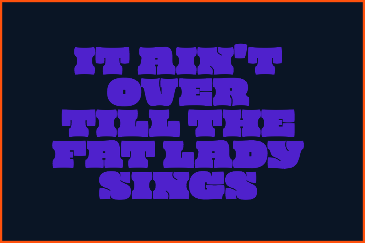
Kostas defines Oi as a “a clarendonesque on steroids”
What were the skills that have been most useful to you in your career?
I have quite a versatile background when it comes to my professional career, and everything I have done I tried to take some wisdom out of it. The best skill I have is constantly questioning what I know and constantly questioning my skill set. This allows me room to keep reevaluating my creative ideas and gives me the urge to keep an open mind and a restless spirit towards knowledge.
What is your dream project?
I see Foundry5 as my dream project. We are just at the beginning of our journey but I want our foundry to blossom and to be able to publish all of our library plans within reasonable time.
Is it common for typographers from different countries to come together to create this kind of multi-language typefaces that you develop on Foundry5? Is it possible for a typographer to design a font for a language that uses unfamiliar symbols?
The majority of fonts in the market support just the Latin script. Foundries usually specialise in a few scripts internally and then they collaborate with external designers to extend the script support of their fonts. Foundry5 is one of the few foundries that can deliver internally Arabic, Cyrillic, Greek, Latin, and many of the Hindic scripts.
A type designer can work in an unfamiliar script but it takes a lot of research to understand the intricacies of each script and especially how ideas that refer to one translate to another without just copying design elements. You definitely have to spend some time familiarising yourself with writing the letters, understand the writing tools, understand the history and the development of the script, and of course consulting with native users and native designers.
Do you have a network of designers with whom you collaborate? How do you support each other?
I have some people I trust a lot. Currently I have a small network of collaborators with whom we share a good understanding of our workflows and excellent communication. In the long run and especially with Foundry5 I would like to have the chance to collaborate with more designers from underrepresented groups in order to expand our library to scripts that we are not familiar with.
Have you heard of MasterBundles before? What do you think about this project? Do you think it is a good way to start selling your work?
Yes I am aware of MasterBundles. The project is helpful for entry level graphic designers giving them the chance to acquire libraries of design elements at a discounted price. As long as the quality of the products is evaluated by experts and the participating designers are satisfyingly compensated for what they offer it is a model that makes sense in pure market terms.
Have you had any experience in packing products into bundles?
I have participated in some bundles and I may do it again in the future.
3 Rules for Designers from Kostas Bartsokas
Kostas Bartsokas is a Greek type designer and typographer. Here he will talk about three basic rules for designers that he deduced for himself.
What are your concerns?
Thanks for your response!
Disclosure: MasterBundles website page may contain advertising materials that may lead to us receiving a commission fee if you purchase a product. However, this does not affect our opinion of the product in any way and we do not receive any bonuses for positive or negative ratings.