If it looks right, it is right – Adam Ladd
Adam Ladd is a type designer and graphic designer based in Cincinnati, Ohio. His work includes type design and font licensing, logos, lettering, graphic design, print design, magazine design and art direction.
As a type designer, working as a full-time independent font foundry, he developed fonts that have been licensed by Harley-Davidson, Food Network, Disney, Trader Joe’s, Starbucks, iD Mobile, Costco, Hobby Lobby, L.L. Bean, Whole Foods Market, Minted, NHL Calgary Flames, Raising Cane’s, Blizzard Entertainment, Penguin Random House, Canva, EatingWell, design agencies, individuals, and others for print, web, apps, epubs, and servers.
He has also done type and logo exploration work for leading home goods and food brands.
Over the years he has been the art director and designer for HOW and PRINT magazines, worked as a freelancer with branding firms and clients, and as an in-house designer with Vineyard Community Church.
His work and experiences have been featured in the books LogoLounge, Logopond: Identity Inspiration, Work for Money, Design for Love, and on the popular design review site, Brand New. He also creates design-related videos that have been widely shared, you can check them in his YouTube channel.
If you are curious about his work and how he develops his typeface, read on: there is much to learn from this experienced designer.
How did you decide to become a professional typographer? How long have you been doing this?
I’ve been a professional graphic designer since 2003 and have always worked with type in some form. My last position was designing magazines, so I was pretty immersed in fonts and styles. This helped lead me into experimenting with designing my own fonts.
What techniques or tools do you use in your work?
I use Glyphs app for the font editor and drawing bezier/vector glyphs, and I also sketch with pen and paper in some phases. Sometimes I use Illustrator as well for some of the hand-drawn styles.
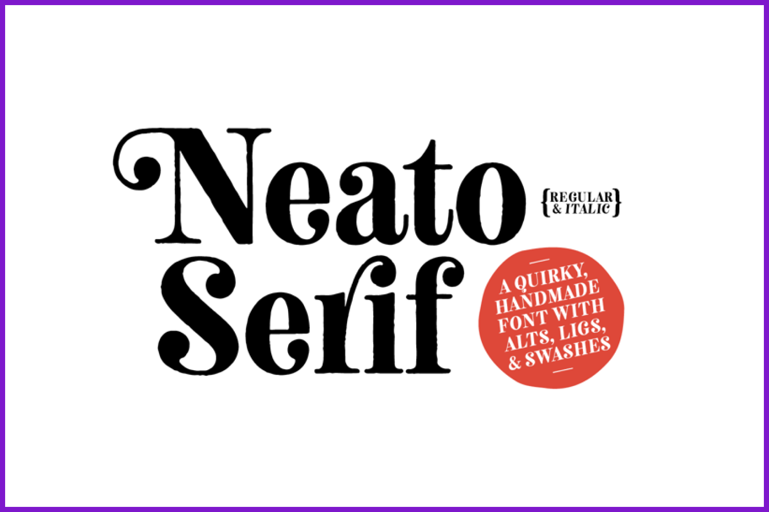
Neato Serif is a hand drawn, quirky serif font in regular and italic styles
What features of Glyphs do you find most useful? Have you tried other tools like FontLab, Robofont or FontForge to compare?
I pretty much only use Glyphs app. I started out experimenting with an app called TypeTool. I find the UI of Glyphs to be easy to use and the preview panel when drawing glyphs a great help to see live what type of shapes or interpolations I’m creating.
There are also a lot of great plug-ins that help make for a better drawing experience and quality output.
How important is typography in graphic and web design?
Very important. It is one of the best ways to convey feeling and tone of voice for a project or brand.
How do you determine which typeface is right for a project?
Understanding who the target audience is and what message you want to convey helps focus on styles to explore.
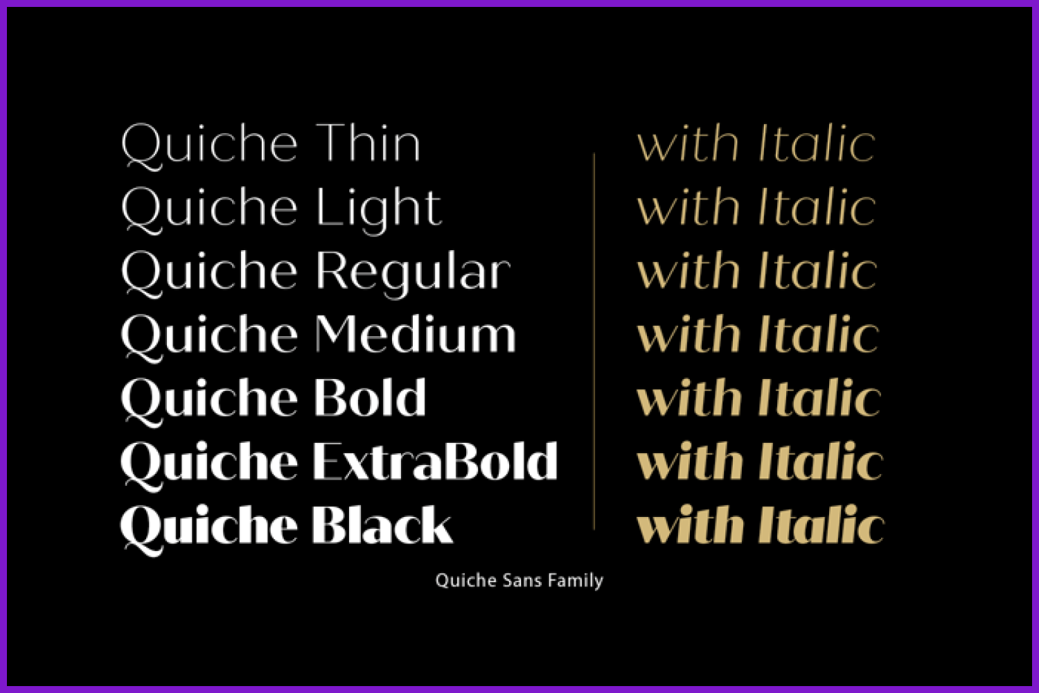
Quiche Sans is a high-contrast, sans serif typeface with monoline stroke endings, angled stems, and geometric proportions.
What are the fonts that come to your mind when you hear each word?
Elegant: High contrast fonts.
Modern: Geometric sans fonts.
Bold: Experimental display fonts.
Casual: Hand drawn script fonts.
How would you define yourself at work?
I try to be thoughtful of the fonts I’m making and how they might be an asset to a customer. I consider if they are unique and useful.
Key moments in your professional career (or the projects you are most proud of):
When I’ve received notes from customers that have bought my fonts and express what they like about it or how they might have been able to use it is always great to hear and encouraging. Knowing that real people are able to create with something I can provide is a blessing.
Where can we find your work? (publications, exhibitions, products, etc.)
Fonts get licensed from hobbyists to large companies. On a more public level, you can find usages (past or present) with ESPN, Harley-Davidson, Food Network, etc. They’ve been used in a variety of ways and applications (branding, websites, apps, etc.).
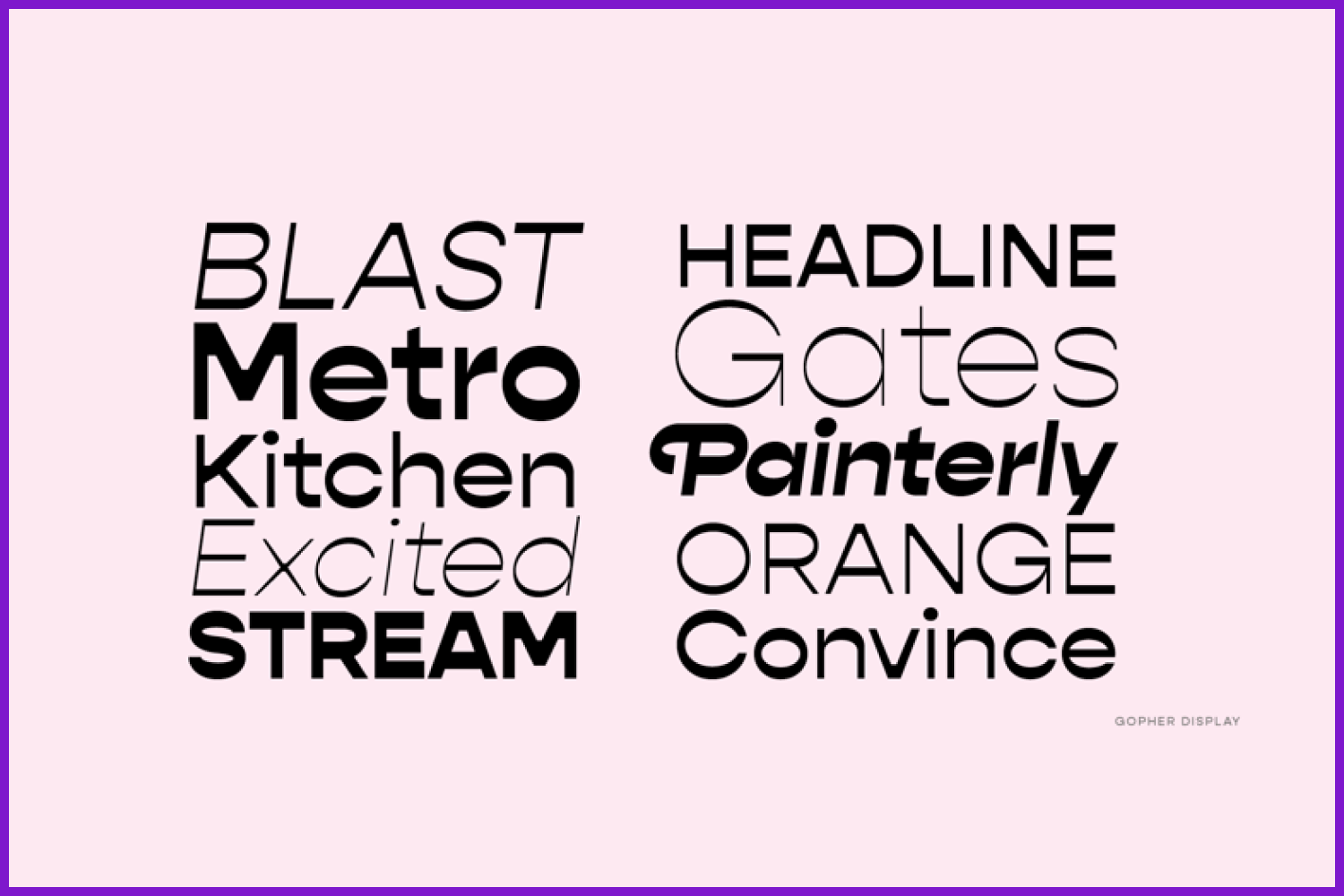
Gopher is a reverse contrast, geometric sans serif typeface with Normal, Text, and Display families. The 48 included fonts in the complete family range from hairline to heavy, with italics.
I understand your fonts are licensed to hobbyists as well as large companies, but surely you have also worked with brands that ask you to develop a specific font for a project. What do you enjoy and dislike the most about each of these ways of working (commission for a project – free font development for licensing)?
I enjoy knowing that the font has met a goal or filled a need for a designer. That they found it useful to help communicate their message in the right tone of voice.
What inspires you or motivates you to create?
I like seeing new expressions of something familiar and trusted. Refreshing the alphabet in new ways is an interesting challenge and can be rewarding to find something that works.
Don’t you find it repetitive to always work on the same 26 letters of the alphabet? Having such a long career as a typographer and having developed so many fonts, don’t you find it difficult to find new ways to represent the same symbols?
Yes, there is a degree of tedium in font development at different stages (be it feeling repetitive or things like working on kerning). But what is interesting is how even relatively small changes in a character can have a ripple effect to others and change the whole look and feel of the typeface.
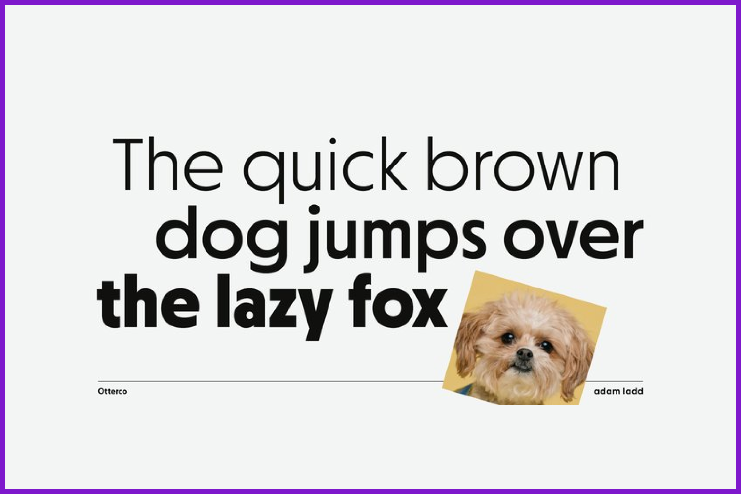
Otterco is a geometric sans serif font family, clean and neutral, with varied round and narrow characters.
Have you ever found that someone has copied your work or used it without your proper permission? What do you think should be done in this circumstance?
I don’t know about direct copies, but I know there have been sites that pirate the fonts and try to post or sell them. It is difficult to navigate and stay on top of all that, but I would like to see this stopped somehow (there are notices you can send, but can be a hassle).
What’s the best piece of advice you’ve been given (regarding your professional carreer)?
In some form, the advice was “if it looks right, it is right”. Meaning, it’s ok to break from the rigid vectors and exact math or coordinates to make a glyph shape look pleasing and right to the eye. This doesn’t undercut quality and consistency, but just gives more sense of freedom to adjust shapes when needed.
What work do you most enjoy doing nowadays?
I enjoy exploring and seeing new fonts come to life.
What is your dream project?
Creating custom, bespoke fonts that are directly in line with the vision of a customer, knowing that it is achieving just the right voice for them can make for an exciting project.
The Config typeface was influenced by geometric sans serifs with circular forms on the tops and bottoms of characters, but the proportions have been condensed by incorporating straight sides for a design that is sturdy and space-saving. It’s efficient yet friendly.
Do you have a network of designers with whom you collaborate? How do you support each other?
Not exactly direct collaborations, but it is good to have some contact with peers to help each other stay sharp. Online forums can be a helpful way to do that.
Could you give some advice for typographers that are starting out?
I think it’s ok to start small. Producing a font is an investment of time and energy. So breaking it down with maybe only basic characters (perhaps even an all-caps font, for example) can help it feel more focused and see what kind of result you get. It can help you learn the process and tools along the way, which will translate to the next font.
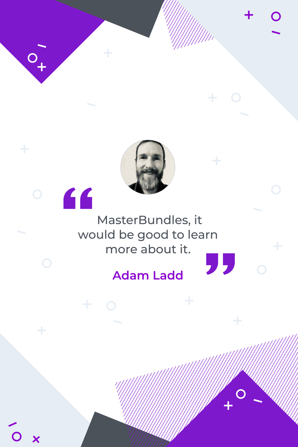
Have you heard of MasterBundles before? What do you think about this project? Do you think it is a good way to start selling your work?
I was not familiar with MasterBundles, but it would be good to learn more about it.
What are your concerns?
Thanks for your response!
Disclosure: MasterBundles website page may contain advertising materials that may lead to us receiving a commission fee if you purchase a product. However, this does not affect our opinion of the product in any way and we do not receive any bonuses for positive or negative ratings.