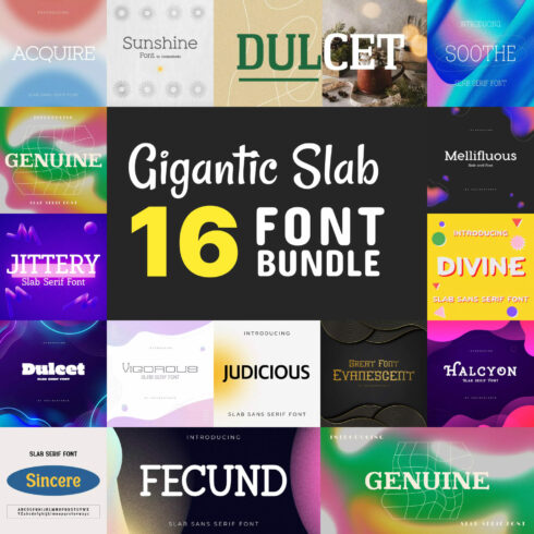
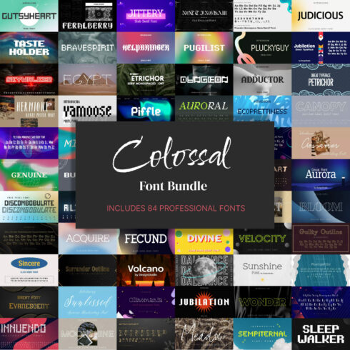
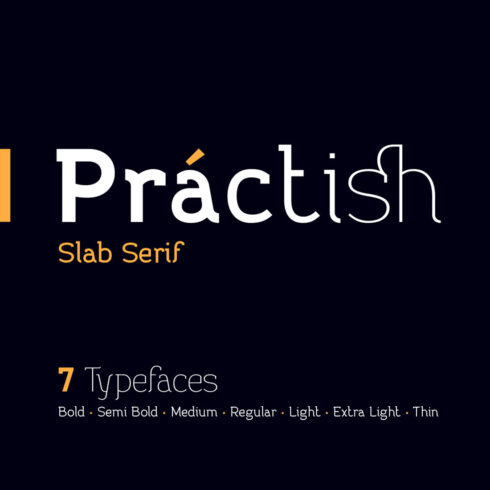
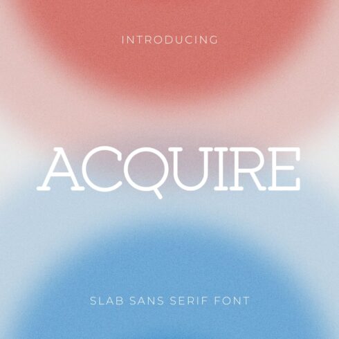
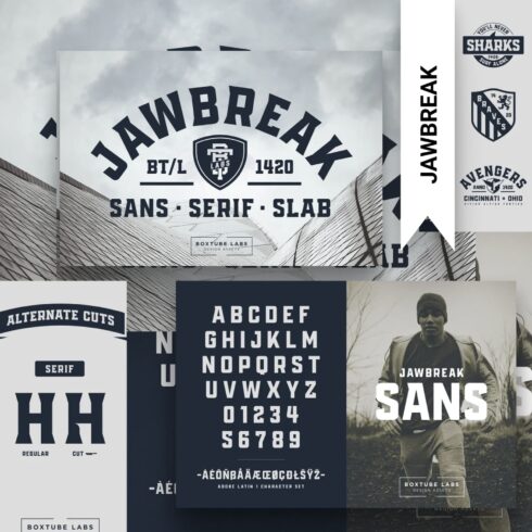
Slab Sans Serif Fonts
1-34 of over 34 results for Slab Sans Serif Fonts


Hot Search Results:
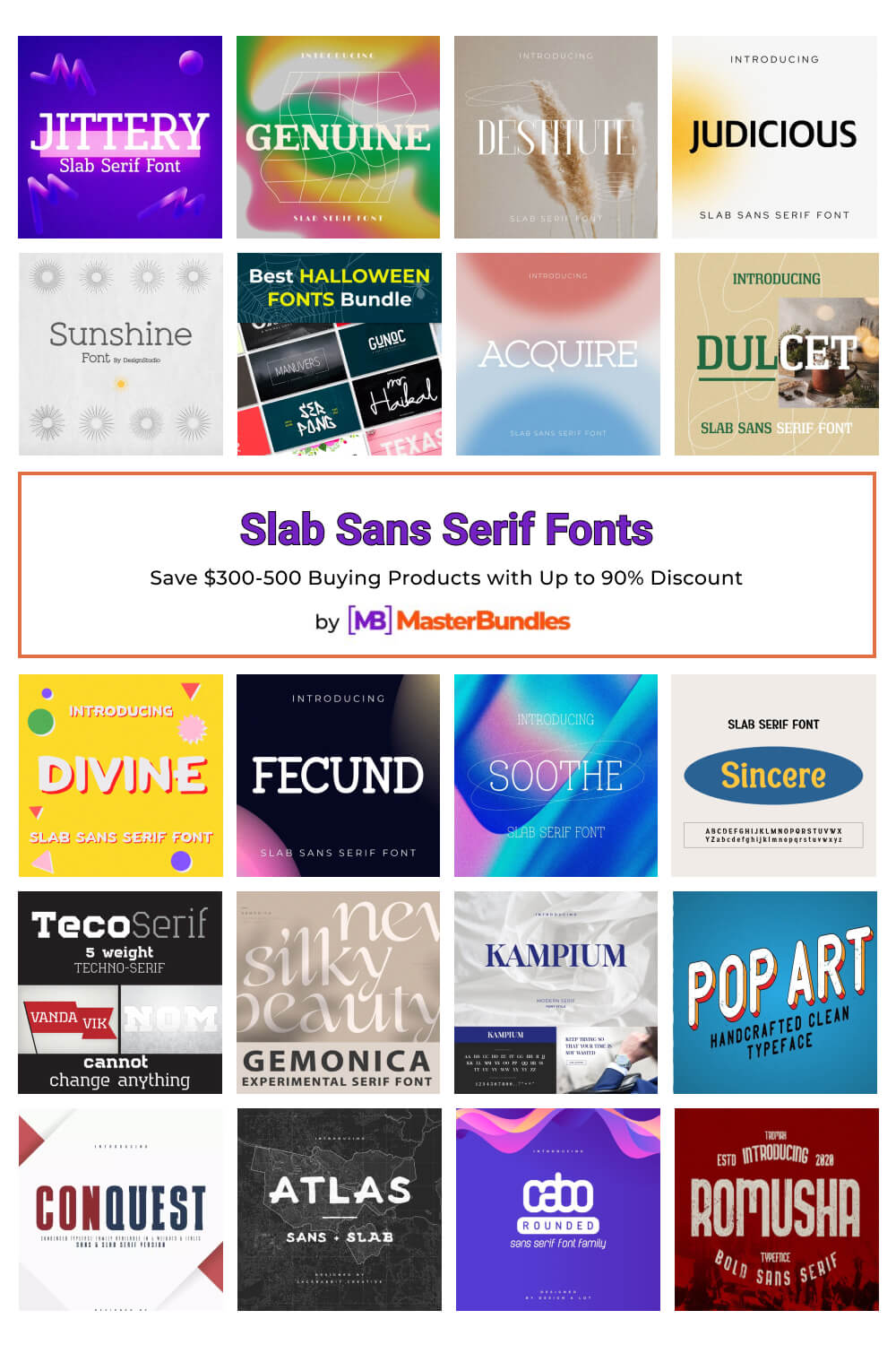


Slab sans serif font is a rather well-known and sought-after script that has gained its popularity through serifs. This font is very flexible while it can be used both for display, banner and, for example, for a newspaper. Before you, there is an eye-catching collection of high-quality and stylish typefaces that you can safely apply to your purposes.
Slab Sans Serif Fonts Table
| Font style | Where to use? | Examples |
|---|---|---|
| Clarendon |
This typeface does have some differences due to the presence of some brackets and the contrast in serif sizes. The serifs have curves quite often and become wider as they get closer to the main stroke. Because of this feature, this font is well suited for the design of some newspapers, and sometimes even for letters and stylized articles. |
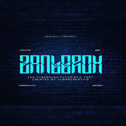
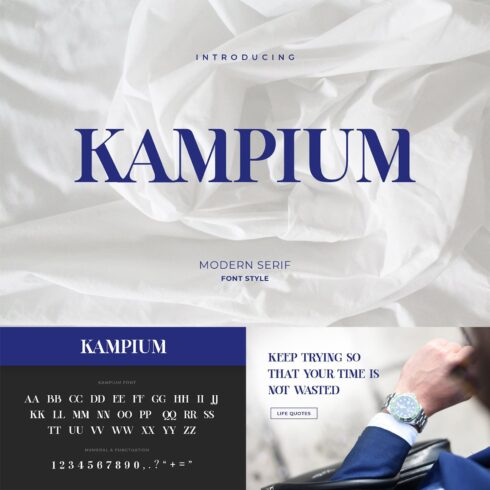
Norwegia Classic Lettered |
| Italienne |
This style of script is particularly eye-catching because of its heavy serifs and dramatic effect. It is also known as the reverse contrast type. Because of this feature, it is a great solution for circus or other entertainment posters, for working with films and creating a nineteenth-century atmosphere. |
|
| Typewriter |
This is a wonderful, handy and very interesting typeface. Its distinguishing feature is its fixed-width format. In other words, each character occupies the same space horizontally. It was originally used for typewriter work, but now would be a great option for some creative ideas. |
|
| Geometric |
This model or otherwise the font style is distinguished by its geometric design of brackets and evenly spaced stems and serifs. Bold slab sans serif font is one of the most popular types in this style. It would be great for magazine designs or headlines for any kind of banner. |
Geometric Slab Font Varna, Carnival VP Slab Font |
FAQ
What is a Slab Sans Serif font?
Slab sans serif font is a very popular and sought-after typeface, distinguished by its thick block-like serifs. The serifs can be of different shapes, e.g. blunt or rounded, or even angular.
What is the main difference between serifs and slab serifs?
The main difference between these two styles is exactly in the serifs. Slab serif typeface has strong rectangular serifs where roundings are quite rare. Serif is a more common style where the serifs are more subtle but can be quite varied in shape.
What is the most common Slab Sans Serif font?
One of the most common and popular slab sans serif fonts is Courier. It is a monospaced script with a slant serif. It was originally designed to be used in typewriters, and was later used quite successfully as a typeface for computers. It is currently very popular with programmers because of its ease of readability in code editors.
Can you use these Slab Sans Serif fonts for commercial use?
Of course, you can buy slab sans serif typefaces for commercial use, because our products have different licenses. Just check out our collection and find the perfect lettering for you.
What are slab serif fonts good for?
This typeface is quite versatile and is used in many industries, from general basic headline text to display fonts. Slab sans serif web fonts are often used on IT-related topic sites. Classic scripts have always been and will usually be a great solution for articles or banners. The use of this lettering for digital purposes has made it very popular, and in many devices it is used by default.
How can I sell my own font?
You can do it directly on MasterBundles digital marketplace. For this purpose you need to fill out the short form and then share your amazing products with our customers.
Most Popular Articles
-

Get Ready for Summer Projects: 50 Best Beachy Fonts
by Rita Asta
-
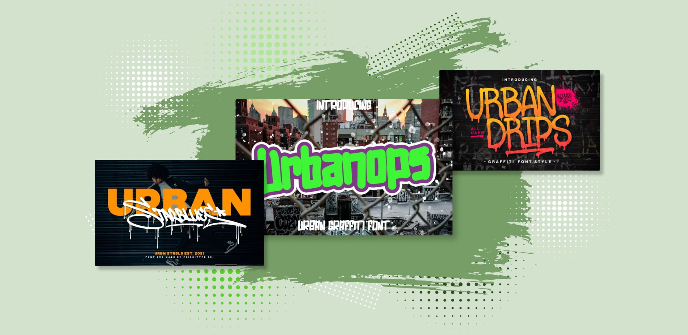
30 Best Urban Fonts for 2023
by Rita Asta
-
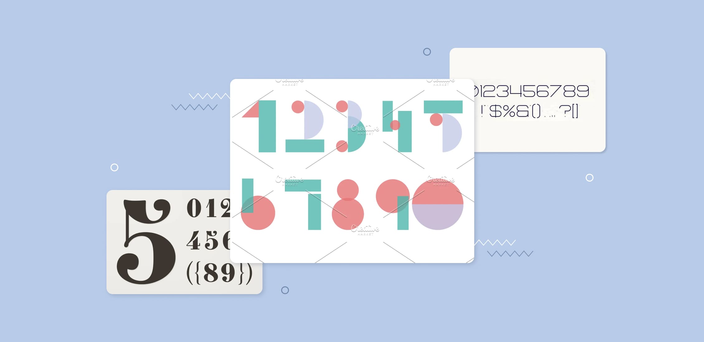
Stand Out with Eye-Catching Numerals: 35 Best Number Fonts
-
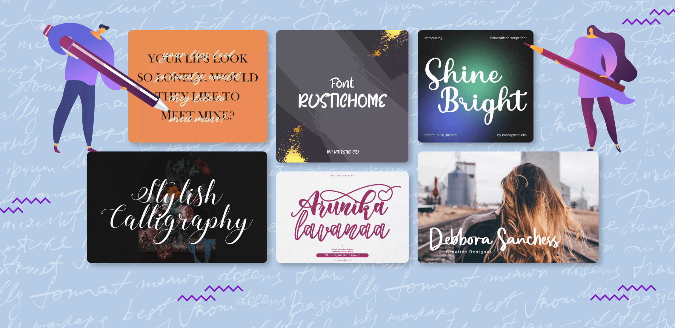
65+ Best 2023 Calligraphy Fonts – Free and Paid