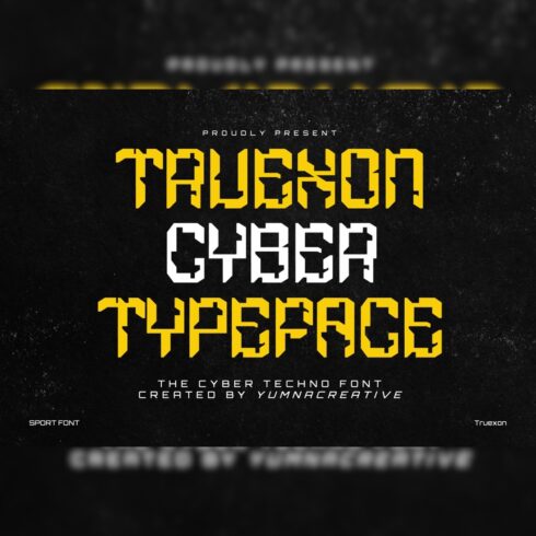
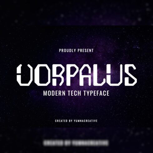
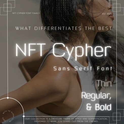
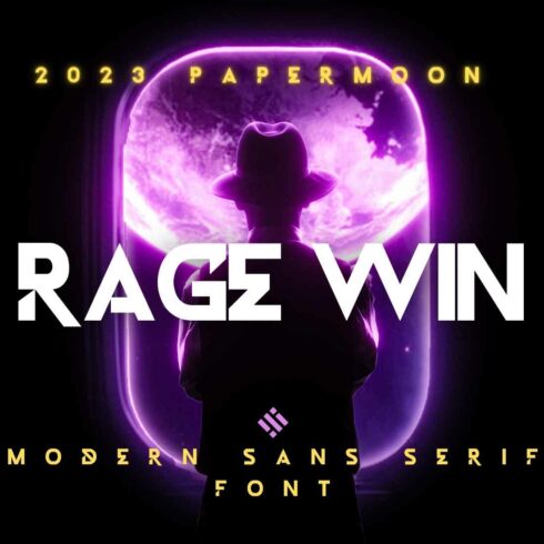
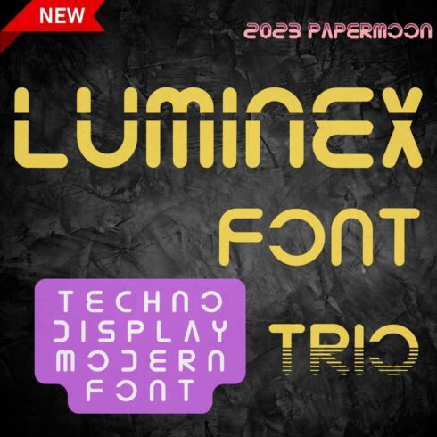
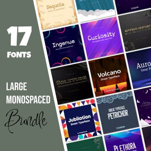
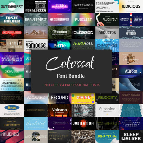
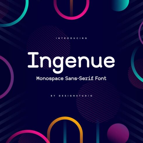
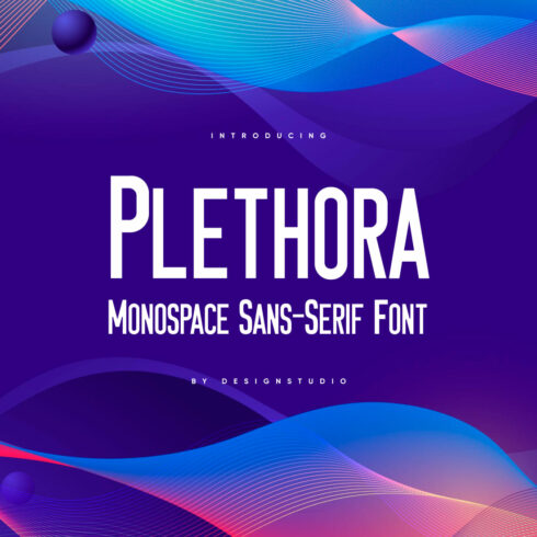
Monospaced Sans-Serif Fonts
1-36 of over 36 results for Monospaced Sans-Serif Fonts


Hot Search Results:


FAQ
What fonts can be considered monospaced?
The definition of this kind of typeface can be understood from its name. Prefix ‘mono’ stands for ‘one’ or ‘only’; ‘space’ refers to an area of height, width, and depth. When talking about sans-serif monospaced fonts, the characteristic of space is limited to horizontal space solely. For instance, regardless of the difference between ‘i’ and ‘o’ symbols, they will take up the same amount of space.
In such a way, the font where each letter possesses equal dimensions is considered a monospaced font. The most frequent usage of these is for programming language developers. Although they fit perfectly for other purposes like headings, short textual elements, or coding, the option is far from being versatile.
What is the difference between monospaced and proportional fonts?
As already explained, characters in a sans-serif monospaced typeface are designed to be even in width. However, in proportional fonts they occupy as much room as required for each letter. Take the word ‘violin’ for example. Letters ‘v’, ‘o’, and ‘n’ are wider in nature than ‘i’ and ‘l’. Despite that, when monospaced, they will occupy the same quantity of room, which forms voids within the word between certain letters. Applying a proportional font avoids this issue, which makes the lettering easier to perceive by the reader.
Interestingly enough, nowadays these borders and differences have practically disappeared. Designers often call their font products monospaced, while they are truly referring to proportional fonts.
Can monospaced fonts be sans-serif solely?
Thinking logically, there are no obstacles to monospaced fonts being serif. Nevertheless, it is a comparatively difficult task to find them on the web. Therefore, technically they can be serif, yet in reality sans-serif options are the prevailing style.
What are the advantages of monospaced fonts?
Sans-serif monospaced fonts might not be suitable for large textual files (e.g., blog articles, books, etc.). However, they may serve as a wonderful graphic design element. Their advantages are:
Minimalistic features. Minimalism is a trendy thing that a designer of any industry can apply.
Simple yet stylish. By utilizing a monospaced font, one is provided with modern, impressive visuals and deprived of the dilemma of deciding other ornamental elements, since a typeface is pretty complete itself.
Numerals. Numbers look especially good when executed in monospaced font.
What is a monospaced sans serif font?
A monospaced sans serif font is a font whose characters each occupy the same amount of horizontal space. For instance, regardless of the difference between ‘i’ and ‘o’ they will take up the same amount of space.
What are monospace fonts good for?
Monospaced sans serif fonts are perfect to use in heading, titles, short textual elements, or coding. This proportional sans serif is most frequently used by programming language developers due to its dimensions. Monospace fonts are used to convey simplicity and minimalism.
When to use a monospace font?
Monospaced sans serif font can be used when you need a simple typeface. Monospace fonts allow you to see each character separately, like in numbers. Most popular monospaced fonts, when used properly, can add more value to your design.
Are monospaced fonts better?
Monospace might not be suitable for large textual files, unlike sans serif fonts. However, they serve as wonderful graphic design elements. A monospaced font is simple and elegant, while serif fonts can be over-packed.
Most Popular Articles
-

Get Ready for Summer Projects: 50 Best Beachy Fonts
by Rita Asta
-

30 Best Urban Fonts for 2023
by Rita Asta
-

Stand Out with Eye-Catching Numerals: 35 Best Number Fonts
-

65+ Best 2023 Calligraphy Fonts – Free and Paid