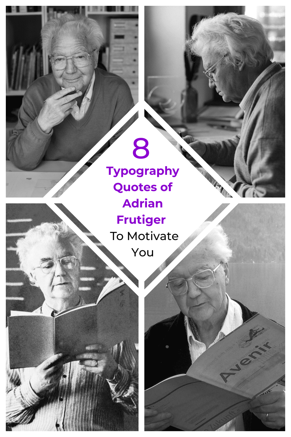
8 Typography Quotes of Adrian Frutiger To Motivate You
The Father of Swiss Typography: Frutiger is considered to be one of the fathers of Swiss typography. His amazing projects influenced the development of the world typographic culture of the second half of the 20th century. Frutiger was lucky enough to work with all font and typesetting technologies: he started as an apprentice typesetter in a printing shop, made fonts for linotypes, was one of the first to master phototypesetting, and became a player in the digital revolution.
Let’s now have a closer look at his life and career path.
Adrian Frutiger was born in 1928 in Switzerland. After his father refused to allow him to study sculpture, he began working as an assistant typesetter in the Otto Schlaefli printing house in Interlaken.
Frutiger later said that his passion for sculpture found expression in his typefaces.
Between 1948 and 1951 he studied at the School of Fine Arts in Zurich, where he was particularly interested in calligraphy. Around 1952, Frutiger’s work (his pamphlet History Of Letters) was noticed by the co-owner of the famous Parisian typography house Deberny&Peingot, Charles Peignot. He invites the young designer to work as an art director and assigns him Paul Renner’s Futura for use on the Lumitype/Photon phototypesetters. But the Futura is too geometric for Frutiger and soon he creates the first sketches of a new headset – Univers.
In 1975 Frutiger creates his next project – a font for the visual communication system of Charles de Gaulle airport in Roissy. The name of the font is originally Roissy, but for licensing to Linotype it was renamed into Frutiger.
Frutiger was fortunate to have teachers who helped him shape his principles of working on fonts. Alfred Willem taught him to see not only black but also white in the shape of a letter and to consider the peculiarities of visual perception, and Walter Käch instilled a love for the instrument – the broad-nib pen.
In 1986 Adrian Frutiger was awarded the Gutenberg Prize for the Art of Typography by the city of Mainz.
He was also awarded the French Cultural Prize.
Type Master
Frutiger had created more than thirty original fonts and developed a systematic approach to the design of multi-component font families.
He is the author of such commonly used nowadays fonts as Apollo, Avenir, Breughel, Linotype Centennial, Egyptienne, Frutiger, Glypha, Icone, Iridium, Meridien, OCR B, Ondine, Opera, Phoebus, President, Serifa, Tiemann, Univers, Versailles, Vectora.
Avenir, Frutiger, Meridien, OCR-B, Serifa, Univers are, without exaggeration, textbook fonts without which it is impossible to imagine the history of graphic design. Just think of Univers alone – after a review by the influential typographer Emil Ruder in TM (Typographische Monatsblätter) magazine in 1961, this grotesque font almost immediately became a national treasure in Switzerland.
Books
Frutiger was also interested in the phenomenon of writing, exploring the nature, and function of the sign, teaching, and lecturing extensively. Among his works are Signs and Symbols: Their Design and Meaning and Form and Counterform.
Frutiger’s output is most fully described in the impressive volume, published in 2009 by the Swiss publisher Birkhäuser under the title Adrian Frutiger. Typefaces: The Complete Works.
Motivational Typographic Quotes
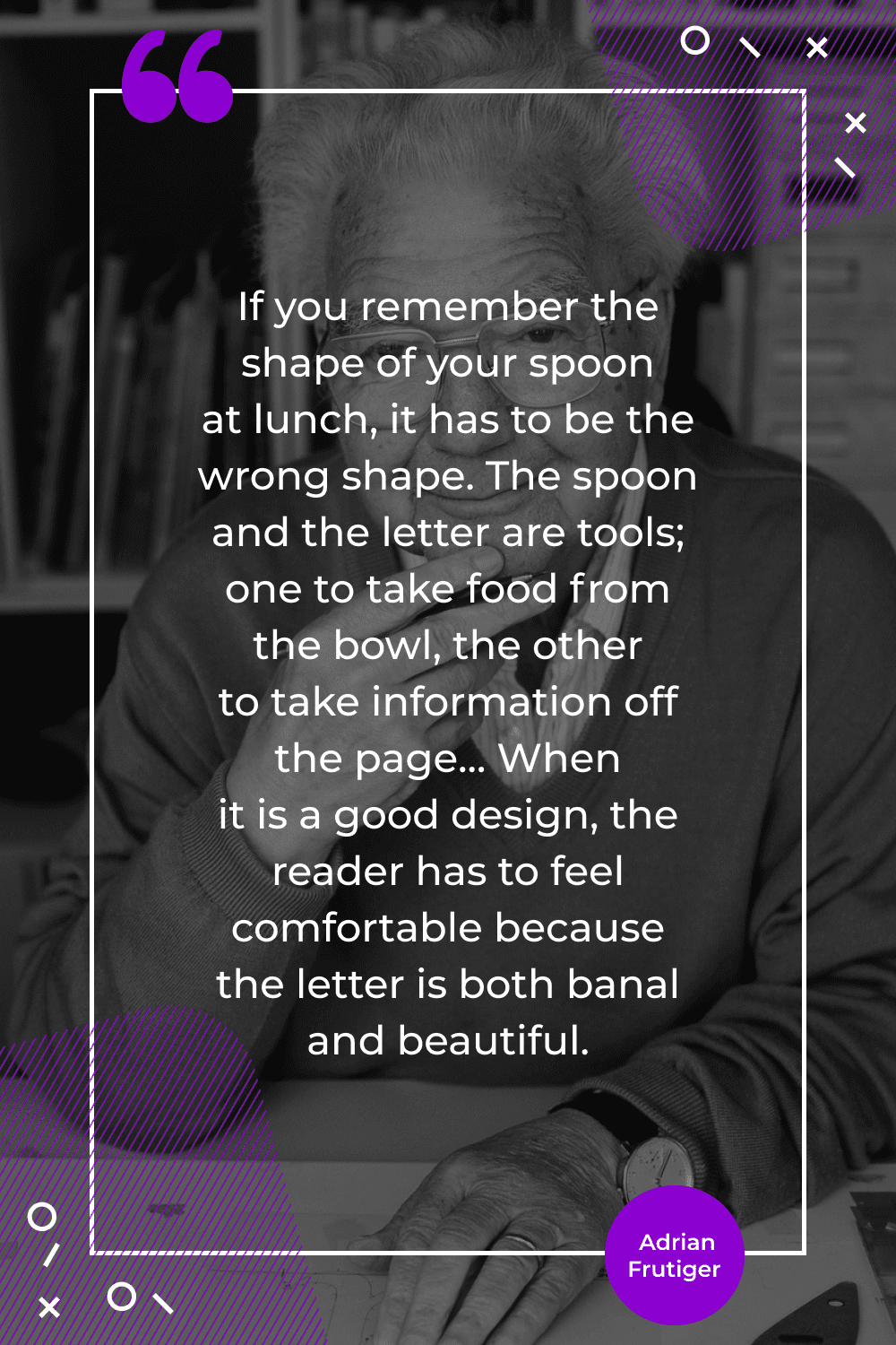
“If you remember the shape of your spoon at lunch, it has to be the wrong shape. The spoon and the letter are tools; one to take food from the bowl, the other to take information off the page… When it is a good design, the reader has to feel comfortable because the letter is both banal and beautiful”.
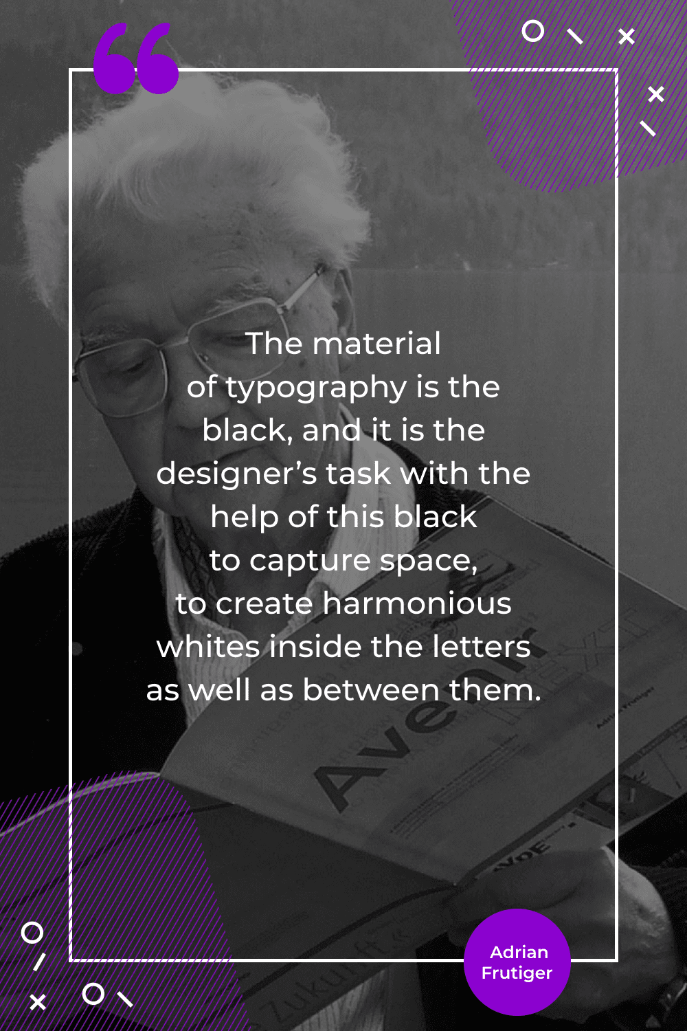
“The material of typography is the black, and it is the designer’s task with the help of this black to capture space, to create harmonious whites inside the letters as well as between them”.
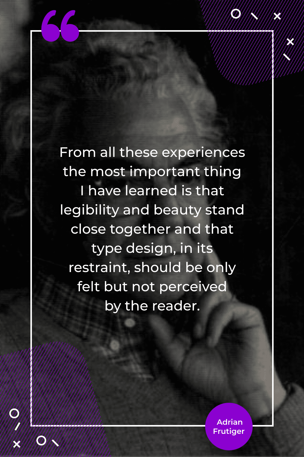
“From all these experiences the most important thing I have learned is that legibility and beauty stand close together and that type design, in its restraint, should be only felt but not perceived by the reader”.
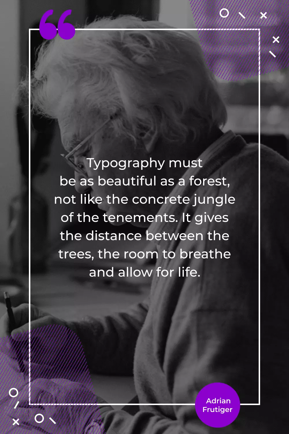
“Typography must be as beautiful as a forest, not like the concrete jungle of the tenements. It gives the distance between the trees, the room to breathe and allow for life”.
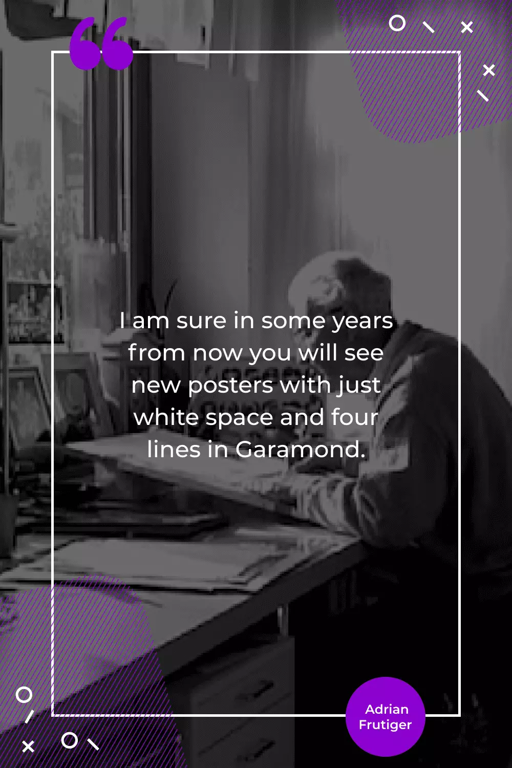
“I am sure in some years from now you will see new posters with just white space and four lines in Garamond”.
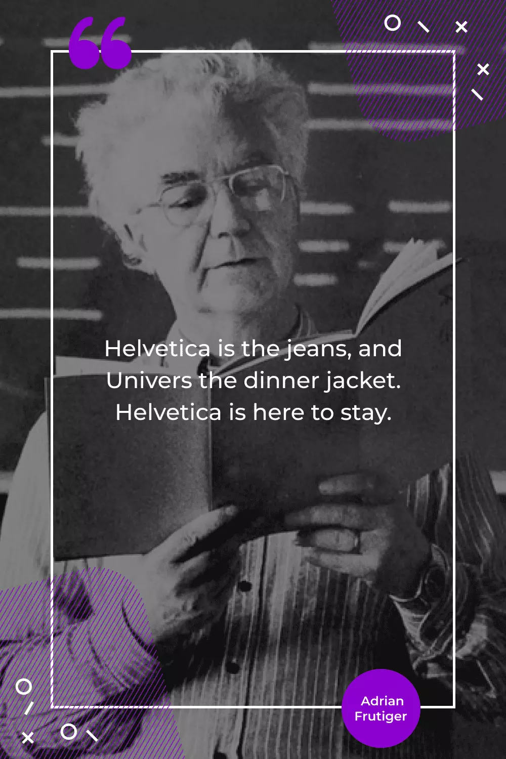
“Helvetica is the jeans, and Univers the dinner jacket. Helvetica is here to stay”.
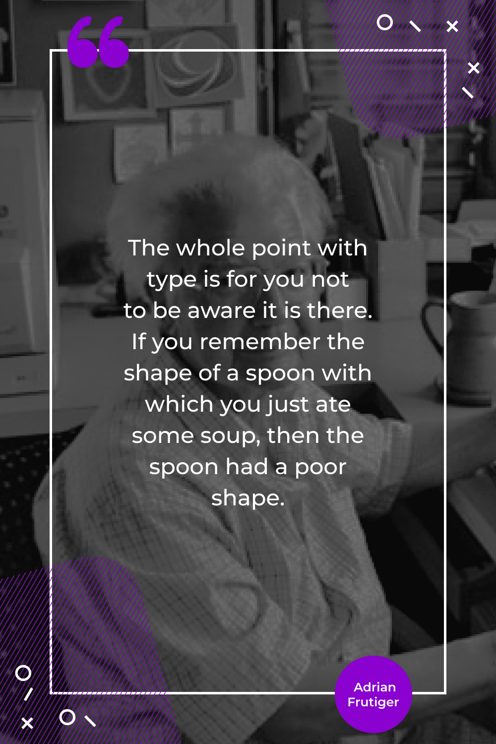
“The whole point with type is for you not to be aware it is there. If you remember the shape of a spoon with which you just ate some soup, then the spoon had a poor shape”.
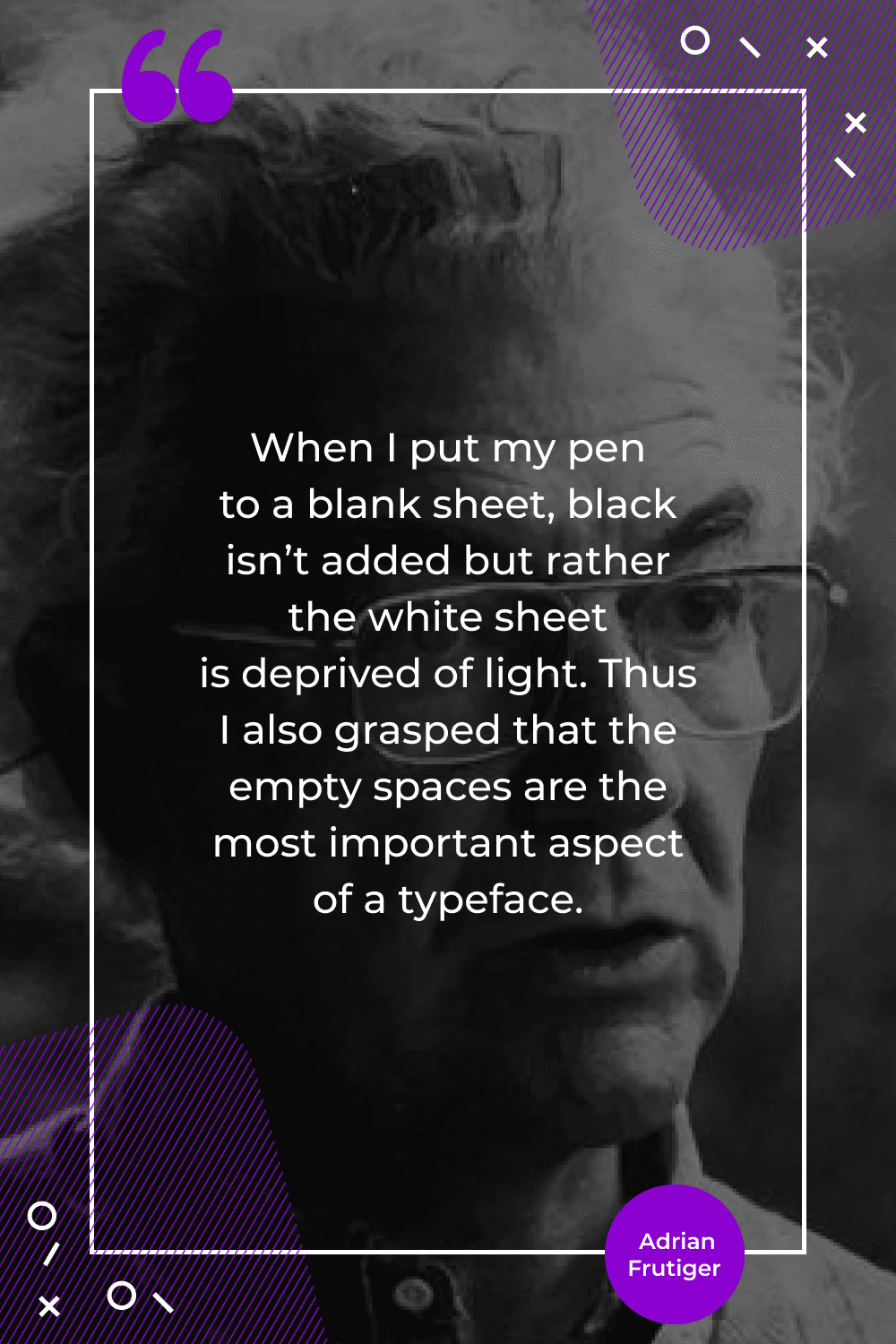
“When I put my pen to a blank sheet, black isn’t added but rather the white sheet is deprived of light. Thus I also grasped that the empty spaces are the most important aspect of a typeface”.
Typography is an essential part of graphic design, and it is an honor to have such bright teachers as Adrian Frutiger. He was a genius of the typographic world of 20’s century who brought us many important materials for creative activity. And we must appreciate it as well as use them for creating new outstanding projects.
- mockups
- certificate templates
- Scene Creators
- Product Mockups
- Print Mockups


What are your concerns?
Thanks for your response!
Disclosure: MasterBundles website page may contain advertising materials that may lead to us receiving a commission fee if you purchase a product. However, this does not affect our opinion of the product in any way and we do not receive any bonuses for positive or negative ratings.