25 Steps to Create Fonts that Sell. How To Become a Typographer in 2022

You don’t just turn on your laptop, open the software, and click the create font button. It takes way more than that to create a font that is ready to share. This is why we created this comprehensive guide for aspiring font designers.
Before we start exploring type design, let’s take a minute to talk about what font design is not. If you already know these basics, please feel free to move to the next section.
Here are some terms you need to understand because I will be using them a lot:
Typography is the art of arranging written characters, while working to enhance their readability and appearance. To do that, a typographer will use different typefaces and play with their sizes, kerning, leading, line length, etc.
So, typography is the art of using different typefaces in multiple settings (like web design, packaging, books, etc). What is important, typographers may or may not design the types they are using.
Type design (or font design) involves creating the look of visual characters (glyphs). These will include letters, numbers, and other symbols. Within one typeface, glyphs will have similar recognizable features. They will also be arranged in sets of fonts and share certain characteristics: weight, style, condensation, width, slant, italicization, and ornamentation. This means that there are multiple fonts available in a single typeface family (e.g., Arial or Tahoma).
As we can see, designing typefaces includes creating fonts. However, you can create an alternative font for a typeface that already exists. By doing so, you will become a type or font designer. The terms “font” and “type” are used interchangeably over and over again these days.
Most foundries use the terms font developer or font designer to refer to the same thing. Foundries are online marketplaces that sell online the types produced by employed or independent type designers. In the digitalized era, the line between typefaces and fonts has become very fine.
Lastly, this article will teach you how to market and how to sell fonts, so you can get the remuneration you deserve after such hard work!
Now go, create fonts, and, most importantly, enjoy it!
Type design as a career
Type design is a great opportunity for a graphic designer (or an aspiring designer) to specialize and build a successful career. It involves creative work and passive income. Who wouldn’t want that? I certainly would.
We will discuss the risks and possible pitfalls of a career in type design in the next sections. But first, how can you be sure that this profession is for you? Are you sure that type design will help you make the most of your skills and passions?
Here’s a brief checklist. You can build a career as a font designer if:
- You are mesmerized by letterforms and calligraphy.
- You have a basic background in graphic design which may or may not include formal training. Additional education in design, liberal arts, or humanities is something you are willing to pursue to grow and stand out as a professional.
- You get excited by vectors and letter curves.
- You are curious about the history of design in general. You are aware of the classic ways while staying true to your vision.
- You are familiar with basic design software and motivated to know the technical side of things.
- You have a broad scope of interests and the ability to draw inspiration from the world around you.
- You can work independently and see the big picture. You can understand the context in which your fonts will be used and create products that fulfill a need.
- You are ready to invest time and money in your career before you see any profits.
- You are ready to compete with millions of other font designers without getting discouraged.
If most of these statements ring true to you, a career in type design is likely to make you successful and satisfied.
Just remember that it is a long way to go.

You need to be motivated by something more than curiosity and the desire for passive income.
If you have a deep passion for letterforms, getting to know the craft from the very basics will be an exciting adventure.
How to make money as a font designer
There are multiple ways to earn a living from selling types. Let’s take a close look at the most popular of them.
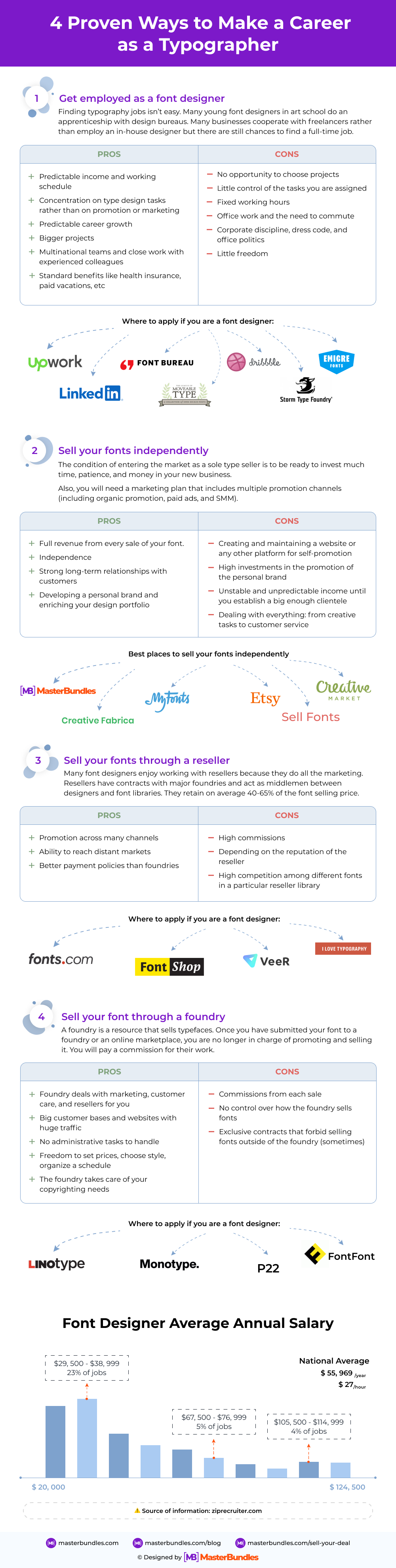
Get employed as a font designer
Finding typography jobs is not an easy task. It is all the more difficult if you don’t have an art or design school diploma and a solid portfolio.
Many young font designers do an apprenticeship with design bureaus while still studying in art school. Afterward, they may or may not get the job.
The best thing about an apprenticeship is that you work on bigger projects alongside experienced font designers. This is a great opportunity to grow professionally, though rarely well paid.
Professional designers usually work alone and only share the results of their work online. So, if you want to specialize in type design only, it wouldn’t be easy to find a corporate job. When it comes to developing fonts, many businesses choose to cooperate with freelancers on separate projects rather than employ an in-house designer. But If you are ready to work as a graphic designer and perform various tasks, even those that have nothing to do with typography, your chances to get a well-paid job at an agency go up.
In the US, an entry-level graphic designer would earn from $35k per year, a staff-level designer would get $45k, and a senior designer could earn up to $75k per year depending on the company. A typographer can expect a yearly income of $45k and up to $60k.
Pros
- Predictable income and working schedule (all stipulated in the contract).
- The opportunity to concentrate on type design tasks without having to do any promotion or marketing.
- Predictable career growth.
- The chance to work on bigger projects even as an entry-level specialist.
- The chance to join multinational teams and work closely with experienced colleagues.
- Standard benefits like health insurance, paid vacations, etc.
Cons
- You cannot choose the projects you work on.
- Little control of the tasks you are assigned, especially on an entry-level. You may have to do a lot of design chores until you get the chance to work creatively.
- Fixed working hours.
- Office work and the need to commute.
- Corporate discipline, dress code, and office politics.
- Always be accountable to seniors for the work you do. Little freedom.
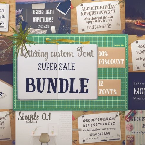
Massive Font Pack - 197 Fonts in 52 Font Families
Where to apply if you are a font designer
It is not always easy to find fixed employment as a font designer. Luckily, there are plenty of freelancing opportunities, so you can add font design to your graphic designer portfolio. Let’s see a few marketplaces where you can find good font designer gigs:
- Upwork: companies are looking to customize their look and feel all the time. To find a freelancing gig as a font designer on Upwork, make sure you search for all the interchangeable terms as well (e.g., type designer, font developer, etc.).
- LinkedIn: less choice, but more focussed and long-term. If you have a strong portfolio, set up an alert for all font design-related jobs on LinkedIn and you might find a foundry that is hiring.
- Dribbble: like other design jobs, Dribbble is a good marketplace for focused gigs. We suggest you build a strong Dribbble profile and portfolio, then clients will start flocking!
- Approach foundries directly: font design is a niche, and the people who work in foundries know their stuff. You need to be lucky, confident, and build a very, very strong portfolio that shows that you can design any font. This is a list of foundries you can talk to:
- The League of Movable Type: it’s open-source, so you won’t make the big money, but boy will you learn something!
- The Font Bureau: these guys have been doing it since 1989… enough said.
- Emigre Fonts specializes in display-style and other peculiar fonts; very cool.
- Storm Type is the old-school foundry of the digital age; they take traditional concepts and make them relevant today.
Sell your fonts independently
If you have a free and independent spirit, you can try selling your type in a font marketplace. To have a stable income with time, you will probably need a website and a big enough portfolio.
While working alone, you will have to master all the nuts and bolts of your business and do lots of negotiations with clients. You will also handle individual sales and customer support. There will be many ups and downs, but the independent road towards success is very exciting.
The only condition of entering the market as a sole type seller is to be ready to invest much time, patience, and money in your new business.
Also, you will need a marketing plan that includes multiple promotion channels (including organic promotion, paid ads, and SMM).
Pros
- You get the full revenue from every sale of your font.
- You are independent and make choices about everything in your business: from design ideas to pricing and marketing.
- You know all your customers directly and have higher chances to establish strong long-term relationships with them.
- With every new project, you are developing your brand and enriching your design portfolio.
Cons
- You have to do a lot of stuff that is not connected to design. You will have to create a website and take care of all the maintenance and expenses.
- You will likely have to invest money into marketing before you get the first customers or clients.
- You will have to be half businessman and half type designer.
- Your income will be very unstable and unpredictable until you establish a big enough clientele.
- You will have to take care of all individual sales and do customer support.
Tips for freelance type sellers:
- Be prepared to invest some money in the promotion before you can make a living selling your fonts. You will need some startup capital and a lot of patience.
- Have a business plan!
- Be prepared to make mistakes and learn as you go. Learn how experienced freelance-type designers do their business. Reach out and ask questions.
- Try to find your niche and work in a recognizable style. Sticking to one style will make it easier for you to get a stable client base.
- Always do market research before you start creating a new font. Always make sure you are creating a font that solves an actual problem that fills a hole in the market. There are always holes in the market that you can fill with your fonts.
- Make sure every type you create is easy to work with, includes many sizes and styles, and can be used in color.
Best places to sell your fonts independently
Okay, you have designed some awesome fonts, and you would like to put them up for sale. Where should you look? My friend, we’ve got you covered:
- MasterBundles: yes, it’s us! We make it extremely easy for you to expose your fonts to the world and sell them to our huge customer base!
- Creative Fabrica has a big reach and gives decent rates when it comes to sales that you refer (up to 75%).
- Sell Fonts: the name is self-explanatory. This is a specialized site to showcase and sell the types you design—but beware of the fierce competition.
- My Fonts is another specialized site that is great if you have really strong fonts that can cut through the noise.
- Etsy: A weird suggestion? We don’t think so. It’s becoming more and more common to sell designs on this platform (including fonts), plus you can sell other things along with typefaces.
- Creative Market offers 70% flat on anything yours that gets sold, and you get to name your price. Again, it’s a big platform, so beware of the competition.
Sell your fonts through a reseller
Resellers are websites that find fonts in foundries and make contracts to sell them over to their customer base. Often, they have a market niche and seek fonts of a particular style.
Many font designers enjoy working with resellers because they do all the marketing. They will make sure your fonts are sold in as many foundries as possible. Resellers have contracts with major foundries and act as middlemen between designers and font libraries. Reselling companies work across many promotion channels and are very good at delivering fonts to end-users.
Some resellers will want to sell your fonts across all foundries, others prefer selling products exclusively to one marketplace.
Resellers have huge libraries, so your font will have to stand up to some tough competition. Do a risk/benefit analysis before making any decisions.
Type resellers work for commission and retain on average 40-65% from the font selling price.
Pros
- Your font gets promoted across many channels. This means that you would get more sales than if you market your product alone.
- The ability to reach distant markets.
- Resellers sometimes have better payment policies than foundries.
Cons
- You lose a part of your income.
- You depend on the reputation of the particular reseller and its ability to promote your fonts.
- There may be tough competition among different fonts in a particular reseller library.
- Resellers may work in very specific genres ignoring all the other fonts that do not match this style.
Tips for selling fonts through resellers:
- Always check the background of a particular reseller and read the reviews.
- Try to understand the client base and dominant marketing strategies of a reseller before starting your cooperation. Look at the marketing tools they use.
- Study their libraries and estimate the risk of your font being lost forever among other products.
- Find out how they carry out customer service.
- Check all the exclusivity conditions and think about whether you want to make such a commitment.
Best resellers to sell your fonts
This is a list of the best resellers you can submit your fonts to. They typically give you between 40 and 65% of the sale price:
- Fonts.com.
- Fontshop.
- Veer.
- I Love Typography.
- FontSquirrel (This is not a reseller per se, as they offer free fonts. However, it’s a great place to put your name out there, so when you go for a reseller you can compete against big-time foundries.).
Sell your font through a foundry
Selling fonts through a type foundry is the most popular earning option among type designers.
A foundry is a resource that sells typefaces. Nowadays, most of them do it through websites in digital form. Foundries can also offer a nice package of additional design services.
Once you have submitted your font to a foundry or an online marketplace, you are no longer in charge of promoting and selling it.
The foundry will take care of all the marketing and administrative tasks. They will also deal with resellers and anyone who shows interest in your font. A foundry will use its reseller network and marketing resources to get your font out there and sell it as many times as possible.
Some foundries may pay you a percentage of each sale, whether it was made directly off the website or through another distribution channel. Other foundries pay a percentage of a wholesale price. In that case, your revenue from a particular sale will depend on the number of channels through which the sale was made. The more parties involved, the less money you get.
After you’ve invested time and effort into creating a font, you wouldn’t want it to be buried in oblivion. So, working with a popular and trustworthy foundry may be the optimal choice for an ambitious type designer. Just make sure your font meets the quality standards of that foundry and is unique enough to compete with other fonts in the foundry library.
Pros
- You will hand over all marketing and customer care to the foundry. They will also deal with resellers for you.
- Foundries have big customer bases and websites with huge traffic. Your fonts will be seen and bought more often.
- You can focus on creating new fonts without having to handle any administrative tasks.
- You are still free to set your schedule, choose which fonts to work on, and how to price them.
- The foundry will take care of your copyrighting needs.
Cons
- You have to let go of a percentage of every sale.
- You don’t control how the foundry sells your font.
- In many cases, you sign an exclusive contract and can’t sell your font outside of the foundry.
The best thing a foundry gives to a font designer is the opportunity to have passive income from every sale of that font.
You also get a guarantee that your fonts will be seen by many people.
Top foundries to sell your fonts with
Article is reviewed by

Is it better to start your journey as a freelancer or look for an employer?
I believe that typographers are doomed to freelance. Fonts are a specific product. You can work as a full-time purely font designer only in companies that produce and sell fonts exactly. And there are very few such companies. It is unrealistic for a beginner to get there to build a career, in my opinion.
Agencies that make identities, including fonts, rarely keep typographers on board.
Therefore, freelancing together with selling fonts on popular font marketplaces + working with local agencies as a contractor, in my opinion, is the only possible way of career development.
What recommendations could you give to typographers, who are just starting their careers?
Where to start your career? Probably from studying. First, try some inexpensive courses. Listen to yourself - is it something you really enjoy doing? Then, you can try to ""volunteer"" to gain a couple of cases in your portfolio. The more socially significant the work will be, the more people will learn about you. Of course, this is not the only way, but many Ukrainian typewriters have declared themselves this way.
At the same time, it is necessary to study the history of fonts, and types, analyze the work of the talented colleagues and absorb more examples of cool work."
Best Related Deals

What you need to know as a type designer
In this section, I will try to give you a glimpse of the knowledge you should have before you draw your own font.
Before you learn how to create fonts to sell, you need to gain a deep understanding of typography as a whole.
The lists of terms I’ll try to explain are not full. I provide links to some awesome resources, so use them to deepen your knowledge on a given topic. If you are not new to the field, you can just move to the next section that is more practical.
The old days of typography
The prehistory of typography dates back to when Sumerians knew formal writing as early as 3500 B.C. Ancient Egyptians were the first to use symbols in art, and Phoenicians created the first written alphabet in 1000 B.C.This alphabet was later taken over by Greeks and Romans. In fact, many aspects of it are still familiar to us in 2019.
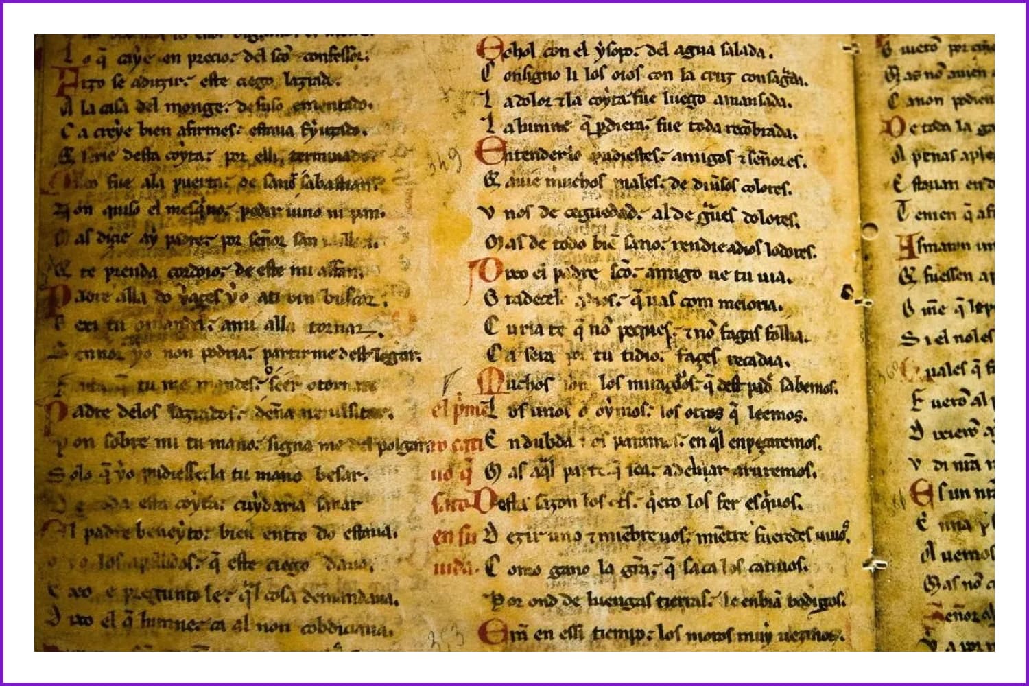
The Middle Ages are famous for their love for calligraphy and lettering that is obvious from the beautiful manuscripts that have survived until these days.
The advent of typography as we know it today began in the 15th century when Gutenberg invented the printing press and the moveable type that could be used with it. Since then, people started experimenting with types, their sizes, boldness, shadows, and styles. The oldest serifs and sans serifs actually date back to the times of the Industrial Revolution.
The next major shift in the industry occurred when line-casting machines like Linotype and Monotype were invented. These allowed us to use a certain type and have it circulate back into the machine automatically. This dramatically eased out the printing process because manual typesetting was no longer required.
In 1885, we saw the dawn of optical scaling when pantographic machines became able to expand or condense characters and images. This allowed typographers to use different sizes of the same font in their works. Also, the “point” font measurement system that we now take for granted was invented at that time. Before that, you would call different sizes of the same font different names.
Best Related Articles


From the 1950s to 1985 prototyping was the dominating trend. This technology involved projecting characters onto a screen and using lenses to adjust the resized images and scale types. The dawn of the digital era in 1980 first gave way to half phototype half digitized machines, each of which had its own formats for fonts. The standard for digital typesetting, the PostScript, evolved in the late 1980s and gained popularity from being included into the first Macintosh and Pagemaker (desktop publishing program).
Now, we have a variety of page description languages and font formats, like Postscript Type One, Multiple Master, Truetype, and Truetype GX, Open Type, etc.
Types of fonts
Over the years, many efforts were made to categorize typefaces and create a structured classification. The most popular approach is to distinguish four basic categories of types: serifs, sans serifs, script types, and decorative types.
BEST FREE Fonts For 2022 (Don’t Miss Out!)
Typography trends for 2022 are coming, some are already here. Todays video will bring you the best free fonts for 2022, paying respect to the trends of 2022.
Below, we will explore every category and basic subgroups it consists of. This classification is by no means an exhausting one, and I will add some more links at the end of the section for those who want to know more.
Serifs
Serif typefaces get their name from the small strokes we see at the ends of lines. These elements make serifs very readable and widely used in printed media. Most go-to serifs include Times New Roman, Georgia, Didot, Garamond, Baskerville, etc. While serifs are also great for titles and logos, they are not perfectly readable online. Nowadays, serifs are appreciated for adding a hint of reliability, sophistication, and formality to a design project.
- Old-style (humanist) serifs are the oldest. You can tell them by the diagonal stress. Stress is the angle of inwards pressure onto a character which makes the lines thinner depending on the axis angle. So, in Adobe Jensen, for instance, the thinnest lines are those angled, not vertical or horizontal. These types speak of history and mystery (e.g., Adobe Jenson, ITC Berkeley Oldstyle, and Goudy Old Style).
- Transitional serifs include our beloved Times New Roman and Baskerville. You can tell them by the difference between the sick and sinner strokes which is bigger than in humanistic serifs but smaller than in modern ones. These types communicate formality, tradition, and reliability (e.g., Americana, Baskerville, Perpetua).
- Neoclassical Serifs would have a vertical stress and smaller brackets. The contrast between thick and thin lines is even more pronounced. These are glamorous, vintage, fashionable, and luxurious (e.g., Walbaum, Didot, Bodon).
- In Slab Serifs, the contrast between lines reaches bare minimum and the letters have chunky serifs. Slab serifs would have fixed width sometimes and remind you of Sans serifs. These fonts look very authoritative and demand attention. The impression you get is of your message being impactful, bold and important (e.g., Clarendon, Rockwell, Archer, Courier, Excelsior).
Sans Serif
Sans Serif fonts got their name from lacking the serif elements at the end of each character. They look more modern and read better on digital screens. These types seem to have more open and humanistic personalities. They look clean and tend to make your message look universal. We see sans serifs everywhere—on websites, in logos and headlines, in small texts, and product packaging.
- Grotesque Sans Serifs look very much like Serif types but without the serifs. You can also recognize them by monotone weight stress and characteristic g’s with a loop at the end. There’s also some squareness to all the curves in these types. These types look simple, neutral, easy to read, and sensible (e.g., MS Sans Serif, Helvetica, Franklin Gothic, Neo Grotesque).
- Humanistic Sans Serifs follow the proportions of classic Roman inscriptions; they also have greater line width variation and contrasting weight of strokes. These types are considered the most legible of all sans serifs. These types look colloquial, decorative, and distinct (e.g., Tahoma, Optima, Gill Sans, Frutiger).
- Geometric Sans Serifs are inspired by simple shapes and look the most modern of all sans serifs. Paradoxically, these monolith-looking types are less readable than grotesque sans serifs. They look trendy, bold, oblique, and sharp (e.g., Avenir, Futura, Harmonia Sans).
Scripts
Script fonts are obviously inspired by handwriting, which makes them fluid and decorative. These types usually have connected elements.
You get a feminine, fancy, elegant, and personal impression from these types.
- Formal Scripts look very 17th century and some of them use the handwriting of famous calligraphers as a benchmark. They look stylish and chic, but not too readable (e.g., Bickham, Elegy, Helonda Book).
- Casual Scripts are inspired by more up-to-date handwriting; you will recognize them by the 20th century style. These types look like they have been drawn by a brush. The strokes are also more powerful. Casual, cool, unique, alternative, and embellished (e.g., Limehouse Script, Freestyle Script, Brush Script, Mistral).
- Display fonts. These types are the most decorative. This category is the broadest and the types are mostly used for headlines, signage, tattoo art, etc. to make a stronger statement. Many display types are dramatic and contain unexpected letterforms or psychedelic and grunge elements. These types are prominent, quirky, friendly, and eccentric (e.g., Shoreditch, Arnold Circus, MO Funky Fresh, ITC Airstream).
- In Monospaced types, all characters are given the same amount of space, regardless of their actual width. In proportional scripts space is distributed depending on the character width. These types look edgy, technological, code-based, and sophisticated (e.g., Courier New, Monaco).
Important typography terms explained
Layout grid
A grid is a backbone of a page layout, the inner structure of placing text and images on a page. It is impossible to build a good enough typographic layout without internal coherency. Grids include guides and columns that make the layout balanced and predictable. Layout grids can be symmetric or asymmetric depending on whether they follow a centerline.
Hierarchical grids are for organizing content on websites. Modular Grids have both columns and rows and allow organizing content in a more structured way than with just columns. These grids are also best for charts and schedules. Baseline grids determine the spacing between lines of text and create a flowing rhythm to it. They are usually combined with other types of grids. Column grids are most popular in magazines where they simply arrange text into columns. Manuscript grids are used where there is much plain text, like in pdf documents.
Measure refers to the length of a text line. This length applies to both paragraphs and columns. Measure makes the text more readable because a line that is too long would be too difficult to follow. Alternatively, very narrow lines would make readers shift their eyes to and fro all the time, which is exhausting.
Leading is the distance between one baseline of text to the next minus the size of the type itself. Longer lines of text require more leading, and larger characters need less leading. Good spacing makes the text more readable and easy on the eyes.
Left alignment is how people naturally view text so it’s better to arrange your content this way. You can align all headlines to the right and justify no more than a few lines of text on the whole page. Justification within one column makes the lines shorter and adds chaos to the layout.
A text rag is a messy side of a paragraph when the text is aligned to the opposite side. Having aligned the text, a typographer needs to take care of the rag and make the line ends move to and fro less. A paragraph with very uneven line endings will have a bad rag. Such rags are tiresome to the eye.
Kerning is the distance between two characters and the process of setting this distance. You will inevitably do kerning when working with headlines, logos, or other prominent text pieces. Tracking refers to adjusting the distance between characters throughout the whole document automatically.
Widows are lines of text that get separated from the rest of the paragraph and end up in a different column or on another page. Orphans are words or short lines that end a paragraph leaving lots of white space. Both widows and orphans should be avoided to increase the readability of text and make it look harmonious.
Hand Lettered Fonts - 16 Stunning Fonts - OTF, TTF, WOFF. Just $29!
A quick way to know that your font is OK
We have a checklist for everything. Here’s your type checklist:
Make the font bigger if:
- You have to make an effort to read the text
- You are squinting your eyes even slightly
- Your hand is automatically reaching out to zoom in
Make the font smaller if:
- You get distracted by separate letters and their forms instead of reading the content
- You find it difficult to read more than 3 words straight
- You need to fight yourself not to zoom out
Reduce the text measure if:
- You notice that you are turning your head to read
- Somewhere in the middle of a line, you get distracted
Increase the measure if:
- You see the text break midways and get irritated
- You feel your eyes getting tired as they move from side to side to read
- The text looks thick and heavy
- You notice that your eyes bounce to the wrong lines and you lose the grip of the content
- You notice white space between lines and it irritates you
- The text looks sloppy and unstructured
- What is the purpose of your type? What kind of message will it be used to communicate? To whom and in what context will this message be delivered? Will it be used for front text or headlines?
- With what media will this font be used? In which countries?
- Which language will it speak?
- What will be its personality? How would you describe its “behavior”? Is it formal and bold or informal and gentle? What three words could you use to describe its character?
- What technical characteristics should it have? Serif or handwriting script? Monotype or proportional?
- What tools can you use to design it?
- Which font size is required to achieve the purpose of the font? How many weights do you need?
- Which popular types could you use as an inspiration for your type?
- What is your deadline?
- Get back to your brief and look closely at the types that you’ve selected for inspiration. Are they more geometry or calligraphy-based? It’s always easy to start with a simple geometrical shape, so let’s assume you want to create a very clean, bold, and basic type.
- Use the basic shapes like a square, circle, or triangle as templates for your letterforms. Use lines to create geometric shapes instead of filling them with color. You can experiment with the width of the shape lines, making them the strokes of your letters.
- Play with geometric shapes to create letterforms starting with any letter. If you use geometric shapes, you can create letters without having to draw every line from scratch. You can also crop shapes with “white space” to form easy and harmonious letters. Also, use overlapping shapes to create more complicated characters like B.
- When most letterforms are ready, start playing with the stroke weight. Now it’s time to put together the first words in your brand new typeface.
- Now use a grid to make sure your letters are consistent in size and structure (for example, the height of bars in Es and Hs should be the same). In a grid, you will set the baseline, the cap line, the mean line, and the descent line of all your letters. Make your lowercase and uppercase letters coherent by ensuring that the meanline of the uppercase characters is the cap line of the lowercase ones. Within the grid, make sure your lowercase m is the widest letterform, and all the others can fit into it harmoniously.
- Come up with a system for curved strokes. Maybe you want to make the angle at which you end the curves the same for all letters. If you trim the strokes using the geometric forms and “white space” functionality, you will have the same angles without much effort.
- Decide on the weight for your letters.
- Now use the same shapes to create numbers and international symbols. Also, put all the characters in a line, close to each other, and make slight optical corrections manually. Sometimes, mathematically perfect letterforms need a little adjustment to look pleasant to the human eye.
- Then, convert all lines with strokes into character outlines (select all the appropriate lines and go Object > Path > Outline Stroke). You can also select one line and then click Select > Same > Stroke Weight to select the rest automatically. At the end of this process, you will have finalized letters, each in a separate shape.
- Now you are ready to create an Ai document and export it to the FontLab. After that, create the same grid you had for your letters and place each letterform into it. When you position each glyph into the framework, you can polish the lines and correct the proportion of each letter in relation to one another.
- Start on paper and draw the “control characters” of your future type – H, n, o, y.
- Draw a grid on paper defining the baseline, meanline, and other important measurements.
- Start sketching your letters in the grid and move the paper to get smooth curves and transitions. As you proceed, pay attention to the width of all letters, not just the height. You can always use a ruler.
- Start drawing numbers and symbols. Use as many sketches as you need to polish every character.
- When ready, scan the sketches with high contrast and open them in Illustrator.
- Get vectorized letters by using the Live Trace option that erases the grid lines. Go Cmd + Shift + D to turn the white background into a transparent one.
- Use Direct Selection and Pen functionalities to correct the letterforms and make them look decent.
- Then go Window → Extensions → Fontself Maker.
- In Fontself, you can work through your sketches letter by letter and add the numbers and symbols one by one by dragging them into the extension. The program will help you see the glyphs in relation to one another and make their sizes and designs consistent. In the preview, you will see the whole alphabet together and write your first sentences.
- Make your design accessible. There are plenty of online opportunities like setting up your design portfolio on Behance, so potential customers can view your designs.
- Use social media to your advantage. Instagram, Pinterest, and YouTube are great networks to showcase, catch attention, and drive traffic to your portfolio.
- Try to find your niche. Be sure to settle on a niche because there are too many generic typographers out there. You want to be a rock star in your niche so that you’ll be able to sell even generic fonts at a decent price.
- Swing with influencers. It’s important to interact and collaborate with influencers who are established in the market. You’ll be able to glean some of their limelight, attract customers, and remain relevant/memorable to your prospects.
- University of Reading
- Royal Academy of Art
- The Cooper Union, Type @ Cooper
- School of Visual Arts
- Rhode Island School of Design
- Cranbrook Academy of Art
- Savannah College of Art and Design
- Tyler School of Art at Temple
- The New School / Parsons School of Design
- Rochester Institute of Technology (RIT) College of Imaging Arts and Sciences
- Cooper Union
- Pratt Institute
- Syracuse University School of Design
- Massachusetts College of Art and Design
- Yale School of Art
- Carnegie Mellon School of Design
- Maryland Institute College of Art
- Virginia Commonwealth University
- Ringling College of Art and Design
- Minneapolis College of Art & Design
- The University of Cincinnati, School of Design
- Kansas City Art Institute
- California Institute of the Arts
- Otis College of Art and Design
- ArtCenter
- Typography Studies
- Typekit
- Monotype
- To the Point
- I love Typography Fontgame
- Web Typography
- Fonts.com
- Professional Web Typography
- Typo Guide
- FontShop Glossary
- I love Typography Website
- 8 Faces
- FontShop News
- Typography Guru
- Incredible Types
- LinkedIn Learning Type Design is a great course for beginners that also gives you the means to start diving deeper into the subject.ou can get it for free if you are a LinkedIn Learning subscriber, or buy it for less than $30.
- Crafting Type’s mission is to take you from zero to hero during their 3-day super-intensive workshop.
- Type Design Class offers several courses, from beginner to advanced, on everything that is typography, even how to sell your work!
- How to create custom typography design in Adobe Illustrator on Coursera is a good hands-on course. If you don’t use Illustrator you will learn useful tips to apply to your favorite application as well.
- Design Your Own Fonts. Plus A Bunch Of Typography Secrets on Udemy is a good course for people that don’t have a lot of time; while not as in-depth as others, it’s good enough.
- The League of Movable Type is an open-source project that includes fonts as well as articles, podcasts, tutorials, and books. Knock yourself out!
- How to Make a Font – Font Design Full Process on YouTube does what it says; they show you the full process of font creation from beginning to end in a friendly, easy to understand format.
- FontForge is not only the best font editor out there (and it’s free!), but also has an awesome learning section and even more awesome community that will help you every step of the way.
- Typography.com is not a proper learning resource, but they keep a blog about their work that is super useful to typography enthusiasts and designers.
- Typography Handbook is a really cool, easy to navigate guide to learn about typography, so you can always apply best practices when designing your fonts.
- http://typedia.com
- http://typedrawers.com
- https://fontsinuse.com
- http://typeverything.com
- http://friendsoftype.com
- http://www.tdc.org
- https://www.atypi.org
- http://www.typesociety.org
- http://www.fontreach.com
- https://type.method.ac
- http://www.typeconnection.com
- https://wordmark.it
- https://typezebra.com
- A brief history of typefaces
- History of typography
- Famous typographers you need to know
- The evolution of typography with variable fonts
- Typography basics
- Fonts explained
- More on font psychology
- 17 kinds of fonts
- Classification of typefaces
- More about grids
- Harmonious typography and grids
- Typographic measurement
- Line length
- More about leading
- Leading in typography
- More about alignment
- Font-size, Line-height, Measure & Alignment
- More about rags
- More about kerning
- Kerning rules
- Differences between kerning and tracking
- More about widows and orphans
- Typographic widows and orphans
- More about the basics of typography
- A full type glossary
- More typography terms
- Terms explained
- Paragraphs and special characters explained
- How to write a good design brief
- 7 basics of a good design brief
- How to design a typeface: A step-by-step guide
- The process of creating a type
- 17 top tips for creating your typeface
- 9 of the best typography tools for designers
- How to Create Your Own Font (In 6 Simple Steps)
Increase the leading if:
Reduce the leading if:
The typographic character explained
Armleg – a stroke that has one side attached to the rest of the character and the other floating; can be upper, lower, horizontal, or diagonal.
Ascender – the upper stroke of vertical letters like “b” or “d” that reach above the x-height.
Aperture – open space between legs on a baseline.
Descender – the part of the letters like “y” that goes below the text baseline.
Bar – the horizontal line on letters like “h”, “r”, or “f”.
Baseline – the line on which the characters sit. Some letters like “g” will reach below the baseline.
Bowl – a stroke made in a curve that creates a closed space in a character (a counter).
Cap Height – the distance between the baseline and the top of uppercase letters.
Stem – the “spine” or “body” of a letter, like the vertical line in D and diagonal stroke in V.
Counter – the white space created inside a bowl.
Ear – the small element at the top right of the letter “g”.
Glyph – one symbol in a set of symbols that are or should be readable.
Shoulder – the curvy element that stems from one vertical stroke to another, like in “m”.
Loop – the lower element of the letter “g”.
Ligature– joining two letters together in one glyph.
Link – the element that connects the bowl and the loop (the upper and lower elements) of the letter “g”.
Spine – the main curve of the letter “S”.
Meanline – the line that could be drawn at the top of lowercase letters and in the middle of letters like “h”.
Stress – making the stroke thicker.
Stroke – a line in a letter, straight or curvy.
Tail – the small stroke at the end of letters “R” or “Q” that goes down.
X-height – the distance between the meanline and the baseline. Or, the actual heights of lowercase letters minus ascenders and descenders
How to make your first font
Brief
Making your own font can be compared to an adventure, a brief would be a map. If you set off down the road without a map, you will never know whether you have arrived in the right place. Here are the main questions you should set straight before you ever draw a single line:
A short algorithm for creating a font
How to Make Your Own Font | Typeface Design Full Process
Using FontLab, I’m going to show you exactly how to create your very own font. This tutorial for beginners, covering the design process, to creating professional quality fonts.
Let’s say you will be creating a sans serif in Illustrator and FontLab.
Let’s go through the most basic steps you need to follow to come up with a new typeface:

If you prefer drawing everything by hand and working in Illustrator and Fontself maker, here’s a short algorithm for you too:
How to create a font that people want to buy
Choose a niche
This tip sounds almost cheesy but what can we do if the font market requires making smart and educated choices. Before you start making your first brief, think hard about the main need your font will fulfill and the audience it will serve. You cannot create a successful product in a vacuum: look around, get inspired by other authors, and then make something better than them.
Be generous with styles, weights, and stylistic alternates
If you are wondering how to create a font that will succeed, there are factors you should consider. Choosing a font is very personal. So, the more alternatives you offer, the higher the chances that your font will have to be appreciated. You can’t offer just regular and bold and call it a day. Think about going extra bold, Semibold, Hairline thin, etc. Your effort will be repaid when customers start choosing your type over all the others.
One more important aspect is to increase the adaptability of your font by including stylistic alternates. By adding multiple ligatures, stylistic sets, and combinations, variable caps you will make your font way more useful and attractive to customers
Pay attention to kerning
Kerning is the character spacing that we notice viscerally, on an unconscious level. So, if you haven’t paid enough attention to kerning your type, even non-professional customers will notice it. A professional designer will never choose a font that is unreadable and hard on the eyes. If you put characters too close to each other, the words will look cluttered and difficult to read. If you go to the other extreme and make the letters too distant from one another, the viewers will notice the discomfort it creates for their eyes.
Create an amazing presentation and add a few bonuses
No one will fall in love with your font if you do not take pains to present it beautifully. Think about the purpose and character of your font and try to create a presentation that reflects its best qualities. Don’t show your font with ADCs but use nice popular words like LOVE and FRIENDSHIP in your presentation. You need to choose the right angle, color, size, and background to show off your new creation. And of course, the font name should be catchy and inspiring.
Also, add a few goodies to your font package to impress and excite your future customers. The free goodies may include thematic badges, various insignia, additional symbols, or even holiday-inspired fonts. It’s also a very nice idea to create special cute versions connecting words for headlines (like prepositions, the words FREE, ONLY, BY, etc.) and add them to your pack. Be generous and you will see excellent feedback from customers in no time. And one more thing: make sure that your font package includes more than two different file types.
Experiment
To be successful, your typeface needs to fulfill a certain purpose AND be original. Sometimes, it’s difficult to take a fresh perspective on creating fonts because there are millions of them already. Can you come up with something unique but not too crazy? The market always has voids that your creativity may fill. The most important part is to be observant and find your own take on the styles that are already available. Also, you could ask yourself, “As a designer, would I be excited to use this font?” If your answer is “yes” then you’re on the right track.
Don’t stop learning
The typography market is a very competitive and technological environment. If you want to succeed in this market, you need to invest in forever learning new tools and methods. Watch YouTube tutorials, attend masterclasses, follow blogs, take online courses—do whatever it takes to be aware of the latest trends.
Find the right tribe and get feedback from them
When you become a part of the professional community and put your work out there for everyone to see, you will get feedback. And this is awesome even if the things you read from peers and experienced designers are not as flattering at first. Join forums and professional online communities to grow as a font designer and be aware of what’s going on in the market. And one more thing: it’s always better to create something, show it to people, receive feedback, and correct your mistakes, than just sitting still and doing nothing.
Make a video about your font
Have you thought about it? If you want to let the world know about your new creation, make a video about it. Moreover, fonts are visual in nature, so making a video is a wonderful chance to show off your font from various angles. Get creative with your promotion and let people see how they can use your font to make the most of it. Show how your type can be used in different contexts to make even more people excited about it.
As I was gathering material for this article, I asked Tarif Khan, the Head of Design for LogoDesign.net to share his recommendations to young type designers and photographers.
Here’s what he came up with:
Where to study
Did you get inspired to start learning how to create fonts? Well, we’ve got some resources for you. Most of them are free, some are paid. You can decide to start formal education, or be content with taking an online course—it’s all up to you.
Formal education
What you definitely need to do is follow the links with inspirational blogs and web resources and subscribe to them (and don’t forget about our MasterBundles blog!). These resources will entertain you and make you a better professional absolutely free of charge.
Blogs and web pages to follow
The pages below should be your everyday go-to resources if you want to immerse yourself in the world of typography and type design.
A selection of courses for type designers in 2022
When you create a font you need a combination of art and craft. It blends creativity and technical aspects that require mathematical precision. This is why instinct and education are equally important. There are a lot of good resources on the internet to get started, both paid and free. The deeper you go into typography, the more research you need to do, but you can always find something that will push your boundaries further.
We collected a series of courses and resources for you, so you can start getting your hands dirty and forge some awesome fonts!
Useful resources (blogs, YouTube channels, etc.)
Looking for more resources? Well… your search has come to an end. These are the ultimate resources to learn about font design:
Tools, organizations, and forums
Here we have a list of useful tools and professional communities you need to be aware of to grow as a type designer. No man is an island, and no successful type designer is either.
Sell Your Fonts. Now!
If you are ready to sell your font, upload it to MasterBundles through our convenient Sell Your Deal form and start earning with us!
Well, that’s basically all we wanted to share with you. Did you enjoy the article? Was it helpful?
Please leave us feedback in the comments and let’s get the conversation going!
Article reviewed by

Is it better to start your journey as a freelancer or look for an employer?
In the early stages of your career, it is better to work as a full-time designer, because working in the company you will be able to gain experience communicating with teammates, you can learn a lot from more experienced colleagues, evaluate types of work and how to cope with difficult situations. Another plus will be a background for improving soft skills because you have to constantly interact with the team. Also, companies often organize knowledge-sharing sessions, which is also very cool, because you can learn a lot not only from beginners but also from experienced designers.
What recommendations could you give to typographers, who are just starting their careers?
1. Learn and consolidate all your skills in practice. Even if there is no commercial order, create cases for your portfolio.
2. It is also important to make a cool portfolio, as this is almost the main criterion for selecting candidates.
3. If you are not native, learn English for better communication and more interesting projects.
4. Do not be afraid of failure, even if you were denied at the start without experience in 10 companies, it is not a reason to give up, the eleventh company will say "yes".
5. Each interview is also an opportunity to improve your soft skills and find out some of the weaknesses that should be improved. Being an experienced designer, I also use interviews as a method of improving my skills and being up to date.
What are your concerns?
Thanks for your response!