Balancing the different roles is the most difficult part – Connary Fagen
Introducing Connary Fagen, an American multidisciplinary creator, skilled in graphic design, typography, art direction, and branding identity, currently living in Heber City, Utah.
His type design studio and foundry, Connary Fagen, Inc., helps brands and individuals communicate through smart design. His customers include Electronic Arts, MTV, IBM, Nike, the New York Philharmonic, Coachella, Animal Planet, Lands End, Anthropologie, Diabetes Canada, and more.
His typefaces include extensive language support, advanced OpenType features, and a wide range of weights and styles, also offering to his customers forever free updates to fonts, including bug fixes and new features. He also designs original commissioned typefaces, totally built from scratch, which in his own words are “the ultimate branding tool to give a brand a consistent, unified presence across media”.
And if you are wondering which typefaces look great together, whether to choose a serif, sans serif or script, and how to use them, check his Font Pairing Guide, where he considers contrast, fit and layout needs to suggest possible uses.
Connary enjoys a great amount of success as a typographer: his projects are curated in Behance Graphic Design Gallery, shops like YouWorkForThem and Creative Market have featured his typefaces and his fonts are bestsellers on online markets. He also won some awards along the way: AIGA SLC 100 Show 2014, PRINT Regional Design Annual 2013 and AIGA SLC 100 Show 2013
Connary was very kind and responded to our interview, where we could learn a bit more about his own workflow. We are honored to have his answers here:
How did you decide to become a professional designer or typographer? How long have you been doing this?
I began experimenting with graphic design back in high school, and started professionally around 2008. I learned type design gradually until I released my first typeface in 2014, opening my own studio and foundry in 2015.
Key moments in your professional career (or the projects you are most proud of):
The first few typeface releases were all important, of course. More recently, I’ve begun to design typefaces in scripts other than Latin, including Arabic, Hebrew, Thai, Gurmukhi, Hangul, and Japanese Kana. I’ve loved languages my entire life and learning to read, for example, Arabic script has been a great experience. In terms of design, I’m pleased with Quiverleaf CF, which came together very naturally, and Mielle CF, which took a lot of time and work to map out and implement.
I think it is remarkable that you are starting to design typefaces in Arabic and are considering progressing to Chinese. How did you learn to read Arabic script? Is it necessary to work with typographers of other nationalities beforehand? How complex is it for a typographer to develop a typeface in symbols that he/she does not use every day?
Thank you! I used a combination of books and online courses like Duolingo to learn the Arabic script. I think it is vital to work with someone who fluently reads the script or language you’re designing for, even if they aren’t a type designer themselves. As for the complexity or difficulty of designing for a script that I don’t use myself daily, there is an initial learning period, but after spending some time with the script I don’t find it too difficult. I believe that having an interest in languages outside of type design helps considerably.
What inspires you or motivates you to create?
Often a simple sketch, or the shape of a tree or a building, or just going for a walk is enough to spur a new typeface. I have a lot of ideas, thankfully; the work is turning those ideas into production typefaces.
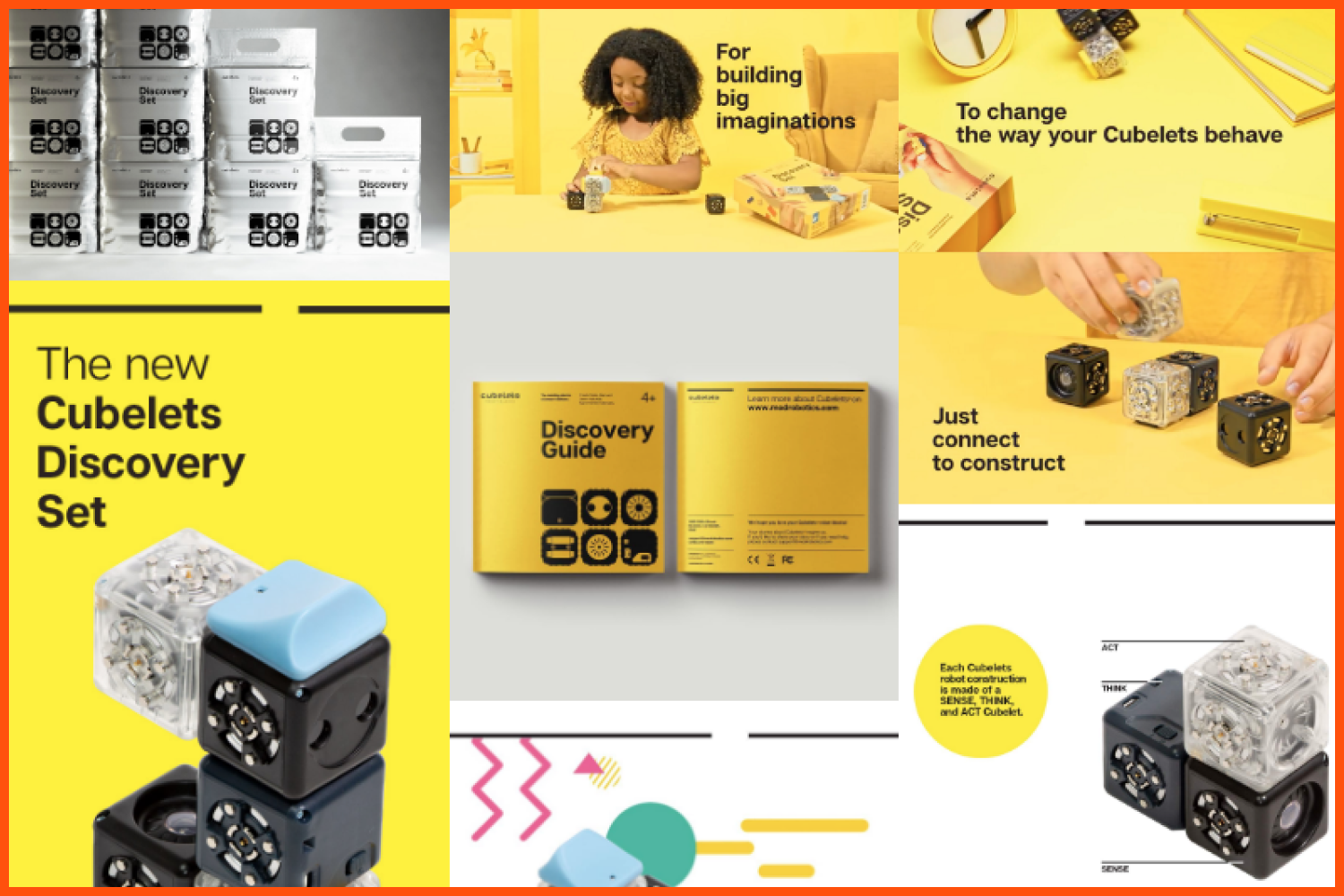
Articulat font in use, by Modular Robotics.
A Song:
Oh Wonder – Technicolour Beat.
A book:
The Plague – Albert Camus.
A city:
Denver, Colorado.
A happy memory:
My dad buying a new iMac in 1998: that little machine paved my way into design.
What techniques or tools do you use in your work?
Elegant: High contrast fonts.
Modern: Geometric sans fonts.
Bold: Experimental display fonts.
Casual: Hand drawn script fonts.
How would you define yourself at work?
I sketch on paper a lot, both during the initial idea phase, but also when I’m stuck on a tricky letterform and need to feel the natural movement of a pen. For type production work, I use Glyphs, and for my typeface specimen images I use Adobe Illustrator or Affinity Designer.
What features of Glyphs do you find most useful versus other font editors?
The way Glyphs handles Bezier curves is perfect. It’s very precise and powerful in ways that most vector design applications aren’t. For example, by holding down the Option key and dragging a node, I can move it along its path without also moving its handles. This simple little thing is crucial to getting details right, and I don’t know of a single mainstream design app that does this. It boggles my mind that high-quality apps like Adobe Illustrator and Affinity Designer don’t have this ability. Besides that, Glyphs has a good interface that stays uncluttered but can be opened up for detailed information when you need it.
Have you had the experience of working cross-functionally with developers, copywriters, project managers, etc.? How was it?
Before I opened my studio, I worked on teams at agencies and corporations, so I had the opportunity to work with many kinds of people early in my career. In particular, learning how to effectively communicate with clients was a milestone in my professional development. Getting outside my head and learning to speak clearly and plainly about design to a non-design audience has also helped me communicate with more care and attention in everyday life, too. Today, I love working solo, but it’s great to collaborate when there is an opportunity to do so.
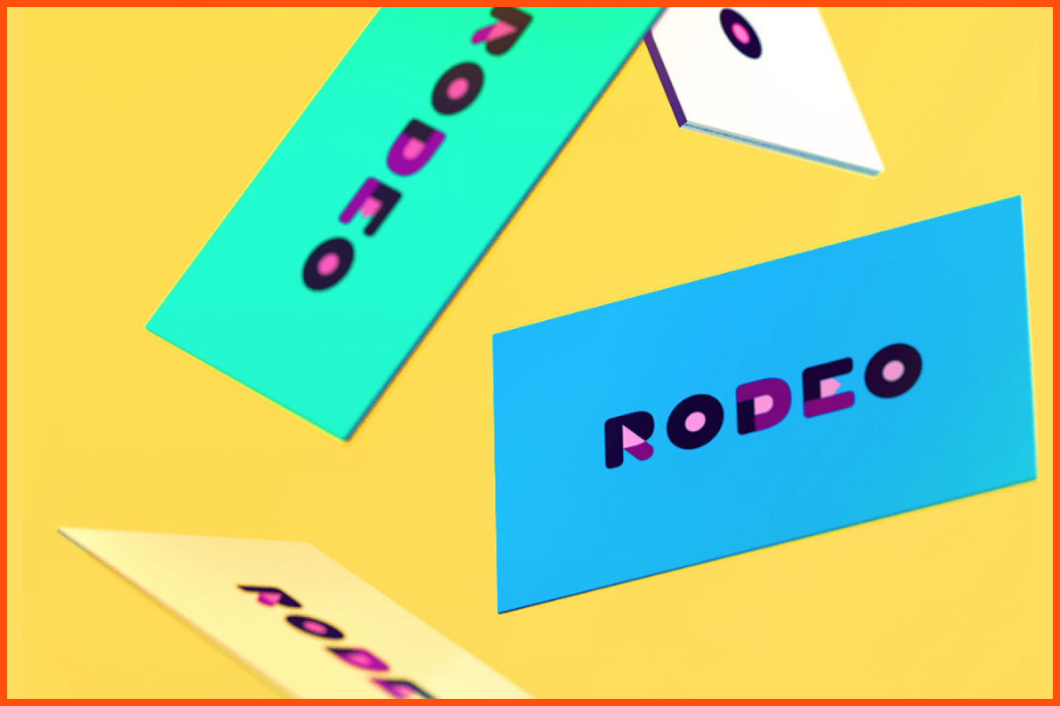
Rodeo’s branding is designed to reflect the vibrancy and enthusiasm of their team. Bold color and a good-natured visual identity stand out in a cold, corporate industry.
How important is typography in graphic and web design?
Essential. Typography is a vital component of layout design. It plays a huge role in how easily read and enjoyed one’s work will be.
How do you determine which typeface is right for your project?
Consider what tone or voice is appropriate for the project. If the goal is clarity and moderation, a simple sans or elegant serif may fit. If the hope is to stand out, consider something unexpected yet smart: maybe a flowing 70’s swashy serif would be stunning on a punk rock album cover, or a monospaced programming font on a beauty product package. Use typefaces with simple features for body copy. Test readability, print things out.
What are the fonts that come to your mind when you hear each word:
Elegant, modern, bold, casual.
In my own work:
- Elegant: Quiverleaf CF, Wayfinder CF.
- Modern: Greycliff CF.
- Bold: Integral CF, Criteria CF.
- Casual: Quincy CF, Mielle CF.
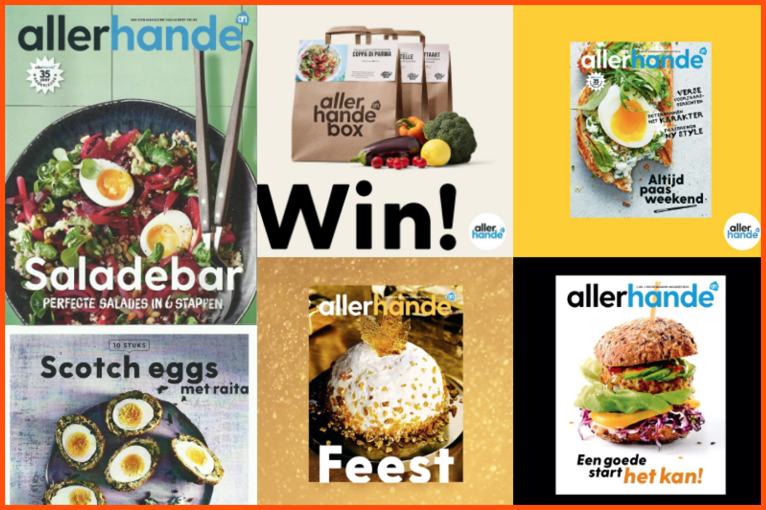
Greycliff font in use, in ALLERHANDE MAGAZINE.
Were you ever worried about how people would react to your work?
Yes, but that has lessened with time and experience. I hope people will appreciate what I create and that my typefaces will find homes with talented designers, but I focus on developing what I believe will be most useful and beautiful and let the typefaces find their audiences naturally.
What were the skills that have been most useful to you in your career?
Sketching on paper, patience, resilience, iteration.
What is the ideal place to work for you? Has this changed during the pandemic?
My ideal work space is a quiet, clean room. I like to work at home, in private. I often move around when I work, so being able to hop between a desk and a couch, for example, is great. I’m grateful and lucky that this hasn’t changed due to the pandemic.
When is your favorite time of day to create?
Anytime! I like to take a break in the afternoon and mentally refresh – maybe go for a walk or a coffee – but I will get work done just about whenever I can.
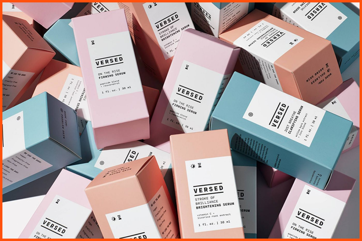
Cartograph in use by Versed cosmetics. It is a handsome and warm monospaced font family featuring lush italics and code-friendly ligatures.
What work do you most enjoy doing nowadays?
I’ve been enjoying focusing on expanding language and script support. I have plans for more Arabic typefaces, and I’m considering chipping away at my first Chinese typeface.
What are your professional goals?
To keep my little studio afloat. To do work that I feel good about. To get my typefaces in the hands of designers who do good in the world.
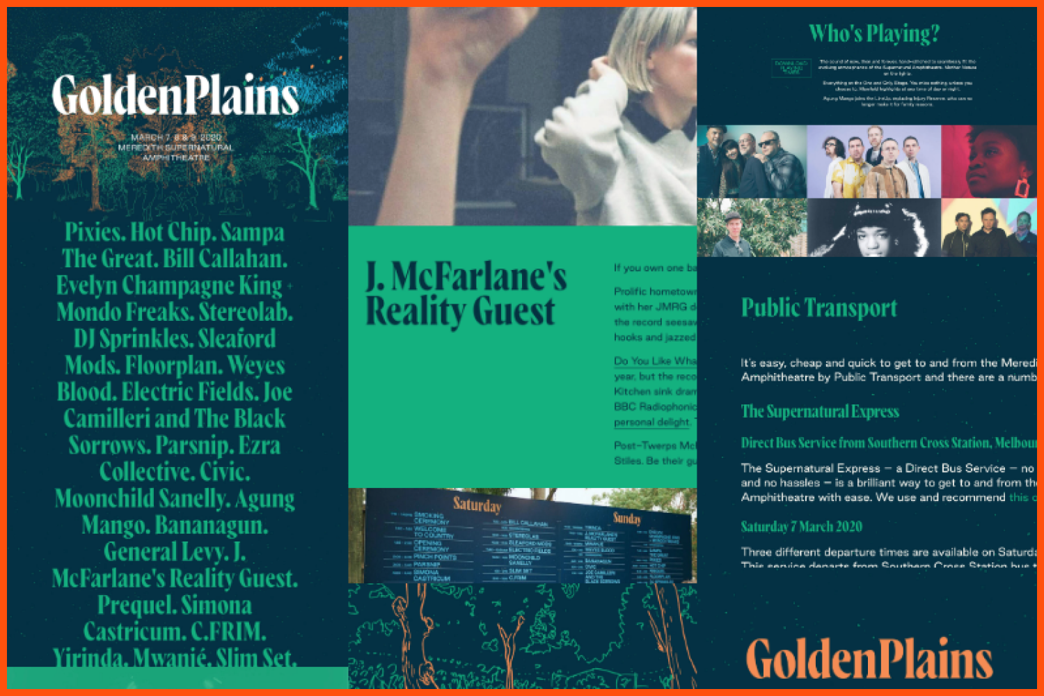
Wayfinder font in use, in GOLDENPLAINS FOURTEEN MUSIC FESTIVAL.
If you consider it one of your professional goals, being a solopreneur must be really difficult. What is the hardest part of running a design studio by yourself?
Balancing the different roles is the most difficult part. There’s a lot of time spent on e-mail, bookkeeping, payroll and taxes, designing advertisements and social media posts, troubleshooting computer problems, and so on. Sometimes there are days or weeks where I don’t get a lot of type design done because there’s a lot of business to do. However, I’m still happy to do it all; it’s just part of the gig!
Have you heard of MasterBundles before? What do you think about this project? Do you think it is a good way to start selling your work?
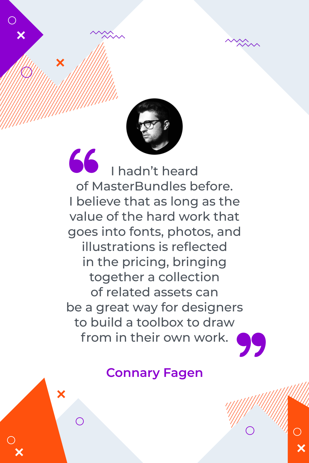
I hadn’t heard of MasterBundles before. I believe that as long as the value of the hard work that goes into fonts, photos, and illustrations is reflected in the pricing, bringing together a collection of related assets can be a great way for designers to build a toolbox to draw from in their own work.

What are your concerns?
Thanks for your response!
Disclosure: MasterBundles website page may contain advertising materials that may lead to us receiving a commission fee if you purchase a product. However, this does not affect our opinion of the product in any way and we do not receive any bonuses for positive or negative ratings.