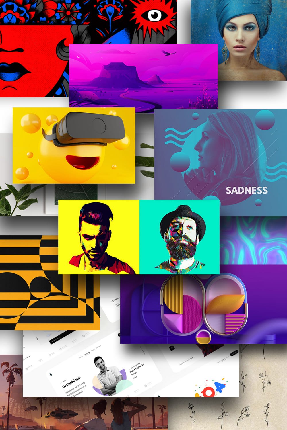
50+ Fresh Graphic Design Trends In 2022. Revolutionary Changes Are Coming!
Graphic Design Trends. Here comes the end of 2021, with less than a month to go until the new year, but that’s no reason to relax.
For many designers, the last month of the year is very busy, and creating up-to-date designs is increasingly difficult. In 2022, there will be many changes, and graphic design trends now play an important role in the site’s quality metrics and customer focus.
MasterBundles adores everything connected to graphic design and we can’t wait to tell you what will run the world of graphic design in 2022!
In this article, we will go through the graphic design trends from 2021 and find out which of them are still on a high. We will also take a look at the upcoming 2022 graphic design trends!
2021 Trends That Will Stay Popular In 2022
Voxel Art
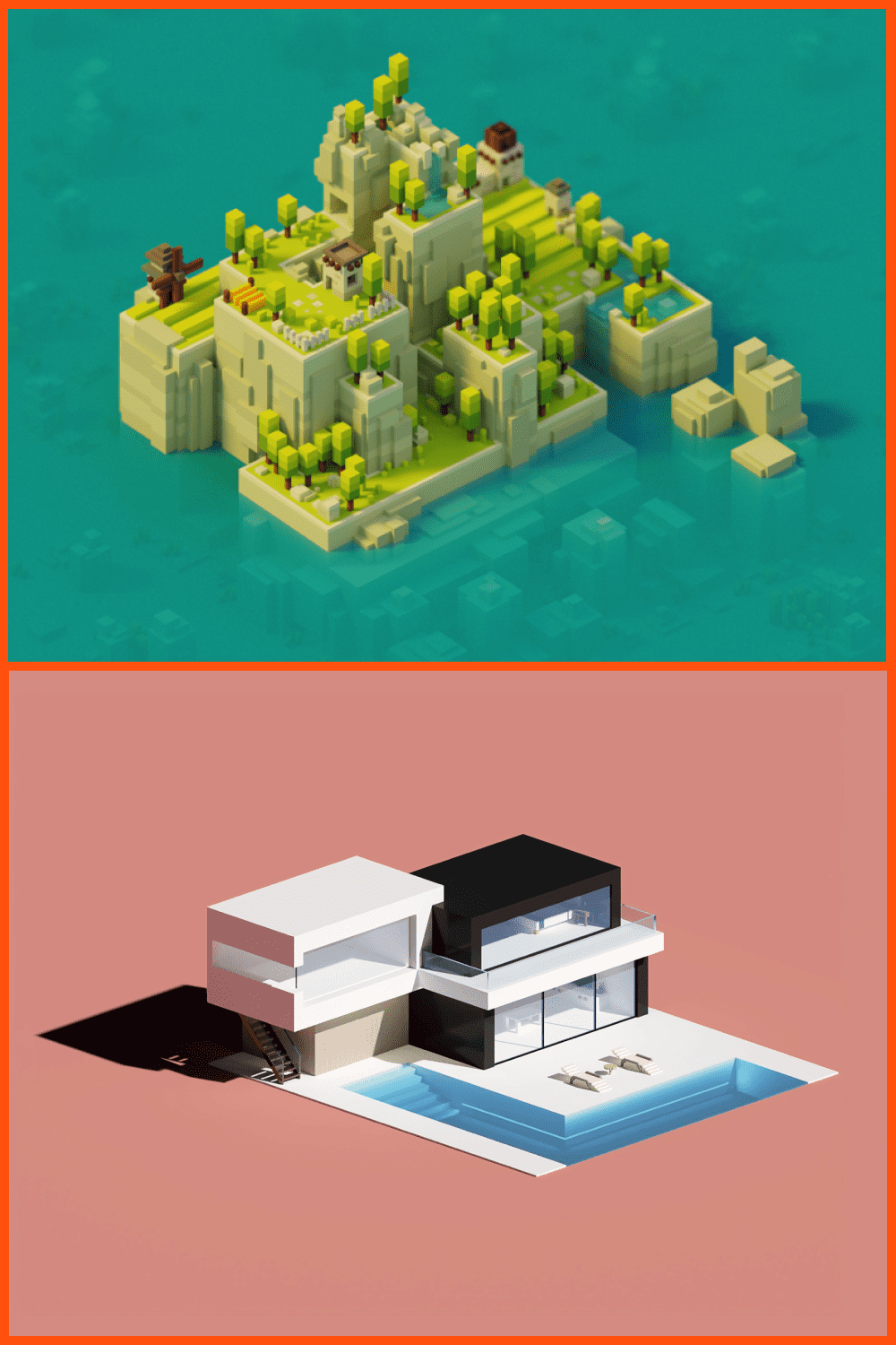
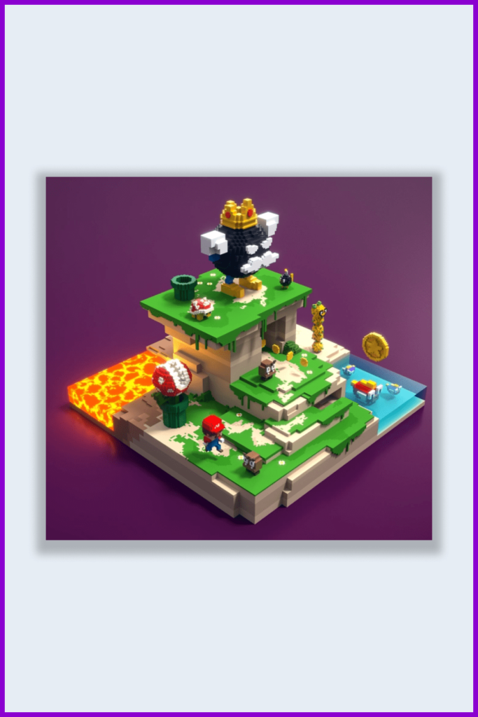
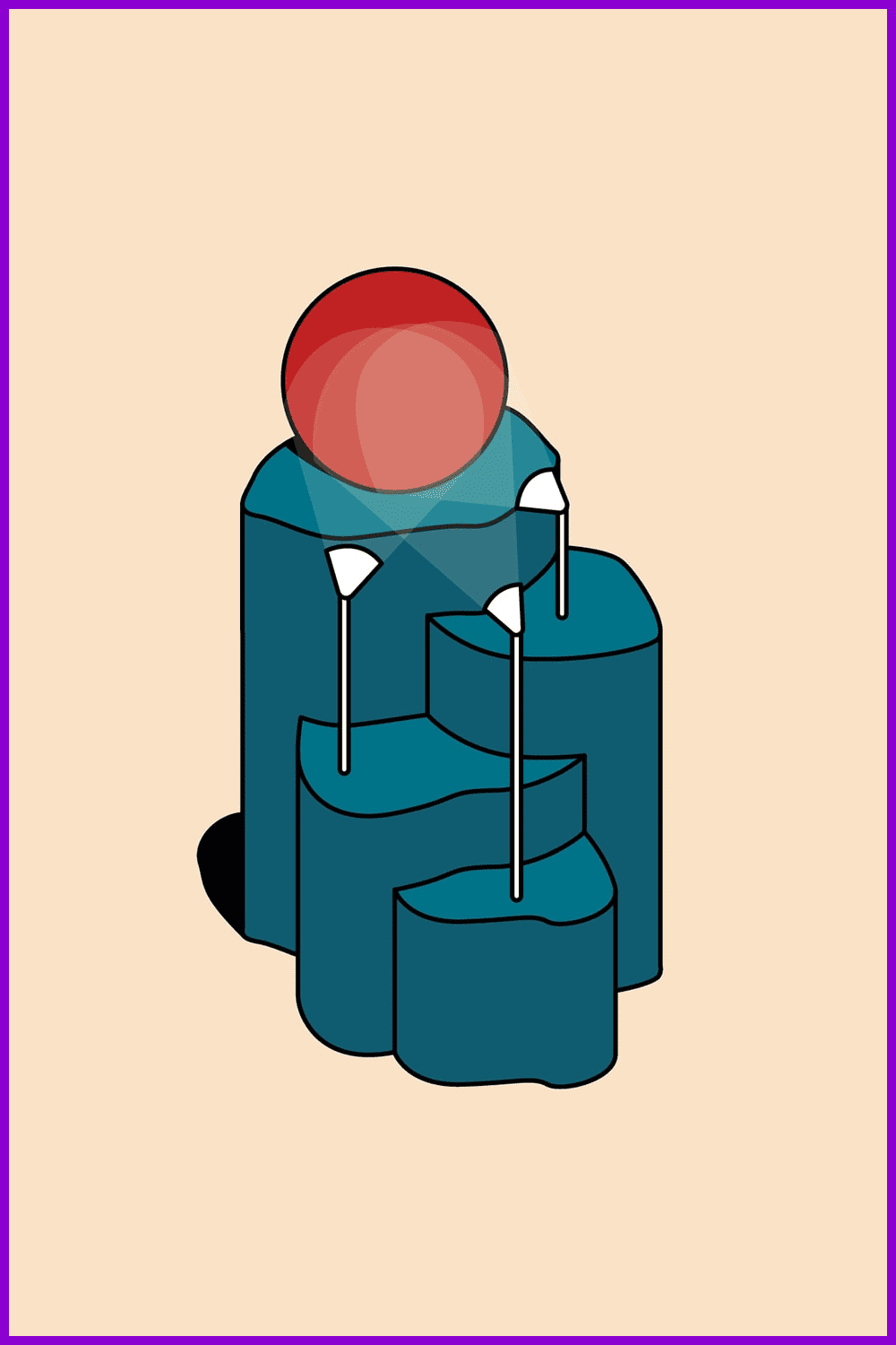
A voxel is a 3D cube. You’ve seen it in many video games, such as Minecraft, and it has an instantly recognizable style, almost like Lego blocks. 3D is the primary favorite among design trends. It’s a visual technique, with a bit of childish simplicity, and retro appeal, but incredibly modern and entertaining.
Geometric Shapes Design
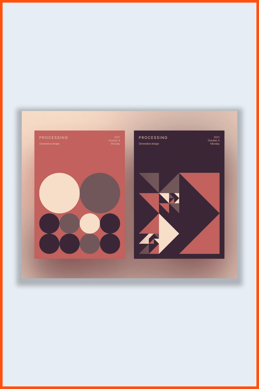
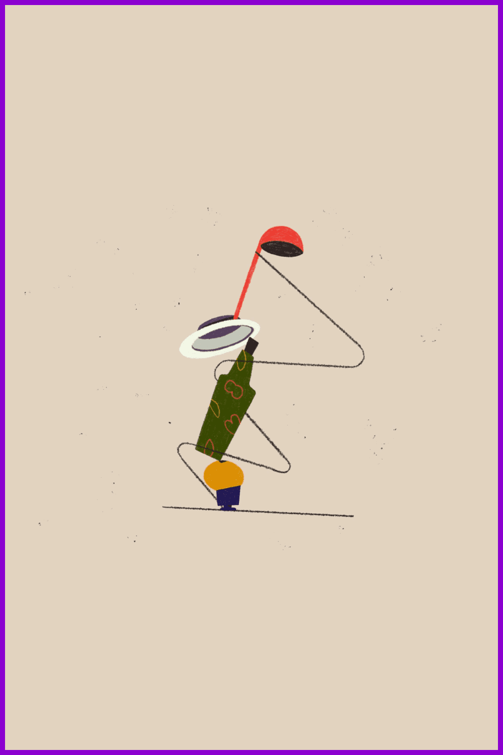
Geometric shapes, as shown above, can add order, consistency, and structure to visuals. You may have noticed that this is quite lacking now in this time of general chaos and disorder. Geometric shapes as a trend are especially popular with both 3D and flat elements. For the most part, you will see them in prints, brand identity, and posters.
Elements of Nature
Organic, soft, natural design trends have slowly evolved away from mainstream trends over the past 10 years. The idea of imitating nature, natural light, earthy colors and tones, natural gradients in color schemes, and flowing lines comes back into fashion. It follows minimalism trends, muted color palettes, illustrations, color filters designed to create a natural atmosphere, and textures depicting wood, stone, etc.
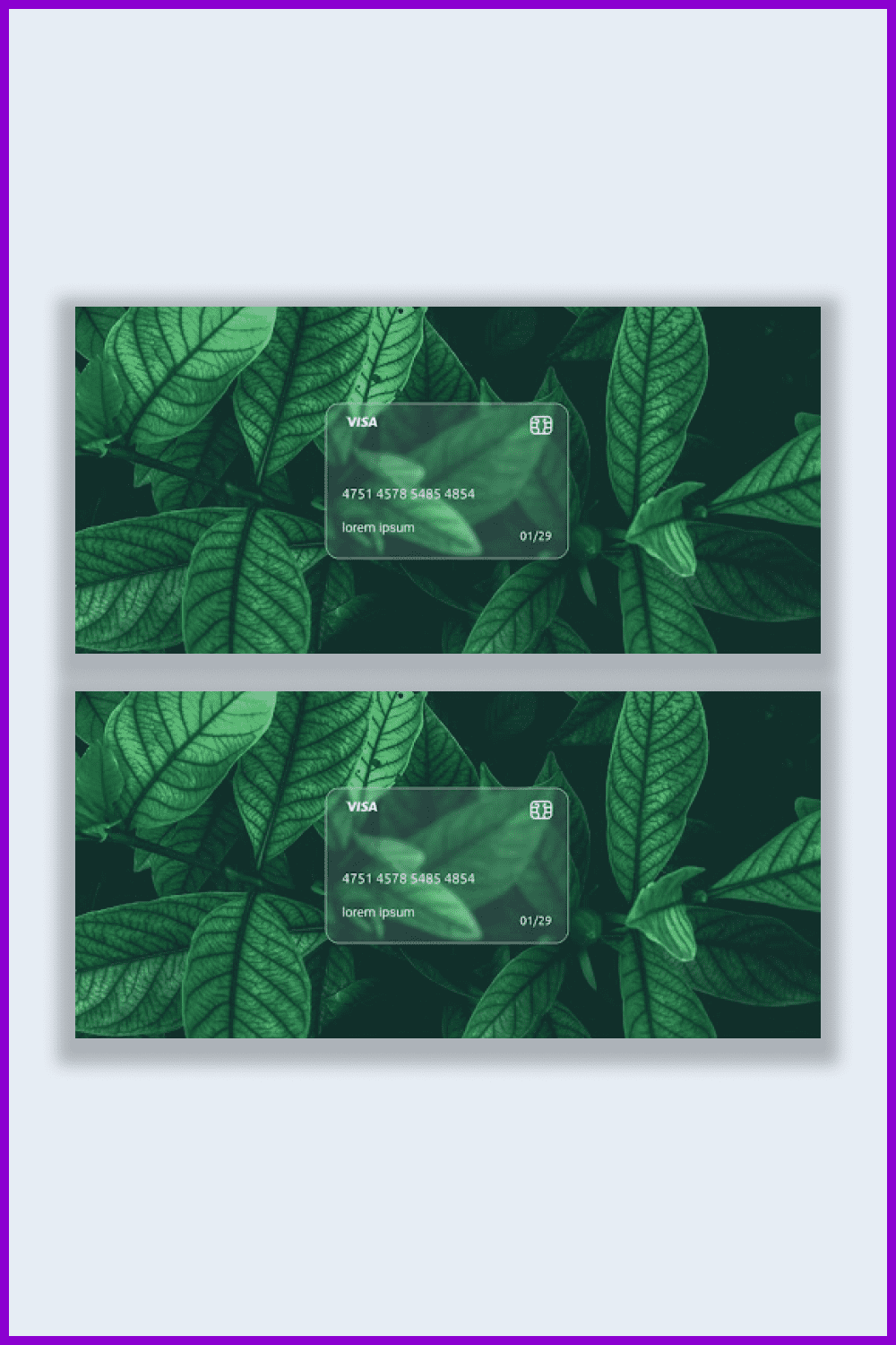
People who find themselves in a pandemic situation have a thirst for nature. It is not surprising, when you have not been allowed to be on the street, that you have a sudden desire to leave the city for a while.
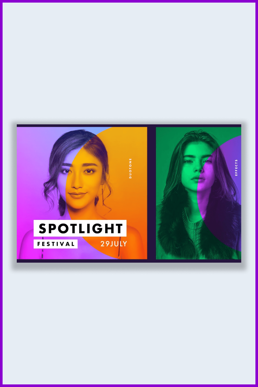
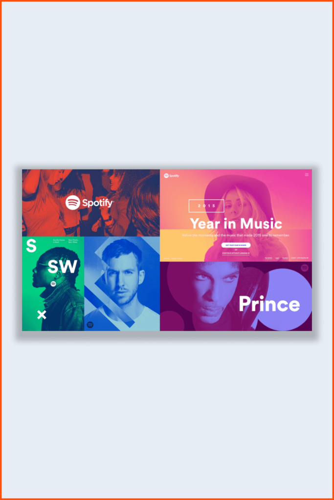
Duochrome Design
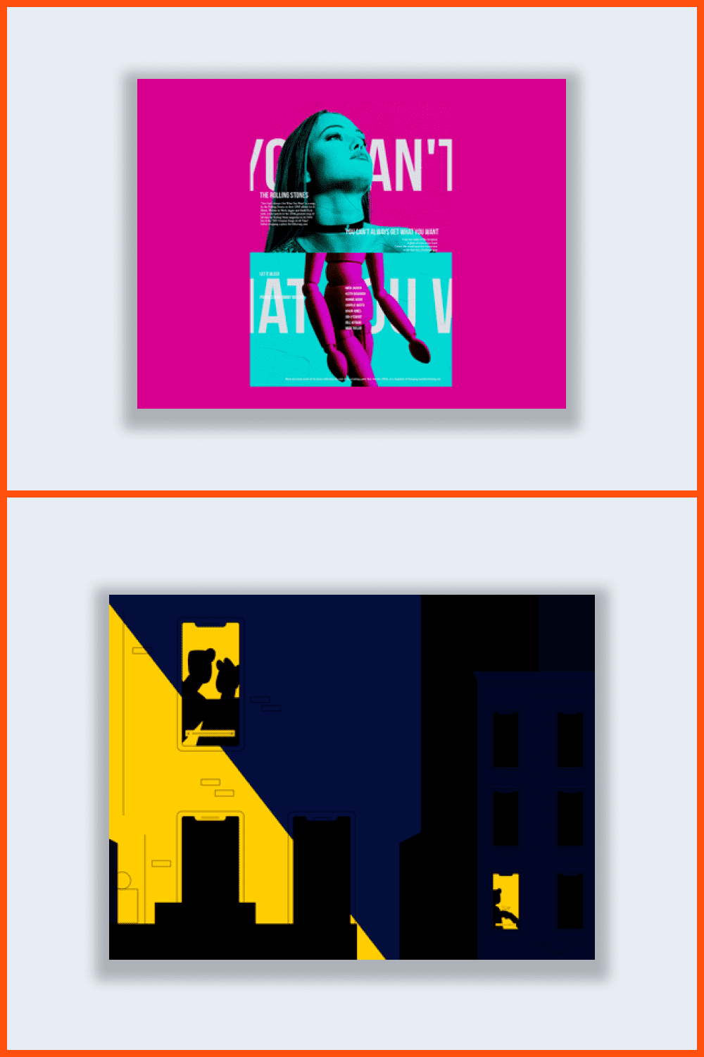
The main idea of this tendency is mixing two contrasting colors. It is quite simple to achieve this design. Just play a little bit with contrast in Photoshop.
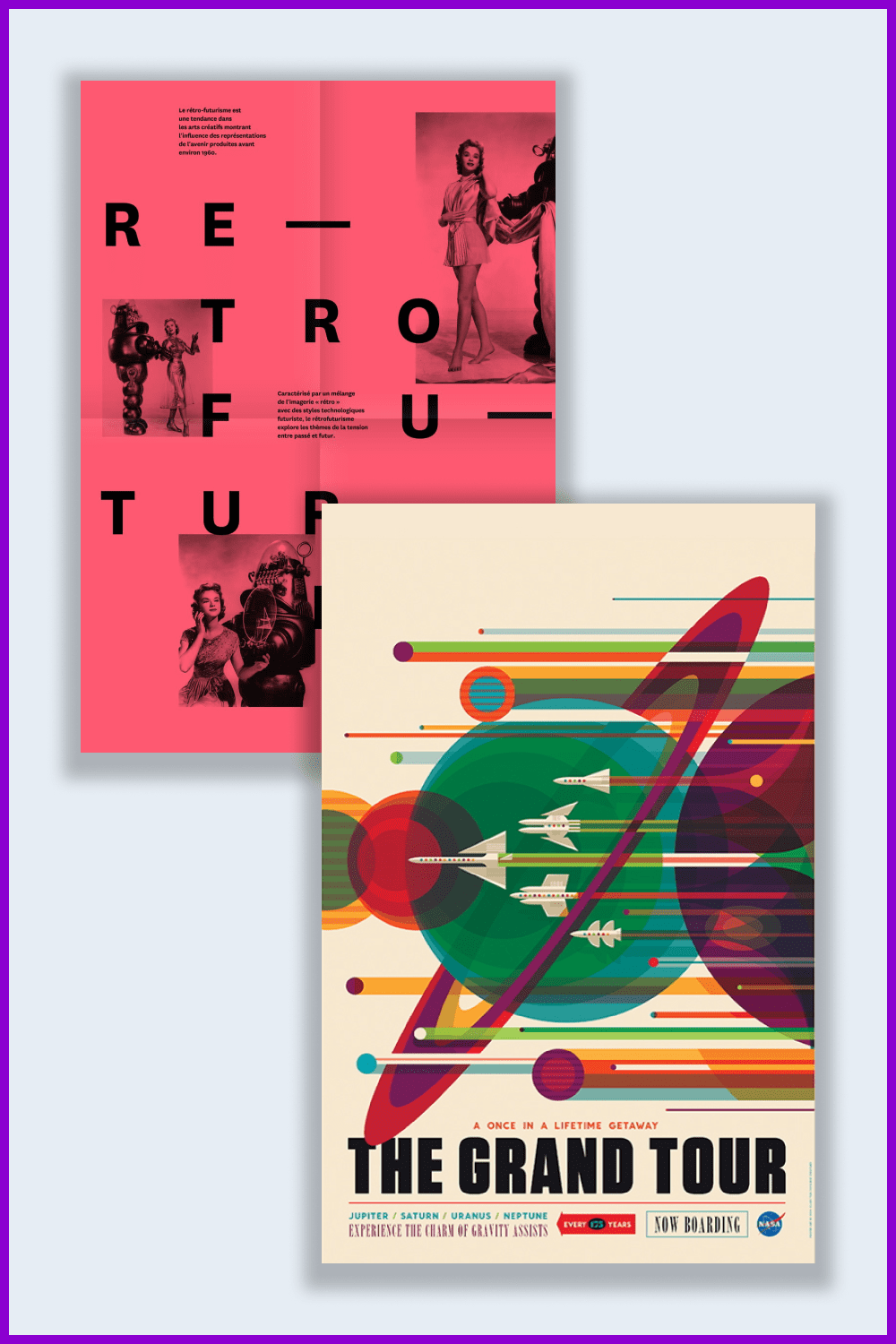
Retrofuturism
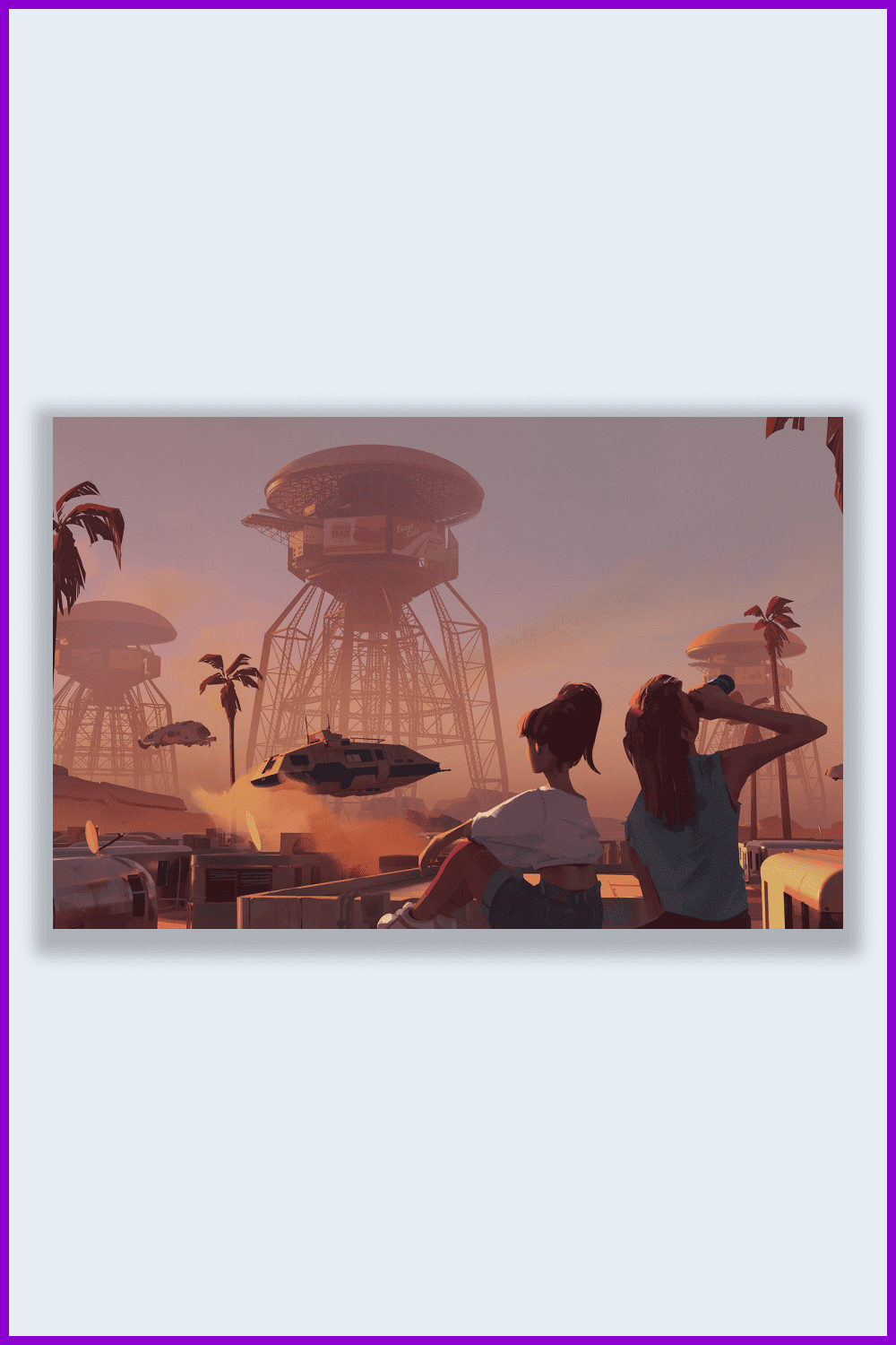
The last few years have been successful for movie remakes, TV series, and video games such as Blade Runner 2049, Ghost in the Shell, and Cyberpunk 2077, among others. These types of projects launch a new visual wave of retro-futurism and cyberpunk.
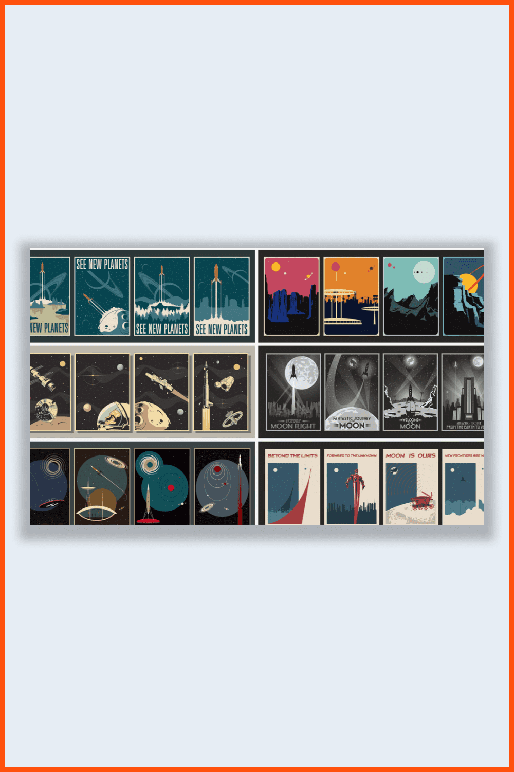
Whether this is driven by films or nostalgia for the old days is difficult to know for sure. Still, it’s based on one single fact: you can see memories of retro-futuristic style everywhere, from movies to product design and fashion trends.
This style evokes nostalgia when people dream of a fully automated future with flying machines and exploration of distant galaxies. The popularity of retro-futuristic design in 2021 will help bring back an optimistic outlook on the future.
Article reviewed by

I believe this is the most crucial method for improving website loading speed. A number of elements on the page may appear or change their position on the page in this case Anyone who prefers to optimize the layout of a web page should use this method. Such a trend has already been prevalent in the 2010-2020 time period.
Ad-watching consumers are aware of this. In 2022, there are no reasons to expect anything different. The same may be said for window coverings. The elegance of the layouts is enhanced by the usage of the dark as the dominant color. Aesthetically, this is a good strategy. Where bright and flamboyant product labels aren't a problem, dark styles are especially relevant.
Graphic Design Trends In 2022
Finally, let’s check out our list of fresh modern graphic design trends for 2022.
90s Nostalgia Graphic Design Trends
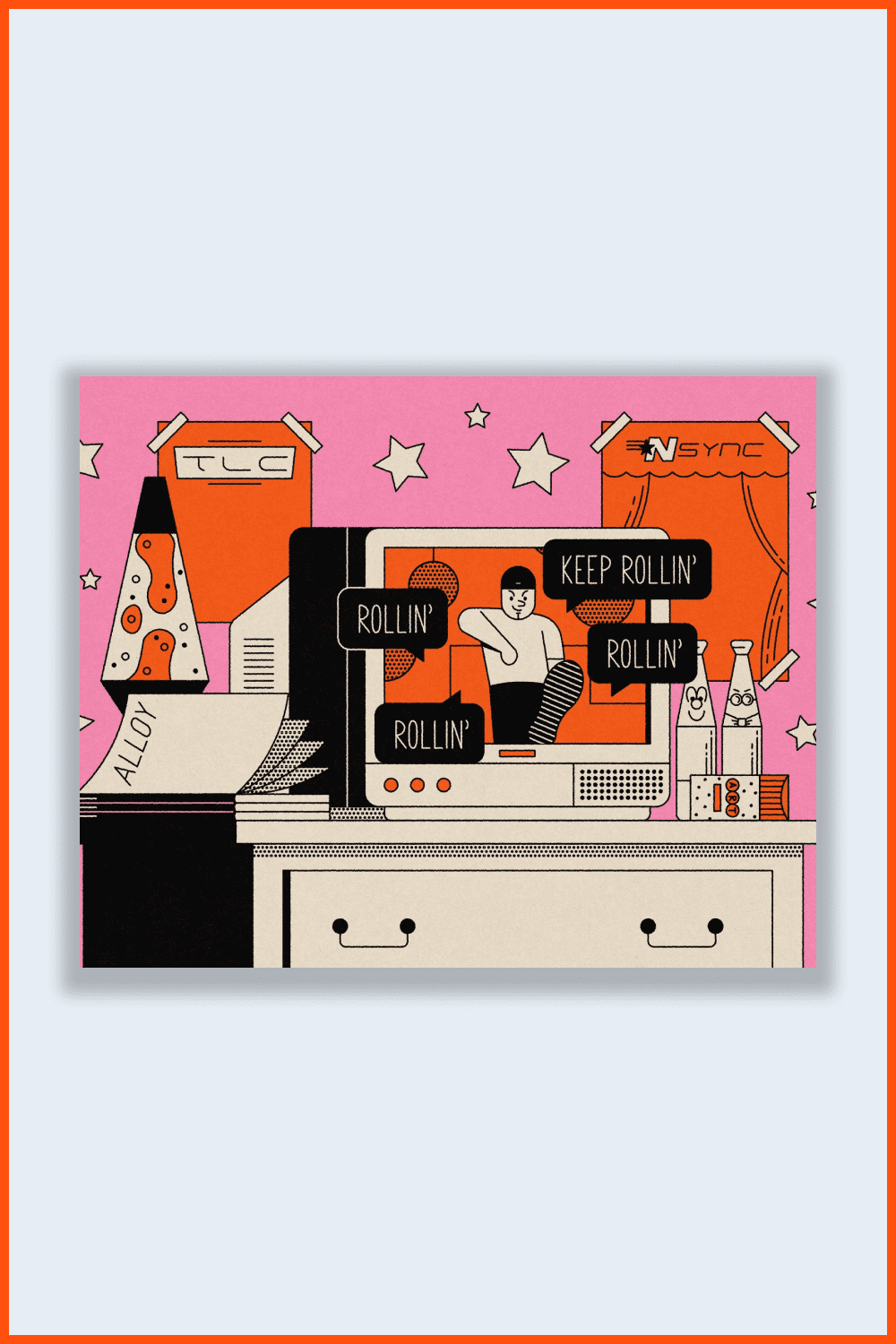
The 90s decade gave us the best sitcoms of all time such as Friends and animated shows like The Simpsons and South Park.
Nearly everything in the 90s—pop culture, politics, and fashion—is imbued with the loud, raw look that marked an entire era.
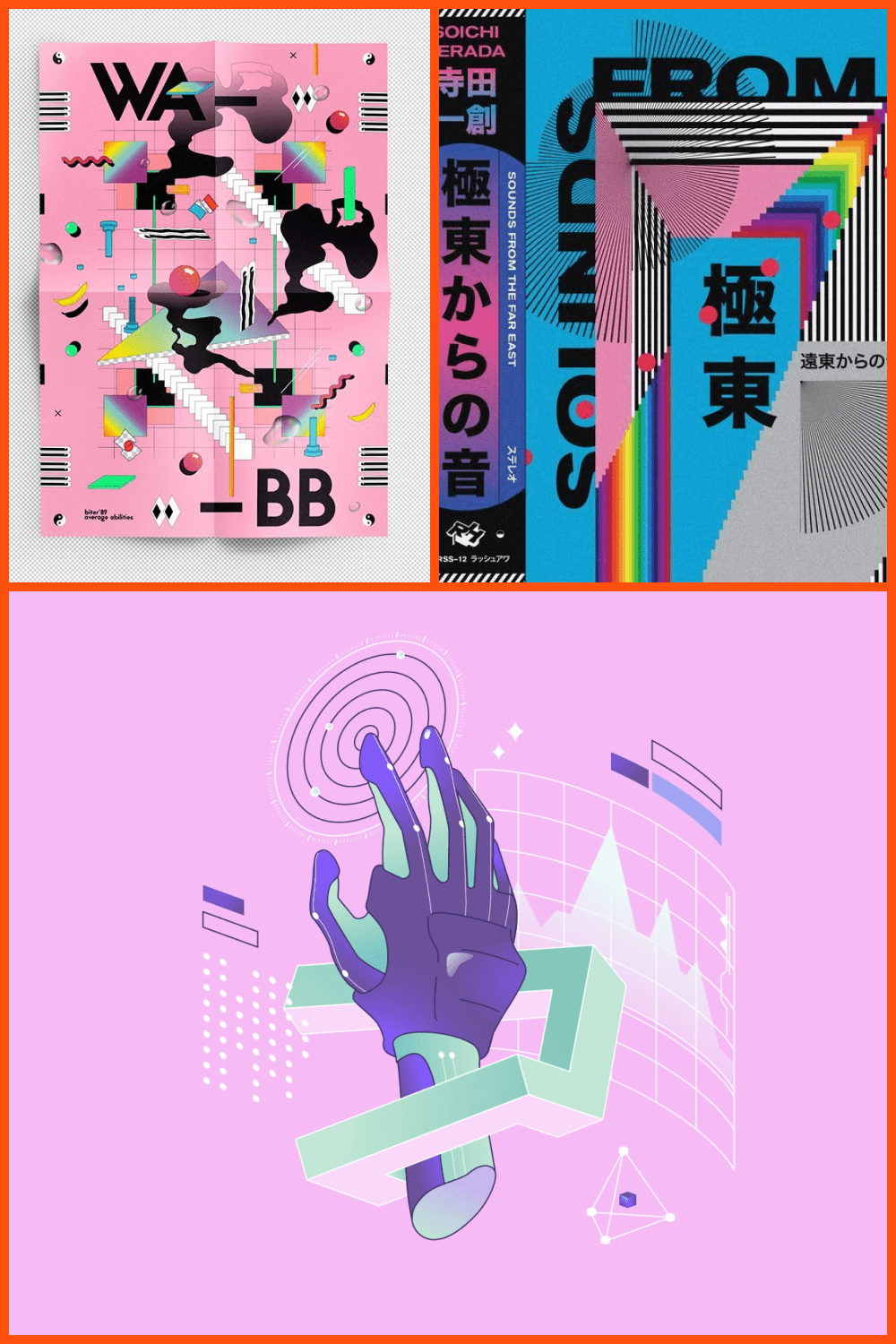
Let’s fast-forward to the present day. That aesthetic 90s image is coming back, and modern 90s graphic design trends are taking it to the next level. Once it takes off, there’s no stopping it.
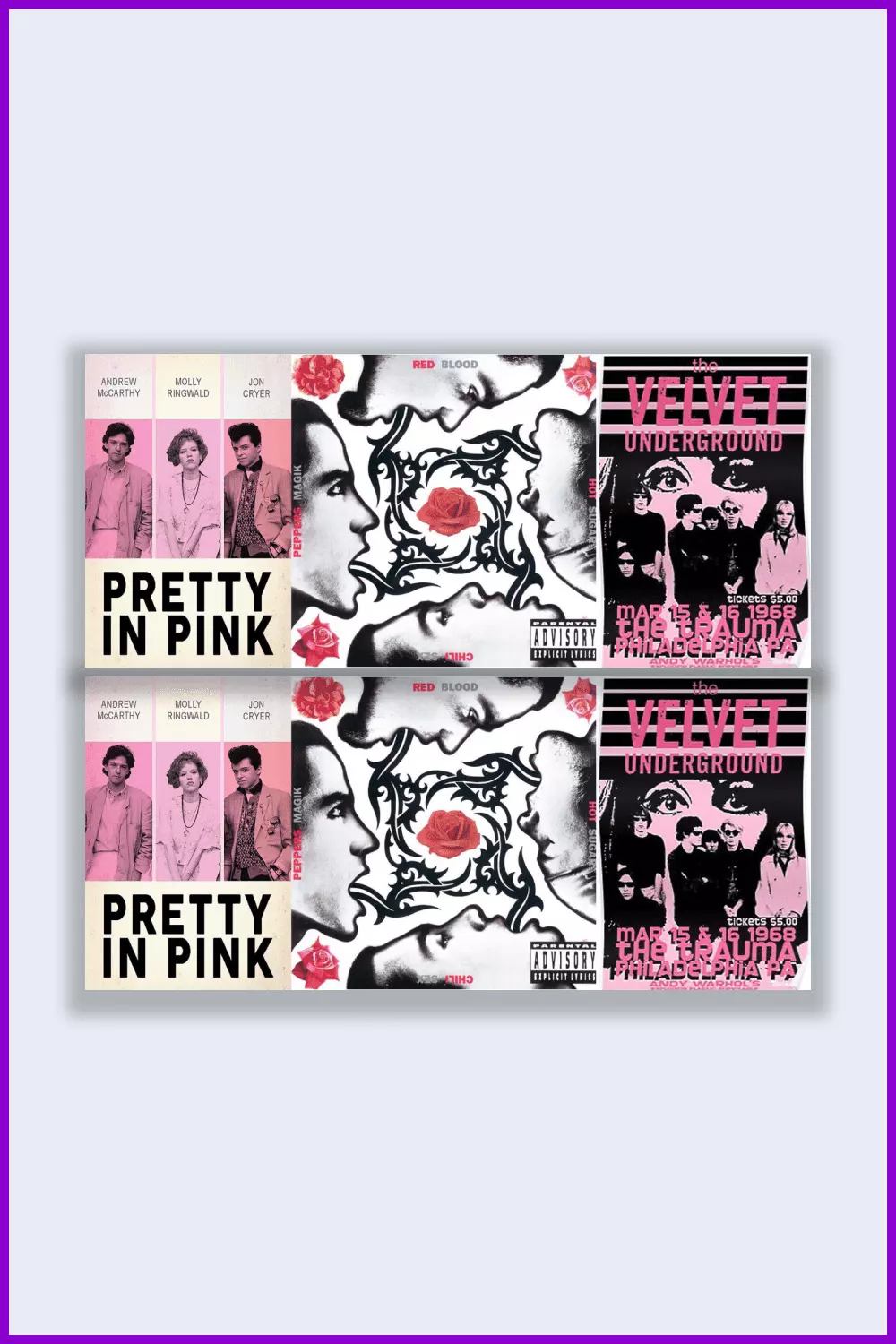
The brutal aesthetic of the 90s is omnipresent and rules the design world constantly. Big fonts, bright colors, asymmetry—all are inevitable components of graphic design from the 90s. It seems that almost all creatives are striving for an unassuming and crude look.
Brands In Motion
Here, we are talking about the trend for interactive animation sites. Market conditions dictate their rules and a static site is unlikely to impress anyone. Therefore, graphic and layout designers are coming up with new ways to animate the site to surprise the user. As evidence of this, we see more and more animation on the sites.
The smoothness of scrolling and animation of various elements (such as text and photos) on a website adds a kind of premium feel that many developers strive to achieve.
However, some sites become overwhelmed by animation, which makes it difficult to use and somewhat confusing. Consequently, to use animation properly, you should not overdo it. It’s important to understand the basic principles of animated elements on the site.
Y2K Graphic Design
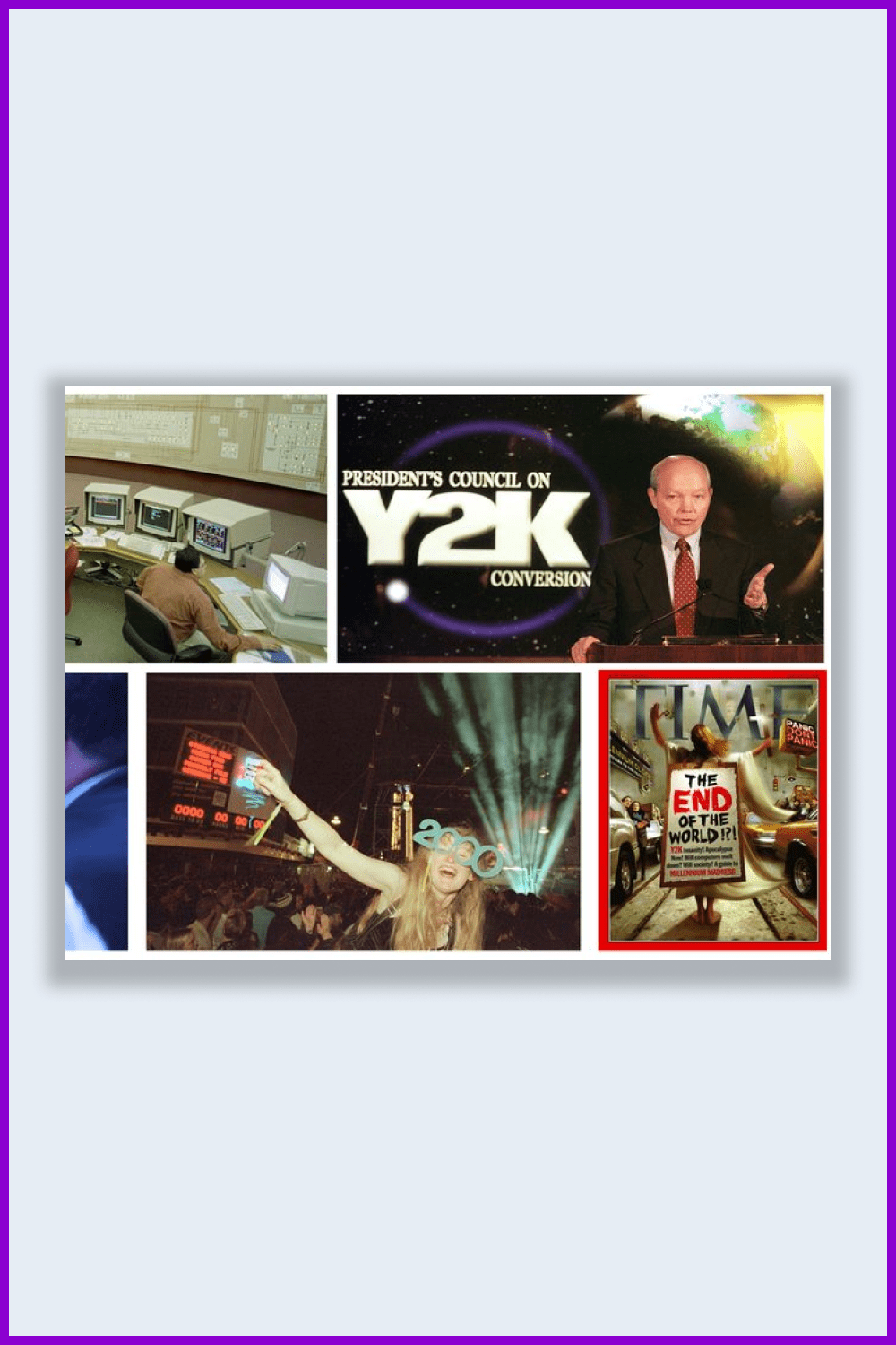
The early 2000s started the era of digital breakthroughs and techno-optimism, tied to animal consumption and the hope of infinite growth.
Artists embraced 3D, small businesses conquered the Internet, and corporations increasingly exported production to places where labor cost them but mere pennies. All these phenomena and events formed their own culture and trends. They are reflected in art and design.
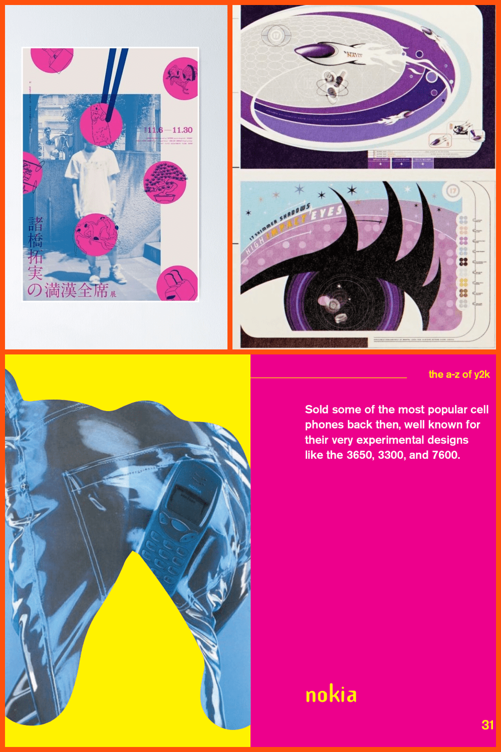
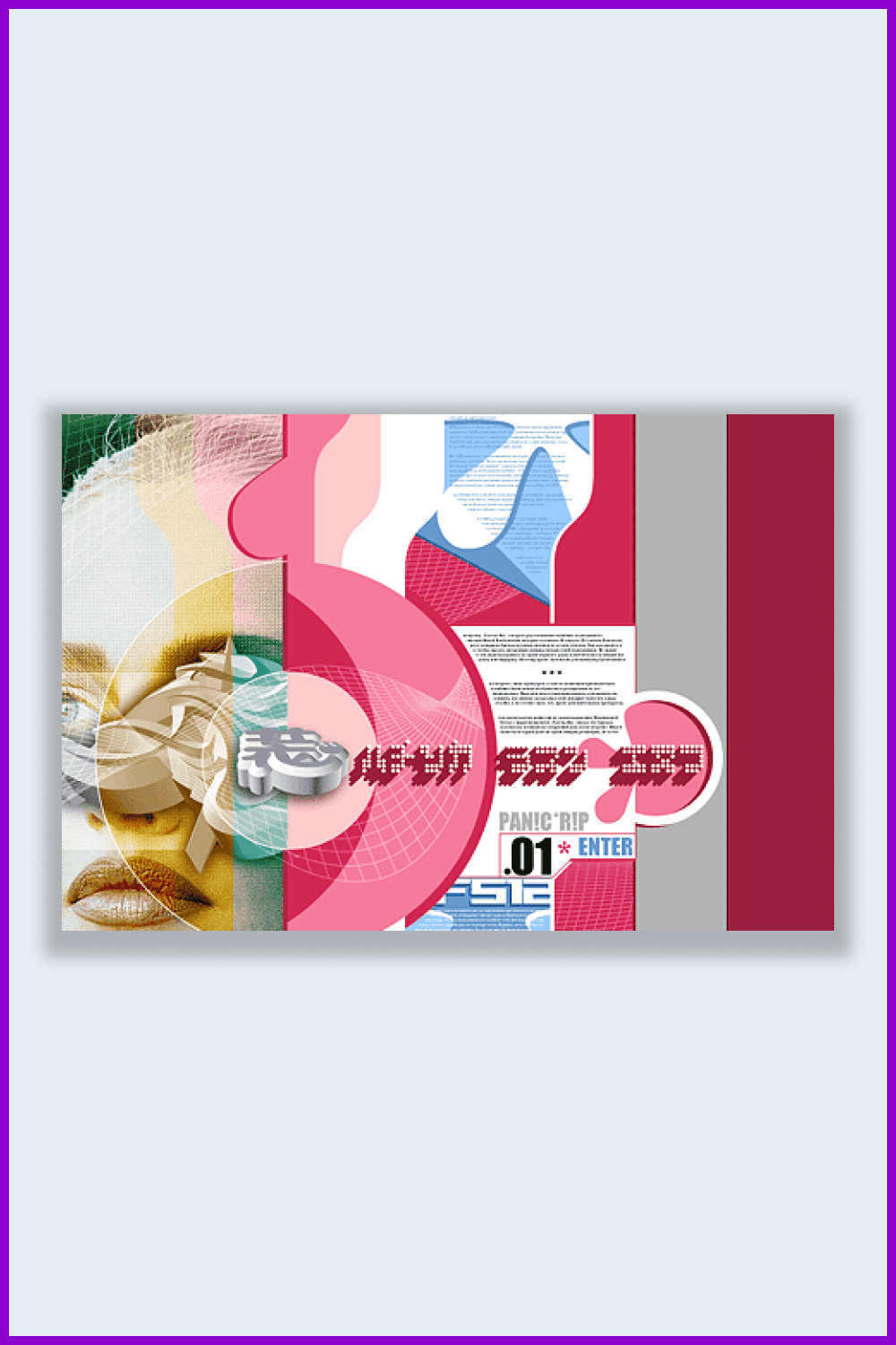
The development of production tools and the rapid progress of digital technologies has opened unprecedented opportunities for digital creativity. Photoshop, CorelDraw and their analogs, numerous 3D packages, and artistic peripherals from Wacom are becoming more and more popular and accessible. They are being equipped with new functionality, tricks, filters, and other elements that designers and artists of all levels can’t wait to master.
Grunge Design
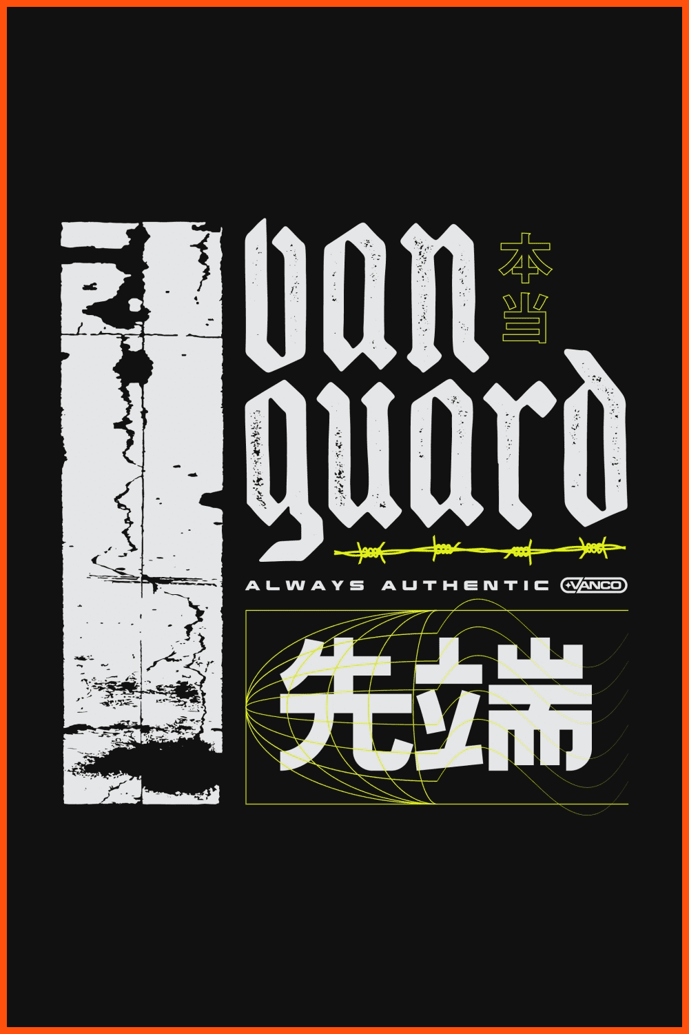
Grunge style is becoming more and more popular in design. Together with brutalism and maximalism, it replaces laconic minimalism and soft elegance. This trend is characterized by sprawling, sloppy typography by hand; a black and white palette base, usually with the addition of red; as well as strokes and drips of paint. Below we have collected some examples of graphic grunge design.
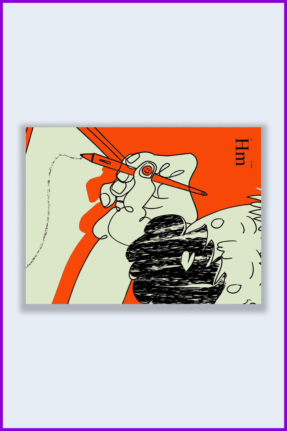
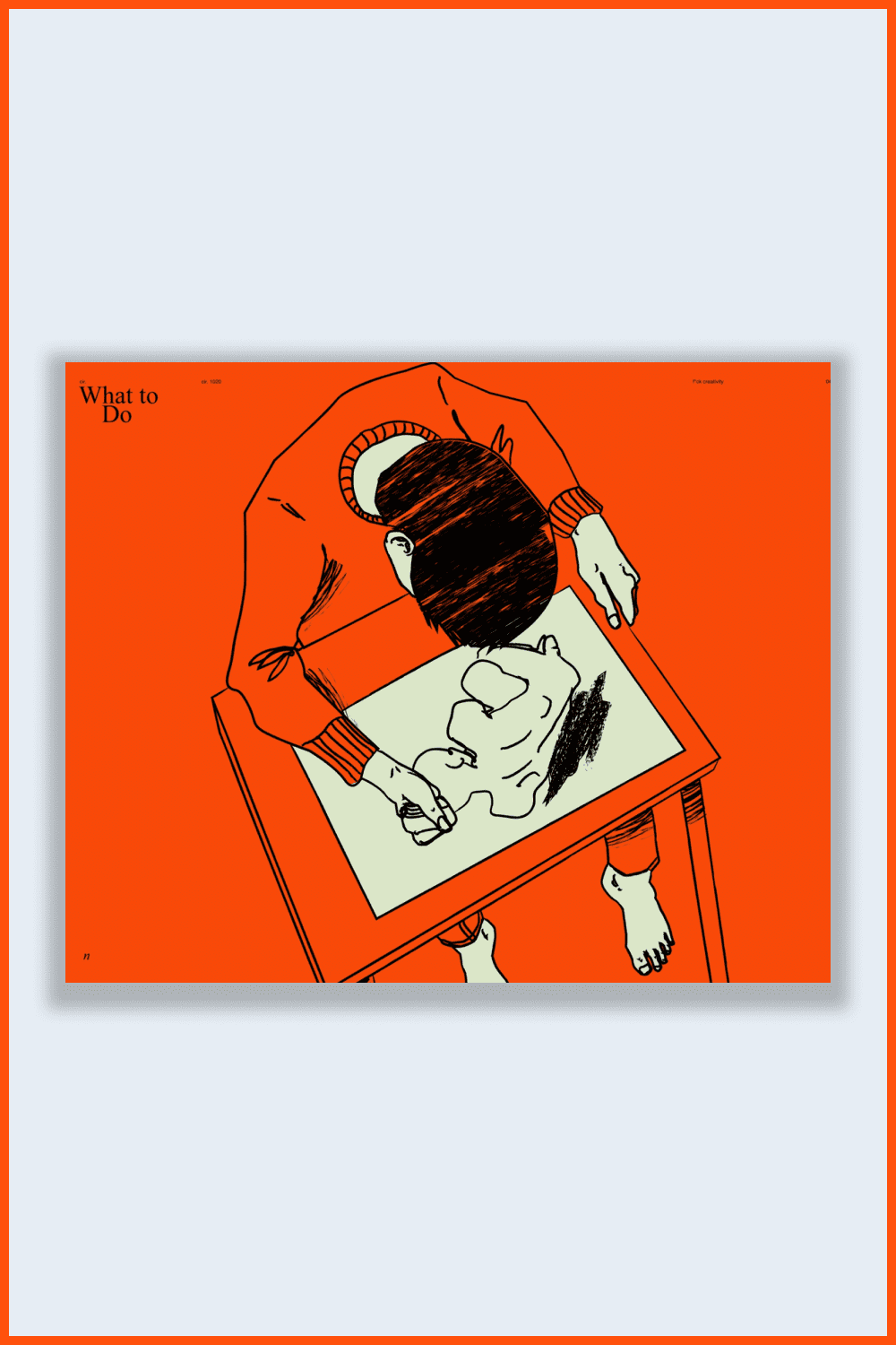
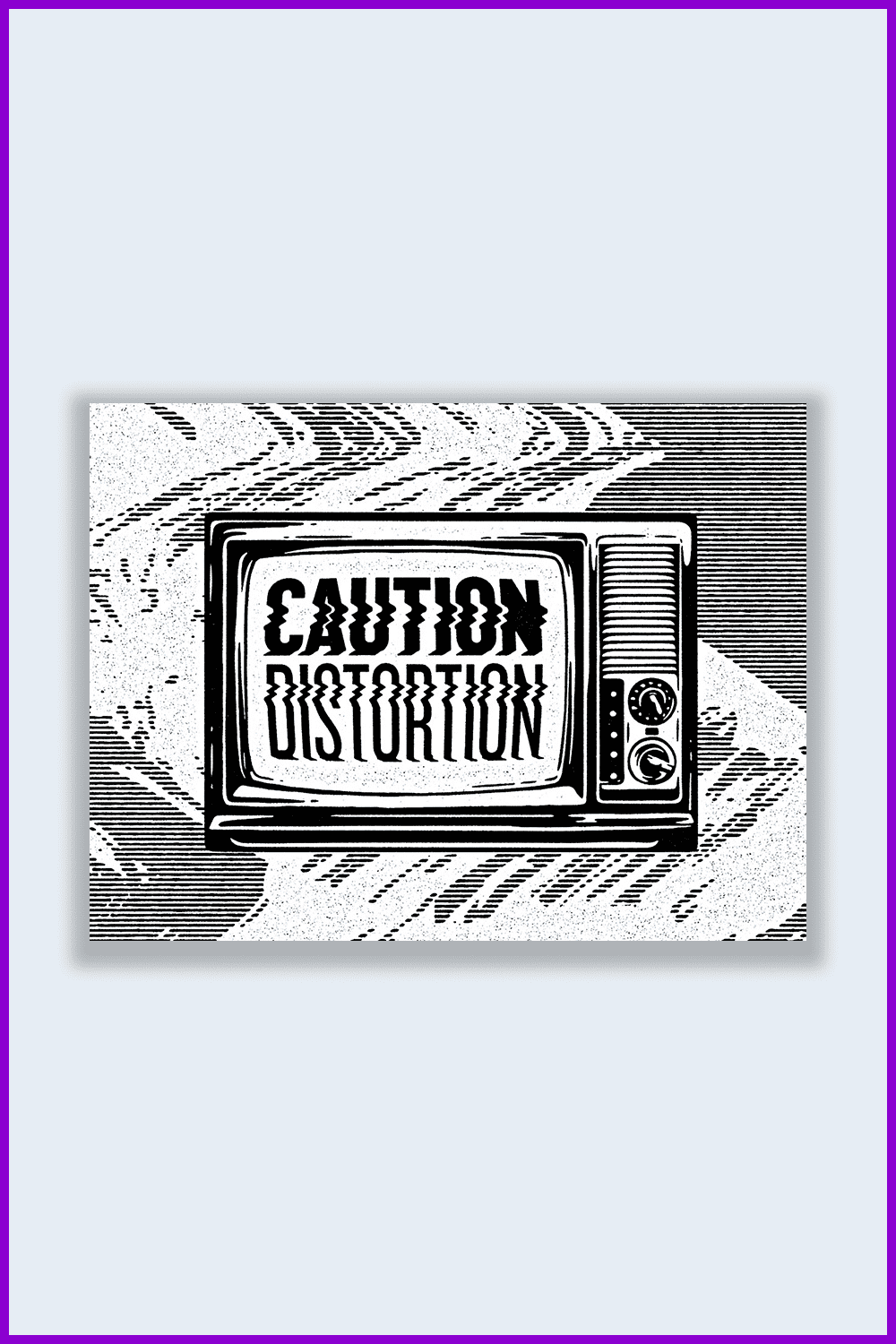
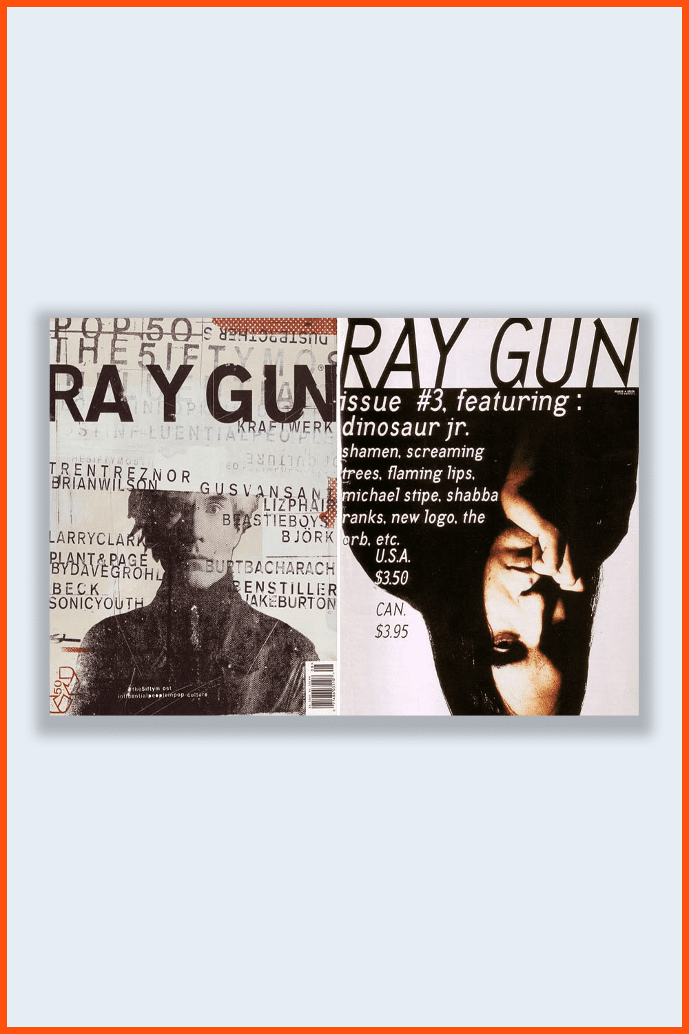
Here is another example of the grunge design from MasterBundles! A cool Grunge Clipart: Bebop Pro Design System bundle that you can get now for $25! 🙂
Psychedelic Design
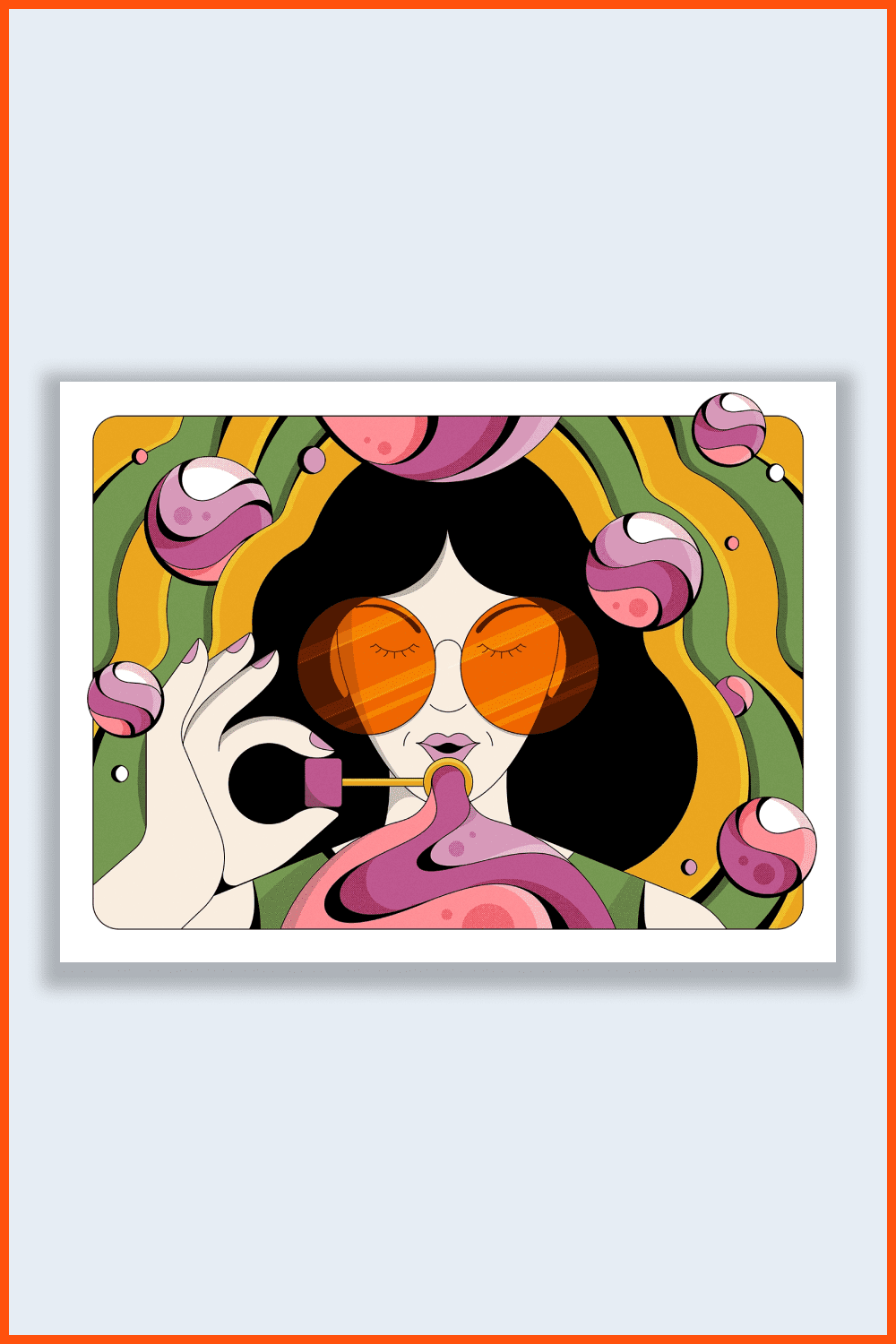
The term “psychedelia” refers to the psychedelic subculture of yesteryear, while the term “psychedelica” is more specific to the experience of an altered state of consciousness.
As for design aesthetics, the two terms are rather interchangeable. Right now, abstract psychedelia has its rightful place among the upcoming design trends of 2022. While this style continues to evolve today, let’s remember when it all started: the Swinging Sixties.
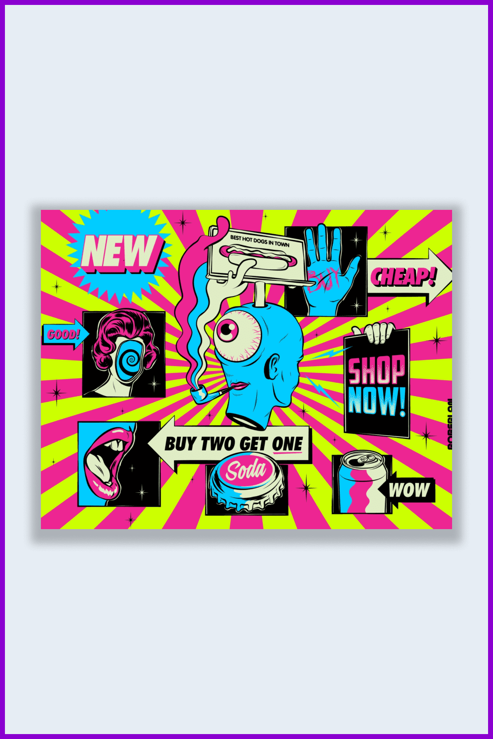
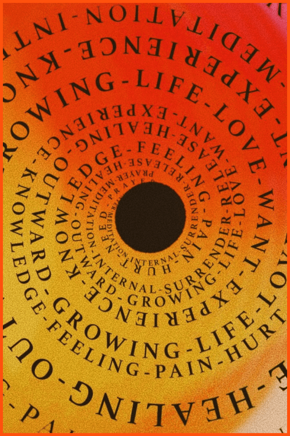
Rooted in the art and music of the sixties, psychedelia is associated with hallucinogens and creative experimentation amidst social upheaval. Psychedelic style both visually and emotionally leads you to a new destination, and the main goal is to open your mind. Psychedelic designs have a life of their own, both in their explosive schemes and in their complexity—to the point where no two views seem quite the same.
The New Wild West
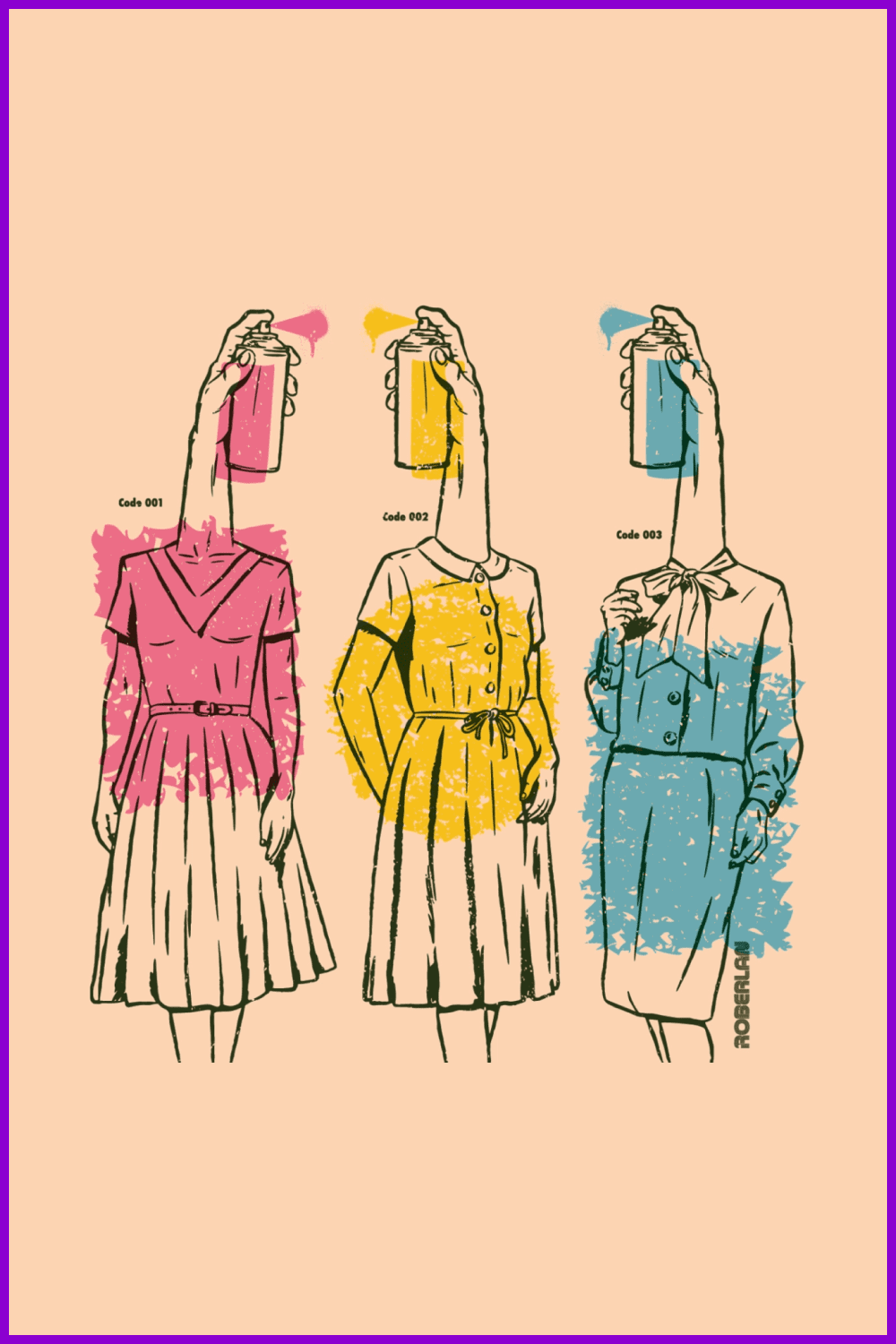
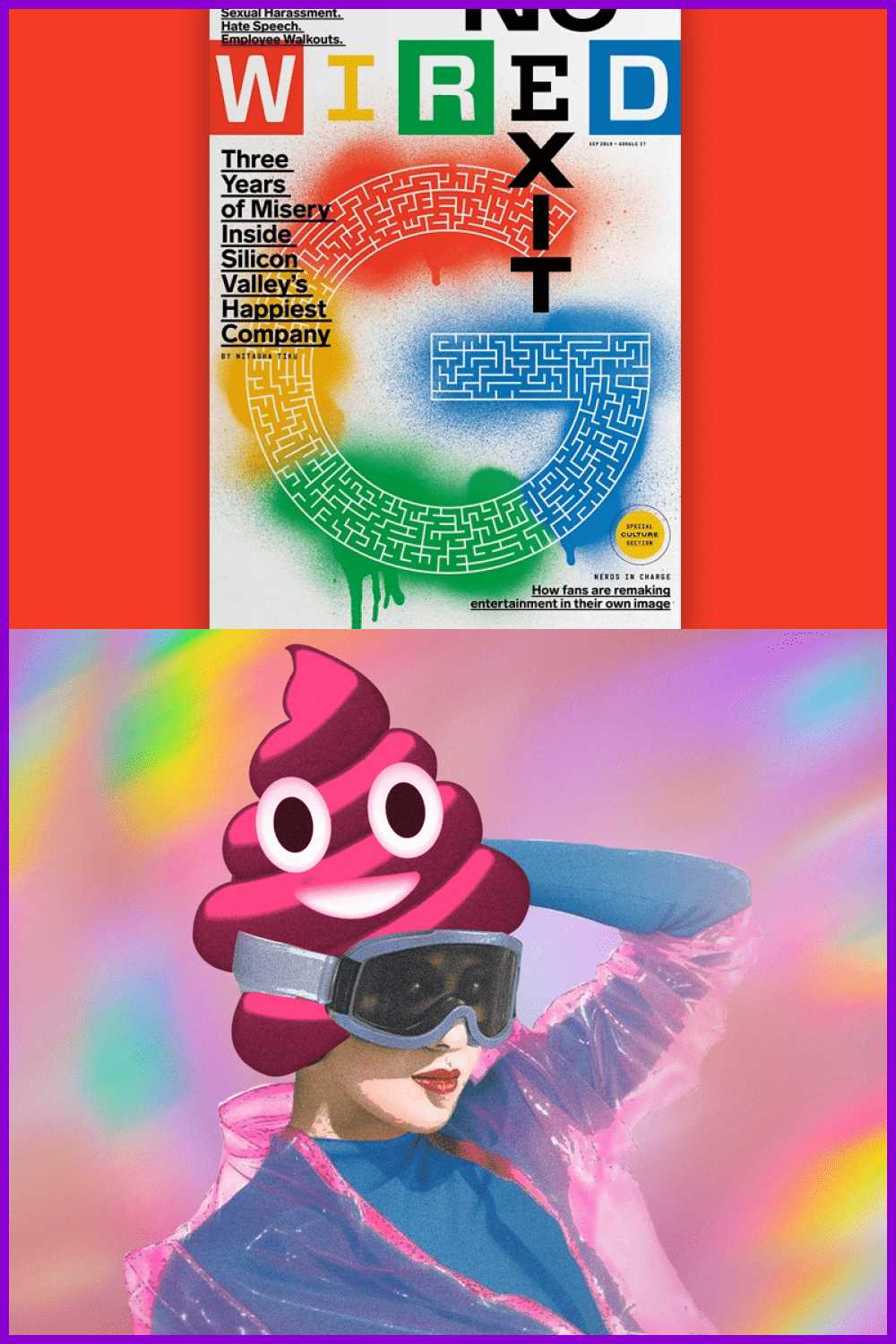
“The trend is a reaction to an increasingly harmonious and consistent graphic style defined by too many brands and businesses. Space is growing for something ragged, raw, something real—sharp collages, stark contrasts, powerful neon, and irregular frames.” — Julius Colvin, deputy director of Space Doctors.
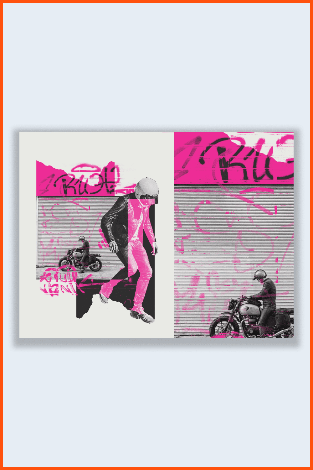
This approach, inspired by the “wild west” of the early Internet, seeks to move away from harmony and toward chaos. “It’s a space of acid green and terminal fonts, screen shots, and digital artifacts as fundamental design elements,” Julius says.
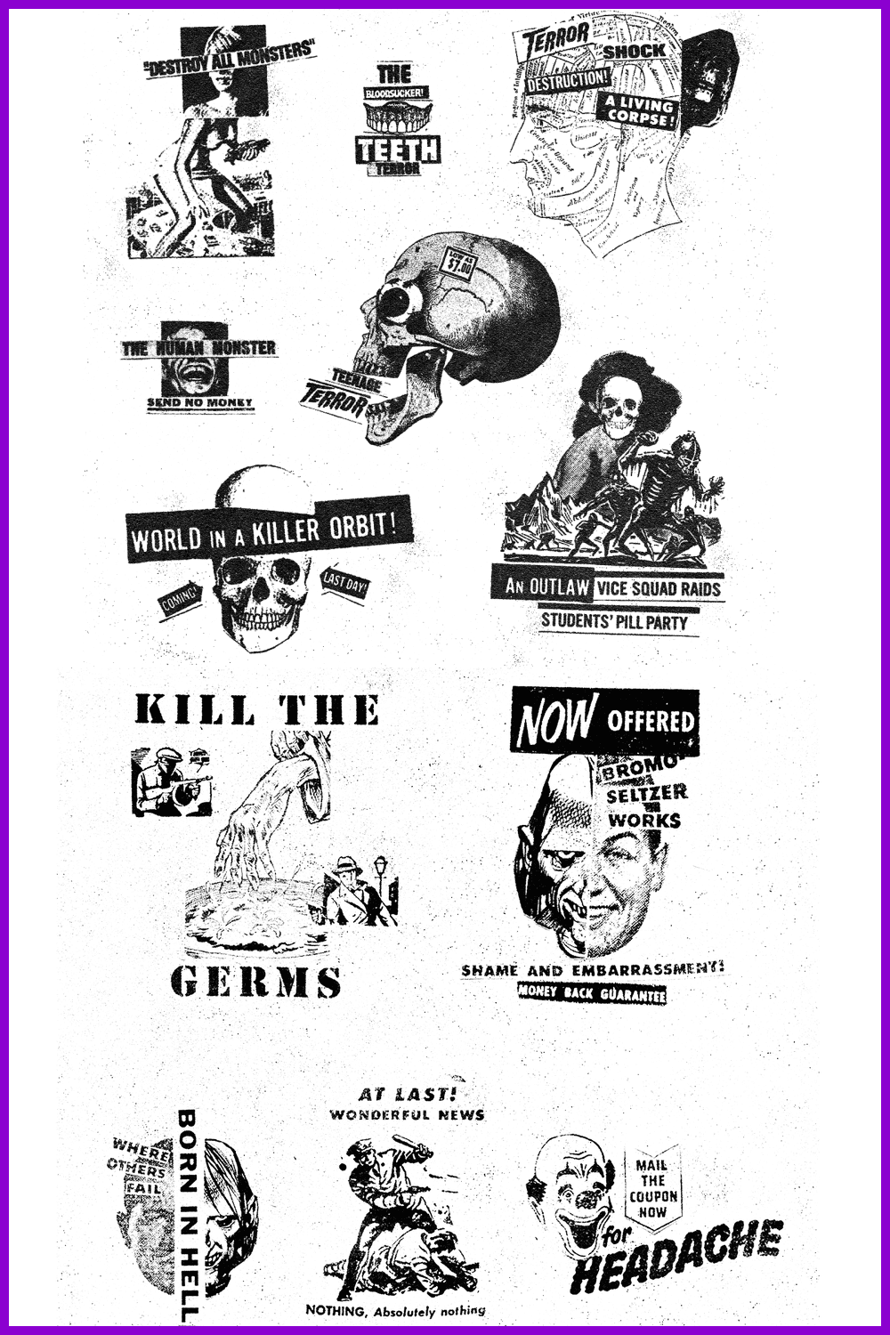
“These are designs based on new skills in the age of the creator economy, so this energy is not the completely unrestrained neon chaos of Internet 1.0. It’s a refined version of digital chaos created by digital natives.”
Breaking Down (Design) Borders
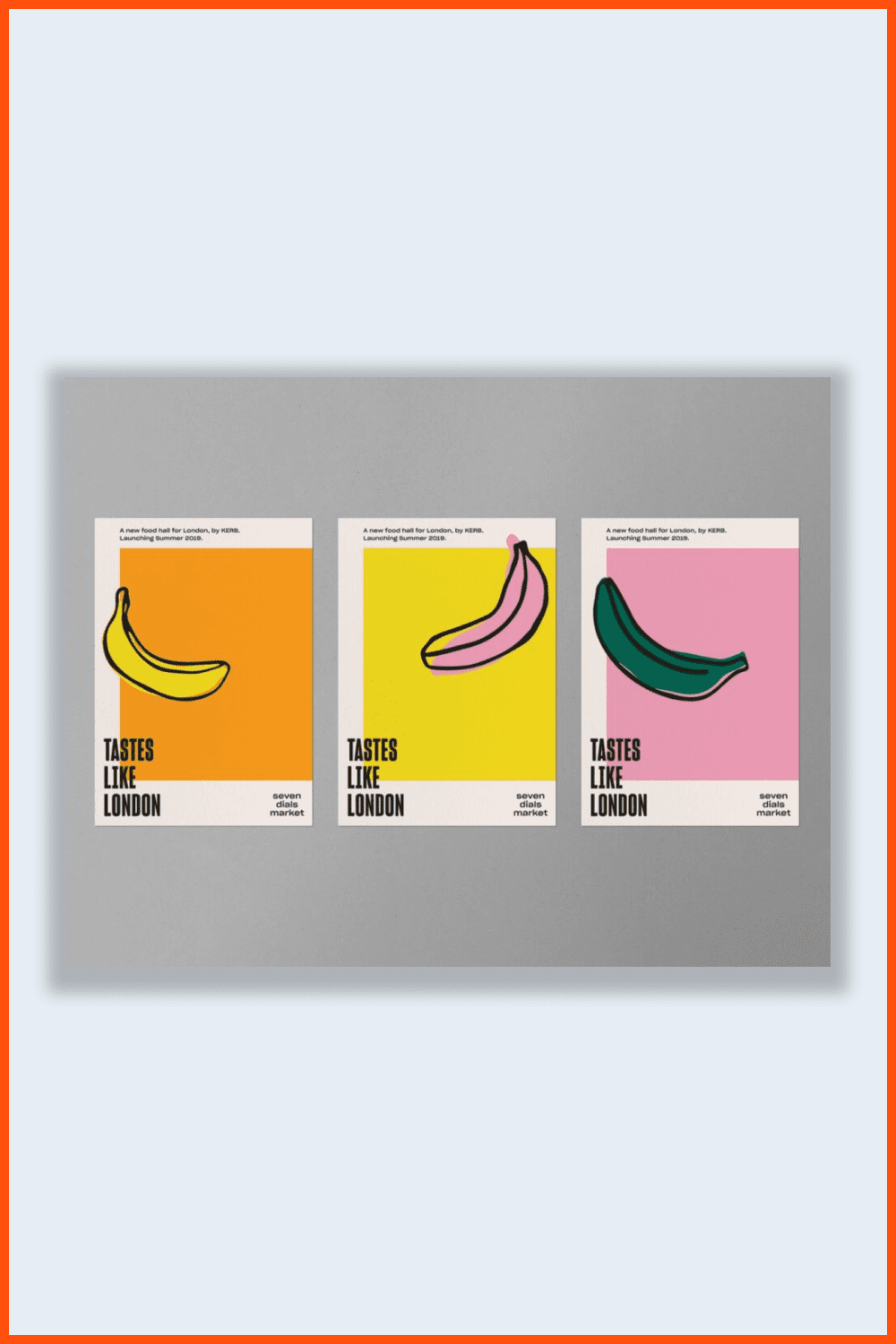
As Ali Ozden, director of design at Universal Favorite, points out, “Although no one liked the global pandemic, it forced us all to think and work in new ways and gave us the opportunity to work internationally, either for foreign clients or in collaboration with international talent.”
It is in this breaking down of network boundaries that he sees the most exciting prospect for the design world in 2022. “It opens up opportunities to collaborate with talent you could only dream of—clients you’ve always wanted to connect with,” he says enthusiastically.
“For us at Universal Favorite, it means working with clients from Korea to the United States and collaborating with designers and artists from New Zealand to Berlin. The most exciting part of this is sharing experiences and skills to help produce more creative results that can shape culture as we move out of the pandemic into another world.”
More Vibrant and Playful Typography
Fresh graphic design trends in 2022 will bring back tiered headers. Text has become a more selective element that provides users with more information from the first time they enter the page. Keep in mind that this trend will look even more beneficial with the right typography.
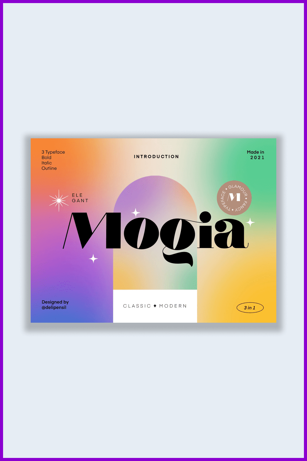
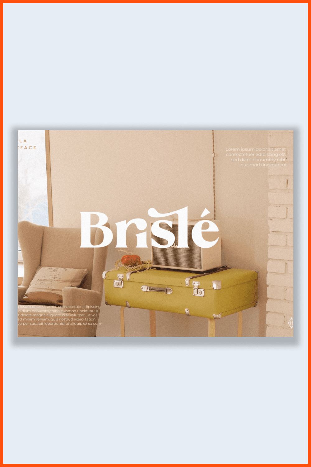
In 2022, designers are moving away from the classics and will use serifs. Sizes will change from word to word. Unique translucent fonts will overlap opaque fonts, and bold and italics will be added. Formal Open Sans that we know now will move to second place.
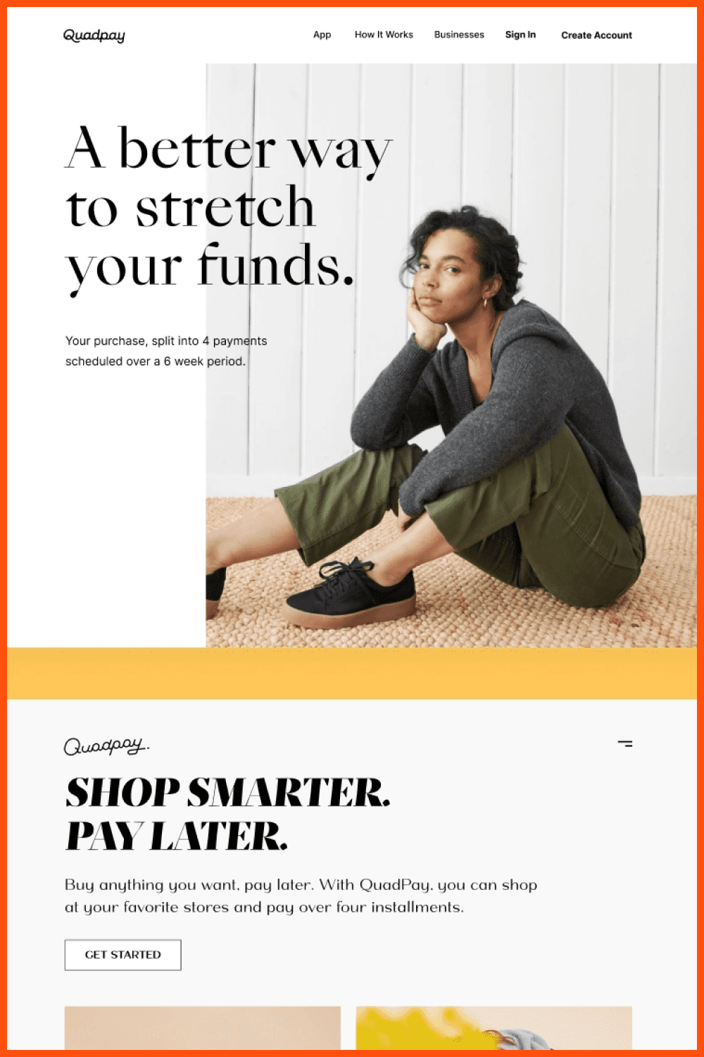
What fonts will be trending in 2022?
- Rounded Sans Serifs.
- High-Contrast Serifs.
- Quietly Quirky.
- Fluid and Simple Scripts.
- Rustic Serifs.
- Strong and Simple Sans.
- Chubby Retro.
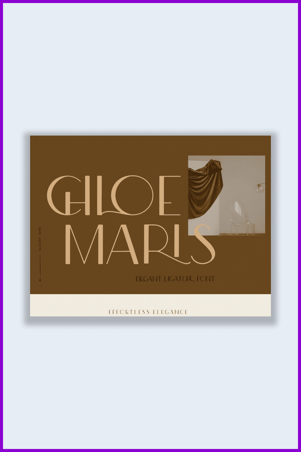
Looking for fonts to enrich your designs? Check out the collection of fonts in our marketplace!
Unapologetic Realism and Subversive Design
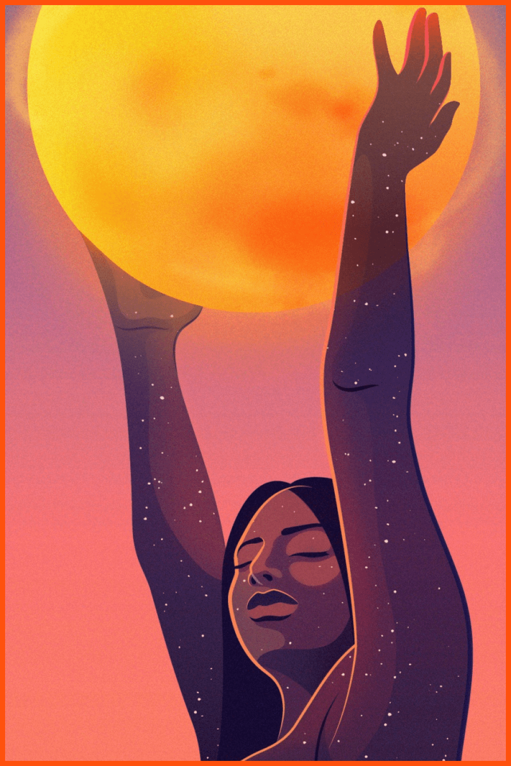
We’ve already seen designers try to do away with traditional “models” in favor of real-life, authentic, and diverse people in illustration and stock photography. We anticipate that in 2022, it will go beyond just participating in the celebration.
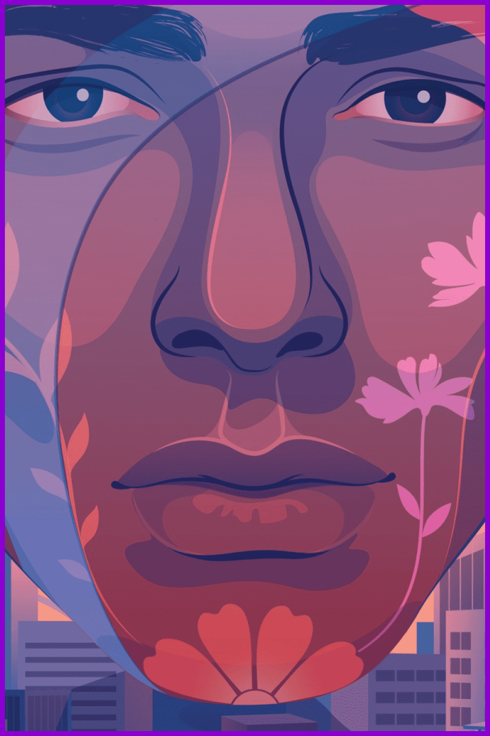
2022 will be the year to show how diverse and unique people really are and how rich our planet is because of our differences.
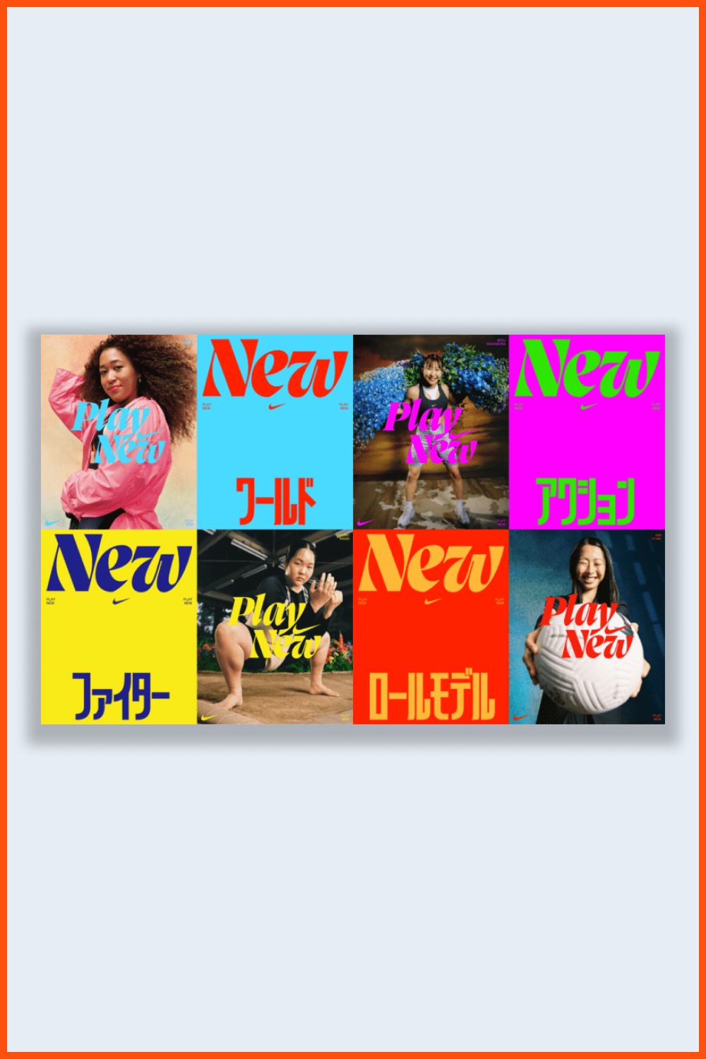
The fashion uses images of real people with their own characteristics, flaws, and uniqueness.
If there’s one thing that designers should avoid, it’s sameness. Highlighting different cultures, skin tones, ages, and identities presents an exciting opportunity to create designs that, like authentic people, are truly one-of-a-kind and attract the most attention.
Japandi
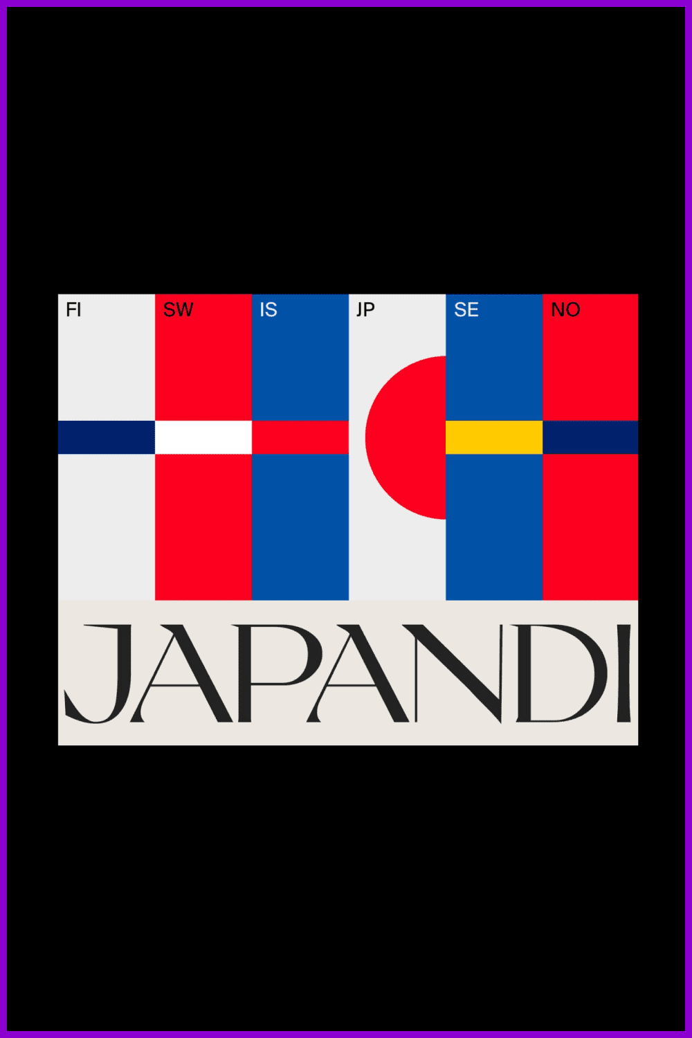
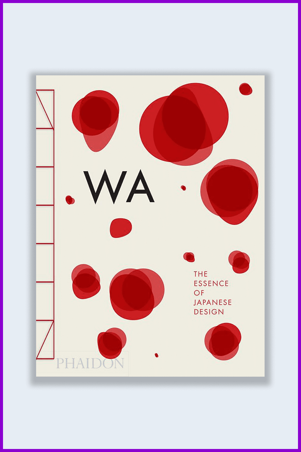
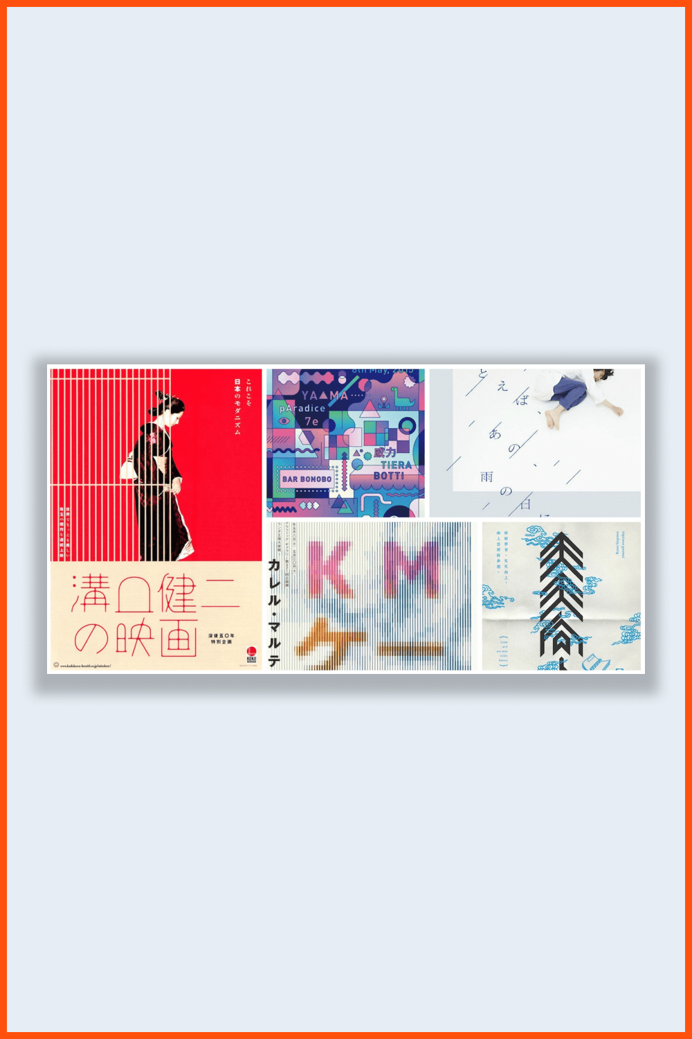
Not so long ago, a new term “japandi” appeared in the English-language designers’ dictionary. It succinctly defines a concise eclecticism with Japanese and Scandinavian elements.
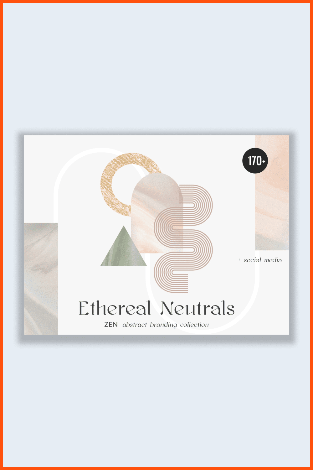
The style of japandi (the word is derived from Scandi and Japan) combined the heritage of two very different cultures and demonstrated their aesthetic affinity.
Scandinavian and Japanese styles are currently extremely popular. They can be found in fashionable design magazines and in numerous brands that have enthusiastically picked up this trend. As a result, minimalistic, functional, warm, and soothing japandi is one of the main trends in graphic design for 2022.
Maximalism Goes BIG
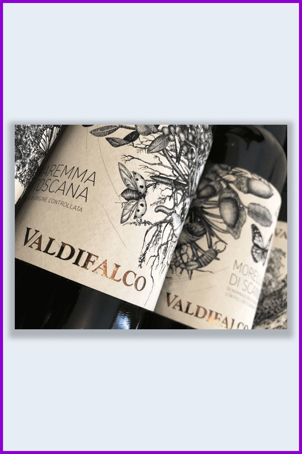
Use of complex drawings have always looked awkward on product packaging. But if these images are made in light colors, thin lines, and on textured paper, they can be appealing to the eye. The addition of premium materials, such as foil and embossing, provides a balance between maximalism and simplicity.
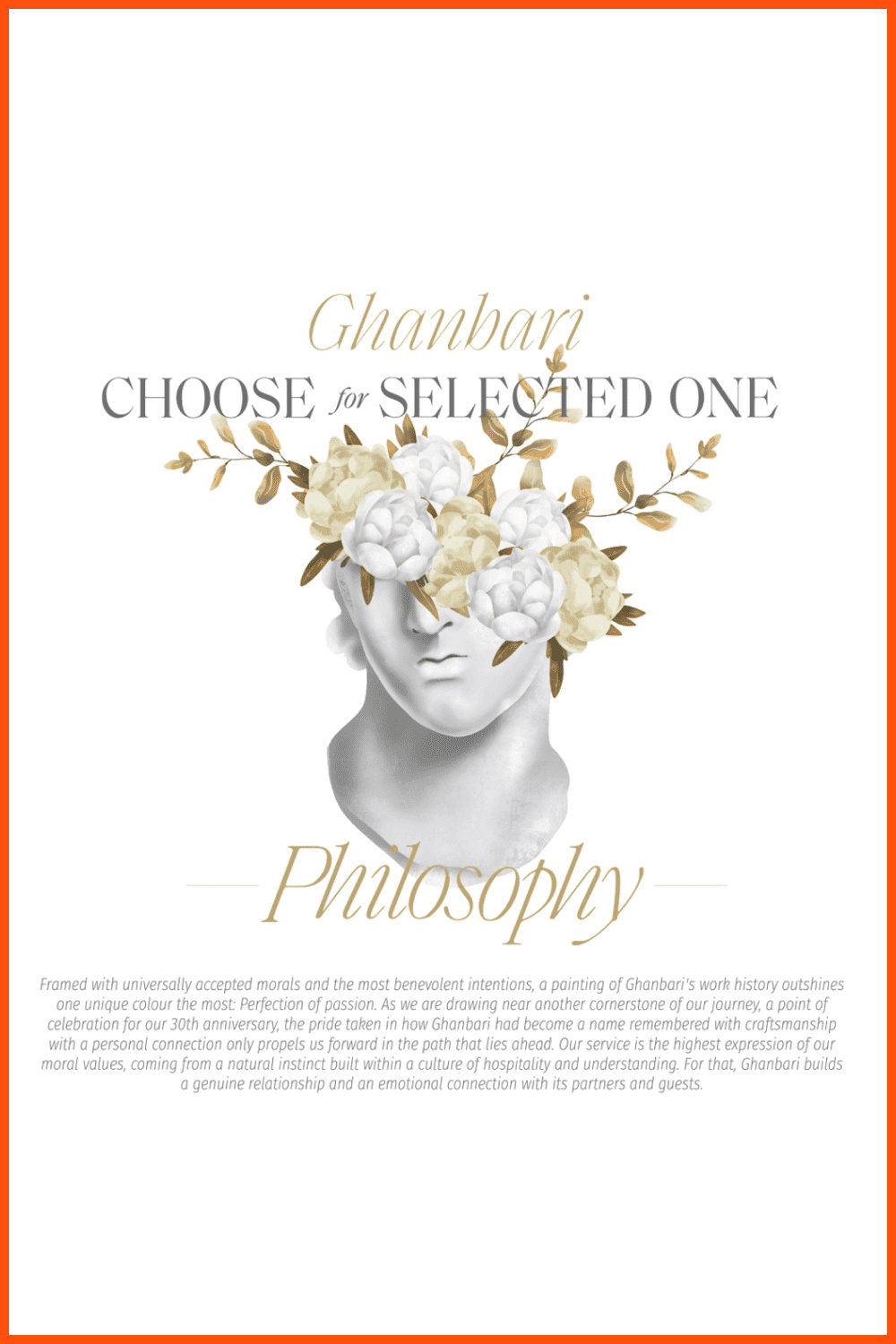
APP Design Trends in 2022
Along with visual trends, we also present technological trends, keeping in mind that design is design, in fact, engineering work, and not just the selection of gradients. We value things not for their color and style, but for how well they solve problems. The teapot handle, its shape, and material is part of the design. If there is no handle or it gets very hot, the kettle is not a kettle. Mobile and web designers who are familiar with technology will offer holographic calls instead of chatting through instant messengers where appropriate.
The Virtual Reality
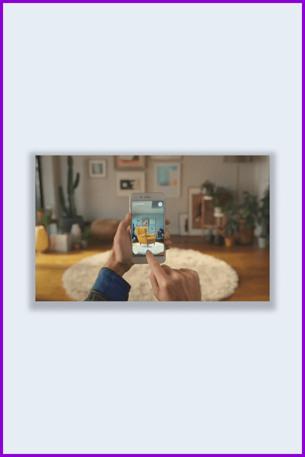
Virtual reality (VR) became more popular in 2020 during the quarantine period. And now, virtual reality is a hit for user interface design on both iOS and Android. Accordingly, this trend will not lose its relevance in 2022. This interactive and immersive experience is currently only available on mobile devices.
With subtle yet eye-catching design elements, VR makes us feel like we are inside the application. For many, it’s like a virtual game.
For example, the IKEA mobile app allows us to see how new furniture will look in our home, eliminating the unnecessary risks of buying the wrong pieces.
Interaction with retail products through a VR experience in an application has been proven to increase user confidence in the product.
No Boring Data Visualization
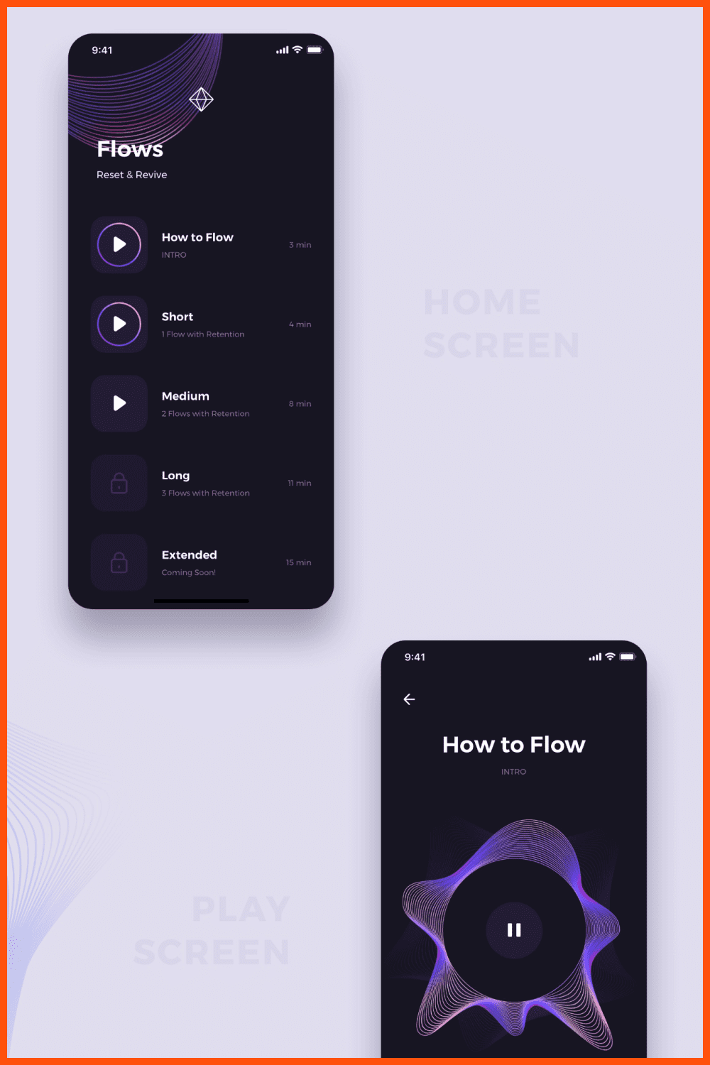
Data visualization can add a little creativity to the development of a data presentation application or general presentation.
Use a variety of animations, graphics types, and colors. This will give your data a more interesting presentation. For example, wave patterns create a subtle hypnotic effect that makes you want to watch.
Shadows and Layering
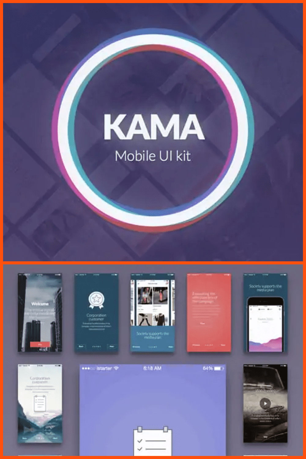
Create visual depth by adding strong shadows and contrast to graphics, photographs, and other design elements. This path is the fastest and easiest.
Shadows and layering are one of the most popular trends in app design. The creators rely on bold dark shadows, layering of elements, and light internal hierarchy.
Neumorphism
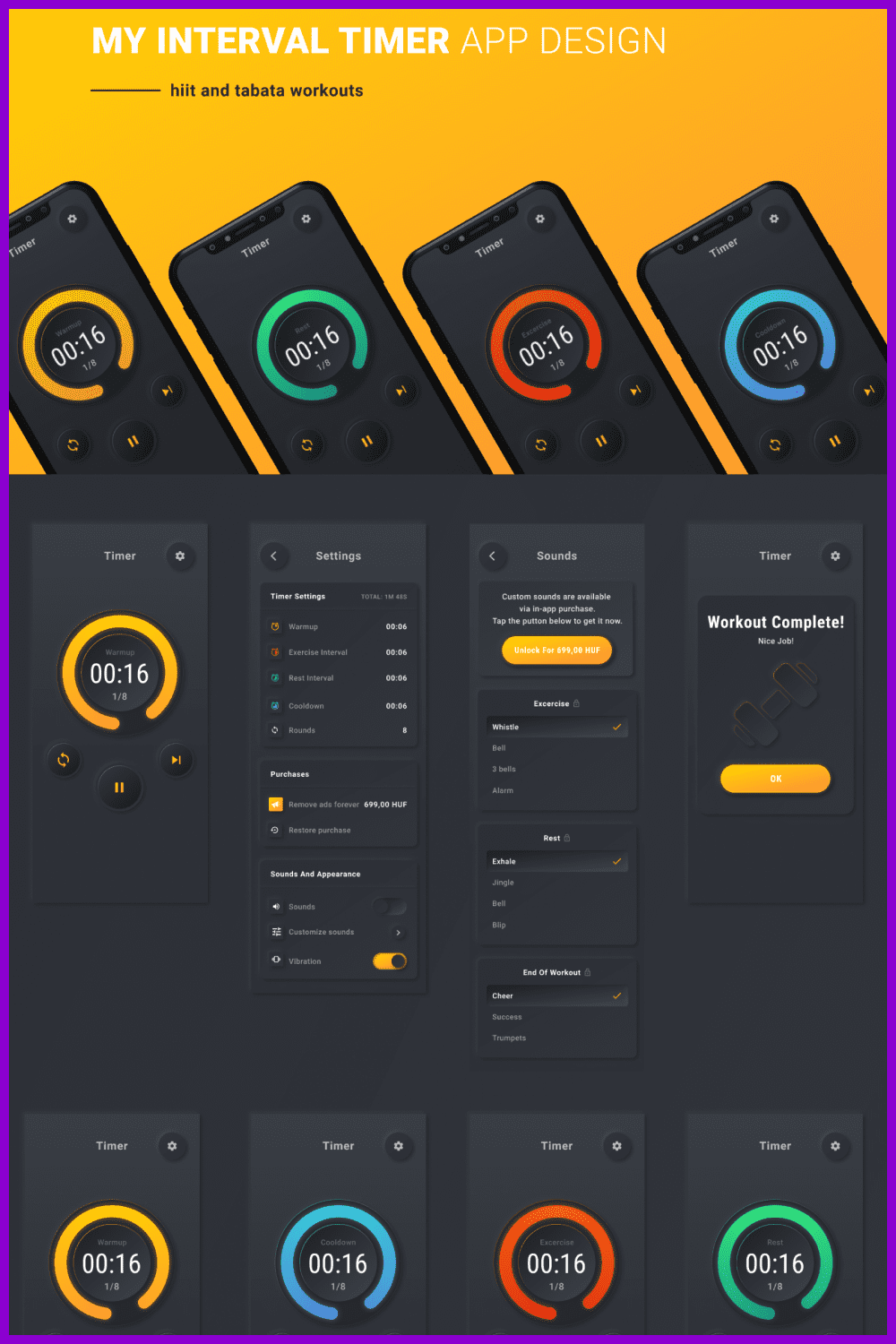
This trend concerns icons and buttons. It appeared to diversify the monotonous minimalism of current styles.
Neumorphism usually uses flat icons and buttons. This effect gives the buttons a volumetric look. It’s like sweeping away simplicity and realism at the same time, thanks to this tactile effect.
Web Design Trends for 2022
Minimalist WordPress Theme
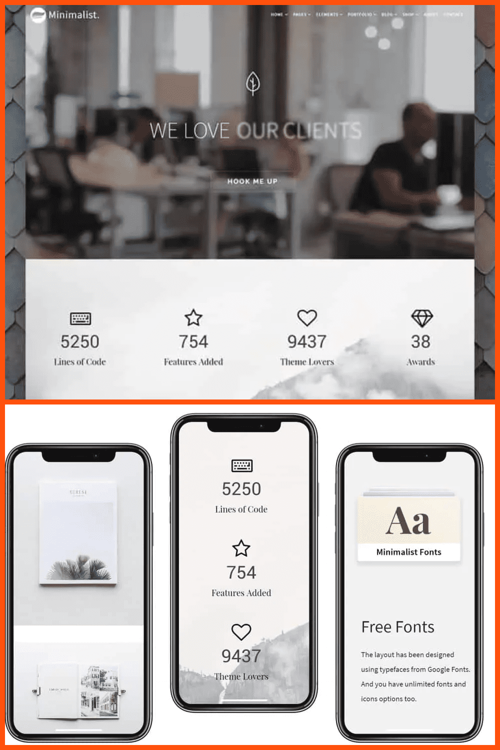
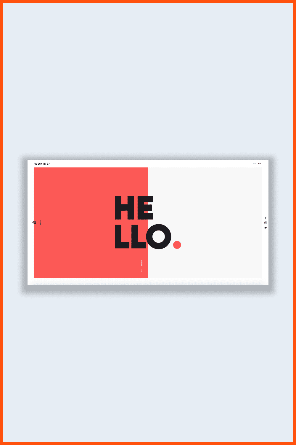
Minimalism is a design trend that has not lost any ground over the past few years. This design principle assumes the use of basic elements, clean text, and white space. This design is simple, memorable, and functional.
Today, minimalism is again gaining momentum in both graphic and web design. Simple fonts, block colors, and bright backgrounds, and other minimal design elements are used. This simplistic design provides usability, which is why this trend is unlikely to cease to be relevant soon.
Parallax Scroll Animations
Parallax scrolling effects have fascinated many for a long time. In 2022, parallax scrolling effects reach the next level in animation. Of course, you need to consider how voluminous the animation will turn out so that the site does not hang for visitors.
It is also important that visitors are not distracted from important information. Alternatively, you should be able to keep the focus where you want it if you limit the parallax effect within the site.
In any case, your site will be dynamic and memorable if you try to only use it on the main page of the site.
Dark Theme
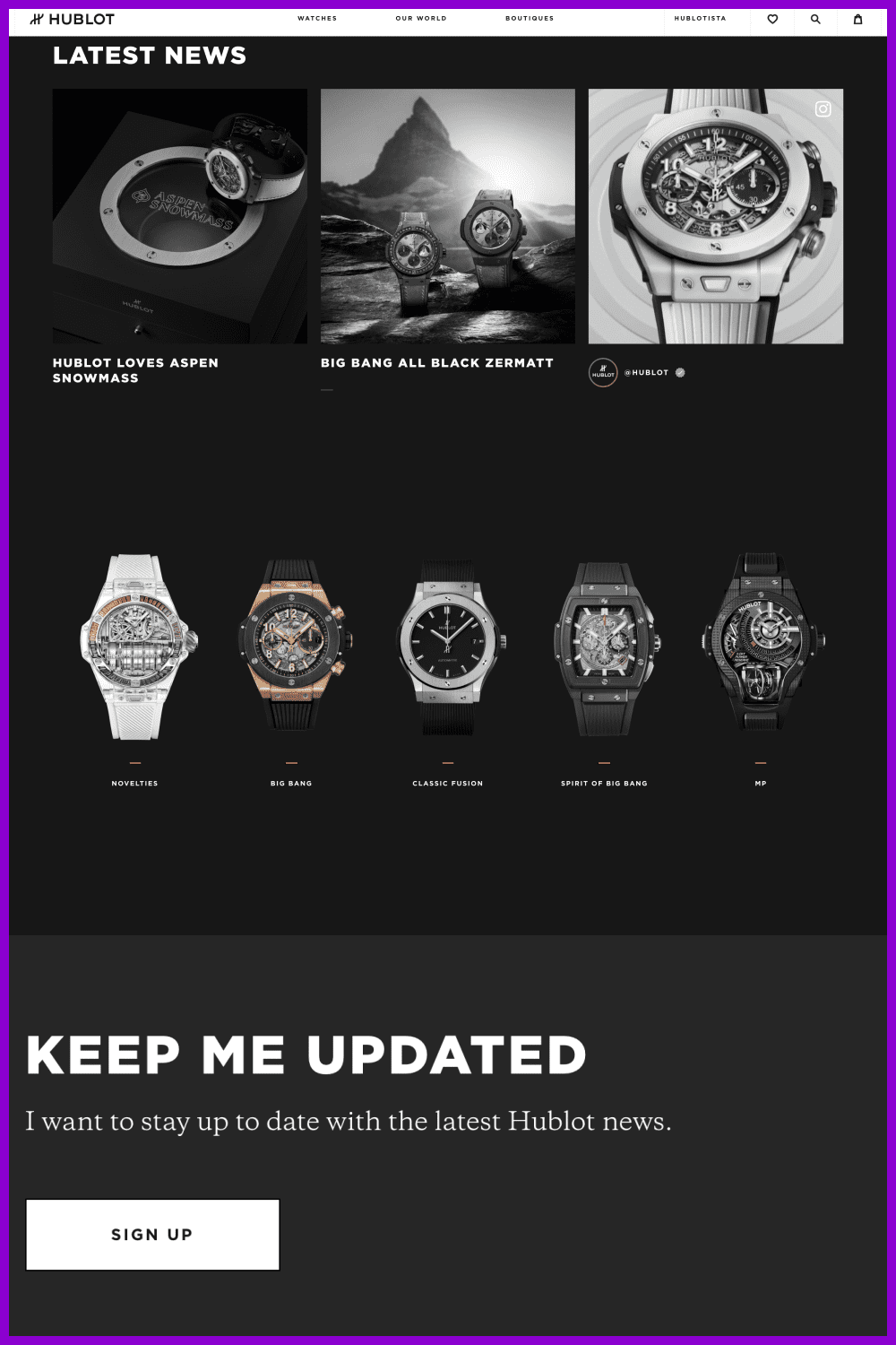
It is worth paying attention to the design of the landing pages of big brands. As an example, let’s look at the Hublot website. We see a simple color change, more noticeable design elements, and high contrast ratio resulting in less strain on the eyes and a touch of elegance. Additionally, dark shades allow the neon glow effect, which is also one of the new trends for 2022.
Black coloring has become widely used. More and more sites began to implement use of this color because (according to studies) it turns out that black elements have the following advantages:
- makes design elements visible;
- creates contrast;
- gives the resource elegance and conciseness;
- does not overload the vision.
Asymmetric Layouts
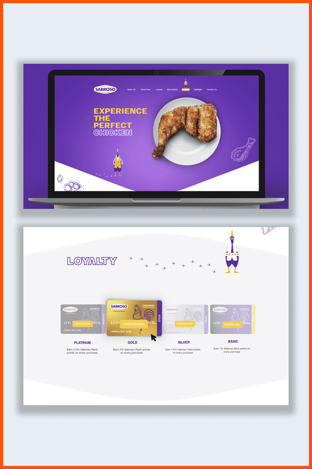
Cheerful, interesting, moderately brutal, and unique web designs have become some of the trends for 2022. All these characteristics can be realized using asymmetry. For a long time, all sites were created according to a certain grid. This made the structure clear, pleasing, and emphasized important aspects. Today, such a model is already considered outdated and unoriginal.
In this case, when using asymmetry in web design, it is important to consider balance. For this, special testing is carried out to determine the ease of page weight for search engines and the client’s perception.
To draw attention to certain things on the site, the elements must grab attention visually. This is possible by creating a site and increasing the blocks’ size that you want to draw the user’s attention to.
Custom Cursor
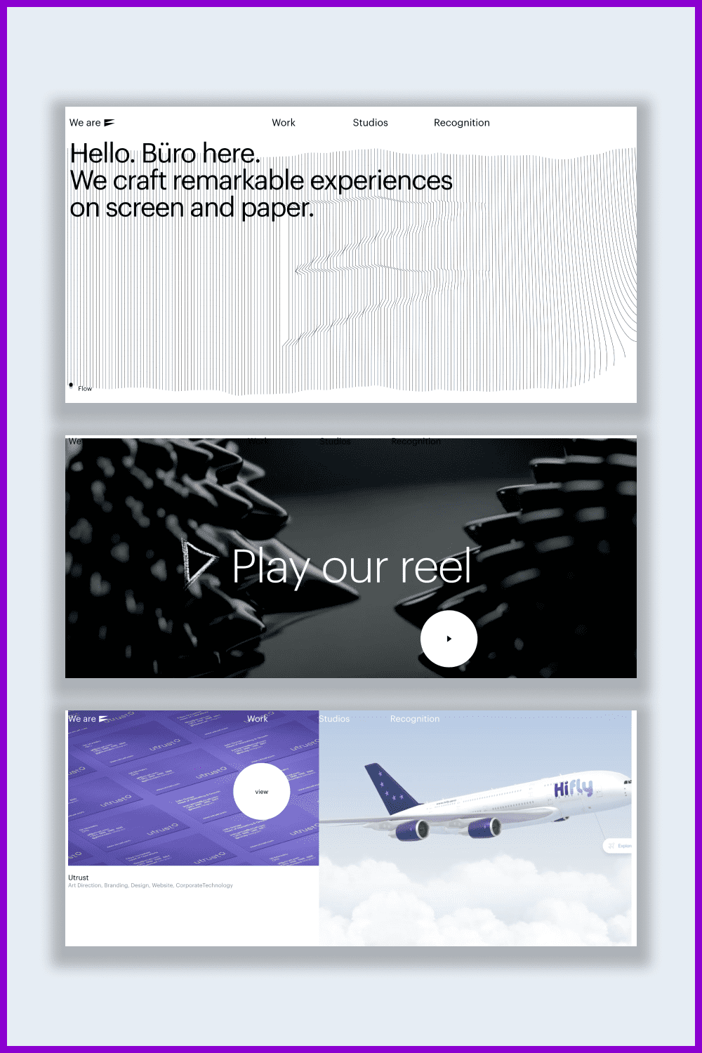
For some reason, most designers are content with a simple classic arrow.
But what if you take that element and turn it into something cool—that’s a real achievement.
Logo Trends in 2022
Everything in our world is changing rapidly. New ideas are replacing some old trends. Companies that want to keep up with the times need to follow these new trends to be in demand. This topic even applies to logos that brands are improving and modernizing.
It is not correct to think that a logo should not be changed once you have created it. This is confirmed by the biggest brands in the world, whose logo history shows that periodic updates to logos keep the brand fresh and relevant.
What will be relevant in 2022? We will tell you in the next section.
Hand-drawn logo elements
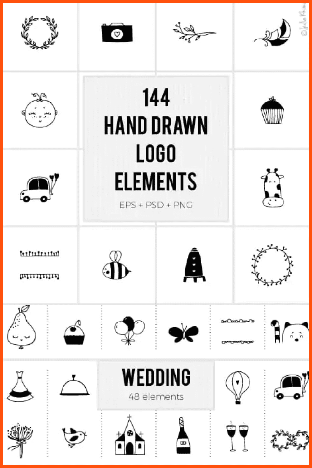
Recently, there has been a tendency to simplify logo appearances, which has led to the creation of many identical signs with typical text elements. As a result, the distinction of various companies has significantly decreased.
This encourages brand owners to think about their unique style to differentiate themselves from the competition. Hand-drawn logos, in this case, are a good start. It helps to highlight the distinctive mark and characterize the brand, emphasizing its individuality.
Minimal Typography Logos Bundle
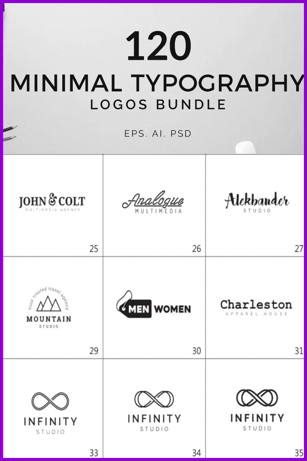
According to design forecasts, in 2022, minimalism will find a new vector of its development. Pay more attention to linear shapes and elements. Thin lines will become relevant, look more aesthetically pleasing and stylish, and help direct a person’s attention. As a result, the picture is more memorable and leaves a pleasant impression.
Gradient Logos
Gradients will continue to be relevant next year, so you shouldn’t give up on them when creating logos. Think of your favorite social network icon, such as Instagram. Color transitions add novelty, a sense of lightness.
You can mix two or more shades and not be limited in application methods. For example, switch between each one or increase the saturation of a particular hue.
The gradient will give an interesting visual effect, as well as emphasize originality and depth.
Vintage Logos MASSIVE BUNDLE
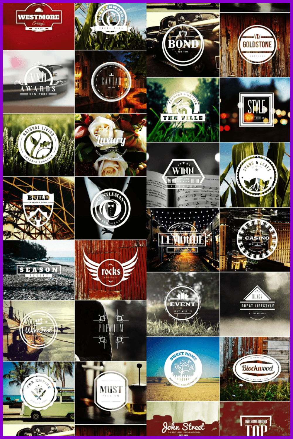
Despite the word vintage, we are talking about a trendy style that makes a confident comeback. This rings true in all spheres of life. It is also relevant in branding. For example, in logos, the simplicity of forms, muted shades, and, of course, a touch of nostalgia are welcomed. All this, according to forecasts, will not lose its relevance in 2022.
The combination of retro art and innovative solutions is relevant. Such a logo will delight customers. And the demonstration of the old days will give a maximum of warm feelings.
UI Design trends in 2022
Today, UI/UX designers use this technique and create a layered structure for stacking elements on top of each other. You can also use soft shadows to show more depth. Thus, a feeling of lightness and airiness of the entire image of the site is created.
Glassmorphism

Have you heard of the newest trend called glassmorphism? This UI design trend is based on an effect called background blur. Thanks to this effect, it appears that you are looking at the elements “through glass.”
We can remember this from the days of Windows Vista, and then in iOS7. Today, this trend is gaining popularity in an updated form. If you want to experiment and make sure that the glass morphism trend is perfect for you, try this Glassmorphism Generator tool.
Voice Interface
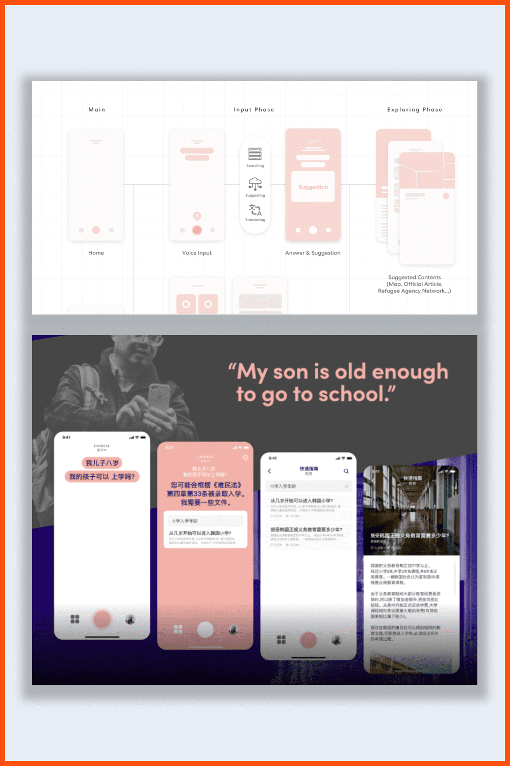
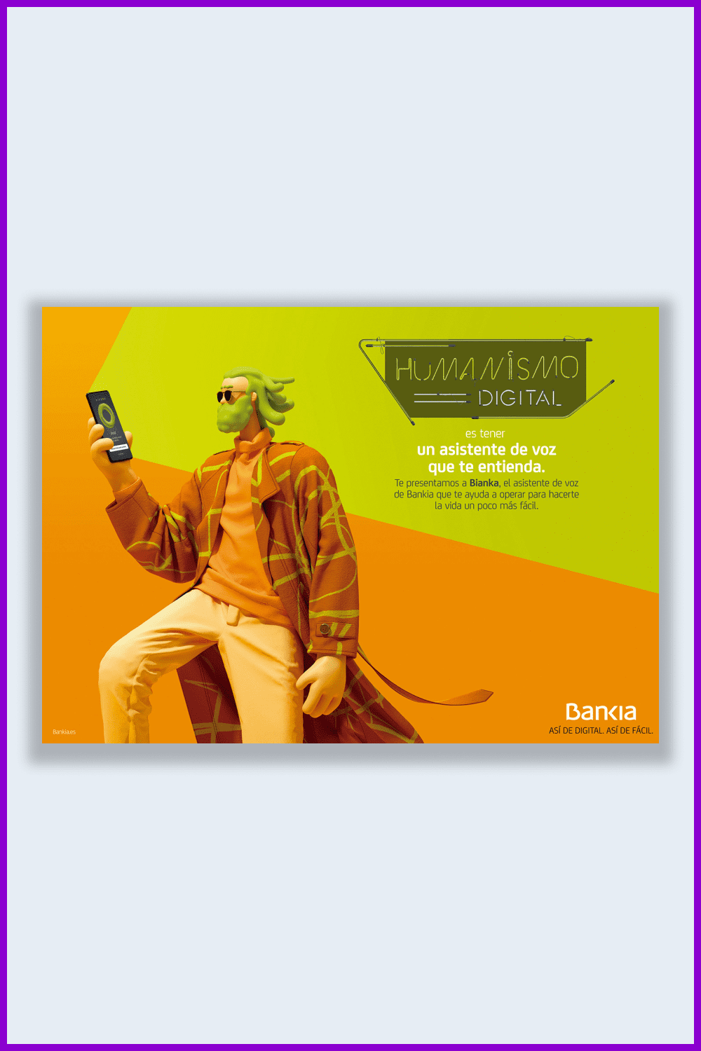
Chatbots and virtual assistants are definitely technological trends of 2020 and will continue to be in the future. They are changing the way we look for and receive, record, and purchase information. For example, Apple, Android, and Google are already using this technology to the fullest and have received positive reviews from users.
JPSDesign
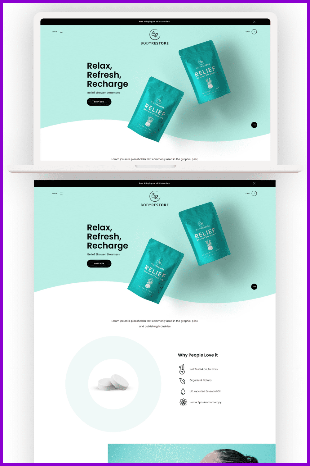
Using new technologies for high page loads, such as soft shadows and floating elements, will provide three-dimensional images. They will add layers and make the design more interesting. You can add a shadow to any element. The main thing is that the site does not become oversaturated and too visually heavy. Thanks to such innovations, designers have the opportunity to create unique complex sites.
Such effects are popular for:
- headers;
- buttons;
- panels;
- main text;
- images.
Apple
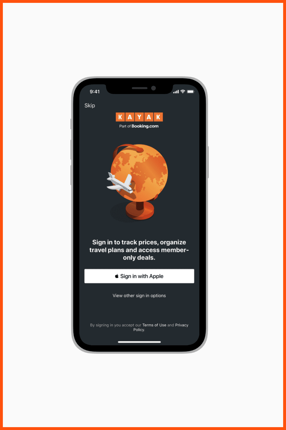
This trend is different from the others; it is by no means visual.
I see more and more people in the industry, realizing that many product design processes have become extremely complex. This trend is about to cut down the elements and fields. It is also necessary to lessen the number of steps a user has to take to reach the desired result. For instance, using a phone number or biometric data as a personal identifier to log in.
Conclusion
As usual, most of the mega-trends are smoothly transferred from the previous year. This applies to geometric shapes, calm illustrations, and simple infographics. Unexpectedly, classical serif fonts and muted colors returned to their former majesty. But the appearance of the psychedelic design, as far as we are concerned, is very in tune with today’s realities of chaos and instability.
The world of graphic design is experiencing unprecedented growth and the next year will depend on you. Get inspired by the top design trends of 2022. Let’s make it colorful, interesting, emotional, and enjoyable!
Sell Your Deal
If you already have a bunch of designs that meet the trends of 2022, don’t hesitate to upload them to our marketplace and start earning! The terms are flexible, the payments are fast and uploading your designs is easy and simple! Use the form below 🙂
Top 4 Popular Questions About Design Trends
🎨 How to keep up with graphic design trends in 2022?
Do not try to make everything fit all of them and stay original. Follow your creative heart 🙂
🎨 Where to look for graphic design trends in 2022?
Read the MasterBundles Blog where you can find the freshest news from the graphic designing world. Look through DeviantArt, Behance, Raster, and Delicious CSS; these are great sources of inspiration and modern tendencies examples.
🎨 How do trends improve graphic design?
They show the artist the trending directions, as well as allowing each artist to contribute something personal to the design flow. As new technologies become commonplace in society, designers will adapt their practices to make their workflow easier.
🎨 Who predicts graphic design trends?
The new technologies that appear every day, week, month, and year will predict the popularity and direction of new design trends and tendencies.
Some Awesome Video About Graphic Design Trends In 2022
Graphic Design Trends 2022
Find out the Graphic Design Trends we’re seeing in 2022 in our video.
Please take a moment to pin this post to Pinterest
- colorful icons
- graphic bundles
- outline icons
- round icons
- sharp icons
- icons
- illustrations
- solid icons
- graphic design news
- graphic design movies
- graphic design trends 2023
- free graphic design deals
- kerning vs leading vs tracking
- animated architecture presentation examples
- graphic design portfolio
- Y2k powerpoint templates
- types of graphic design
- best graphic design magazines
- graphic design interview
- graphic design shows
What are your concerns?
Thanks for your response!
This article is inspired by and relies on the following sources:
- Behance.net
- Dribble.com
- 99designs.com
- YouTube
- Apple.com
Disclosure: MasterBundles website page may contain advertising materials that may lead to us receiving a commission fee if you purchase a product. However, this does not affect our opinion of the product in any way and we do not receive any bonuses for positive or negative ratings.
