Typography Essentials: Kerning vs. Tracking vs. Leading

Typography is aesthetically pleasing and tricky at the same time. An entire career can be dedicated to it. Fortunately, there are plenty of font resources online. Before making your fonts, make sure you learn a bit about the critical aspects of typography.
Using leading, tracking, kerning wisely in Photoshop and Illustrator is crucial to making your text look proportional and readable. Let’s dive into what each process entails and what is the role of kerning vs leading vs tracking in typography.
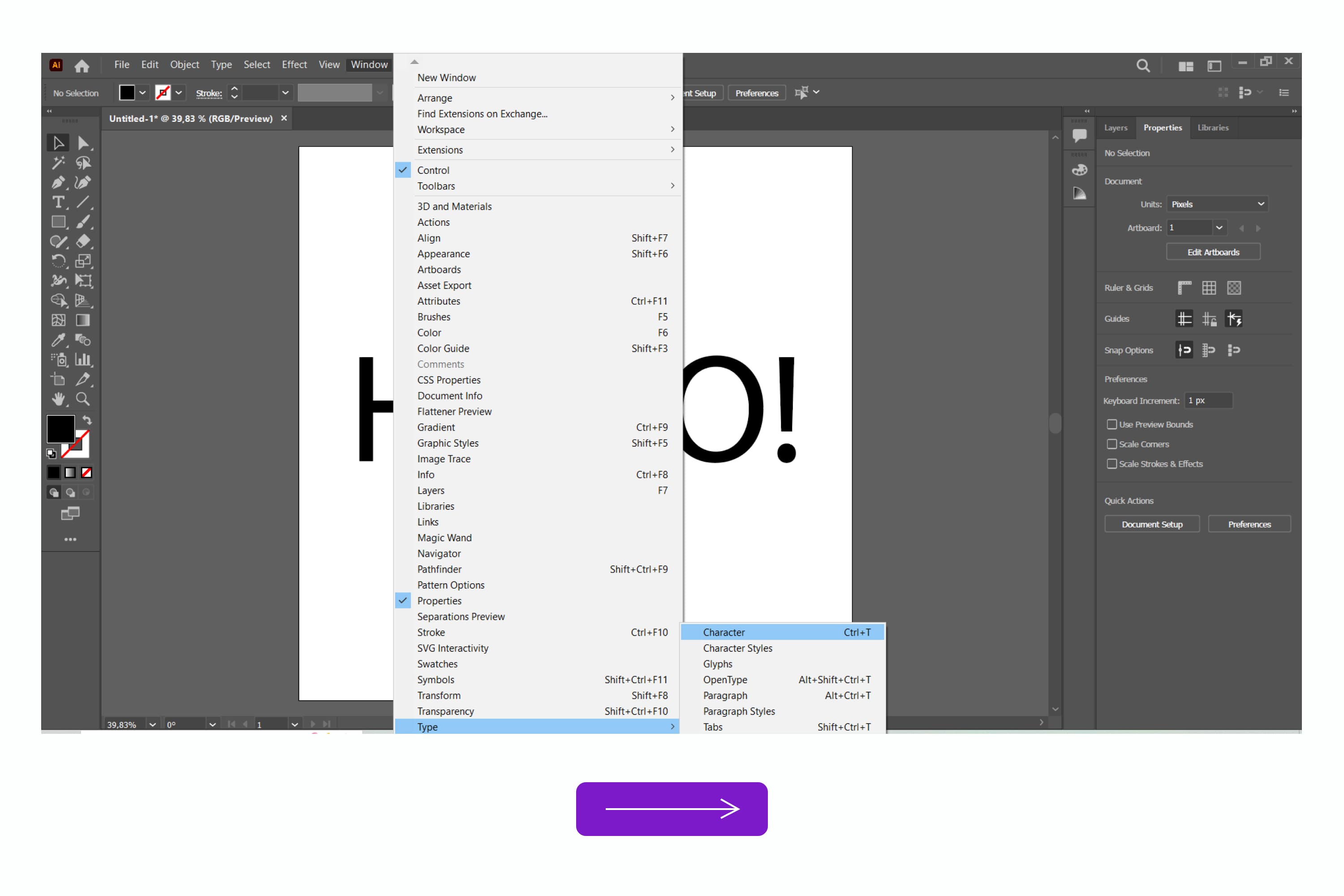
What Is Kerning?
If you look at a text and see that some letters are too far apart while others are too close, it is time to modify the kerning. In simple terms, kerning involves increasing or narrowing the spacing between letters.
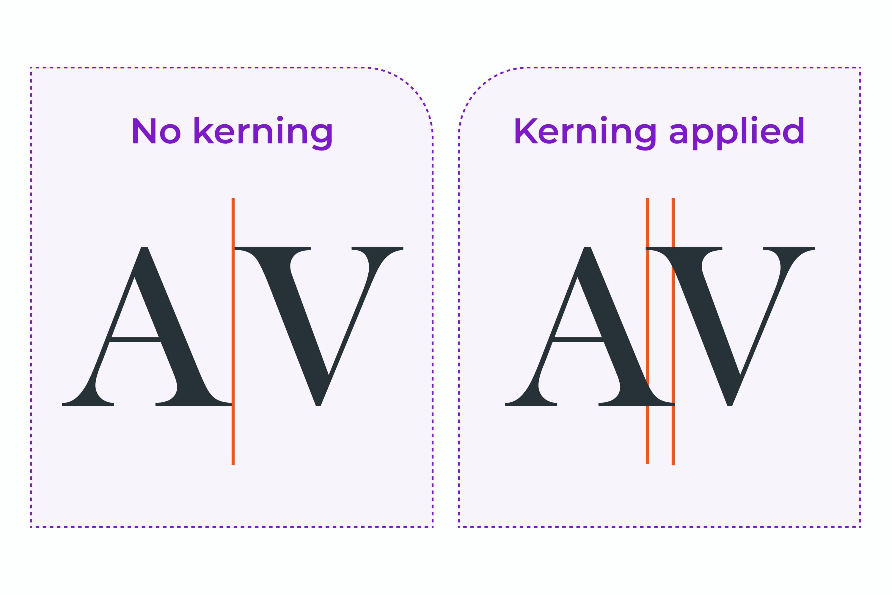
The primary goal of kerning — have a proportional distance between each letter, considering any serifs or stylistic peculiarities. That’s why kerning is pretty tricky and subjective. It takes lots of practice to kern a font impeccably.
Extra tip: Rotate the word upside down to see the letters as shapes, and you’ll be able to see big gaps more easily.
How To Adjust Kerning in Photoshop and Illustrator
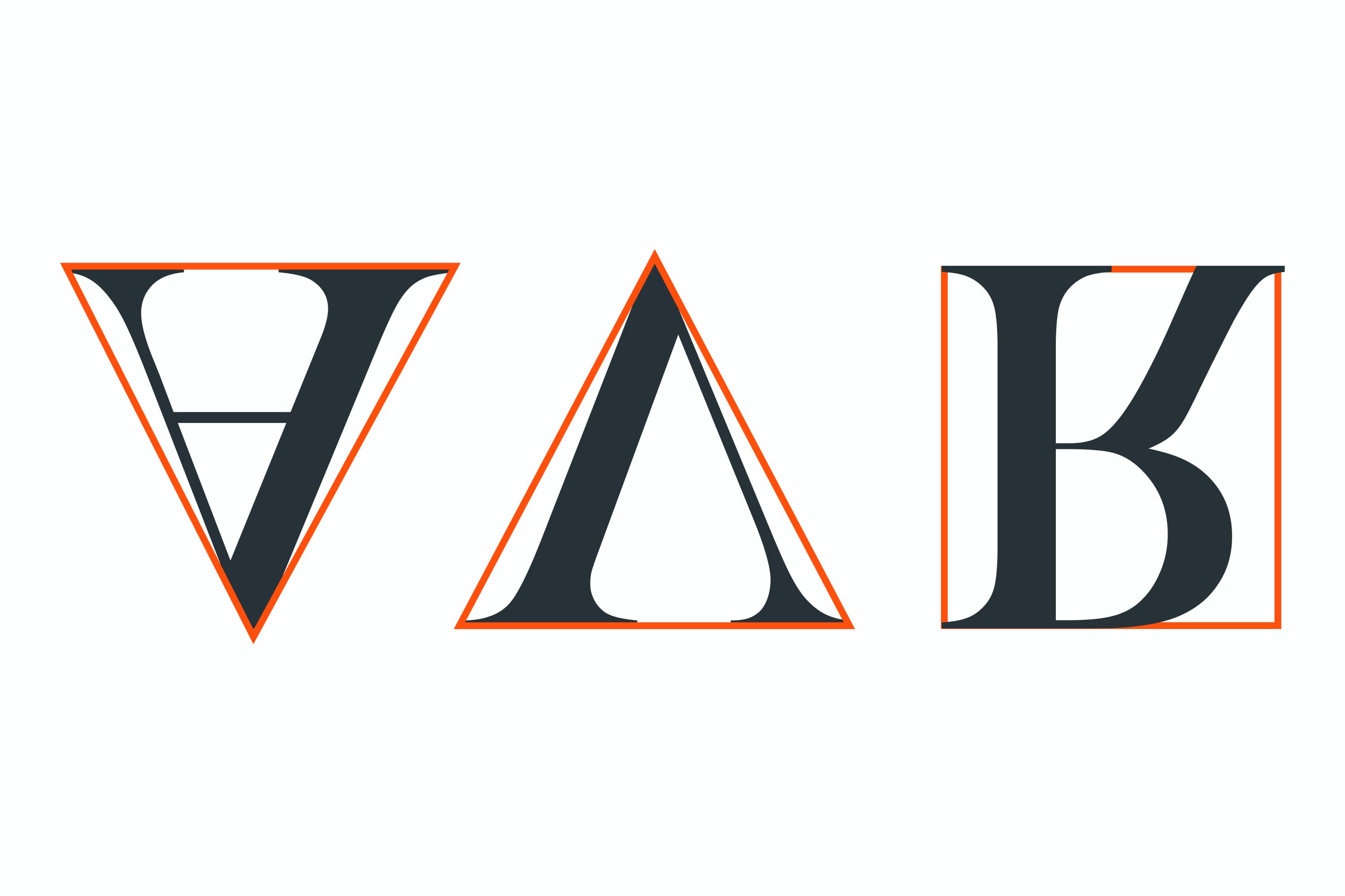
Using the character palette. You can adjust the kerning through the character palette (if you don’t see it, go to Window → Type → Character). The kerning field V/A is below the type size. Highlight the number and use the up and down arrows to adjust the space.
Using the shortcut. Place the mouse cursor between two letters you intend to kern and hold down the option key. Click the directional arrows to move the letters right or left (ALT+left/right arrow on PC).
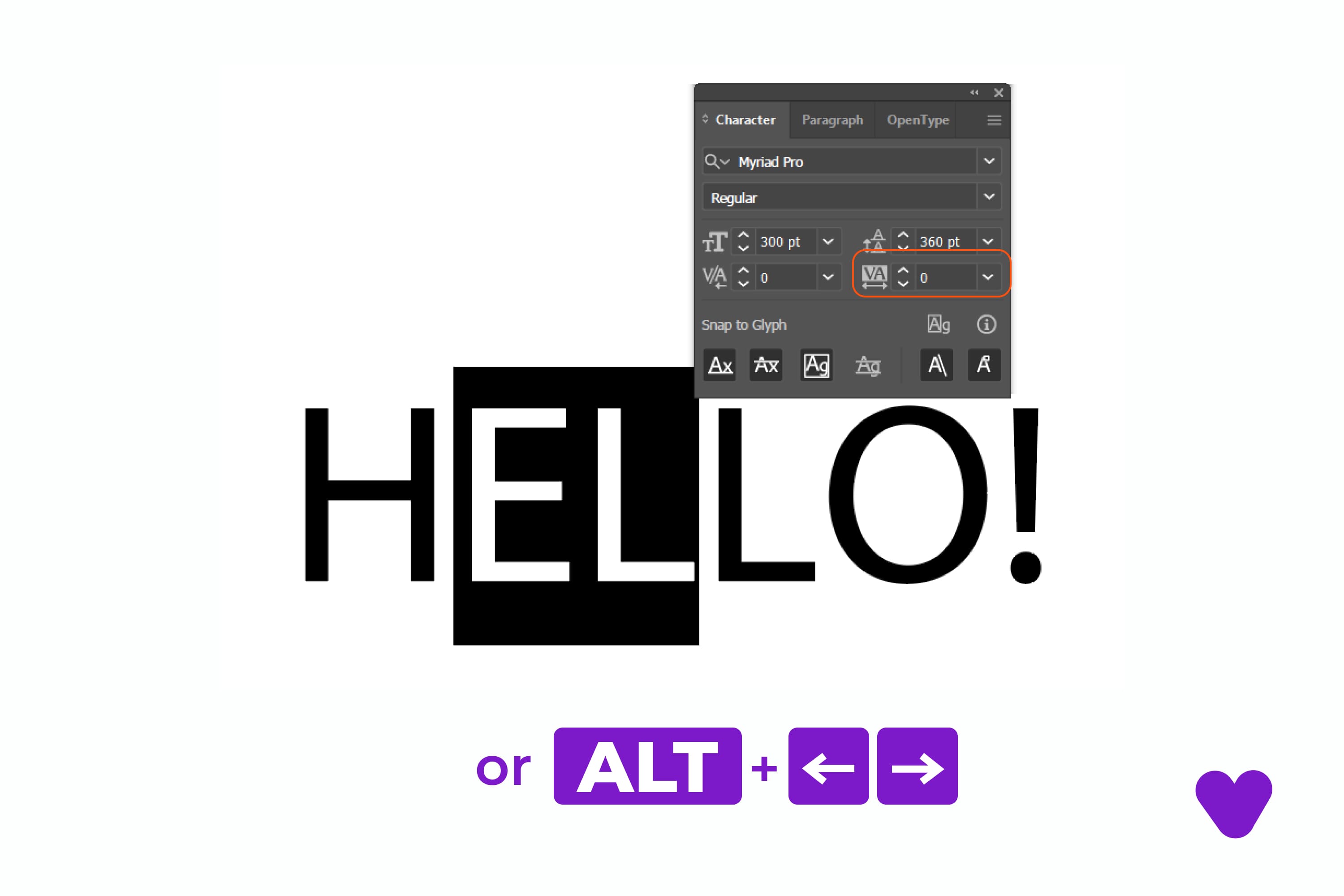
What Is Leading?
If you look at a text and feel that the spacing between the lines needs to be adjusted (vertical spacing), it’s time to change the leading. So, in simple terms, leading in graphic design is the process of increasing or decreasing the spacing between the chosen lines or all the lines of a paragraph.
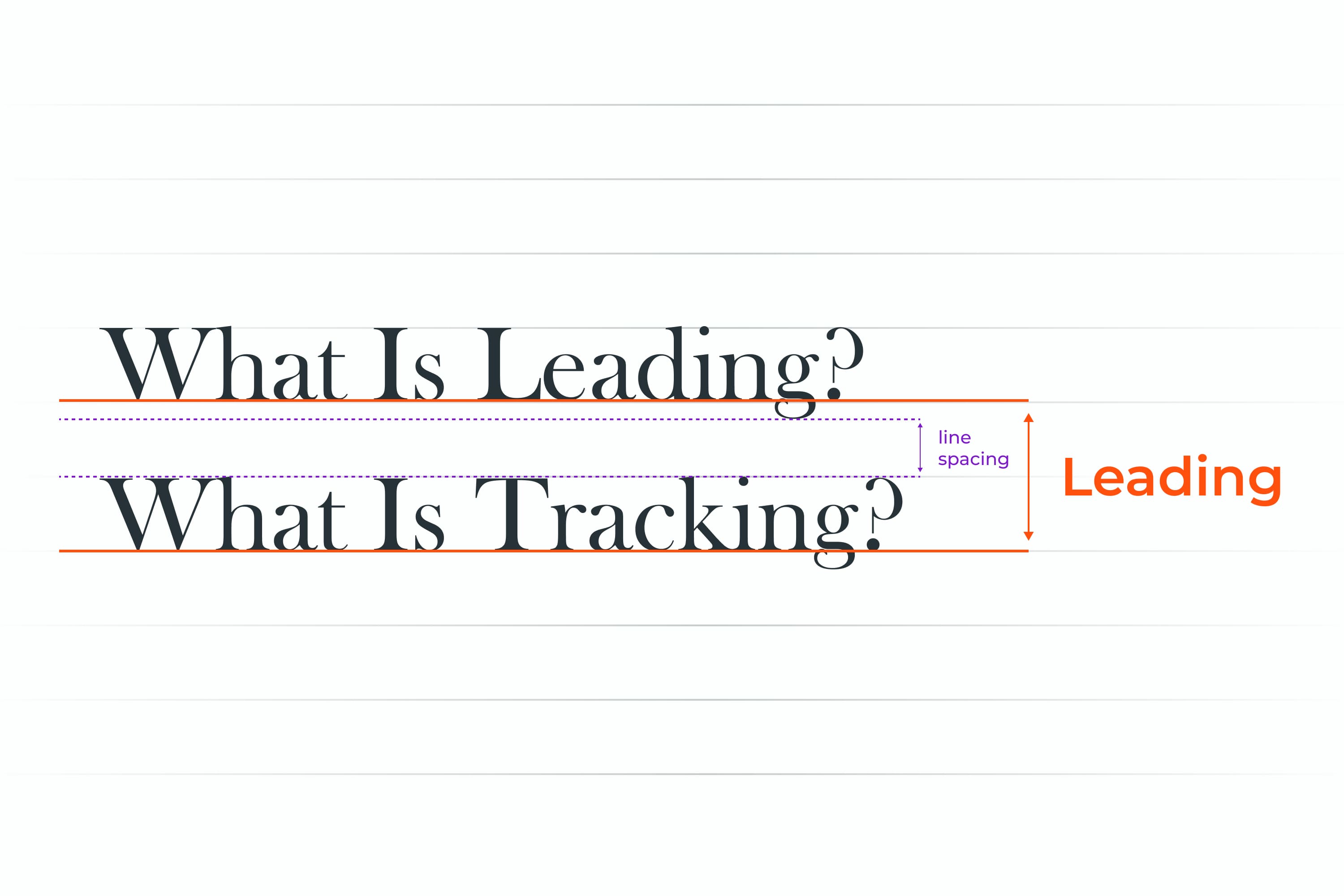
The main goal of leading is to ensure that the spacing from the bottom of the words above to the top of the words below is sufficient to make the text legible. Leading typography is tricky since you need to consider the parts of certain text symbols that are longer (for example, a lowercase y) and fall below the baseline or the ones that are taller (for example, a lowercase f).
![]()
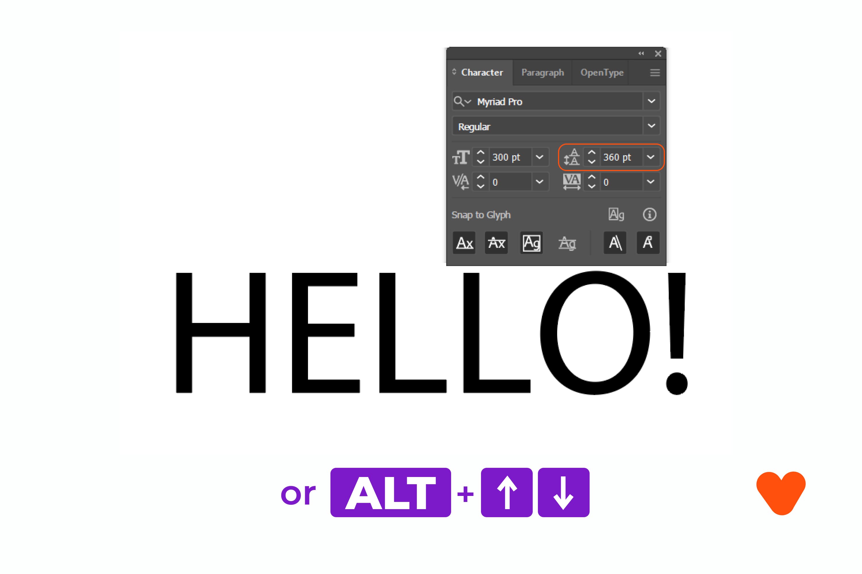
How To Adjust Leading in Photoshop and Illustrator
Using the character palette. You can adjust the leading by using your character palette. The leading field is the A with the A underneath. Simply highlight the paragraph you wish to modify, then change the number in the leading field.
Using the shortcut. Select the text and then hold the option key + down/up arrow to adjust the leading (ALT+down/up arrow on PC). You need to hold the option key + command key + up/down arrow for larger increments.
What Is Tracking?
The beginners in design may wonder, “What is tracking in Photoshop or Illustrator?” If you look at a text and see that although the distance between each letter is proportional, the spacing throughout the entire word might need to be larger or smaller, this is when you need to change font tracking. To put it simply, tracking is about adjusting the space between all the letters in a word equally.
The primary goal of tracking fonts is to fill a space that does not match the type’s parameters or to make a single word seem impressive and airy. Creators need to be very careful when adjusting the tracking since the too big or too small spacing between the letters can immediately lead to difficulty in reading.
![]()
How To Adjust Tracking in Photoshop and Illustrator
Using the character palette. You can adjust the tracking with the character palette. Tracking in the palette is also V/A, but it’s got a whole lot of letters highlighted. Highlight the number and use up and down arrows to adjust the space.
Using the shortcut. Select the whole text box you want to adjust, hold the option key, and press the directional arrows to adjust (ALT+left/right arrow on PC).
Note that every time you increase or decrease the tracking, it changes by increments or decrements of 20. You can always change this standard setting (Preferences → Type → Tracking).
![]()
Conclusion
Tracking, kerning, and leading are all critical to making your text readable and appealing. Although all the processes are related to typography, there are significant differences between them. You need to master all three to create attractive typefaces. Practice can help you master skills in tracking, leading, kerning, and other aspects of typography.
Best Related Articles


Some Awesome Video About Kerning
Kerning, tracking and leading – what’s the difference?
Typography – what are kerning, tracking, and leading…and how can you remember which is which?
FAQ
Here are a few frequently asked questions about the kerning
What is the difference between kerning leading and tracking?
The difference between kerning, leading, tracking is significant. In typefaces, kerning is about adjusting the spacing between two letters, whereas text tracking in design is about adjusting the spacing between all the letters in the word equally. In contrast to kerning and tracking, leading letters go beyond single words and refer to the spaces between the baselines of your text sample.
Is tracking and kerning the same?
Although both tracking and kerning deal with letter spacing, tracking is the space between each letter, and kerning is the gap between certain characters or letters. That’s why kerning is usually vital for the design of a logo.
What is space between the lines called?
The space between lines of text is known as “leading” in typography.
What is the space between two letters called?
A gap between two text symbols is what typewriters call kerning.
What are your concerns?
Thanks for your response!
Disclosure: MasterBundles website page may contain advertising materials that may lead to us receiving a commission fee if you purchase a product. However, this does not affect our opinion of the product in any way and we do not receive any bonuses for positive or negative ratings.