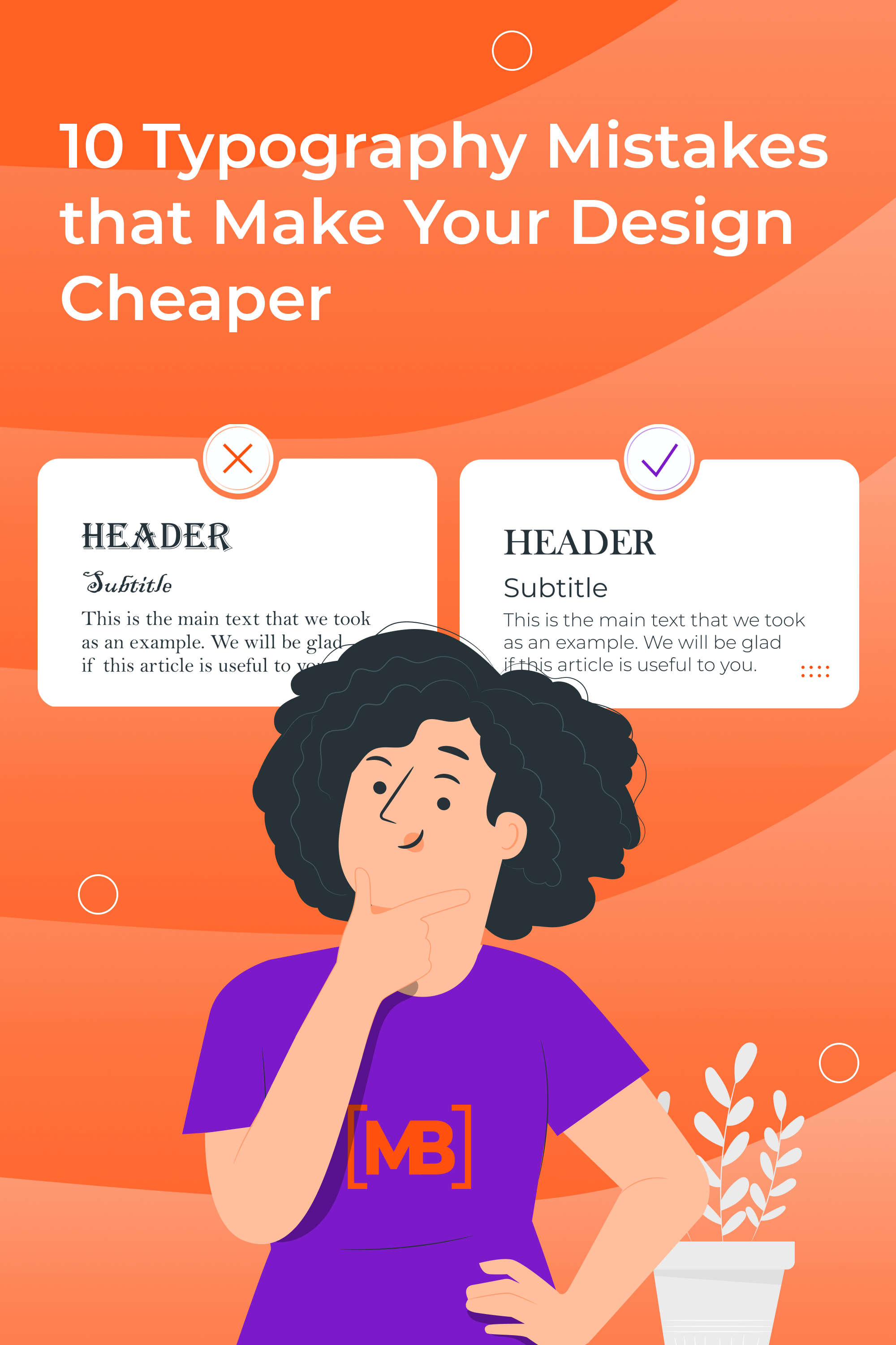
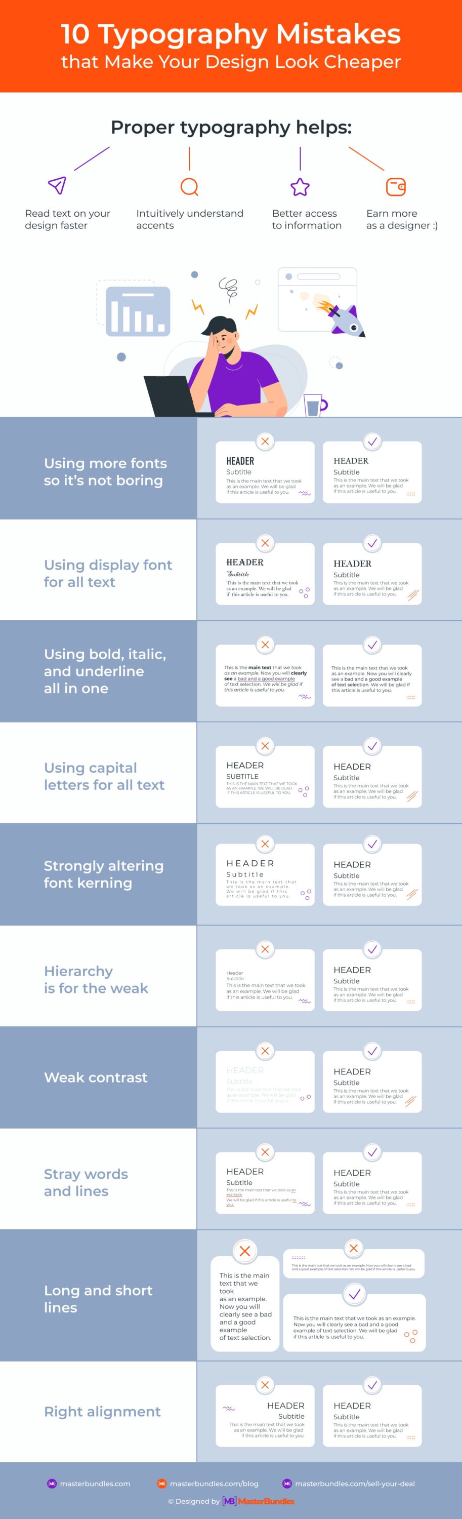
10 Typography Mistakes that Make Your Design Cheaper

It’s no secret that good typography affects the outcome of your work. Good typography not only contributes to the aesthetics of the product but also enhances the user experience. The client will be able to read the text faster, intuitively understand the accents, and be better oriented in the information.
Let’s figure out what these errors are and how to fix them.
Using more fonts so it’s not boring
Aspiring designers often think that if you use a big variety of different fonts, you will achieve a cool design. Actually, it works the other way around.
Using a large number of fonts spoils the visual image, creates visual noise and harms the user experience. A person simply cannot concentrate and perceive information holistically with such distractions.
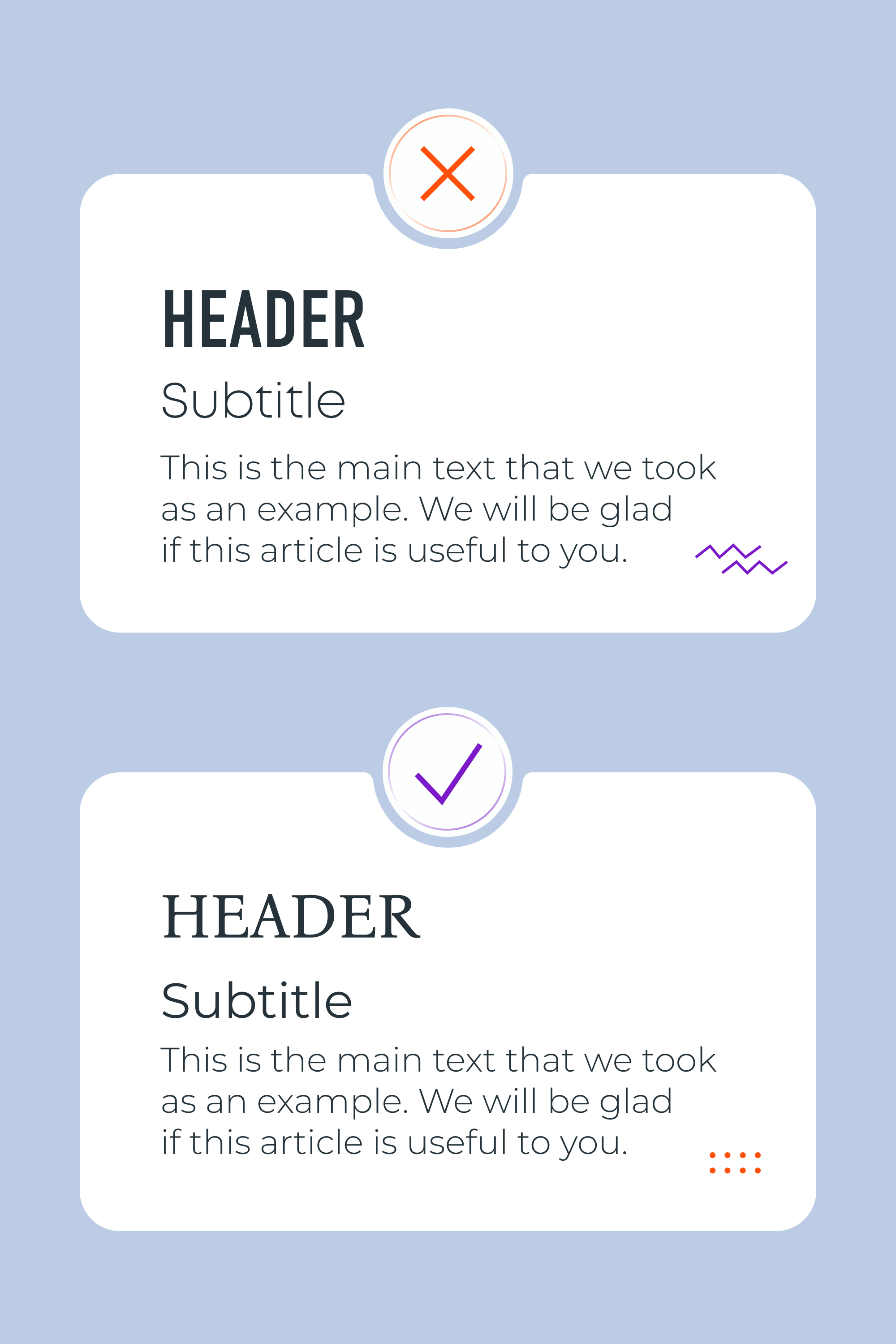
Choose a maximum of 2 fonts for your projects. For example, use the first font for the headings and the second font for the main body text. You may also choose to use a single font and its different styles for accenting headings, captions, etc. — this also looks really cool.
Using display font for all text
Is there a temptation to choose an unusual font for the heading and then decide to use it for ALL of the text? Do you never want to be online again?:) This might happen if you choose wrong. In your head, the fancy font you picked out looks like a cool unique design with a twist, but in fact, it is a non-working design. Our brain thinks it’s too complicated and we just don’t want to interact with bad typography when viewing websites, banners, menus, etc.
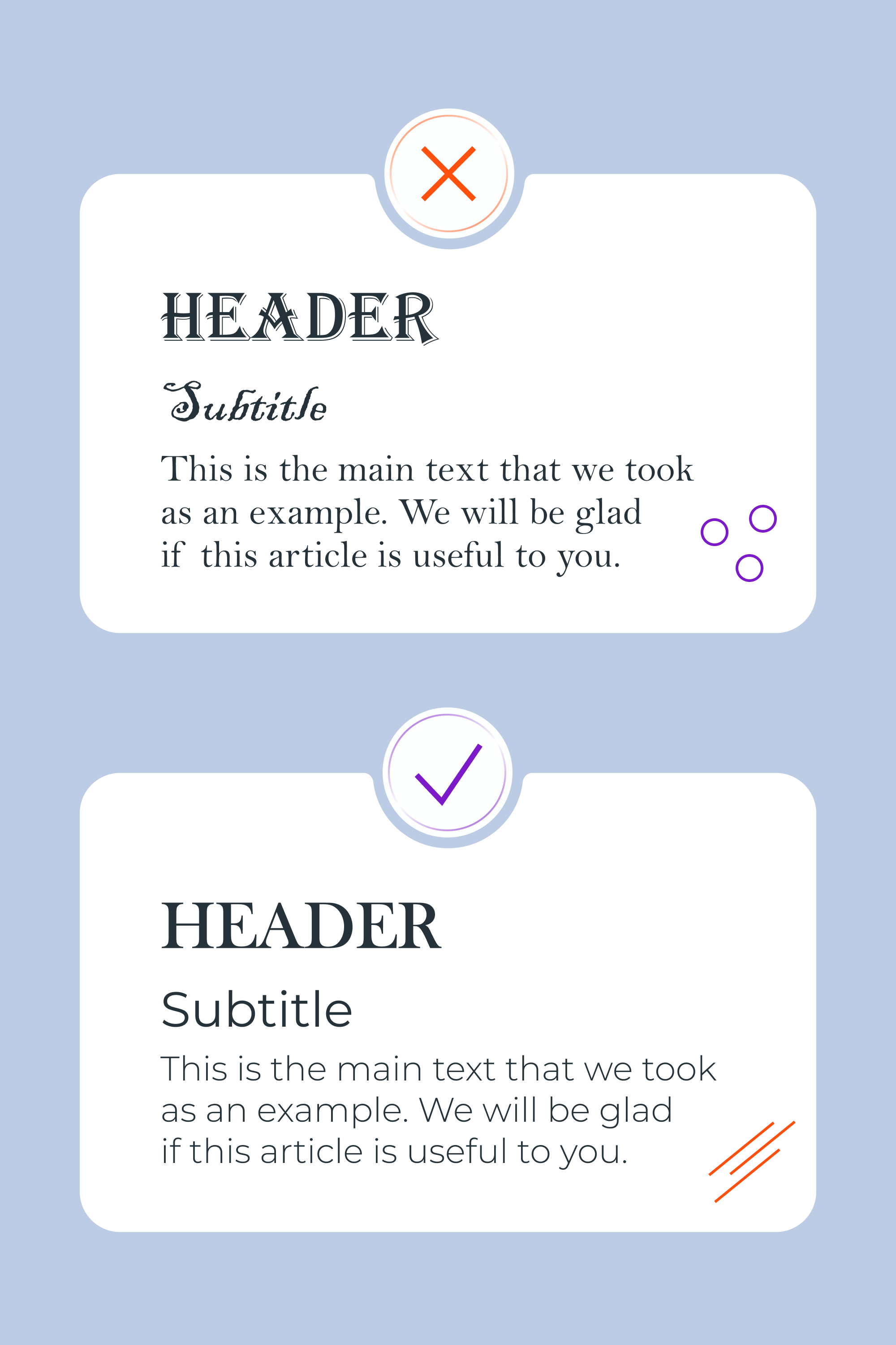
Use just one nice display font for titles or headings, and then choose an easy-to-read font for the main body text. Simple fonts are still in vogue. For example Bodoni, Helvetica, Open Sans, Montserrat, Inter, Circe, and the like are all good choices.
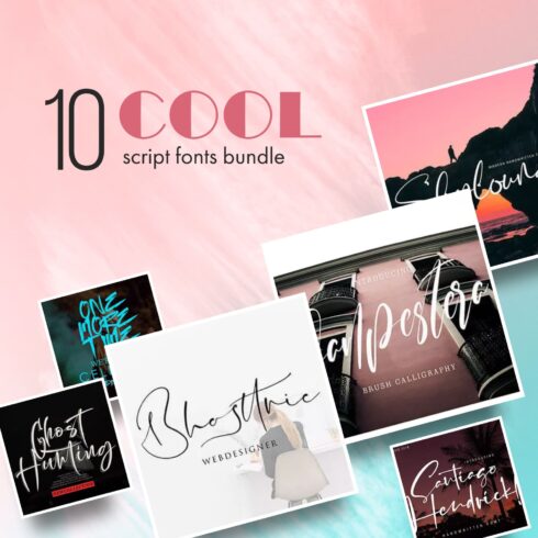
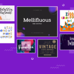
If you’re looking for new fonts for your projects, we have 1500+ fonts to offer to you! There are both premium and free options, and there are often discounts up to 90% off premium fonts. You can find a font for any project and style, so save yourself the time looking any further and check out this link.
Using bold, italic, and underline all in one
Here is one of the most common bad examples of typography. We tried to show what the text looks like when a designer chooses all the available options. Don’t you agree that it looks bad and incomprehensible?
When working with text that requires emphasizing, keep in mind that the highlighted areas will direct the user to the most important information. Your goal is to encourage a desired target action. You may choose to use bold lettering, or underline an important statement, or maybe use italics, but don’t emphasize everything. If you highlight everything, then you have highlighted nothing.
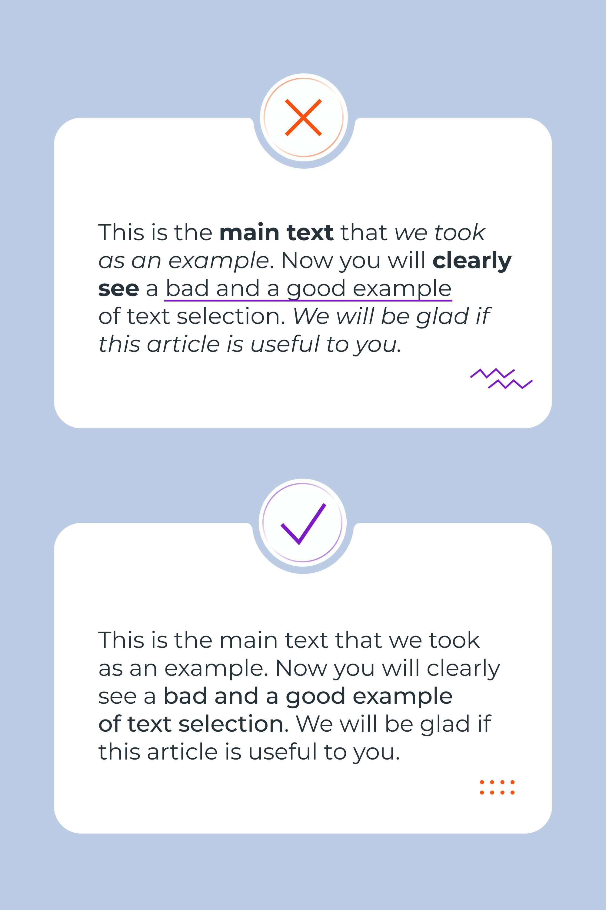
Use underlining, bold, or italics to highlight just the most important words or phrases and you’ll be fine. Think about what words you want to stand out the most and leave everything else alone. An exception may be a quotation, which can be written entirely in italics. After all, we highlight it this way to separate it from the rest of the text.
Using capital letters for all text
Highlighting all text in capital letters is a bad idea if you have a large amount of text in your project. Doing this will be inconvenient for the readers because using all caps on a large area of text makes reading difficult.
In addition, the frequent use of capital letters makes us feel like we are being shouted at, and we don’t need such an effect in the design.
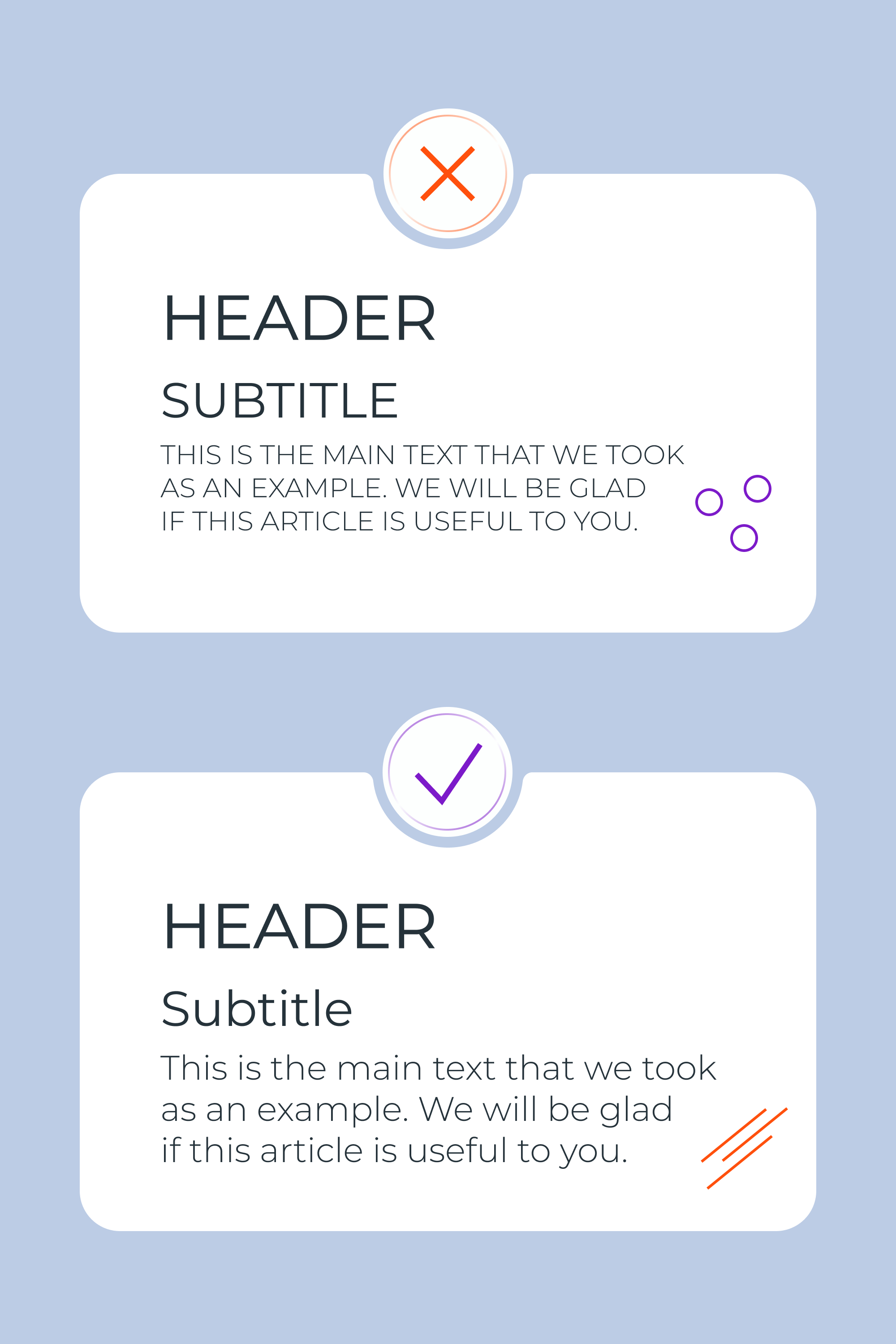
But it’s not always the case. Sometimes your design might call for the emphasis that capital lettering brings, or perhaps it’s just the right project for this emphasis style. For example, in a restaurant menu, most of the text can be written in capital letters, and this will look normal.
Most often, you should use capital letters only for titles.
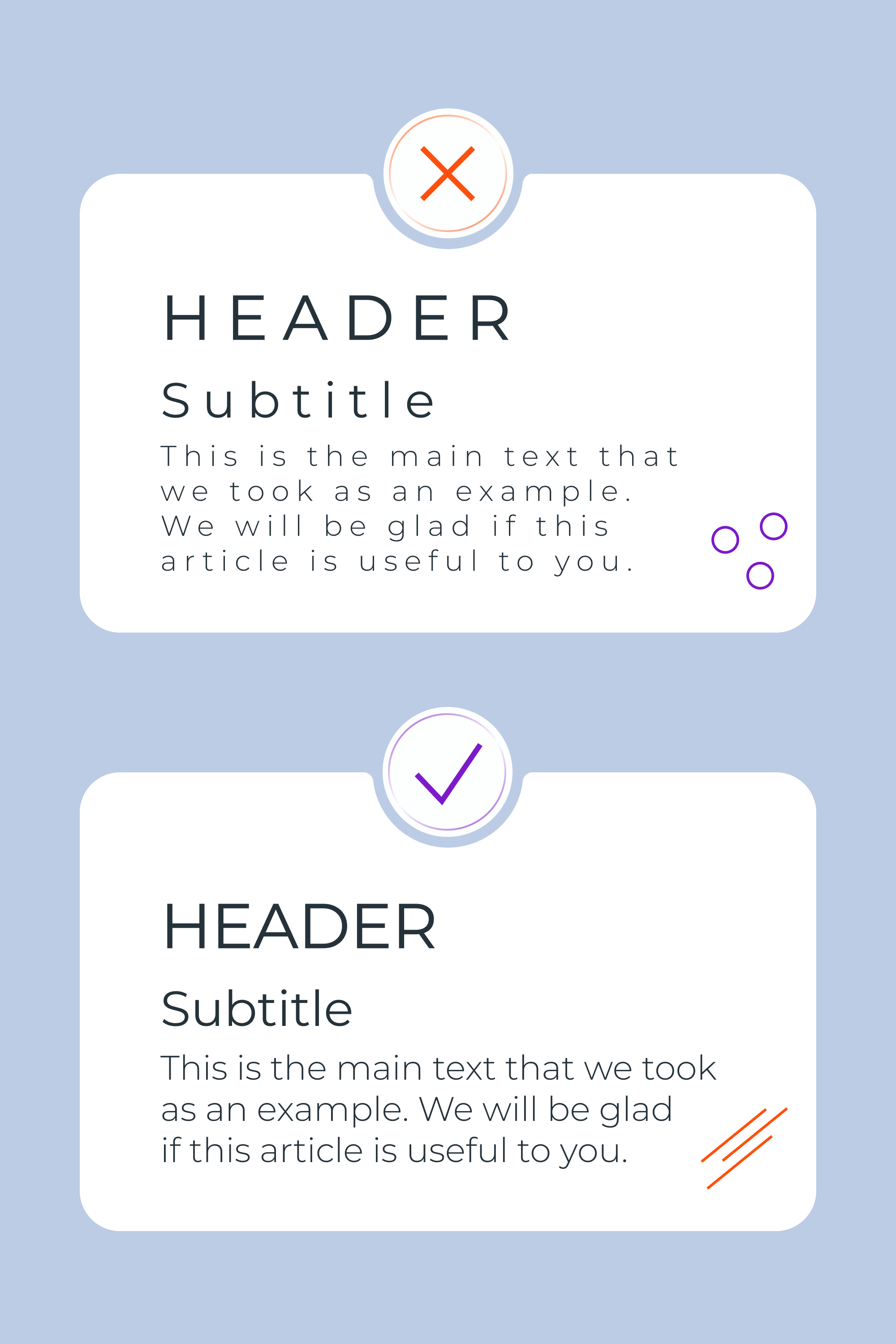
Strongly altering font kerning
The creators of each font typically work it out so that everything looks harmonious. Please trust the creators and do not disturb this balance. Changing the original kerning in most cases leads to sloppy and difficult-to-read text.
Although it happens that kerning can be slightly tweaked if it is directly necessary, and often this is only for caps names, the main thing is that these kinds of adjustments should be done in moderation.
If you belong to the category of font creators, then you yourself understand this rule. By the way, MasterBundles has cool conditions for selling fonts and other designs, so join us. We offer easy process of uploading the works to the platform, fast payouts, and sometimes promote the coolest works. Using the Sell Your Deal form, you can upload your work in 5 minutes.

Hierarchy is for the weak
Hierarchy in the text is required. The use of headings and structure helps the user quickly and conveniently find the information he needs. Have you ever visited a website and found just a long sheet of plain text? If yes, what did you do? With a probability of 99.9%, you simply closed the page. If there had been a division of the page into H1, H2, H3 … the main text, then you would have likely stayed there to scan through the information and maybe even found what you were looking for.

This rule works not only for websites but for any kind of design. To avoid this error break the text into parts and gradually reduce the font size. In this case, H1 will be the largest and body text the smallest in this hierarchy.
Weak contrast
Dull typography = bad typography. If the user needs to strain their eyesight to read the text on a banner, website, menu, etc., then you’ve lost them.
Also, typography without contrast does not attract attention and it is more likely that it will not be noticed by the target audience at all. Your design will not create any interest or solve any problems. In fact, it will be so plain and boring that it will just be ignored.
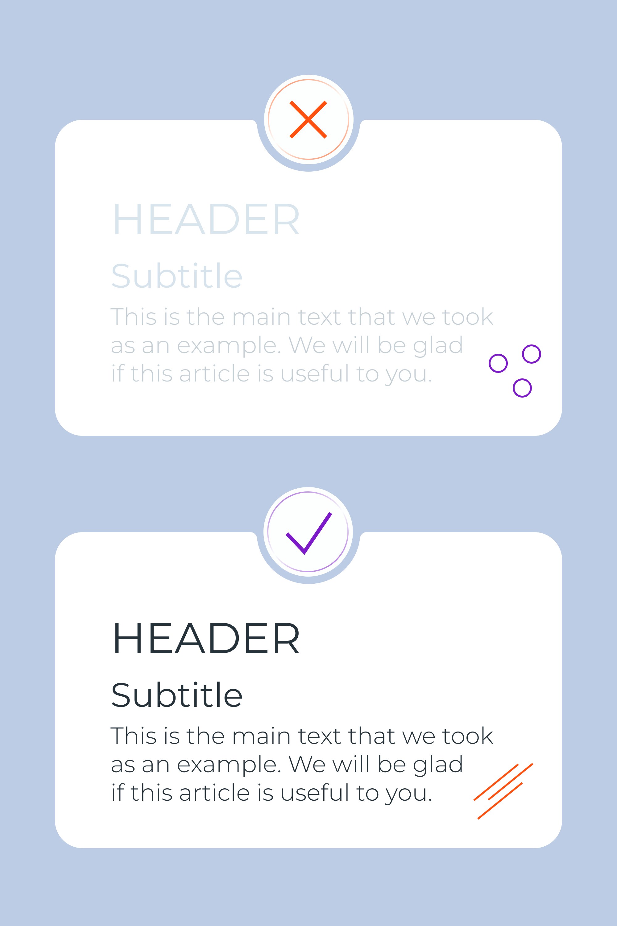
Therefore, choose a color for the font so that it is clearly visible and the text can be easily read. Don’t use bright color combinations for the background and text, as this also spoils the visual picture. Also, black #000000 is better replaced with dark gray shades so that the contrast is more pleasing to the human eye.
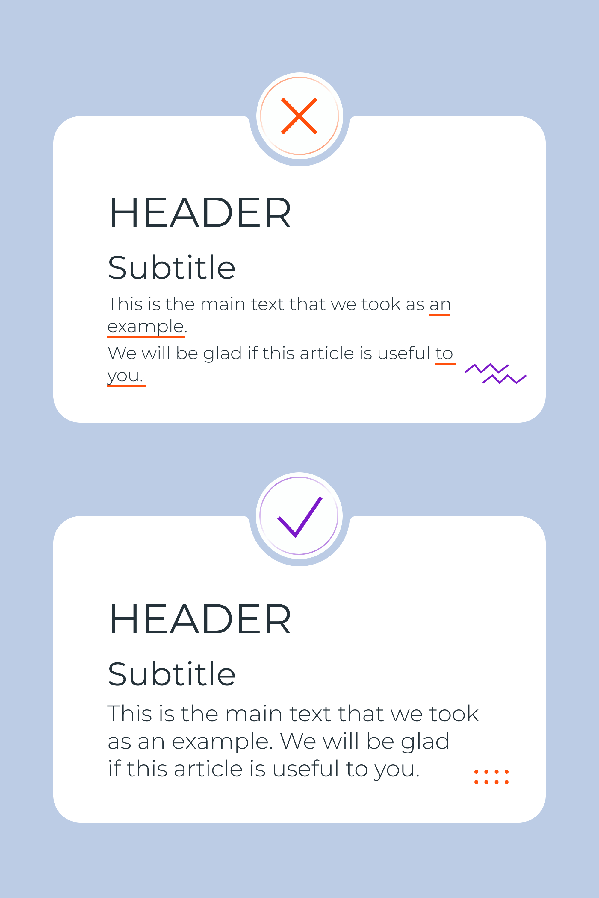
Stray words and lines
When working with text, make sure that there is no preposition left at the end of the line or that a word is not carried over to the next line. Just remember this rule and your design will instantly become cleaner and easier to read. This is the skill of a professional!
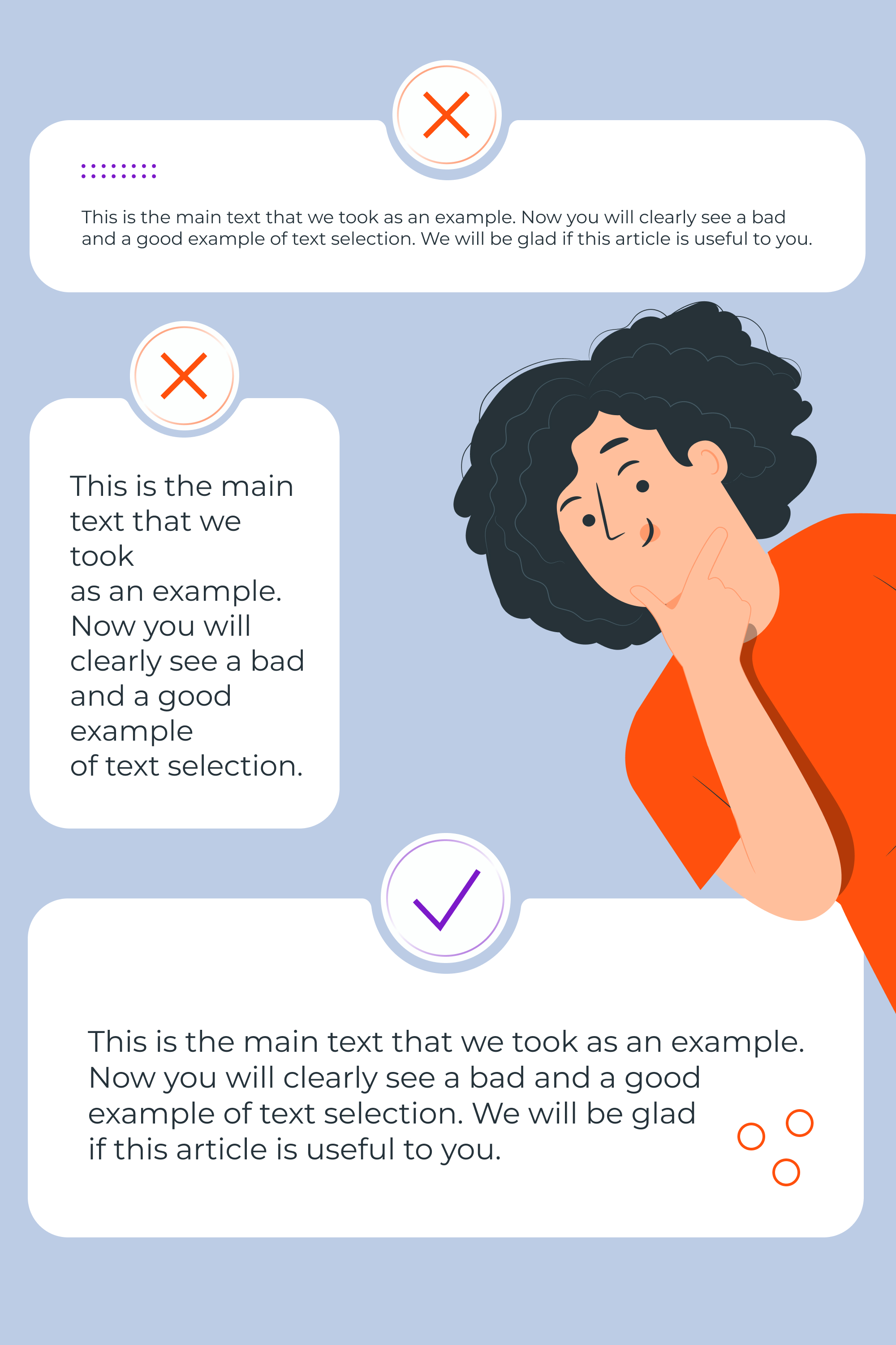
Long and short lines
Lines that are too short make the text stretch down a lot, and long lines make people too tired to read everything. So try to do something in between so that the user doesn’t have time to get bored while reading.
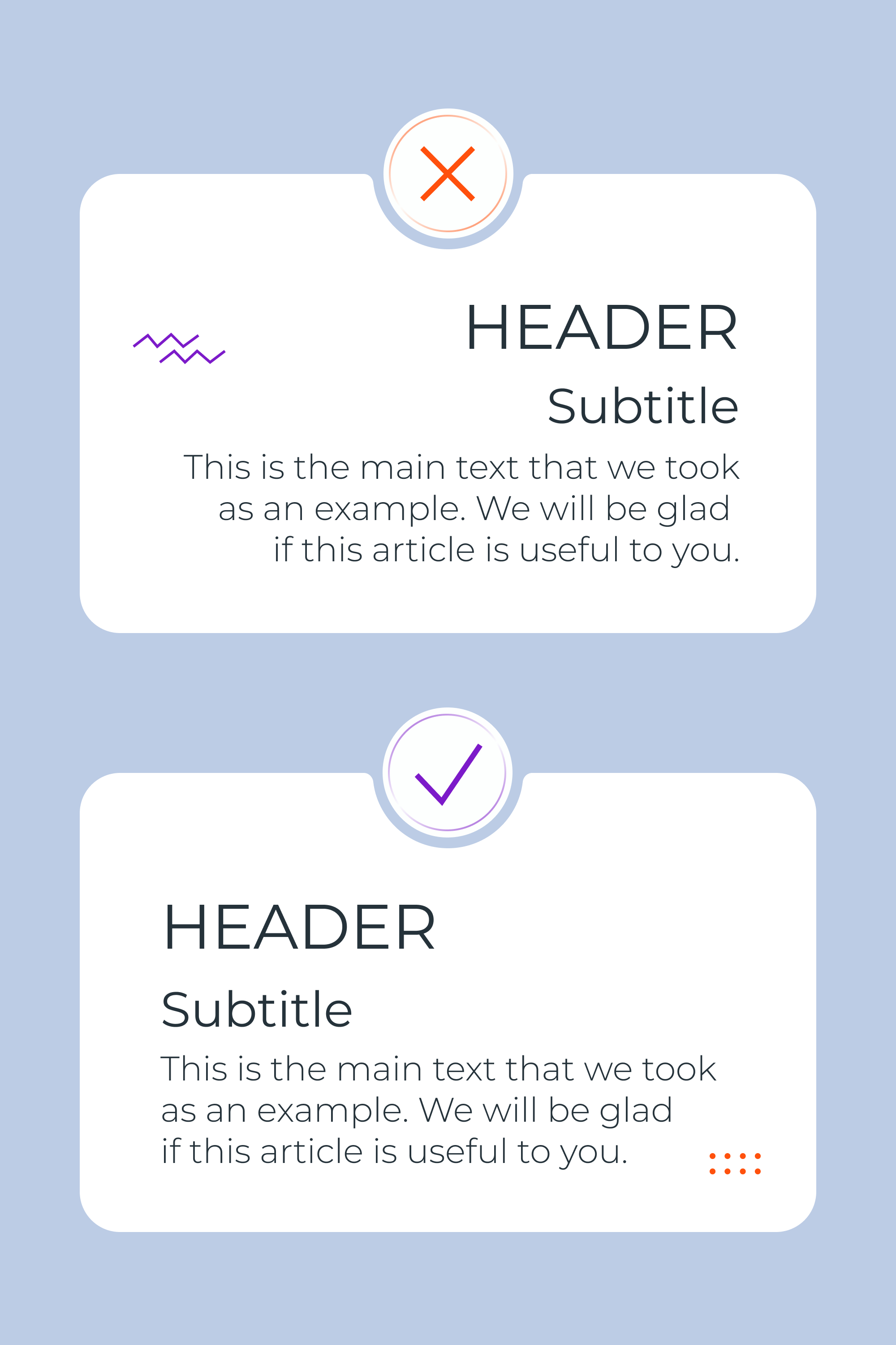
Right alignment
In most countries, people read from left to right, which means the left-aligned text is better perceived. Sometimes you can use center alignment to highlight quotes or some words for emphasis. It is recommended to avoid right-aligned text 🙂
10 Typography Mistakes that Make Your Design Cheaper in Infographic
Conclusion
Thanks for reading this article. Now you know what kinds of subtleties to look for when creating a design. It’s okay if you can’t keep track of everything at once (especially prepositions — they’re tricky). Don’t despair and continue to do your best work, and if you forgot something, then return to this article. Save yourself some good and bad examples of typography so that you have something to build on.
Some Awesome Videos About Typography
10 Typography Mistakes that Make Your Design Look Cheaper
More articles: https://masterbundles.com/blog/
Graphic design bundles: https://masterbundles.com/
6 Typography Golden Rules (NEED TO KNOW)
Do you understand the basic rules of typography layout and size? In todays video tutorial, I have 6 golden rules for typography in graphic design, but also a couple bonus tips at the very end. And on top of that, there is even a quiz to test your knowledge on the content in todays typography video.
Graphic Design Tutorial: Typography Design & Art Direction pt. 1
What makes for good type, layout and design? How can you art direct a designer when it comes to typography. Are there any examples or tutorials on critiquing typography for something with a lot of type?
Best Related Articles


FAQ
What should you avoid in typography?
We recommend avoiding the mistakes that were written about in the article — incorrect use of fonts, kerning changes, lack of hierarchy, lack of contrast in the text, and excessive selection of text.
Which is the most common mistake made in typesetting?
In our opinion, it is the use of a large number of fonts in a project.
What are the 6 golden rules for typography?
- Use 1-2 fonts per project.
- Respect the hierarchy.
- Don’t use Caps Lock for body text.
- Watch the length of the lines so that they are not too long and not too short. The optimal line length for desktop sites is 40-70 characters.
- Highlight important points in the text, but don’t overdo them.
- Avoid hanging prepositions and lines.
What are the consequences of the incorrect use of typography when writing text?
This leads to the fact that a potential client will skip over or close a site or not take the targeted action that needs to be completed. After all, design should help solve the problems of the client, and bad typography interferes with this.
- really bad websites
What are your concerns?
Thanks for your response!
Disclosure: MasterBundles website page may contain advertising materials that may lead to us receiving a commission fee if you purchase a product. However, this does not affect our opinion of the product in any way and we do not receive any bonuses for positive or negative ratings.