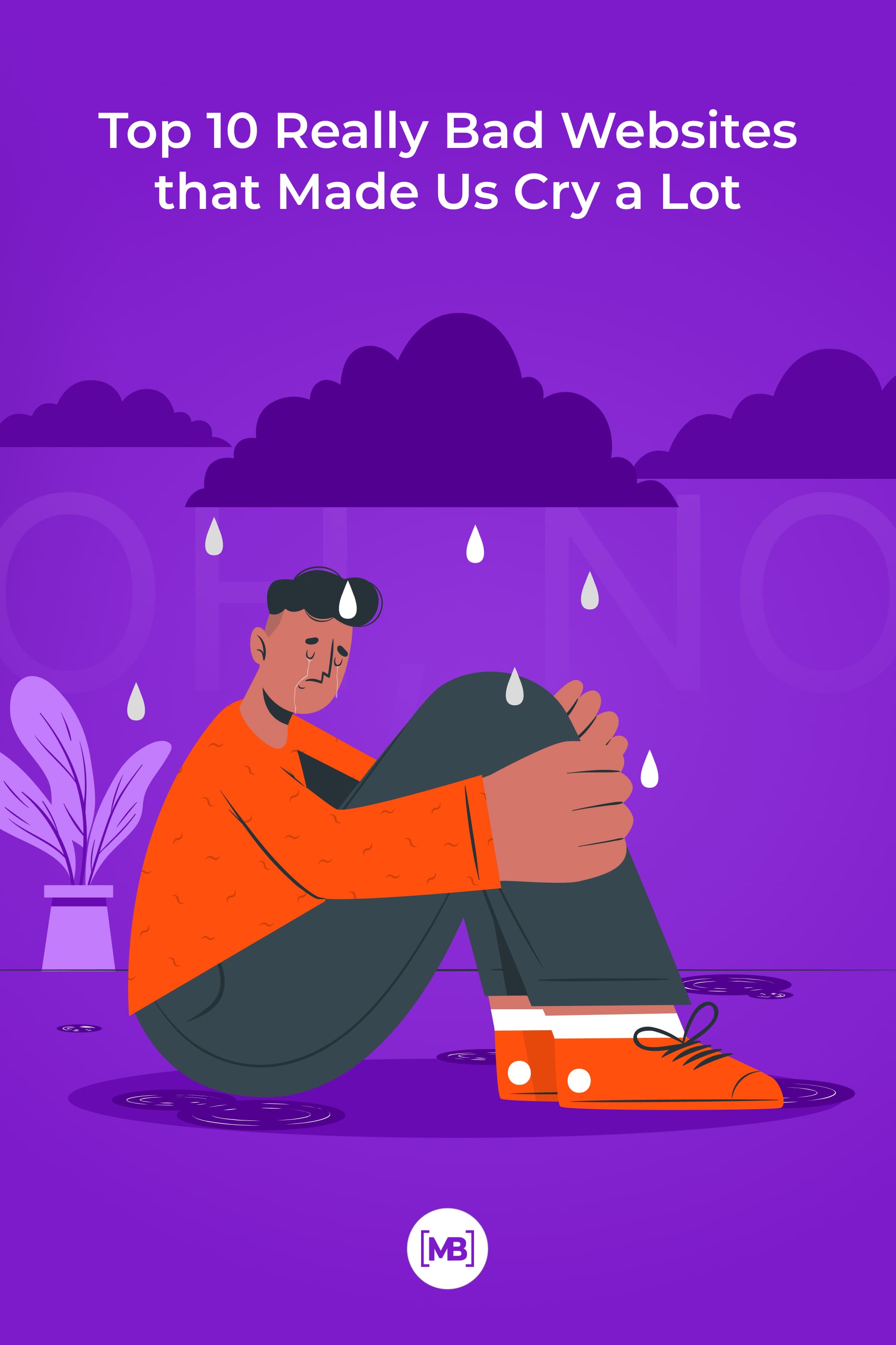
Top 10 Really Bad Websites That Made Designers Sad In 2022 [And Ways To Fix Them]
Do you want to learn how not to design websites? Then keep reading. With some examples of really bad websites designs, we will show you what common mistakes UX/UI designers make. This article is a dialogue between you and me, so feel free to write your opinion in the comments.
Important: We do not criticize, mock, or discuss the site’s content, branding, or owners. We give recommendations on how to improve the design, so no bullying:)
Diller Scofidio + Renfro
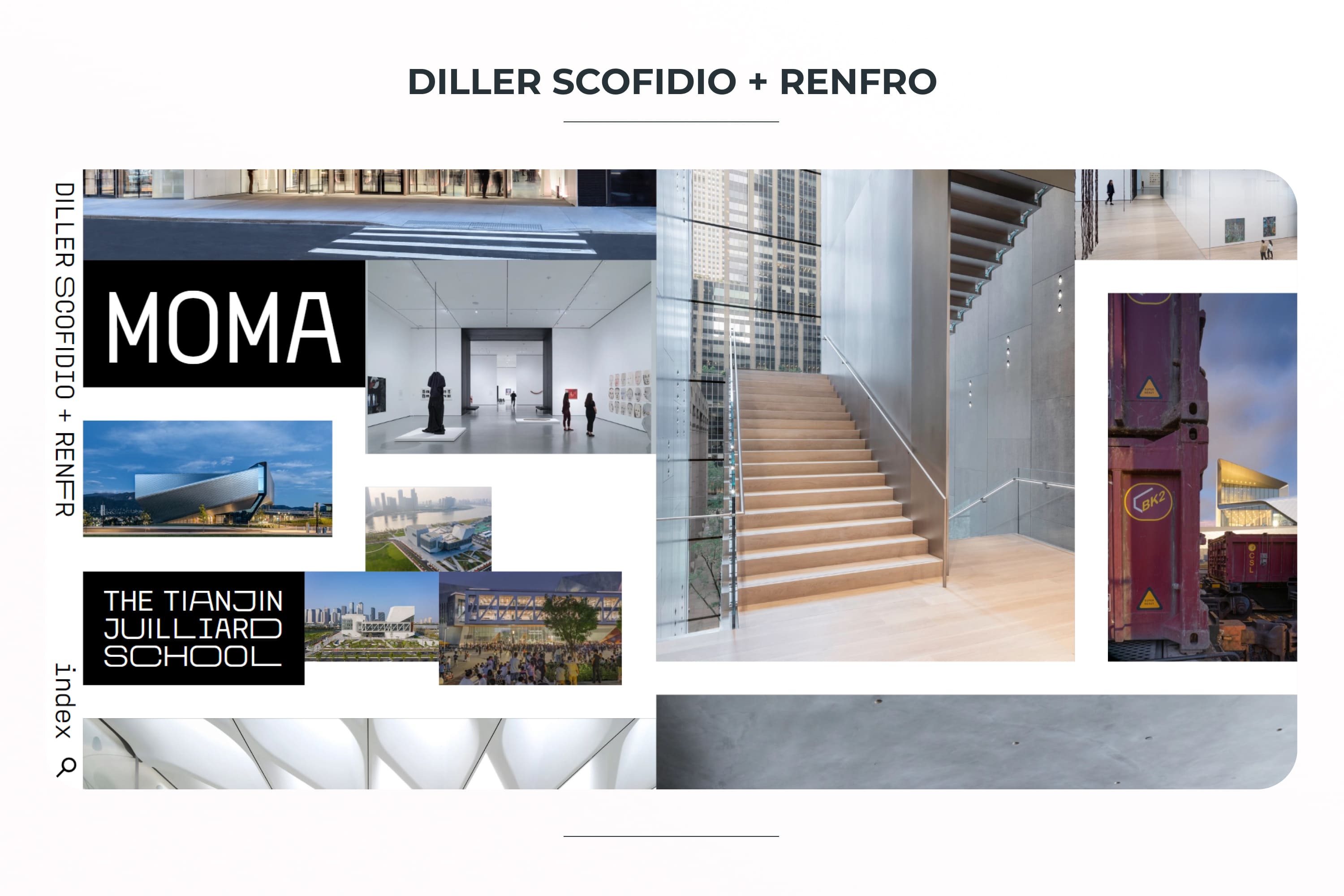
We clearly see a design in the style of brutalism and it will not be the only one in the selection. Indeed, this site stands out for its uniqueness, but for a simple user, it is a brain explosion.
What’s stopping you from accepting it? Chaotic arrangement of elements, lack of normal navigation, difficult to read phrases. To go somewhere, the user needs to guess that he needs to click on the desired image. It’s not user-friendly at all. In this case, it is worth learning more about the psychology of user behavior on the site. This will help make a stronger design.
What can you do if you want to keep this style? I would suggest making the site navigation at the top of the page for quick access. It would also be cool to add tips on how to use the site. Then such a strange design could become a cool feature and make the user stay on the site longer because of interest. It is also worth removing huge empty spaces and thinking about more readable fonts.

Berkshire Hathaway Inc.
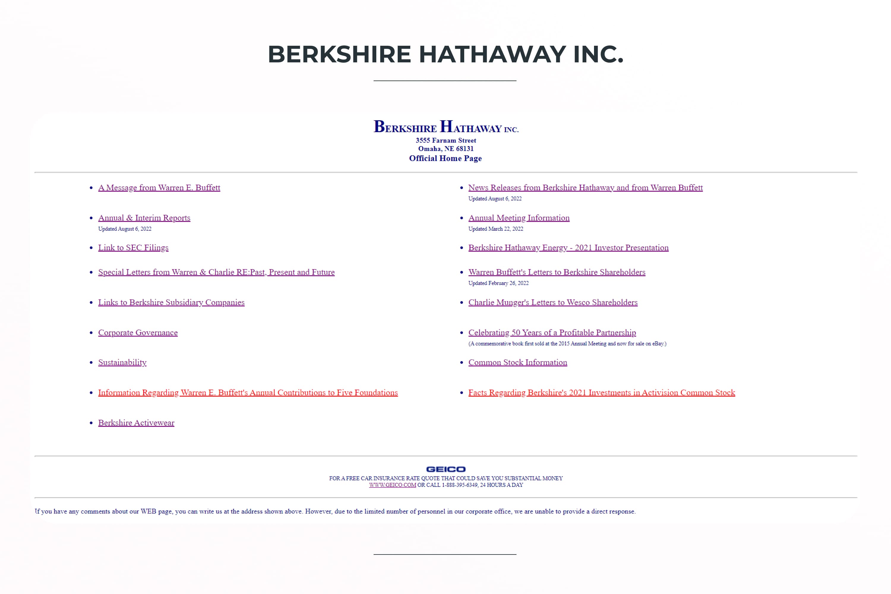
This site looks like it’s crashed and the styles aren’t loading. The user sees only links on a light background. Not enough for a pleasant experience of staying on the site. So, it is on the list of bad looking websites.
When you visit the site, it is difficult to understand what the company does. This means that it will be more difficult for the user to realize the value of its services. Perhaps the authors wanted to show that only the essence is important to them, and not the cover. But in 2022, even this message could be organized more attractively.
How can this be fixed? Add photos/pictures that will immediately be associated with the activity or the company itself. Also, make sections on the main page blocks. The top information with name and address can be written on one line separated by vertical lines.
Pacific Northwest X-Ray
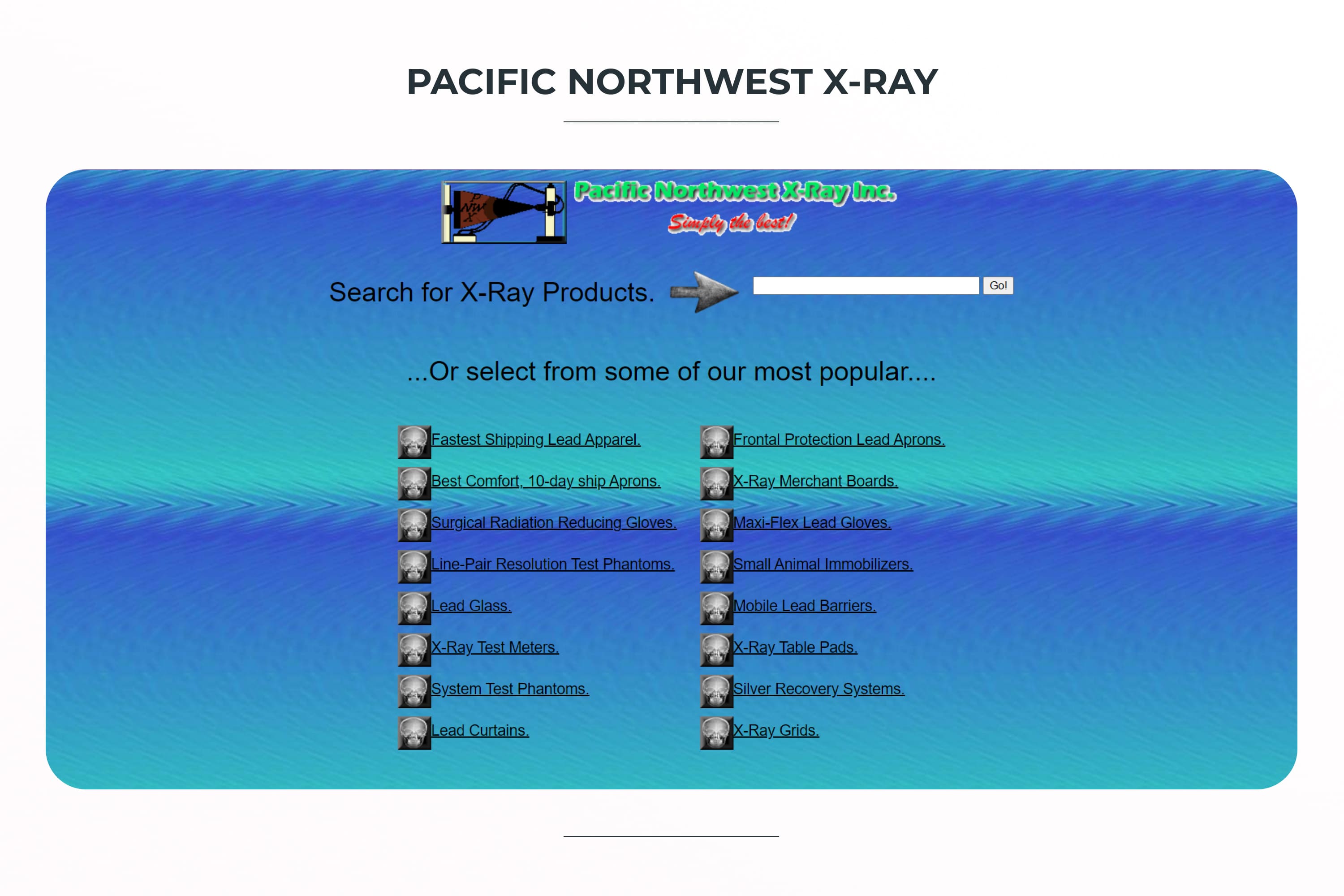
This design deservedly appeared on our list of ugly websites. It violates the rules of composition, color combinations, and typography. It looks like we dug it up from the 00s.
Let’s now take a closer look at the problems and think about how to fix them. First, the problem with colors immediately catches the eye. It is worth replacing the background with a plain or light gradient because these small waves are distracting and make it difficult to read the text. The upper part of the site should be put in order and made white, for example. But if they should stay green and red, then make the background white.
Secondly, problems with typography must be solved. It is necessary to return the hierarchy to the text, decorate the text according to the hierarchy, and put indents in order. This will make the page look more organic.
Seems like the website sells goods. Therefore, it is better to place product photos on the main page. That way, the user will immediately understand what kind of site it is and what they can find here.
Of course, it is worth removing these incomprehensible images of skulls. Why are they here?
007 Museum
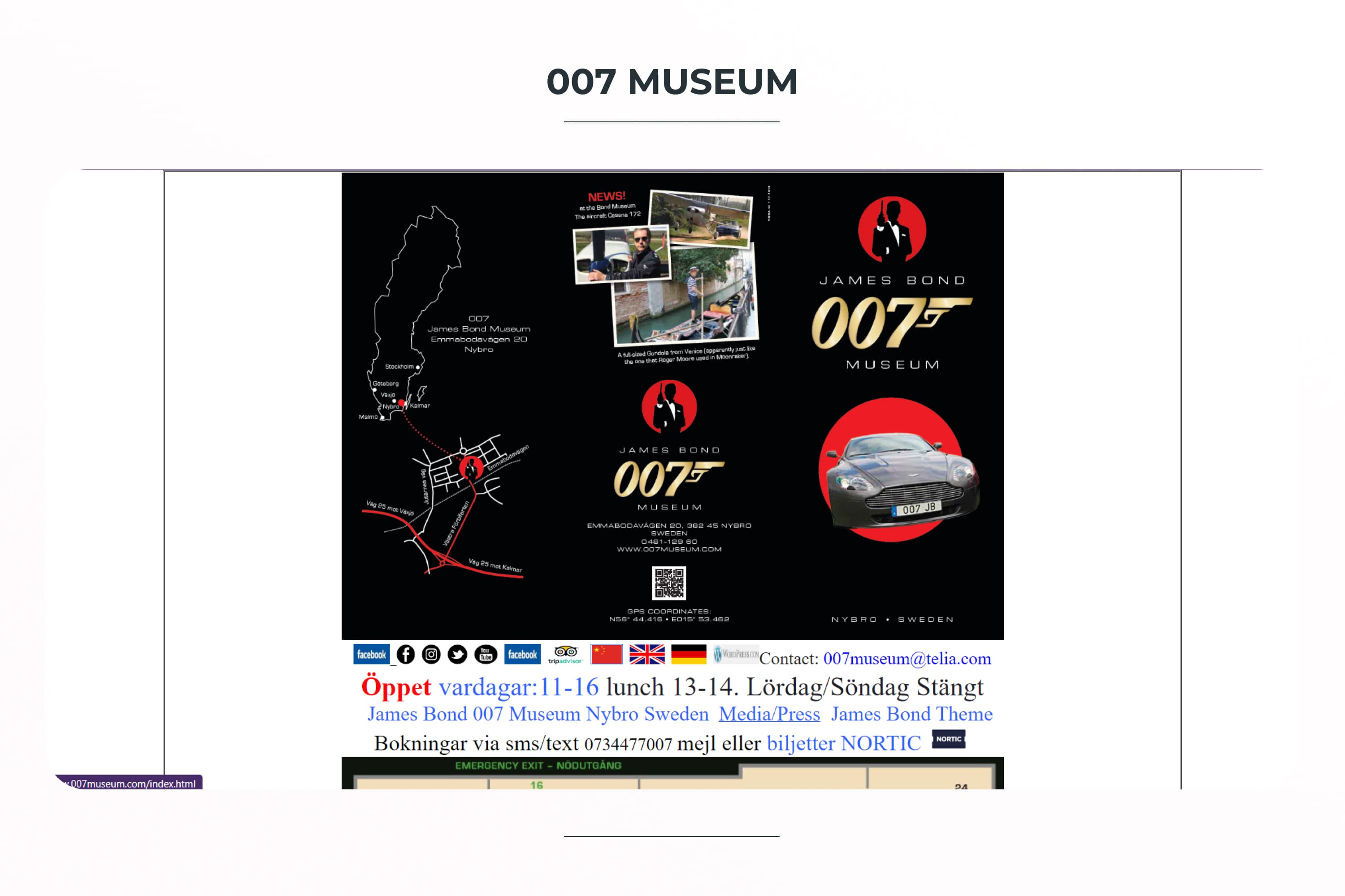
Secret agents, luxurious living, challenging missions — all this could be interesting to convey in the site design for the 007 Museum. But Agent Bond fans may be upset because this is one of the world’s worst website designs.
What’s wrong here? Let’s start with page sizes. Something went wrong during the layout, so the page scrolls to the right — it shouldn’t be like that. And, it looks like they used images of their marketing brochure for the main page design. A fresh, new design should be made that is sized right and laid out in a proper way.
Again we see chaos in the arrangement of elements — different sizes, heights, and indents. This complicates the perception and causes a feeling: “What’s wrong with you?” 🙂 They need to be structured and put in order. If there was supposed to be brutalism here, then the designer needs to choose other references of this style and use better pictures for the main collage.
I would also suggest adjusting the fonts and padding between elements. The text is pressed tightly against the top side of the block and because of this, it is hard to perceive it. It seems to me that it is better to redo it than to fix it. What do you think?
Yale School of Art
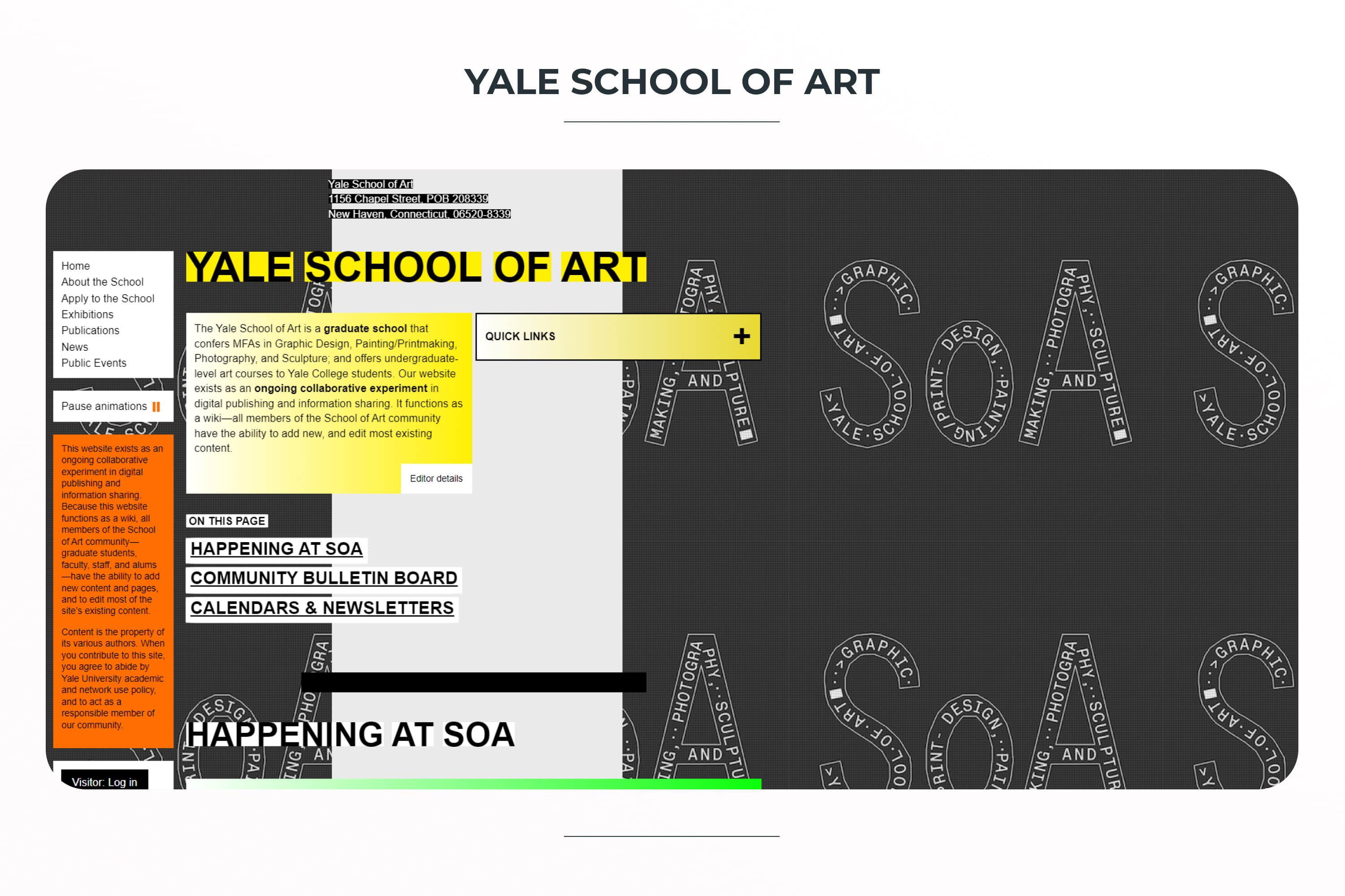
Although this one is on our list of the worst websites in the world, it is quite famous as a representative of brutalism. It is a controversial decision for an educational teaching website. This site evokes a feeling of chaos and misunderstanding, although with this design they wanted to convey the versatility of art and the ability to create within the walls of spruce.
At the same time, navigation is immediately visible, and potential students and parents should find information about training.
There is a full set of problems that complicate the understanding of the user. Most of the text is too small and hard to read. Too many text background elements also make it hard to read, such as black text on an orange background. Our vision is not very happy with such a design decision.
Designers did not use the right half of the page, so you have to scroll a lot. Using the whole page size would improve the situation.
Such an unusual design could be changed to more familiar visuals used for educational sites. It is possible to choose a more user-friendly direction of brutalism, for example, like Figma’s site.
Chester Tourist
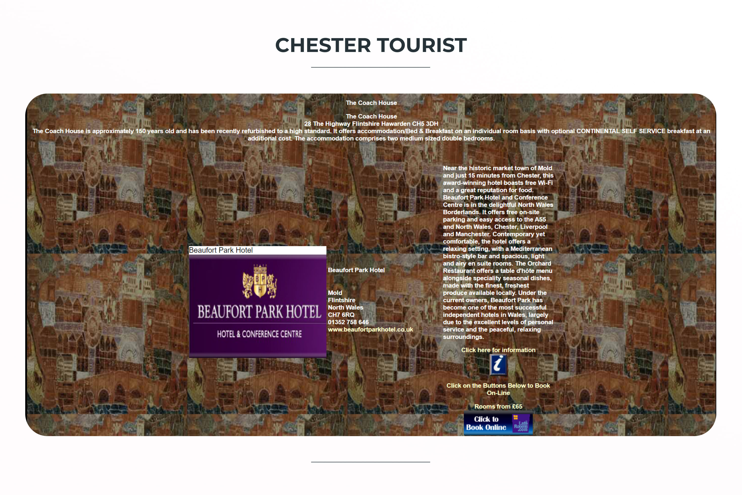
If you want to cry over design, then these messy websites will give you something to cry about. I will be brief — the background with illustrations is cool, but only as a single insert or highlight in the design. In this implementation, it’s terrible – white text on a colored background is absolutely unreadable.
Also, the central composition made this site very long and left a huge amount of wasted space.
I would recommend:
- break down information into blocks and categories
- make easy navigation at the top
- use more space
- make a website in a minimalist style on a light background
Bear Springs Blossom
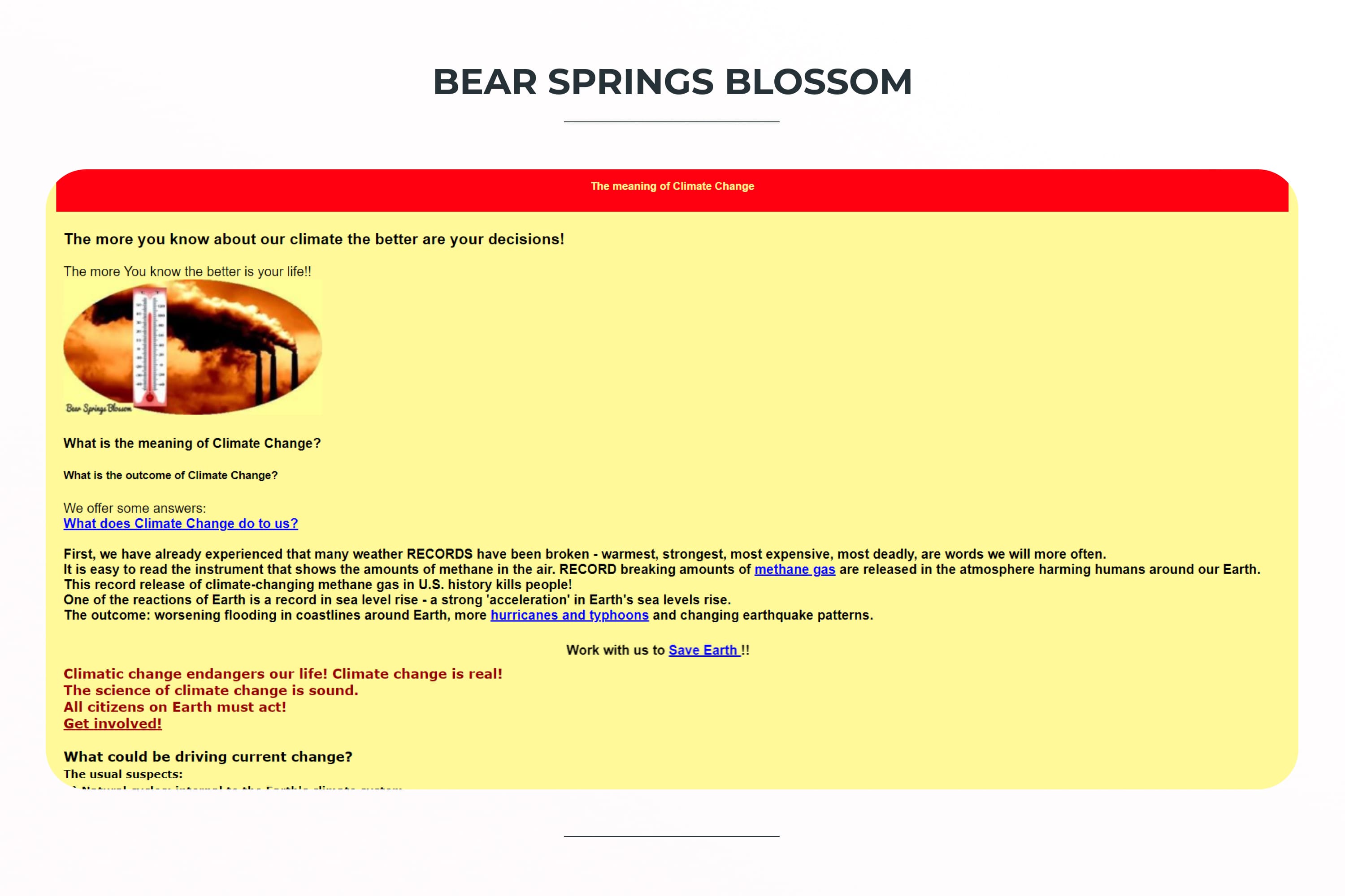
This site is about a very urgent problem of mankind — global warming. But people won’t watch or read it because it’s one of the world’s worst websites.
The combination of colors simply does not allow you to look at the page for a long time. Bright blue text on a bright yellow background is not the most pleasant combination for perception.
There is no structure and hierarchy here either, so it’s hard to catch your eye on something. And if you want to look at the pictures, they are of terrible quality and different sizes and shapes. All this negatively affects the user experience.
I would recommend correcting these points and bringing this important information to society in a better way.
Trackybirthday
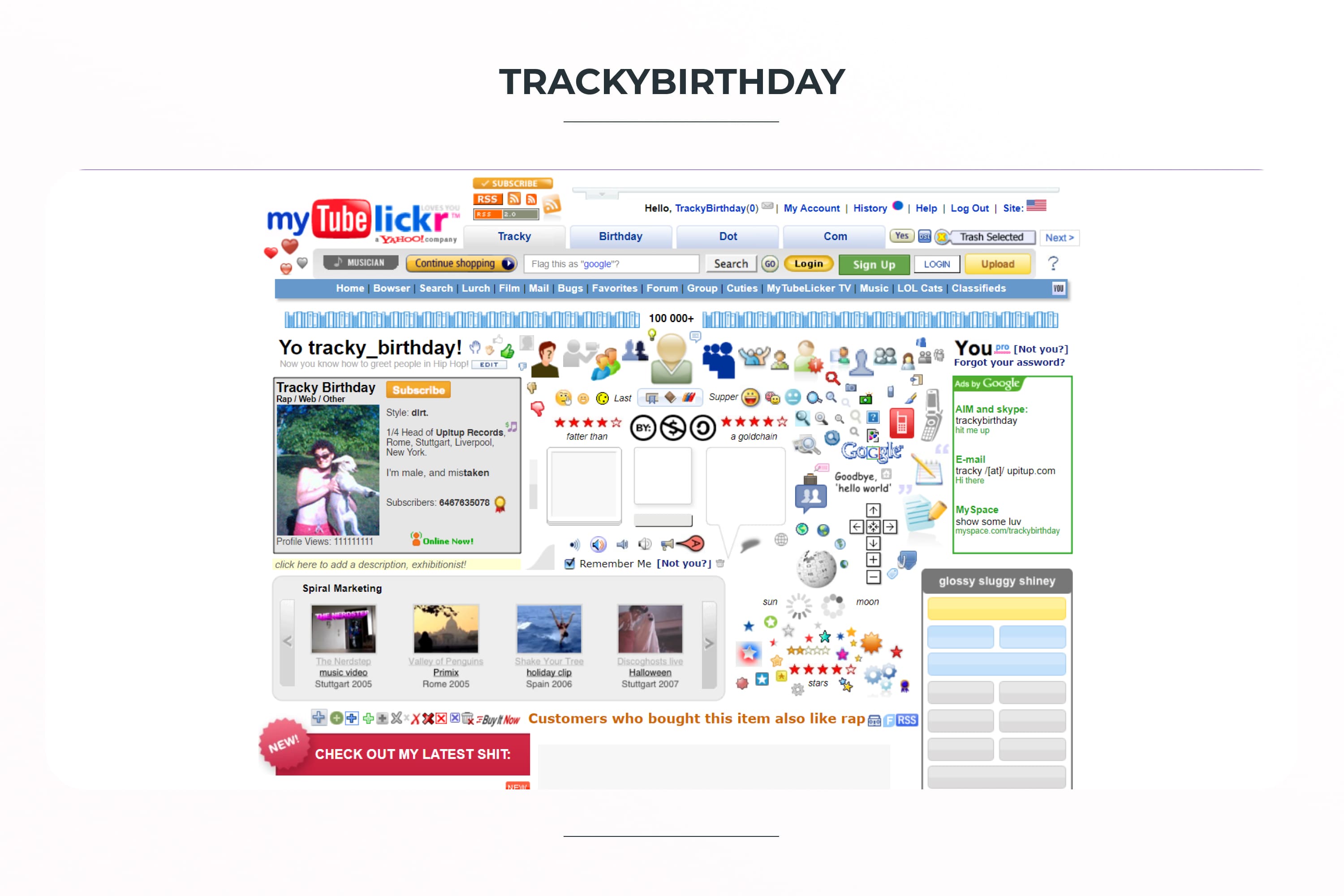
This is one of the most cluttered websites I have ever seen in my life. Nothing is clear on the site, there are too many different elements, and the page below does not load at all.
This site can no longer be saved. You just need to create a new design. By the way, do you understand what this site is for? I don’t 🙂
Arngren

Here’s another cluttered site. It’s clear — its aim is to sell goods. But it doesn’t look user-friendly. Why?
- Scrolling the site page to the right – this is best avoided on sites.
- Necessary site navigation. Very strongly pressed to the left edge, inscriptions of different sizes and colors.
- There are many elements and they are pressed against each other. This makes it difficult to focus on the search.
- Not well thought out UX.
In order for this site to stop causing horror, it is worth working through these moments.
I would recommend focusing on the big players, eBay and Amazon, and see how they are doing.
Hrodc
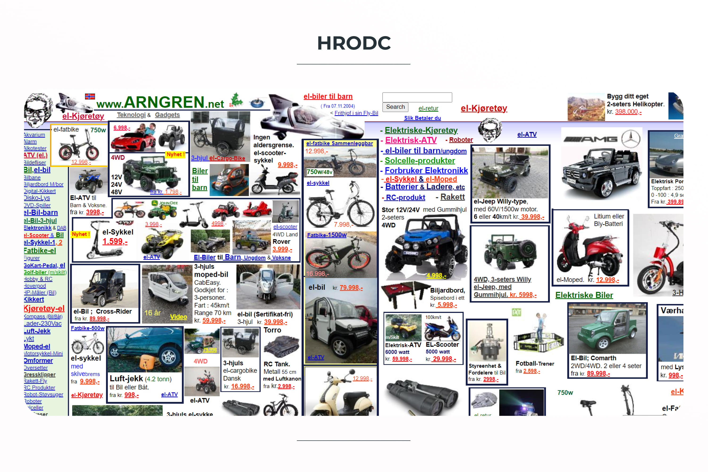
This is a horrible website for the user.
What are the errors that need to be corrected?
- Colors. It is not a good choice to use a bright orange background for the entire site. It can be used to highlight certain blocks on the site, but not for everything. This color for the text is chosen illiterately.
- Header. Incomprehensible beginning of the site. It is better to place navigation here or explain to the user what they will find here.
- Buttons. A terrible combination of colors for buttons and huge fonts on them. In general, it would be better to make categories in blocks with a short description. These buttons look the same, which makes it challenging to find the information you need.
- Footer. It would be cool and convenient to add non-links to information about the company, working conditions, some categories, social networks, etc. For now, it’s just a white rectangle.
- Font. Such a font with strokes and geometric corners is not very readable for all buttons. Also, the font size is too large.
- Inserts with red background. They look very strange here. Golden 3D text is difficult to read on a geometric red background. The text is very large. It’s difficult to read.
What else would you add here?
This is where I decide to finish browsing really bad sites – let your psyche come to its senses 🙂
In order to not create such poor content for our digital world, check out what MasterBundles has for designers. We offer a bunch of cool stuff to help you – icons, site templates, stock content, UI kits, fonts, clipart, and much more. Check out the main page and choose the category you need. Or, you can become our vendor, upload your products and earn passive income!
Article reviewed by

I enjoyed reading this article and I thank the author for producing it. It's a great article, with high-quality images, on what not to do when creating a website. Of course, if you have the budget, I'd usually recommend outsourcing your website design to an agency such as ours, but I can appreciate that sometimes your budget may not allow for this and you may need to do it yourself.
What I really like about this article is the 'how can it be fixed' section underneath each image or example. This is useful because it gives the reader some thoughts on how a professional would go about fixing each website. There's also a direct hyperlink to the website so you can see it for yourself. Also, the length of each of the 10 examples is great because it's not too long or short, which is great to keep a reader entertained but not overly complicated.
In order to improve this article, I would probably start off by talking about why your website is important. For example, your website is the first thing people see so you should consider taking care of it and making sure it's UX-friendly. Also, I would consider putting more real-life examples rather than obviously bad websites as examples. Sometimes, you get websites that look good on the outside but there are issues when scrolling or navigating more. To me, it's obvious that these chosen examples are bad but maybe it would make sense to choose more where it's not as obvious.
What are your concerns?
Thanks for your response!
Disclosure: MasterBundles website page may contain advertising materials that may lead to us receiving a commission fee if you purchase a product. However, this does not affect our opinion of the product in any way and we do not receive any bonuses for positive or negative ratings.