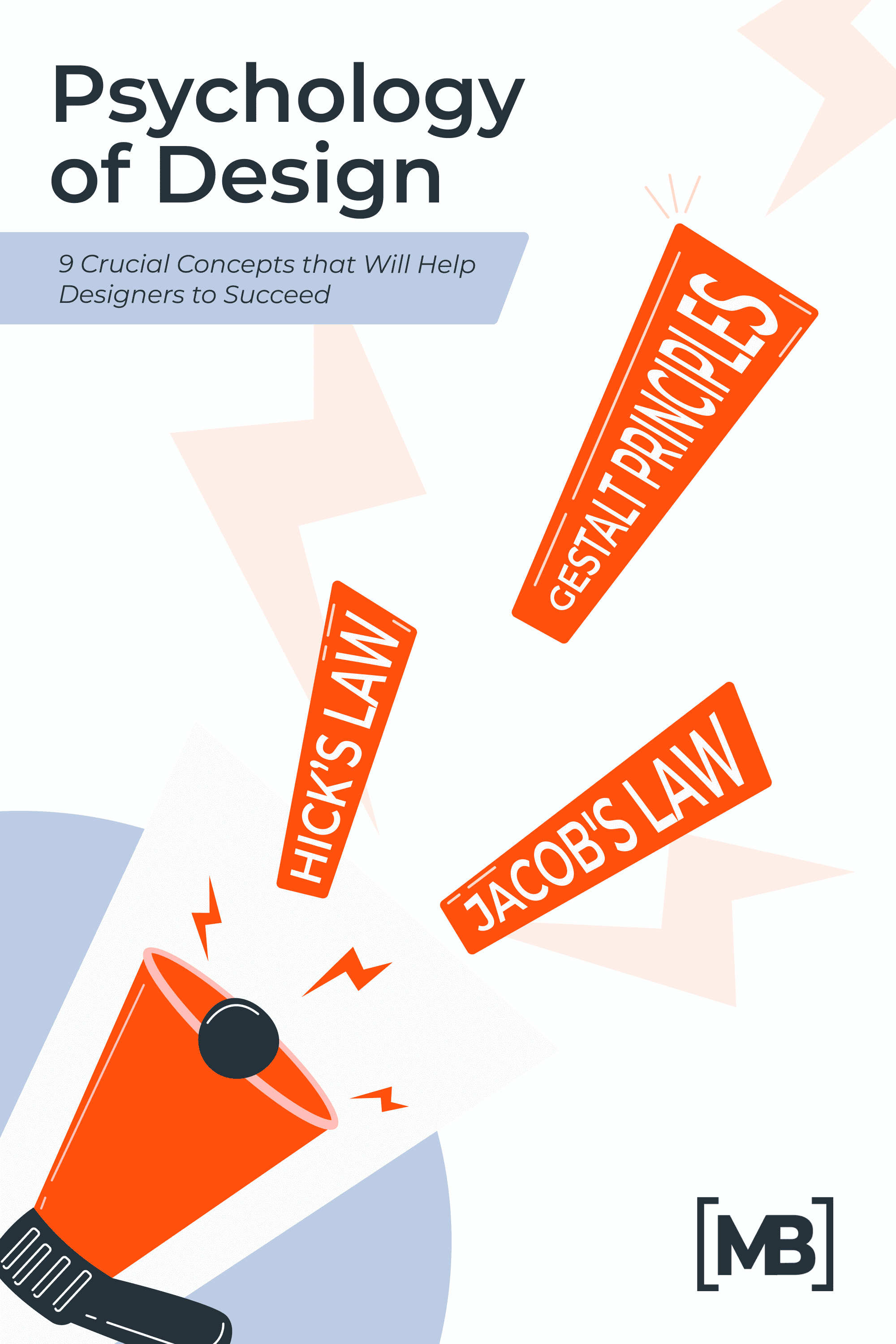
Psychology of Design: 9 Crucial Concepts that Will Help Designers Succeed
If you are reading this article, you are on your way to success in your design career. Knowing psychological principles and the characteristics of human behavior are the key to creating an effective design.
Cognitive psychology encompasses various studies of mental processes such as attention and perception, memory, problem-solving, and creative thinking.
By knowing these psychological tricks, you can create value for your target audience and make sure that users get an unforgettable experience. You can influence the user’s behavior and push him to perform the desired target action.
For example, did you know that people remember experiences as a whole event, not the individual details? Researchers at Tufts University and Brown University conducted an experiment in which they asked participants to draw a penny. It appears to be nothing complicated, but it turned out that the participants in the experiment coped with the task very poorly.
The researchers concluded that people cannot remember anything about an object other than its general value. This is due to such a phenomenon in cognitive psychology as a limited amount of memory.
Similar psychological principles can be useful in design. Want to know more? Read on. To save your time, we gathered the most important information in the infographic at the end of the article – check it out 🙂

How do Graphic Designers Use Psychology?
The user-centric design trend is forcing designers to rethink how they approach their work and delve deeper into understanding the target audience. Donald A. Norman, in his book The Design of Everyday Things, defines design as an act of communication, which means a deep understanding of the target audience.
If you apply psychology in the creative process, the result will be cool because knowledge of psychology helps to create a design that will force users to perform expected actions, such as making a purchase or contacting a team.
Knowing these techniques will help you design more consciously. You will be able to argue your decisions to the customer and look professional to him.
Let’s find out the tips that you can use right now.
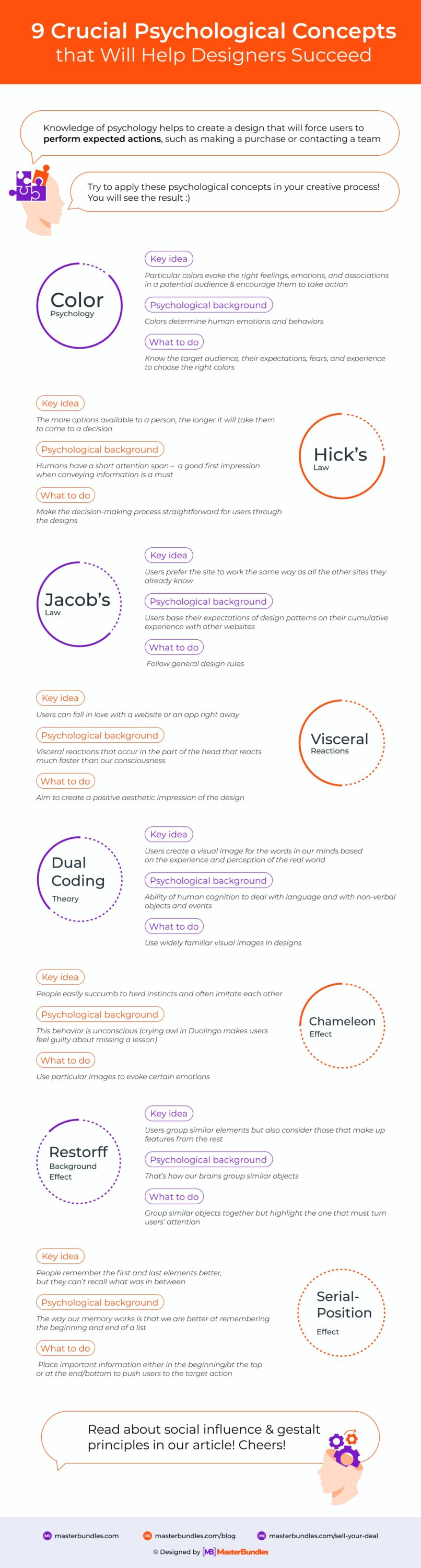
Color Psychology
Designers use colors to evoke the right feelings, emotions, and associations in a potential audience and encourage them to take action. This helps to solve the task set for the designer.
For example, if you choose a red color for the “Buy” button, you can increase clicks on it. A study by the University of British Columbia found that red increased the efficiency of complex tasks.
It’s good that the main associations with colors have already been sorted out and there is no need to conduct your own research. We have collected the basic information in a convenient format so keep this cheat sheet for yourself.
Here is the list of the basic colors and the meanings which they are typically associated with:
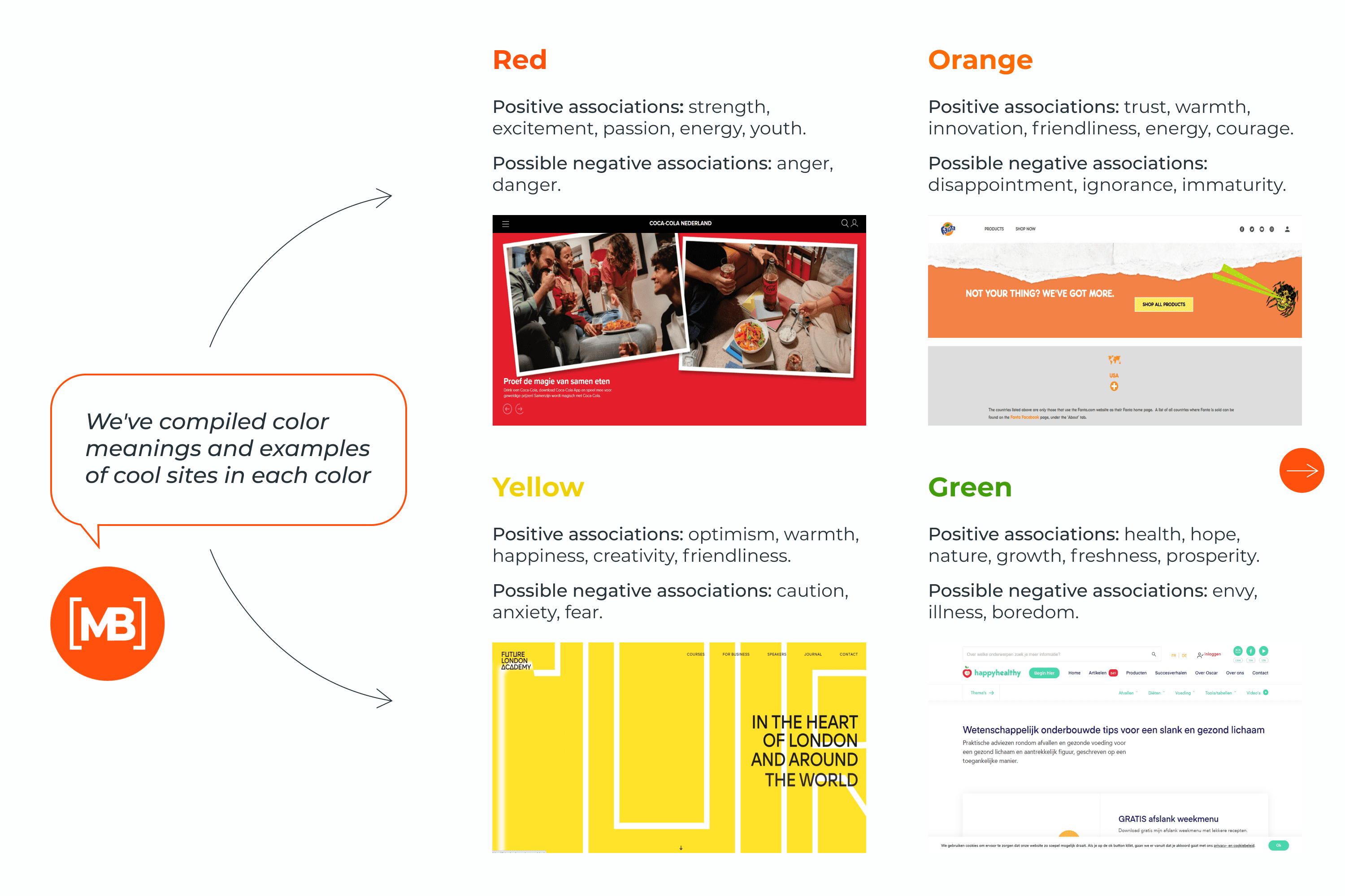
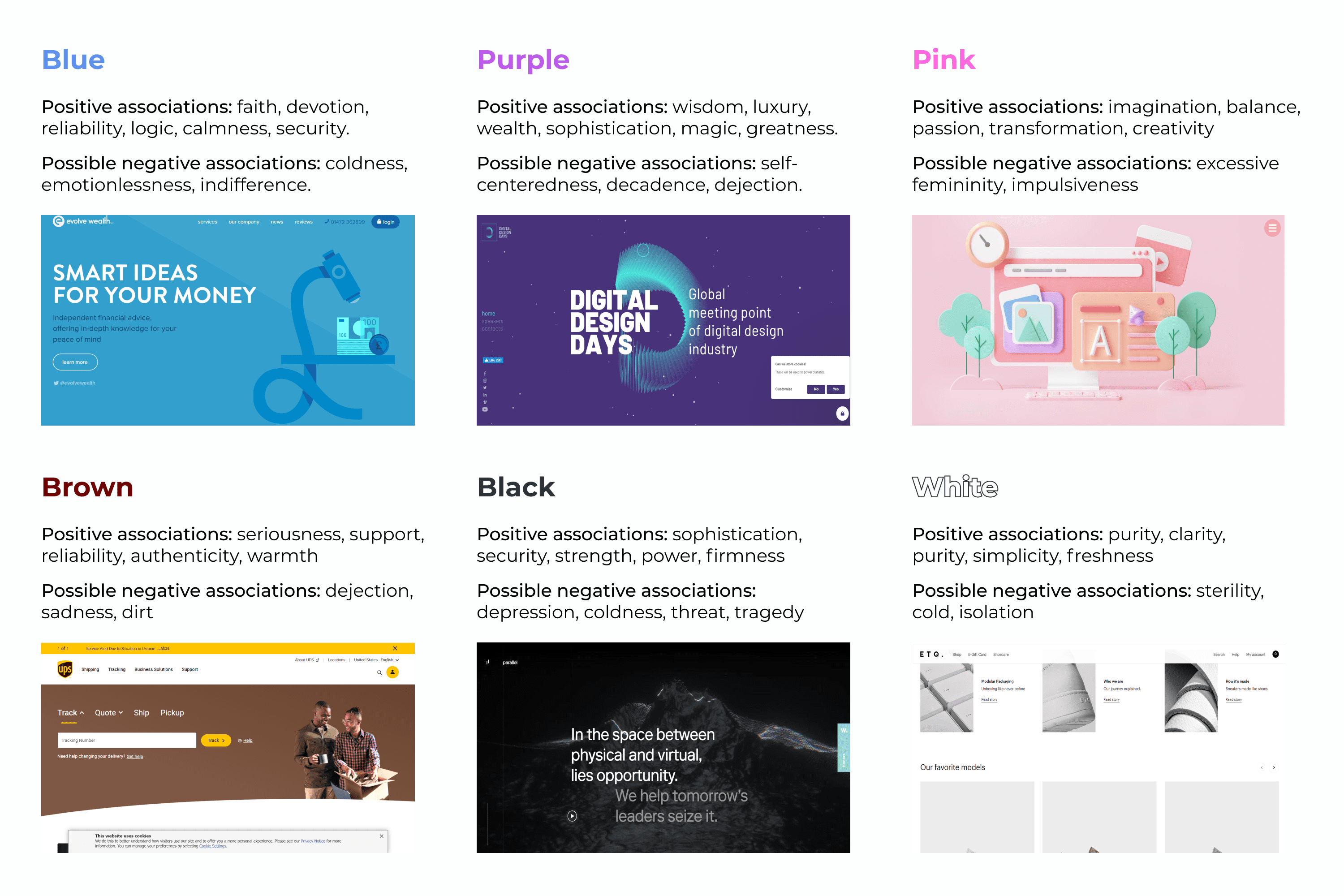
This article will help you understand in more detail the psychology of color and how to apply it in your projects.
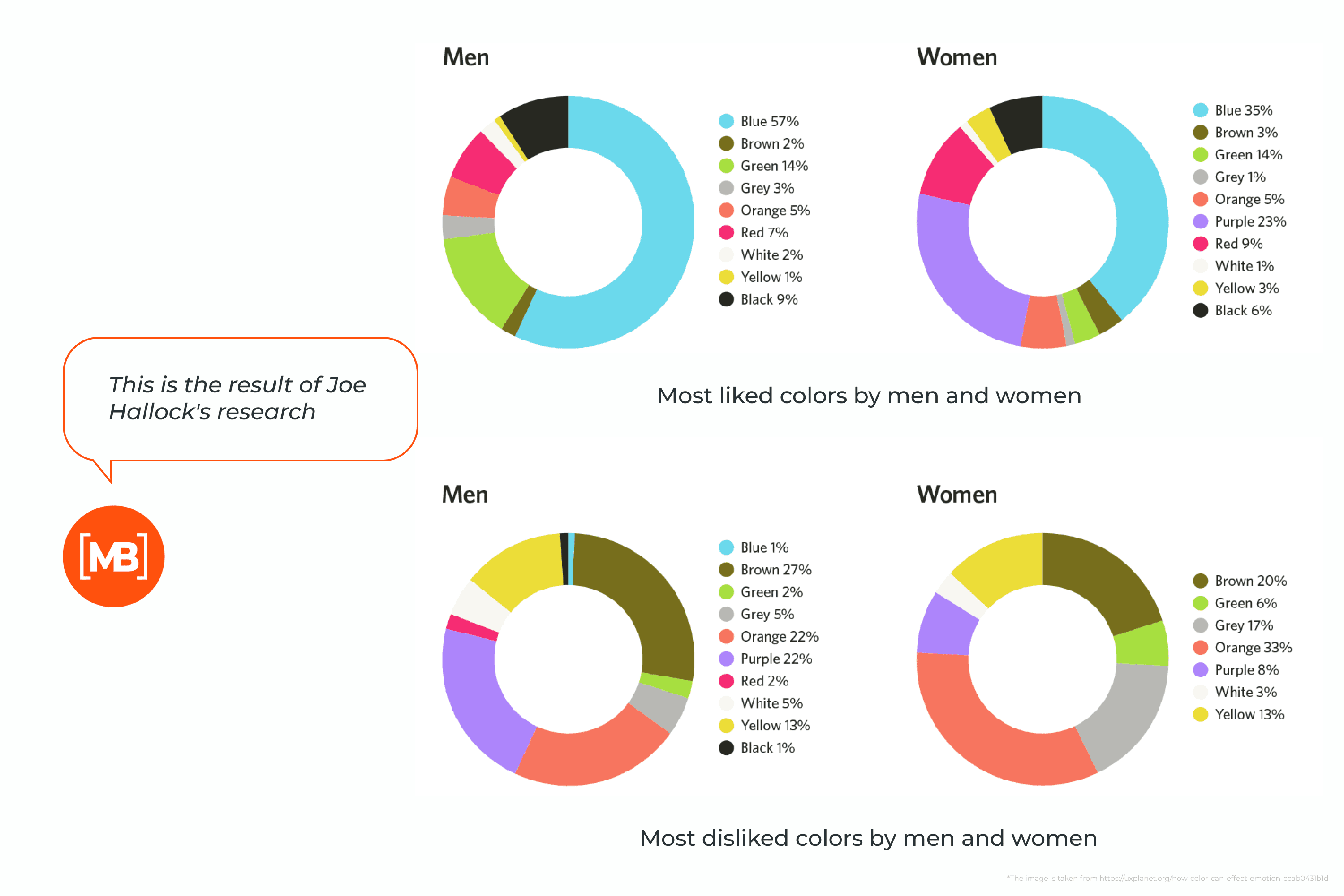
Don’t forget that color perception can be very subjective and can vary by age, gender, and culture. For example, in some cultures white is associated with purity and happiness, while in others it is associated with sadness and grief.
When choosing a color for a design, consider the gender of the target audience. A study by Joe Hallock, Principal Design Manager at Microsoft Azure, found that men and women have different color preferences:
Hick’s Law
Humans have a short attention span, so it is necessary to make a good first impression when conveying information.
Users want as many choices as possible until they get them. Psychologist William Hick and his research partner Ray Hyman proved that the more options available to a person, the longer it will take them to come to a decision.
A more scientific explanation of Hick’s law reminds designers to include only necessary elements. Extra elements that serve no serious purpose will do nothing but tax the user’s mind and weight down the experience.
Hick’s law has become somewhat of a staple for web design, particularly when it comes to limiting the options in menus or interactive elements on a page. But, on a micro-level, it can be equally applied to all visual designs.
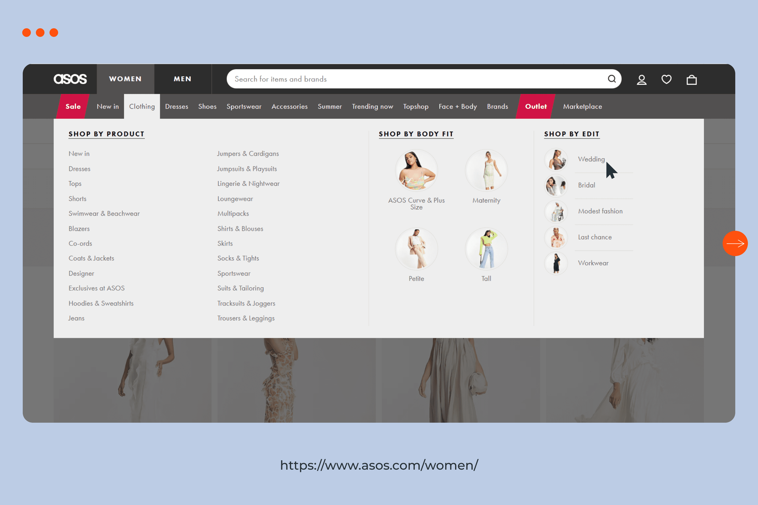
The designer must make the decision-making process straightforward for users through their designs. For example, on e-commerce websites, there are various options for the user to get to a specific product.
An implementation of Hick’s law would involve creating high-level categories. Then the designer breaks down the complex steps into easy-to-digest information so users can quickly access what they need. This way, similar items are grouped into one category and the complexity of decision-making is diminished.
ASOS does a good job by placing similar items under the same category so the user isn’t overwhelmed by the choices they have to make.
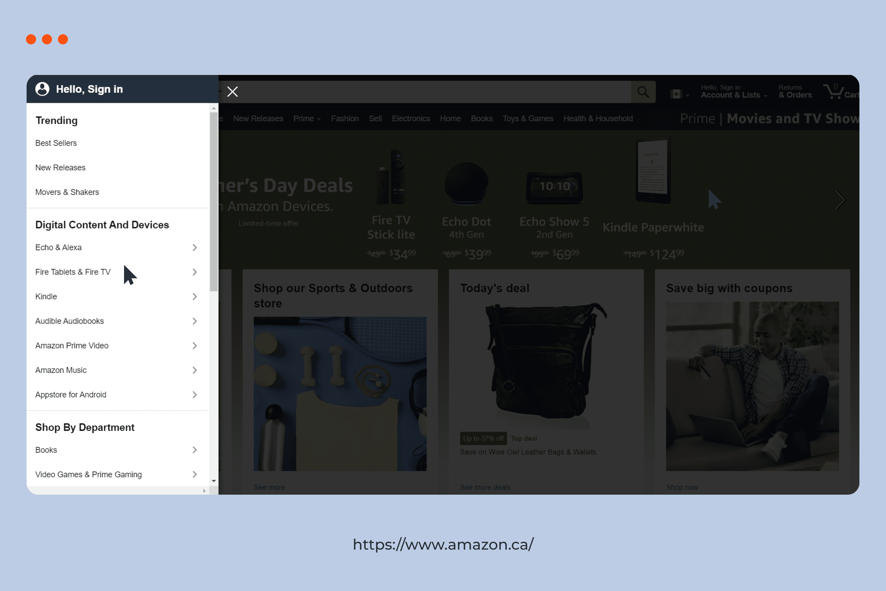
Jacob’s Law
According to this principle, users prefer your site to work the same way as all the other sites they already know.
It was formed in 2000 by usability expert Jakob Nielsen. He described the tendency for users to base their expectations of design patterns on their cumulative experience with other websites.
This principle encourages designers to follow general design rules so as not to confuse users, which can lead to a higher cognitive load.
Visceral Reactions
Have you ever had that feeling when you fall in love with a site right away? Or maybe an app that made you nauseous the moment you opened it?
If yes, then you already know what a visceral reaction is. These kinds of reactions occur in the “old brain” responsible for instincts. This part of the head reacts much faster than our consciousness. Visceral reactions are rooted in our DNA, so they are easy to predict.
How do designers use this knowledge? They aim to create a positive aesthetic impression of the design.
If you know your target audience and their needs, then you know what they will like. Therefore, the tendency to use beautiful high-resolution photographs or colorful pictures in designs is not accidental.
The next time a client sends you poor-quality photos, politely remind them of these social psychology principles.

Social Influence
This law stems from Robert Cialdini’s famous book Influence: The Psychology of Persuasion. In it, the author wrote a list of principles that dictate how we should behave in society. You can use these same principles to determine and influence people’s behavior.
Reciprocity. People don’t like being indebted to others. A clear implementation example is when a user is offered a bonus for the user’s data. It could be a free ebook, a 5 Ways to Make Up Your Lips guide, or other free content. This works because a person was given something and he feels that he must give something back in return.
Authority. Most people cannot be competent in all areas. Therefore, the best choice is to rely on the opinions of experts. Accordingly, we allow experts and those whom we consider “authorities” to influence us. People generally tend to obey the opinions of experts because they consider them trustworthy. In design, this could be the placement of an influencer to advertise a product or service.
Consistency. This law concerns the behavior of people who want to be consistent in their decision-making process. In a study by Cialdini, two groups of volunteers went from house to house. The essence of the experiment was to persuade homeowners to install a billboard next to the house.
The first group called once with this offer. The second group visited the homes twice, asking the homeowners to put up a sign on the lawn that read “Be a Safe Driver.”
The second group had a 450% higher success rate. This is an example of consistency, as the homeowners felt compelled to remain consistent in this case.
Social proof. On e-commerce sites, we use ratings, reviews, and recommendations to reach other users. It also helps guide them in the right direction when making purchasing decisions. After all, most of us read reviews before buying to understand if everything is fine.
For example, Amazon has a “Customers who bought this item also bought” section. This creates the feeling that if someone else bought this second product, then it must also be good and we need it.
Scarcity. The scarcity principle says that if something is in limited supply, people want it more. This is often used to create hype for a product. A person feels that he is limited in the duration of the choice. In this state, the client is more prone to impulsive purchases.
Liking. We tend to share our views with people we like. In design, this principle can increase conversions. To do this, it is worth designing and working out the “About Us” section on the site:
- add photos of employees
- write a brief interesting characteristic that can be adapted to the project
- affect some personal qualities of employees
By doing this, potential clients will find similarities between themselves and the project team. This will no longer be an unfamiliar site, but something closer to their own thoughts and likes and more humane. This will distinguish him from the background of others he doesn’t “know” and will stimulate him to take the targeted action.

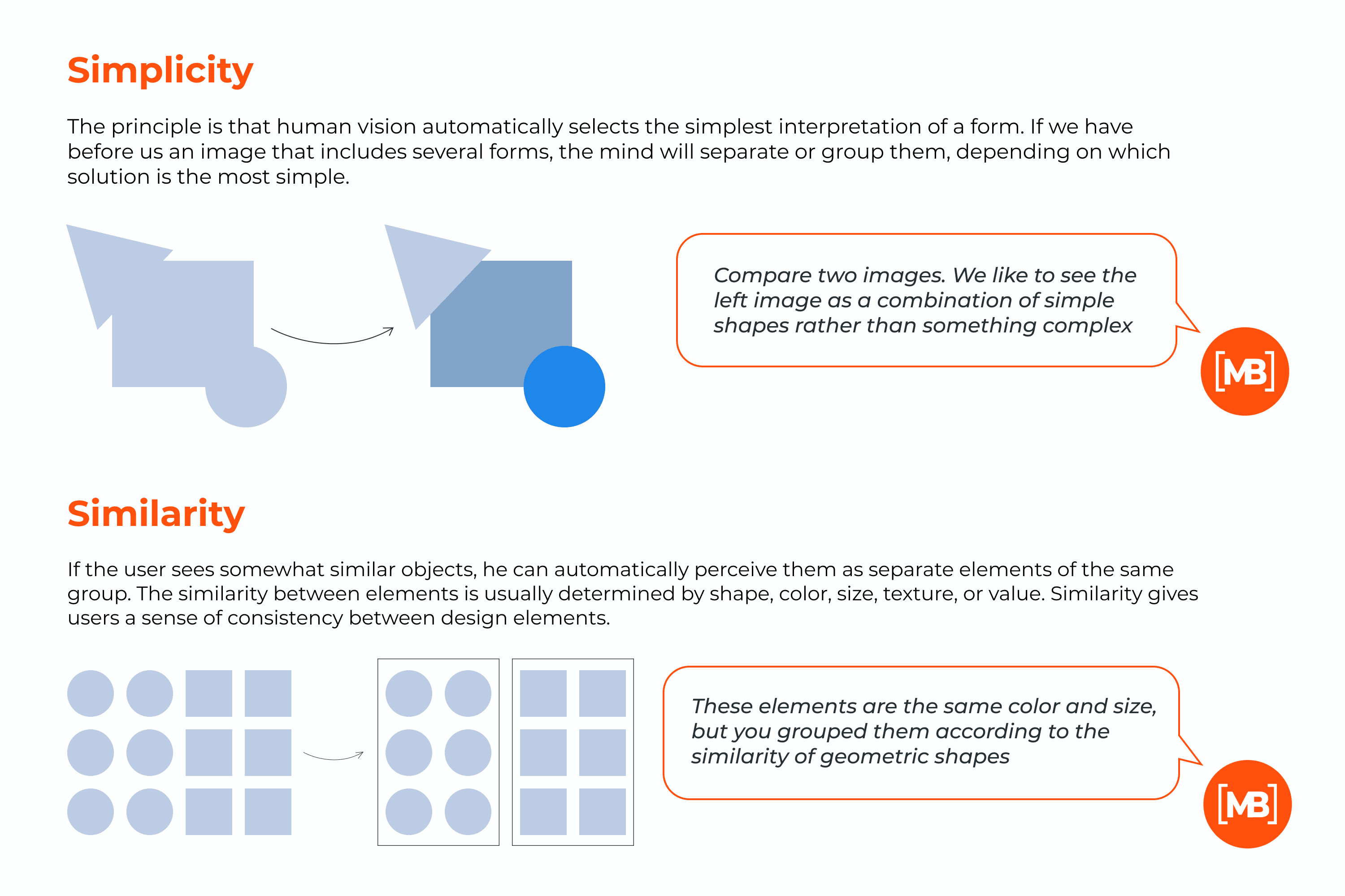
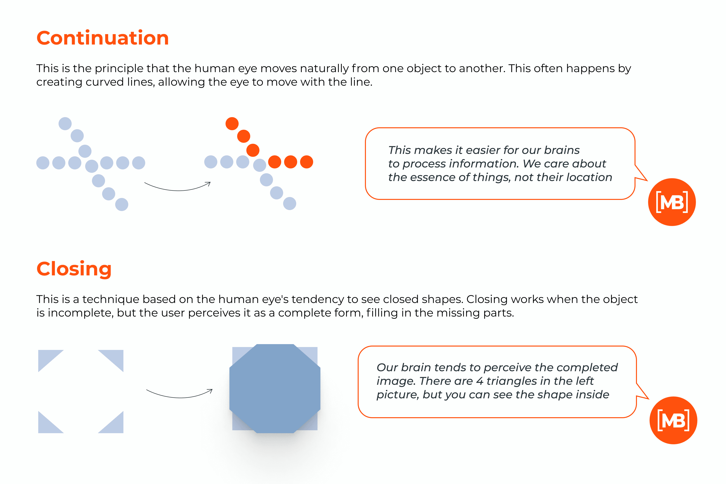
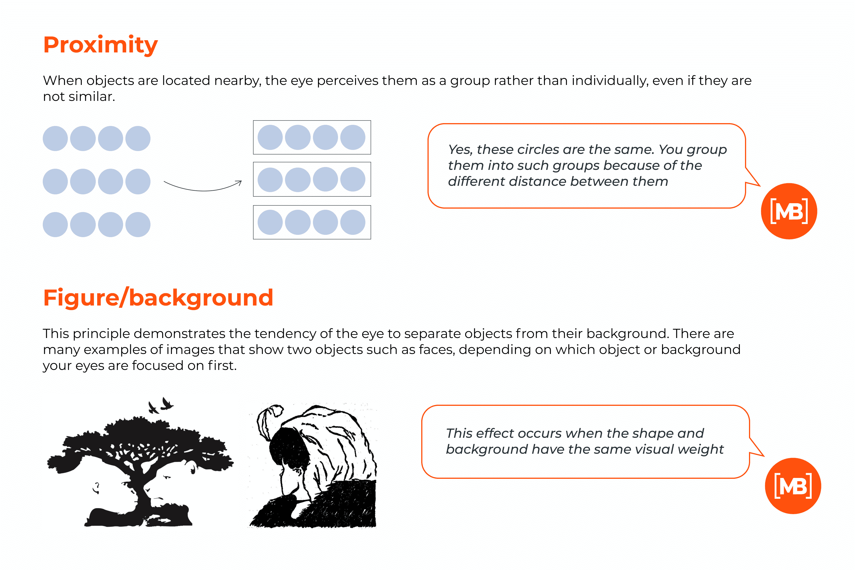
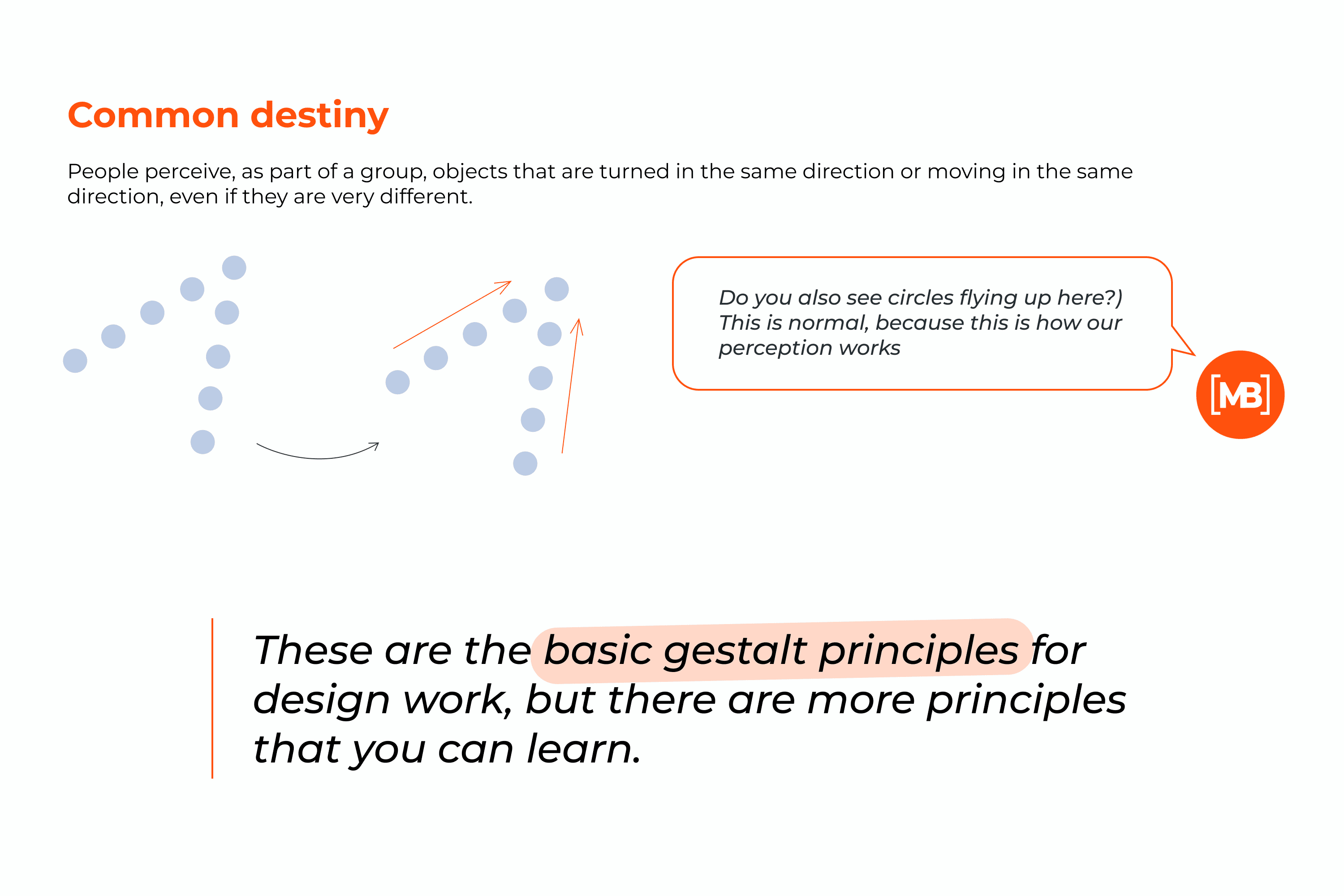
Gestalt Principles
This psychological theory is almost 100 years old, but it has not lost its relevance. The word gestalt means “one.” This theory shows how people tend to group visual elements.
You have come across these psychological principles, and likely have heard them before; you just didn’t know so much about them. Most likely, you even use them in your designs already. Now you know what they are called.
The principles by which users form groups include:
Dual Coding Theory
This theory was proposed by Allan Paivio who attempted to give equal weight to verbal and non-verbal processing.
Paivio argues that human cognition has become specialized for simultaneously dealing with language and with non-verbal objects and events.
This makes it easier for users to remember important things in the design by using a dual coding system.
We create a visual image for the words in our minds based on the experience and perception of the real world. Think of “football” and images of the ball, the athletes, the stadium will automatically appear in your mind.
For example, when creating a logo for a football clothing store, you can use the image of a ball. So you will strengthen associations with the subject of the project and evoke the necessary emotions in the client.
Chameleon Effect
People easily succumb to herd instincts and often imitate each other. This behavior is unconscious. But you, as a designer, can consciously use it to create content that evokes certain emotions.
For example, Duolingo uses this theory to the fullest. Users of the application who missed at least one lesson were shown a crying owl when they returned.
It makes users feel guilty about missing a lesson. This encourages them to return to learning and continue using the app.
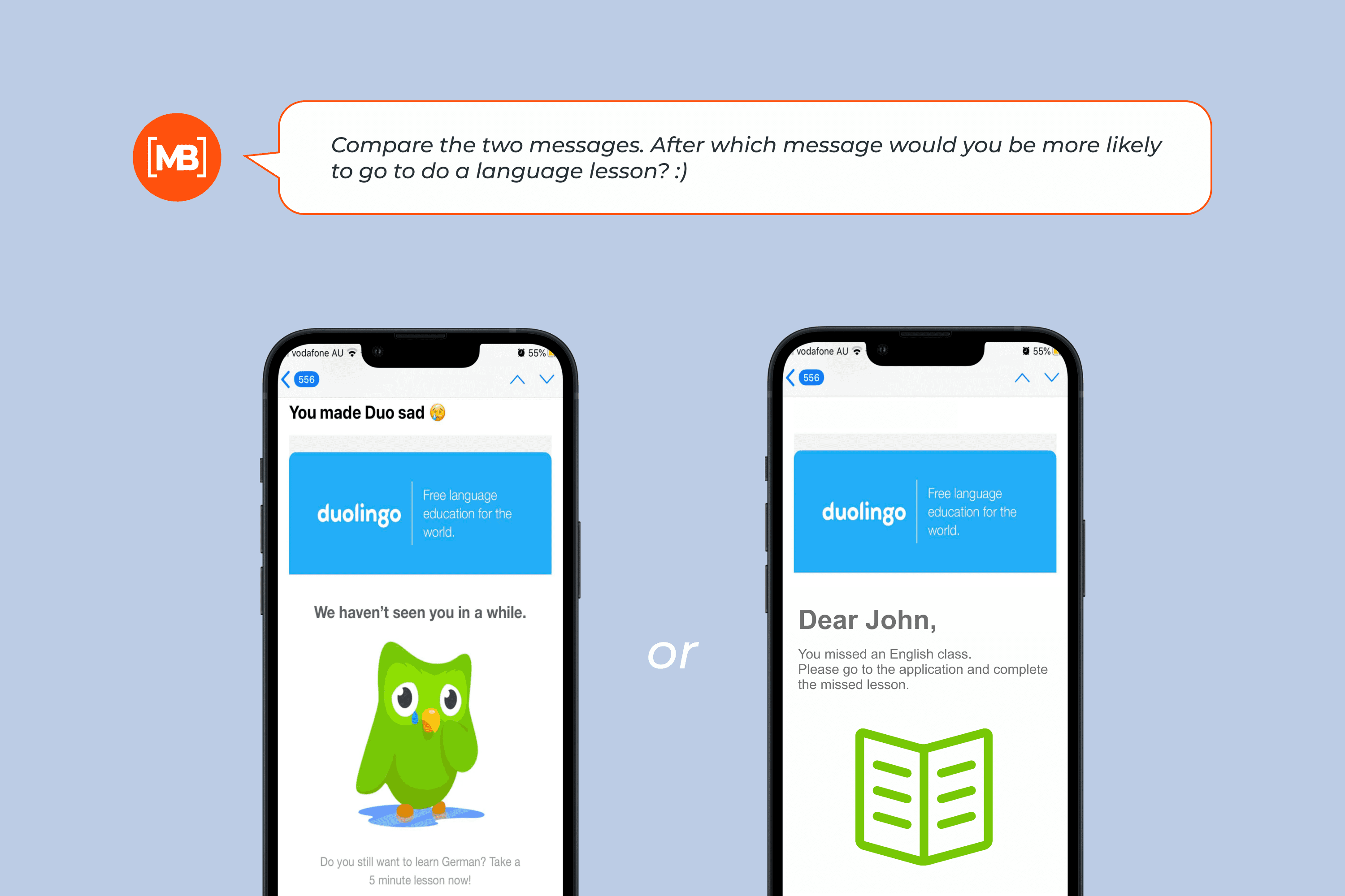
Behind such notifications, there is an obvious intention to make users experience the same feelings as the application character.
Use this technique in your design.
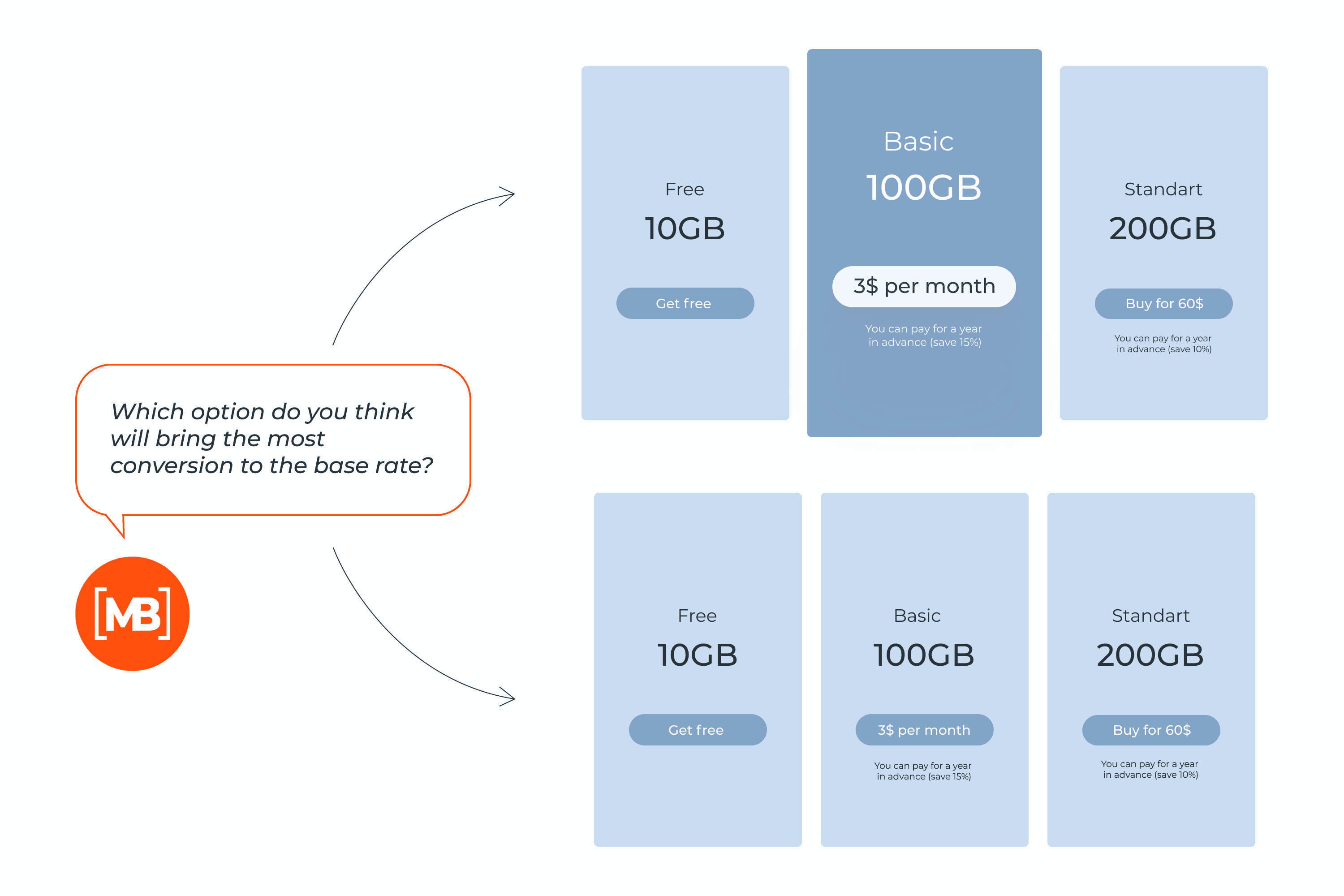
Restorff Background Effect
We are expanding the list of mental principles that can be called horror. This principle is about how our brains group similar objects. Although we will always group similar elements, we will also consider those that make up features from the rest.
For UX design, the von Restorff effect is great for when you need users to accurately notice important information.
For example, if there is a sale on a particular service, then the message about this will be in bold. The main thing is not to highlight everything in bold; otherwise, the accent and emphasis will be lost.
Another example is the visualization of the tariff plan. If you need to encourage the client to choose a particular package, then it needs to be highlighted in perception. To do this, you can use a simple trick:
- make several packages so that the desired one is average in cost
- put it in the center
- highlight with color and make it a little larger
This is how you manage the look and attention of a potential client, stimulating him to buy what is needed for the business.
Serial-Position Effect
The term was coined by Hermann Ebbinghaus after research he did on himself. When people are asked to recall a list of items in any order, they tend to start at either the beginning or the end of the list and have difficulty remembering the middle.
This theory confirms that people remember the first and last elements better, but they can’t recall what was in between.
How does this principle of graphic and web design psychology work? For UX designers, this will help to place certain elements in such a way as to make the interface more convenient for the user and push him to the target action.
For example, the best-selling products should appear at the top and bottom of the list, while the least popular products should appear in the middle.
When designing an advertising banner, the most important information that the client needs should be at the top and the bottom.
How do you choose which elements to place in the middle? Don’t take it all on yourself because the marketing department can handle it better. Find out what information is least important.
Try this test. Do you remember now which principles of psychology you read about in this article? Now check out their positions in the article. What could you remember? 🙂
Psychological Concepts in Infographic
Conclusion
I tried very hard to make this article as clear as possible for you. I hope you understand the importance of knowing how human psychology can be used in design. Use these valuable tips to pump up your level and earning potential.
If you need more articles with tips that will help you in your work, just like this post and share it with a friend. This will help me understand what is important to you. And don’t forget to review MasterBundles periodically.
Best Related Articles


This article is inspired by and relies on the following references:
- Raymond Nickerson, Marilyn Adams. Long-term memory for a common object. Source: https://www.researchgate.net/publication/244467910_Long-term_memory_for_a_common_object1
- Donald A. Norman. The Design of Everyday Things.
- Ravi Mehta, Rui Juliet Zhu. Blue or red? Exploring the effect of color on cognitive task performances. Source: https://pubmed.ncbi.nlm.nih.gov/19197022/
- Joe Hallock. Preferences – Favorite Color. Source: http://www.joehallock.com/edu/COM498/preferences.html
- Ray Hyman. Hick’s Law: Making the choice easier for users. Source: https://www.interaction-design.org/literature/article/hick-s-law-making-the-choice-easier-for-users
- Robert Cialdini. Influence: The Psychology of Persuasion.
- design thinking principles
What are your concerns?
Thanks for your response!
Disclosure: MasterBundles website page may contain advertising materials that may lead to us receiving a commission fee if you purchase a product. However, this does not affect our opinion of the product in any way and we do not receive any bonuses for positive or negative ratings.