Luring your Clients with Color: Easy Tips to Understand Color Semiotics
Have you ever heard the phrase that reality is just a matter of perception?
And what if I tell you that perception is the key to the universe and you can easily play with it? No, you don’t have to be someone like Doctor Strange or Wanda. You just have to be a simple graphic designer with the knowledge that different hues have a major impact on a person’s behavior and can even determine further actions. So let’s explore the ability of color to change people’s perceptions, like how you can hook clients with different shades of blue and pink. It’s all about color psychology.
Also, a little pause before we start. Here, on MasterBundles we have very warm and friendly company! So, we invite designers who are searching for a place to sell their work to join our marketplace. Cool terms, no product limits, and designers of all skill levels are welcome. To upload the product, just fill out a simple Sell Your Deal Form, and let’s make our digital world more beautiful together.

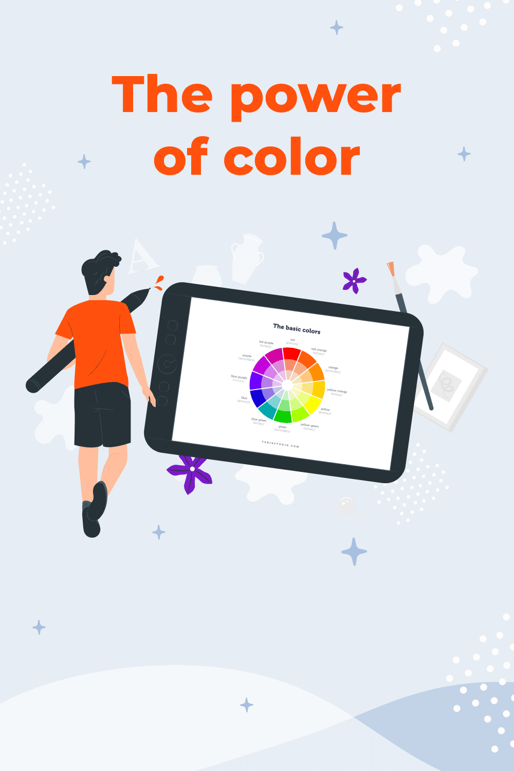
The power of color
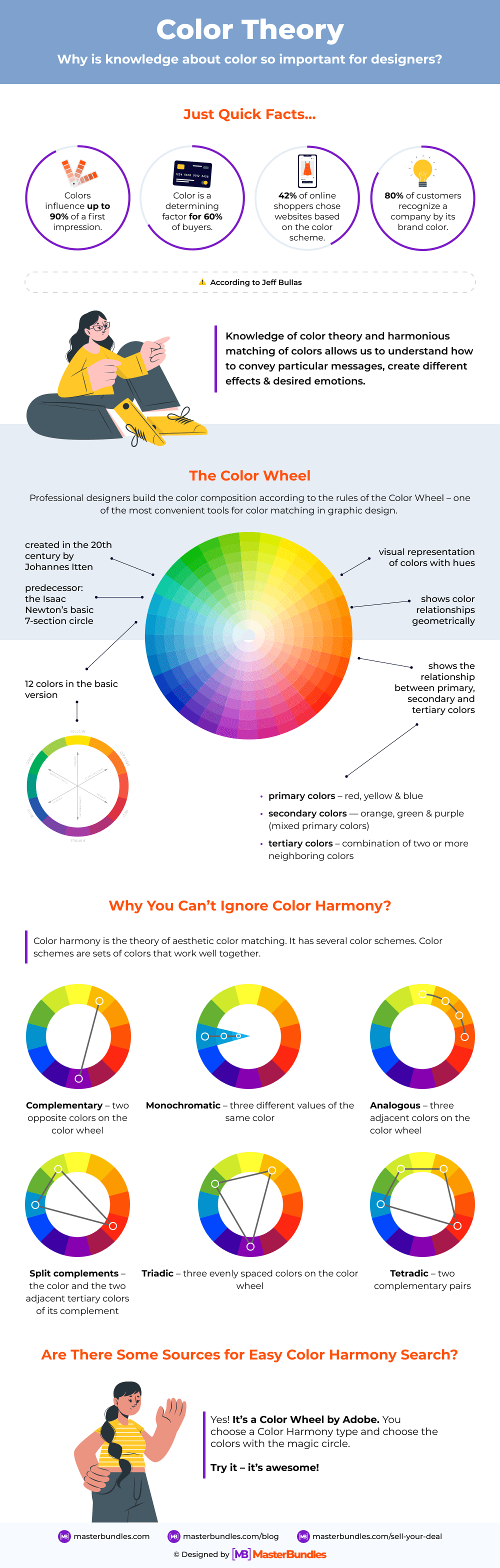
I know you are familiar with color wheel theory and the usage of triadic or analog systems.
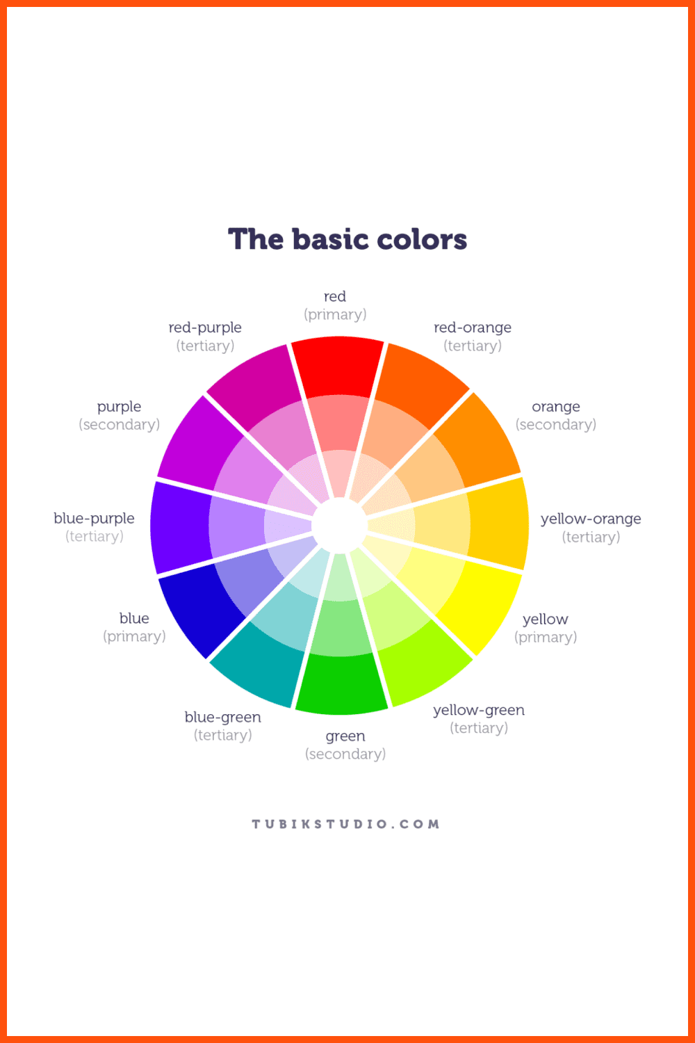
We all know that you typically use red and green color schemes together only on Christmas, and we have probably never used pink in a finance theme.
But let’s take a step forward because we are talking not about the best-looking color combinations, but about its ability to move people.
The Little Monkey in my Head
I want you to imagine a little sweet chimpanzee. A cute creature with a yellow banana.
It is interesting that primates, among other mammals, can distinguish colors. Furthermore, the evolutionary Fruit Theory explains why apes see colors by describing their natural desire to find fruits among the leaves. A zillion years of evolution changed their eye’s structure to see yellow.
The trait of color perception was a natural selection necessity and continues to play an important function in providing sensory information about the environment to our brain. Of course, we no longer need to search the forest for fruits and mushrooms. However, the brain still responds to color signals.
So, mother nature gave these cute chimpanzees the ability to easily see bananas and this was a huge evolutionary step. Actually, that is also why the yellow color reminds people of life and happiness. This is color psychology. The idea of a banana makes the tiny monkey in our own heads happy!

The semiotics of color
Objects reflect light in a variety of wavelength combinations. These wavelength combinations are picked up by our brains and translated into the phenomenon we call color. The visual color is like a code with a unique meaning for our brain.
People perceive color as a sign with its own unique meaning. Every color constitutes a combination of social, economical, historical, and cultural characteristics. This combination is stable and you can’t break it. By no means can 2+2 equal 5 so the red color in no way can symbolize peace or bunnies.
This is the semiotics of color.
And what does semiotics have to do with chimpanzees and design?
Knowledge of color symbolism helps you send the right messages to your audience and the example of chimpanzees helps you realize the importance of the psychology of color in evolution.
More facts to understand the situation:
- According to the Association of Psychological Science, less than 60 seconds are enough for a person to make an initial judgment on a product or other person.
- Neo chose a red pill because patients prefer red and orange over blue due to the association of the last with tranquilizing, not healing. Moreover, you can read research on Pharmaceutical Packaging Color and Drug Expectancy and carry the convention that pharmaceutical companies spend huge sums of money on color research. Also red color makes our hearts race.
- According to Hubspot researchers, only 1% of people think a black product is cheap or low-quality, which means that almost everybody perceives ads or packaging done in a black design as a sign of luxury products.
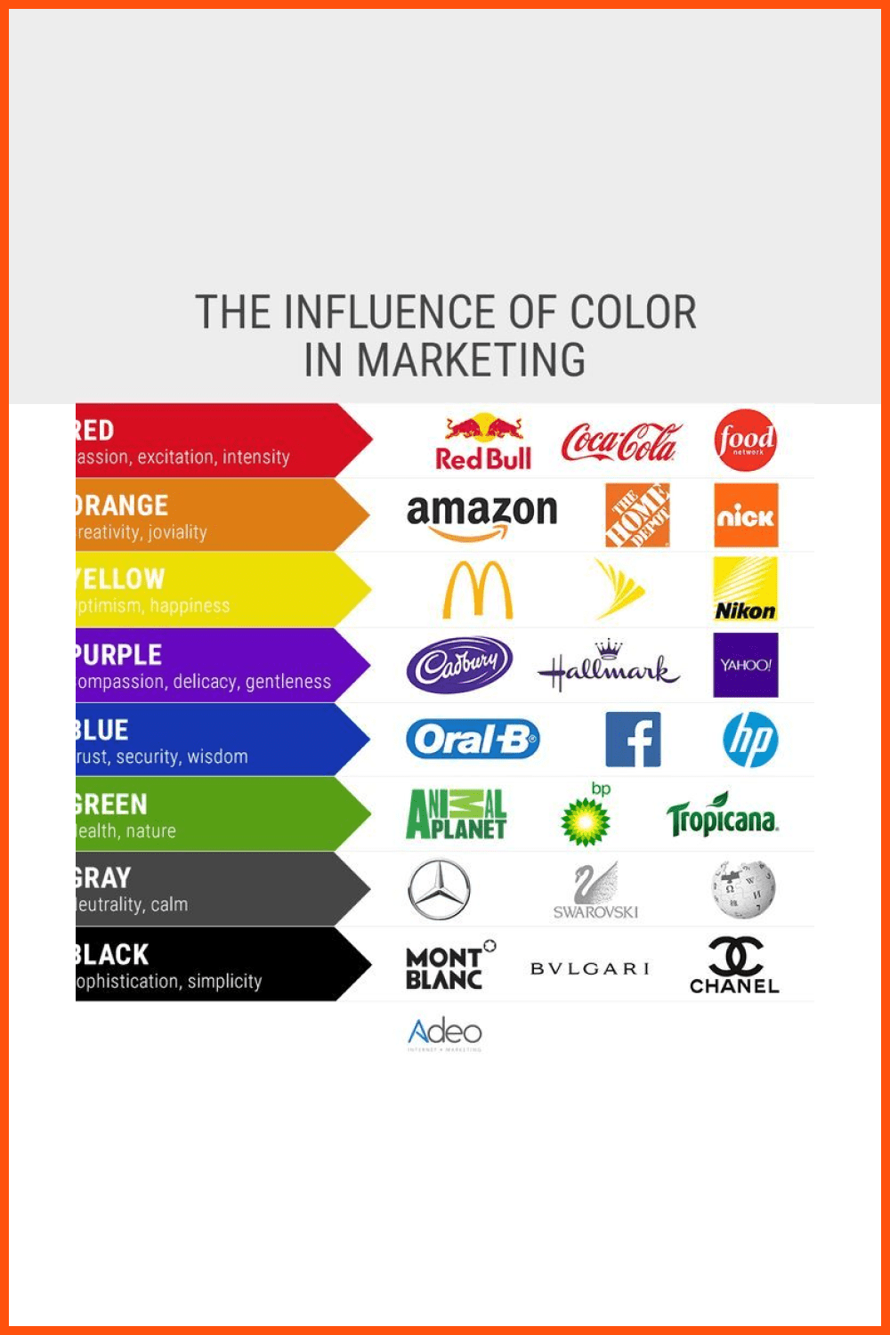
According to marketologist Jeff Bullas, effective use of color is one of the biggest factors in marketing and the right marketing color psychology ensures success.
- Colors influence up to 90% of a first impression.
- Color is a determining factor for 60% of buyers.
- 42% of online shoppers chose websites based on color scheme.
- 80% of customers recognize a company by its brand color.
As you can see, color is a powerful tool. Moreover, brand color psychology is a crucial factor. The main question is how to work with semiotics and use it as a powerful tool that can affect a person’s perception.
Best Related Articles

How to Work with Color Perception
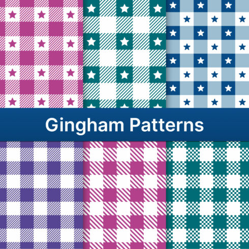
First and probably most important, I urge you to study color. Of course, there are many cheat sheets available on Google, where you can find a color emotion guide like the one below.
For future reference, you can pick a really good color psychology chart for your work and save a pin on your Pinterest.
But the real power is in the details – as always.
Don’t neglect the importance of studying art, color psychology, marketing. Learning will give you the capacity to feel color, whether you’re a web designer or simply creating a vector infographic.
Different approaches will teach you to feel color and use it correctly.
Study Art
Hundreds of years ago, in a pre-pixel era, artists mixed ground limestone with sand and a copper-containing mineral to create a blue color.
It’s time to learn about color and the various techniques for using color in art. It is also helpful to distinguish expressionism from cubism and to train your eye to recognize them. Learn, visit galleries, and adore the beauty of art.
Drawing by yourself is also essential. Purchase pastels, watercolors, and pens, and experiment with various techniques. From a thumbnail and quick sketch to a nature morte, try it all.
This activity will give you a clear indication of how the colors are arranged. It’s an exciting and challenging way to learn more about color.
Increase your Color IQ
Leatrice Eiseman, an American color expert and director of the Pantone Color Institute, suggested 6 tips that will increase your color perception.
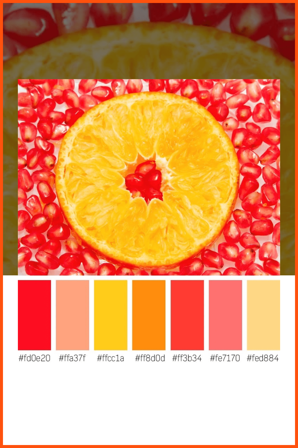
- Studying multiple meanings and other senses, Leatrice recommended appeal to test using examples of feelings of energy and zest. What taste is associated with energy? Pink grapefruit, pomegranate? Imagine a warm bright color palette of pink grapefruit. Actually, you will understand color theory psychology quite quickly with the help of taste association.
- Study the value of color. Experiment with adjusting the value of color – how dark or light the color is. Dark blue sky or navy blue are much more powerful colors than simple blue. Burgundy evokes more dramatic feelings than red. A stronger message conveys a much darker adjustment. Lighter adjustment in color is good for naive topics or lighter emotions.
- Study saturation of color. As there is no gray in fully saturated hues, they are lively and rich. Gray undertones in less intense colors make them appear faded and soft.
- Study the impact of iridescent or metallic textures. Multicolored effects captivate our attention. As a result, we are strangely attracted to iridescent or metallic finishes.
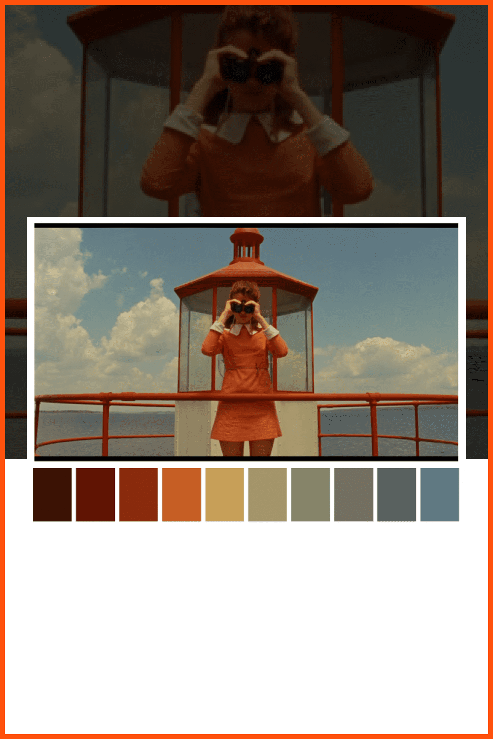
- Watch animated films and movies. Eiseman insists that producers and directors analyze movies’ color schemes because color theory psychology is a powerful tool for film production. For example, Stanley Kubrick’s directing style relies heavily on color to create powerful images and scenes. Red is chosen to express terror, dread, and foreshadowing in one of M. Night Shyamalan’s best films, The Sixth Sense. By comparison, Gary Ross uses red to represent hope, love, and sensuality in Pleasantville.
- Study color trends not only in graphic design but in fashion and other relative fields. Analyze color in advertising from brand agencies. Many resources from Pantone and fashion bloggers are available.
Study your Target Audience
Learning art color is a great idea, but you should also research your target audience and collect relevant data about your customer and product. Moreover, this is crucial if you create commercial projects.
Perceptions of color differ from region to region. A single color can have multiple, even contradictory, meanings around the world.
Analyze your target audience. Try to create a portrait of typical clients.
Who are they: their interest, age, cultural context, gender, and pain points. Try to answer what needs you are fulfilling with your product. It will benefit you in understanding the situation and the product.
These exercises will help you:
- Write down a list of words associated with your targeted audience or product.
- Google each one and make a screenshot of all suggested pictures.
- Gather all screens in one big collage.
- You can blur your super collage for better color perception.
You will see a pattern and some coherence in the colors.
Even if it’s obvious that the sky and airplanes are associated with blue, don’t miss a chance to do this research. You might think you know all about colors, but you may find a new color association to reach your customers or create a real message in your work.
You can also read some studies on color personalities and combine them with portraits of the target audience. I think the psychology of color hints will give you some fresh ideas.
How to create a new reality
You are probably a good designer who has completed his homework in study, learned the nuances between cubism and modernism, drew a landscape with watercolor, analyzed the target audience, and used Google to find out that velvet brings illusory and mystic vibes.
But how do you gather this data?
Determine your goals. Whether there are emotions and actions you should evoke or you have some general information for color representation, this is a key step.
You can use bright CTA buttons even in a red color scheme on finance ads and stimulate your customers to take some actions, but dominant red colors on a fintech website is not a good idea at all, as red is not a symbol of stability. Yes, the real trick is in watchfulness and in raising the inner feeling of color.
You will feel the difference by learning and practicing the recommended exercises.
So don’t miss the chance to create a new reality with your works.
Some Awesome Video About Fonts Color Trends of 2022
Super Practical Guide to Color Theory, Color Models and Perfect Color Palettes | UI Design
Maybe you’ve followed all the color harmony and color theory tutorials to a tee and generated a complementary color palette, but you notice that the colors don’t seem to match very well, perhaps they look harsh or a bit muddy and unprofessional and you don’t really know why.
What are your concerns?
Thanks for your response!
Disclosure: MasterBundles website page may contain advertising materials that may lead to us receiving a commission fee if you purchase a product. However, this does not affect our opinion of the product in any way and we do not receive any bonuses for positive or negative ratings.