Color Theory in Graphic Design: What Is Color Theory?
Color Theory in Graphic Design. Colors surround us everywhere, every day, and every single minute. Subconsciously, we react differently to different colors. With the Color Wheel, we can learn to combine different colors and shades properly, taking advantage of their visual combination in graphic design.
If we slightly go back in time, we will see that the first website was primitive: black text on a white background and blue highlighted links. However, nowadays it’s very hard to surprise anyone with crazy contrasts, gradients, and neon. And if at first glance it seems to you that the company’s site, logo, or promotional products are chaotic in their colors, then we’re going to have to disappoint you: this is not true (well, it usually is :D). Because even in the exaggerated designs, everything is done strictly according to the rules.
Professional designers build the color composition only according to the rules of the Color Wheel. And sometimes it is quite easy to differentiate just a good photo from a masterpiece thanks to the right color combination. When you create a visual product – illustration, pattern, collage, photography, etc. – you need to keep in mind the Color Wheel.
So, today we are going to learn some super-precious and useful information about how to use this powerful instrument in your creative designing and artistic activity.
Spin the wheel and let’s start!

Types of Color Schemes
Who Created Color Wheel?
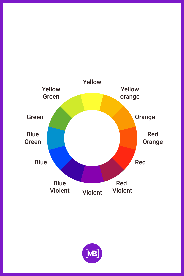
A color wheel is a basic tool for combining colors. It was created in the 20th century by the Swiss artist and art theorist Johannes Itten. He just added more colors to the basic 7-section circle created by Isaac Newton in 1676 and showed what happens when you mix some colors together. The color wheel, designed by Itten is considered to be one of the most convenient tools for color matching in graphic design.
Why Do We Need Color Wheel?
The color wheel is designed in such a way that combinations of any colors chosen from it will look good together. This tool organizes the image of all possible colors and hues of the spectrum and allows recognition of different color schemes for the objects in one composition. Sounds a little bit confusing, isn’t it? But let’s try to figure it out in practice!
How Many Colors Are in There?
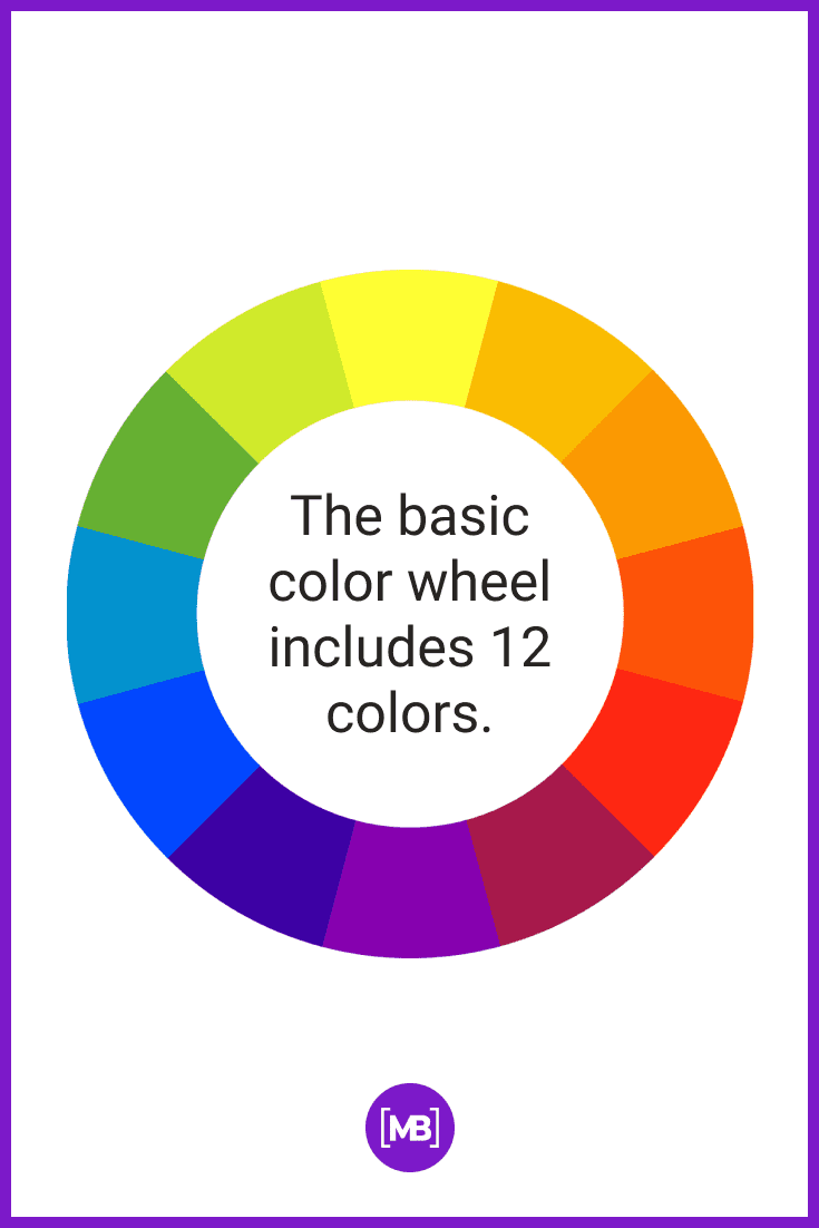
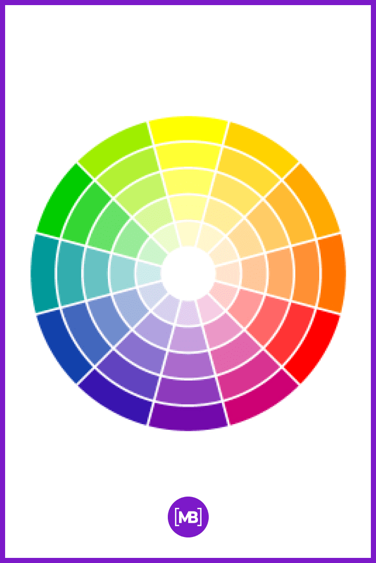
The basic color wheel includes 12 colors. They can be divided into 3 different categories:
- main colors – red, yellow, and blue;
- complementary (secondary) colors: purple, orange, and green;
- combined (tertiary) colors – the combination of two or more neighboring colors (for example, orange from red and yellow).
Why You Can’t Ignore Contrast Harmony?
Contrast harmony is the theory of aesthetic color matching. If you want the design elements in the project to look harmonious, you can not ignore this element.
There are several approaches to how to properly combine colors. But designers most often use complementary, analog, and triad.
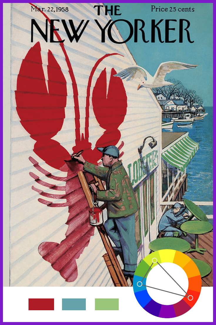
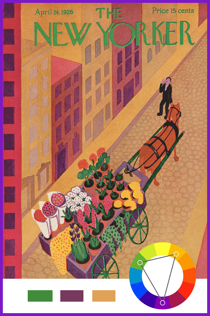
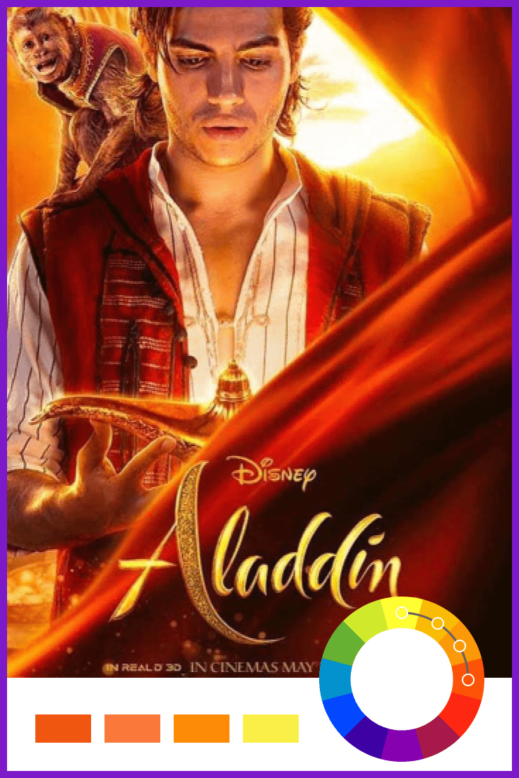
What Is Complementary Harmony?
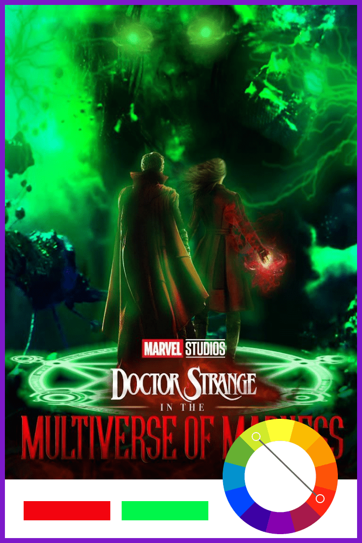
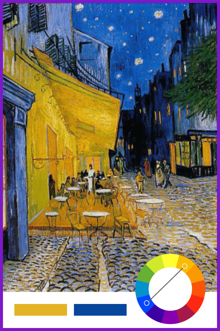
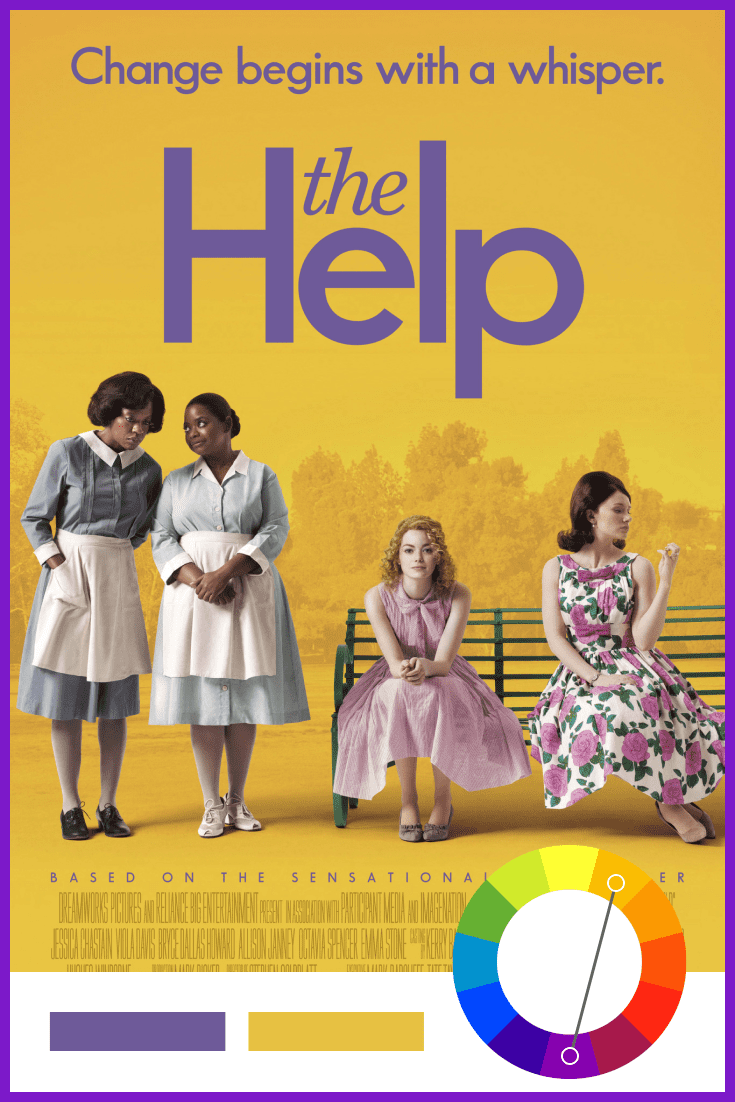
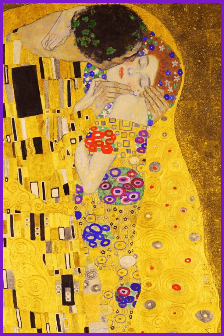
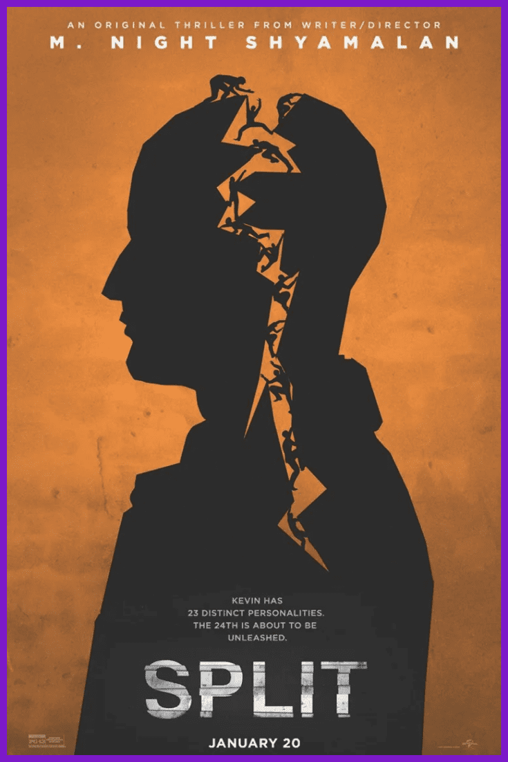
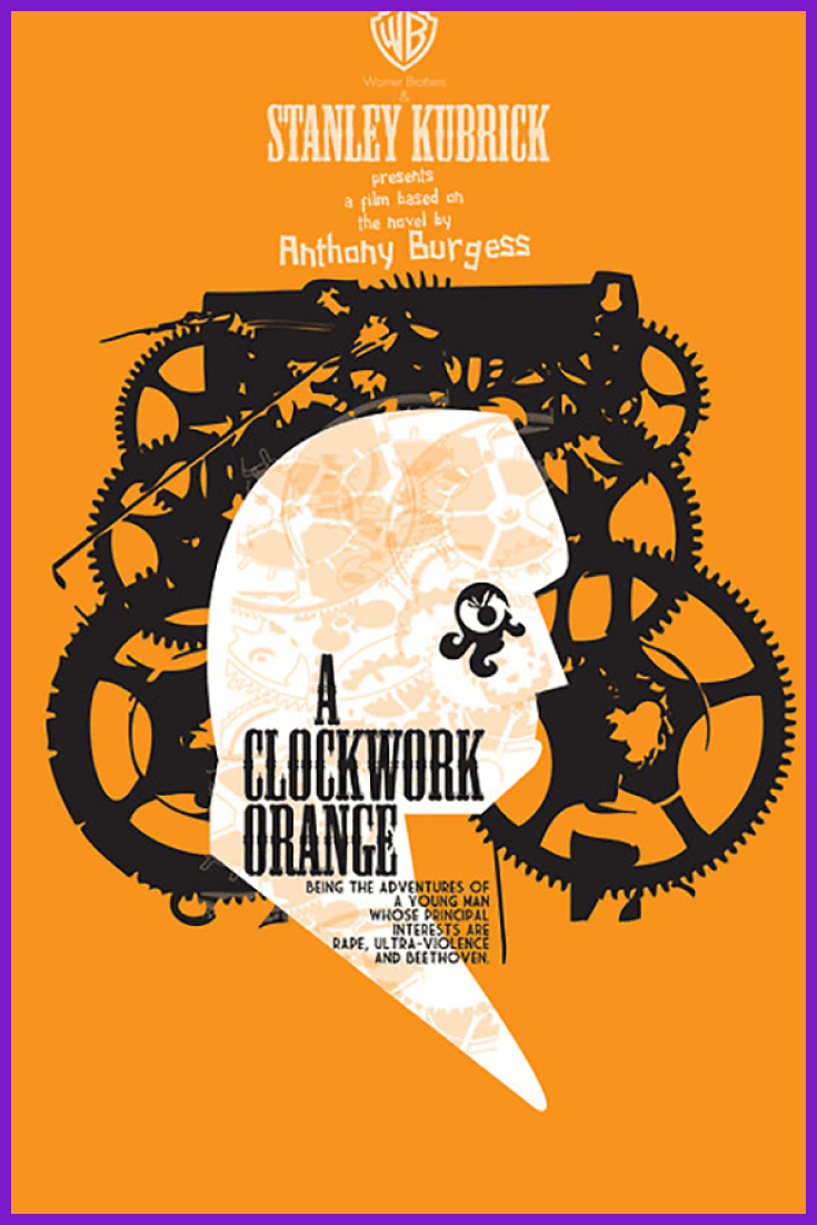
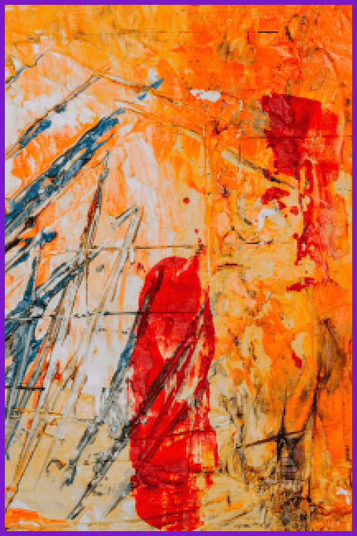
Let’s start with complementary colors. They are any two colors located opposite on the color wheel. For example, blue and orange, red and green. These colors create a high contrast, so they are used when you need to highlight something. Optimally, you need to use one color as a background and the other as an accent.
Let’s look at some bright examples of complementary harmony used in the film- and photography-making.
What Are the Pros of Using Split-Complementary Harmony?
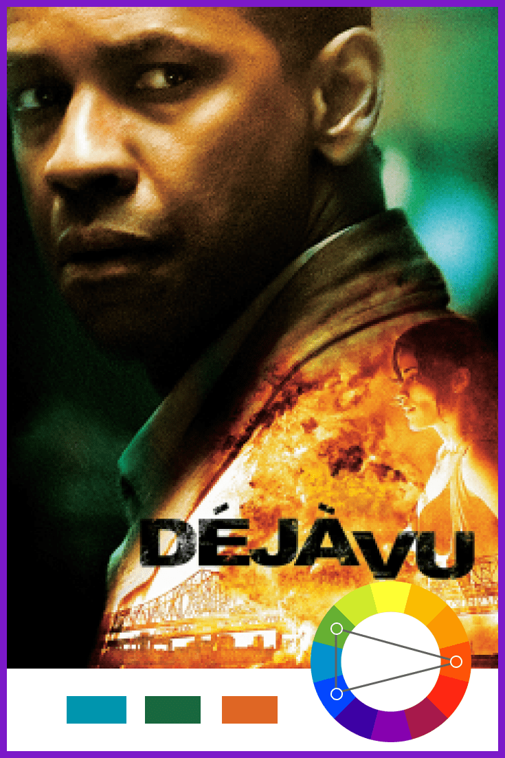
The use of split complementary colors gives a high degree of contrast, but is not as saturated as the complementary color. Split complementary colors give more harmony to the composition than direct complementary colors. Here, as you see from the examples, we have one main color and the second which is split into two additional colors.
What the Classic Triadic Harmony Can Give Us?
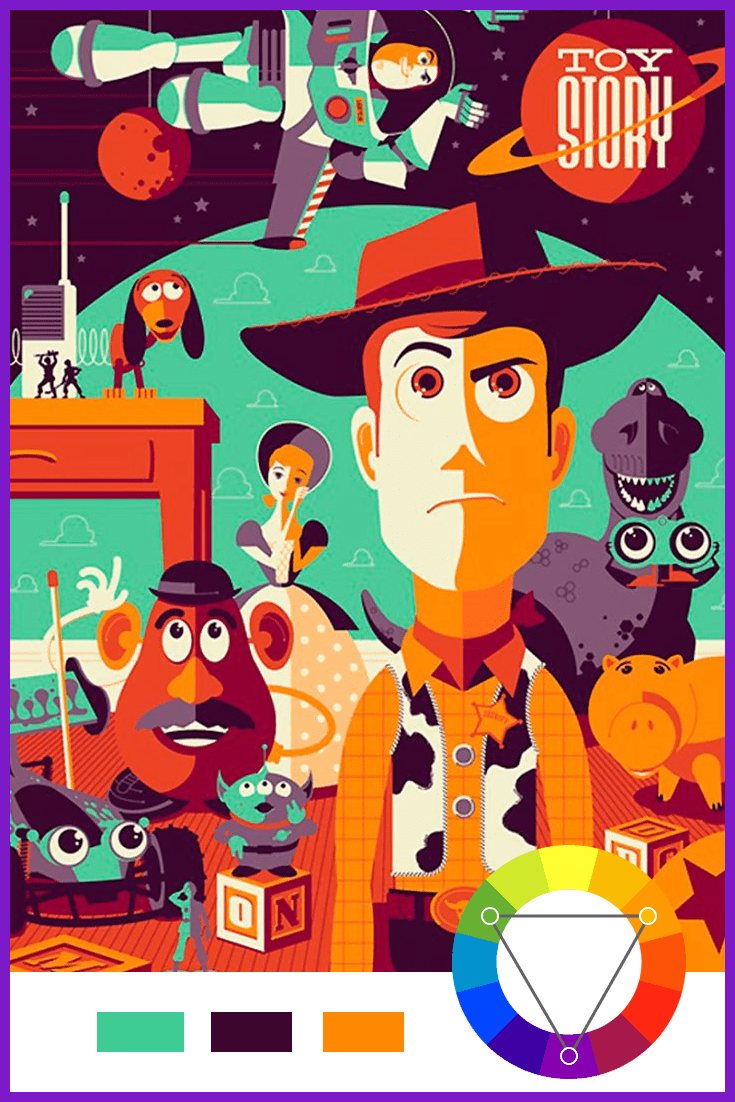
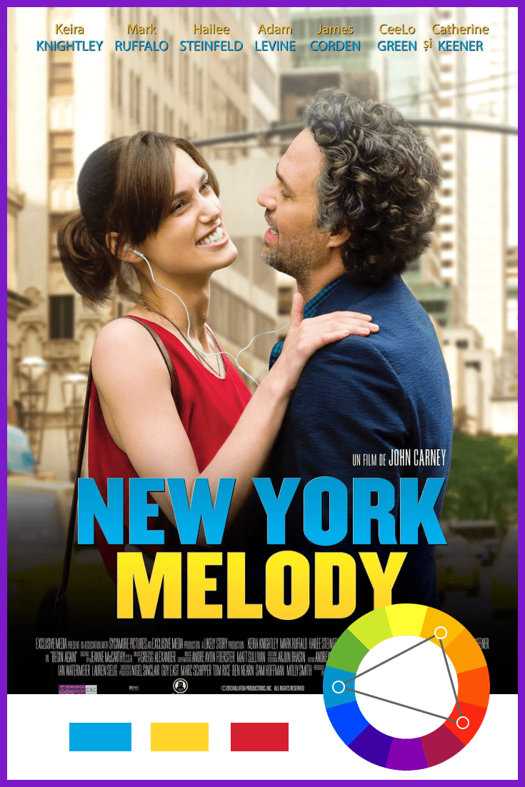
The classic triad is a combination of three colors that are equally distant from each other on the color wheel. For example, red, yellow, and blue. The triadic scheme also has high contrast but is more balanced than the complementary one. The principle here is that one color dominates and accentuates with the other two.
Does the Analogous Harmony Always Look Boring? (No)


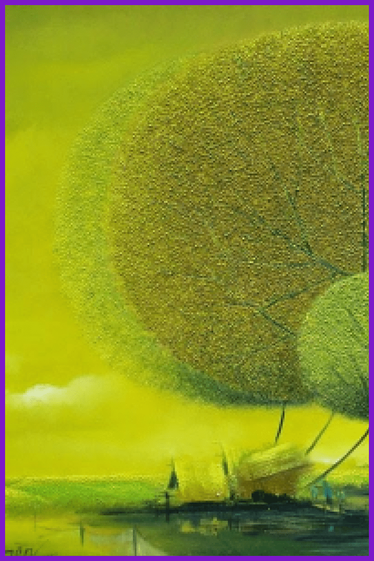
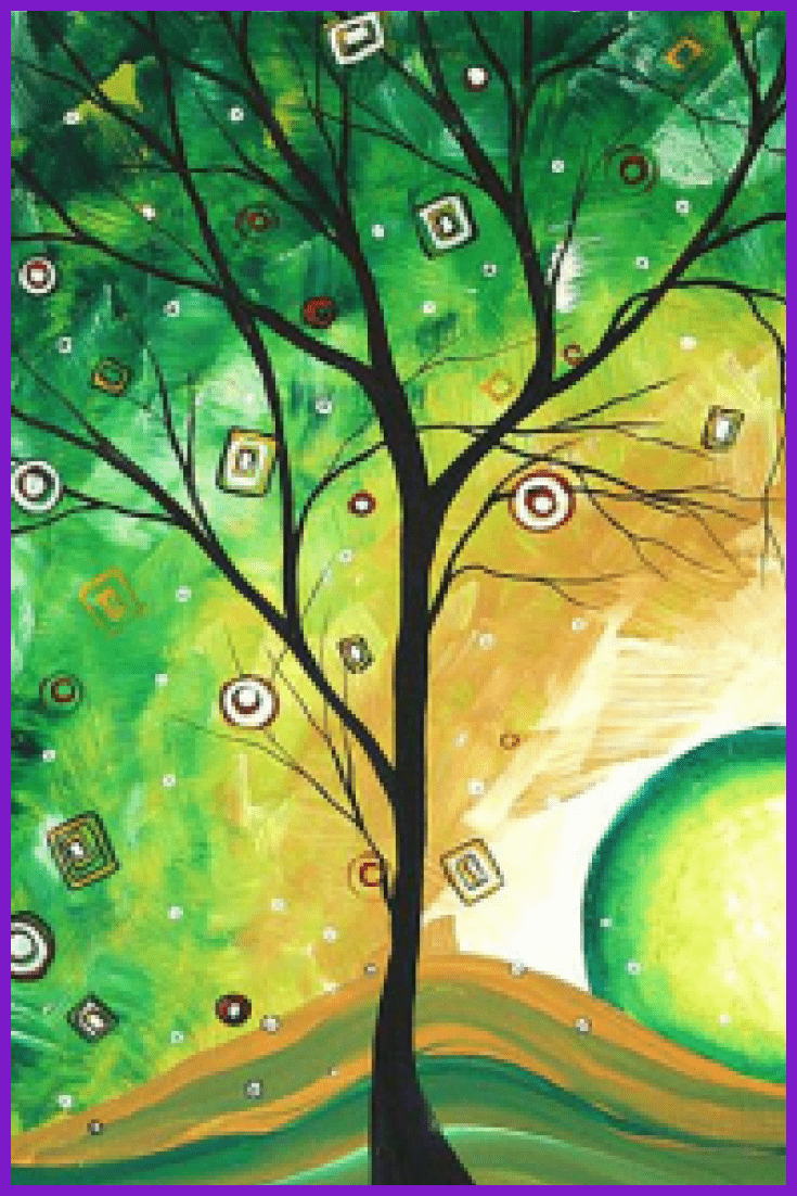
The analog colors are situated close to each other on the color wheel. This scheme may seem boring, but in fact, the eye perceives it as something natural and pretty: it is often found in nature (look at the picture of the sunset with its’ orange, lilac, and pink hues).
Can We Get More Harmonies? Sure! Meet the Tetradic Harmony 🙂

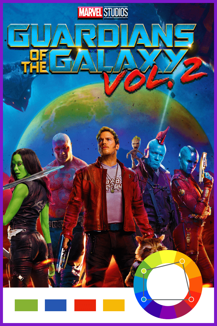
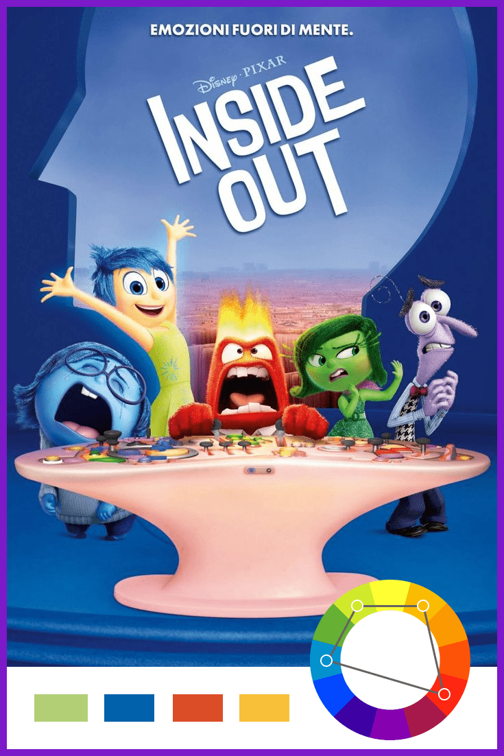
If the previous contrast harmony schemes are not enough for your creative activity, we prepared some more complicated variations of harmony. And Tetradic Harmony is one of them. This scheme includes one main color and two complementary colors and few complementary colors.
Why Do You Need to Use It Carefully?
Attention! This is the most complicated scheme of all. It offers a greater variety of color choices than any other scheme. So be careful, because if all four colors are used in equal quantities, the scheme can look unbalanced, so you need to choose one color to dominate. You should avoid using pure color in equal amounts.
Square Harmony or Tetradic Harmony?
It is quite simple to the tetradic harmony, still has some peculiarities. This is a combination of 4 colors equidistant from each other on the color wheel. Although these colors are different in tone, they still complement each other. Example: purple, orange-red, yellow, blue-green.
How to Create Monochromatic Harmony?

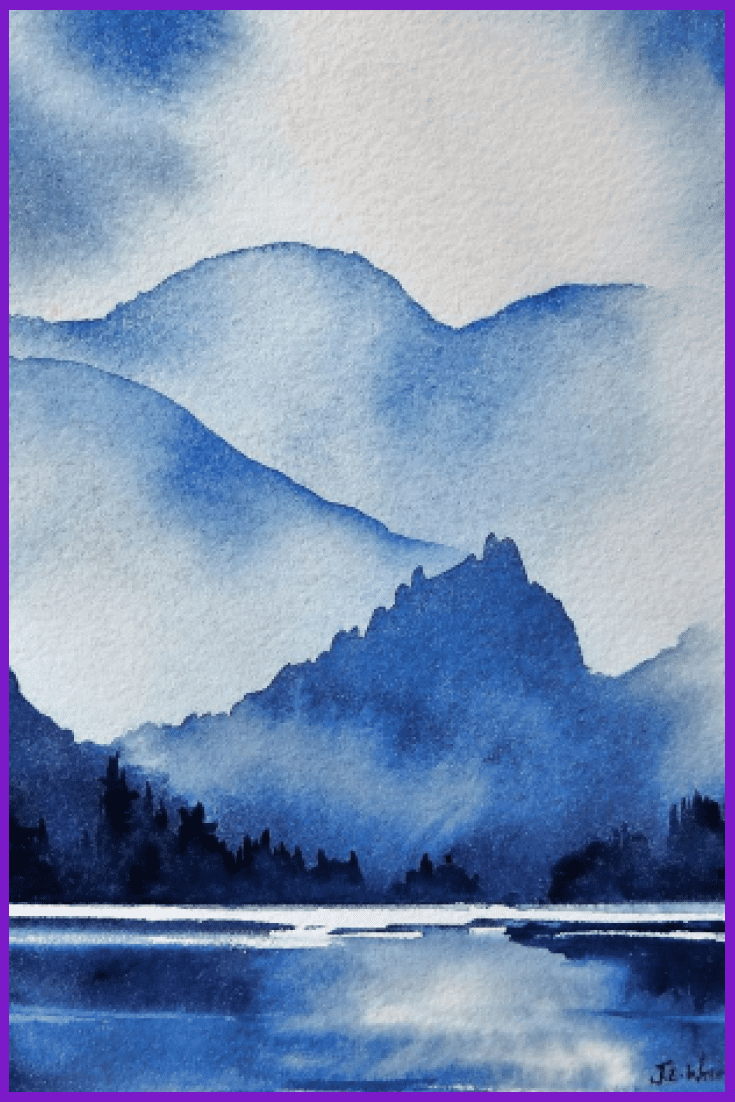
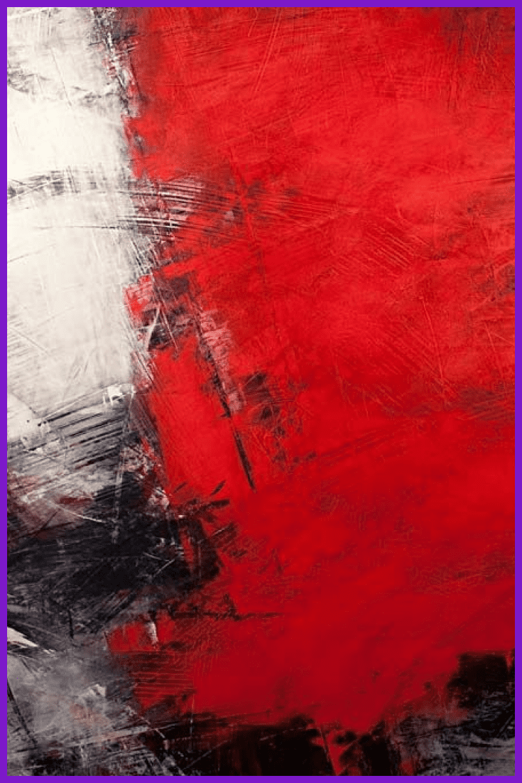
Single-tone color harmony can be created by combining a single color tone with its darker and lighter shades. As a result, it is possible to achieve, on the one hand, strong tonal contrast and, on the other hand, subtle color patterns. You can also use a classical monochromatic combo – black and white. And such a design will look very stylish and sophisticated.
How Does Color Psychology Knowledge Help In Design?
Some people like red and some are in love with black color. And this choice is always subjective. However, it’s hard to argue that, in general, each color affects us in a certain way.
Thus, guided by the laws of color psychology, designers can choose the colors that will transmit the main message of the site or product more accurately. Let’s have a look at some universal associations related to the basic colors.
Does Red Show Passion?
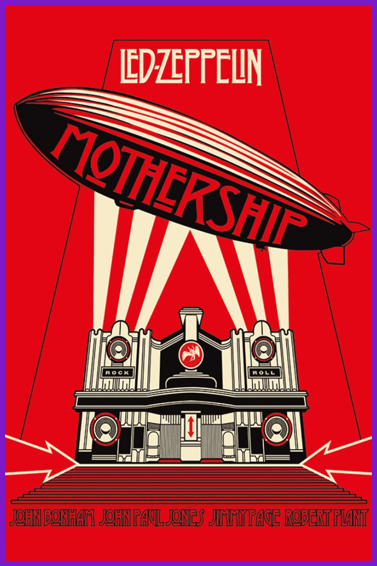

Red draws attention and is associated with love, energy, war, strength, and passion. Using this color in graphic design is a bold decision, but only if the product is really powerful and bright.
What is the Brightest Color On the Wheel?


Yellow is the brightest color on the color wheel. It is often associated with happiness and joy, as well as reliability and self-confidence. Designs in which yellow is the primary color convey energy and optimism.
When Orange Is the New Black?
Orange is the color of adventure and communication. Here aggressive red is balanced with cheerful yellow – and the combination is strong and driving, but friendly at the same time.
What Is the Color of IT?


Blue is a calm, peaceful and reliable color. Insurance services, banks and IT companies often choose this color for their logos and websites because it conveys security and honesty.
Which Color Demonstrates Harmony and Peace?
Green is a symbol of life, renovation and growth. The main place of all shades of green is nature, it is its main color. Use green to show harmony and inner peace.
Do We Have Some More Color Theory Tips?
We also want to give you a few more tips on how to use colors and create an outstanding design. When looking for a proper contrast harmony for your future design, it is necessary to remember that:
- bright colors go well with muted colors;
- warm colors combine well with cool colors;
- dark colors are better to combine with light colors;
- bringing in achromatic colors to your composition enhances contrast (warm colors are best combined with black, and cold colors with white or grey);
- highlighting of the main color contributes to accentuation and strengthening the general ideological content of the composition;
- pure colors varied shades usage allows to remove sharpness.
Are There Some Sources For Easy Color Harmony Search?
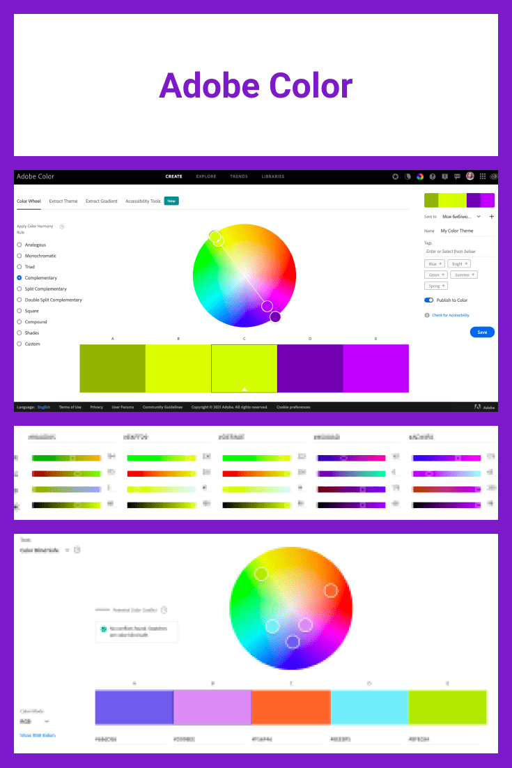
For dessert, there is an awesome Adobe tool which can help you to find different color harmonies in an easy and simple way. Here you can choose any type of Color Harmony you want to use in your design, then move the little upper circle on the color wheel to choose the main color you will use in your project, and voila! you have the ready-made color scheme just in a few seconds.
That’s it, I figured out the color wheel, where should I send my ready-made cool designs?
Master Bundles always welcomes your cool design bundles, which you can easily add to the site using an intuitive upload form. Here we have the philosophy that designers should do their pure creative work, but sales and marketing are our concern.
Kisses and hugs.
How can I help make the world a lovelier place?
Don’t be afraid to use your creative superpower to the maximum, at the same time following the rules of color theory and you will make high-quality designs that everyone wants to buy and use 🙂
And if this article was helpful in understanding color schemes, then don’t be shy to share it with all your friends on Facebook or other social networks. Especially, if some of them still don’t really understand why you can’t mix purple and red 😀
And don’t forget to sign up for our newsletter, there’s a lot of useful stuff 😉
Article reviewed by

This topic is extremely relevant not only to artists like myself but to graphic designers and decorators as well. To get started with color theory, you will need to examine and become familiar with the color wheel. When you look at the wheel, you can see which colors are opposites and which are close in shade. The wheel is an excellent tool that can help someone get started with color theory, and I've attached an image as an example.
As an artist, color theory matters because I need to know exactly how to mix the perfect shade of color for whichever piece I'm working on. I need to understand how to mix different shades of primary colors to create the secondary colors, and also understand how to add whites or blacks to change the value of a color. Another important aspect of color theory is understanding how complementary colors work. Using complementary colors while mixing helps us create a variety of neutral tones, which add a sense of realism to any piece, as most colors we see in nature aren't perfect brilliant hues, but rather shades with a variety of neutrals in them.
Complimentary colors are also important when designing a piece. Because color is relative, complementary colors also help a main color pop. For example, if you are designing a piece and need to prominently display the orangishness of something, surrounding the orange item with a neutral blue, its opposite on the color wheel, will help the orange stand out. This aspect of color theory is incredibly important to any type of design, whether creating graphics for a book, clip art for a website, or an oil painting for a gallery. Understanding the relativity of color, how a hue appears to change color when placed next to a different hue, and how colors interact is vital to all aspects of design work, and this is why color theory still matters.
Some Awesome Video About Color Theory Wheel in Graphic Design
COLOR THEORY BASICS: Use the Color Wheel & Color Harmonies to Choose Colors that Work Well Together
Learn color theory and how to choose colors that work well together: with the color wheel, color harmonies and color palettes.
What are your concerns?
Thanks for your response!
Disclosure: MasterBundles website page may contain advertising materials that may lead to us receiving a commission fee if you purchase a product. However, this does not affect our opinion of the product in any way and we do not receive any bonuses for positive or negative ratings.