Brutalism Graphic Design: Full Guide (2023)
Design trends are constantly changing. The concept of brutalism often pops up in the design community, but many don’t understand what it is about. Check out this article and you will find out the history of its origin movements, learn how to spot this style in the real and digital world, and learn how a web designer can apply it. Let’s get started!

What is brutalist design itself? Let’s plunge into its history.
You need to understand that web design is not the area where this style originated. It originally came from another art format. Which one do you think it came from?
The brutalism trend appeared in the architecture of the 50s and 60s. The Second World War had passed and left behind destroyed cities, devastated countries’ economies, and a huge number of people without shelter and the other “finer things in life.”
There was practically no money and no choice of materials for construction, but cities had to be rebuilt. Beautiful buildings with decorations were out of the question – no resources, no time for design, and such solutions were impractical at that time. Who needs monograms when tens of thousands of people have no housing?
We needed something convenient, simple, safe, and understandable – thus the style known as brutalism appeared.
The buildings of brutalistic style were cold and rough. You definitely have examples of these in your city, so I offer an interactive:
- go out for a walk on a sunny day
- given your knowledge on brutalism, look for it in your city
- share the result and photos with us in the comments
It will be interesting – let’s try it!
The name itself already characterizes the style. Surprisingly, it is based on the non-English adjective “brutal.”
Brutalism is from the French “beton brut,” which literally translates as “raw untreated concrete.”
The main visual component of brutalism in architecture is a large amount of concrete and “dampness.” There is no decor, no smooth lines, and no soft edging. It often appears if they took a huge stone and tried to give at least some shape to it.
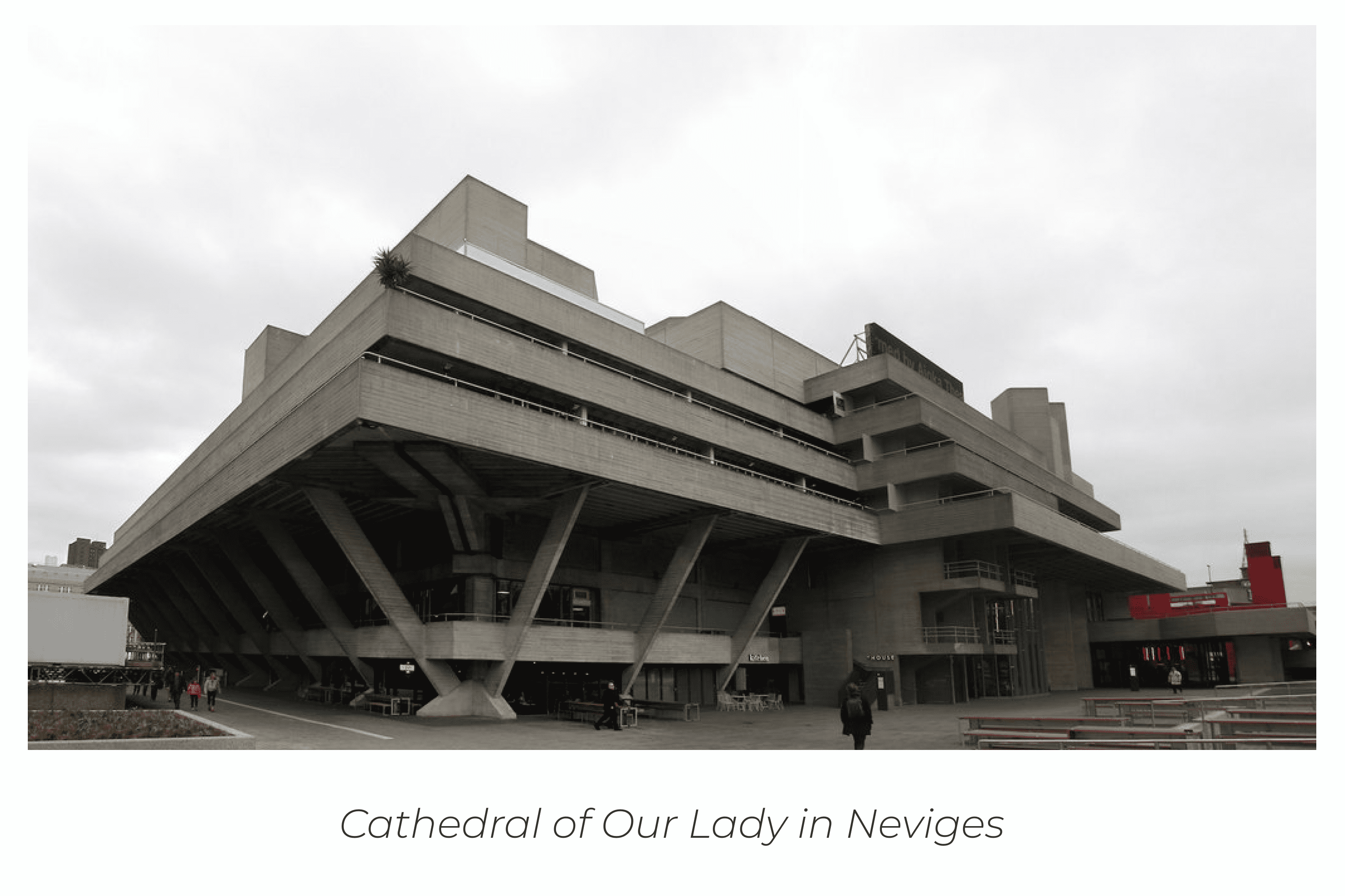
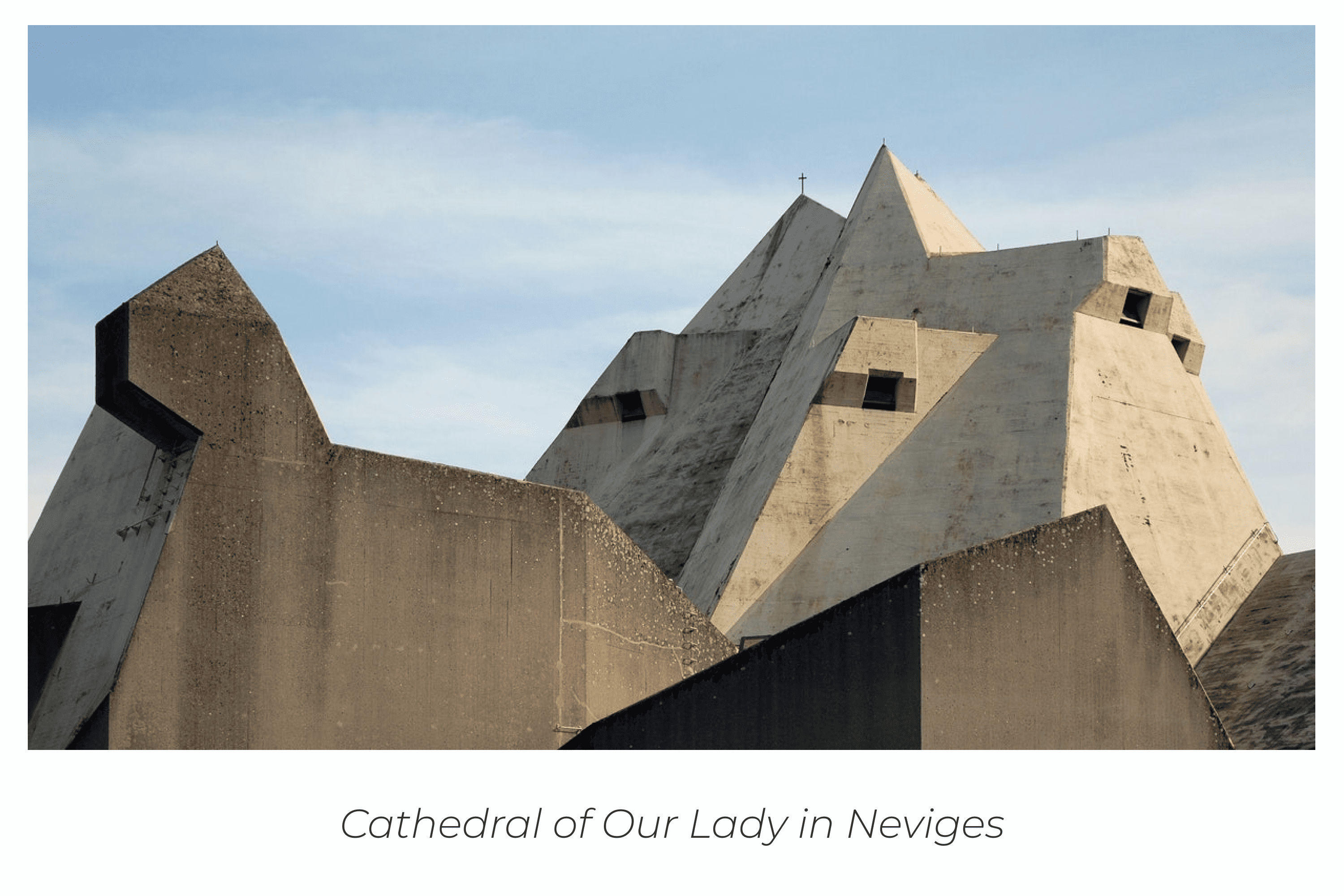
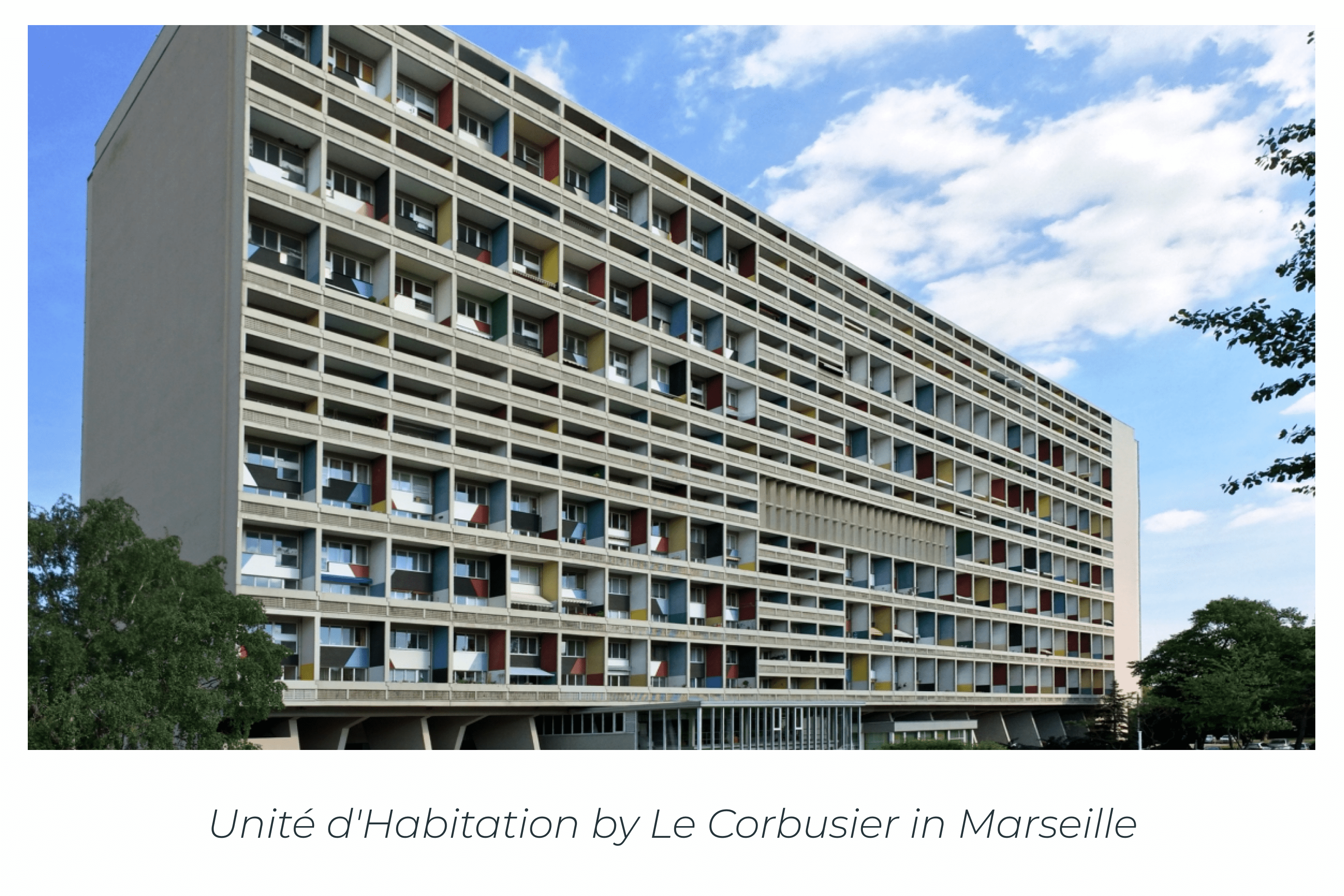
The first building of this trend was the Unité d’Habitation by the architect Le Corbusier in France, Marseille. This project included 337 apartments, which was a convenient solution to the problem of housing for those whose houses were destroyed by the war. The project was successfully implemented in 1952 and the architect continued to build similar structures. The next one was built in Berlin.
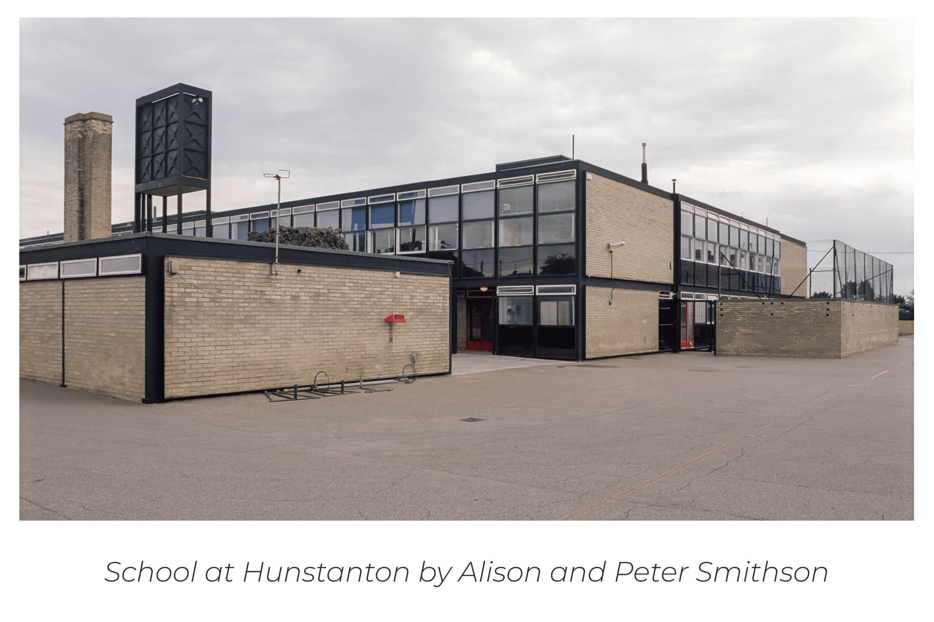
Was everything built only of concrete? Basically yes, but not without a few exceptions. The famous architects Alison and Peter Smithson from the UK decided to go beyond the standards and built a school in Hunstanton out of glass and brick.
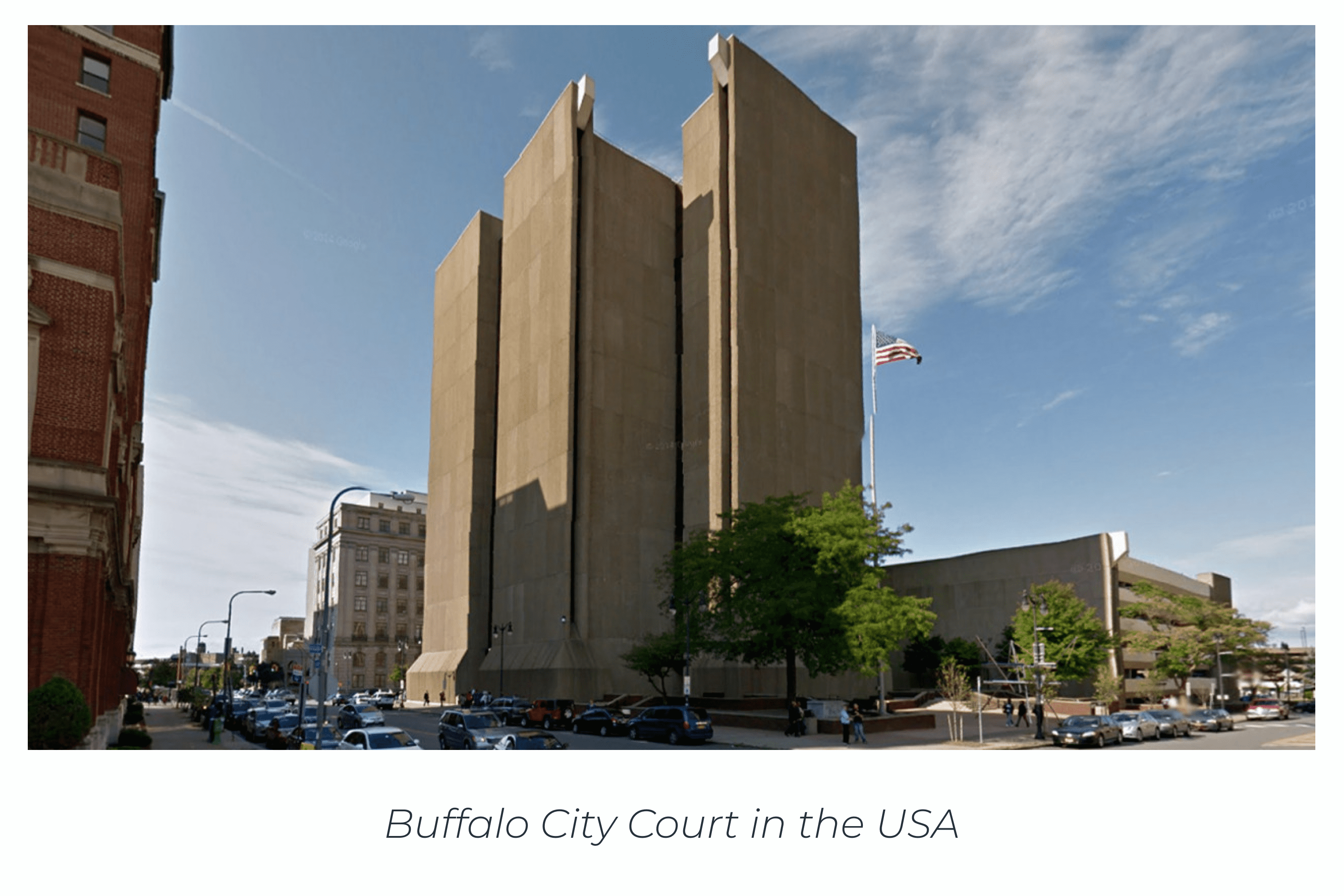
The most famous brutalist building is the Buffalo City Court in New York, USA. It was built in 1974 and is still in operation. Looking at it, you can feel the weight of the many sentences and ruined destinies that occur there. Do you feel it too?
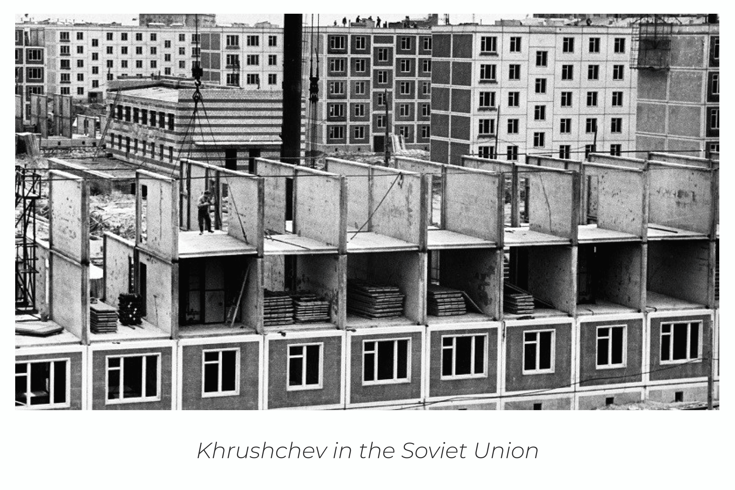
By the way, the course of brutalism caught on not only in European cities, but also in the Soviet Union. The problems of the post-war period did not bypass it, and in addition, the government promised housing for everyone.
From this came “Khrushchevki.” These anthill-like apartment buildings were the solution. At the time, it was considered temporary housing, although people still live in it today.
Closer to the 70s, many European countries increased their standards of living and wanted something more elegant, joyful, and interesting. Therefore, brutalism had become somewhat obsolete, later to be reborn in the digital world.
Minime Color Font:
How did the brutalist art style resurface?
In 2014, the creative design community showed the world their protest against lined, sleek, and ready template sites. The Internet was taken over by visually similar services, which means that no one stood out in the market.
Therefore, unusual and mind-blowing sites began to appear. In 2014, creative agency director Pascal Deville first called this trend “web brutalism.”
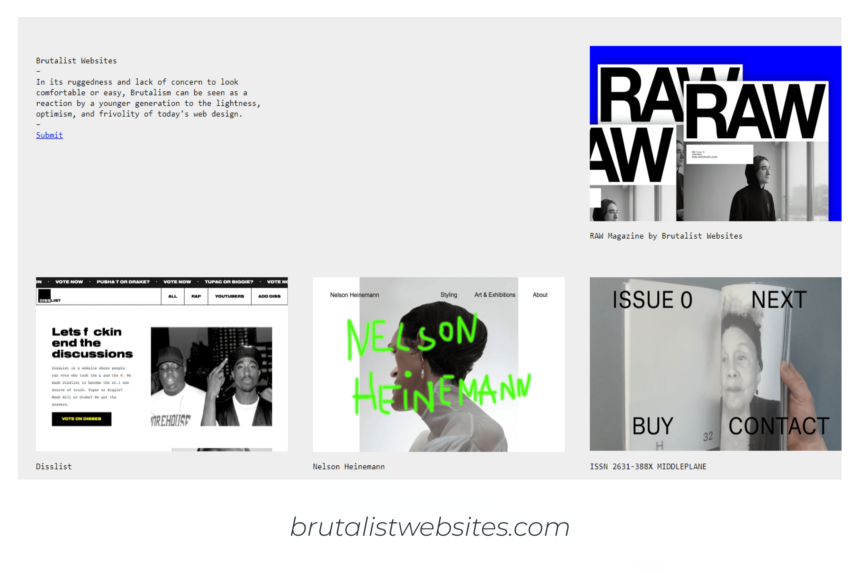
He even launched a thematic portal where he collected all the creative services in brutalist design style for inspiration. The portal itself is also designed in the best traditions of this trend. Go to it and share links to those projects that blew your mind in the comments!
Web brutalism has become a countercultural trend in design. This is a loud protest against minimalistic identical sites.
The main purpose of this style is to create the most understandable site without visual excesses—rounding, mottling, and unnecessary design—to make the content most readable and user-friendly. But how is this different from minimalism?
By the way, if you create works in the brutalism style, we will be happy to see you on MasterBundles. Our marketplace welcomes designers of all styles & skill levels. Uploading your products will take just a few minutes if you use our convenient Sell Your Deal Form. Don’t hesitate to make the digital world better 🙂

Types of digital brutalism
Since some designers confuse this trend with bad taste and lack of understanding of website creation, then several types of brutalism can be distinguished.
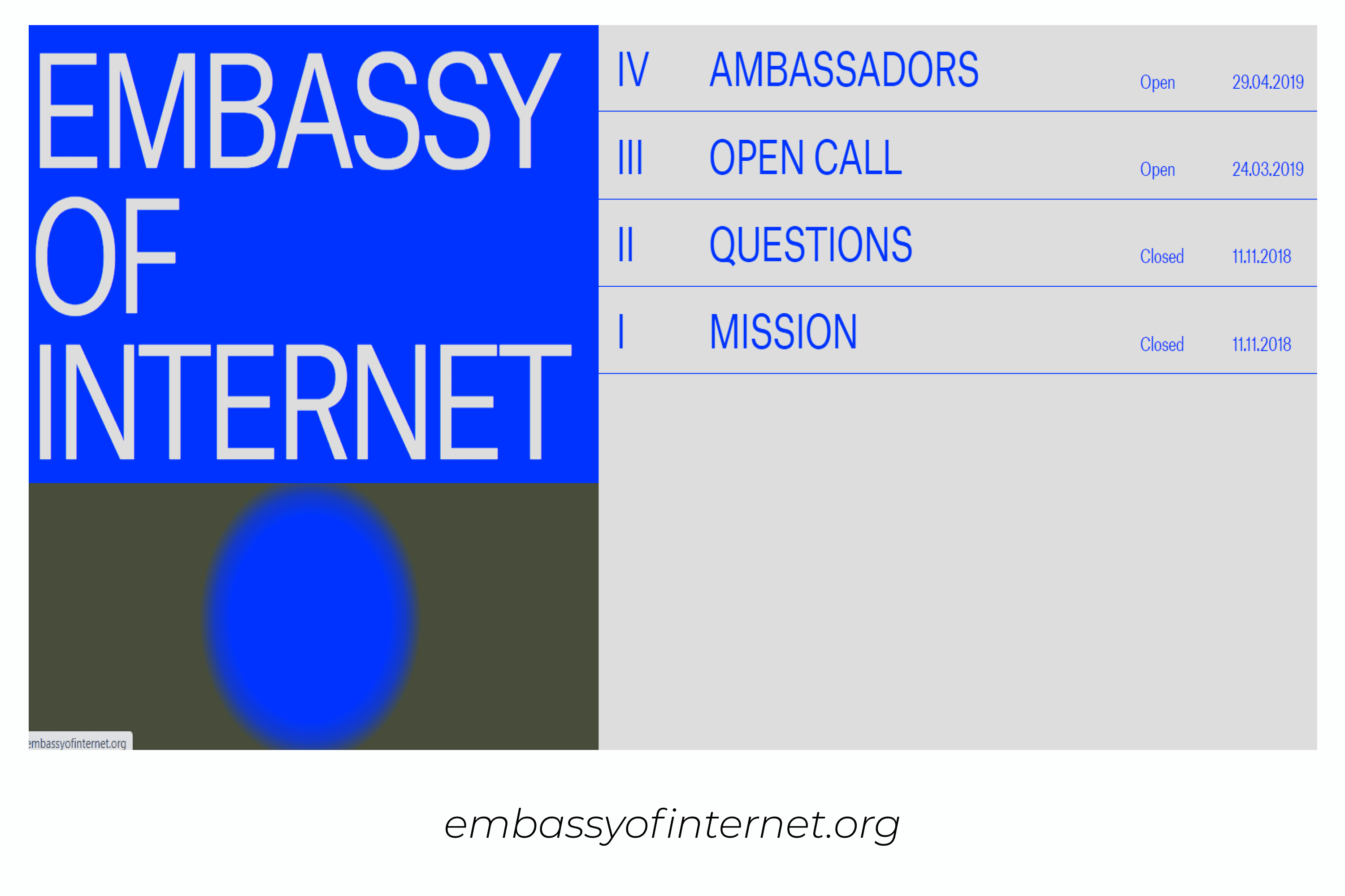
L’internet BRUT
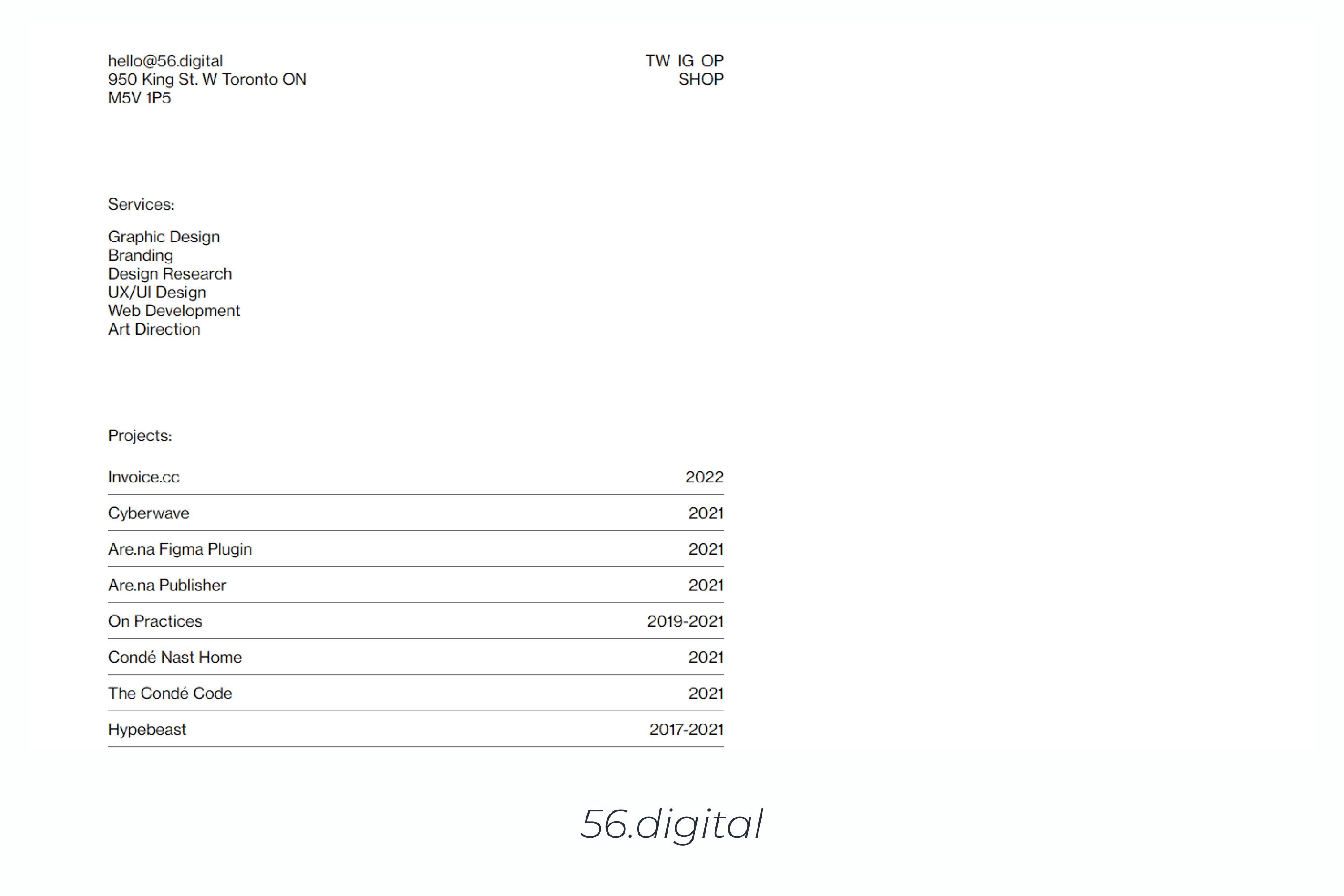
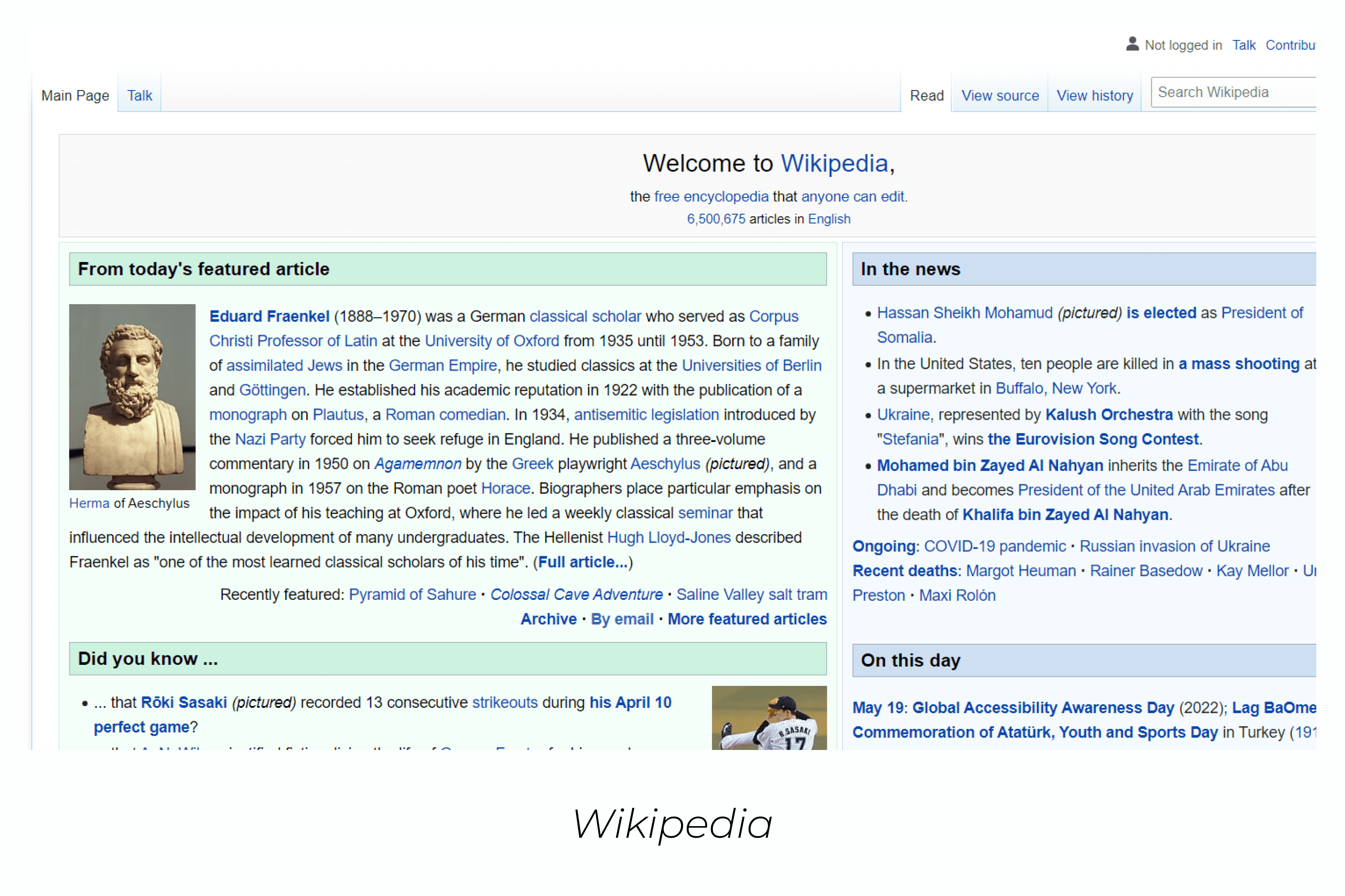
This type of brutalist design is the closest to the philosophy of architecture. The basis is simplicity and clarity. L’internet BRUT can be translated literally as “Raw” or “Unprocessed Internet,” the source materials of which are the HTML markup language and the minimally used CSS style language.
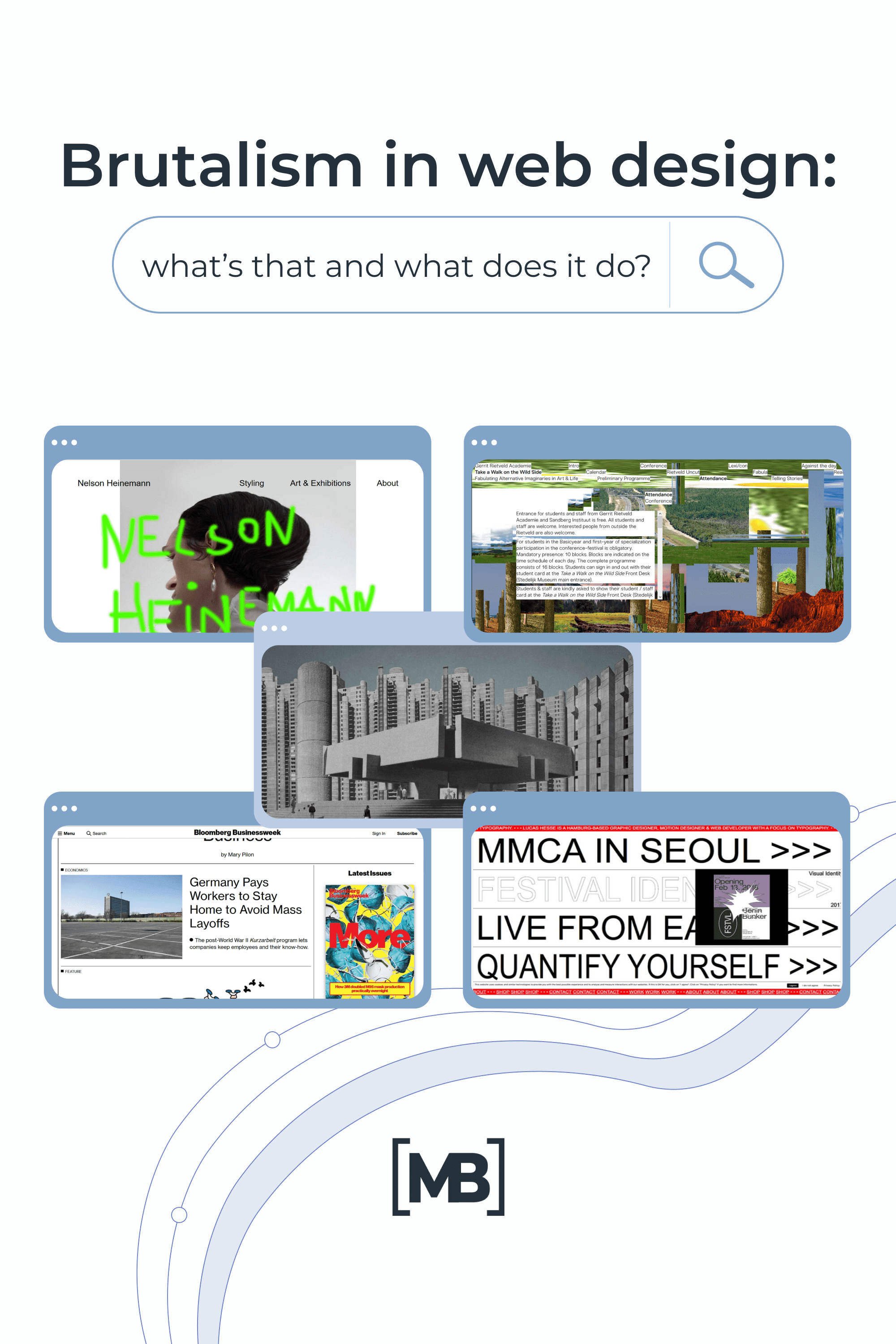
On such sites, the hyperlinks are blue, the background is white, and the text is black. The most famous representative of this type is the well-known Wikipedia site.
L’internet FOU
This type of brutalist web design is the most controversial in the community, but also quite popular. Literally, L’internet FOU can be translated as “crazy internet.”
The philosophy of this style is to protest newfangled sites. This is what became the trend of 2019-2020 and is now actively developing. You can read about other design trends in 2022 in this article.
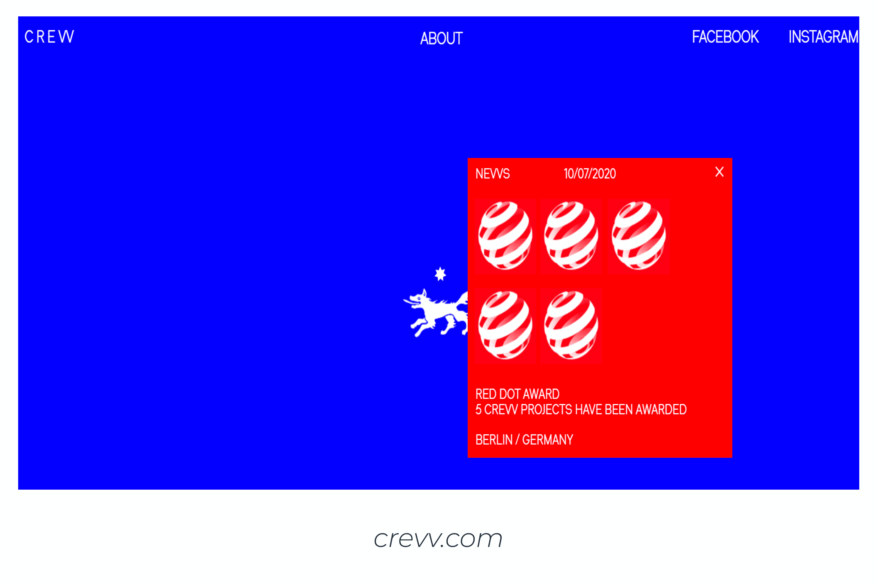
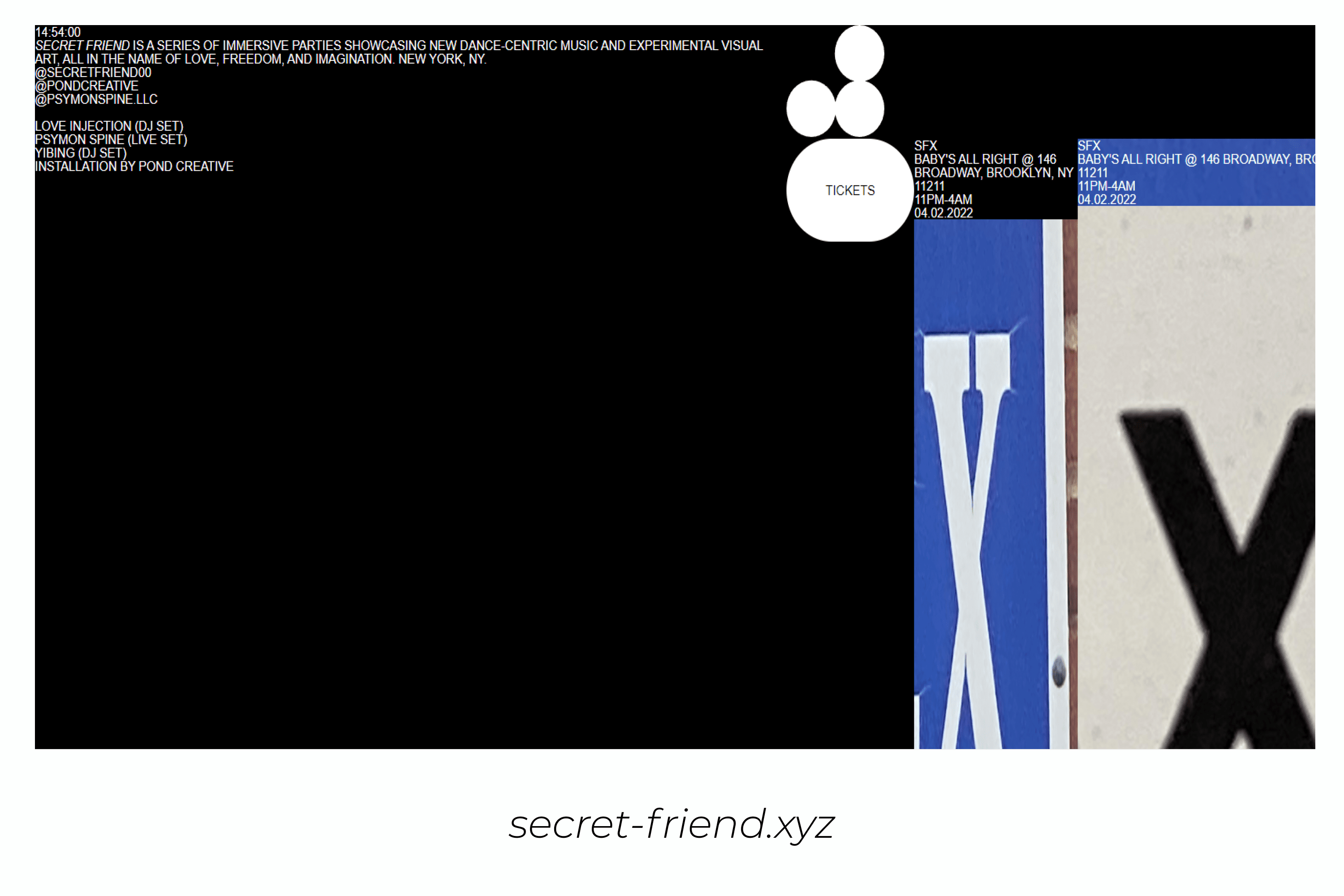
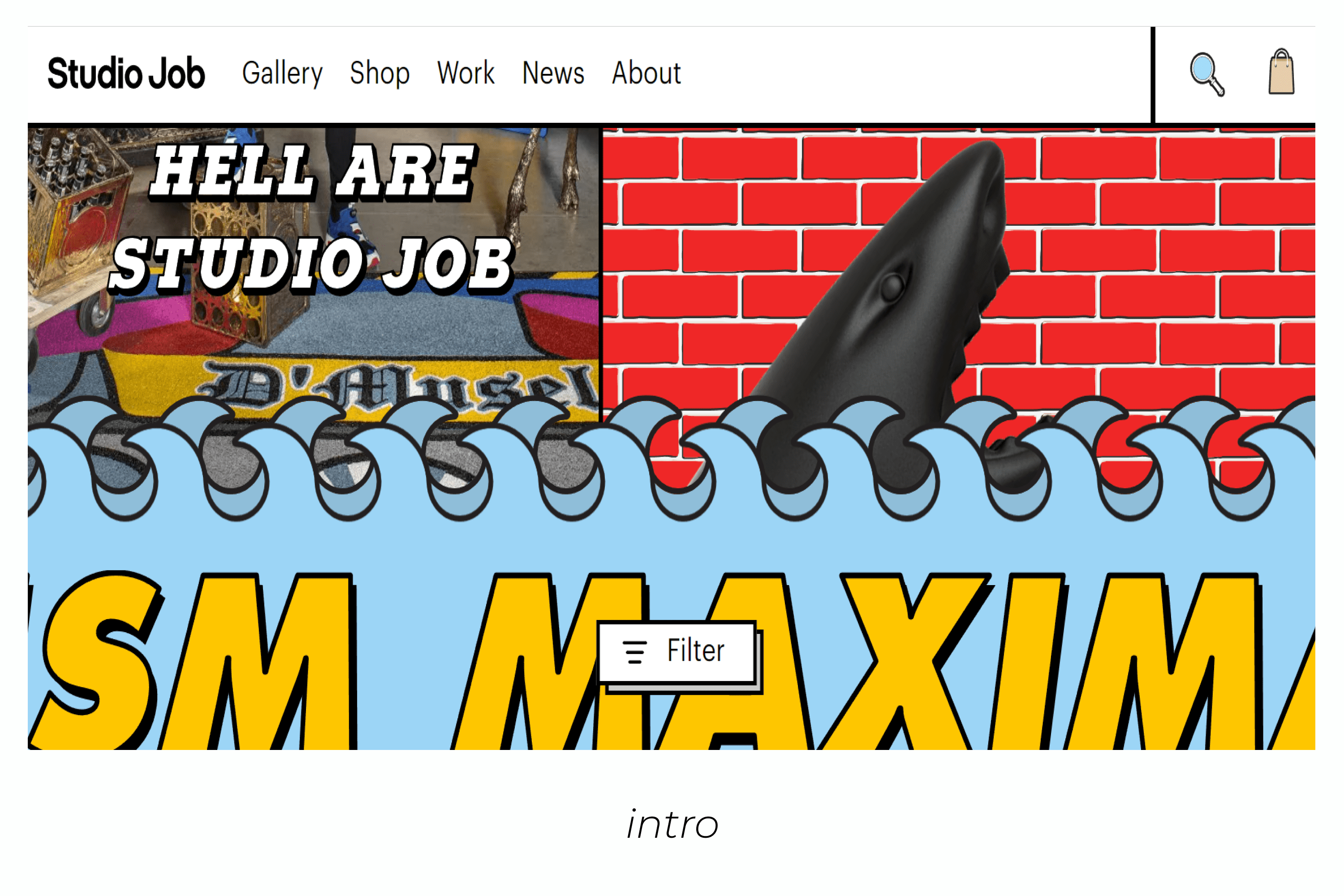
Sites of this type are often complex, combining toxic colors, rough shapes, and raw images.
My Honey Modern And Stylish Brush Font:
How to recognize brutalism design
In order to not be confused by brutalism web design, it seems that you need to remember the main features of the style. Let’s get started!
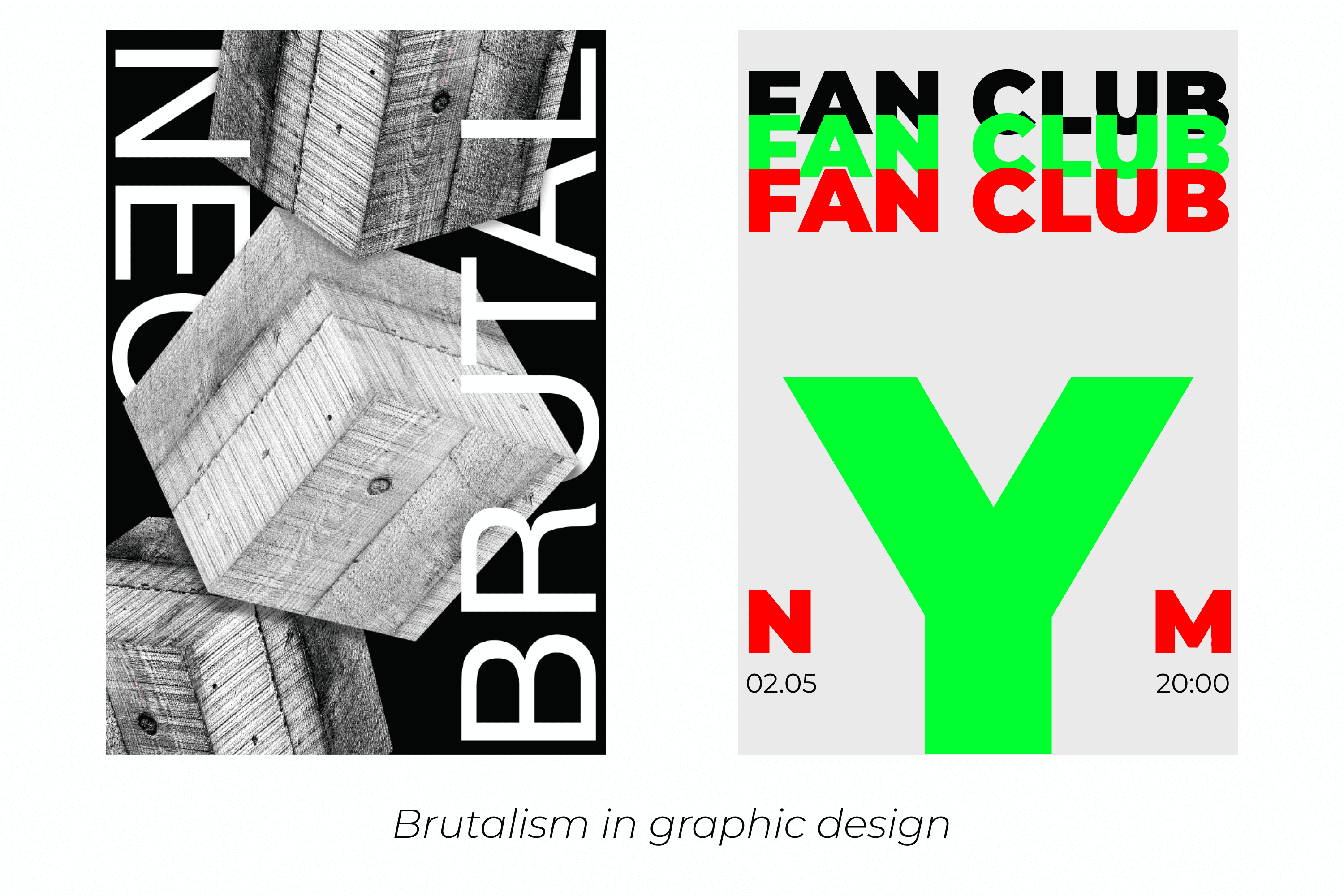
- Solid “raw” background. It can be white or black without shadows, textures, or gradients.
- No hierarchy. If you go to a site and your eyes scatter, then this is it.
- Often a single font, monospaced typography, is used. However, there is a downside to using a mix of fonts.
- Brutalist typography is also highlighted by lettering across all or most of the screen.
- There is no symmetry and not enough space between the elements. As if everything was squeezed as close as possible to each other in order to add more. Vertical rhythm, positioning and alignment have disappeared without a trace. And what was a grid is forgotten completely.
- The lack of a properly chosen palette. The mixing of mismatched colors. Often it is green, blue, or red.
- No images at all.
- Black and white style, where all elements are designed in black and white.
- Minimal site animation.
- Overlapping elements. And no, this is not because a layout designer wrote the wrong code – it’s actually a design decision.
- Links are underlined and buttons look like buttons. Links can also be blue, like hypertext in a document.
It looks like there are visual errors in the design. That is why brutalism is either adored or not understood. But it definitely evokes emotions, which means it attracts people.
For some web designers, brutalism is a way to step outside the boundaries that the community has set. Such sites may look like the worst examples of websites of the 90s. It is often created purely as a joke for other designers who understand the irony.
Tio: If a web designer wants to stand out, create something unique and memorable, then this trend is clearly worth paying attention to.
Best Related Articles


Advantages and disadvantages
If you remove taste preferences, then the advantages of brutalism in web design are:
- non-standard approach to presenting the products or services
- viewer reaction (black PR is still PR)
- saving time on the creation of technical specifications and the structure design
- the predominance of meaning over form, if brutalism is used in a dosed manner
The disadvantages include:
- not suitable for all niches
- clients often refuse to design in this style, because of the fear of being misunderstood by potential customers
- criticism from a number of users
- inconvenient interface if brutalism is used to the fullest
What can you get out of brutalism for your work?
To benefit from the use of the brutalist style, it should be used in a dosed manner.
The functionality and simplicity of the early brutalist buildings can be applied to web design. A simple one-page site with clear anchors can do a better job and bring high conversions. Using an unusual combination of colors and fonts can make your product stand out.
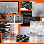
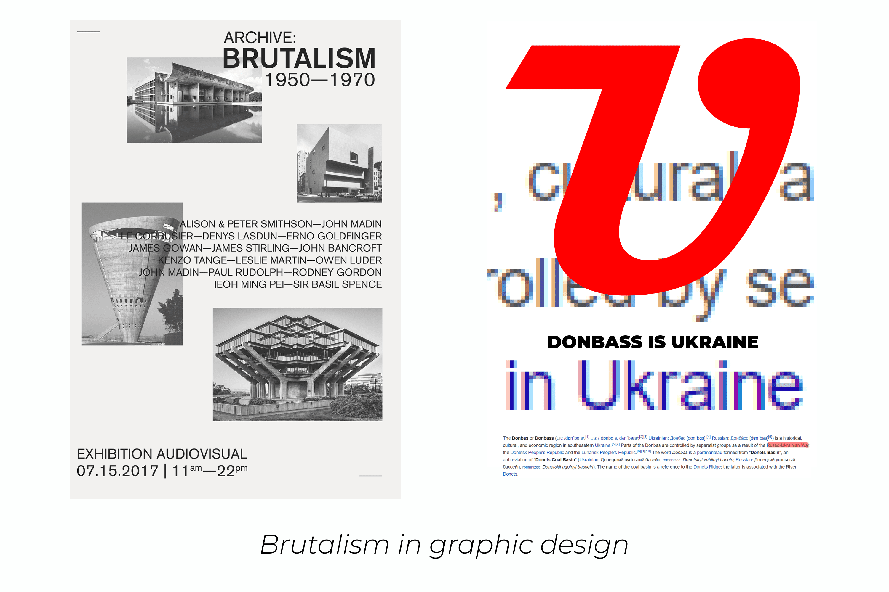
You can use brutalist graphic design to create posters, advertising banners, certificates, and business cards for your project; it’s not just for website development.
Findings
Web brutalism is special and won’t appeal to everyone. But it is easy to take advantage of any direction, but you need to use its advantages in a reasonable dosage. The novelty effect sometimes breaks established associations and forces the audience to change their mind about the brand.
A designer needs to understand how to use web brutalism in a way that doesn’t look gaudy, and know whether it’s worth doing for a particular project.
Now web brutalism is moving from being misunderstood and not accepted by the audience, to the mainstream and something that can be commercially feasible.
In doing so, brutalism taught us that there should be no monopoly in design. When you flip through various sites, and they are all made in the same colors, the same fonts are used, photos and blocks are located very similarly, it gets boring.
However, in order to spread further projects on Dribbble and Behance, we believe that web brutalism must become a bit softer for the audience.
Some Awesome Video about Brutalism
What is brutalism in web and graphic design & how to work with it?
Design trends are constantly changing. The concept of brutalism often pops up in the design community, but many don’t understand what it is about. Let’s find out the history of its origin movements, learn how to spot this style in the real and digital world, and learn how a web designer can apply it. Let’s get started!
- graphic design news
- really bad websites
- types of graphic design
What are your concerns?
Thanks for your response!
Disclosure: MasterBundles website page may contain advertising materials that may lead to us receiving a commission fee if you purchase a product. However, this does not affect our opinion of the product in any way and we do not receive any bonuses for positive or negative ratings.