Everything Is in the Fonts – a Glossary for Beginners
If you just discovered an interest in graphic design, typography will be among the first areas you get acquainted with. Its world is complicated and versatile, like jungles. You will delve into font types, colors, sizes, contrasts, spaces, and other principles essential for efficient design. To walk through the jungle unharmed, you need a guide, and there we are.
In this glossary, we will touch on some aspects of typography that you can deepen into later. We start from the basics, gradually beading it with additional terms. Thus, using it as a syllabus is a great idea 🙂
Basics – Types of Fonts
Sans-Serif fonts are fonts without serifs at the end of strokes. At first they appeared in the late eighteenth century. Initially, they were applied exclusively as decorative fonts, but in the twentieth century, people started to use them for typing. Sans-serif fonts represent simplicity and minimalism.
Serif fonts are opposite to sans-serif fonts – they have serifs. Serifs are one-sided and two-sided. Their shape can be varied: triangular, rectangular, rounded, decorative, in the form of a thin horizontal line, and so on. The readability of serif fonts from the monitor screen is still a controversial issue, and some designers prefer not to use this typeface for large blocks of text.
Accidental (display) fonts have an eccentric design. They are unsuitable for the main text and are intended for title pages, labels, posters, headings, and other small text passages to attract and emphasize attention. Display fonts can be formal or informal and reflect any mood. Gothic fonts, imitating medieval handwriting with a wide-nib pen, can also be attributed to the accident ones.
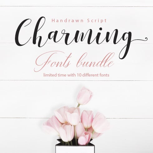
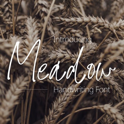
Script (handwriting) fonts imitate someone’s handwriting or calligraphy style. There are two subtypes: formal and casual. All formal ones have something in common – an elegant, noble typographic design. These fonts are not suitable for basic texts. Casual handwriting fonts are more modern. They are not so strict in shape, with broad strokes, and often resemble an imitation of a letter with a soft brush.
Symbol (dingbat) fonts. These are fonts that have icons instead of traditional letters. This group includes sets of special characters (mathematical, linguistic, phonetic, chemical, musical, chess, keyboard, etc.), borders, ornaments, vignettes, and other typesetting ornaments. The most popular symbol fonts are FontAwesome, Zapf Dingbats, Wingdings, and IcoMoon.
Proportional and monospaced (fixed-pitch) fonts. In proportional fonts, the width of the character varies depending on the design of the letters. For example, the letter “i” in width is much smaller than “m.” Times New Roman is a proportional font. In monospaced fonts, each character occupies the same width. Narrower signs simply get more space around them to level the difference in width. Examples of monospaced fonts include such fonts as Courier New and Anonymous Pro.
Basic Typography Terms
Further, we gathered the basic typography terms. If you believe we need to add something, let us know in the comments.
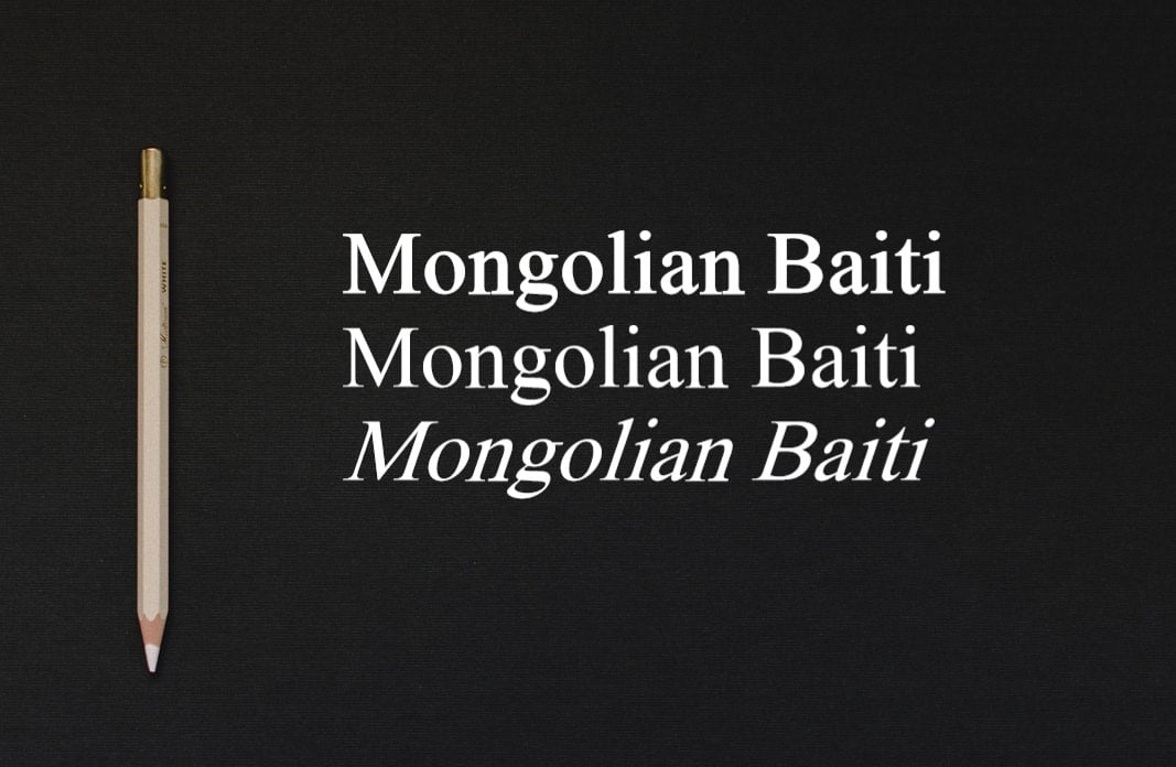
Typeface is a set of fonts, united by common style features, different from other fonts. It’s a group of characters, letters, and numbers with the same design. Mongolian Baiti is a typeface. It has various attributes, slopes, thin and thick lines. As a rule, when talking about a typeface, it means one font and all its possible styles. Each style of the typeface is a font.
Weight. Determined by changing the thickness of the main and connecting lines of the same signs. This means that within a single typeface, weight can vary: super light (ultralight, extra light, thin), light, normal (book, regular, Roman), semibold (medium, demibold), bold (heavy), and super bold (extra bold, black, ultrabold). Look at the bright example below.
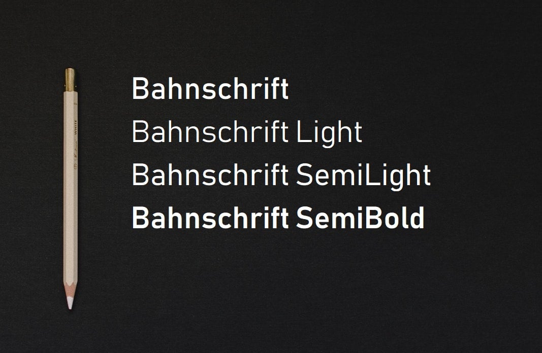
Good and rich typefaces have many variations of this parameter.
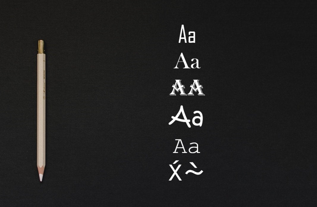
Contras is one of the main font features. It’s the ratio of the thickness of connecting lines to the thickness of the main lines of characters. This feature varies from low-contrast to high-contrast fonts. The easiest way to understand it is to look at the example.
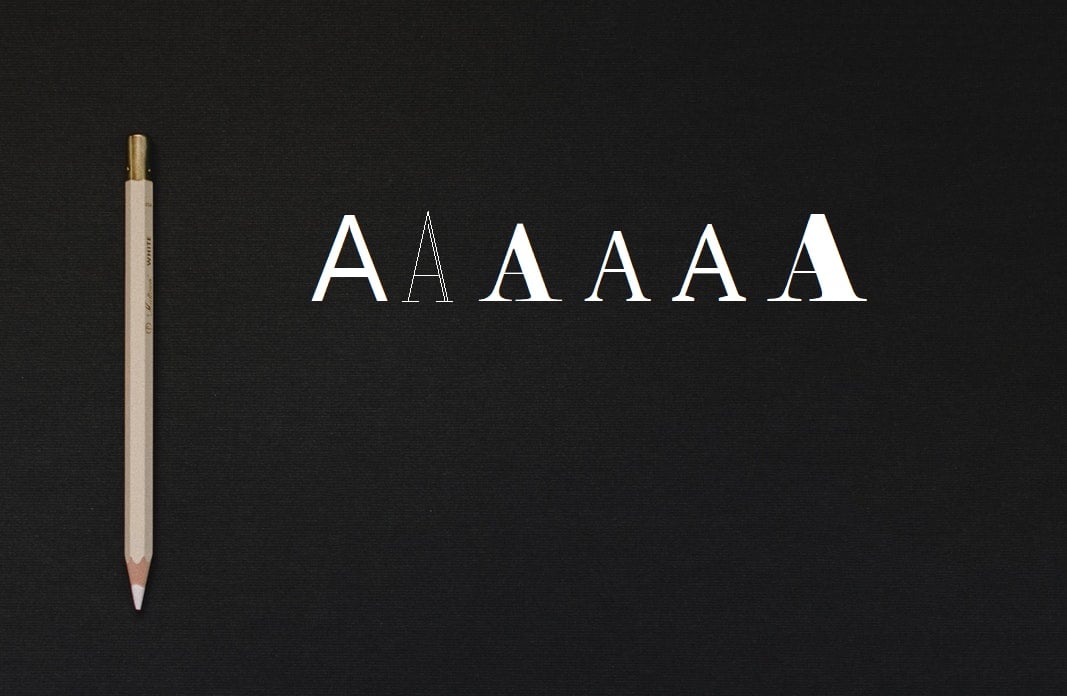
Here you can see different fonts chosen for the same letter A. We see that the thickness of the main lines in some fonts is much larger than the connecting line that runs horizontally. The font can be non-contrast (monoweight), low contrast, contrast, and high contrast.
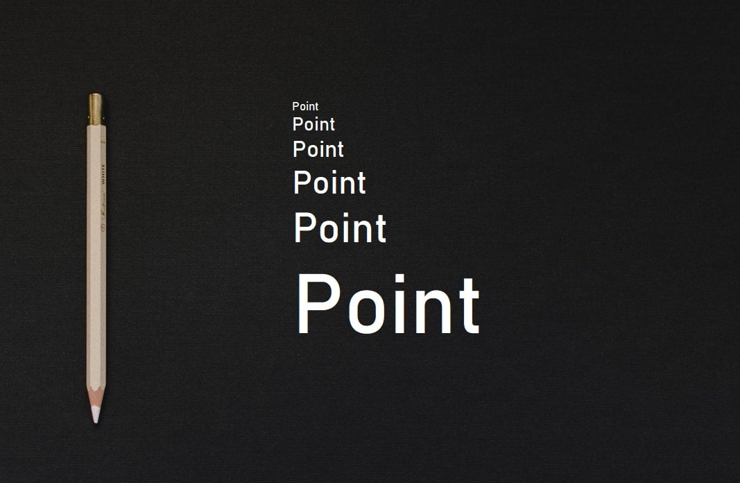
Point size (size, body size) is a typographic unit of measure. The size of the font in the typeface or the size of the spot on which the sign is placed.
Tracking and kerning. These two concepts are more complex, but they allow you to set the tone of the information in the design. Tracking is an even or proportional spacing between letters. Kerning is a selective or different spacing between letters. Below you can see an example of tracking. Tracking and kerning can be positive (the set becomes more rarefied) or negative (the set becomes denser).
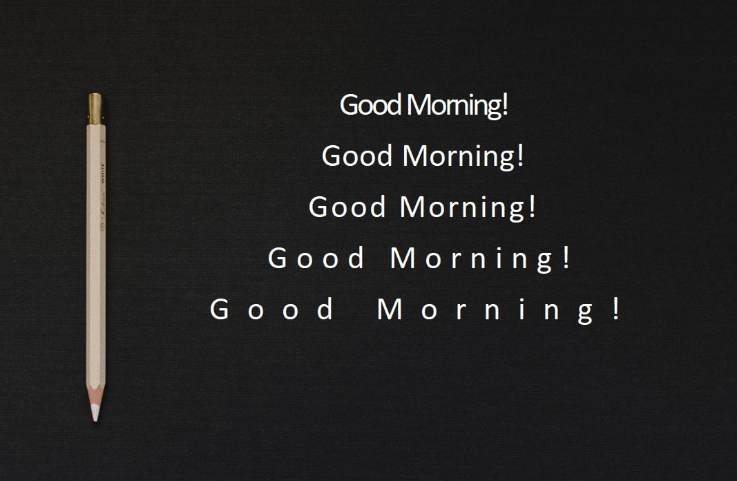
You can see that even though the lines are written in the same font, they give completely different perceptions. You may notice such examples of using great tracking on sites related to style, fashion, design, photography, and other art-related topics.
Linespace (leading). This is the vertical spacing between lines of text. Beginning designers often neglect linespace forgetting that it needs some settings at all.
Read more about kerning, tracking, and leading in our article.
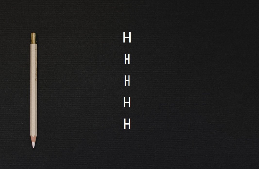
Proportion. It is an indicator of the change in the width of the characters within the same typeface. As a rule, it is measured by the outer contours of the main strokes of the “H” sign. Changes in this relationship form extra-condensed, condensed, normal, extended, and extra-wide parameters. There may be other degrees of change in proportions.
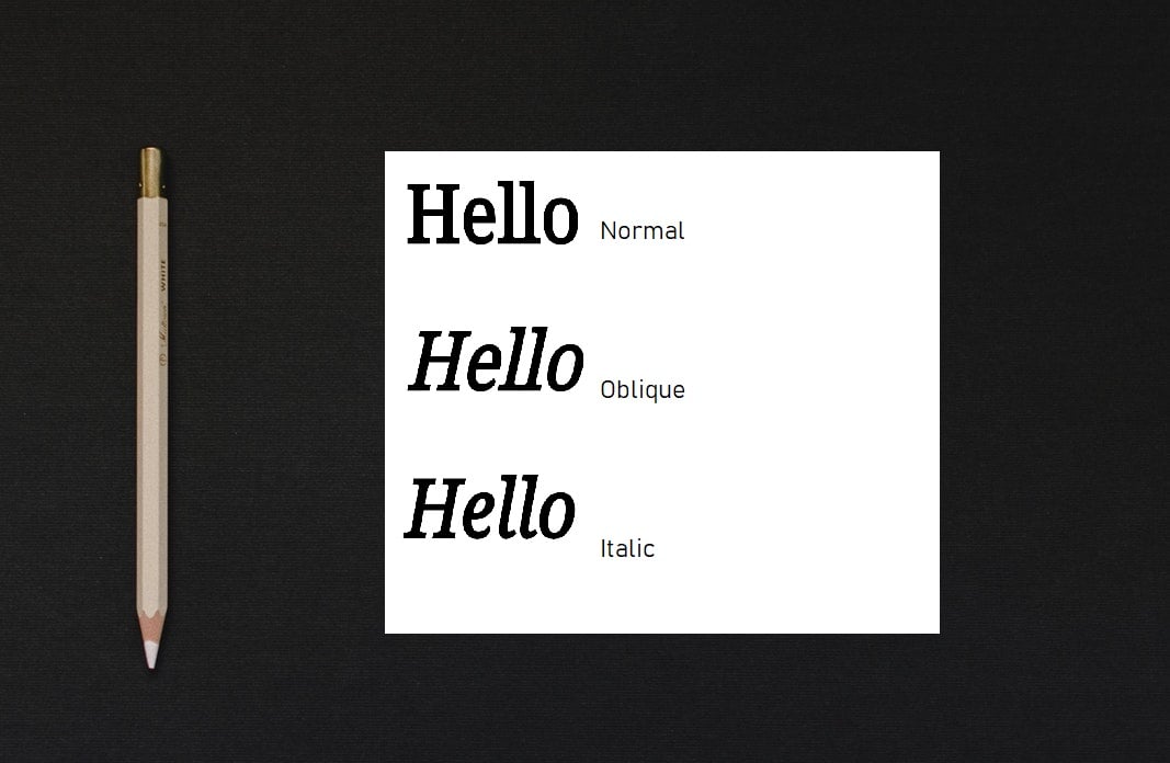
Italic and oblique. Italic and oblique are often confused, considering them the same, but they are different styles.
Oblique, as the name suggests, is a mechanically slanted typeface and does not differ in the structure of letters from regular writing. You can create a similar style by clicking on the desired button in Photoshop, although sometimes the ready-made version is inside the headset.
Italic is also oblique but with its own unique set of characters, significantly different from regular writing in a more handwritten form of lowercase letters. The English name Italic indicates that for the first time, such a font appeared in 1501 in Italy at the printing house in Venice. It was cut by a Bologna engraver based on the handwritten italics of the papal office and had no capital letters. As a rule, it is now used with the regular font as a highlight.
Good typography is a pledge of easily accessible information, while in the case of bad typography, you have to make an effort to understand the text. As Oliver Reichenstein notes in the article, Web design is 95% typography, and optimization of typography is the optimization of readability, accessibility, ease of use, and the achievement of graphic balance in general. And now, let’s find out what parameters help to achieve all this.
Important text parameters:
Font size – it should be comfortable for the average user, not too small and not huge. The reader has no desire to increase or decrease the text in his browser.
Font style – must correspond to the site’s theme and display each letter. No one will peer into intricate curls or words crushing each other.
Line and letter spacing – there should be enough free space on the page. The text should literally “breathe.”
Color – since the main task of the text is to be readable, no unpleasant or indistinguishable color combinations with the background are allowed.
Font Type and Color
The choice of type and color is a very important part of web design. It depends on how the site visitors perceive the information and whether the site will be memorable.
Font Type
Let’s find out how different fonts affect consumer mood.
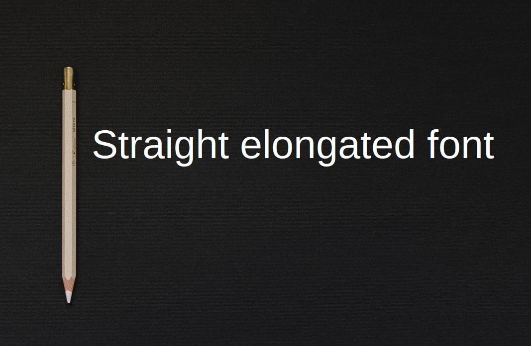
Straight elongated fonts. They convey a business mood and are almost universal fonts. However, you should note that the direct font will be inappropriate for non-mass and original products that must be visible among competitors.
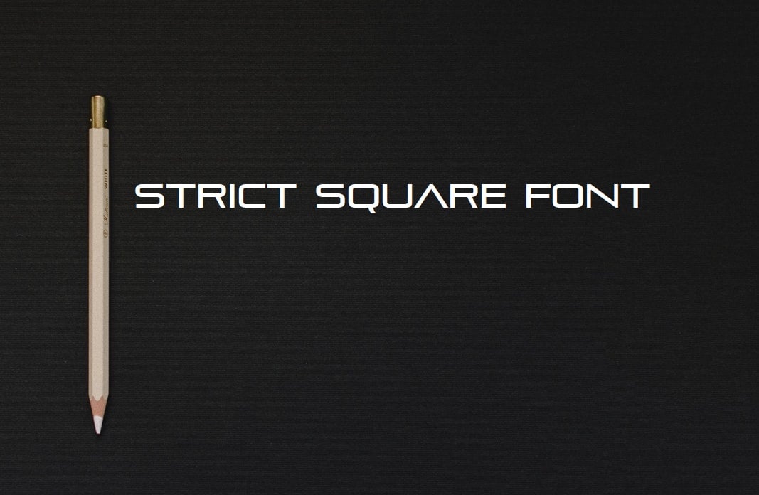
Strict square fonts. Mainly used in the design of social advertising, advertising industrial products, and technology. Lightness and simplicity are inappropriate here. These fonts are designed to set a person up to the seriousness of the information provided. They create an impression of importance and credibility. Therefore, they are designed to attract business partners and investors.
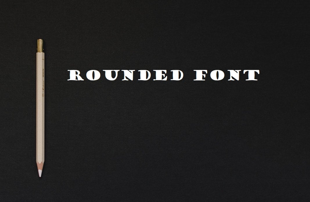
Rounded Fonts. They convey a feeling of comfort and coziness. While square fonts look harsh, rounded ones are positively perceived as a good brand attitude toward consumers.
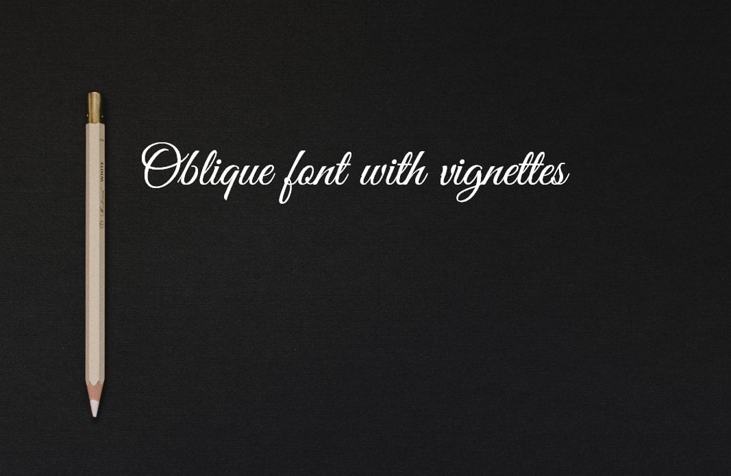
Oblique fonts with vignettes. Most often used to advertise products for girls and women. Such fonts evoke a feeling of lightness and beauty. Beauty salons, clothing stores, and cosmetics often use them. They facilitate the perception of information, and it looks less important.
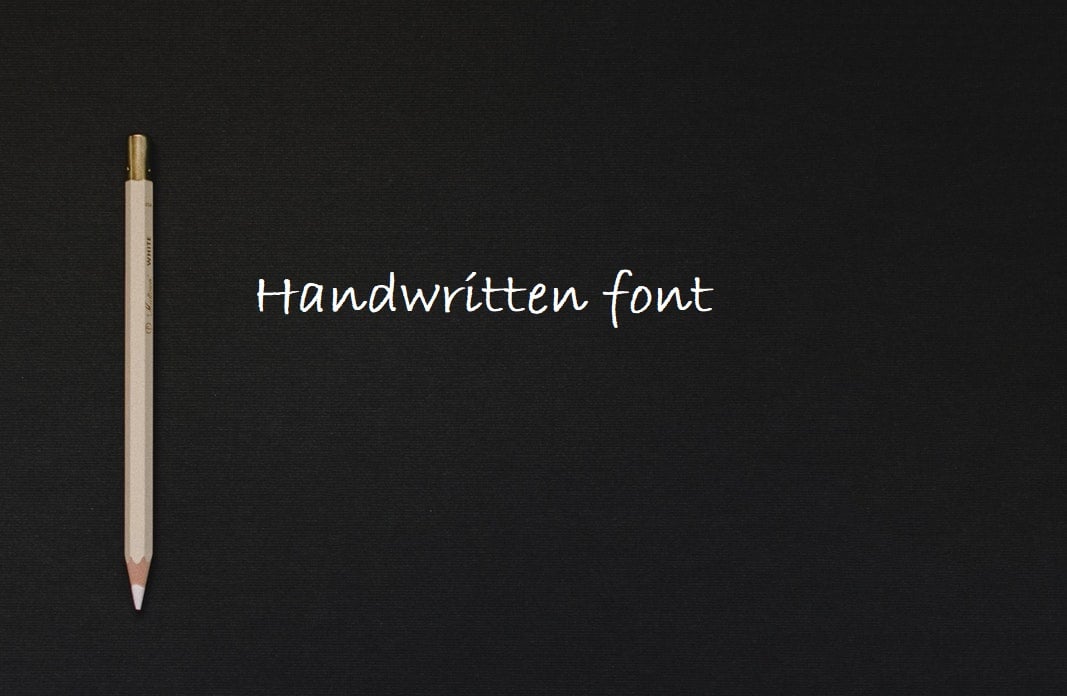
Handwritten fonts. Not suitable for outdoor advertising and oblique fonts – they are difficult to read if the large size of letters is chosen. At the same time, they are great for emphasizing the exclusivity of a product or service. Handwritten fonts are used for advertising lawyers and consulting services, medical practices, writing invitations, and conducting political PR actions. They cause a feeling of trust and give greater reliability to the information.
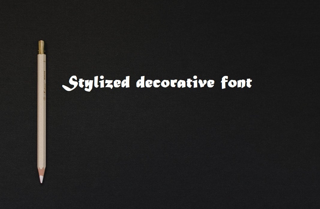
Stylized decorative fonts. Fonts that look like graffiti or Gothic inscriptions should be used only where they will bear the corresponding semantic load. For example, it is completely inappropriate to use a gothic font to advertise a barbershop or children’s store. At the same time, it will look good on the sign of the themed bar.
Color
Color is a kind of “emotions generator” for site visitors. The coloristic design of the text conveys the accents of important information that can cause excitement or stimulate certain actions. This is a powerful factor in manipulating the user’s emotions.
It is best to choose a contrasting background color and text for ease of text perception. In addition, try to avoid a large number of colors. However, do not neglect them at all to escape being bored. Oddly enough, the best combination is white and black (dark gray). Bright shades can be difficult to read. Beware of combinations like red-green, blue-yellow, and purple-orange.
A marketing specialist Gregory Ciotti points out in his essay The Psychology of Color in Marketing and Branding:
“When it comes to picking the ‘right’ color, research has found that predicting consumer reaction to color appropriateness about the product is far more important than the individual color itself. … It’s the feeling, mood, and image that your brand creates that play a role in persuasion. Be sure to recognize that colors only come into play when they can be used to match a brand’s desired personality (i.e., the use of white to communicate Apple’s love of clean, simple design).”
How to Choose a Font?
First of all, you need to understand the purpose of your design. What message do you want to transfer? By what means? In a good design, typography fits the goal. For example, if you create a design that mainly relies on images, it is better to choose a font that fits the style of illustrations and does not distract all attention from itself. The font should be in harmony with the rest of the design. Just like it does Brainik Font in the example below, if images are the main element of your design, use simple fonts to emphasize the illustration.

Some content is never intended to be read but only to improve the design or decoration. In this case, you can choose favor of design over readability. A decorative font that is meant to be “heard,” not read, can convey the idea of your design better than a serious font that is meant to be read, not “heard.” But it is important to remember that the fonts with the strangest or most beautiful designs are far from the best-regarding reading and convenience.
Having decided on the purpose of design, determine the audience. It is extremely important, as the choice of fonts will depend on the age, interests, and cultural background of the audience. Some fonts are more serious, others are more careless and playful, and others are more decorative. Knowing your audience can narrow the font area to choose from. When planning a corporate identity and design, consider how you want potential customers to see your company.
Do you want your company to look classic, serious, or traditional? Then you should choose an elegant serif font. Want to look stylish and minimalist? Then a sans serif font will suit you. Do you need something in between? Then you should combine several fonts. Simply put, the font that you choose says a lot to people about your company, so you should take it wisely.
How Many Fonts to Choose for a Project?
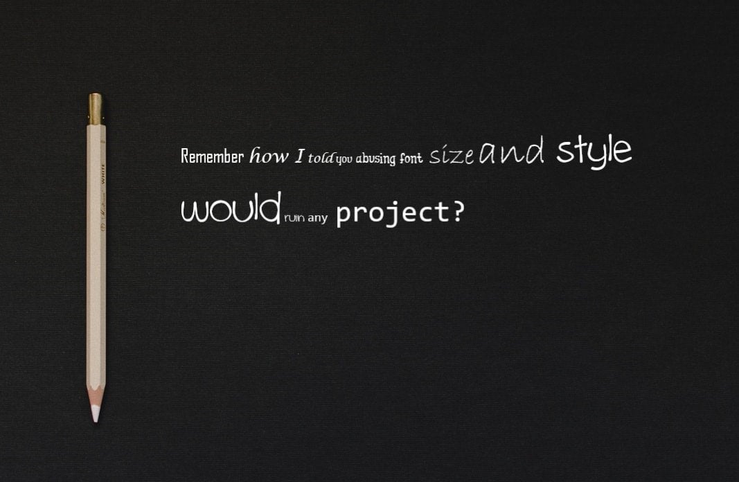
Using one font is usually quite boring. In this case, it is difficult to create an effective visual separation only by changing the size and color of the font. For this, it is better to use different combinations of fonts. But how many fonts are you going to use? We recommend using two (maximum three) fonts. When using more than three different fonts, your website loses its structure and looks unprofessional. Remember that abusing font size and style can ruin any project.
Sometimes, due to different styles and weights, it is possible to create the necessary variety even within one typeface.
If you decide to work with more than one font, make sure that the font families match each other in terms of the width of the letters. Here is how it looks in practice:
- Decide on the main font you will use for headings. To do this, you can refer to the corporate identity of your brand.
- Then you need to select an additional font that will be used for the main text. It should be easy to read, even on small screens.
- And finally, your third font should attract attention. You can use it on the buttons of the target action or emphasize some parts of the text with it.
Consider that the text size should not be less than 13 points. The best choice is within 14–18 points. Not too big and, at the same time, readable. And if you do not have enough experience and knowledge, do not even try to use unusual, fancy fonts. Keep it simple.
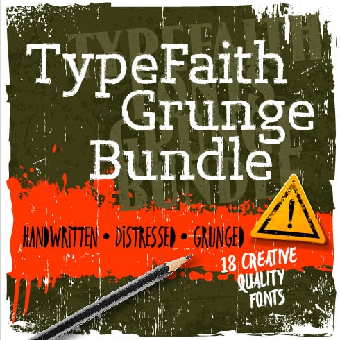
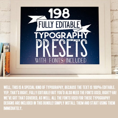
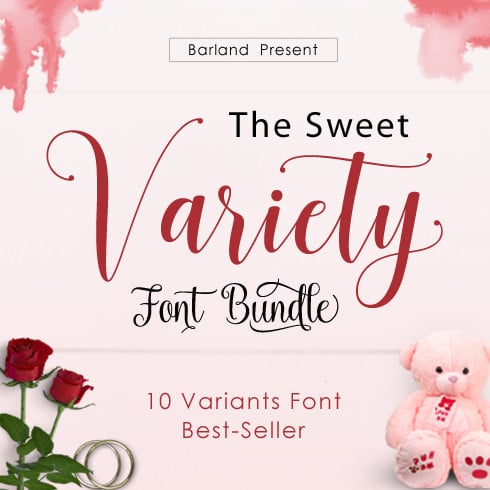
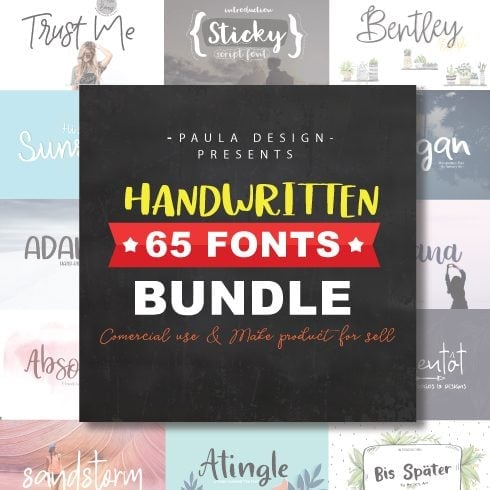
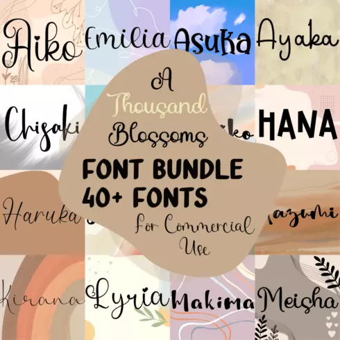
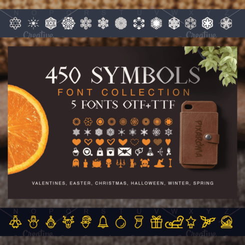
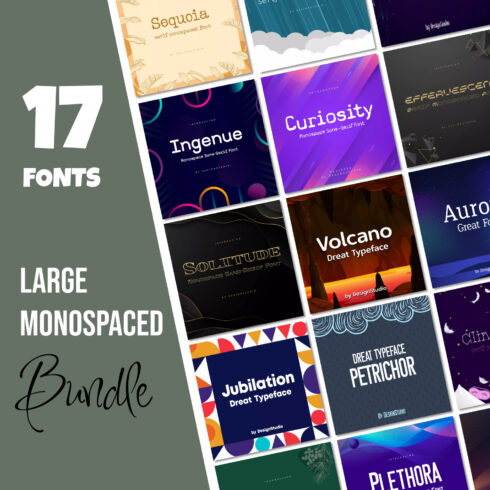
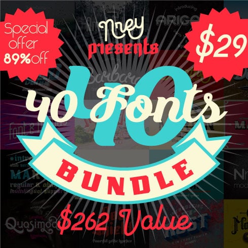
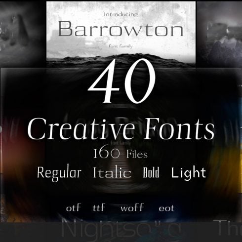
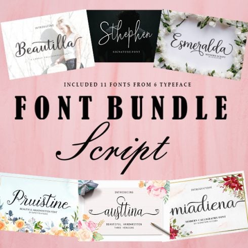
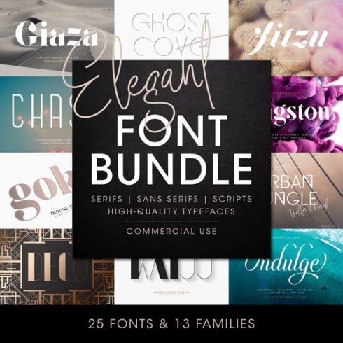
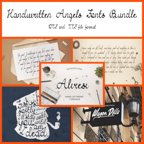
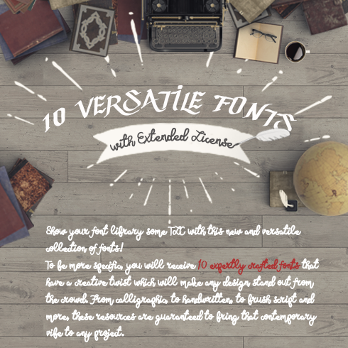
A Few Fonts for Your Projects
You will experiment a lot in your career. The more tools you have in this way, the more freedom in your experiments you have. Hence, we picked up a few font bundles that will definitely find a place in your collection.


If you already create fonts, become our vendor and sell them on MasterBundles! You will upload the products in a few minutes, promote them easily, and have a 50%-commission from each sale! If you have any questions, write us at [email protected], and we will help!
Best Related Articles


Video About Everything Is In The Fonts
The Ultimate Guide to Typography | FREE COURSE
Do you know the difference between a typeface and a font? Tracking and kerning? Learn everything you need to know in our ultimate typography guide.
The Psychology of Fonts | Fonts That Evoke Emotion
Learn how to use the psychology of fonts to your advantage by choosing fonts that evoke emotions in your readers.
What are your concerns?
Thanks for your response!
Disclosure: MasterBundles website page may contain advertising materials that may lead to us receiving a commission fee if you purchase a product. However, this does not affect our opinion of the product in any way and we do not receive any bonuses for positive or negative ratings.