Hand Lettering Guide for Beginners: How to Start Hand Lettering Step-by-Step

Have you noticed how hand lettering has become somewhat a regular part of our life? Most likely, you’ve seen some decorative hand lettering for beginners guide and tool set at a local convenience store. With the rapid growth of the ad market and the development of printing and marketing technologies, the areas of lettering are constantly growing.
In addition to direct marketing communications, lettering also serves as a dialogue with consumers, forming a lasting connection with the brand and creating positive feelings toward the advertised product. So let’s develop this captivating and useful skill with the help of this amazing tutorial.
Let’s get started!
What is Hand Lettering?
In simple words, lettering is a drawing of letters. This type of design art allows any graphic designer to create unique letters on paper, chalkboards, walls, computers, etc.
An example that many people are familiar with is writing on a chalkboard. In restaurants and stores, it is often used to announce promotions, display menus, or simply for interior decoration.


Is It Like Calligraphy?
It is not. Calligraphy is the art of writing with a pen, brush, or marker. The shape of letters in calligraphy is determined by the size, shape, and inclination of the writing instrument, and the pressure applied to the paper.
Lettering can be done by taking a pencil and a ruler, drawing the desired shape on a piece of paper, and then filling it in with a marker. Or it is to do the same thing with a drawing tablet in a vector program.
Calligraphy is a much more complex art. If you don’t get it right the first time, you have to start all over again. With lettering, you can reshape them over and over, measure them with a ruler, fill them in, and change the shading as you go. It doesn’t require the same skill as calligraphy.

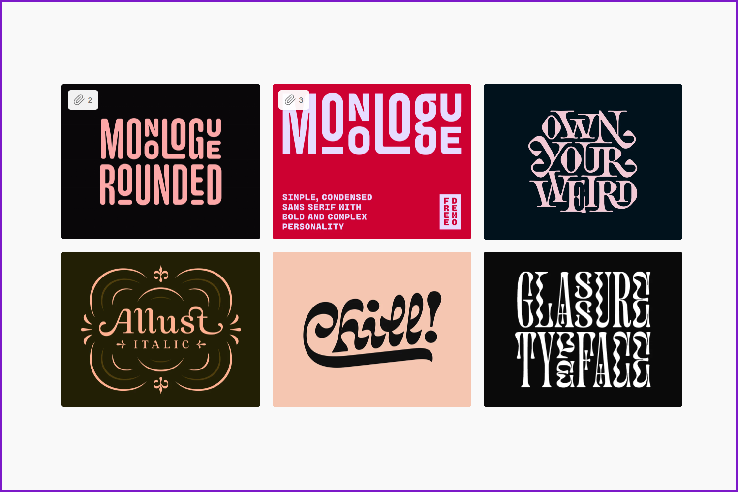
The Types of Hand Lettering
There are different types of hand lettering. They are also used, respectively, for different tasks.
Vector lettering
For example, vector sketches are processed in Photoshop or originally created using a graphics tablet. They look more futuristic and modern.

Mixed lettering
Many artists combine several types of fonts at once in their composition: both graffiti and handwritten or printed.
Silhouette lettering
Another common option is to “enclose” phrases and words in a certain silhouette or outline. The author first draws the borders for the composition, then “inserts” the text into it so that the finished image looks laconic and unified.
Gothic lettering
More and more often, lettering uses a Gothiс script, borrowed from calligraphy. It recalls the Medieval style and looks very interesting.
Graffiti lettering
Also, drawings in the style of graffiti painted on a sheet of paper can be called lettering. Although the style itself is considered distinctive, graffiti scripts are actively used by lettering artists.

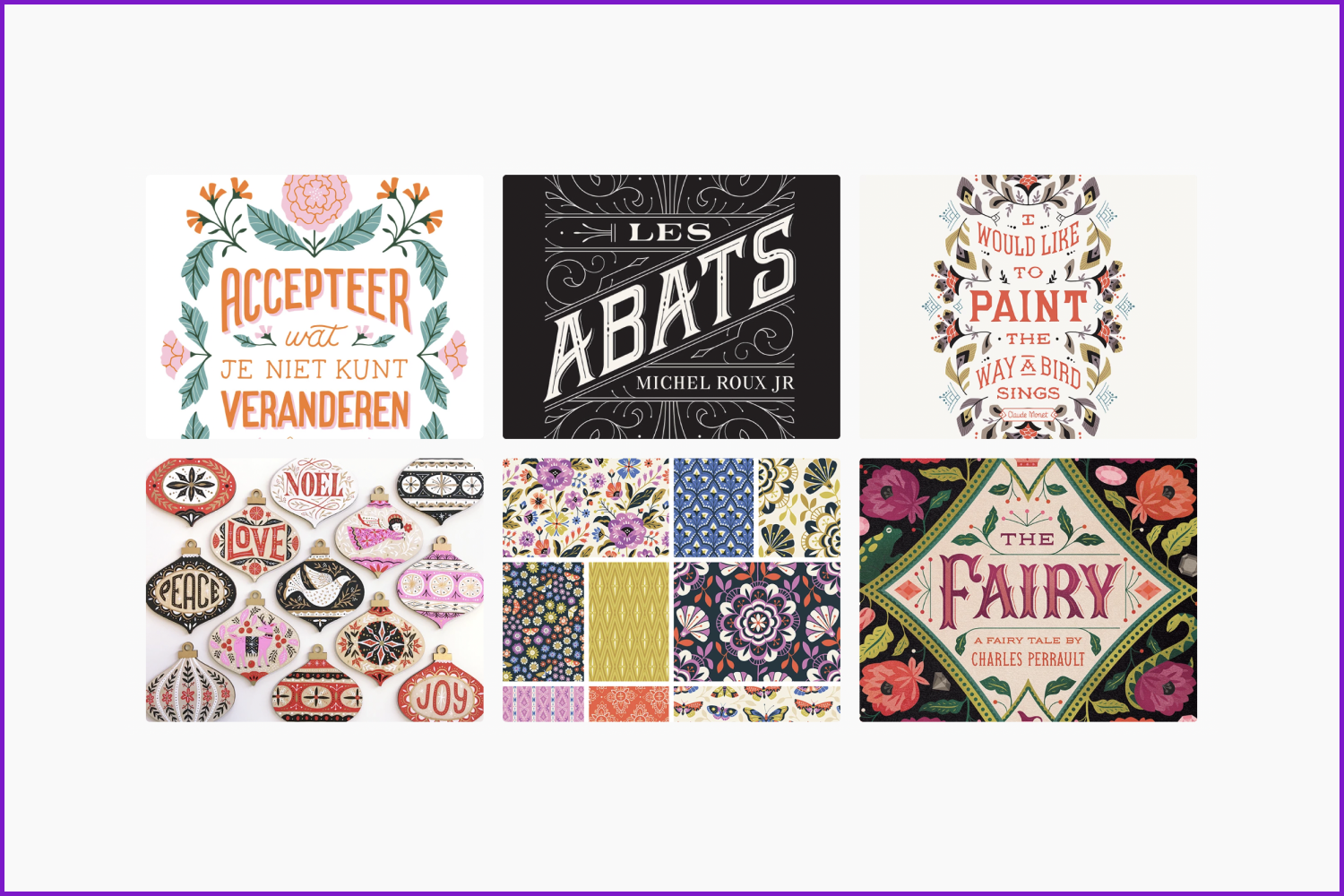
Vintage lettering
Ornamentation, distinctive texture, serifs, and special colors are all about the vintage style of lettering. The drawings resemble the text from posters of the last century. The artist does not need to invent new fonts and elements – inspiration can be found in twentieth-century advertising posters and labels.

3D lettering
Three-dimensional images require the author’s ability to work with perspective and attention to detail. The most advantageous is lettering each element, which is worked out in detail by the artist.

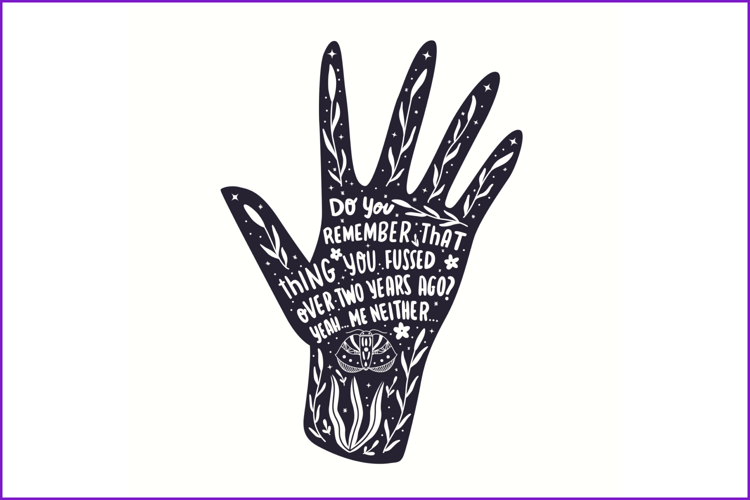
Lettering with background
Also, the designer can shift the emphasis from the letters to the background or details. Various decorative elements, objects, plants, flowers, and other decorations complement the composition and make it more attractive.

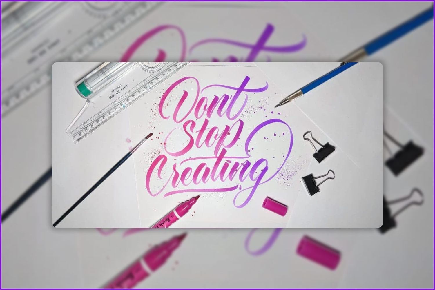
Gradient lettering
Another interesting technique in lettering is the smooth change of colors, or ombré (gradient). You can use several different colors or shades of the same color and then create a transition from letter to letter or from left to right, for example.
What Makes a Hand Lettering Starter Kit?
What makes a perfect toolset for decorative writing? Let’s find out which hand lettering tools for beginners you will need to find your artistic way in hand lettering.
Paper. It is best to choose sketchbooks with paper designed for lettering (Fenimore black, Moleskine, Leuchtturm, or Canson). It is durable and allows you to erase pencil and use ink. It does not allow inscriptions on the back. It absorbs moisture and paints well, but does not dry your pen completely in one word. The general rule for such paper is a thickness of more than 180-190 g/m2.
The surface of the paper should be smooth so that the pen or pencil does not cling to the micro-impressions – this will be very annoying.
You can train on regular office paper, with a ruled sheet underneath, so you won’t mark everything every time or print out rulers. Interesting effects are obtained on designer cardboard or pastel paper, especially if writing on colored paper with white gouache. The same works with craft paper.
Ruler. It’s impossible to develop a steady hand and draw perfectly straight lines without a ruler. It is needed to draw a grid for the future inscription and a square (or rectangle) for each letter. It will be much easier to place them evenly and balanced.
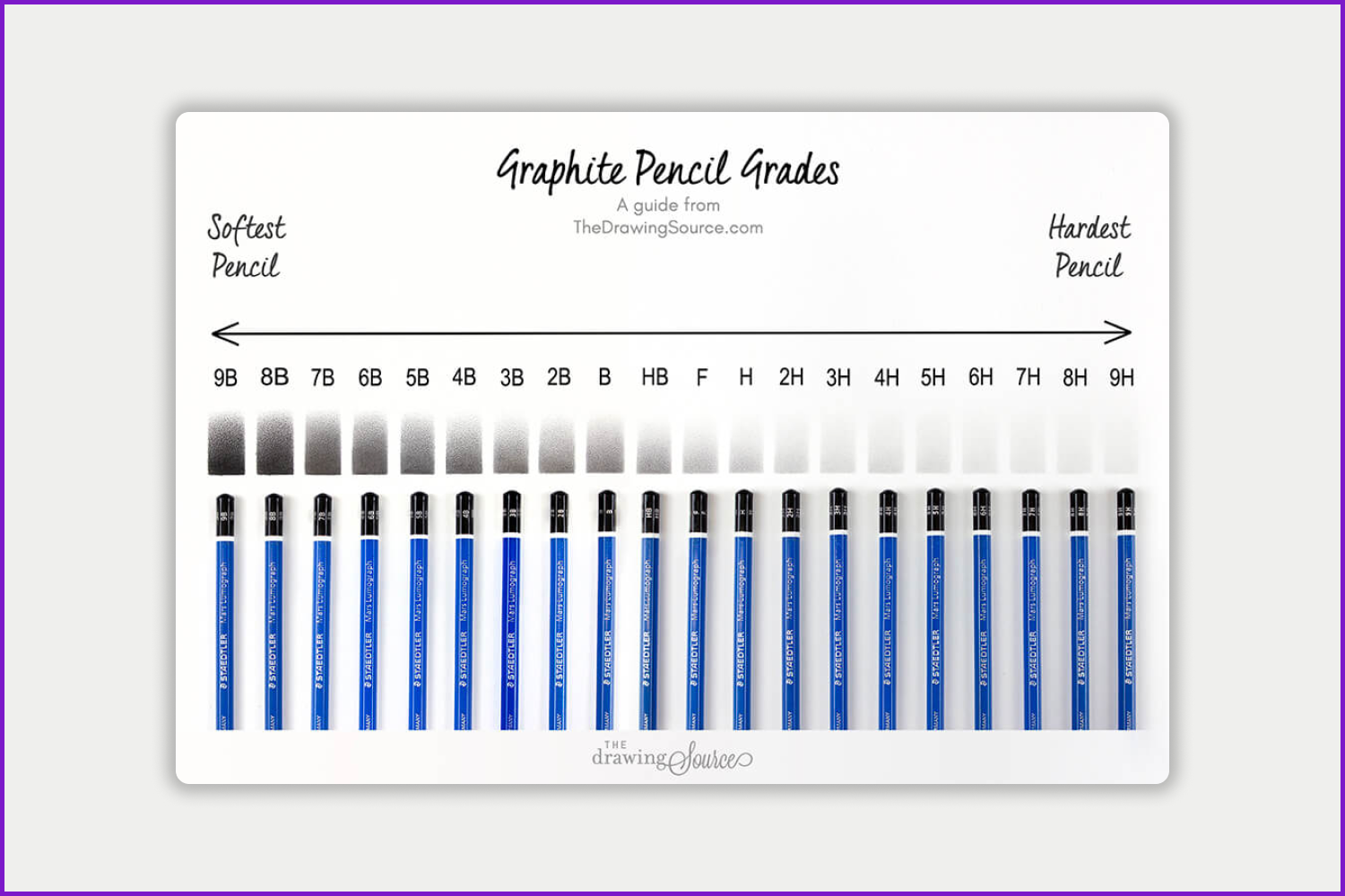
Pencil. There’s nothing better than a sharp pencil to learn different types of lines. Baselines, x-lines, and cap heights will help you create a stencil for your first handwritten words. For rough layouts and sketches, any automatic pencil or even a ballpoint pen will do for beginners. By the way, the sketch will look grungy with it, which is a look you might like. For your primary sketches use lighter pencils with hardnesses from 6H to HB. Subsequently, they can be softer from 1-6B.
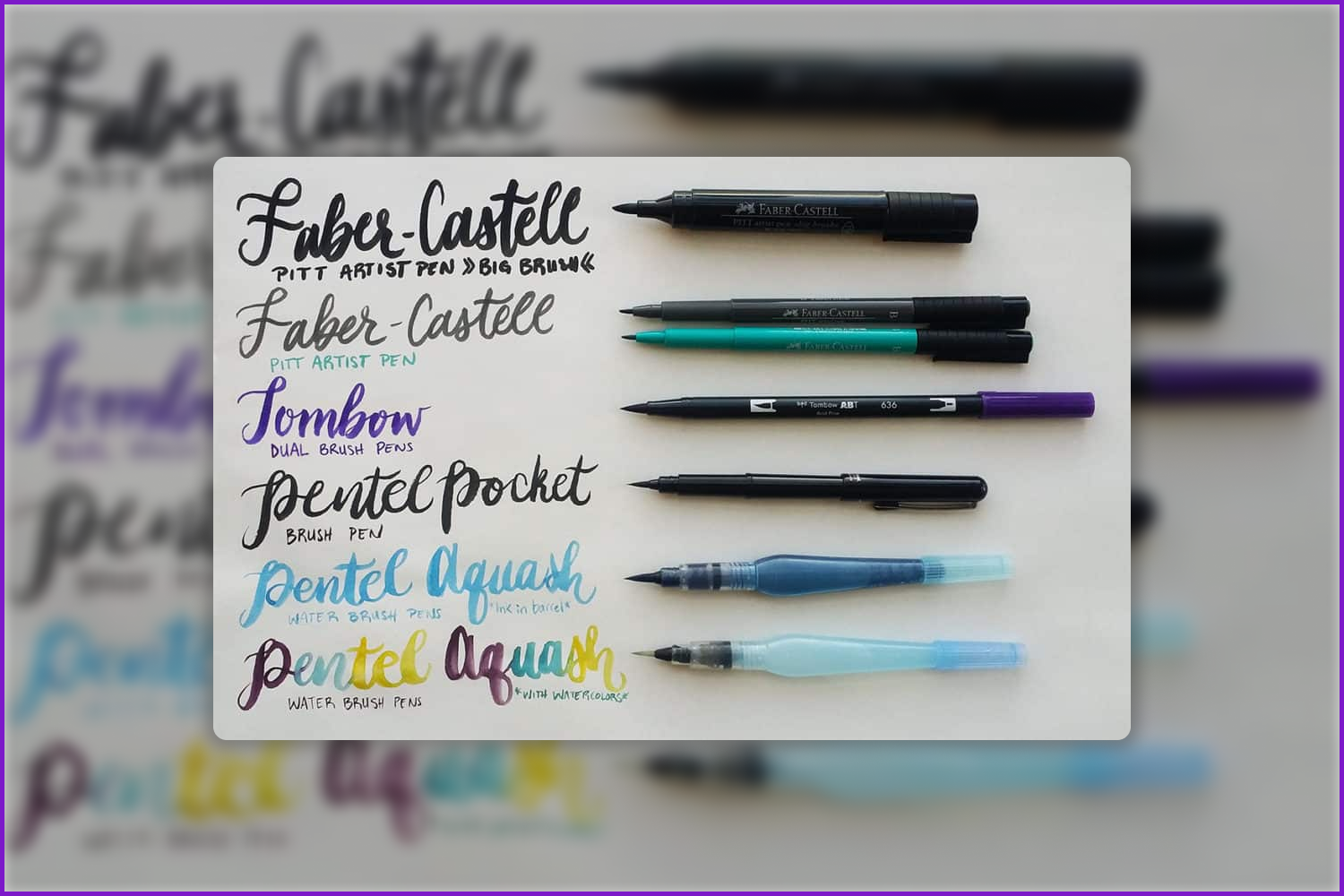
Brush pen. The shape and flexibility of brush pens allow you to experiment with line thickness. They imitate drawing with a brush but are as easy to use as a pen. You may choose the best hand lettering pens from Kuretake Cocoiro or Faber Castell pen (by the way, they do not require special paper, unlike the spirit markers) or any brush pen with a medium-length brush tip. It has the optimum length to create flowy strokes and maintain control.
Brush. When you begin to feel more confident, you can try flat brushes for the same types of writing. They are a bit more difficult to write with and more pliable, but that is their beauty. You can use anything you can think of – a sharpened stick, glued toothpicks, a plastic card, and sometimes even a foam rubber sponge if you write on larger formats.
Hand Lettering for Beginners: First Steps
When all the basic instruments are found and purchased, it’s time to start hand lettering. But how, you may ask.
Let’s begin with the warm-up exercises. To do this, you will need pages with exercises. You can download them here (full training course from Tombow Pens USA). First, draw simple lines, then go to wavy and more complex ones. Each time, try to keep the size of the elements and the distance between them the same. This will help not to spoil the inscription in the future. Do everything in a calm manner, without rushing.
In Progress also contains exercises, a place for training, and relevant explanations. This is a practical guide that can replace a coach.
Copy the hand lettering you like. There is nothing wrong with copying handwritten fonts you like first. Take a sheet of paper. Draw one central line – the inscription will be located along it. Make several lines parallel to it. You have created a template. Next, repeat the shape of the selected font without breaking the boundaries of the template. You can also use special hand lettering practice sheets for this purpose.
Such exercises will teach you to control your tool and determine the size of letters in advance.
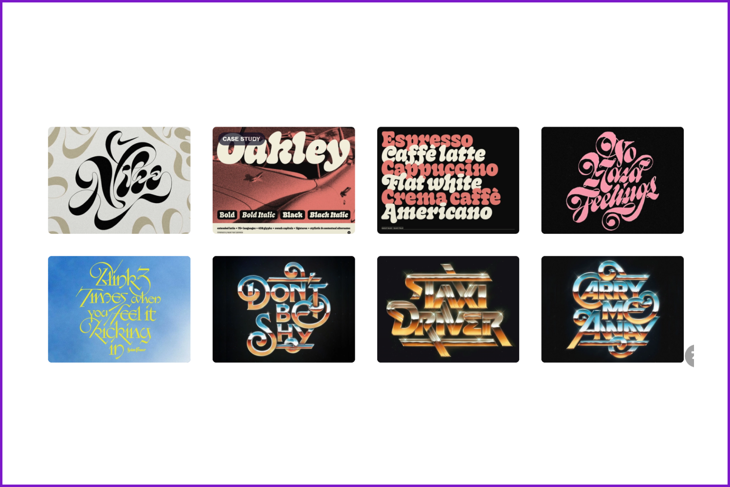
Look through many examples with hand-lettering fonts. Pay attention to where they have the heaviest elements (hatching, thick bold black lines), and where there is space, voids, and spaces. Notice how the author worked with the white space around, because it is no less important than the drawing.
8 Artists to Get Inspired
By the way, we prepared a list of great hand lettering masters below:
Jonathan Ortiz

Driele Martinez
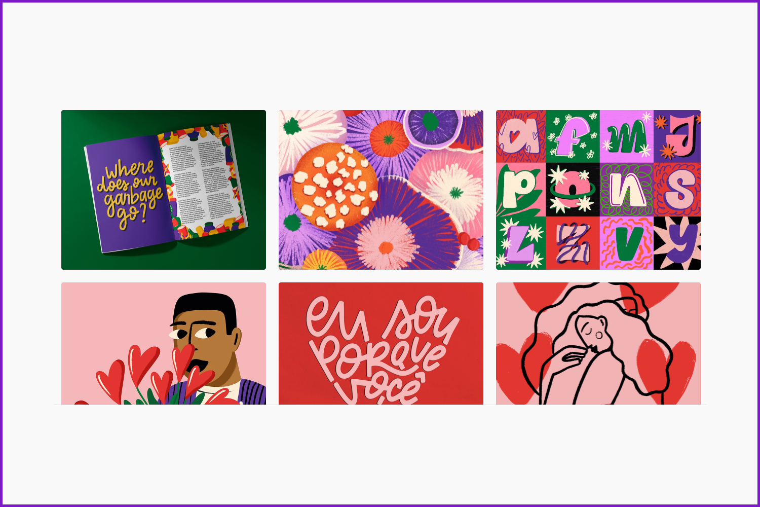
Yusril Muhtadi
Rebeca Cyrineu
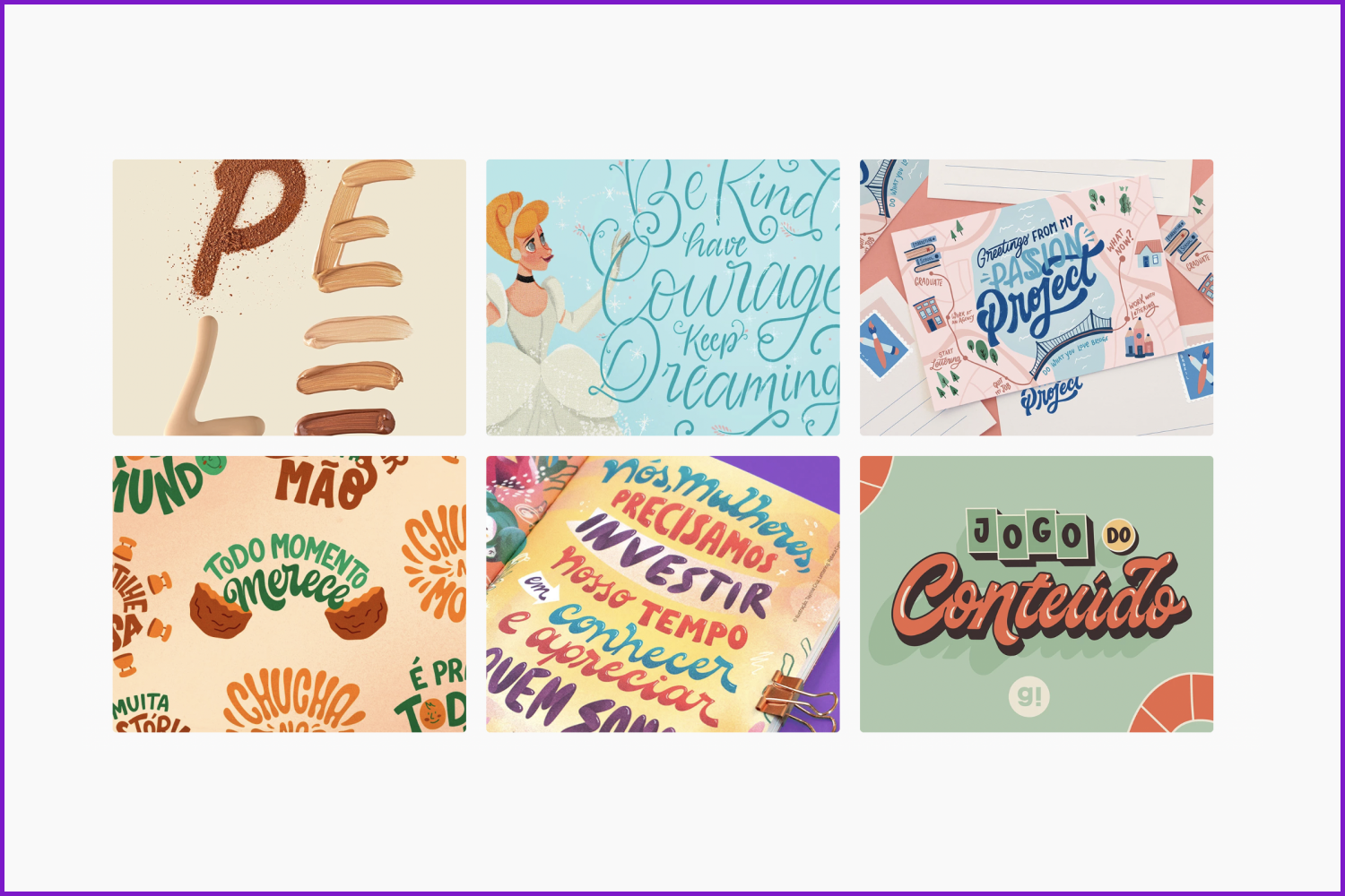
Clairice Gifford
Paul von Excite

Wells Collins

Mark van Leeuwen
Draw one letter for fun. Choose one letter. Draw it as many times as you have the imagination to do it differently each time. Fill a page or two with the letter, but don’t try too hard: remember that this is a game, not an exam. Draw for fun and to try something new. Make things up, and play with the shape.
Notice the hand lettering around you, remember it, and try to copy it. Take a picture of the sign with the font you like. Buy a package with a beautiful inscription. Find an advertisement, and choose any fragment of the font.
Look for more great examples of hand lettering fonts on Dribble, Behance, and Adobe Stock. Get inspired by them.
Learn the theory and look through text and video guides. We made a collection of good tutorials that you can watch for free to study lettering.
- Explore digital lettering techniques
With this guide, you will explore the process of hand lettering and start creating new unique designs. It’s very good for hand lettering practice.
- Hand lettering techniques
Another tutorial on how to create cool digital hand lettering arts.
- Beginner Hand Lettering Tutorial | 10 Things I Wish I Knew As A Beginner
This is a great video tutorial that includes 10 important things every hand lettering beginner should know.
- Procreate Lettering for Beginners
It is a wonderful and easy tutorial created for you to learn Procreate lettering on iPad basics.
- Hand Lettering Basics (Procreate)
If you decide to start learning the digital hand lettering alphabet in Procreate, this video is a must-see for you.
- How To Design A Hand Lettered Vintage Logo
And if you are interested in logo design with hand lettering, you are welcome to watch this start-to-finish video guide made by Will Paterson.
- Fun with Hand Lettering
This Udemy course will teach you 12 various hand lettering styles.
- Hand Lettering Essentials for Beginners
This is the course created by Mary Kate McDevitt, lettering and illustration designer. It includes 12 lessons of step-by-step hand lettering for beginners during which you will learn basic principles and rules of lettering, study styles of lettering, and the process of inking and finalizing lettering designs, brainstorming, and more.
- The Golden Secrets of Script Lettering: Find Inspiration In Your Handwriting
Another great workshop from Skillshare that will inspire you on easy hand lettering creativity.
- The Art of Hand-Lettering: Techniques for Mastery and Practice
Pay attention to this book written by commercial artist Helm Wotzkow if you want to learn more about the techniques of hand lettering.
Developing a Steady Hand and Movement
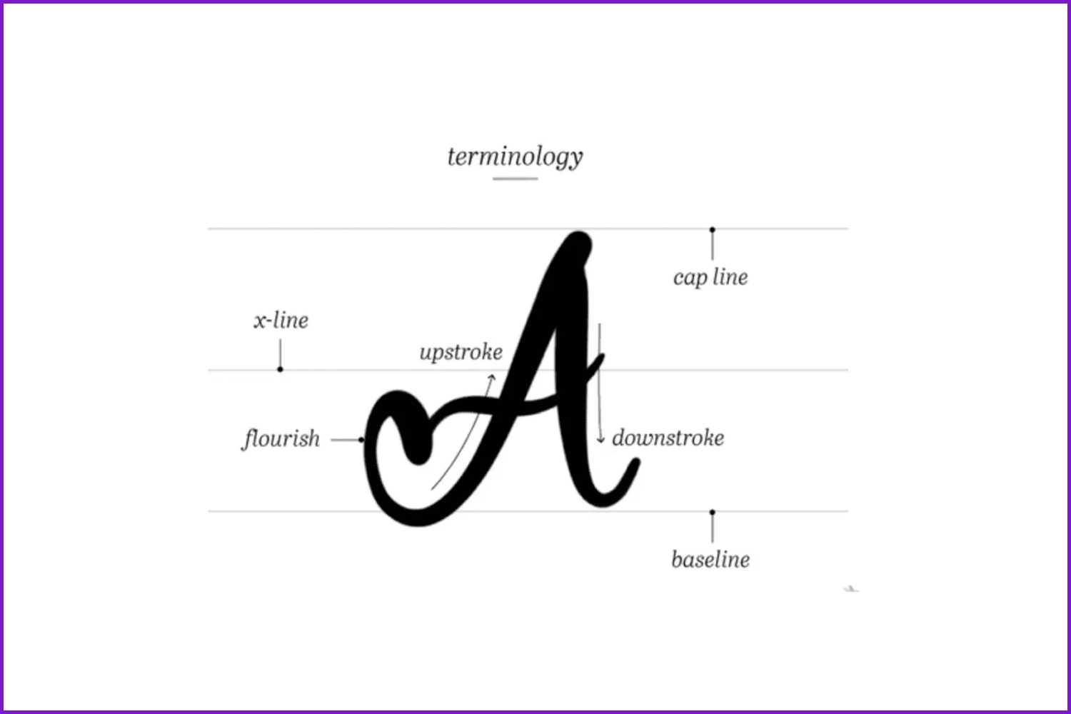
One of the most challenging parts in hand lettering is making your letters flow in a particular way within certain limits. The above-mentioned baselines, x-lines, and cap lines serve as such. Drawing your letters within the three equidistant parallel lines will help you achieve steadiness in your handwriting. The cap line determines the height for all capital letters. The x-line determines the height for all lowercase letters, while the baseline creates the guide which the entire word sits on.
If you wish to add dynamics to your decorative writing, use flourishes. Swirls, loops, and decorative strokes of any type will help you create movement. Just don’t overkill it with all kinds of decorative elements. Now that you know the basic theory, let’s proceed to our free practical lessons.
Basic Hand Lettering: The Alphabet
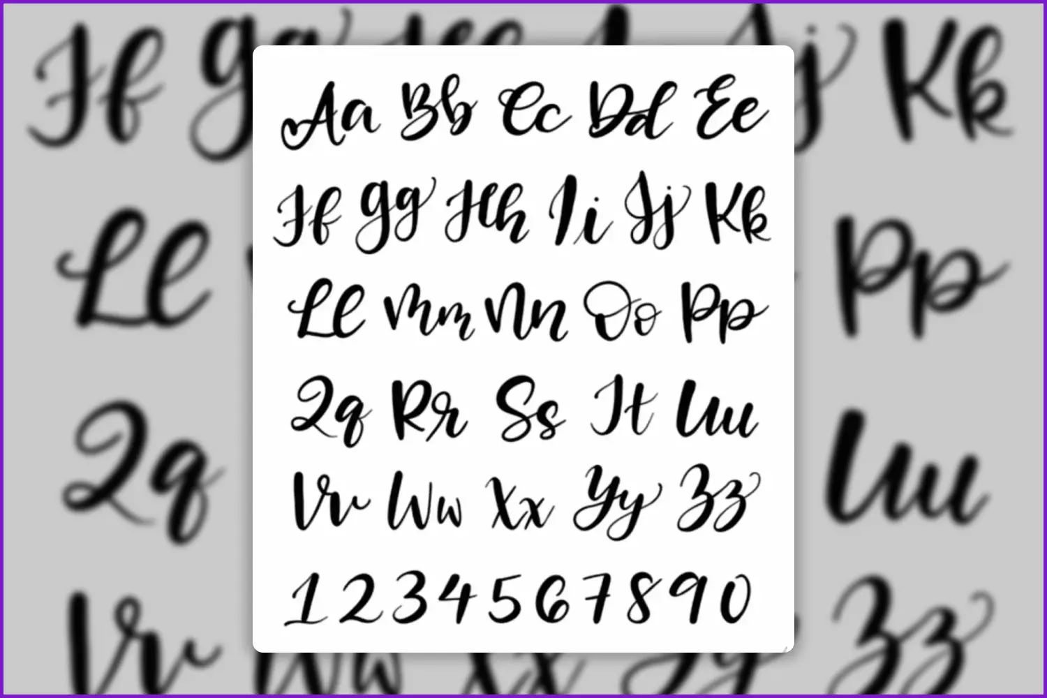
Let’s start with something easy and familiar – the alphabet. Once you develop your personal style of writing, you will be able to incorporate letters into fonts or a logo. The only requirement here is keeping your hand lettering as creative as you can. Before you start, search for a downloadable reference which includes all the letters, then follow these steps:
- Use a ruler to draw a cap-line, x-line, and baseline. Remember, these lines will guide your first few letters.
- To add flow to your letters and make them more versatile, you need to balance the pressure. To create thin lines, release pressure on upstrokes. On the contrary, to make thick lines, apply more pressure on downstrokes.
- The lines are there to guide you, but they don’t necessarily have to limit you. In other terms, you are free to go outside to give your hand lettering a more dynamic look.
- Speaking of more versatility, use decorative elements like loops and flourishes. But only when you’ve grasped the basics.
How to Transition from Thick to Thin Lines
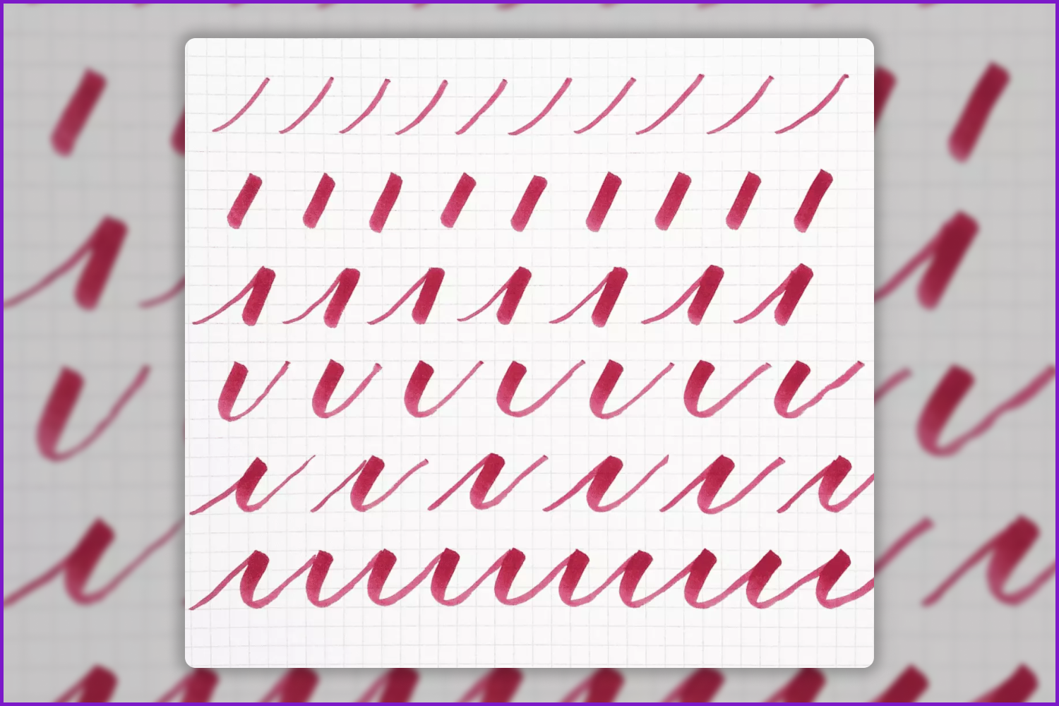
Learning how to transition from thick to thin lines is one of the basic skills to make your hand-drawn letters flow. However, this is a skill that can be learned through consistent exercise. For starters, you need to get accustomed to your pen. Practice the sequence of stroke sizes to adapt to the pressure. Begin with the “hairline” barely touching the page, then add more pressure to create a more visible line. Finally, add the maximum pressure your pen tip allows to make the strokes as thick as possible.
Don’t get disappointed if your lines look shaky at first. Practice is the key to success. Using as many pens as possible to do the strokes, you will gradually develop a steady hand and understand the capabilities of every instrument you use for hand lettering. Also, don’t try making the strokes perfect, just try to be consistent. Start with separate lines, then connect them with one another to end up with a solid structure. This is a great exercise to use as a daily warm-up.
How to Create a Hand Lettering Artwork
Now we are sure that you have all the necessary information to begin creating your own hand lettering masterpieces. So we propose you use these detailed lettering tutorials for step-by-step methods to create your first artwork.
Hand Lettering Tutorial | How To Draw Brush Script
Hand Lettering Tutorial | How To Outline Lettering
Bottom Line
Hand lettering is not rocket science for amateurs, but rather a fun way of bringing out one’s inner artist. As for graphic designers, this is a great skill to use for your work because you can create brand identity details, logos, banners, etc. with the help of hand lettering. Be creative and develop your unique style of decorative drawing. It’s always fun to experiment!
Article reviewed by

As a hand lettering enthusiast, I was keen to learn more about the tips and techniques covered in this article are all about hand lettering for beginners.
The different types of hand lettering covered at the start of the article provide some good examples of what hand lettering is and isn’t. It gives examples of different types of styles we could try out. I am looking forward to trying out the ‘Ombre lettering’ or ‘Gradient lettering.’ There is a list of links to tutorials on how to achieve different effects towards the end of the article, which is a great combined resource for anyone looking to get started with hand lettering. If you don’t have time to read the article, there is a handy audio version at the beginning, which can easily be listened too. This is a good tool for longer articles.
This author answered many of the questions I have on hand lettering. In particular, they go into great detail on the materials you will need in the ‘Starter Kit’ section, which helps to demystify the hand lettering process and materials. They cover what type of pencils, paper, and the different types of brushes and brands recommended for hand lettering. I wasn’t sure which type of pencils to get, so this was good information. The author also provides links to some really useful tools such as ‘printouts’ for warm-up exercises, which we can do to help loosen up In preparation for hand lettering.
This is a valuable and in-depth resource for any aspiring hand letters out there. I will refer back to it again, as the videos of other artists' work are a nice collection for that daily dose of inspiration.
Best Related Articles


Some Awesome Video About Hand Lettering
Beginner Hand Lettering Tutorial | 10 Things I Wish I Knew As A Beginner | Learn How To Hand Letter
This video is everything that I wish someone had told me when I was a beginner trying to learn how to handletter! These tips and tricks will hopefully help you letter better. Click “show more” for links to things mentioned in this video!
How to Learn Hand Lettering in 2021: 7 Easy Steps for Hand Lettering Beginners
Do you want to learn hand lettering in 2021? These 7 steps for hand lettering beginners will be a huge help for you! Let me know what excites you about lettering in 2021!
Handlettering: Where to start as an absolute beginner | How To Handletter
Here are my tips for where to start as an absolute beginner learning how to handletter! I hope they help you!
FAQ
Here are a few frequently asked questions about the hand lettering.
How do you start hand lettering?
Most people think that there is no point in taking up drawing letters if there is no opportunity to devote at least a few hours a day to this activity. In fact, the main thing is to practice regularly, even if only for five minutes a day. Such exercises will do more good than an hour once a week.
What are the 4 types of lettering?
There are many different types of lettering, but we can define 4 different types: cursive, Gothic, vintage, and 3D lettering.
What are the first two steps of hand lettering?
The first step is to choose the instruments you will need. And the second is to find a great hand lettering tutorial for beginners.
How do I get better at hand lettering?
Practice more and study new hand lettering tricks and techniques.
This article is inspired by and relies on the following references:
- MASTERING HAND LETTERING by Mye De Leon
- THE ABC OF CUSTOM LETTERING by Ivan Castro
- IN PROGRESS by Jessica Hische
- Hand Lettering 101 Book: An Introduction To The Art Of Creative Lettering
- www.webpagefx.com/blog/web-design/hand-lettering-tutorial/
- www.piecescalligraphy.com/2015/06/21/practicing-thin-and-thick-strokes
- www.ftd.com/blog/create/hand-lettering
- www.creativelive.com/blog/hand-lettering-for-beginners
What are your concerns?
Thanks for your response!
Disclosure: MasterBundles website page may contain advertising materials that may lead to us receiving a commission fee if you purchase a product. However, this does not affect our opinion of the product in any way and we do not receive any bonuses for positive or negative ratings.