Video Figma Tutorial: How to Easy Create Efficient Black Friday Banner Advertisement Design
Black Friday is not too close yet, but time flies fast – it’s time to get ready. So I decided to write a Figma tutorial on creating an efficient Black Friday banner advertisement design. Why is this article helpful? You’ll see:
- examples and recommendations for designing social networks during an advertising campaign
- video with the whole process from beginning to end for creating a social media banner
- where to start and how to implement the design of advertising banners
- tips from a practicing designer not only in hard skills but also in communication with clients
- ideas for your design
- cool products for your design that will save you time.
Let’s develop your visual taste and level up your work together!
What Are the First Steps When Creating a Banner Advertisement Design?
Before implementing your ideas, I recommend doing an analysis. Ideally, the marketer should provide information about who the target audience is, what tone of voice is best, what brand book the brand has, what advertising was used, and its results. Depending on this, the designer can choose the style and colors of the future Black Friday banner.
Next, you need to determine the offers with which advertising will be launched. This information is also provided to the designer by the client or marketer, but it would be great if you can offer your ideas.
If the client wants to throw everything at the advertising layout at once and you see that it will be bad for perception, suggest some changes to him – you are already at the beginning of the work to show your skills. It is best to prepare references. So the client will have a guideline for structuring their ideas, which will help avoid too many edits in the future.
This is an imaginary client for me, so I must use my imagination. Let’s imagine that you work with a women’s clothing brand with a friendly tone of voice and their target is women ages 18 to 35 years old. They have a fairly minimalistic style and their Instagram is in bright colors. Black Friday is coming soon and they need banners and Instagram posts. The task seems interesting, so let’s get started!
A Few Tips on Creating a Black Friday Banner Design
Let’s start with advertising banners that will run on Facebook and Instagram. In the video, I started with a ribbon, because I designed the store from scratch 🙂
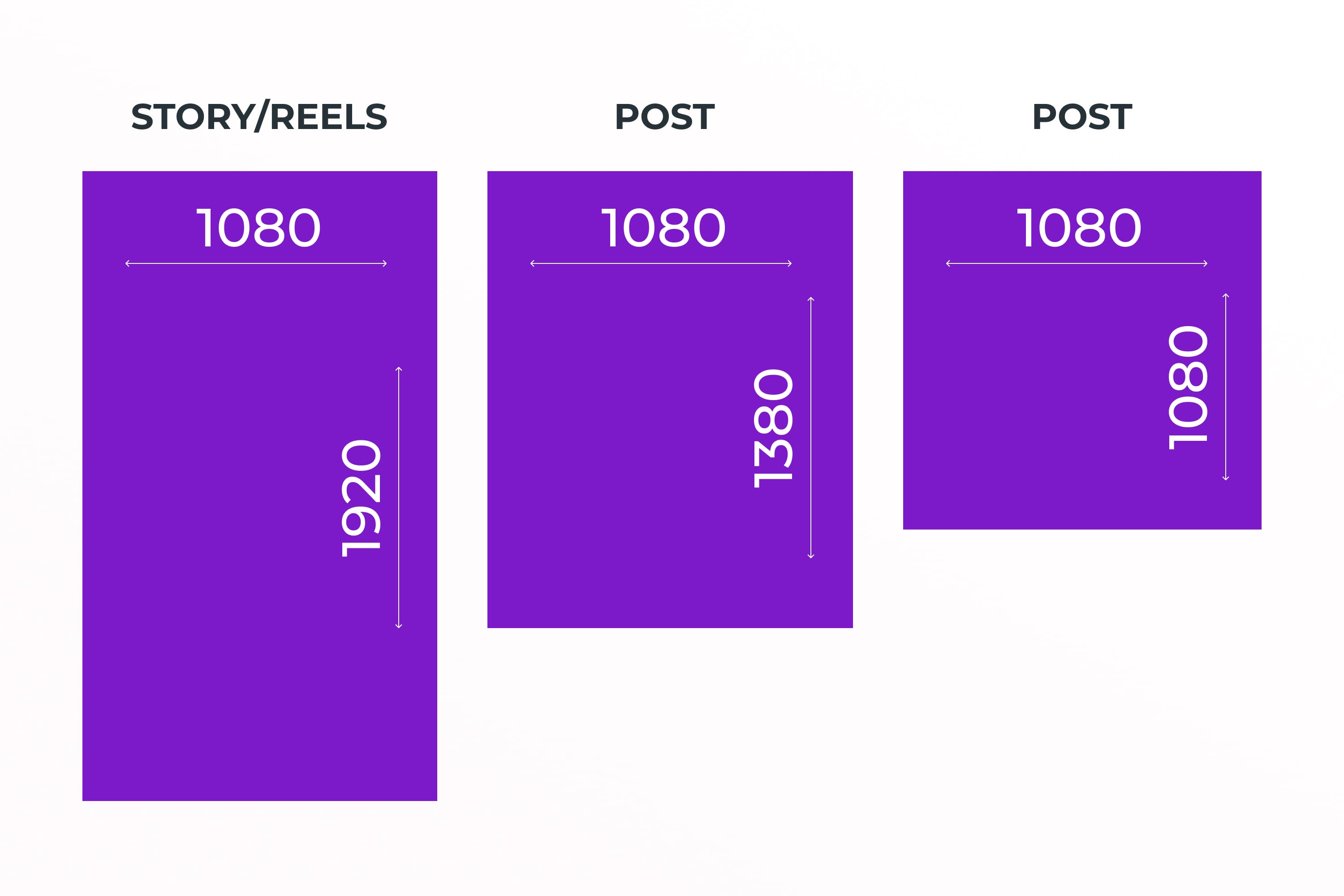
I will do it in standard social media banner size for stories and reels – 1080×1920. It’s also a good idea to resize for posts right away – 1080X1080 and 1080X1350. This is necessary for ads to display well in different formats.
So, how do you make an effective black Friday banner design? I will share with you some recommendations, so write them down.
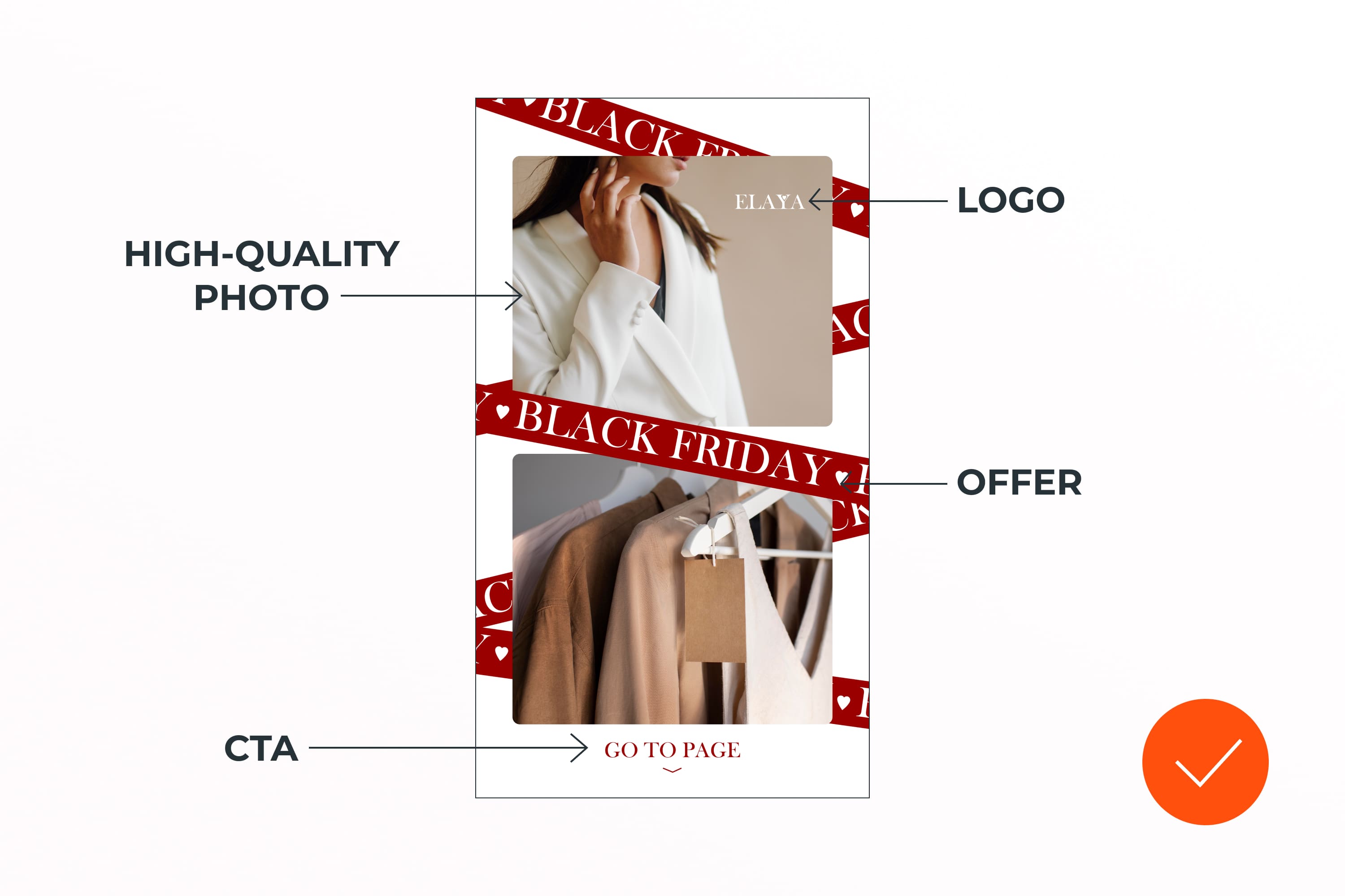
- High-quality image. Choose a photo where the product is visible or fits the service’s description. It should not be pixelated, outdated, or watermarked.
But, if the client does not want to provide high-quality photos, then first explain to him the importance of this, show examples with/without high-quality photos, and offer alternative solutions. If that doesn’t work, and this order is important to you, then warn him of the consequences and do as the client wants. If the order is not very important to you, then you can refuse and find a client with whom you will be on the same wavelength.
- Design for your target audience. This will make it easier for you to style your ad and make it more visible to the right people.
- CTA. It should be mandatory – at the end, add a call to subscribe, go to the page, buy now, etc. Tell the person how to interact with the advertising.
- Typography. Stick to the hierarchy rules for clean design. Choose the largest and boldest font for headings, and choose an easily readable font for body text. By the way, in advertising banners, it is better to use all the rules of typography – more on that here 🙂
- Short and clear Black Friday offer banner. You don’t need to write a lot of text about why they need to buy here – you need to come up with an understandable trigger for the target audience. It should be so that from 1 sentence it is clear to a person what it is and whether he needs it. On Black Friday, this is of course information about big discounts, free shipping, 1 + 2 = 2, etc.
- Experiments. Now everyone is fighting for the attention of the viewer, so don’t be afraid to experiment with design. But remember that the product or service comes first. We’re not discussing concept ads right now, or the ones that very big brands do.
- Fonts. They should be readable. For a user-friendly design, I recommend using no more than 2 fonts.
Creating a Social Media Banner Design in Figma
After searching for references on Pinterest and in an article with design ideas, I settled on a minimalist style. I will do them in Figma for convenience and speed, but you can do it in Photoshop or Canva.
I will have 5 banners, all aimed at a female audience from 18 to 35 years old. Let’s get started and you will find out how fast and easy it is! We will create 1 banner design for the advertisement step by step, and another 4 ideas you can find in the video. There, I realized the idea of the Sims game. Let it be a tutorial and a reference for your design 🙂
How to Create Catchy & Stylish Black Friday Banners for Instagram in FIGMA: Step-by-Step Process
Customizable social media templates.
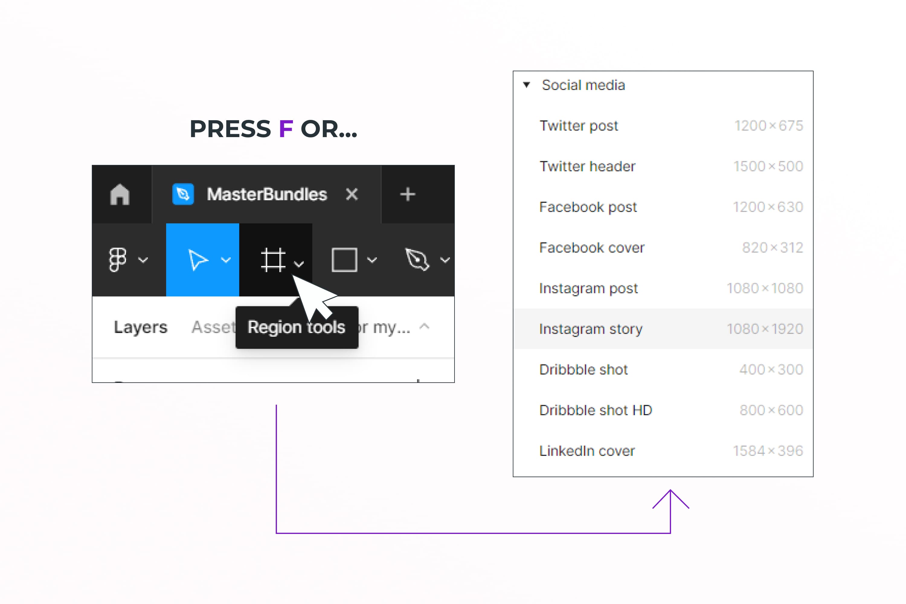
Click on the grid at the top or press the F key, and select a ready-made frame for the story format in the right corner of the screen.
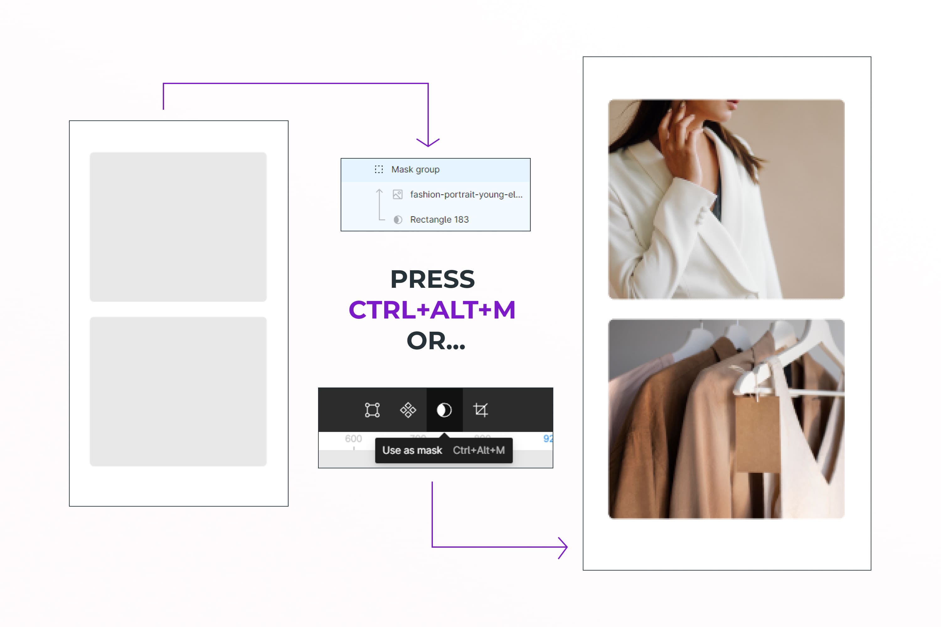
Select 2 photos of your product and add them to the frame.
Press the R key and add 1 Rectangle. Next, create a copy of it and arrange them so that they live in the center of the frame. This is necessary to make it convenient to make the images the same size.
Images of goods or services should be on top of rectangles – check this in the layers in the left corner of the screen.
Select the rectangle and the photo and press the key combination Ctrl + Alt + M. Ok, so now you made a mask. Do the same thing now with the second image.
Below them, I want there to be a ribbon with the phrase Black Friday. To do this, I add a long rectangle, press the T key, and add the text I need. It is better to choose colors that contrast with each other, but in such a way that they blend well with the images.
I select the text and copy and paste it several times to fill this ribbon.
I select the rectangle and text, press Ctrl + G, and group. Further in the right corner of the screen I enter the desired angle of inclination and add it to the frame under the photo. I will duplicate this several times. You can also add a shadow for volume, but I decided to do a flat design this time.
At the bottom, I add a CTA and an arrow down, as an indication. Hooray, the banner design is ready 🙂
This banner is for the offer that the store is running on Black Friday. It is quite general because there is nothing specific – terms, prices, conditions. But in this case, it is targeting message 1 of the goal – Black Friday in the store, and with the help of the CTA below, leads the user to the page.
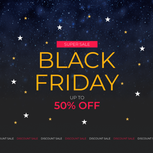
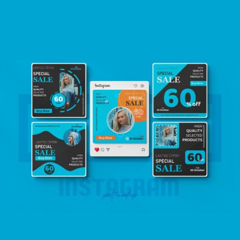
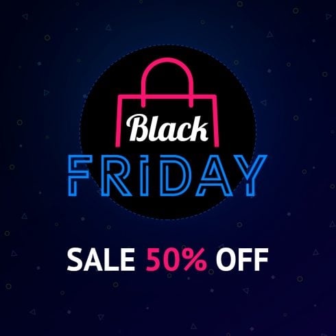
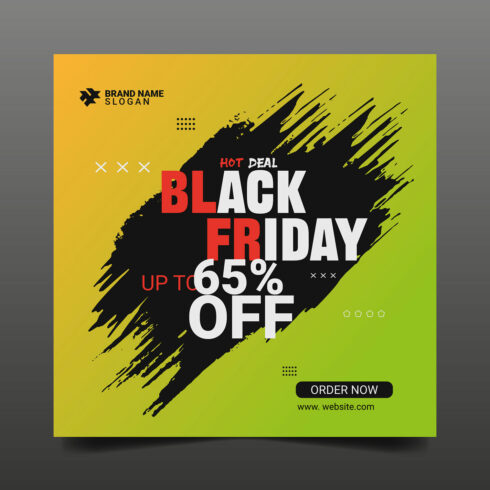
Templates for Black Friday Sale Banner
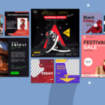
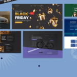
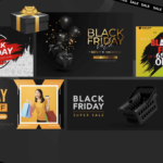
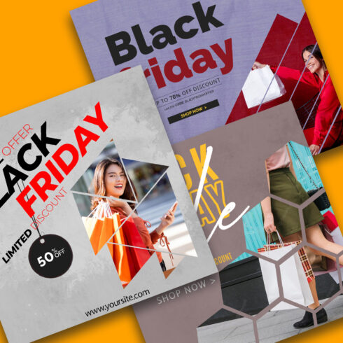
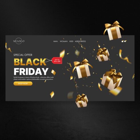
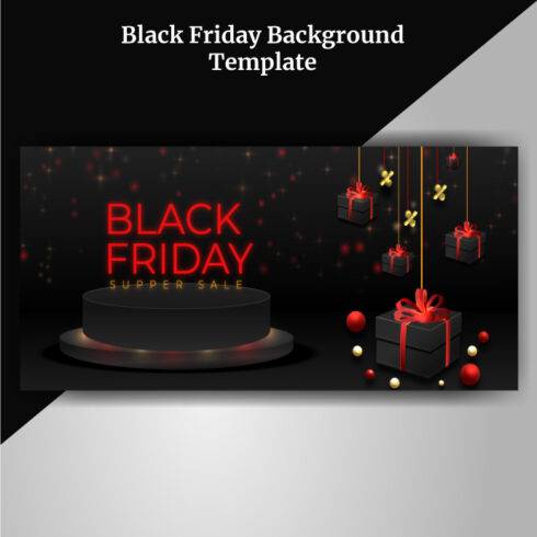
If you have a lot of orders and need quick but cool solutions for banner ads, then this collection is for you.
If you have ready-made cool templates for social networks, or illustrations for Black Friday, and others, then upload them in a simple and convenient Sell your deal form. After all, your design may be needed by another designer or client!
How to Prepare Social Media for Black Friday
Before launching an advertising campaign it is worth preparing all the landing pages. Social networks, online stores, and advertising pages should be designed in the right theme. Such an integrated approach will make advertising effective.
Let’s take an example: you saw a cool hoodie ad on Instagram with a call to action on the page. You liked the product and the discount – you clicked on the advertisement and instead of being happy with the purchase, you were disappointed.
There are no sweatshirts in the posts, no highlights in the stories either, and the page itself looks like it’s from 2000. At this point, subconsciously, you no longer trust this store and, most likely, just leave it.
How does this affect the client? He spent money on ads, paid for banner advertisement design, and your click, but got no results.
Take note of all this and explain to the client why it is essential to prepare the website and/or social media comprehensively. And you will already have an additional sale and loyalty from the client 🙂
How to Create Instagram Designs for Black Friday
Using Instagram as an example, I will show the main points in preparing social networks for an advertising campaign. They should include:
- high-quality product photos
- goods that will be in the design of the advertisement itself
- an indication that there are discounts (you can add a period)
- stories should show goods and shipments during the advertising campaign to increase loyalty
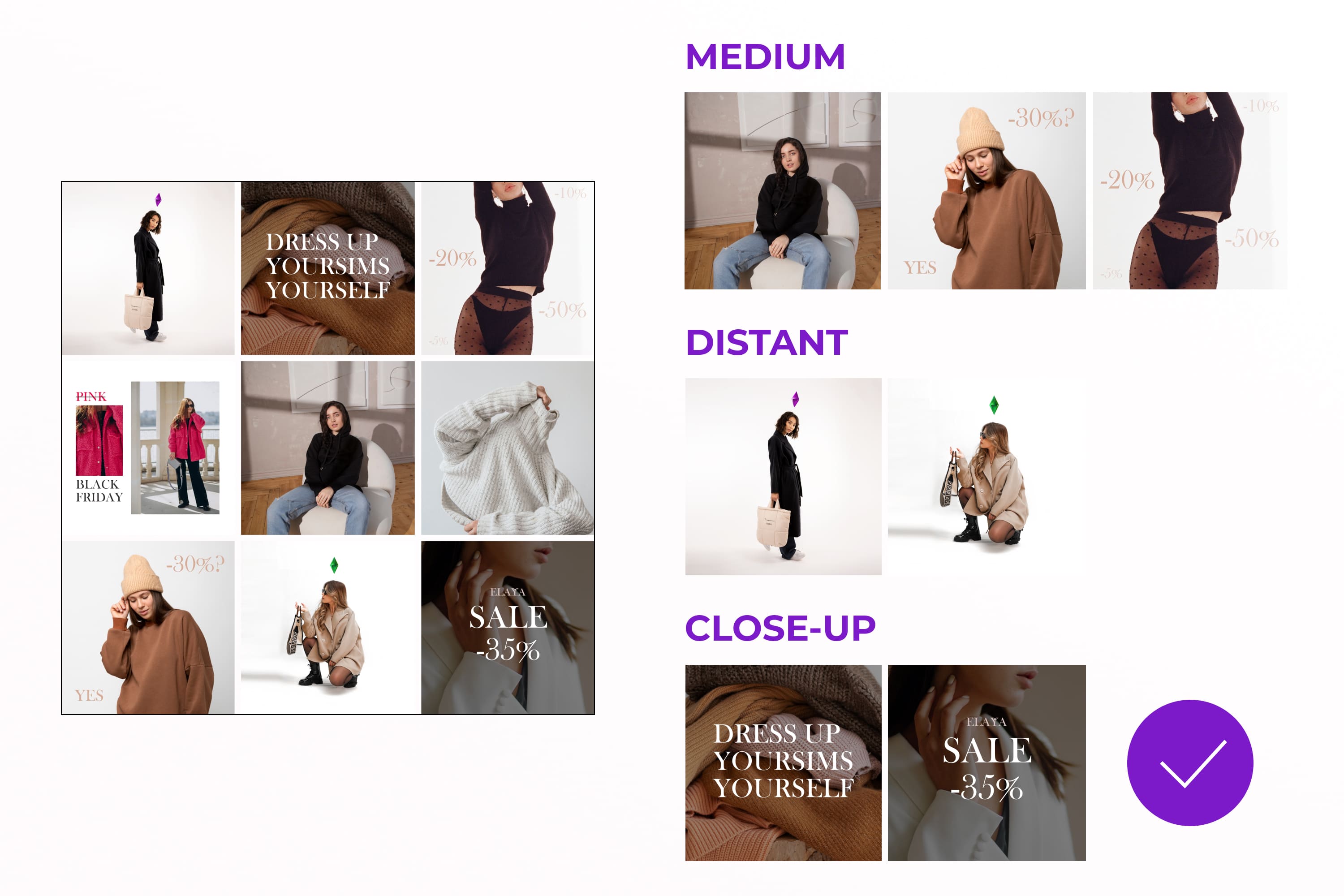
- the design should be diverse (medium, distant, close-up, video + can be diluted with illustrations, pictures, photos of accessories, nature, etc., which suits the theme).
It was a little difficult because I had to independently look for photos for the store on Freepik and Unsplash. But I coped with this task and picked up the right images.
I wanted to somehow highlight this profile among others and I generated ideas. Suddenly I came up with an idea – to make a hint of the Sims game. Many girls love this cult game and it fits the description of the target audience. So I decided to use a 3D crystal design, which you can find on MasterBundles. I followed the instructions above and this is what I came up with.
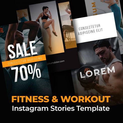
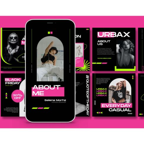
Social media templates
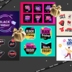
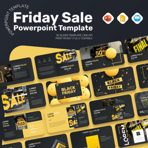
Need to set up social networks, but don’t have enough time? Then take these templates for yourself and adapt them to your niche.
Congratulations, now you know the rules for creating an effective Black Friday banner for goods and services. You can also explain to the client why he needs a good design and a well-prepared social media page.
Don’t forget to watch the video – you will find 4 more ideas for banners that you can use in different projects. Thank you for watching and leaving hearts under the video and on the article. Know that when you do this, it makes the designer Lera very happy!
- Black Friday Sale Banner
What are your concerns?
Thanks for your response!
Disclosure: MasterBundles website page may contain advertising materials that may lead to us receiving a commission fee if you purchase a product. However, this does not affect our opinion of the product in any way and we do not receive any bonuses for positive or negative ratings.
