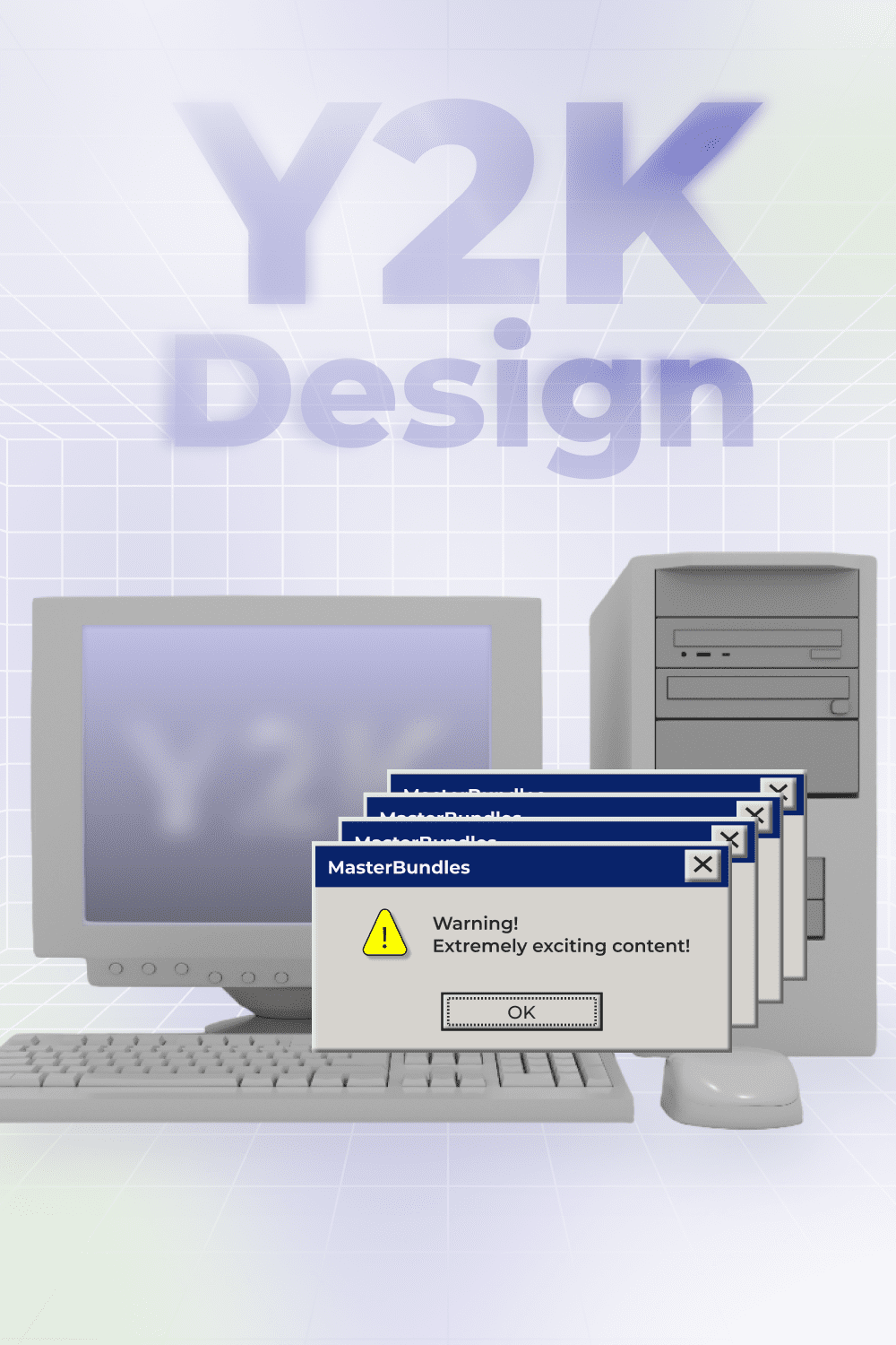
The Comeback of Y2K Design: How to Play with Y2K Aesthetics in 2022?

Hold off your 90’s dark grunge and anti-design – the 2000s glam is coming back, and we’re all for it!
The Y2K zeitgeist dominated between 1995-2004 and, for many of us, defined the warmest childhood memories. Blobby, shiny, futuristic – we were all under the influence of tech optimism and Britney-dominated pop culture. If only we had a clue that the Y2K aesthetic would be officially back almost 20 years later to plunge us into sweet nostalgia!
What stands behind the wild popularity of Y2K design in the 2020s? How to interpret this aesthetic in your current web & graphic designs? We’re deep diving into the topic right now.
A Brief Guide to the Y2K Aesthetic
The title Y2K (abbreviation for the Year 2000) – referred to as “the year 2000 problem”, “Kaybug”, or “Millenium bug” – has never meant to define any style direction. This term originates from the Y2K glitch, which caused many software failures worldwide.
It had to do with dates after Dec 31, 1999. As complex computer systems were assembled in the 1960s-1980s, engineers removed the ‘19’ digits and utilized the two-digit calendar date to save memory space (e.g. 70 instead 1970). Despite the international preparations and programming adjustments, a few significant failures happened in the changeover of the 2 millenniums.
The Y2K term was pulled over by pop culture demanding a new tech-driven aesthetic after a dark 90s era. The hype around tech optimism left a significant imprint on the 2000’s aesthetic defining its sleek, futuristic appearance.
“It’s a bit grunge, a bit anime, a bit pop, a lot of tech. It has a cheap feel to it, in the most endearing way possible.” – Tobias van Schneider
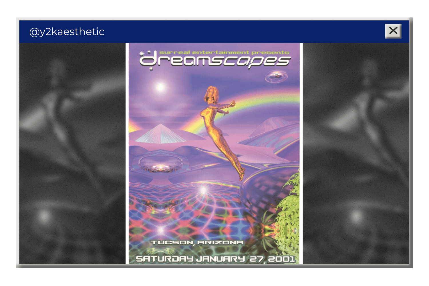
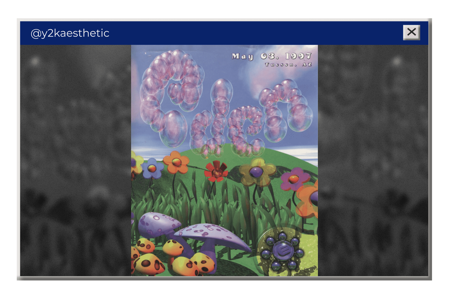
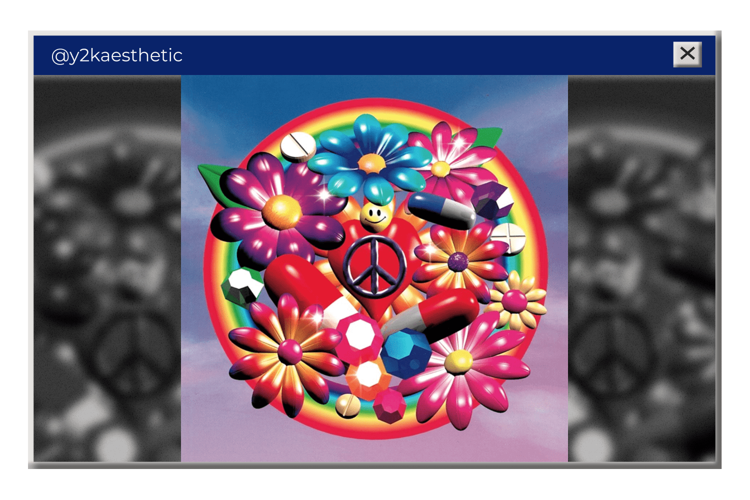
According to the Y2K Aesthetic Institute, the era’s highlights were skin-tight leather pants, silver eyeshadow, shiny clothing, Oakley sunglasses, gradients, and blobby electronics. Indeed, the late 90s and early 2000s had the cheekiest interfaces, most primitive graphics, “pinkiest” and “bluest” colors, and most iridescent backgrounds:
What’s more, the Y2K era stood at the origins of web & graphic design as we’re used to seeing it now. The rapid progress of digital technologies (Photoshop, CorelDraw, etc) and the mass prevalence of product design led to crazy experiments in design.
5 Features that Define Y2K Designs
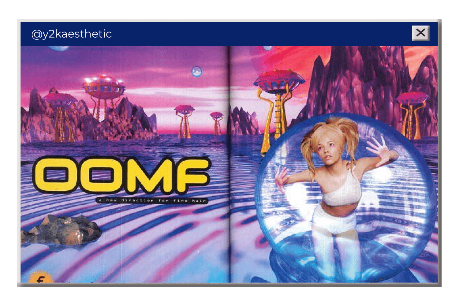
1. Cyber Aesthetic – clearly, a significant inspiration for the tech-optimistic era. It features space elements, skyscraper grids, cold colors, hologram & glitch effects, neon text, and more. The cyber aesthetic was shaped by the 90s sci-fi movies like Matrix and video games.
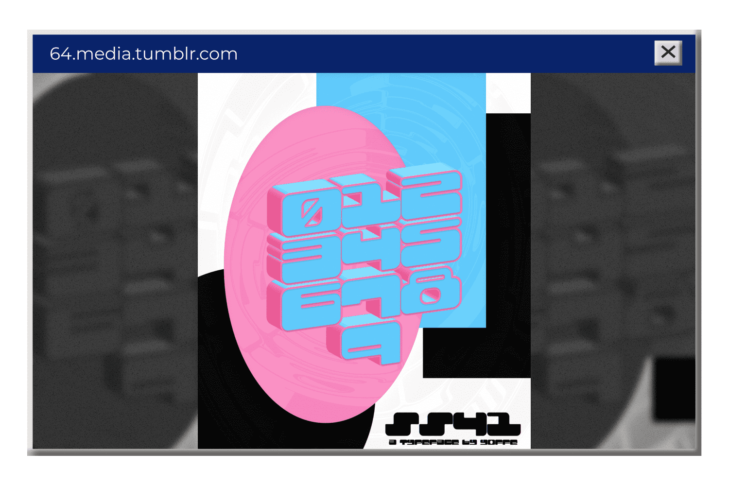
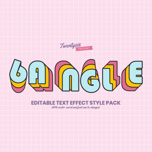
2. Bold 3D Objects – provide a “futuristic” perception of the drawn reality. 3D effects were especially popular in chunky lettering with glitter, gradients, or strong drop shadows. Followed by the release of Microsoft’s “Word Art”, 3D art got more accessible to the masses and turned into a distinct 2000s symbol.
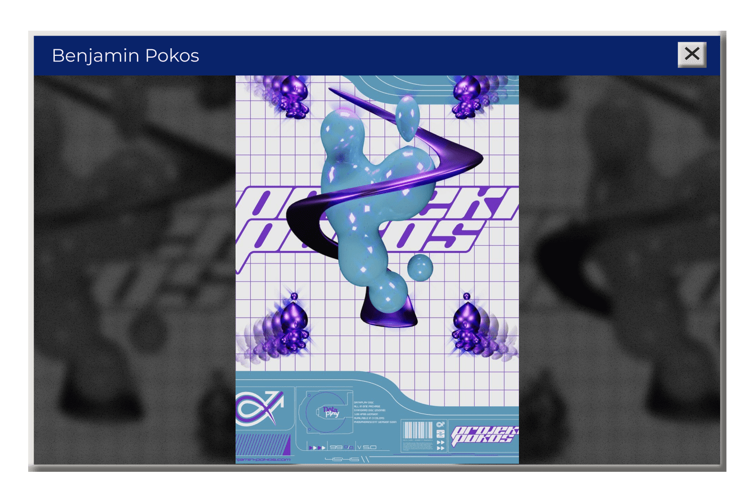
3. Blobjects & Blobitecture – refer to a postmodern style characterized by curved and rounded forms that form a complex whole. Blobitecture was evoked around the late 90s and early 2000s to point out the futuristic aesthetic of that time.
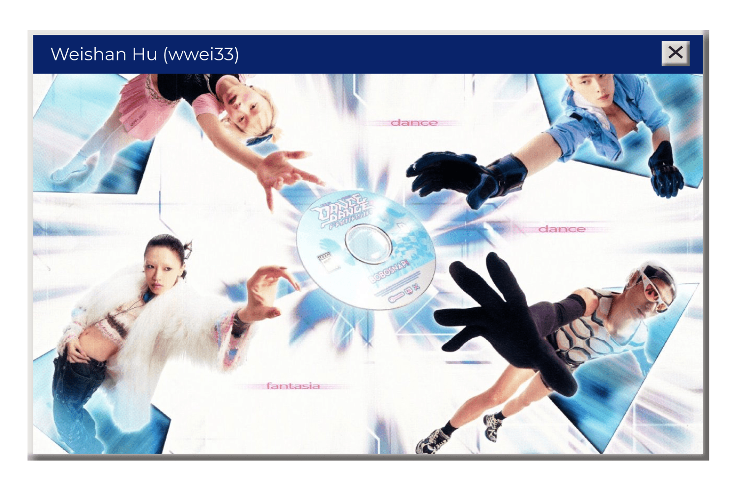
Y2K design was saturated with objects inspired by organic tear-like shapes: from Volkswagen’s New Beetle to the Sony CD-Walkman and Karim Rashid’s designer chairs:
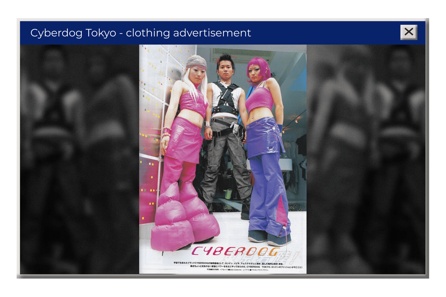
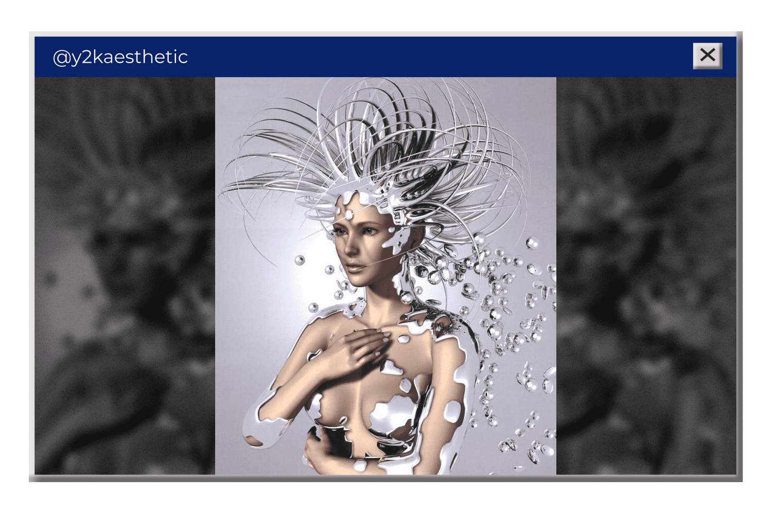
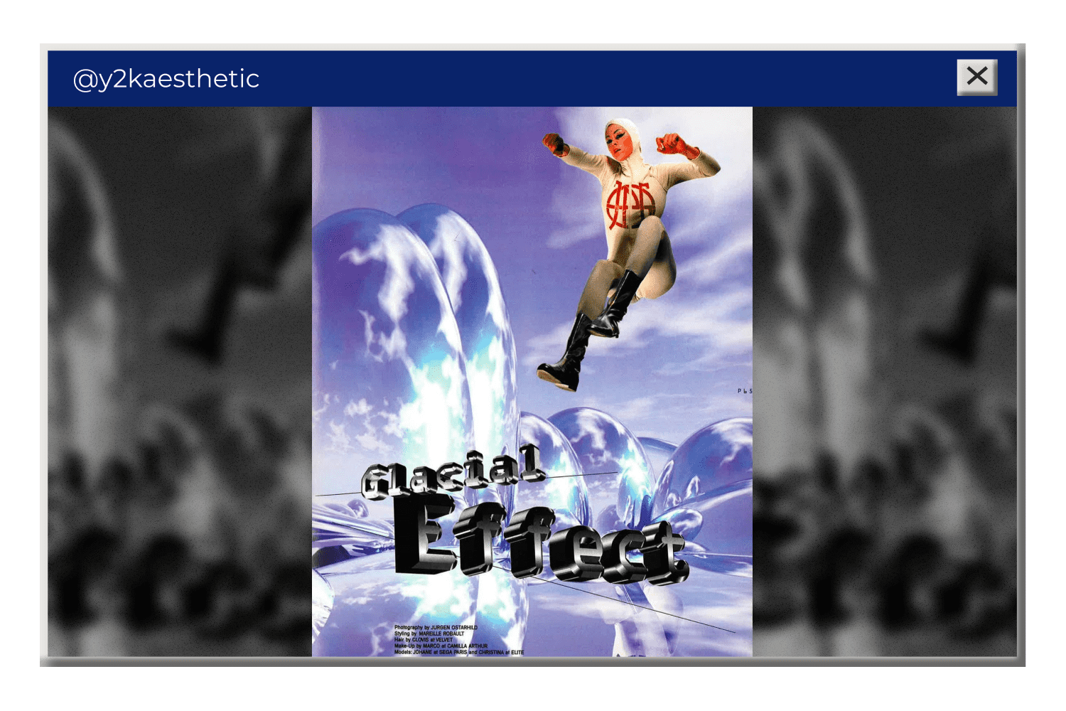
4. Translucent & Shiny Textures – in particular, silver metallic, glitter, vinyl, and sheer plastic. Because they add a more interesting fleur to any basic element, designers would use those in every possible element: text headings, backgrounds, vectors, icons, etc.
5. Vibrant Colors (especially pink) – define the Y2K atmosphere while contrasting the “futuristic” ice blue and pastel colors. The most common vibrant hues are bubblegum pink (adored by teens and pop culture), orange, and purple.
Why 2000’s Design is Coming Back
The concept of rethinking previous fashion trends is nothing new. Humans always took their inspiration from earlier periods to the current time while adding their own distinctive, modern touch. That’s how fashion works in its cyclical nature.
According to the cynical concept, trends come back every 20 years. With little math, we may conclude that now is the time for a new generation (Gen Z) to reinvent and popularize Y2K designs as something “new” and “fresh” for their period.
While Gen Z is willing to discover and experiment with a more fashionable aesthetic, their older counterparts (millennials) reflect on the 2000s through their memories. We’ve known these colors, brands, music, games, and TV shows since childhood, and they provide comfort. Nostalgia fosters pleasant emotions of connection with the past and evokes relief, and shelter from future uncertainty. Who wants to hear about pandemics, wars, and human rights issues? Better pass me a Spice Girls CD!
Combine our sweet nostalgia with a killer design and product … and voila, you invented the working sales machine!
6 Ways to Integrate 2000’s Aesthetic In Today’s Graphic Design
Simplified interfaces, low-poly computer graphics, neon colors, and holographic CD-like textures…
Before the resurrection of Y2K graphic design, those retro attributes seemed like a nightmare for 2010s minimalists. It takes us back from flawless minimalism and clean design to a funky fusion of pop, kawaii, neon, and tech.
How can the 2000 style pair with a modern branding & interface design?
We’ve got some inspirational examples below. To help you recreate the futuristic Y2K aesthetic in less time and effort, we included links to useful web products sold by MasterBundles.
MasterBundles is the marketplace of trendy web products (fonts, patterns, icons, vectors, backgrounds, etc). We let talented designers sell their products at good rates. Become our vendor by filling out the sell your deal form and enjoy the perks of a passive income!
UX/UI
What if you don’t have to produce complex fluid designs for your Y2K project? The 2000s outburst led us to a point where primitive interfaces are actually… a thing.
Designers would purposefully use outdated interface styles to produce Y2K web designs. They would bring to mind the time when everyone was hyped about asymmetrical designs, flat UI, and Times New Roman as a default font on a plain white background. Take Kurt Champion’s portfolio as an example.
Outdated-looking browser windows. deliberate faults, pixelation, and a generally low-tech look – would we really enjoy it? Absolutely! But only on our newest MacBooks with the 1.5s loading time 🙂
Typefaces
The 2000’s graphic design was definitely influenced by Microsoft’s Word Art. Designers were obsessed with font decorative aspects: thick outlines, shadows, and bold, or italic characters.
The “WordArtish” font styles might not be everyone’s cup of tea, yet, they can be easily reinterpreted in a more fresh lightweight way. For example, designers can use large bold fonts of any typeface they like.

Bold fonts are easy to play with: just make it translucent or include a texture, or simply incorporate punchy decorative elements like drop shadows, airbrushing, or a free-flowing type alignment.
Just make your font stand out!

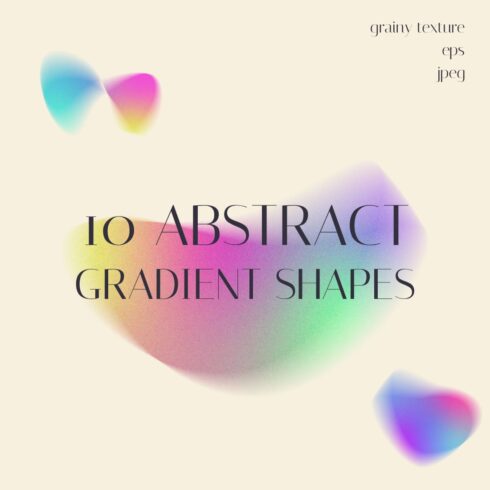
Gradients
After a few years of solid-color dominance, gradients are having their moment again. This color trend was all the rage in the late 1990s for birthday invitations and school assignments.
Nowadays, designers may employ the more advanced mesh gradients to tap into Y2K website nostalgia and create an interesting backdrop.
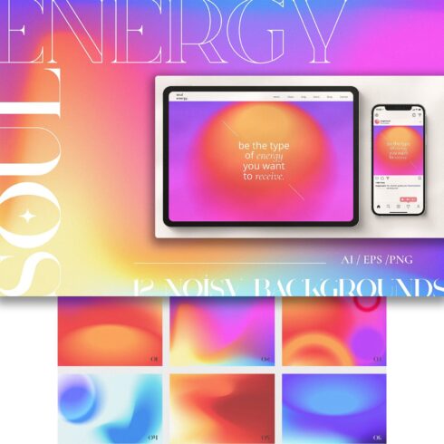
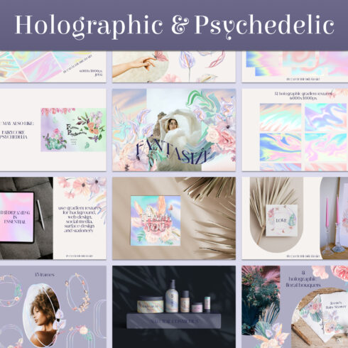
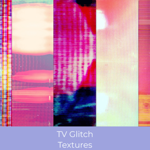
Textures
Textures. This is something that Y2K designs had in abundance. Textures were influenced by electronic design and fashion. From iMac G3 featuring transparent colored plastic to fur coats and glossy vinyl – these are just a couple examples of popular 2000s textures.
Modern web & graphic designers would often use holographic psychedelic textures, striking glitches or else as a background or filling.
Futuristic Effects
It’s impossible to recreate the cyber-like design without using effects like 3D, neon lines and shapes, metallic elements, glitches, etc. Y2K was rich on futuristic effects and able to give every illustration a very cyber-inspired look.
Combine only 1 effect with another distinct Y2K-inspired item – and it will do the job.
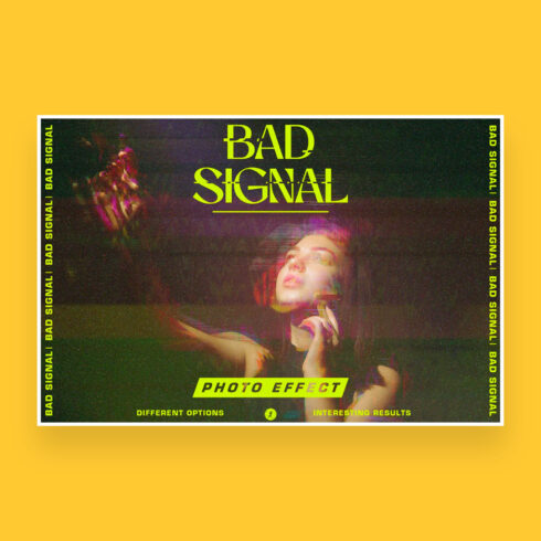
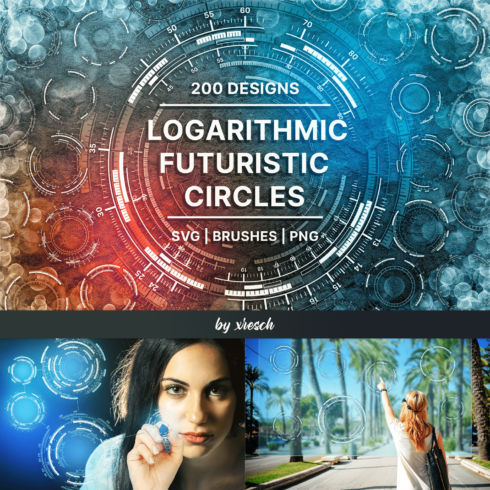
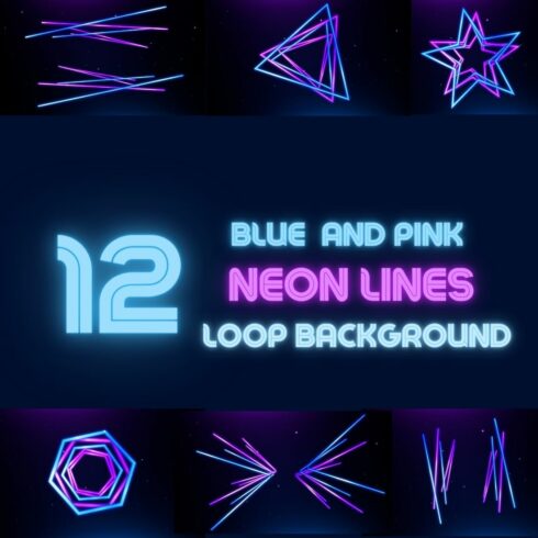
Image Vectors & Icons
We’re living in a visually-overloading era, and web designers should find a way to deliver a distinctive visual narrative as fast as possible. This is where Y2K iconography can help, providing a unique graphic style you can’t pass by.
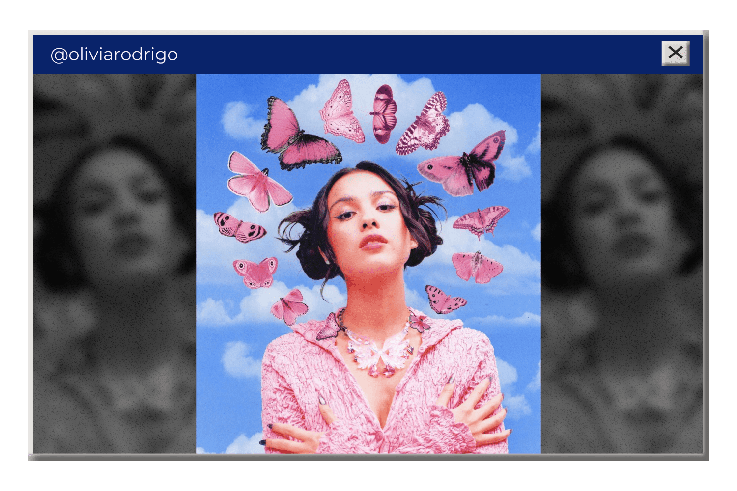
Vectors and icons related to the 2000s era will instantly add the Y2K feel to any image or design. There are many Y2K sticker packs featuring 2D and 3D graphics, dark lines and shadows, flashy images, and cheesy, grungy iconography like happy faces and butterflies.
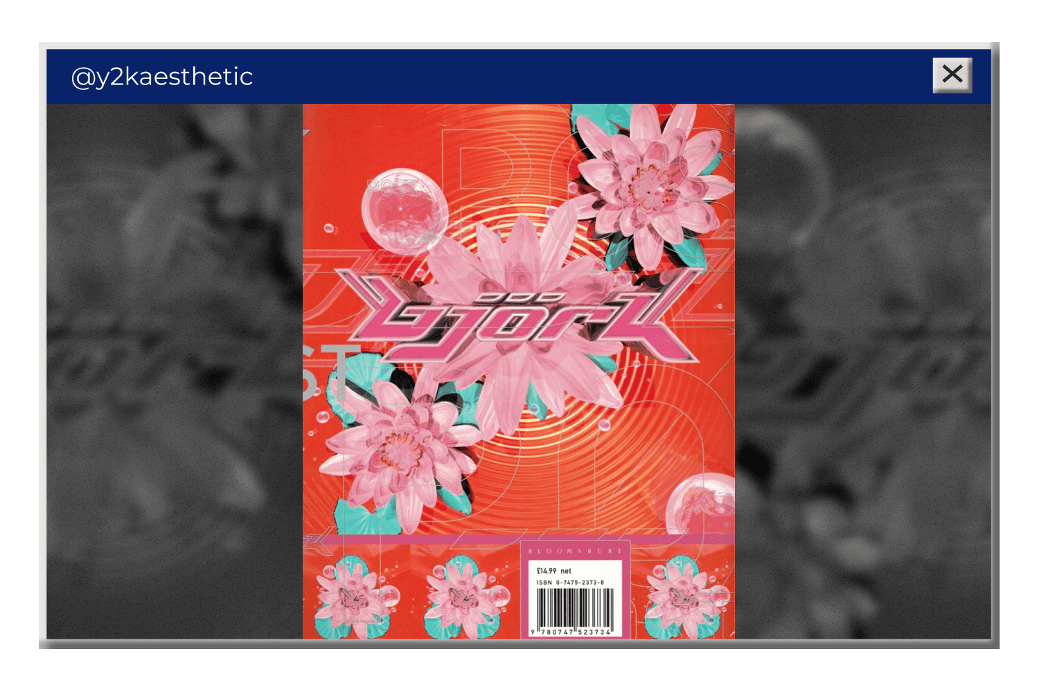
For example, Y2K icons are actively used Olivia Rodrigo’s recent album cover:
That’s it now!
Whoever says what, going back to the 2000s design is fascinating. We can study the Y2K ideas and develop them into incredible futuristic projects using the best available tools.
Best Related Articles


Some Awesome Video About Y2K Design
How to Create Y2K Logos, Shapes & Vectors! – Adobe Illustrator CC Tutorial
Learn how to create Y2K-inspired logo shapes, vectors, and icons in this Adobe Illustrator CC 2022 tutorial.
- Y2k powerpoint templates
- graphic design shows
HOW TO Y2K (+FREE PACK)
today i’m sharing episode 1 of my Y2K series, focussing today on a logo work process, and sharing a free + deluxe y2k pack for symbols and fonts for my Photoshop heads! all packs are a WIP and are being updated regularly ! follow me on instagram for pack updates! @griffin_gfx
FAQ
Here are a few frequently asked questions about Y2K design
What is Y2K design?
Y2K design is a trend in design dominated from 1995 until 2004. This aesthetic was influenced by rapid tech optimism and big faith in a new technological future.
The Y2K graphic design features metallic and translucent objects, glitter, blobjects (round-shaped items), futuristic effects, and cyber-inspired block typography. The prevailing colors are bubblegum pink, chrome, icy blue, orange, glossy white, and black for lines.
What makes Y2K aesthetic?
Y2K was not the most user-friendly period when it comes to design. Many Y2K designs were heavy and overloaded with effects, bold fonts, and bright elements.
Until recent times, the Y2K aesthetic was considered bad taste. Yet, as Y2K designs are coming back, we begin to perceive them as something pleasant, and nostalgic. The modern interpretations of this style change the way we used to perceive the Y2K design before.
What are Y2K logos?
Y2K logos are logo designs created in accordance with 2000s trends. Y2K logos typically inherit bright neon colors, geometric shapes, massive lettering, and tech- or cyber-inspired elements.
What are your concerns?
Thanks for your response!
Disclosure: MasterBundles website page may contain advertising materials that may lead to us receiving a commission fee if you purchase a product. However, this does not affect our opinion of the product in any way and we do not receive any bonuses for positive or negative ratings.