Bauhaus Graphic Design: How to Convey Complex Meaning with Simple Solutions
The name Bauhaus has a meaning that already makes clear the scope of the school. It was the school that revolutionized architecture, home design, and graphic design.
This direction has promoted the idea of simple and effective solutions to the world. The workers of the school searched for and found the opportunity to simplify the complex, refuse over-decoration, and at the same time create masterpieces.
Today, Bauhaus graphic design is relevant because the user has to concentrate on the meaning and function of the design and at the same time, use interesting solutions: asymmetry, bright colors, strict figures, etc. This design is not boring and, I can only assume, it will be relevant for the next few years.

A Brief History of the Bauhaus: What, Where, When, Who and How?
Let’s imagine Germany after World War I. Ruin. Economic fall. Lack of resources. At the same time, there is an urgent need to restore the life of the inhabitants. Such conditions make this a task with an asterisk, do you agree?
In such difficult conditions, the Bauhaus school of construction and artistic design was opened in Weimar.
For 14 years (1919-1934), her followers made a breakthrough in architecture and graphic design. Thanks to the Bauhaus, a revolution took place in which everything unimportant in the subject was mercilessly cut off.
Meaning, simplicity, and efficiency of design prevailed over embellishments.
Let’s look at the most important points in the development of the school and what happened to them.
1919. Opening of a school in Weimar
The first director was Walter Gropius. He believed that every artist should know the craft. That is why the training program consisted of practice in workshops – in metal processing, sculpture, wood, glass, advertising, textiles, etc. In addition, the students were engaged in dancing, stage performances, and led an active social life within the school.
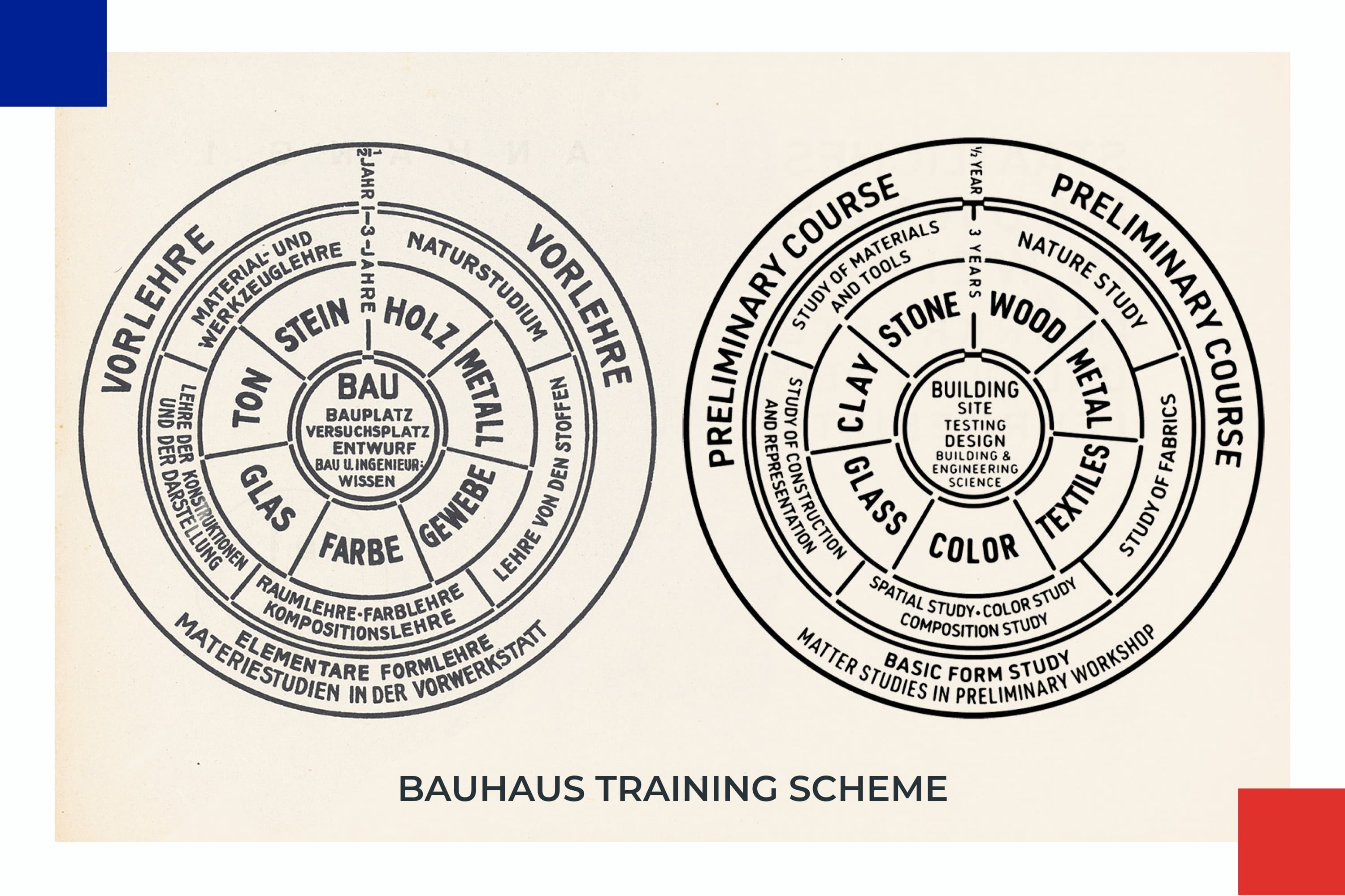
In the classroom, students created real objects and looked for new solutions in which better quality is created with fewer resources.
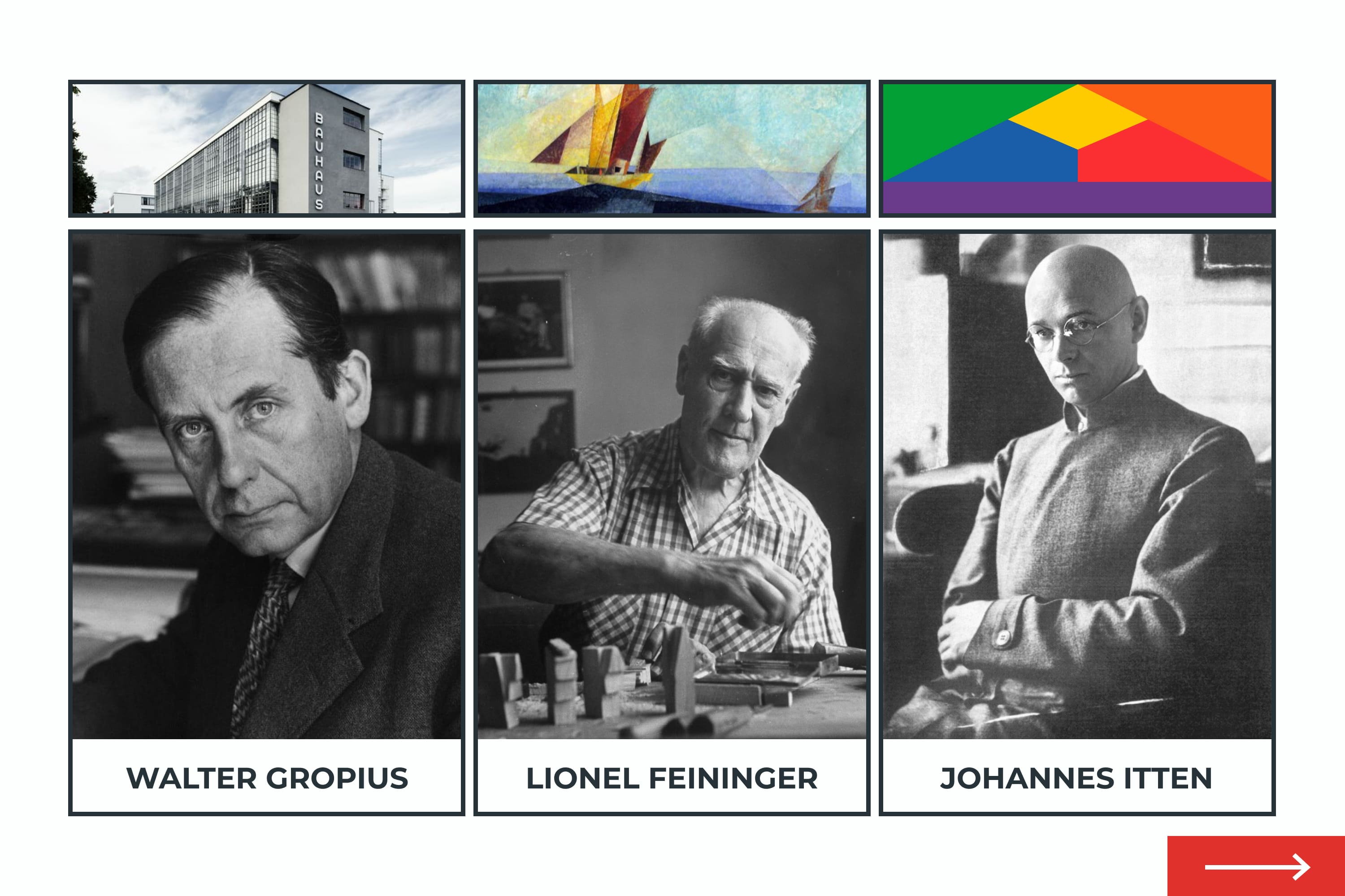
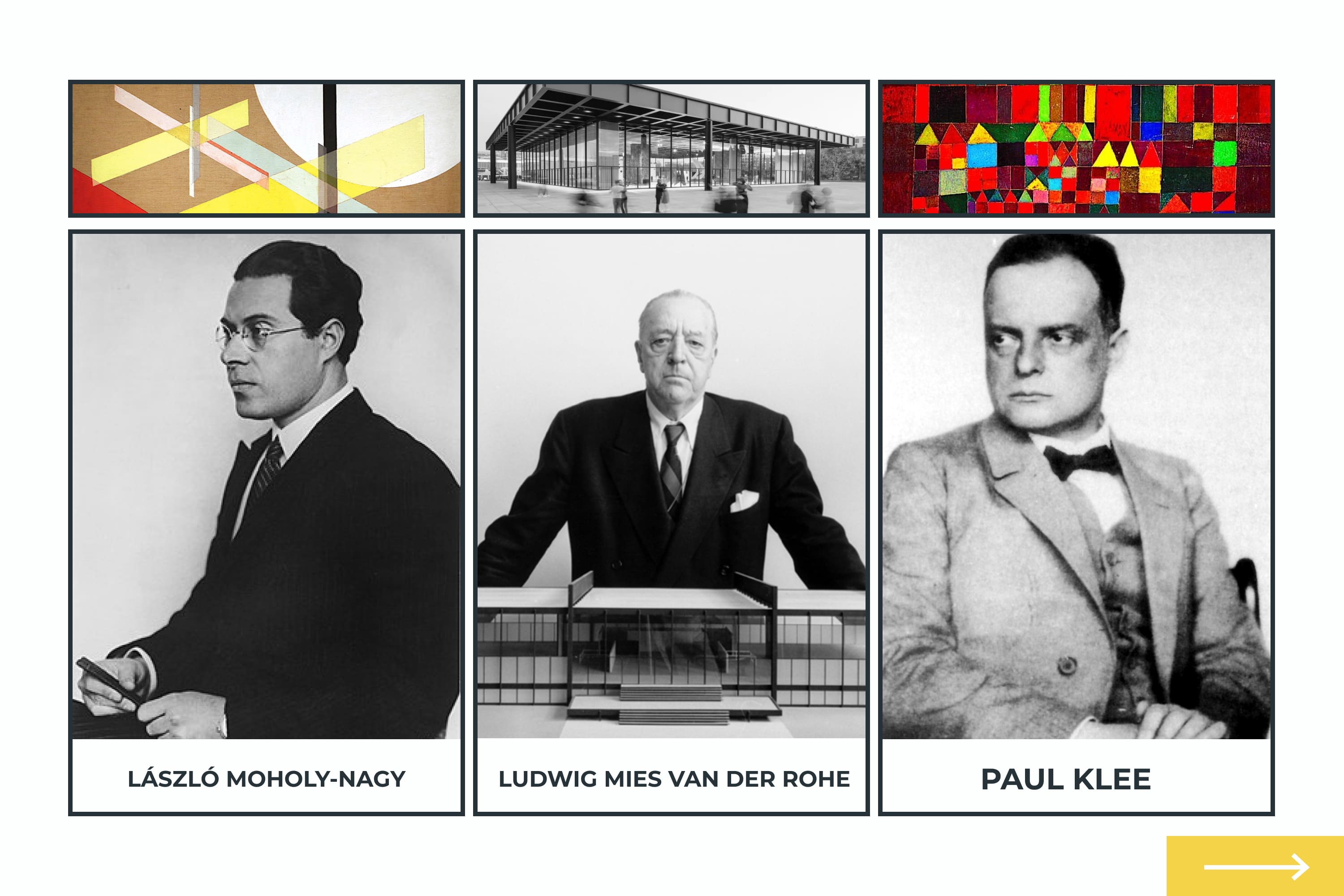
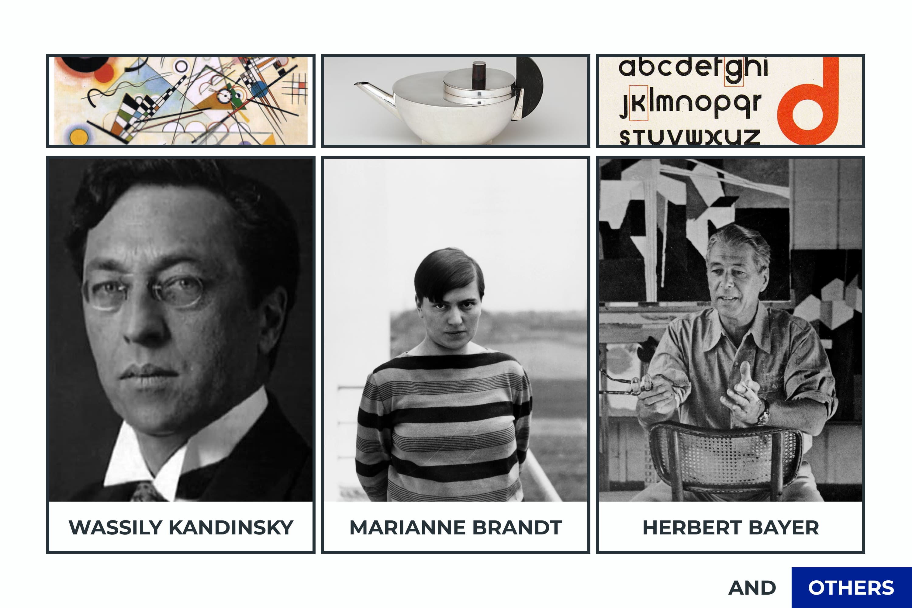
Curators were assigned for each direction. You can find the most recognizable and famous people in the infographics below.


1923. An exhibition that showed the power of the Bauhaus
Interestingly, the school existed on taxpayer money and was free for students. Therefore, the German government hinted that it was time to show the Bauhaus representatives the work and its results. There was no other choice.
The assumption is that many of the works were made right before the exhibition. Maybe, but the exhibition amazed everyone with a new style of work and rethinking of ordinary things.
1925. Creation of the well-known Bauhaus identity
Due to political oppression, the school moved to Dessau in 1925. It is this building that collects all the ideas of the direction.
At the same time, Herbert Bayer created the famous font, which was used in the school logo. The font discards large letters to simplify writing, consists of simple geometric shapes, and is easy to read. It was the basis for other typefaces in Bauhaus graphic design.

1933. Closing of the school
Unfortunately, the free and progressive ideas of the school strained the German government. Followers began to be considered propagandists of communism, and the school was deprived of state school status.
In 1933, the third director, Ludwig Mies van der Rohe, decided to dissolve the school. This was the end for the Bauhaus school, but not for the style. The students went around the world and began to promote the famous Bauhaus graphic design in different cities.
Thanks to love and faith in the Bauhaus principles, today we are adapting this style for our design. I have prepared for you style characteristics and Bauhaus graphic design examples.
How To Understand What Is Bauhaus Graphic Design Style?
Students and followers of the Bauhaus style worked to make everyday things comfortable, affordable, and beautiful, but without unnecessary embellishments. It concerned architecture and household items, which moved into modern Bauhaus graphic design.
Let’s look at the basic principles of style so that you do not stand out in the designer crowd and can distinguish it from others.
Minimalism and Functionality
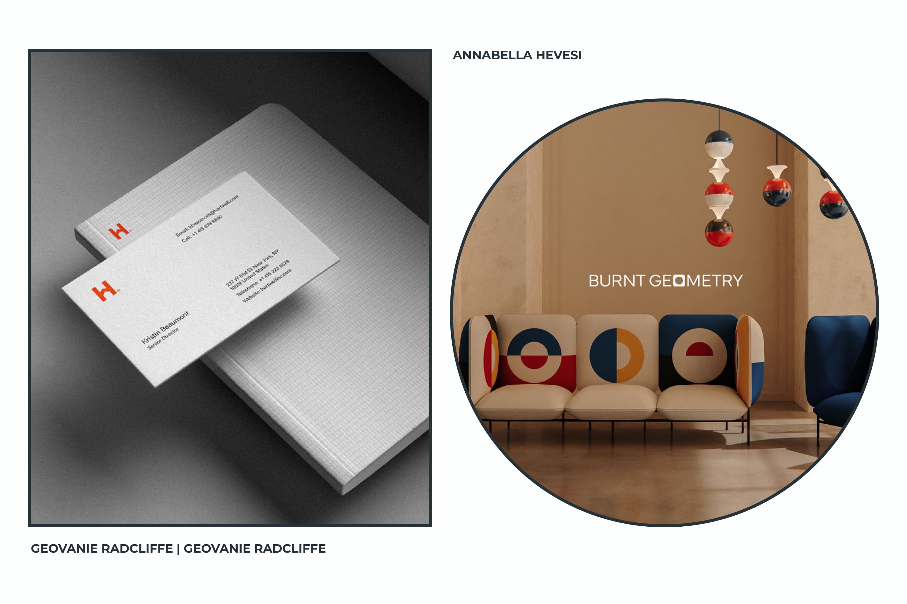
In Bauhaus graphic design, every detail has a role, but no meaningless decorations. It is important to simplify the design to the point where it holds the viewer’s attention and fulfills the purpose of the particular design.
Therein lies the great difficulty. It is necessary to reach such a decision when a minimum of elements will carry a maximum of meaning. This requires practice and observation, otherwise you get a boring and empty picture. And this isn’t about the Bauhaus.
Mix of Bright Base Colors
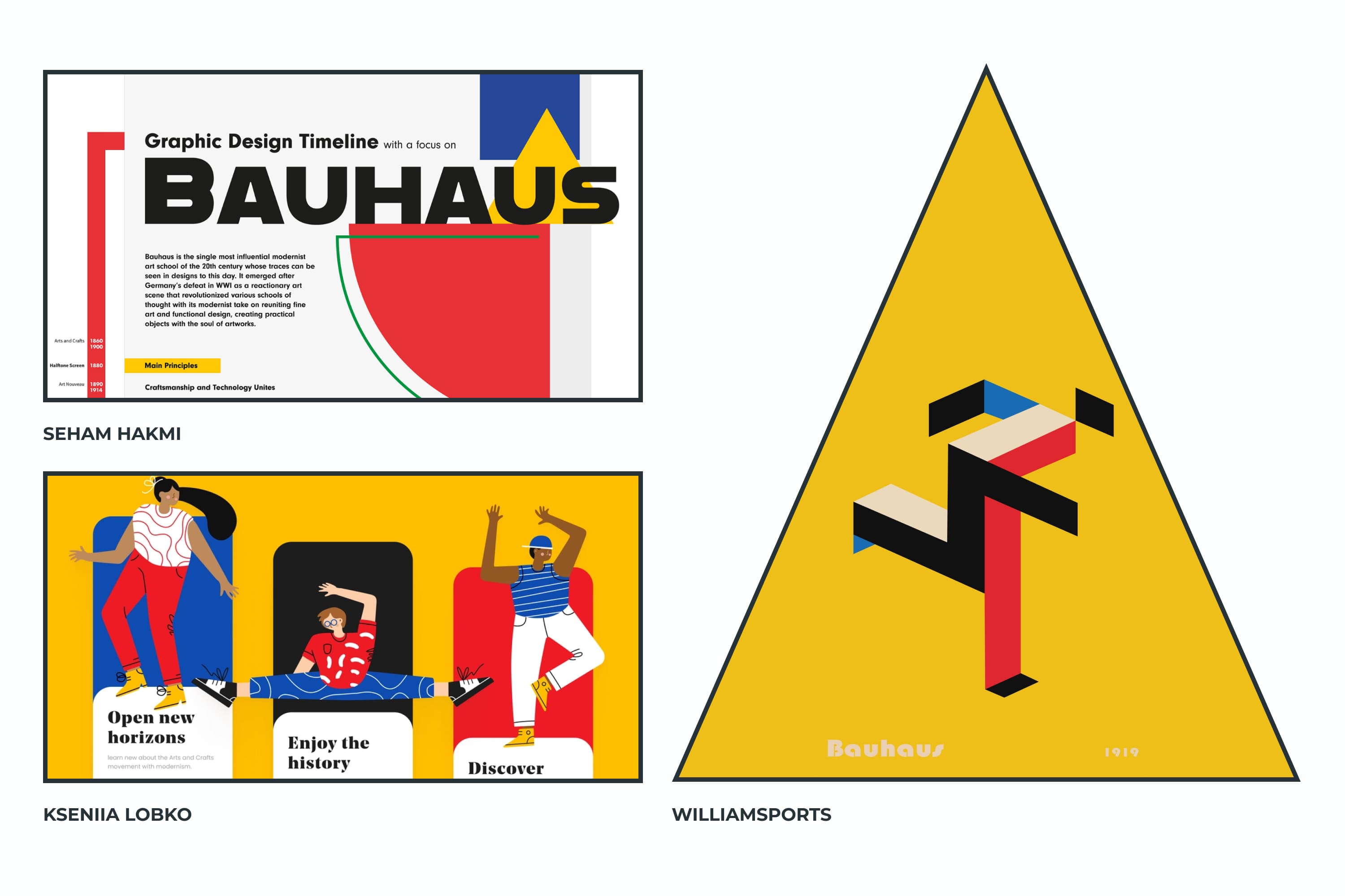
Trademark of the Bauhaus graphic design style – pure, contrasting shades without mid-tones. These are the three basic colors: yellow, red, and blue. They are usually combined with white and black. Such solutions attract the eye and at the same time do not burden it.
Perfect for use in any design area, as long as the brand concept is in tune with bright colors. These are mainly youth brands, digital studios, entertainment, and food.
Collages
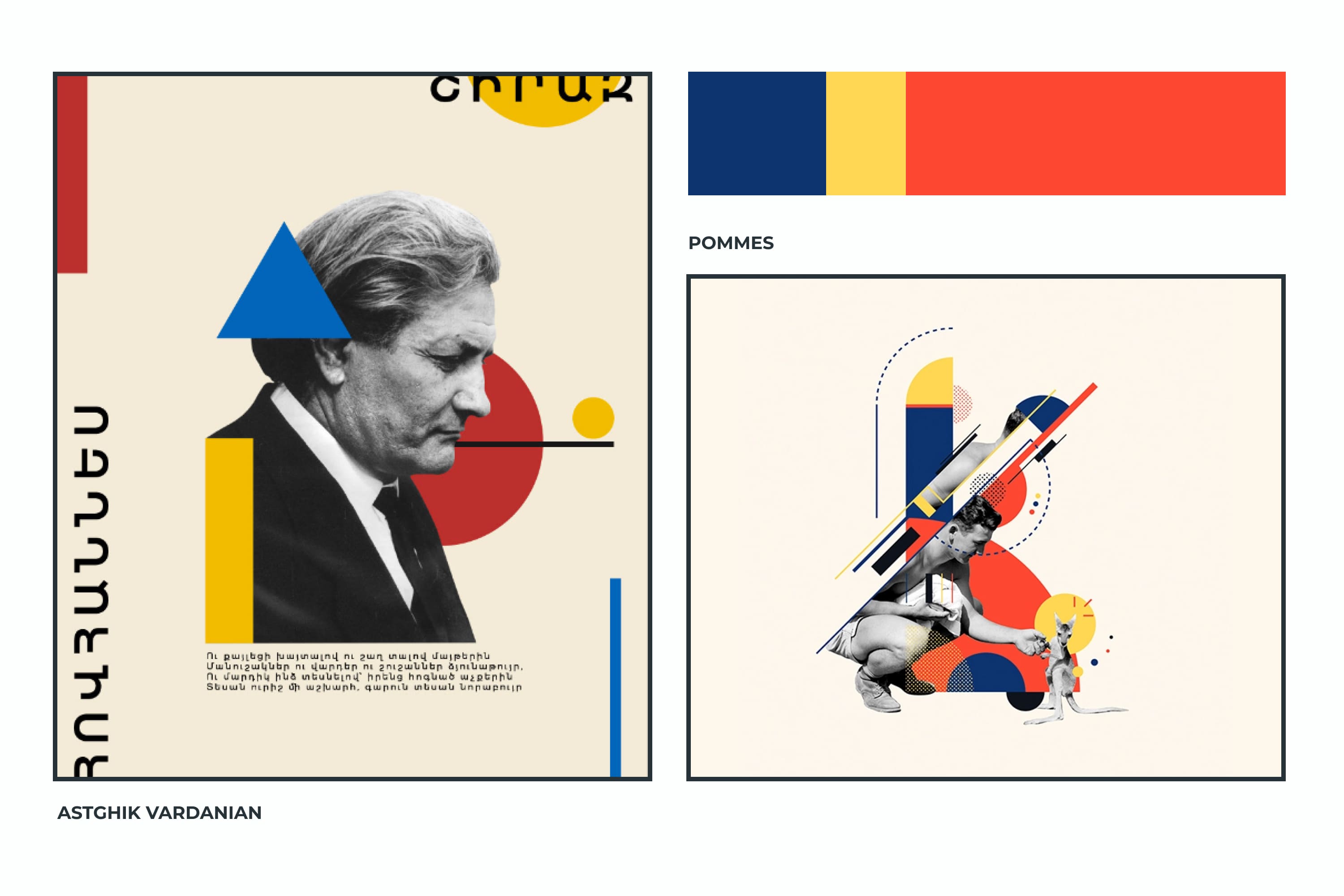
Pinterest at one time had a boom in combining body parts, flowers, animals, and natural elements. Here you need to be careful and learn the art of collage, so as not to create chaos.
Such collages fit perfectly into the design of posters, book or music album covers, advertisements, posts for social networks, and on the main screens of portfolio sites.
Diagonal Lines In A Grid
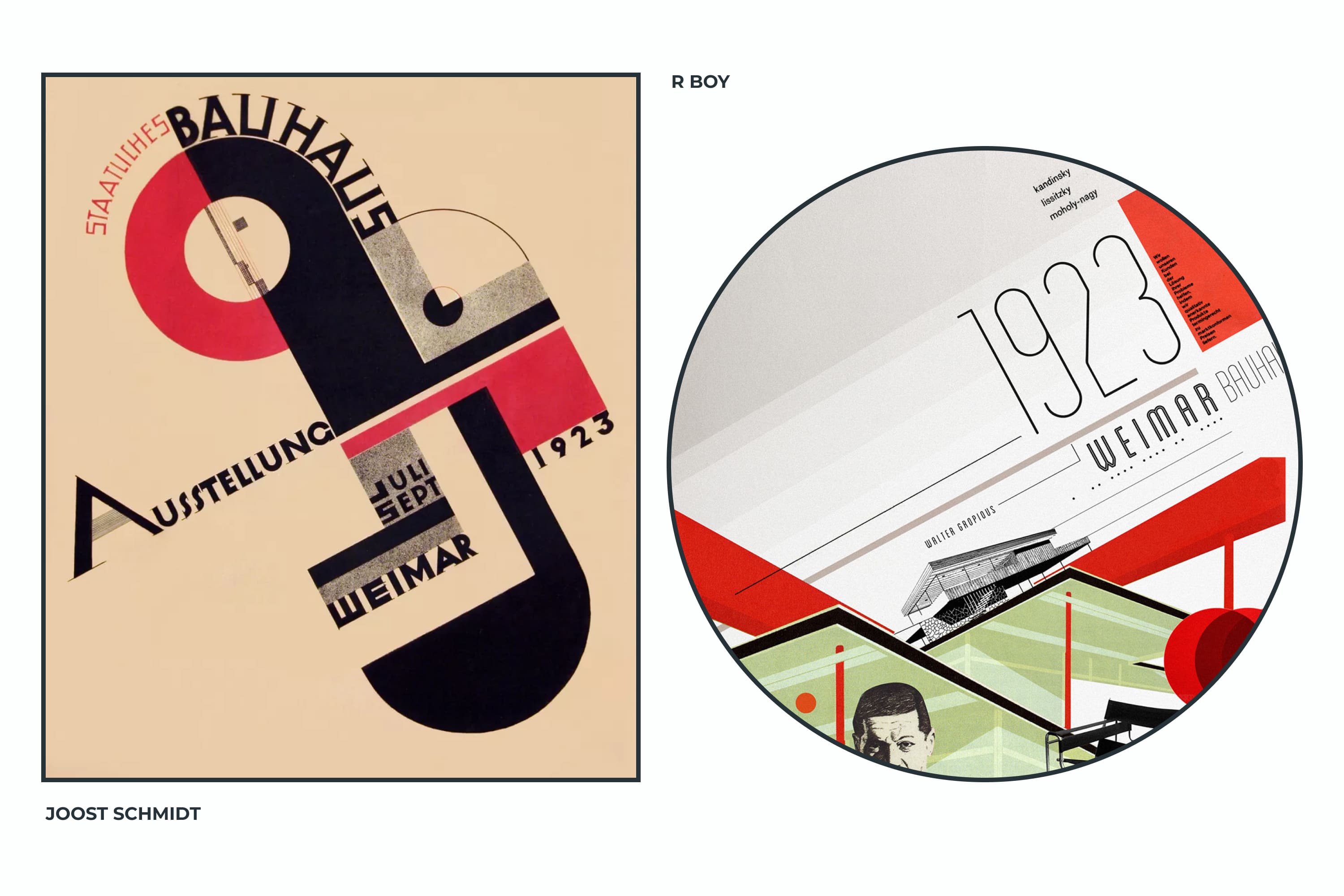
Bauhaus graphic design posters are notable for their non-standard layout. Instead of the usual verticals, we can notice the diagonal arrangement of elements.
This solution creates a sense of dynamics, forcing the viewer to consider the details and connect everything to the big picture.
It will look spectacular in the design of business cards, certificates, posters, lined music albums, etc.
Simple Shapes
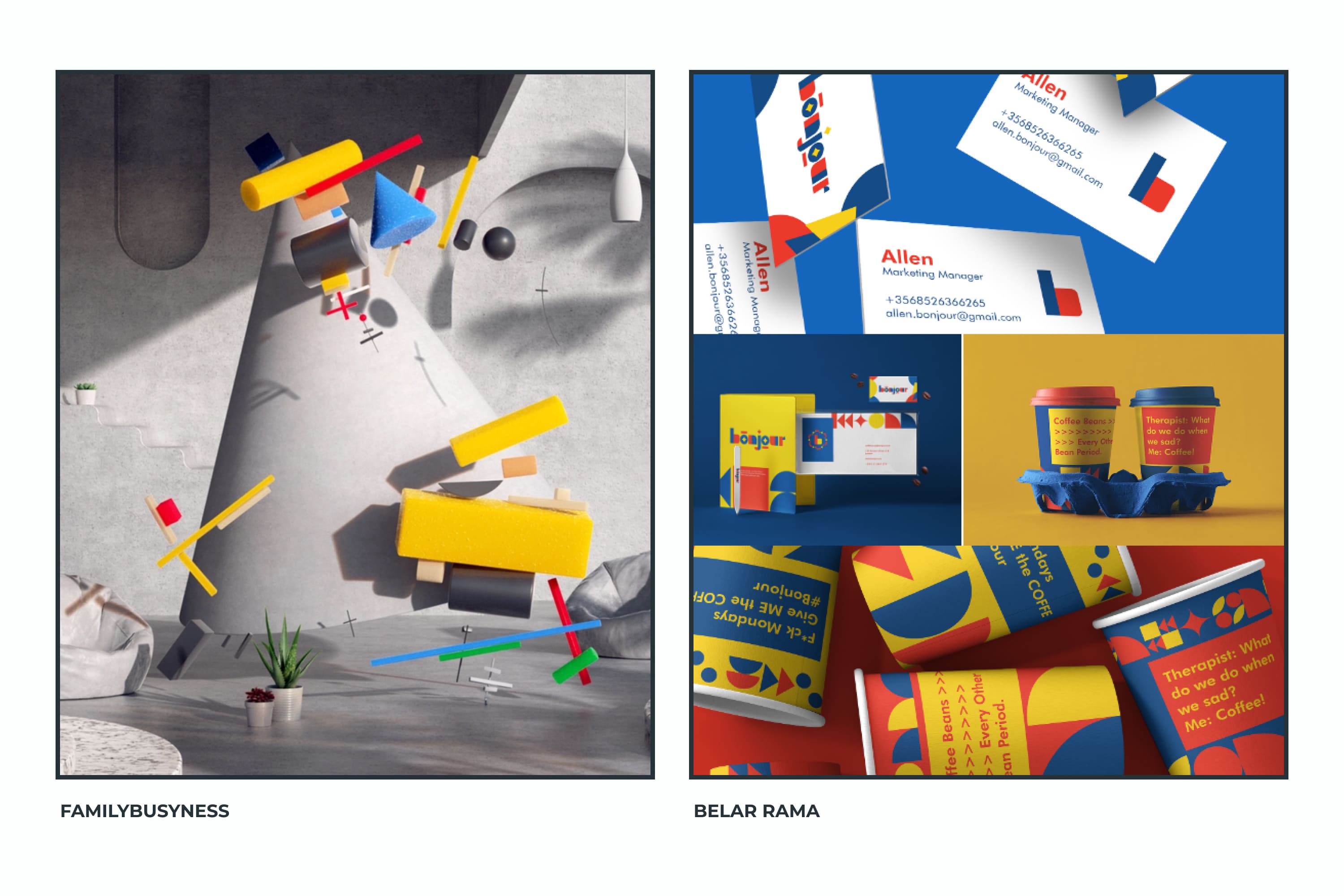
This is a trend that will be with us for another year. It is pleasant for our vision to perceive simple figures because they are understandable.
In addition to physiological reasons, you can add more moral ones. Such figures are associated with childhood, pyramids of rings and triangles, cubes with inscriptions, etc.
Simple shapes can be used to accent the design. For example, as it is done on the cover of a book. Here, the circles create the design and replace the letters.
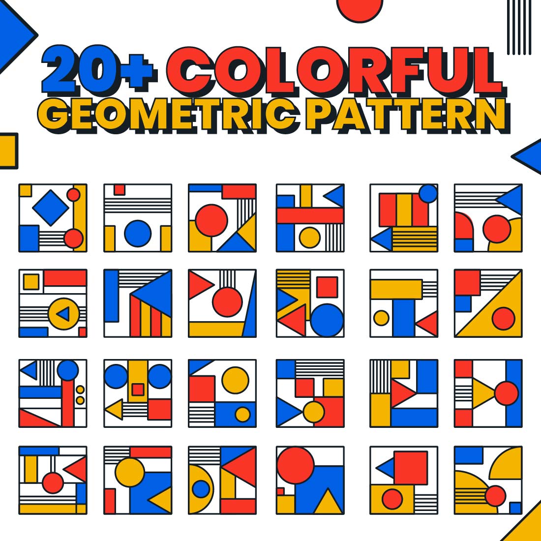
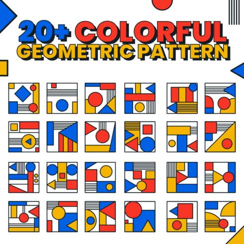
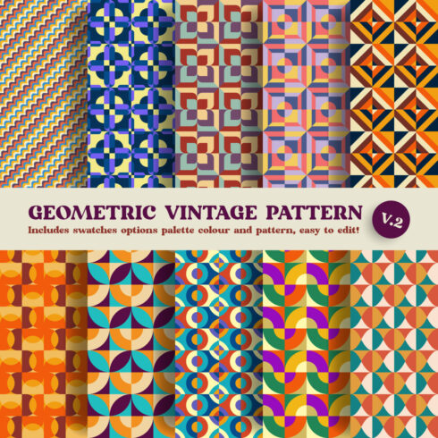
A very relevant solution is the creation of a geometric pattern. This design technique helps to create attractive packaging, covers, wrapping paper, interior pictures, certificates, business cards, banners, website inserts, unusual characters, logos, etc.
Combined with the base colors, you can create a fresh and exciting Bauhaus graphic design.
20 Plus Colorful Geometric Shape Pattern
| Price | $9 |
|---|---|
| File type | AI, EPS, SVG |
| Date | July 5 2022 |
| Colors |
white |
| Rating |
(14 Votes)
|
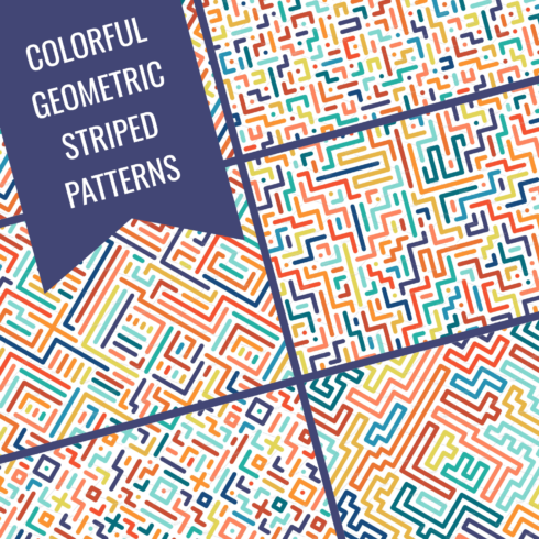
Colorful Geometric Striped Patterns
| Price | $6 |
|---|---|
| File type | AI, EPS, EPS10, JPG |
| Date | May 24 2022 |
| Colors |
black white |
| Rating |
(12 Votes)
|
Typography from Simple Shapes
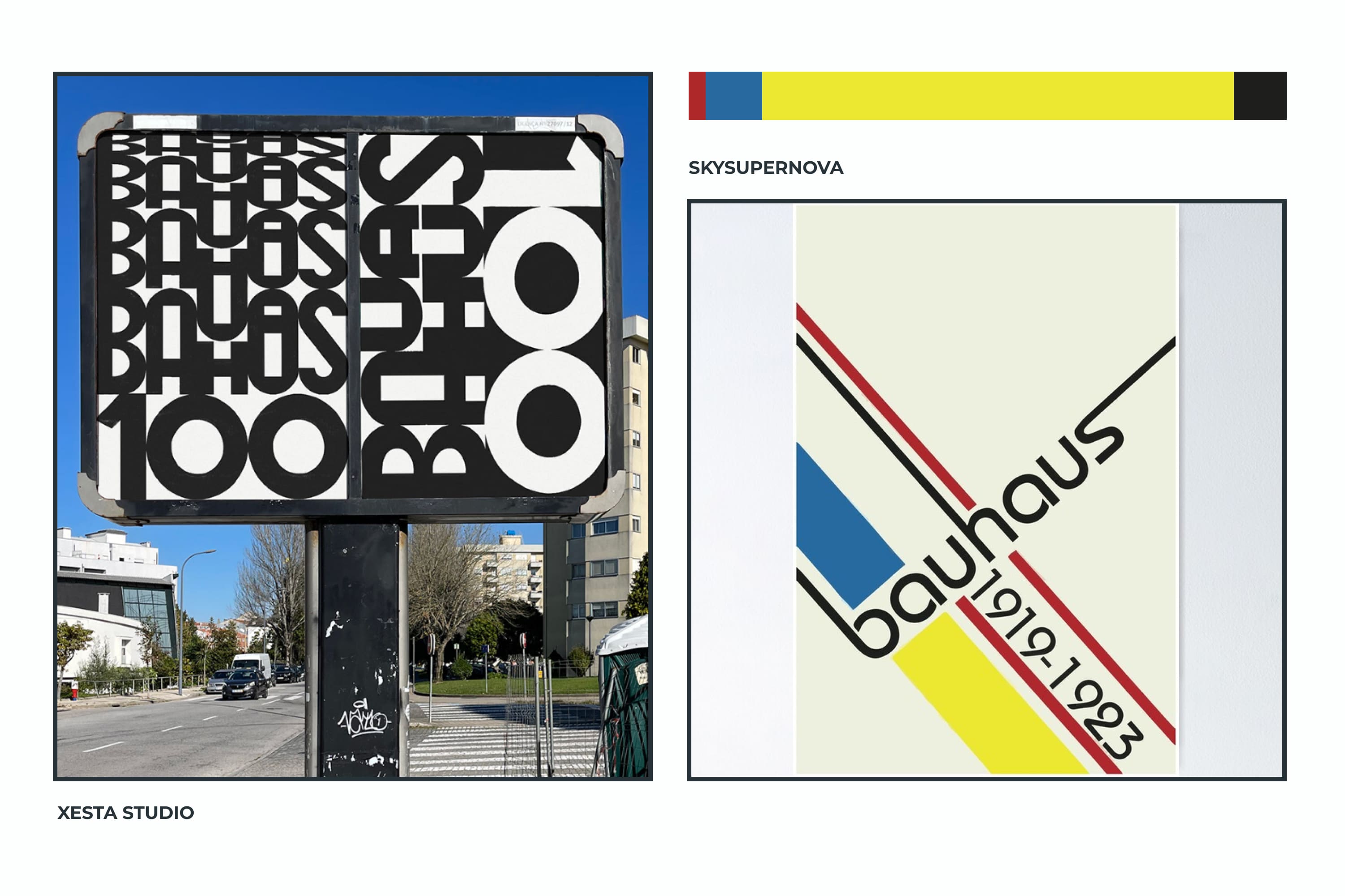
Look at the font of the Bauhaus logo – simple, made up of simple shapes, with no capital letters. This is the basis for the typography of this direction.
Use simple and clear geometric fonts that will be easy to read. Such a font will perfectly fulfill the main function – to convey the meaning of the text to the viewer. No decorations are needed for this, which will distract from the importance.
Excellent! Now you know and can use the principles of graphic design Bauhaus in your work. Experiment, be brave, and find new solutions to old problems. Then you will not only design in the Bauhaus style but also be one of its followers. After all, the students of the school were engaged in the search for new solutions.
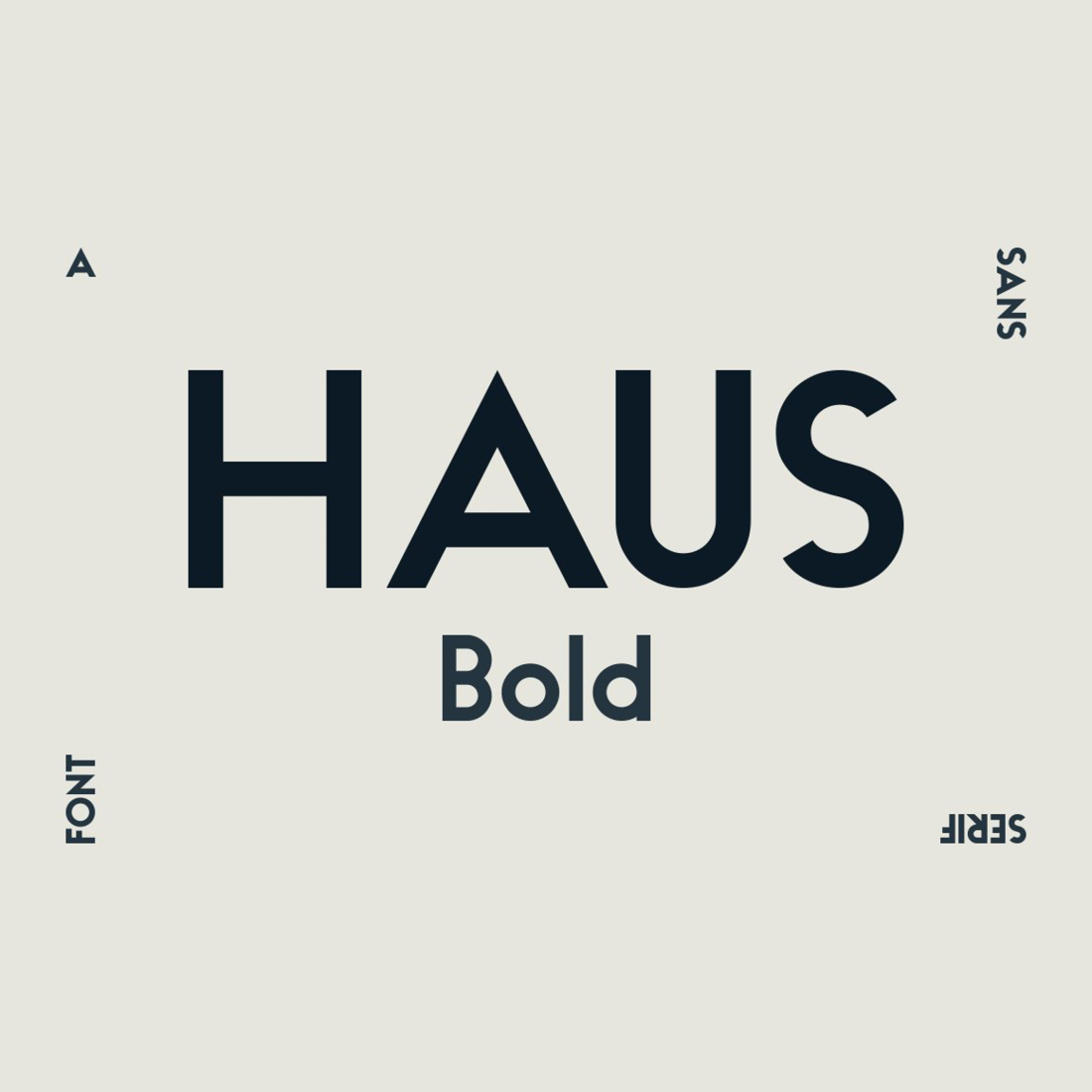
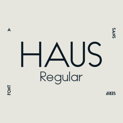
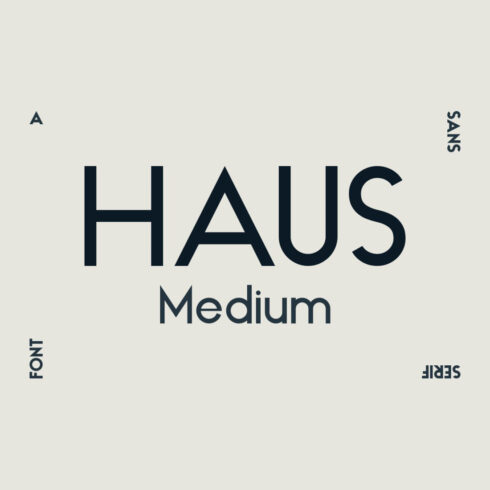
HAUS Sans Bold
| Price | $14 |
|---|---|
| File type | TTF |
| Date | August 2 2022 |
| Colors |
blue gray white |
| Rating |
(12 Votes)
|
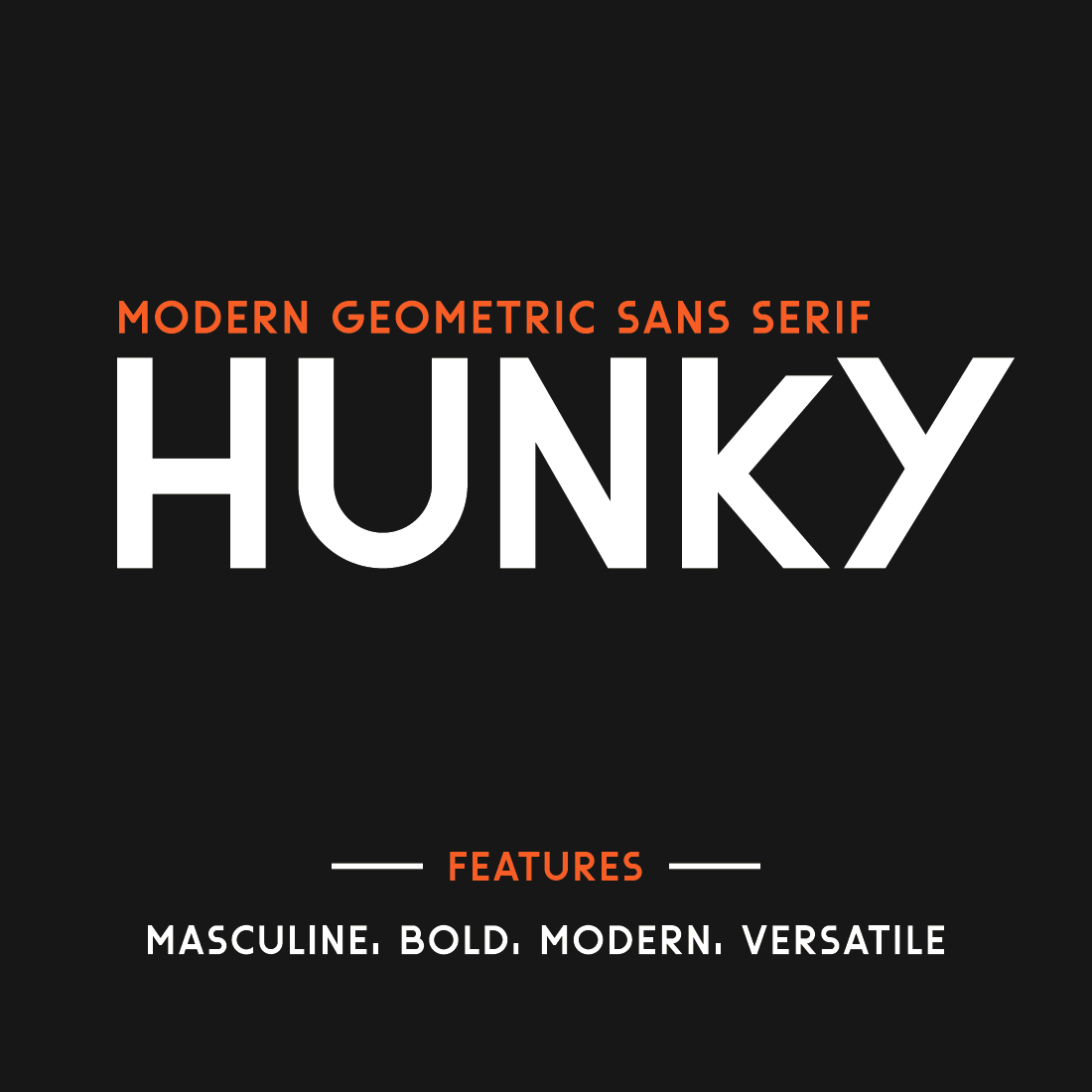
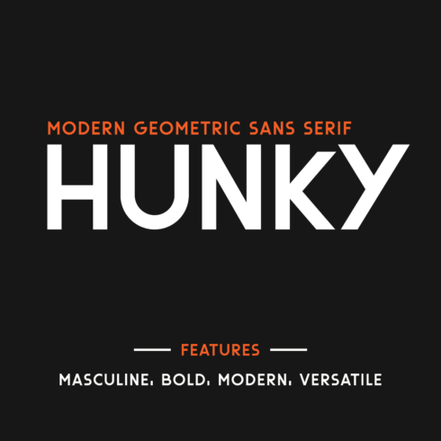
Hunky-Geometric Sans Serif Font
| Price | $11 |
|---|---|
| File type | OTF |
| Date | October 9 2022 |
| Colors |
brown gray orange |
| Rating |
(15 Votes)
|
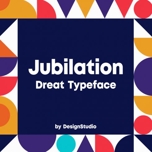
Jubilation Monospaced Sans Serif Font
| Price | $5 |
|---|---|
| File type | OTF |
| Date | October 6 2021 |
| Colors |
blue white |
| Rating |
(11 Votes)
|
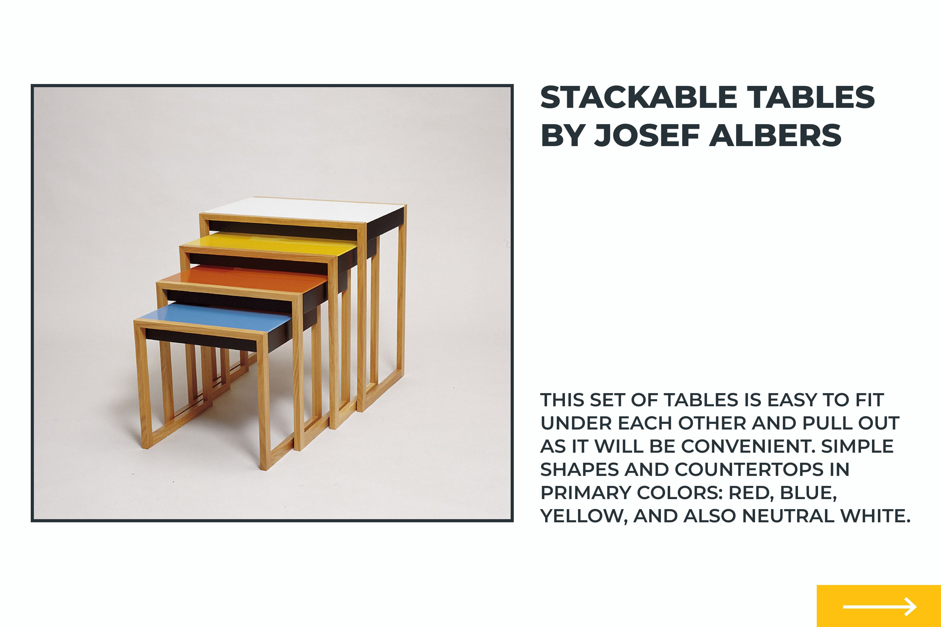
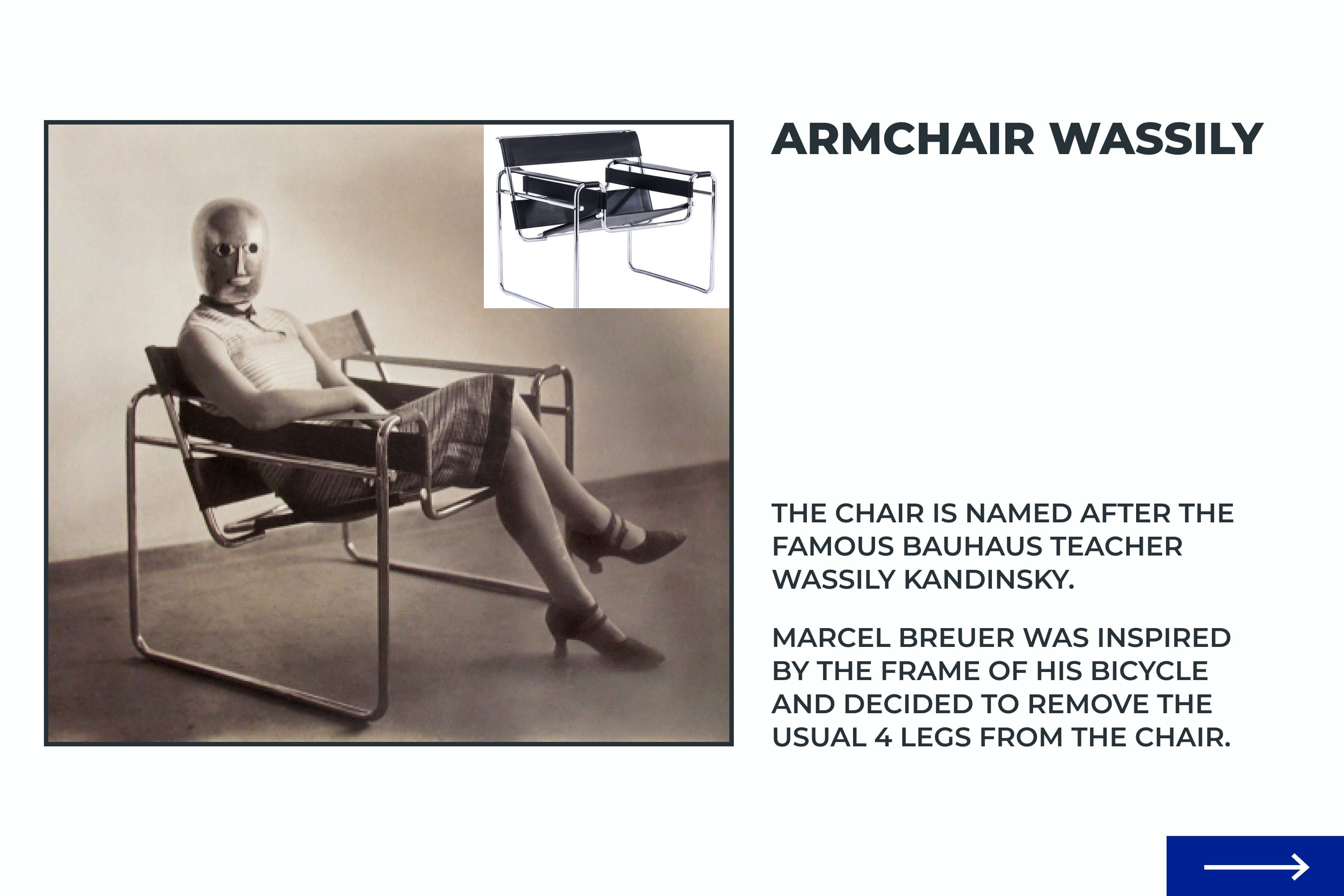
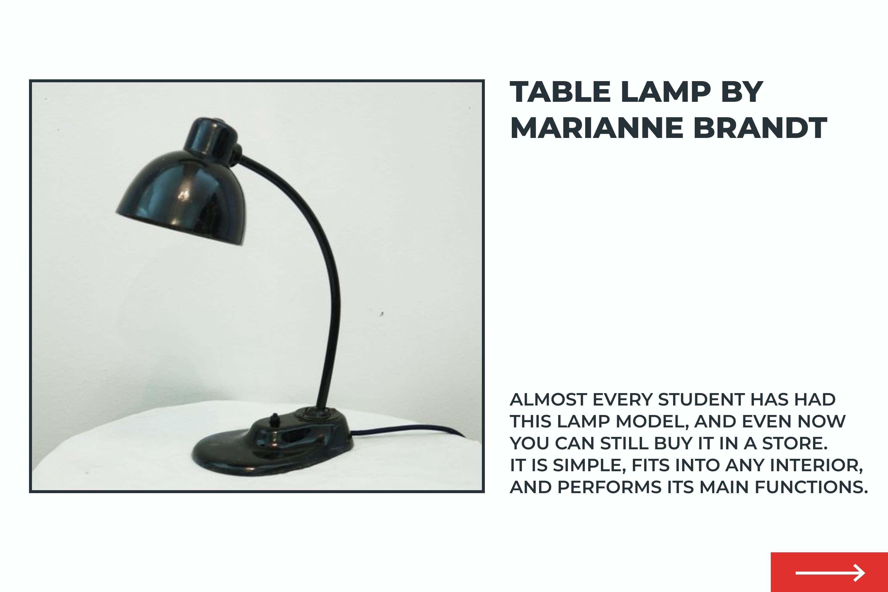
Bauhaus in Our Everyday Life
Did you understand that the Bauhaus came to design from architecture and domestic design? For general development and inspiration, I propose to look at the things that we use for a comfortable life. Bonus – you can tell your friends that it was invented or adapted by the Bauhaus school 🙂
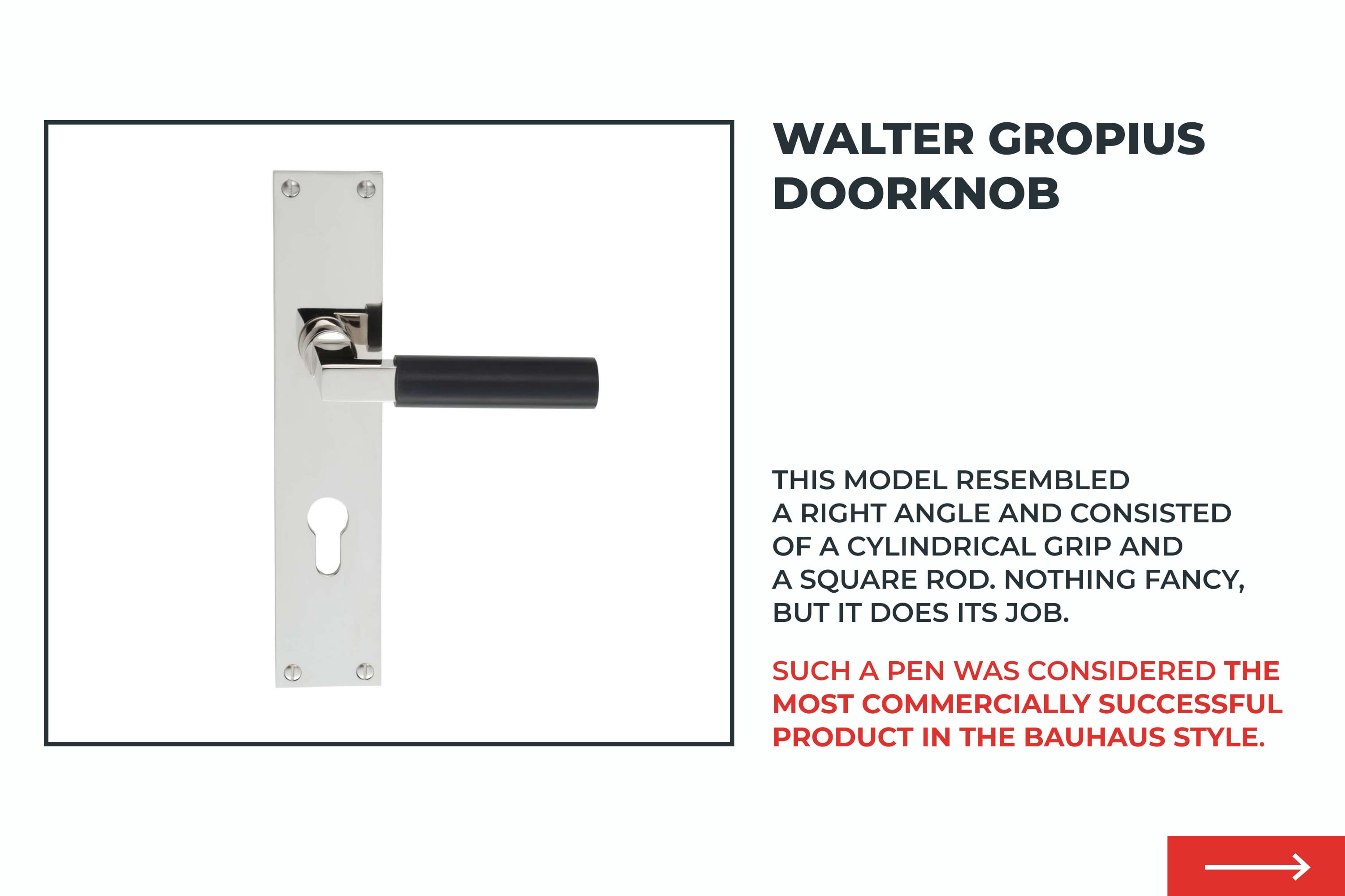
Walter Gropius Doorknob
This model resembled a right angle and consisted of a cylindrical grip and a square rod. Nothing fancy, but it does its job.
Such a pen was considered the most commercially successful product in the Bauhaus style.




Bauhaus Graphic Design in Infographic
Now you know even more about the Bauhaus, which greatly influenced the development of graphic design, the creation of fonts, and the objects around us.
We briefly reviewed the school’s history, its principles, and how to use them to create actual designs. Another plus is the style that you now know and can distinguish from others.
I will be very grateful for your feedback in the form of a like and comment on the article showing that this content about Bauhaus graphic design was interesting to you.
Some Awesome Videos About Bauhaus Design
Bauhaus Design Principles
Looking for inspiration? Everything old is new again, so let’s take a look at the principles of Bauhaus design to get your creative juices flowing.
Bauhaus Design: Everything you need to know in 50 seconds
As we celebrate Bauhaus’ 100th year, get a look into the people, principles and history that shape the Bauhaus Design movement.
FAQ
Here are a few frequently asked questions about Bauhaus design
What is Bauhaus graphic design?
Bauhaus in design promotes the concepts of the Bauhaus school, which was originally more about architecture.
Bauhaus graphic design is defined by simplicity, bright base colors (blue, yellow, red), diagonal grid layout, clear lines, and geometric shapes. At the same time, the most important thing is its functionality and the fulfillment of its tasks.
What is Bauhaus design style?
The Bauhaus is a school of crafts and art that existed from 1919 to 1933. The main goal of the school was to find the best solutions for creating design with minimal resources.
This goal is reflected in the Bauhaus design style: abstract simple geometric shapes, clear lines, bright colors, diagonal arrangement of elements, and minimal elements. All unnecessary decor was discarded as all elements had to play the role necessary for the consumer.
How did the Bauhaus change graphic style?
The Bauhaus has strongly influenced graphic design. Thanks to this style, designers create effective and efficient designs that make life easier for consumers.
You can recognize Bauhaus graphic design style by the minimum number of elements, bright colors (blue, yellow, red), clear typography, combinations of simple geometric shapes and lines, and non-standard composition.
What are the Bauhaus design principles?
These principles describe the Bauhaus style and are included in the school’s manifesto:
- There is no border between an artist and a craftsman. The goal of the first director was to remove the line between craftsman and artist to create new solutions.
- Form follows function. The main thing is the functionality and efficiency of the solution. For this, embellishments were swept aside and only the necessary remained. At the same time, such a design should not be boring.
- A complete work of art. At school, students worked in workshops with different materials, and they created real objects. This is the synthesis of fine and decorative arts.
- Real materials. The materials must reflect the true nature of the objects and buildings. Glass, metal, and concrete were mainly used.
- Minimalism. The followers of the Bauhaus preferred simple geometric shapes and lines. It conveyed dynamism and clarity of direction.
- Reasonable use of resources. The Bauhaus was born at the time of rebuilding after the 1st World War and there were not enough resources. Therefore, the designers of the Bauhaus school were looking for new solutions, where the maximum benefit is obtained with a minimum of materials.
- Continuous development. Bauhaus is about the constant search for new solutions. Architects, designers, and artists constantly need to explore, be creative, and try to do it like no one else. Thanks to this, we know about Bauhaus and use it to this day.
- Graphic Design Portfolio
- Design thinking principles
What are your concerns?
Thanks for your response!
Disclosure: MasterBundles website page may contain advertising materials that may lead to us receiving a commission fee if you purchase a product. However, this does not affect our opinion of the product in any way and we do not receive any bonuses for positive or negative ratings.
