TikTok Logo Design – History, Meaning, and Evolution
TikTok is a world-famous hosting platform that allows users to publish original edited videos, often with bright effects superimposed over them. Anyone who has used the application at least once, or watched videos made with it, has likely noticed the TikTok logo. What is it and what is its meaning?
TikTok Logo History & Evolution
Before plunging into the design features, let’s get acquainted with TikTok history. Initially, the resource was developed by a little-known at that time Chinese company ByteDance. Its activities were aimed at creating the latest Internet technologies and mobile applications.
Zhang Yiming was the head and founder of the company. It is he who is considered the creator of TikTok. In the second half of 2016, the company launched Douyin video hosting.
At first, it was not very popular.
The primary audience in the beginning was the people of China. Gradually, the popularity of the application began to grow and spread beyond the borders of the country. The developers of the service noticed that new users began to actively register in it, and they began to improve the application. They redesigned it and added new functionality.
A modified version was released to the international market under the name TikTok. A year later, the developers bought the well-known social network musical.ly and merged it with their application. This is how the modern version of TikTok (TT) appeared, which is used by millions of people today.
What does the TikTok logo look like?
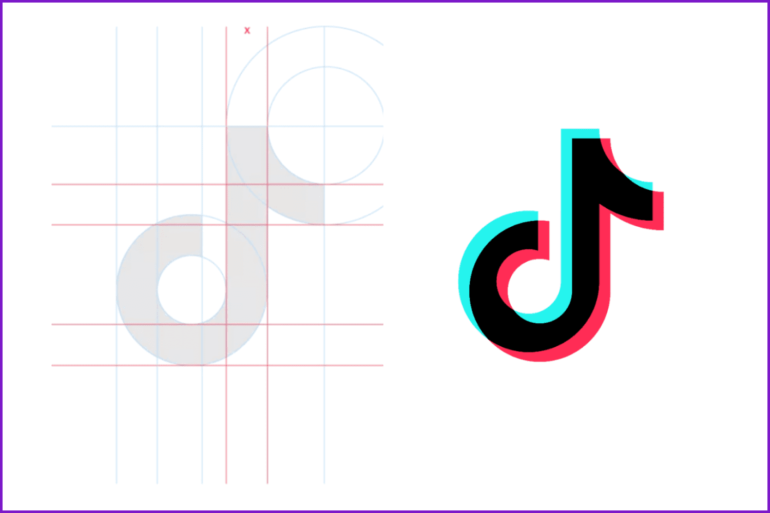
The hallmark of the service is the TikTok logo. The developers worked on it and were able to create an icon that really looks very stylish.
What Font is used in the TikTok Logo?
The uniqueness of the logo is given not only by its graphic design, but also by the font used. Many mobile app developers prefer to use curved serif fonts. However, the TT developers decided to go the other way and used a regular font, without any additional elements.
TikTok Logo Colors
The coloring of the logo is memorable. The designers decided to create a pattern that combines a bright color palette. The logo uses four shades. On a black background, there is a note icon, consisting of white, bluish, and pink shades.
Designers did not just randomly decide to use such a color scheme. They wanted to use these shades because they blend perfectly with each other. They also create a visual 3D effect that makes the logo stand out among the many icons of other mobile applications.
Favicon

Many users do not know what a favicon is and where it can be found. In fact, a favicon is an icon that appears in a browser tab when a page is open. You can see it if you go to TT through a browser on a personal computer.
The TT symbol consists of two parts: an image and a title. Since the favicon is too small, the icon had to be redesigned. The name was removed from it and only the logo remained. It depicts a drawing of a note. In some browsers, when you open the service page, the TikTok favicon is displayed without a background at all.
Evolution of the TikTok Emblem
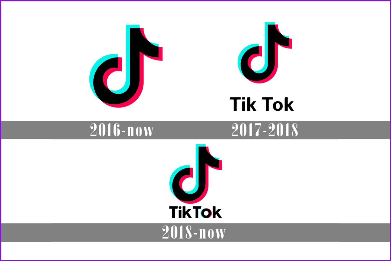
Since the official release of the application on mobile devices, the logo has not changed remarkably. But still, the icons of different years have several distinctive features that you should familiarize yourself with.
In 2016, we just had a letter “d” without any additional decorations.
In 2017, with the original icon, “Tik” and “Tok“ were set as two separate words: there is a clearly visible gap between them. Then it was decided to redesign the logo to make it look more compact. Therefore, the space between the words was removed, and the font was rounded to get rid of sharp corners.
During this period, the logo had a simple design. It consisted only of a graphic picture, without a title.
In 2019 there were dramatic changes and the icon began to look like a modern version of the logo. The service mark was supplemented with the current name located at the bottom.
Who Designed the TikTok Logo?
Just like with the Facebook case, the name of the author of the TikTok icon is unknown. However, the creator of the sign shared the story of how the idea for the logo design came to him:
“The idea for the TikTok logo came to me suddenly. I then stood in total darkness, surrounded by a crowd, and looked at the bright stage. From the high-quality powerful sound, the image vibrated, pulsated, like a living creature… The black background perfectly highlights accents, soft corners convey the life of music. The 2D wave was the finishing touch of the picture,” said incognito.
Inspired by the mission of the app, the logo TikTok designer wanted to create a symbol that would fit the inner world of so many talented people. To do this, the designer chose black as the background color to get people interested in entering the app.
After the sketch of the musical note was completed, the designer wanted it to look distinct against the black background, so he added an electronic wave effect to the 2D design.
“I tried several times to repeat the musical note, and then chose the one that was most attractive to the eye.”
When the TikTok logo was created, the designer not only wanted it to stand out from other applications on the main screen of the device but also to look cool and exciting.
Again, the name of the TikTok logo designer is shrouded in mystery. One thing that is known is that this is a young man who loves to attend music events, especially rock concerts.
What’s the Meaning behind the TikTok Logo?
So what is the TikTok symbol’s meaning? There are two versions:
- The TikTok icon features a musical note. The app provides its users with the ability to shoot and watch videos accompanied by music.
- The TikTok logo features the letter “d”. We all remember that the initial name of the brand was Douyin.
Wrap up
All elements of the corporate identity—from the color scheme to the TikTok symbol—visually reflect the main ideas of the brand: simplicity and creativity. The minimalism of the logo helps to easily adapt it to any task, including a favicon for a website and an icon for an application.
Do you feel like you can create a 100 times better logo for TikTok? Upload your version of a TikTok logo png file by filling out the SELL YOUR DEAL form.
Also, check out some other Logo Designs for more inspiration! Who knows, maybe it’s you who will be the next tech giant’s logo designer!
TikTok Logo Design – History, Meaning, and Evolution
TikTok is a world-famous hosting platform that allows users to publish original edited videos, often with bright effects superimposed over them.
Please Take a Moment to Pin this Post to Pinterest

- Bauhaus Graphic Design
What are your concerns?
Thanks for your response!
Disclosure: MasterBundles website page may contain advertising materials that may lead to us receiving a commission fee if you purchase a product. However, this does not affect our opinion of the product in any way and we do not receive any bonuses for positive or negative ratings.
