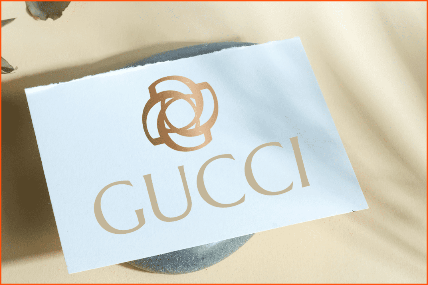
The History of the Gucci Logo: What Does a Famous Logo Conceal? [Contest for the Best Logo Design]

You can likely only name a few brands that have the powerful association with distinction and luxury that Gucci has. This is particularly true in light of the recent hype around The House of Gucci, the movie dedicated to the brand’s centennial.
Yet, we are interested neither in fashion nor the secrets of this Italian family, but in design—specifically, the design of its logo.
A double-G symbol in the Gucci logo became a metaphor for high quality luxury and company pride. But how was it created? Is the version we see today the original one? Let’s talk about the narrative behind the creation of the famous Gucci emblem and how it has transformed over the years.
![]()
Article Reviewed By

Hey, guys! Recently, MasterBundles launched a contest where six talented designers created their versions of the Gucci logo! Each designer reflected in these logos his or her vision of the brand, its history, values, aesthetics.
According to the voting results, Bimo Finca is the winner but of course, all of our talented participants did a great job!
In case you are reading this after the end of the contest, I’m glad to inform you that we still accept your variations of Gucci logo.
So, if you are inspired to rethink the concept of the famous logo, drop me a message at [email protected] and we will add your work to our post 😊
Create Your Version of the Famous Gucci Logo
Here are thirteen variations of the Gucci logo created by talented logo designers! Which of them do you find the most suitable to represent the famous Italian fashion house? Let’s talk in the comments!
Logo from Slavko Suniti
![]()
“When I thought of Gucci, the first thing that came to my mind was clothing. The original logo Gucci was clean and soft and fit almost any clothing style. However, I wanted to design something sharp and bold, a logo that could represent a badass car. That’s when I came up with this single letter logo, that looks both clean and expensive due to the rich gold color.”
Logo from Aviel Artemon
![]()
“I would describe my logo as controversial yet elegant, as many designers to this day have strong disagreements about whether gold and silver can be mixed. I believe that I have proved that these two colors/materials look very elegant together. This Gucci logo sweater I presented is the perfect concept of a debatable style choice which turns out to be a hit, as most of Gucci’s releases.”
Logo from Shaban Liboria
![]()
“The central icon is a circle made of two letters G which stands for the Gucci brand. The circle design that I created represents wholeness and God whose center is everywhere and whose circumference is nowhere. This new Gucci logo represents the favorable brand that has no limits.”
Logo from Viktoria Tamar
![]()
“My Gucci logo design has a peaceful and collected feel to it. When remaking the logo I wanted to create a design that both resembled Gucci but wasn’t so flashy and out there. This was when I thought of using their iconic gold color but making it mat so it looks more composed. As well as with their iconic letter G I included it but in a very simple font.”
Logo from Arthur Juta
![]()
“We all know that Gucci is known for its loud designs and colors, but the brand does have some very nice casual, everyday pieces, that’s when the idea of creating a new design came to my head. Even though the old Gucci logo had a clean design, I created a more minimal and clean logo, a simple letter G with thin letters and plain font. A Gucci logo sweater design that won’t be the first thing you notice.”
Logo from Alexandra Helmen
![]()
“My logo is a candid design for a possible Gucci collaboration with a tech company or an original Gucci electronics line. As the world we live in dives deeper and deeper into technology, I believe that all big brands should cater to these needs and start introducing tech to the company. The logo still includes Gucci’s originality while the letter G design represents a computer glitch.”
Logo from Brad Ray
![]()
“I took for inspiration a silhouette of a butterfly and decided to incorporate it into the logo. It looks beautiful when presented in a jewelry piece like a necklace, bracelet, or ring. The lines make up a simple, elegant, yet creative shape. The luxury feel is added through golden and silver colors.”
Logo from Kemal Hasanudin
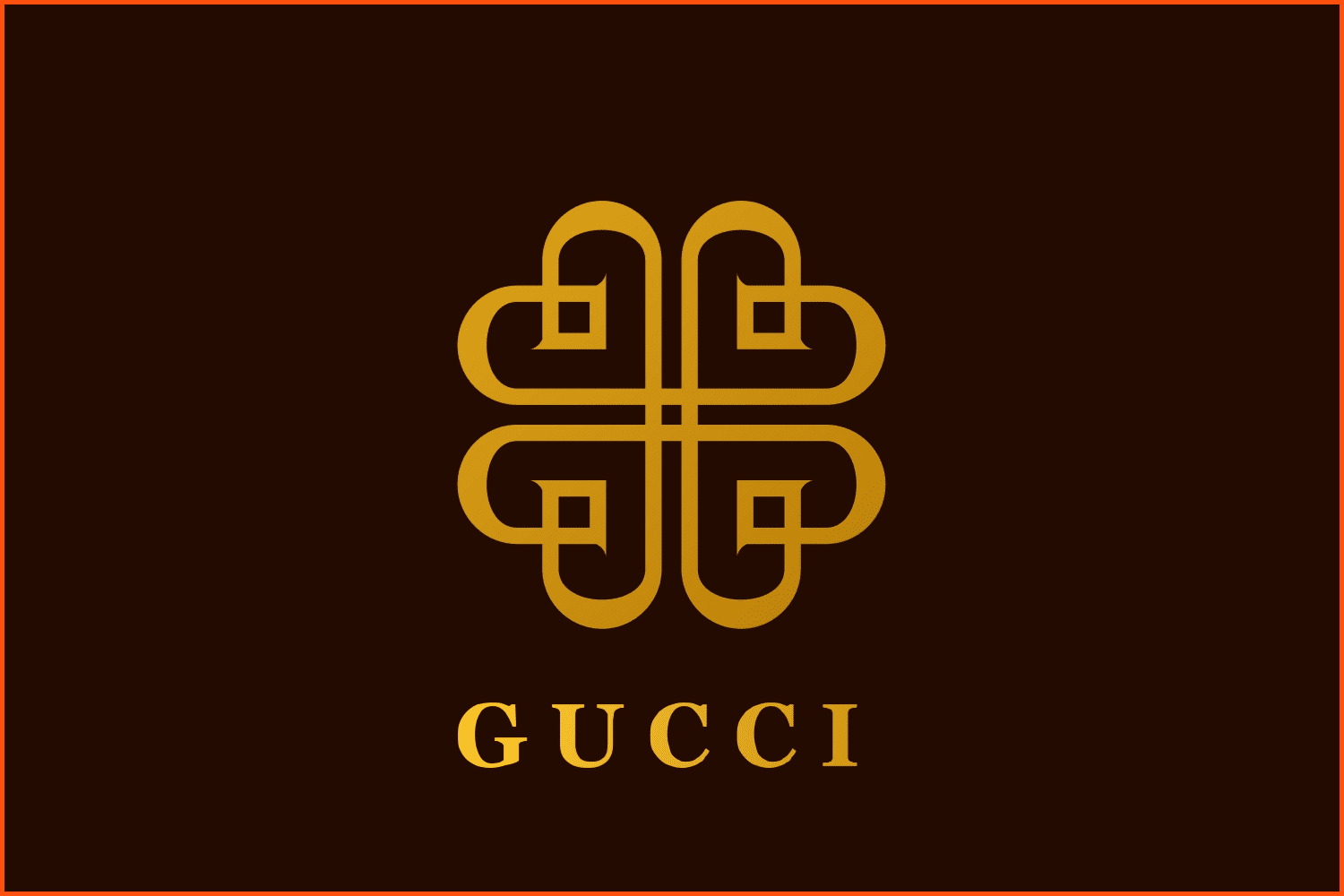
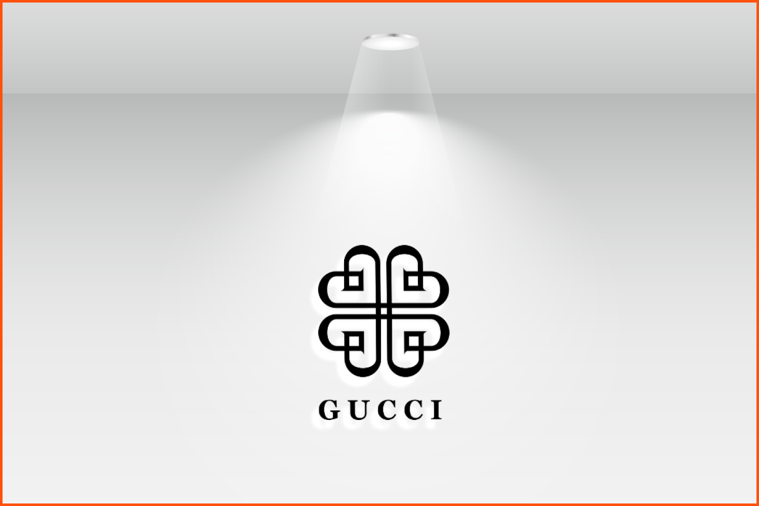
“At first, it seemed difficult to redesign a famous brand logo when the logo is already outstanding. However, I tried to make sketches with several styles: modern, luxurious, and simple. Then walla! I found something that fits; a mix of G.U.C.C.I letters and a heart symbol. I tried to make a new shape from it then use a mirroring technique. Here it is, as you can see, it forms a flower shape and looks beautiful!”
Logo from Rizka Hasni
![]()
![]()
“I will explain my Logo with two keywords, Business Sustainability. From there we hope that Gucci always exists and has a place in every customer’s heart and as we know, their business is dynamic! These dynamic things I present on the font type that are not shown as vertical or horizontal.”
Logo from Rakha Mulia
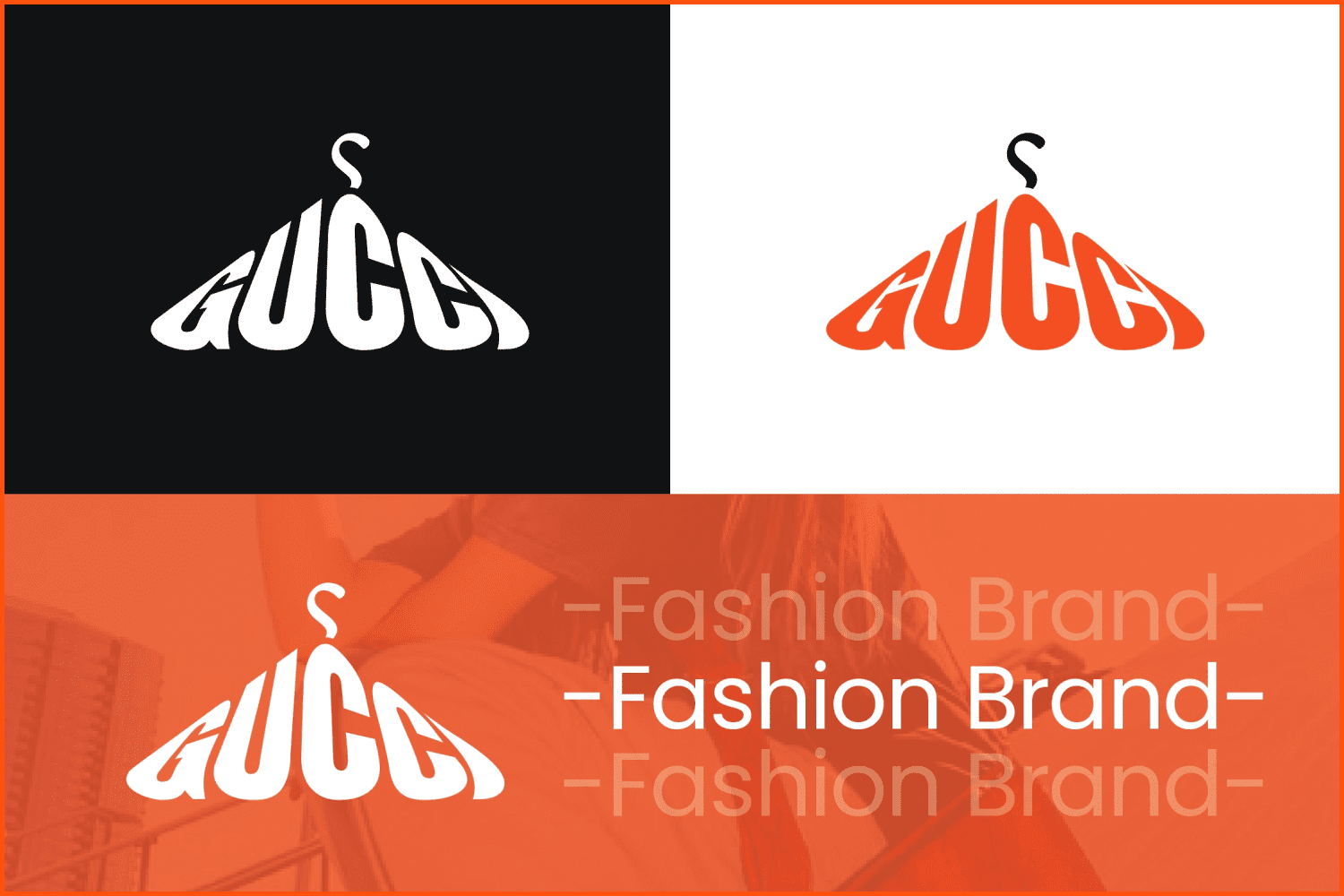
“The Gucci logo presented is a logo with a more fresh feel but does not eliminate the modern impression, a logo with a typographic style combined with a hanger, indicating that Gucci is a quality fashion brand, the orange color in the logo looks fresher and not stiff.”
Logo from Bimo Finca
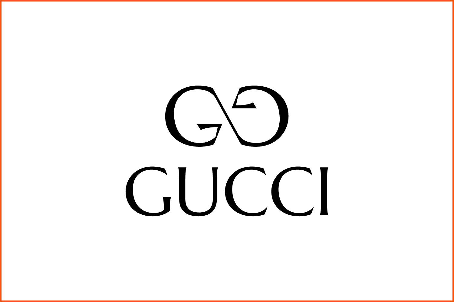
“The main icon is the Infinity monogram which is made with two letters of G which present Gucci’s Brand. The Infinity symbol represents the business value. The black color represents the boldness of passion which Gucci has in the industry.”
Logo from Rani Damayanti
![]()
“By not removing the original type as Gucci’s identity, I add Flowers as a symbol that represent beauty and fortune. Besides, The Color of Flowers and Fonts symbolizes a luxury brand from luxury products.”
Logo from Fikri Prasjaya
![]()
“The concept of the Gucci logo that I redesigned is a combination of the letters: G, U, C, and I. It looks like a symbol of god, because Gucci itself has a brand that is known as a global fashion brand with the best quality. And also, this logo’s character is perfect for young adults nowadays.”
How the Gucci logo was created
Even though Gucci was founded in 1921, by 1933, the business still didn’t have a specific logo. When Aldo Gucci decided to take part in the business, he decided to create the brand logo that would represent the company’s legacy in a more beautiful and luxurious way. When thinking of the logo, he decided to combine the initials of his father, which would later become the famous Gucci sign. Now, you will always see the double-G emblem below the Gucci name. At first, it was difficult to recognize the brand solely by the logo. However, over the years, it has become easily recognizable by nearly everyone.
![]()
Gucci logo elements throughout the years
With the celebration of the brand’s centennial in 2021, we can surely say that both the brand and the logo have come a long way. But do you know how many times its style and design have changed over the last century?
One of the most interesting stories about the logo change was after the death of Guccio Gucci in 1950. Aldo had become the owner of the brand, and to honor his father’s memory he decided to preliminarily change the logo to depict a knight in a shield holding suitcases. However, he did not forget about the double-G emblem. It was kept as the trademark, and was printed on suitcases, bags, and other leather goods they made.
![]()
Image by MasterBundles
In recent years, despite its reputation and longevity, the brand nearly lost its rights to the logo in the UK. In 2012, for some obscure reason, the brand was unable to renew the ownership of the logo according to UK laws. This error left the company incapable of ensuring their logo would remain proprietary without a lawsuit, which gave other brands an opportunity to imitate this legacy. This unfortunate case forced the Gucci team to pay more attention to important details and take everything more seriously.
What fonts and colors can you see in the logo?
The unchangeable emblem of the luxury brand is the double-G. This design goes beyond the meaning of just two letters combined. It is the entire history and legacy of the brand. The design pays tribute to the person who was the foundation of the brand from the first day. This is surely what Aldo had in mind when he created the symbol.
You will always see the Gucci logo in gold. There have been some extravagant variations, depending on the clothing collections. No matter the variation, the two-G emblem is never removed. With the combination of the sans-serif typeface font and the unique facing design, the brand is always recognizable.
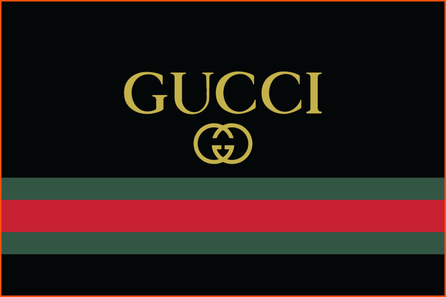
Apart from the logo, the Gucci brand always stands out due to the famous color scheme of dark green and red stripes. Although the logo is usually shown in either gold or black and white, the specific red and green stripes always remind you of the brand as well. Many collections include this color combination of green-red-green stripes along with the gold emblem itself.
FAQ
Here are a few frequently asked questions about the Gucci logo
What does the Gucci logo look like?
It is a double-G emblem with the word Gucci above it in capital letters.
What font type is used in the Gucci logo?
The font is in a serif typeface.
How do you draw the Gucci logo?
The logo itself is very easy to draw. It is a combination of two letter G’s facing each other. In all of their variations, Gucci always kept this style the same.
Some Awesome Video About Fonts Color Trends of 2022
How to Draw Gucci Logo Easy
Do you want to learn how to draw a Gicci logo easy for beginners. It’s super easy art tutorial, only follow me step by step, if you need more time, you can make pause.
What are your concerns?
Thanks for your response!
Disclosure: MasterBundles website page may contain advertising materials that may lead to us receiving a commission fee if you purchase a product. However, this does not affect our opinion of the product in any way and we do not receive any bonuses for positive or negative ratings.