How to Set Up Your Perfect LinkedIn Profile Step by Step
Social media is a powerful tool in the digital-driven world. The Facebook network connects you with your friends, family, and like-minded communities. Instagram is a cutting-edge platform for sharing both your personal and business photos. Twitter is great for sharing your thoughts and insights. However, there’s one social media platform that may become your most powerful recruiting weapon. It’s LinkedIn.
If it is set up properly, LinkedIn becomes your digital business card and enhances your personal brand. You can build connections with your fellow creatives, influencers in design, recruiters, and any professionals that might be interested in your expertise. If you start your own business, LinkedIn also gives you the opportunity to create your business page.
Beyond this, LinkedIn can also become a powerful magnet for new clients. It takes only a few efforts to optimize and set up an account on LinkedIn, and you’ll be seen by dozens of entrepreneurs who may be willing to work with you.
Dive into this step-by-step guide to learn how to set up your LinkedIn profile correctly, so you stand out among thousands of other designers.
Create a Catchy Bio
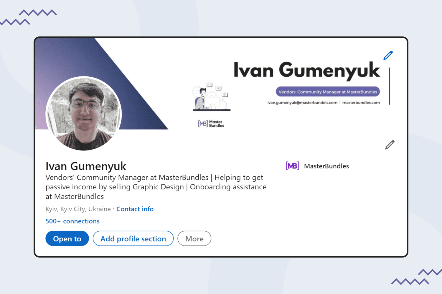
You have just a few seconds to engage people scrolling through designers’ profiles. How can you make people want to work with you? To make sure you stand out, the bio of your profile should attract attention. Take a look at an example of the bio page for our community manager:
- Add all the details in English. While creating your profile and writing the main description, use only English. It will help you to attract a bigger community.
- Use only a smiling profile picture. Make sure your face is clearly visible and smiling to “welcome” new people and create a good first impression. Your profile picture must be at least 400 x 400 pixels. Also, the upload size is limited to 8 MB.
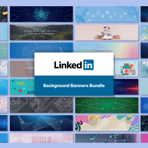
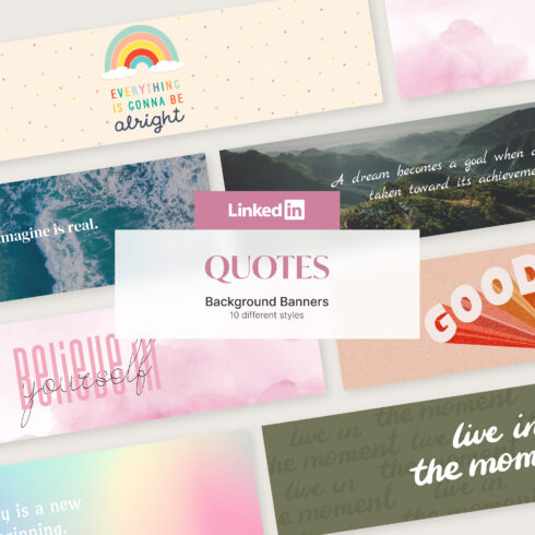
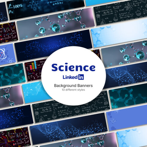
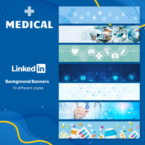
- Add key details on the cover image. The information given on the cover picture should tell who you are, what your company is, and which areas of expertise you have. The optimal size for the cover image is 1584 x 396 pixels.
- Add the relevant header. Briefly describe your expertise, your current employment, and which services you can offer.
- Сonsider adding your personal email. Just like you can see in the example, an email put in the background image is easy to be noticed by interested recruiters or clients.
Click “Open To” and Add All Your Expertise Areas
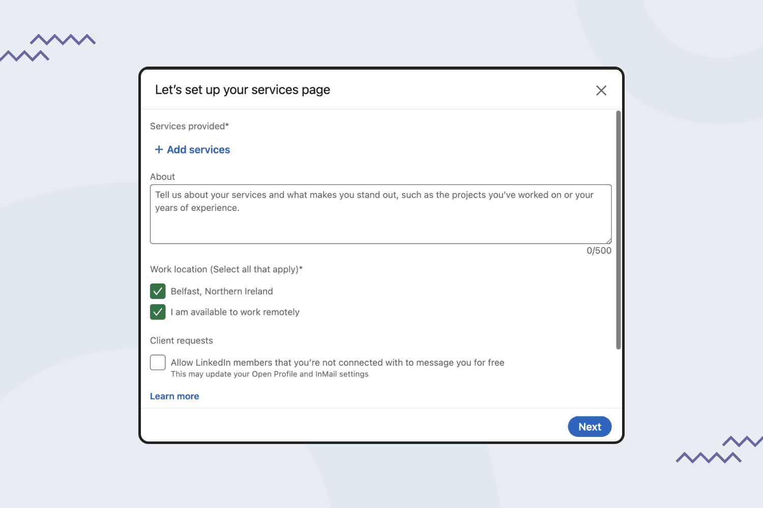
Clicking the “Open To” button, you can turn on “providing services” and mention up to 10 types of services you provide, including the types of products you create. For instance, graphic design, illustrations, logo design, fonts, etc. If you’re not making use of this section on LinkedIn, then you’re going to miss out on a lot of opportunities.
Click “Add Profile Section” to Add All the Details
Clicking the “Add profile section” button, you can add detailed information about yourself, your work experience, your areas of expertise, and other details. The more information you add, the better.
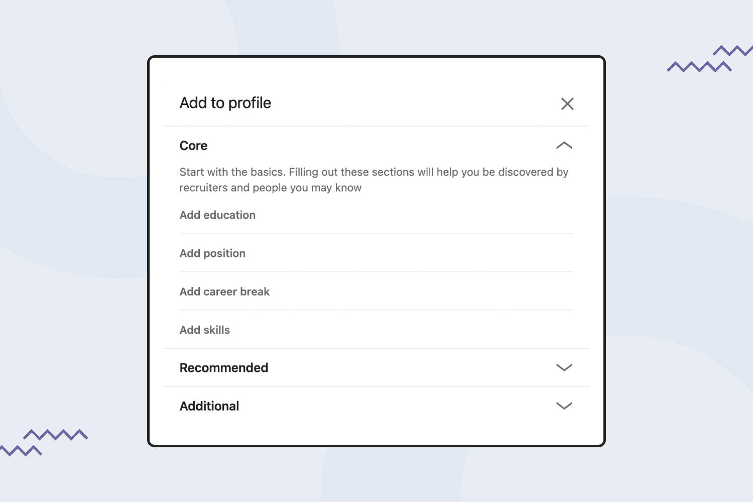
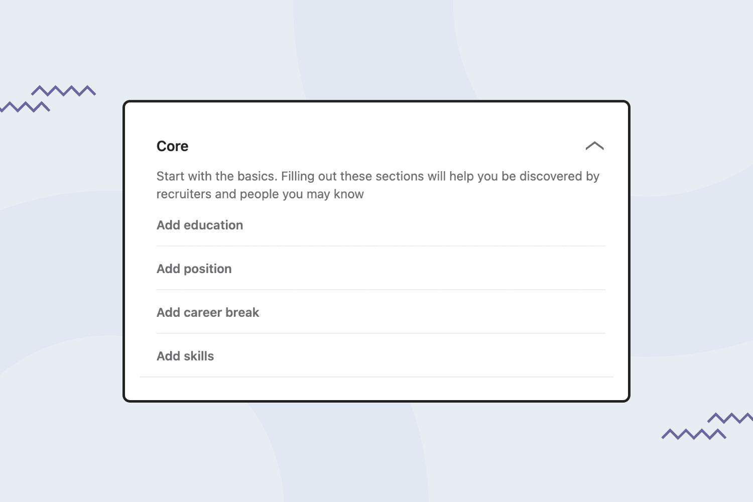
- Add details to the Core Section. In the Core section, pay particular attention to two areas — Add Skills and Add Position. Add as many details as possible to stand out. Not all vendors know it, but if you are a MasterBundles vendor, you can also mention it in the position. It will help you to get noticed by the community.
- Add details to the Recommended Section. In this section, you can mention all the design courses you finished, as well as add all your certificates.
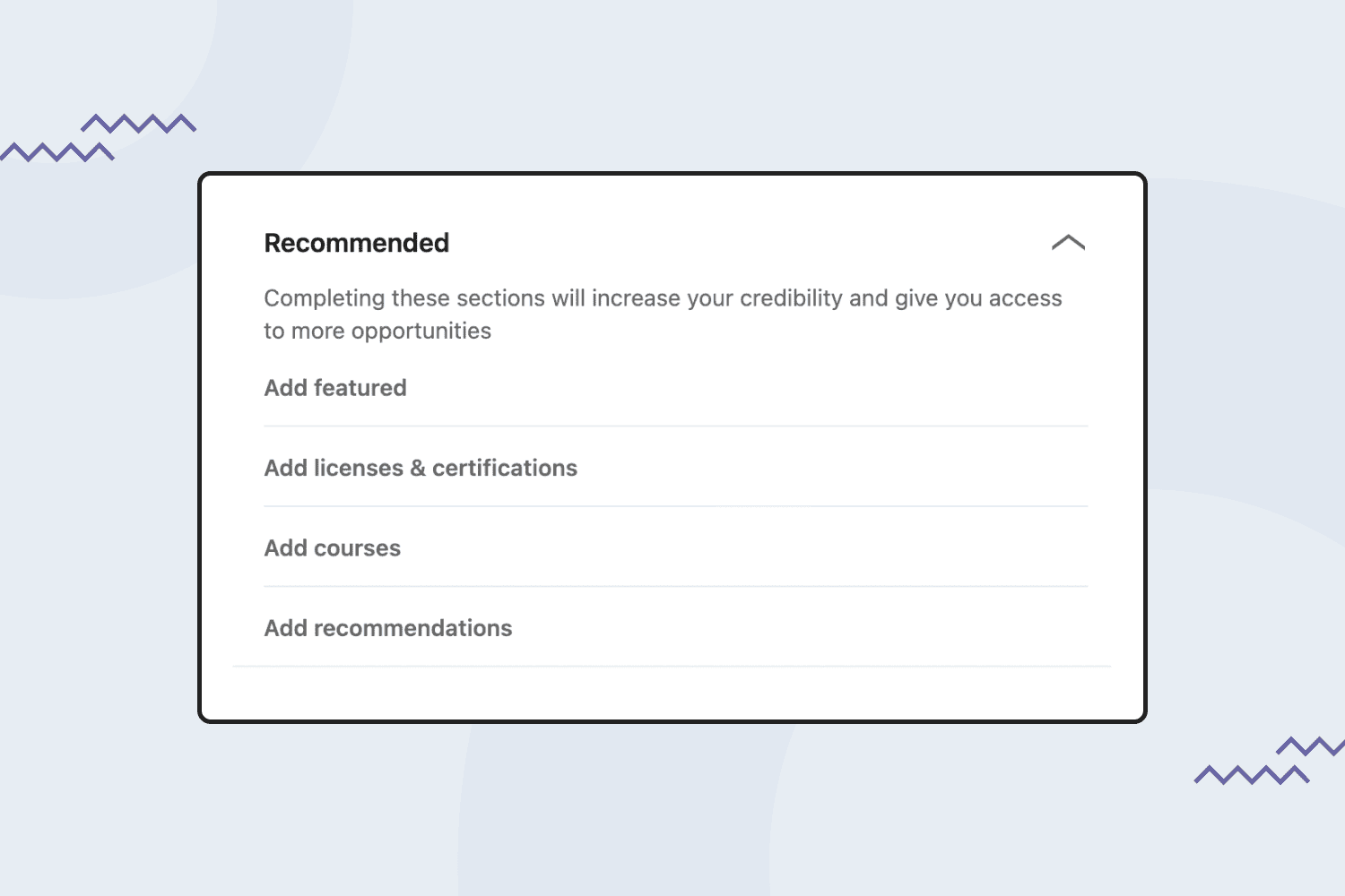
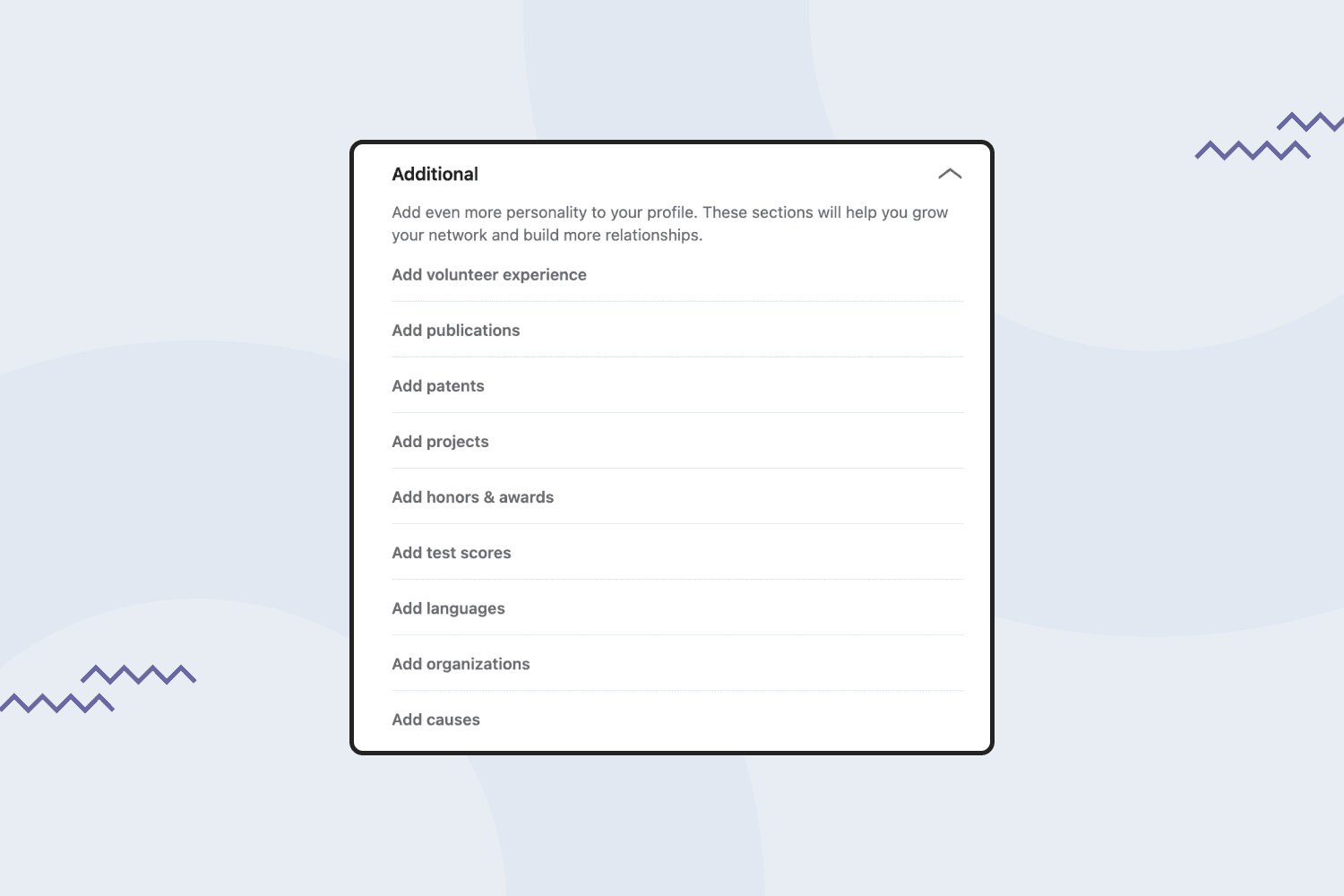
- Add details to the Additional Section. In this section, there are also a few points worth your attention. However, it is not as important as the previous sections. What I recommend is adding all the languages you speak.
Fill In Information About Yourself
In this field, you can add a catchy bio that stands out with all your primary achievements and areas of expertise. Remember that LinkedIn is your professional network, so you should think twice before writing such things as your passion for pizza unless you are a pizza brand designer 🙂
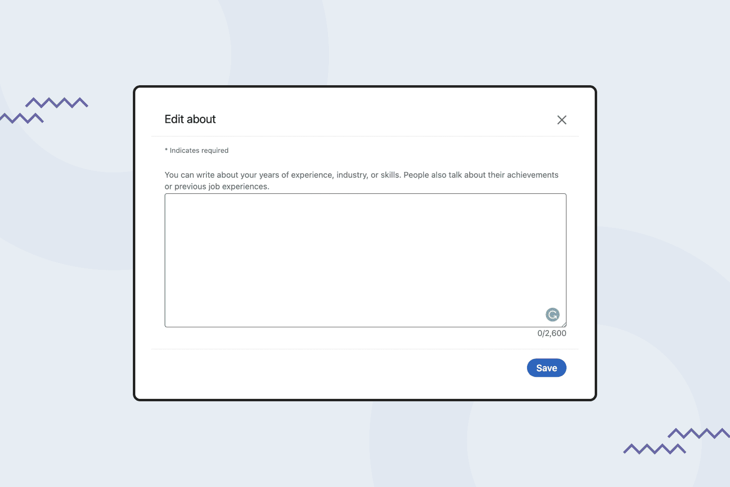
With its 2,600-character limit, the summary gives you about 370 words to explain who you are and what makes you a unique and great candidate to hire or build a connection with.
Here are some tricks for writing a catchy About Section:
- Create a bullet list with your professional background to improve readability.
- Avoid jargon-filled phrases like “Highly motivated designer with attention to detail.” You will not stand out from the crowd if you use such phrases.
- Stick to a theme — design — and explain how it has shown up throughout your life and what motivated you to become a designer.
- Include numbers (proof) to quantify your achievements.
Here’s an example of a poorly written About section:
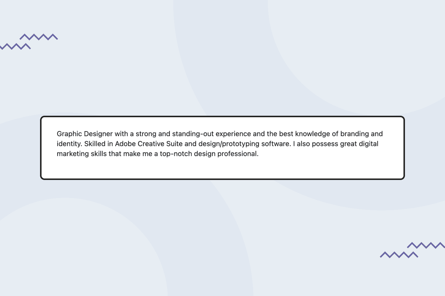
It gives no specific information that could be useful to your potential connections. It also has lots of jargon phrases that nobody believes.
Now, take a look at a great About section:
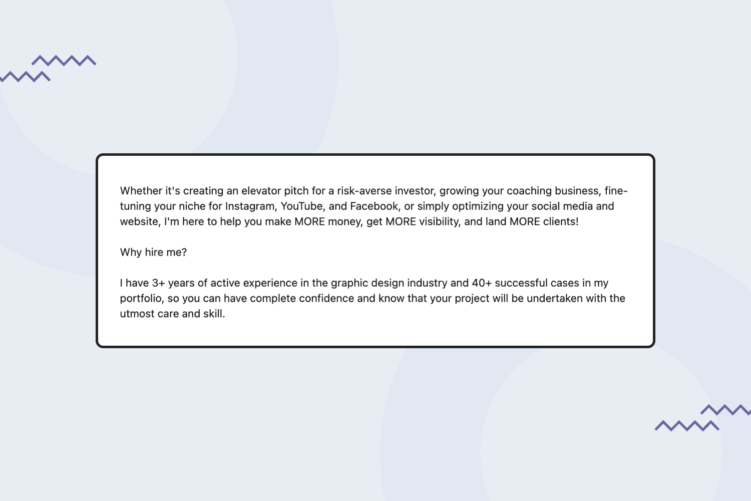
In this example, you can see specific numbers and client-oriented messages. The designer concentrates on how her expertise can benefit clients. Also, she mentioned the type of work she can deal with.
Set and Keep Up Your Activities
Remember that LinkedIn is not only your professional page. It’s still a social media platform. It is recommended to regularly publish posts and updates, repost other content, add your personalized comments, and share your new achievements. LinkedIn’s publications are shared thanks to organic traffic, which brings you new leads as well.
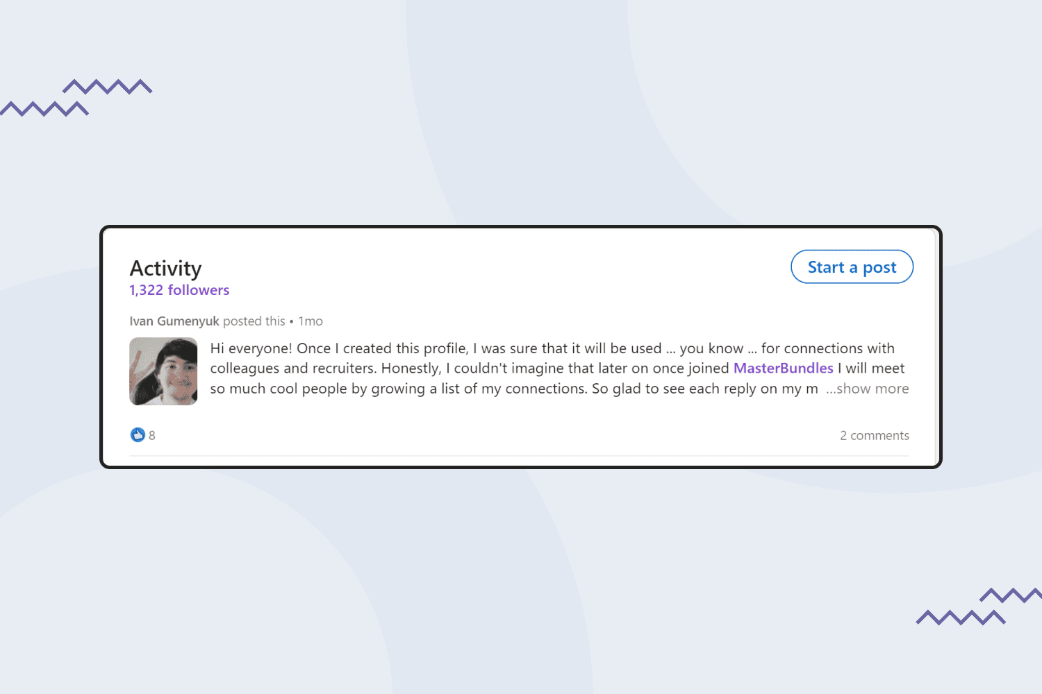
When it comes to engaging with content, here are key ways you should consider:
- Adding your own posts. Which type of content should you post? It might be your successful cases, insights, finished courses, and freebies on your own page. The most important thing is to make sure that every piece is original and brings some value to the readers. For instance, if you talk about a course, make sure to share your feedback on whether you recommend joining it and who would benefit the most from the course.
Note that if you include the image in your posts, the size of the image should be 1200 x 628 pixels. - Reposting from others. Make sure you follow different professional designers, entrepreneurs, and anyone who is interesting to you, and share their posts, but only if you have something to say about them. For instance, instead of just reposting the top 5 tools for beginners in design, consider adding your personalized advice to the repost. You should take every step as an opportunity to build your expert image.
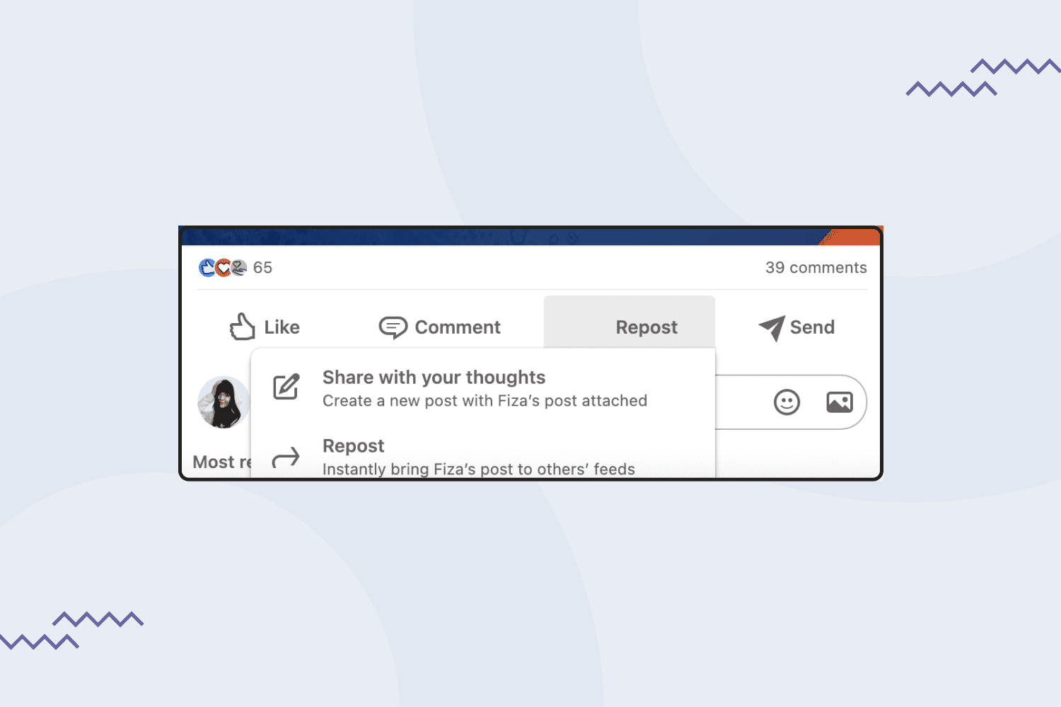
- Likes and comments. This is what also makes LinkedIn different from other media. Every activity you take on Instagram is depicted on your page. Your followers may see what you like and read your recent comments. Make sure you regularly engage with relevant content.
- Stories. Stories are relatively new on LinkedIn. The type of content you may consider for stories is the backstage of you working on a project, your workflow tips, or even feedback from your satisfied clients. If you decide to use LinkedIn stories, remember that the appropriate size is 1080 x 1920 pixels.
Add Your Work Experience
This is one of the most important elements of your LinkedIn profile. Consider adding all the companies you worked with as a designer, even if it was a short-term project. It will add credibility.
When you add each work experience, include the following:
- Briefly describe the employer/marketplace.
- List your key duties or responsibilities.
- List your key achievements with specific numbers.
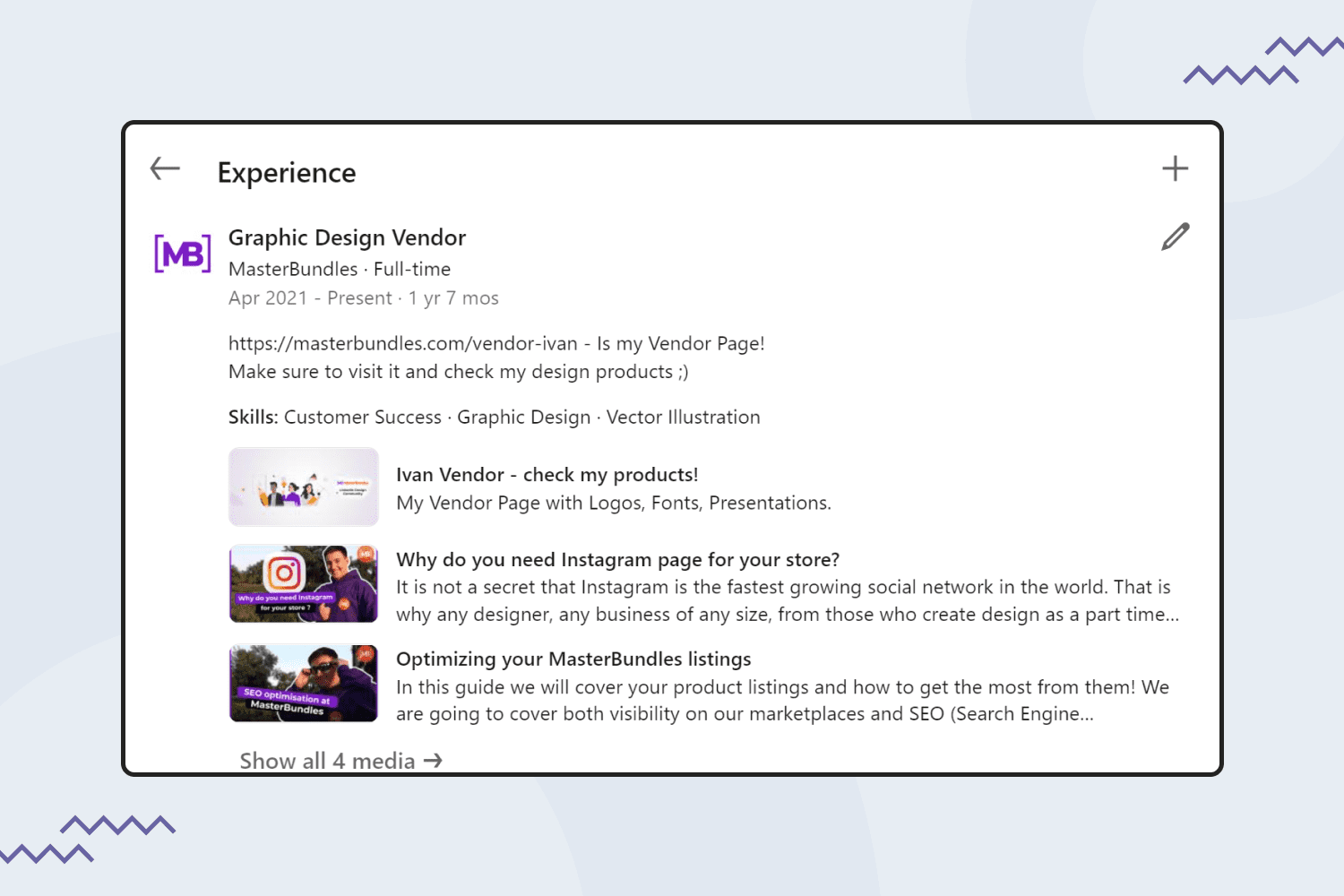
Also, consider adding that you are a MasterBundles vendor and include the link to your profile on the marketplace. A little tip: by clicking “add media,” you can add a clickable link to your store. You can also add your skills in the work experience section. However, just like when writing a resume, you should be targeted and choose the skills that are most in demand.
Join MasterBundles’ Community on LinkedIn
MasterBundles also has a community on LinkedIn. We regularly publish news, articles, educational materials, and other insights from our marketplace. You can get inspiration, useful information, and build your network there! Keep up with the latest updates by joining our community and learning everything firsthand!
Wrapping Up
If you just started building your LinkedIn profile or just have a plan to do it, the mentioned steps will help ensure you don’t forget the essentials. Yes, it may take a while before you get noticed by potential leads and build a strong network. However, you have all the chances to overcome fellow designers if you invest your time and efforts in keeping your LinkedIn profile up-to-date.
So, if you’re actively looking for new job opportunities as a designer or just want to build a professional community, you should make sure that your LinkedIn profile is your trump card.
Some Awesome Video About LinkedIn Profiles
Crafting the Perfect LinkedIn Profile for UX/UI/Product Designers
Here’s how to create a LinkedIn profile that gets you noticed by UX, UI and Product Design recruiters, hiring managers and clients so you can get more of the right design opportunities into your inbox!
Set up Your UX LinkedIn Profile in 1 Hour
A UX LinkedIn profile is in fact very similar to a UX design resume. In this video, I’ll share my best tips and recommendations to setup essentials of your UX design/product design LinkedIn profile in 1 hour.
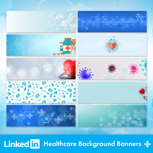
- LinkedIn background banner
What are your concerns?
Thanks for your response!
Disclosure: MasterBundles website page may contain advertising materials that may lead to us receiving a commission fee if you purchase a product. However, this does not affect our opinion of the product in any way and we do not receive any bonuses for positive or negative ratings.
