Minimalist logos Trends & Changes in 2023
Nowadays, branding and web design tends to be more aesthetic, sophisticated, and eye-catching. Thus, there is no surprise that many famous companies change their logos into something more minimalistic and simple. All of these minimal logo designs continue to be outstanding and recognizable.
If you are into logo design, then nothing is easier than taking ready-made templates and customizing them according to your personal needs. MasterBundles has many cool minimalistic designs for any taste!
And now let’s see how the trend for minimalism changes today’s graphic design and branding, and evaluate some of the most prominent minimalist logo examples we’ve found for you.
Minimalism in Graphic Design
Minimalism in design does not mean getting rid of all elements but keeping only the necessary elements. Minimalism is a trend in graphic design that keeps only the most basic characteristics from the creative process itself, such as brevity of means of expression, simplicity, precision, and clarity of composition. Minimalism is considered a simplistic movement, but graphic designers themselves know that it is not so simple. Minimalism encompasses the highest degree of conceptualism and abstraction.
But what is a minimalist logo? If a logo consists of only basic shapes and lines and has a minimal color scheme, it is seen as a minimalist logo design. This style is very popular these days because creative minimalistic designs grab the attention and interest of almost every casual passerby.
In order to create a quality minimalist design, the designer must have not only the ideas but also know the artistic means of expression that are appropriate for this style. Thus, let’s have a look at the main elements of the minimalist trend.
Metaphors
One of the basic moves of minimalism is the use of metaphors to convey certain concepts. Metaphorical imagery can be typographic and become a central component of a composition.
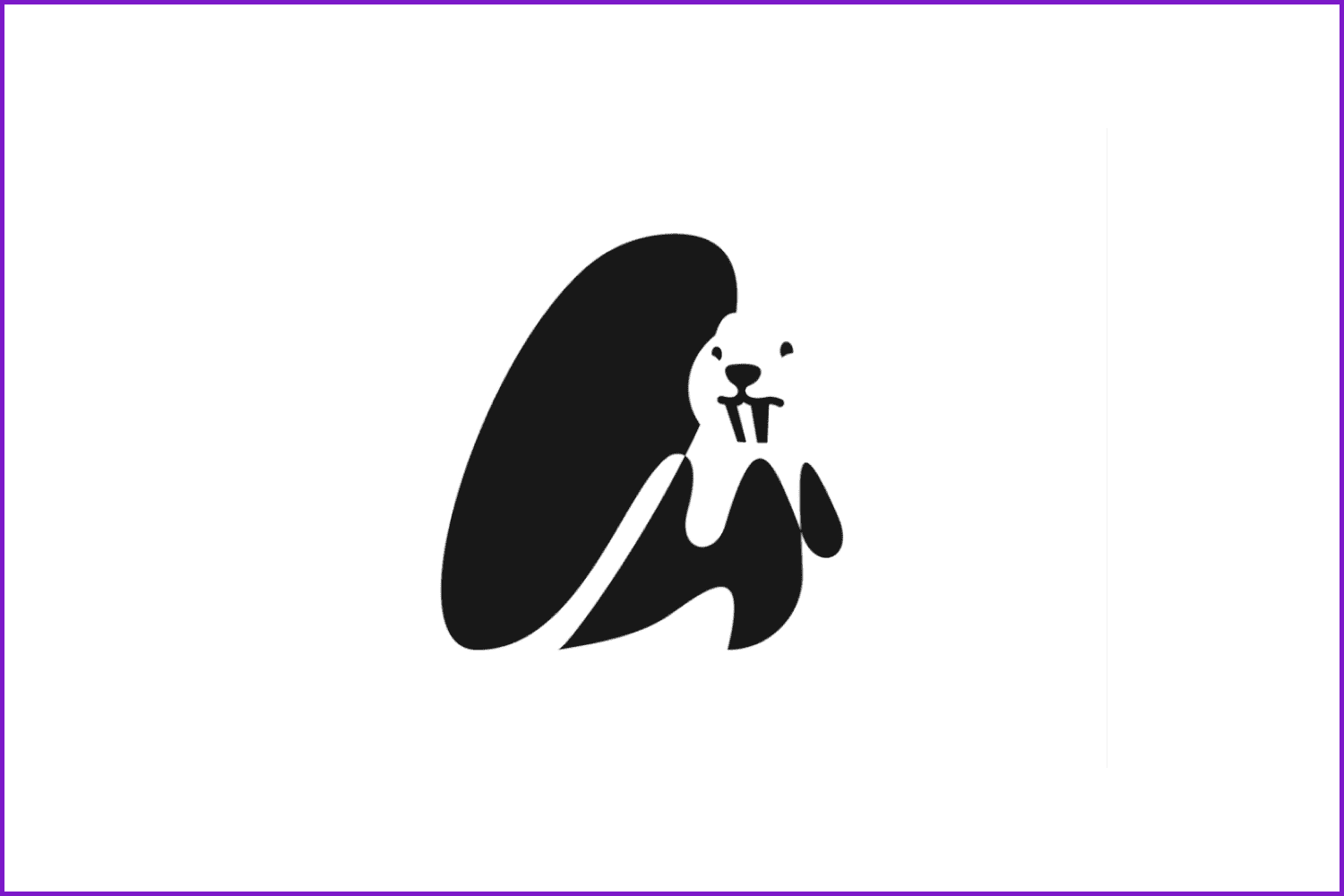
Logo by Giorgi Sisauri
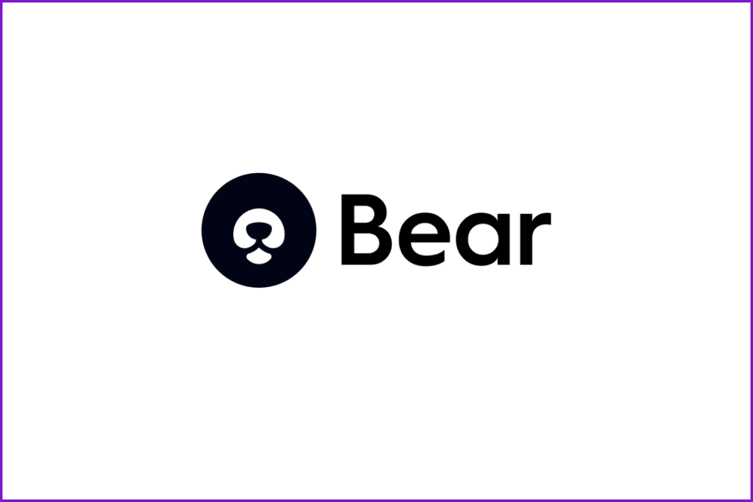
Bear Logo by Second Eight
Empty Spaces
Another characteristic of minimalism is the use of negative space as a means of artistic expression. When looking for a stylish logo in this style, do not be surprised to see large amounts of unfilled space. Free space is one of the basic elements of minimalism as a graphic design style.
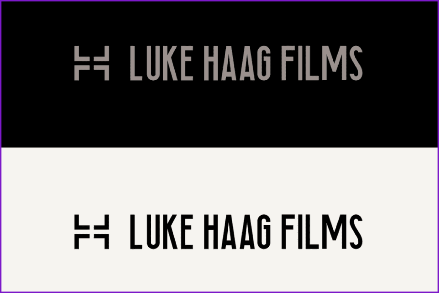
Luke Haag Films Logo by Rob Hobkins
Typography
The style is characterized by the use of grotesque (sans serif) fonts in addition to the use of typography as a metaphor. Since the point of minimalism is to maximize the use of minimal resources, the letters should be simple yet expressive and convey the character of the company.
DogPark Logo by Benjamin Oberemok
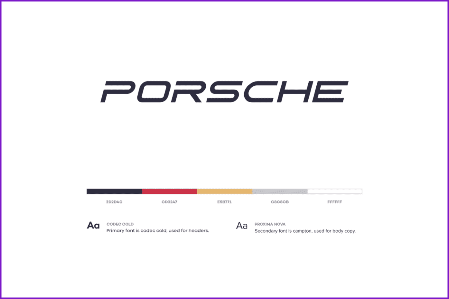
Porsche Logo Concept by Stian
Symbols
Minimalism often uses symbols rather than images. The essence of a symbol is that its meaning is clear to everyone, and there is no need to add text or pictures to explain it.
The Desk Company Logo by Lisa Jacobs
Oxena E-bike Brand logo by Lisa Jacobs
Textures
If you want to make a minimal design use textures as well as consistent colors.
Zarrini Wines Logo by Gennady Savinov
Products that Come in Handy if You Want to Be Minimalistic
MasterBundles also has something to offer simplistic designs lovers. Let’s see what we have.
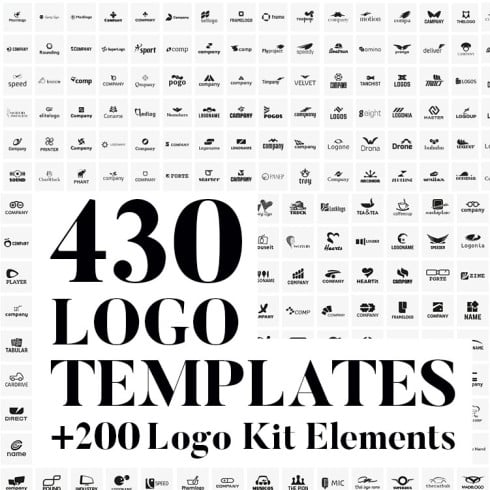
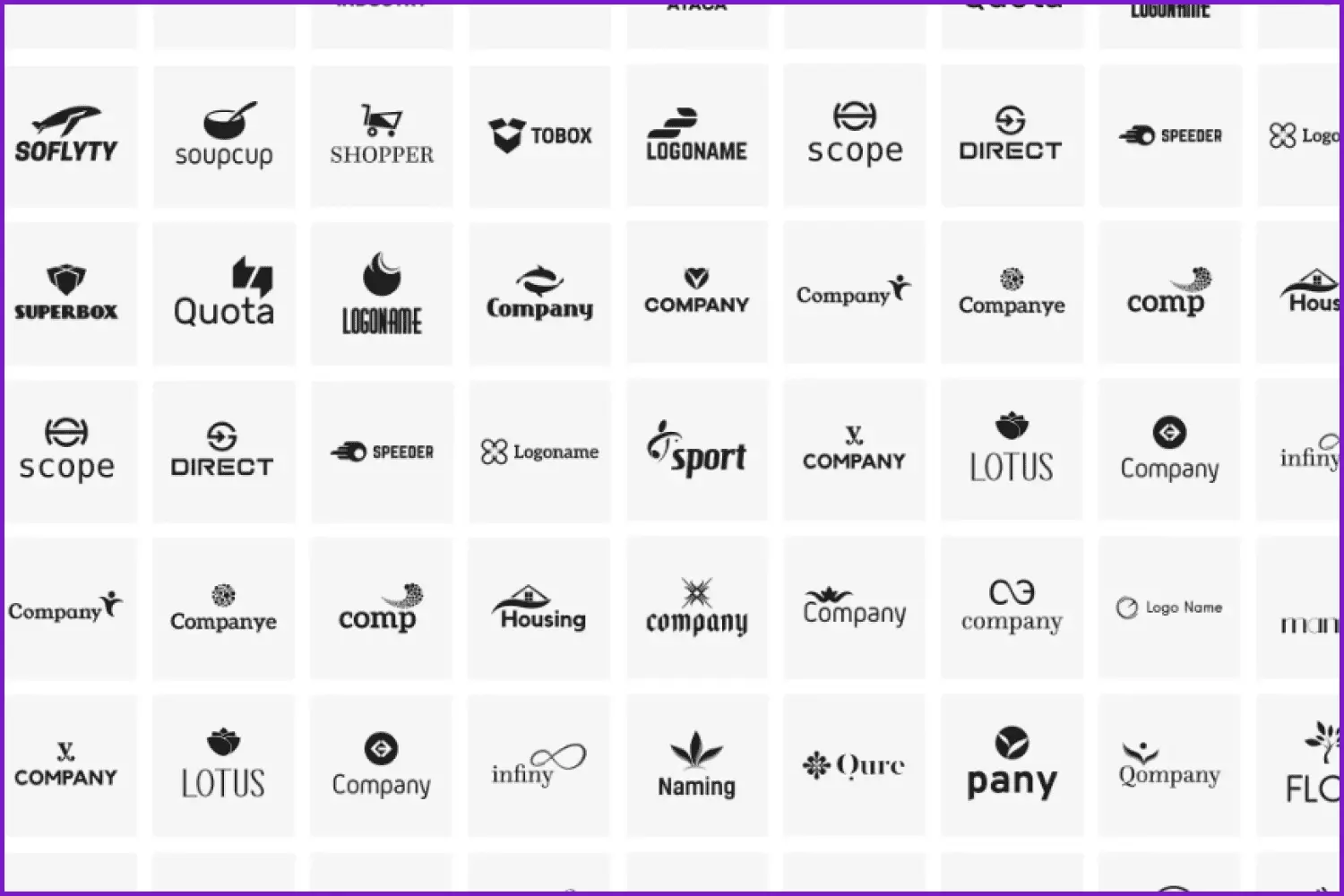
Flat Minimalist Logo Bundle
A huge bundle of amazing simplified logos. The collection includes 430 logo templates, as well as 200+ additional elements.
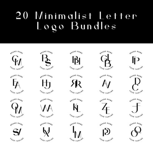
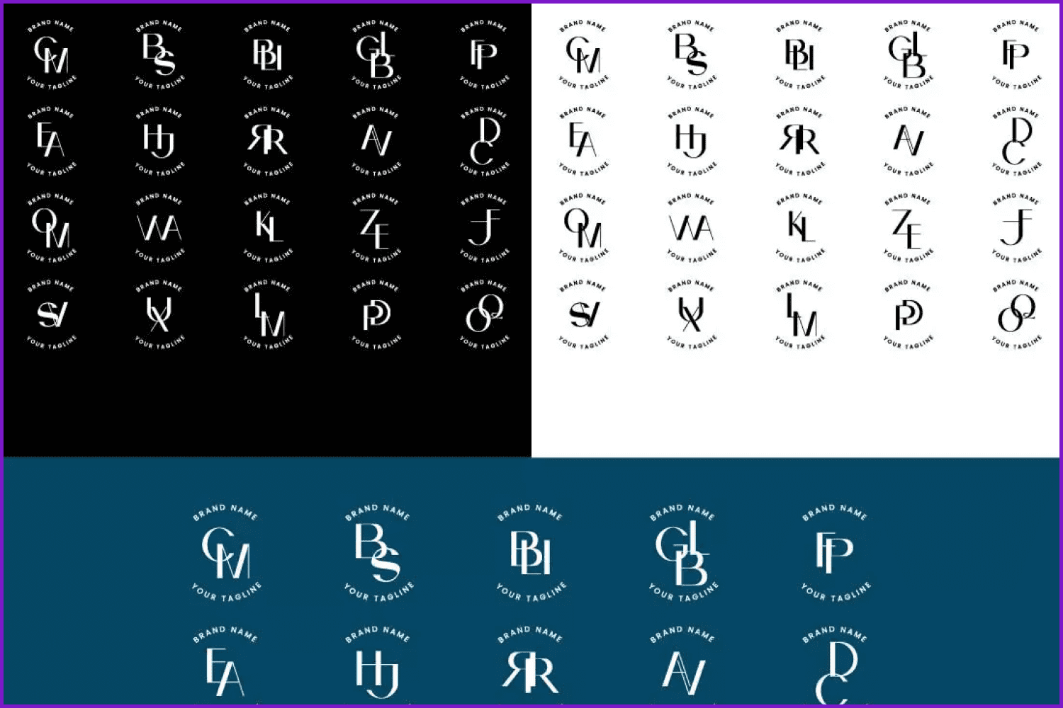
20 Minimalist Elegant Letter Logo
Need something elegant but simple at the same time? This set of 20 cool minimalistic logo templates will help you make your new company logo.
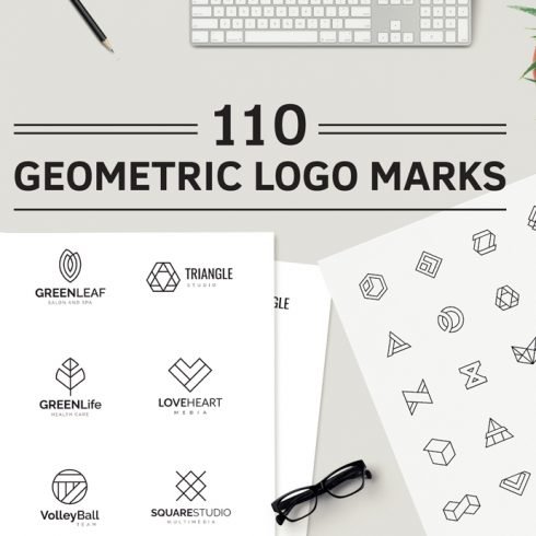
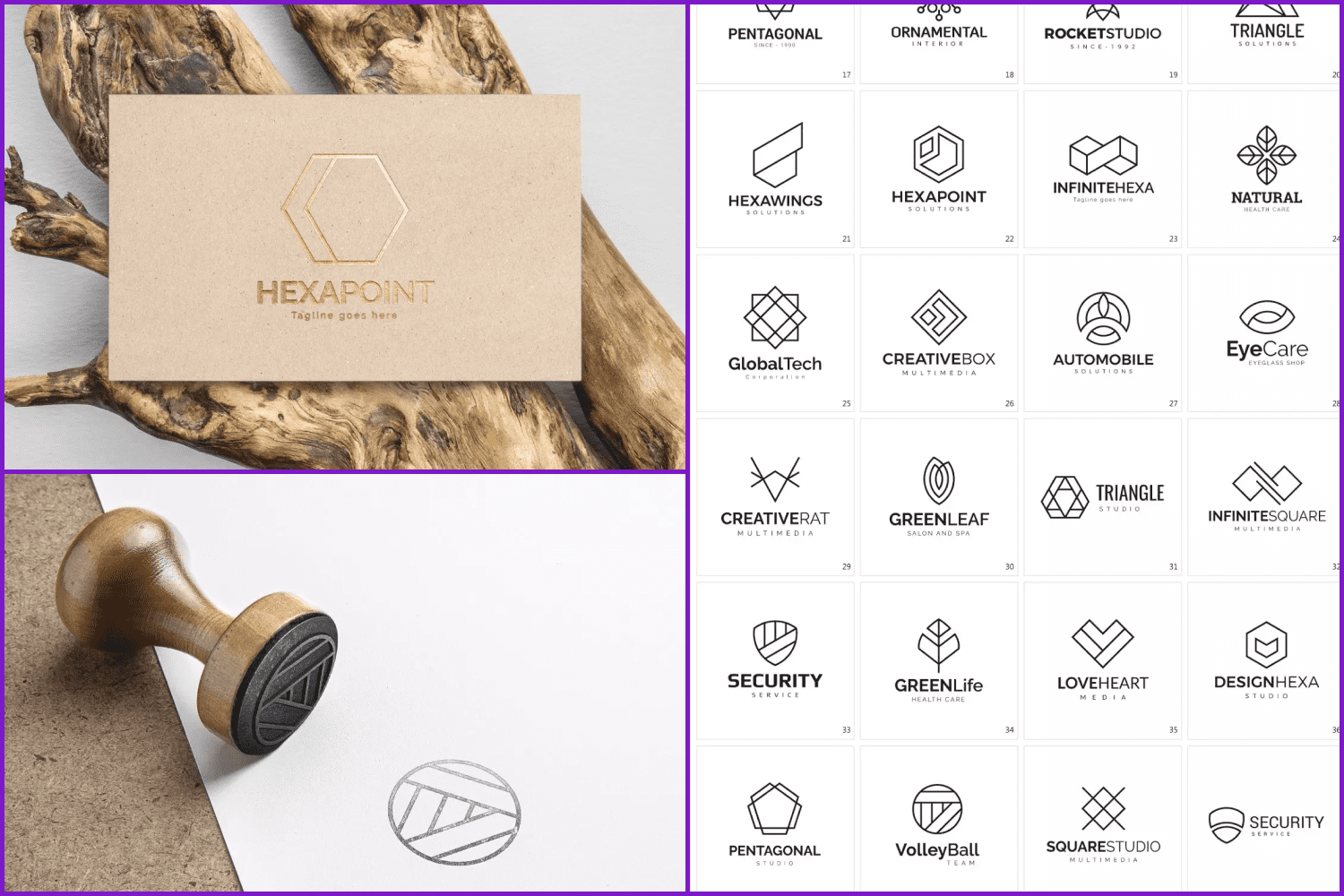
Geometric Logo Pack
Geometry as well as logo minimalism trends rule in 2022, so grab this collection of 110 amazing logo designs and create your own unique branding.
Minimal Logotype Collection Floral Style
Floral and natural motifs remain popular this year as well. So we could not pass by this awesome collection of minimalistic and elegant templates.
Minimal Branding Logo Pack
It is possible to make a perfect professional logo for any brand using this clean graphic design big pack of 120 various templates.
Minimal Typography Logos Bundle
These simple, yet stunning font combinations will complete your branding. All logos are editable and easy to customize.
50 Luxury Logo Bundle: Linear Premade Logo Pack
These simple, creative, and clever pixel-perfect logos will highlight your branding perfection. These logos are suitable for luxury businesses such as hotels, wedding agencies, restaurants, beauty salons, real estate, furniture, etc.
40 Minimal Logo Templates
This is a collection of 40 custom-crafted and adorable logo designs and symbols. All of them are made as vectors and are easy to customize.
If you like to create original minimalistic logo templates and other minimalistic arts, feel free to share them with potential customers via our comfortable and easy-to-fill-in Sell Your Deal Form.
How Famous Brands Changed Their Logos in 2022
It’s not a secret that many famous brands did some rebrandings in recent years. In 2022, the companies started to change their designs to more minimalistic and simple ones. So let’s see how some of the giants made changes to their logos.
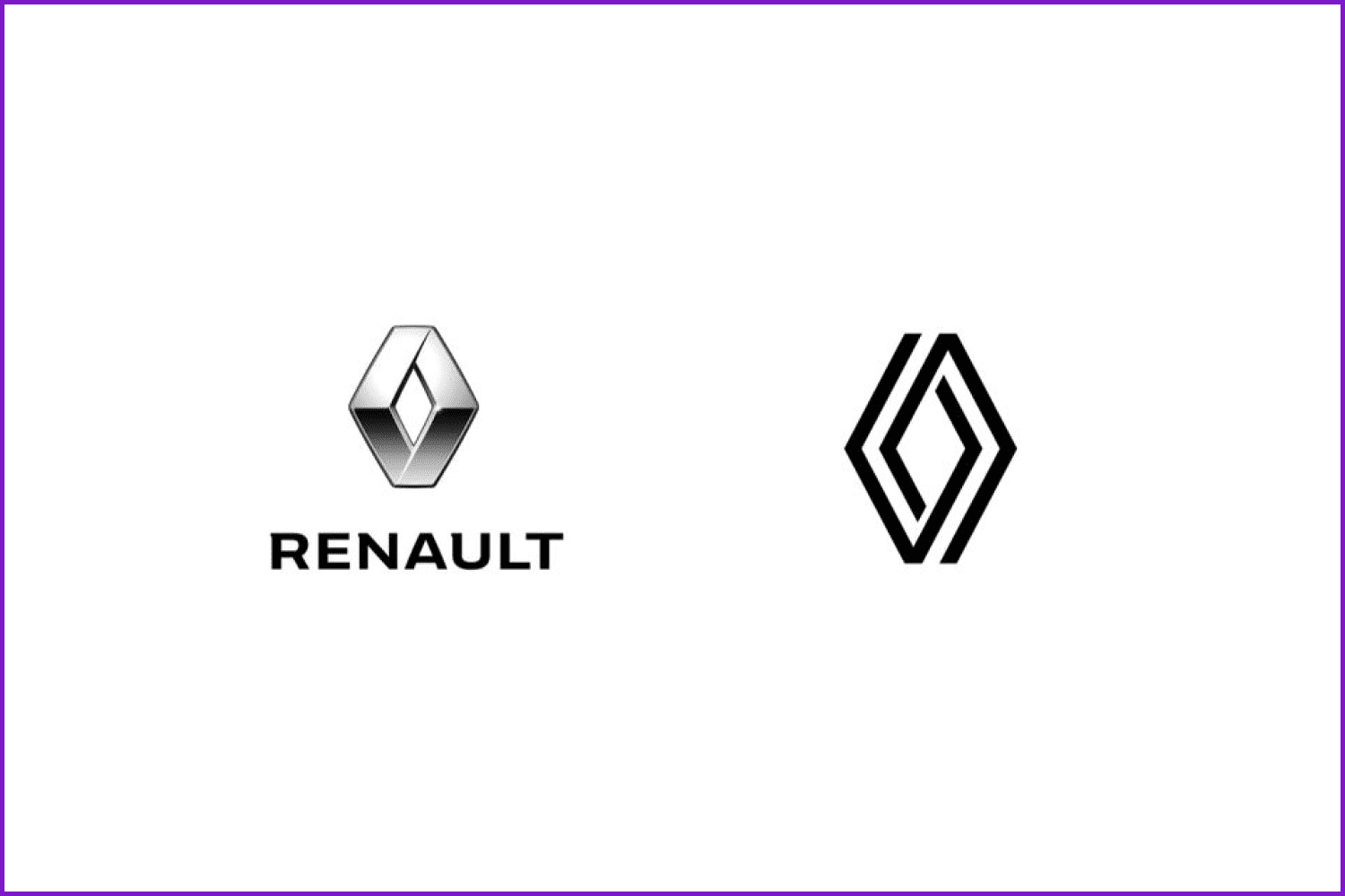
Renault
French automaker Renault recently surprised many Europeans by redesigning its logo. Well, it is not common for automakers to gradually change their logos over the years. Recently, however, many car companies have redesigned their logos to reflect a more modern, futuristic aesthetic.
Barilla
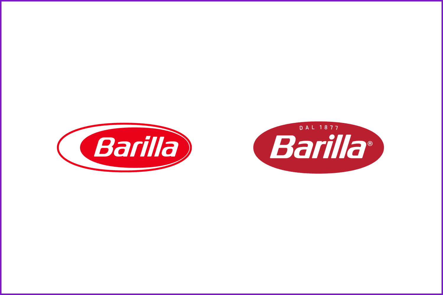
Barilla, the market leader in pasta, celebrates its 145th birthday this year. While little can be seen from the new brand logo, much has changed in the context of the packaging, the most important visual element in the industry, and all changes can be evaluated very positively.
Minecraft
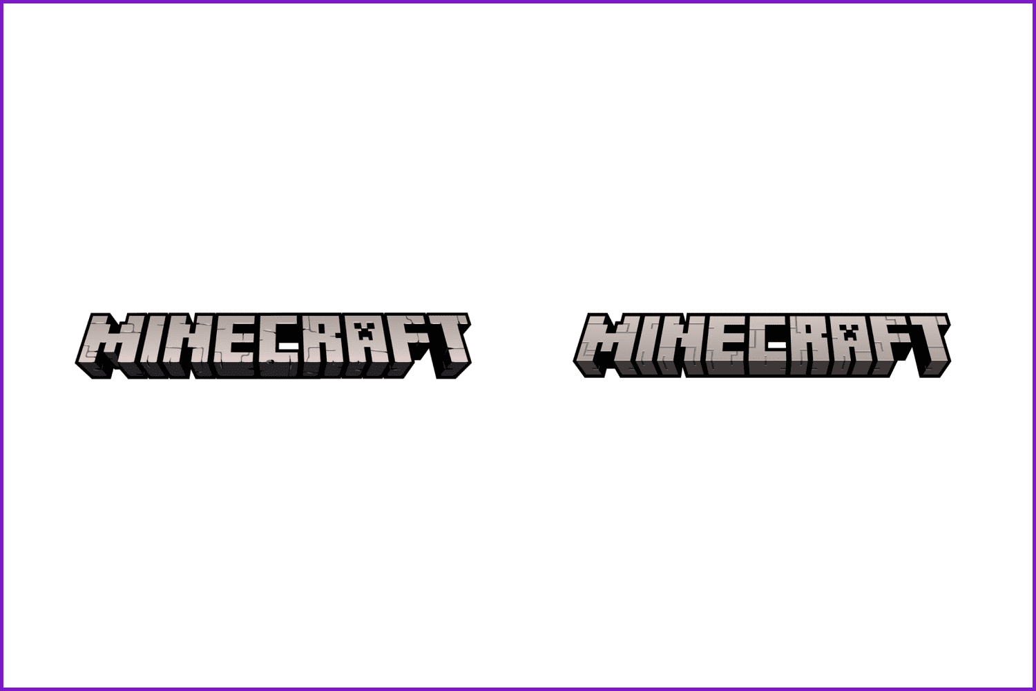
Scandinavian agency Bold, together with the Minecraft Brand Direction & Creative in-house team, has developed a new brand logo. The designers believe they’ve managed to develop a lively visual language that retains basic patterns and recognizable brand character.
Baskin Robbins
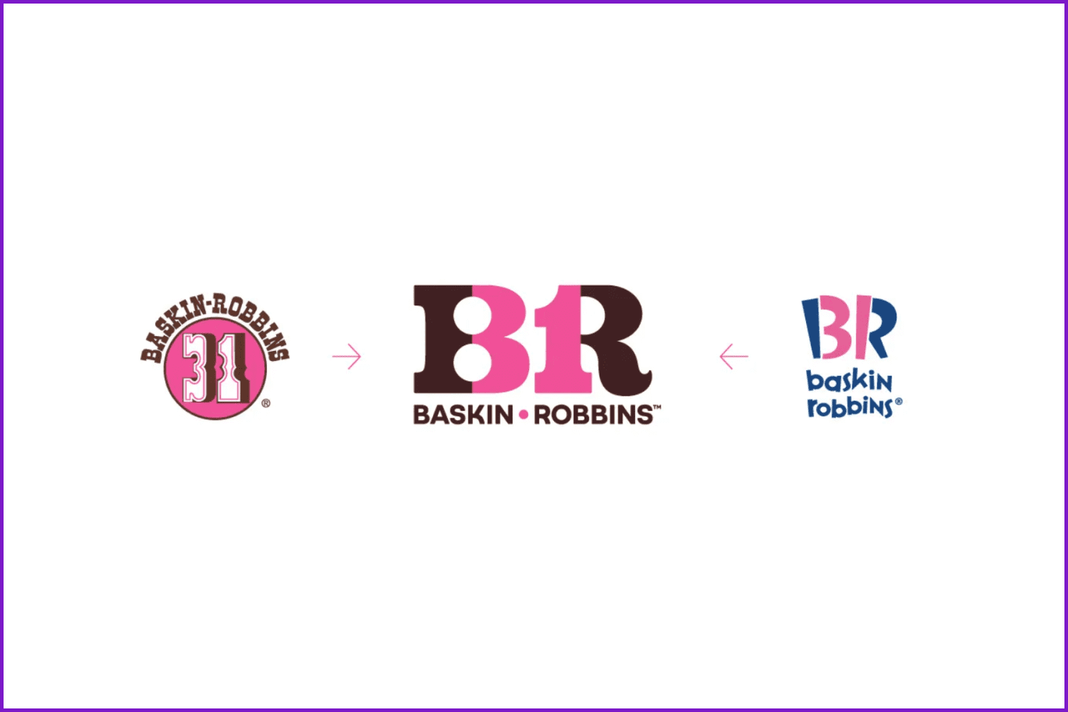
The new logo features a new corporate color, a bright emblem, and the number “31” in reference to the brand’s classic slogan “31 flavors” (meaning that every day of the month, a new flavor of ice cream can be tried).
Ferrari
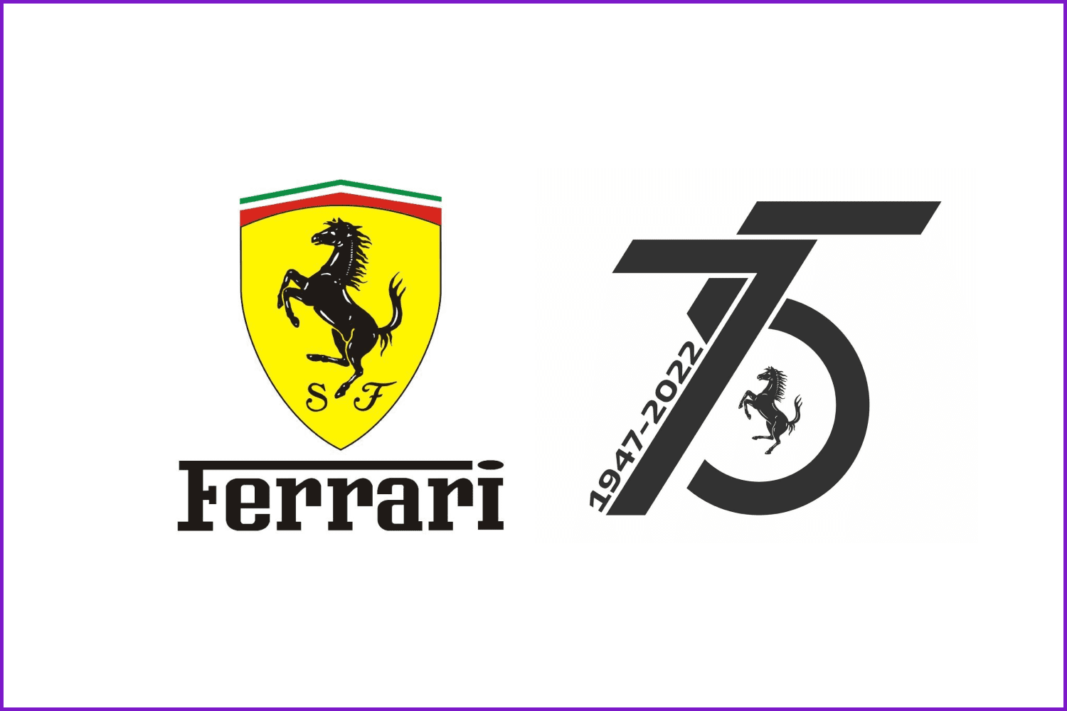
The iconic Ferrari automaker already revealed its 75th-anniversary logo. It is a trendy composition of the letters 7 and 5, with the dates 1947 and 2022 engraved in them. Additionally, the number 5 has the brand’s distinctive black horse inset into its belly.
ABC
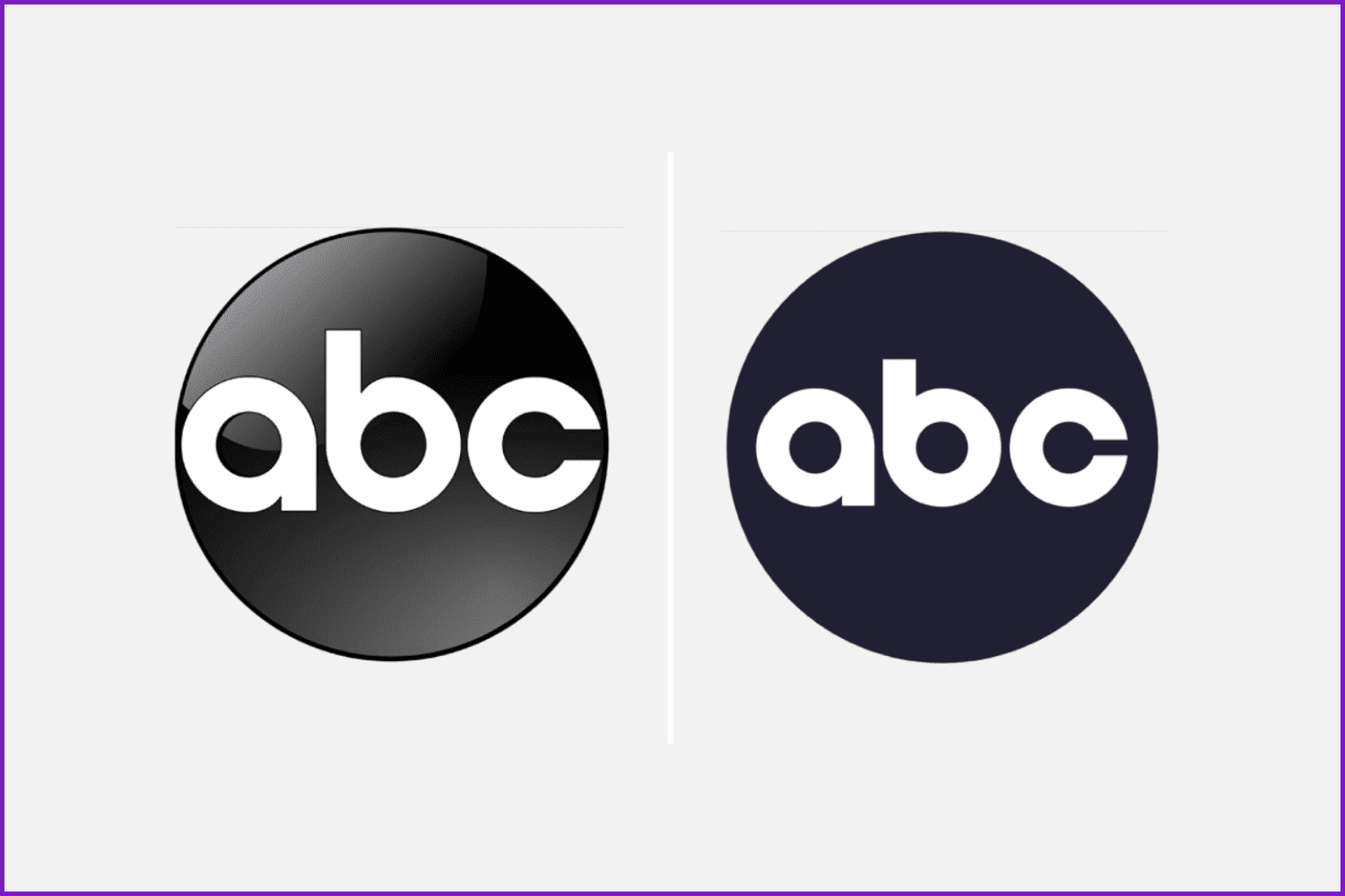
This redesigned logo offers greater graphic flexibility, which is especially important in the digital age where some decorative elements do not display well on small screens. The new design should also be more legible when scaled down to fit the menus of streaming programs and social media applications.
Pringles
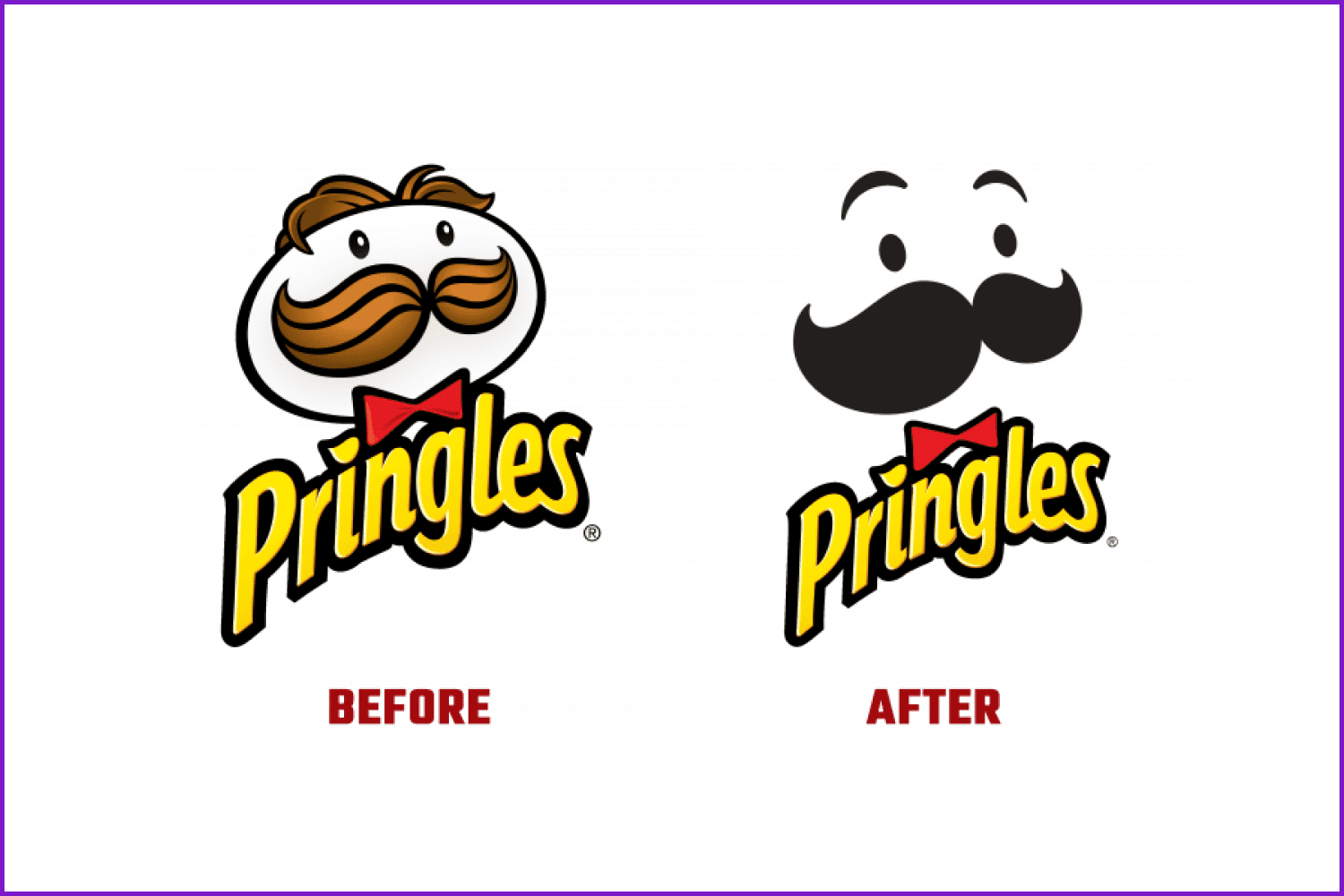
Pete Matthews, design director for the Pringles brand, said that maintaining this iconic look was an integral part of the renewal.
The intent of the new design, he says, “is to simplify and modernize the design, showcase the brand’s mascot in a bold way, and emphasize the ability to stack tips across the entire series.”
Volvo
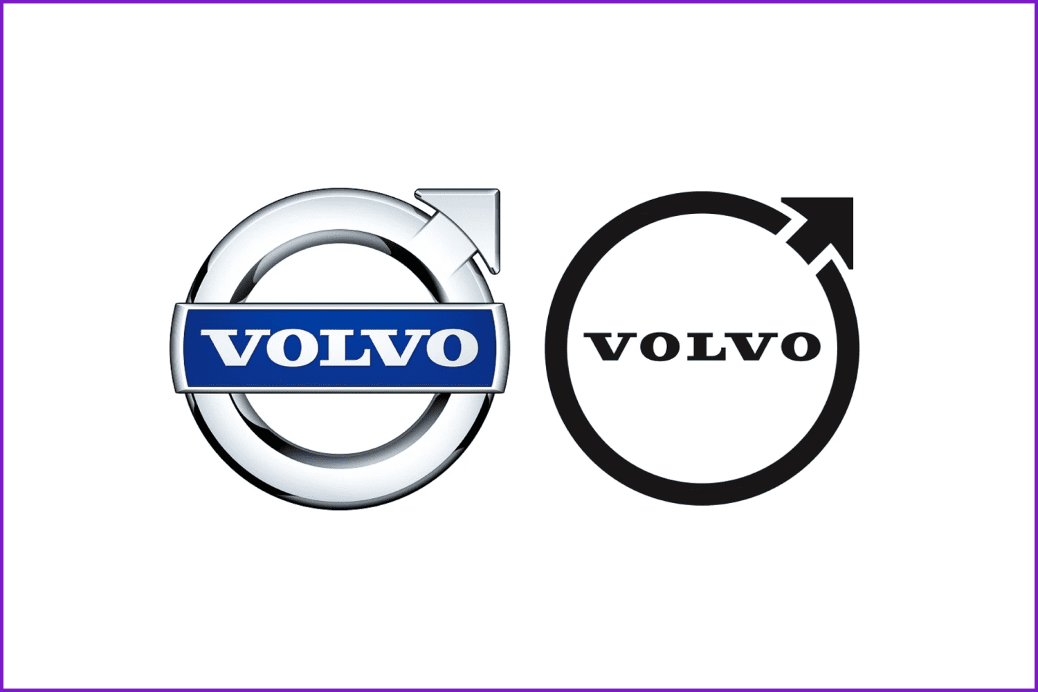
Following in the footsteps of other automakers, Volvo refreshed its logo. So, starting in 2023, the company will adopt a simple, flat, modern emblem. The new logo is now completely flat, with no volume on the rim, brand arrow, or text. The new graphics are designed to give the brand a greater presence in the digital world and make the brand instantly recognizable to younger consumers.
We hope that all the minimalist logo examples presented in this article will be inspirational for you. Consider the trends but do not forget to be original and show your unique style through the branding you create. May the creative force be with you! 🙂
Minimalism in Branding in Infographic
FAQ
Here are a few frequently asked questions about the minimalism in design
How do you use minimalism in design?
Minimalism in graphic design can be found in branding as you read in this article. Many posters, ad banners, social media templates, presentations, as well as web design tends to be more minimalistic too.
Why is minimalism important in design?
Because minimal logo designs are remarkable, as they catch the eye and don’t irritate the potential customer.
What are the principles of minimalist design?
The main principles of minimalist design include using metaphors, symbols, textures, simple typography, and free space.
Why are logos minimalist now?
Because we need to perceive a lot of information each day, it is important to create brand logos that are easy to perceive, remember, and recognize out of the crowd of various trademarks and emblems.
Some Awesome Videos about Minimalism in Branding
NASA Logo Redesign: MasterBundles Makes a Logo Minimalistic
In 2022, many businesses went for minimalistic logos. While Pringles, Volvo, ABC, and others redesigned their logos in favor of minimalism, there are brands and companies that stood true to their old logos.
Hence, our designer Valeriia decided to play a game called “What if famous companies made their logos more minimalistic” and there you are – a process of redesigning the NASA logo!
Let us know in the comments if you like the video, so we keep creating similar content! Share your ideas on what company should be the next one 🙂
_____________________________________________________
💜 [MB] MasterBundles: https://masterbundles.com/
💜 Companies that redesigned their logos in 2022: https://masterbundles.com/minimalism-in-logo-branding/
- Gucci logo
What are your concerns?
Thanks for your response!
Disclosure: MasterBundles website page may contain advertising materials that may lead to us receiving a commission fee if you purchase a product. However, this does not affect our opinion of the product in any way and we do not receive any bonuses for positive or negative ratings.
