Product Specs
| Created by | Laura Worthington |
|---|---|
| File type | OTF, PDF, TTF |
| File size | 1.48MB |
| Date of Creation | April 6 2023 |
| Color | green orange red yellow |
| Rating | 5 (7) |
| Category |
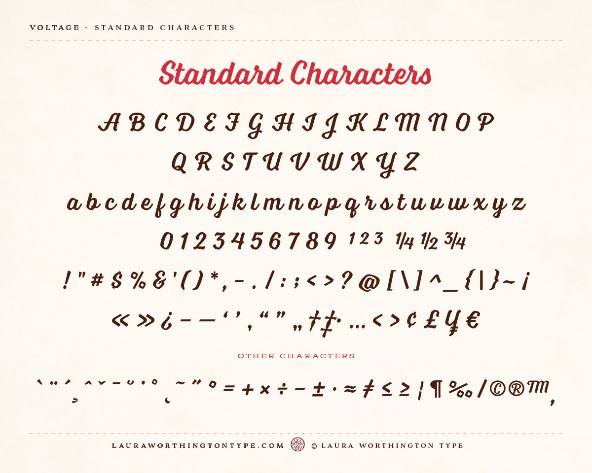
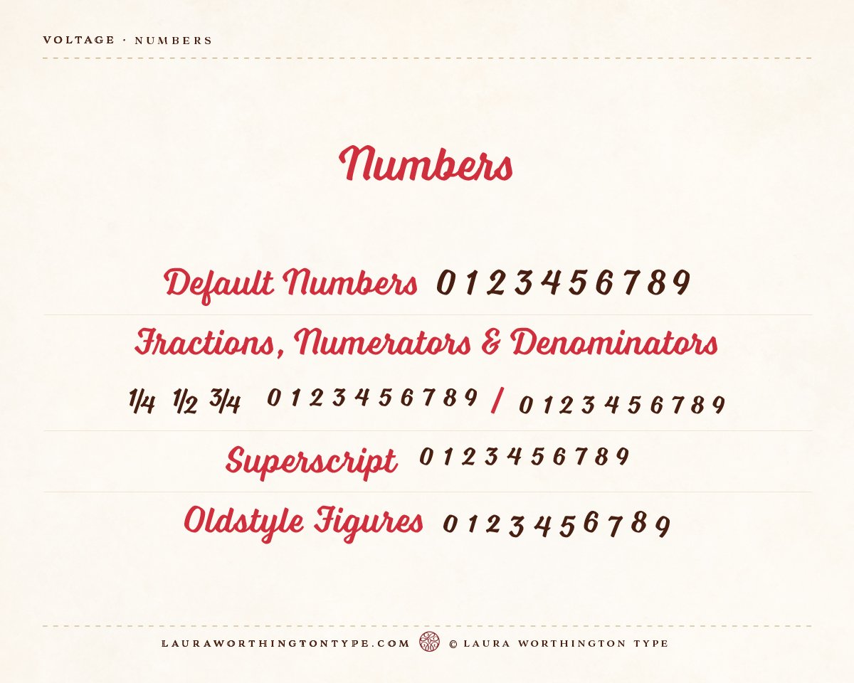
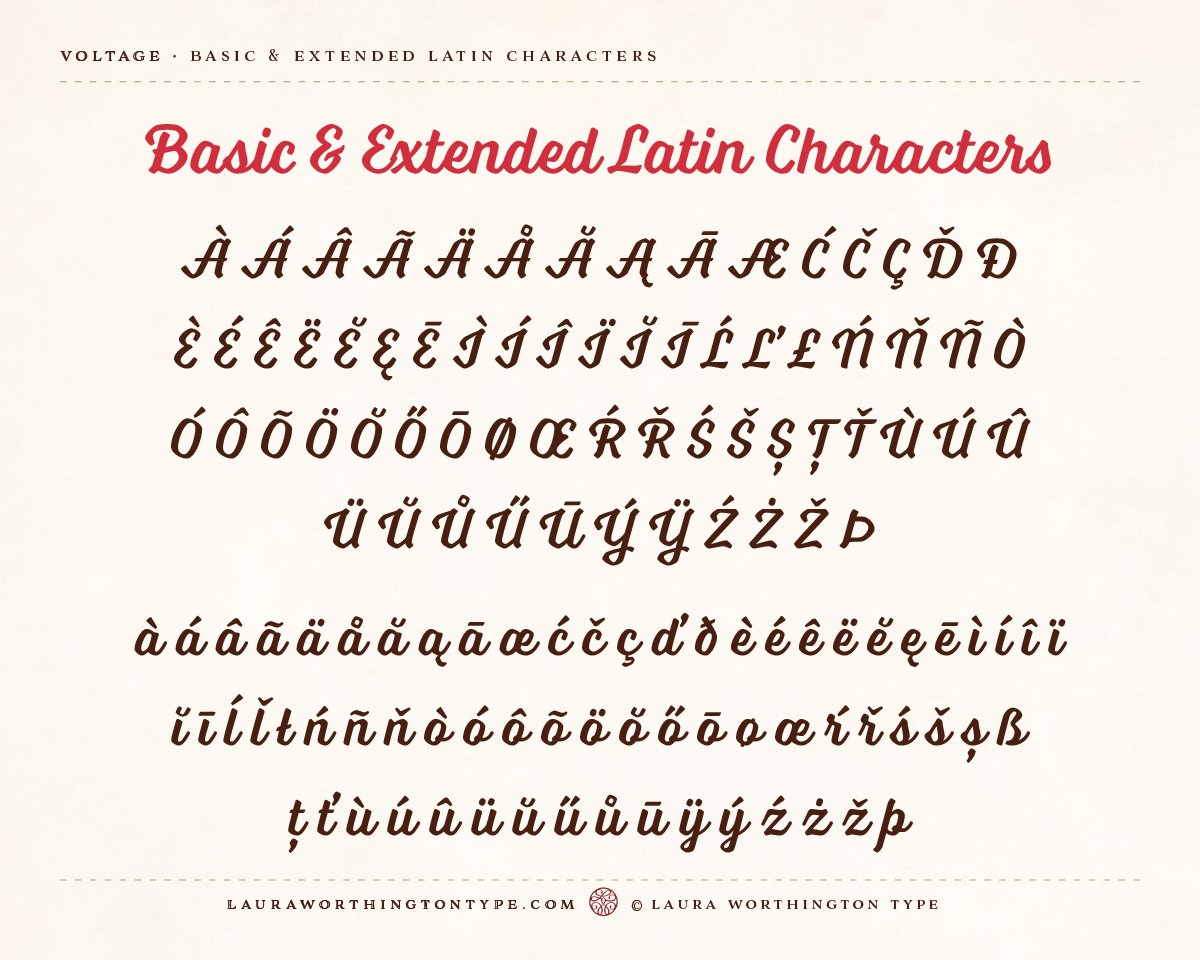
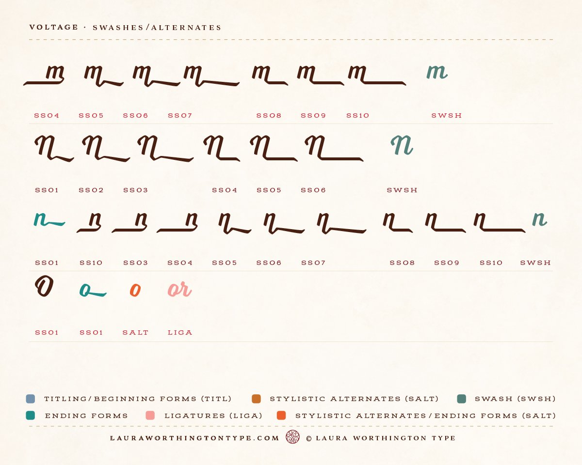
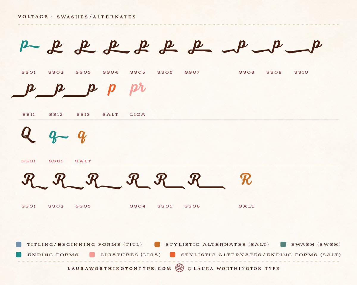
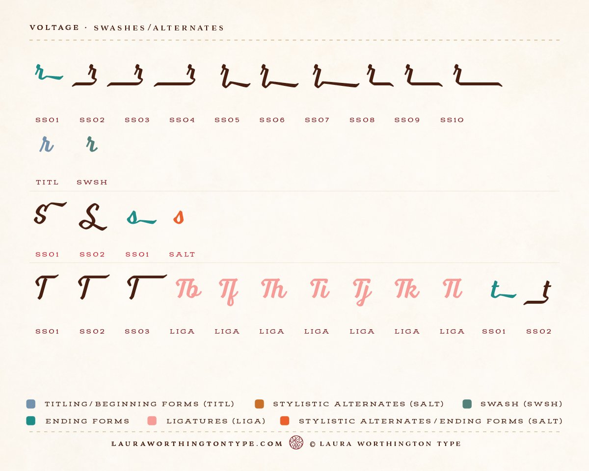
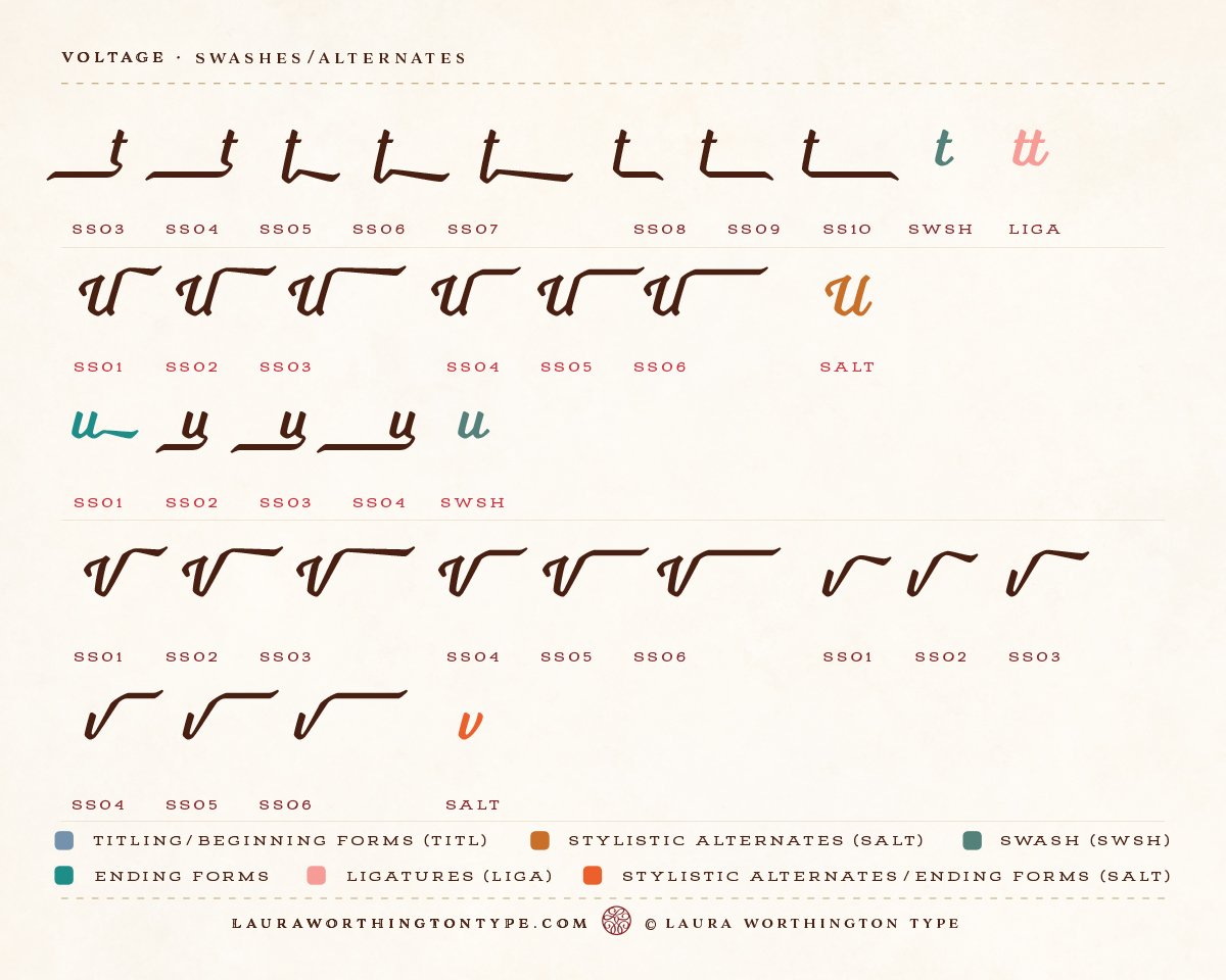
To view the User Guide that shows all of the features and what’s included, visit: http://bit.ly/TL8RHs
NOTE: For questions, including how to use this font and access alternates, please visit the FAQs page on my website: http://lauraworthingtontype.com/faqs/
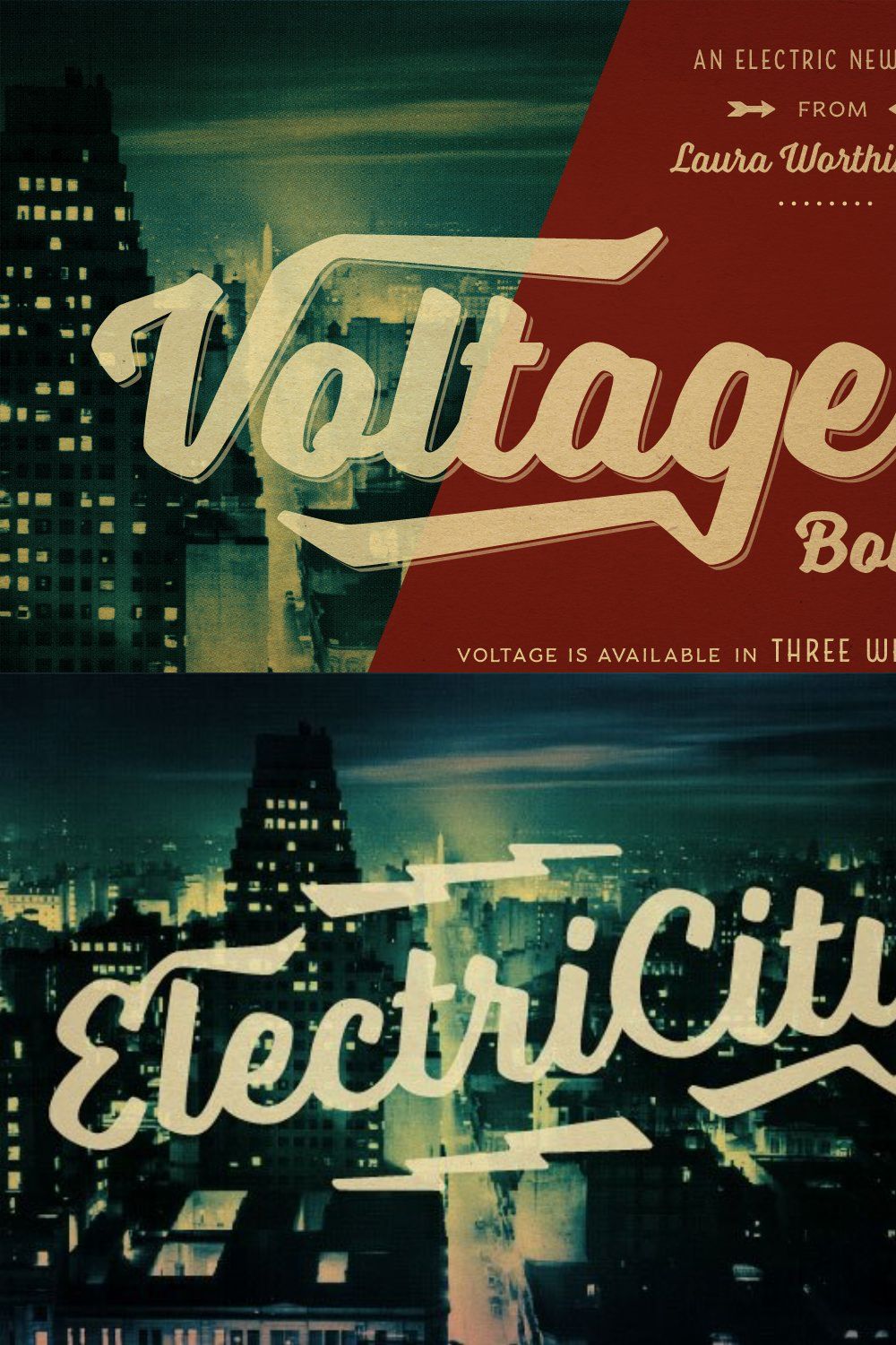
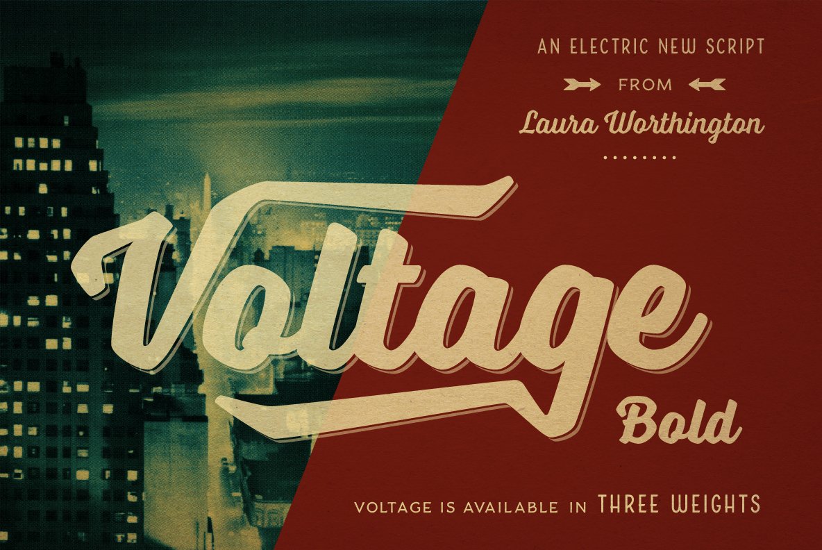
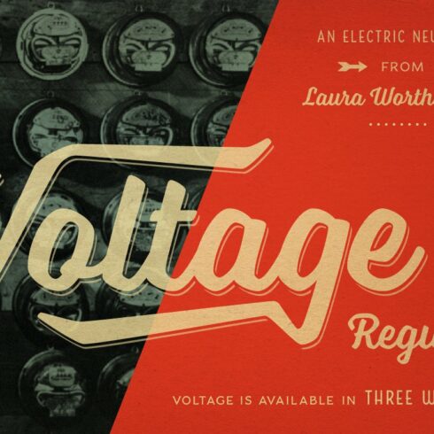
Voltage, created by award-winning typeface and lettering designer Laura Worthington, is an unexpected and energetic standout in the world of script fonts, breaking free from formal classifications while retaining the degree of personality we treasure in hand lettering. Her primary goal was unique: readability with personality. Gone are the large loops, the frilliness, and the choice of beauty and elegance over utility.
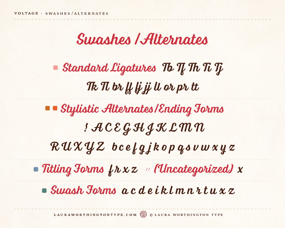
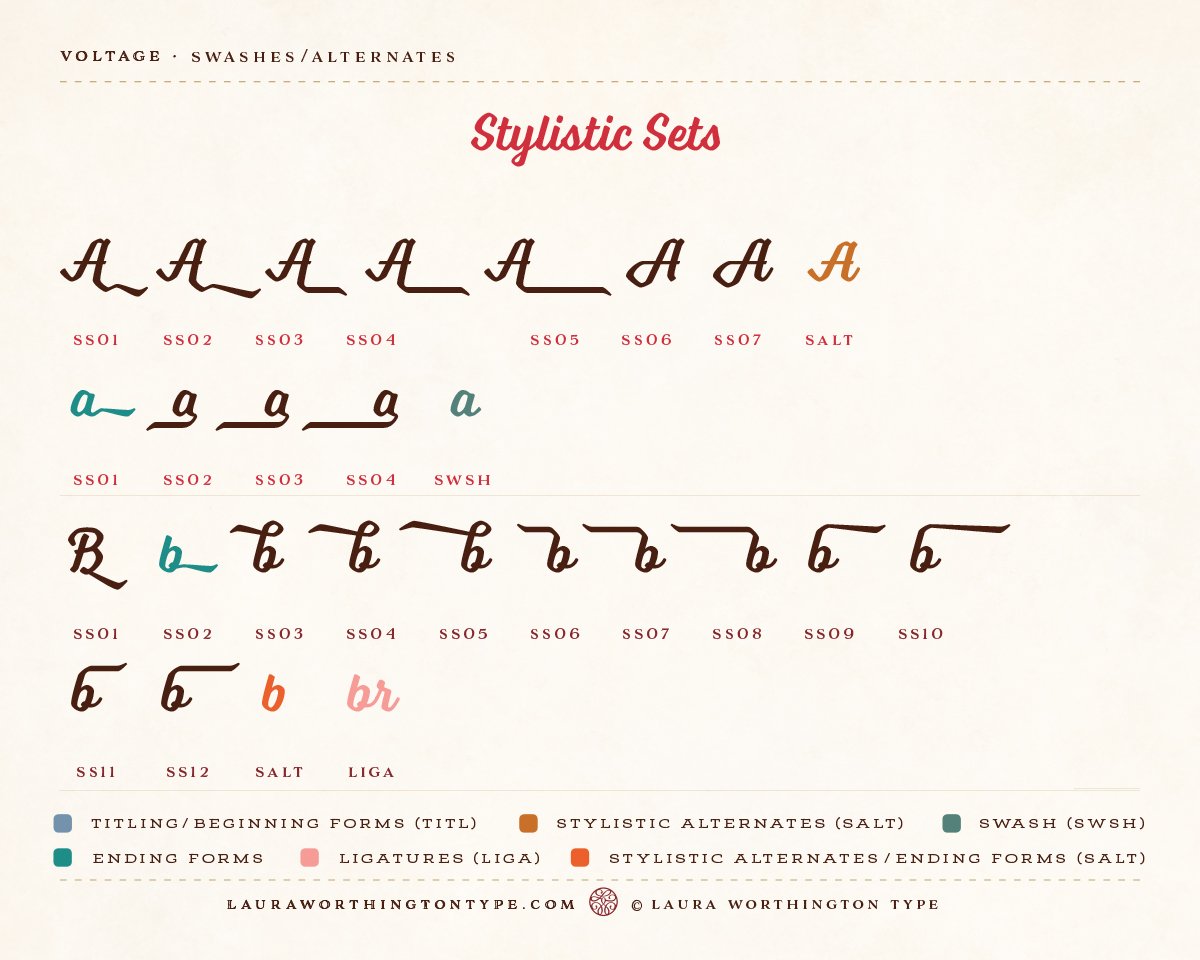
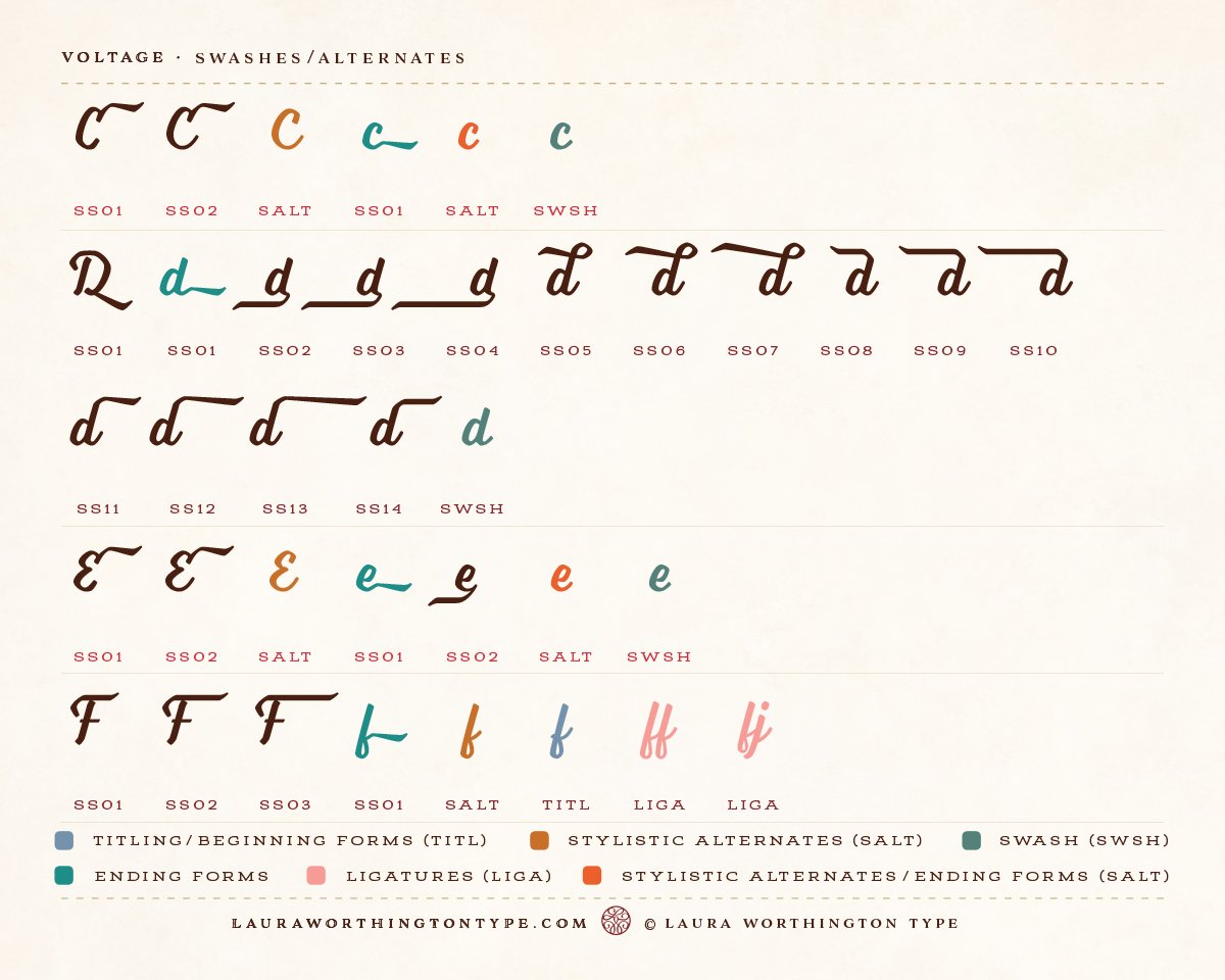
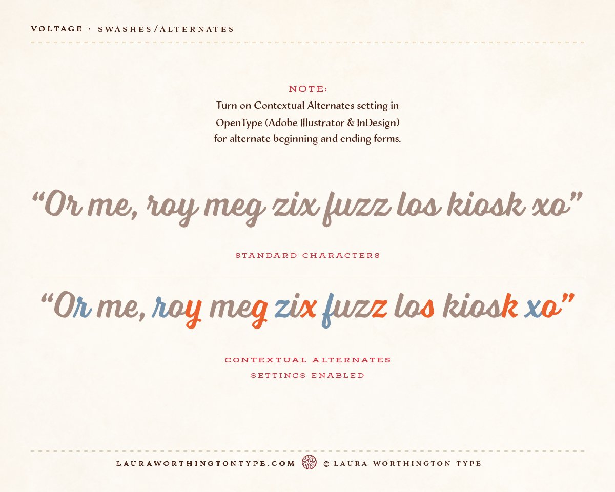
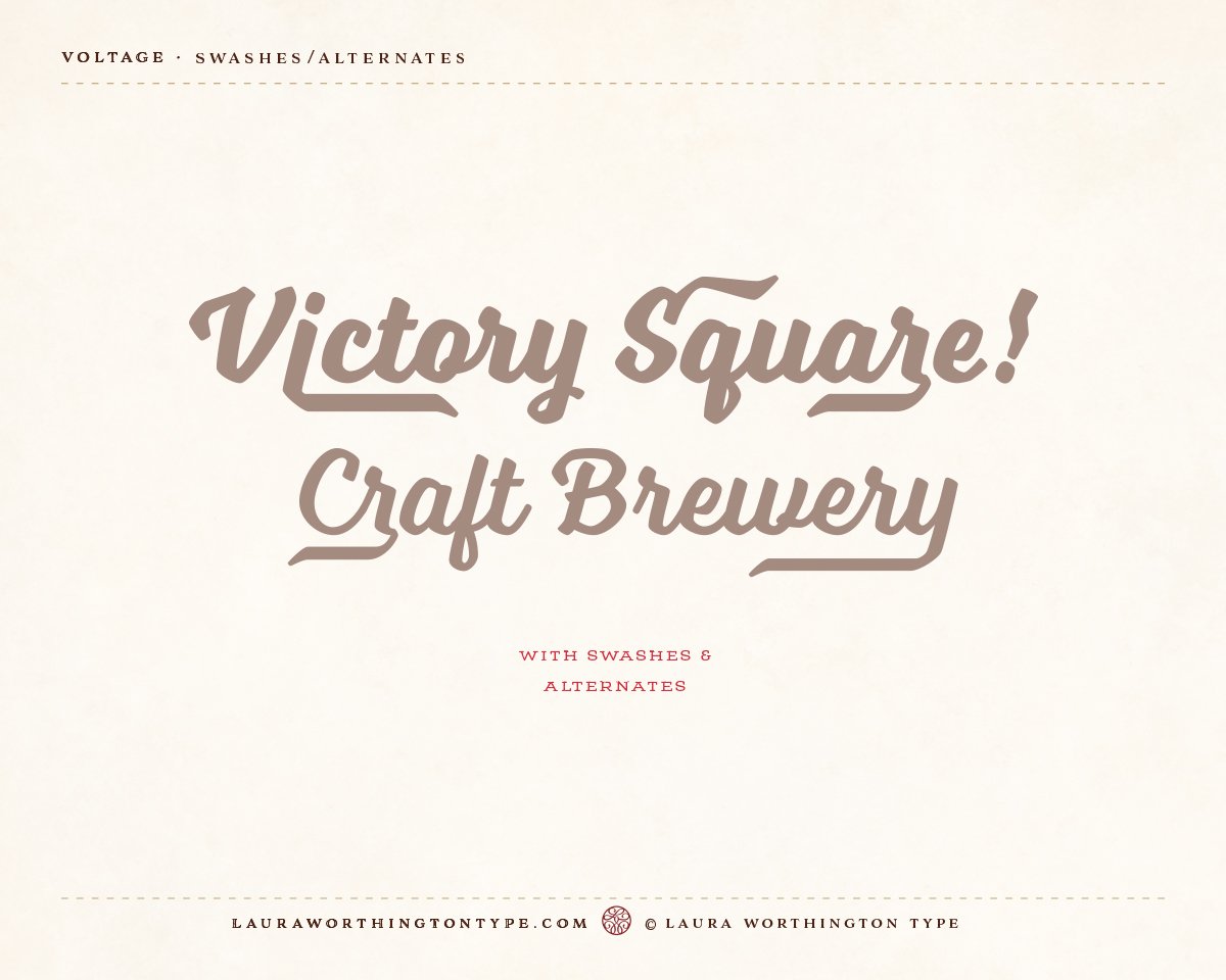
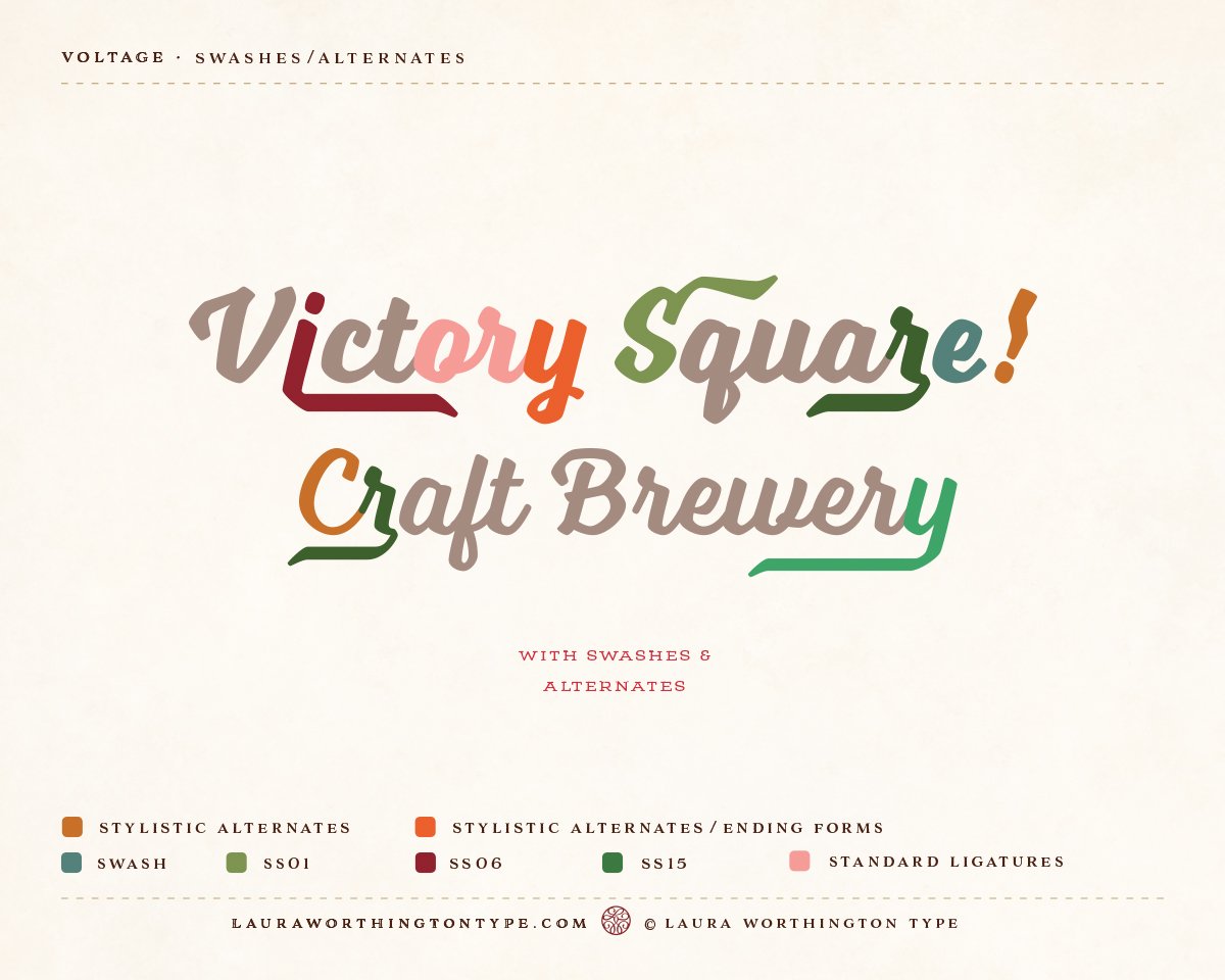
Voltage takes the script font in a different direction, with an emphasis on practicality and uniformity, and with the reader’s needs at the forefront—this is a straightforward, muscular lettering font, assertive, yet down-to-earth. The beauty is found in its elegantly-wrought construction, its versatility, its references to a different era, and in the galvanizing swashes and alternates available not only in a professional designer’s software, but to everyone with a computer.
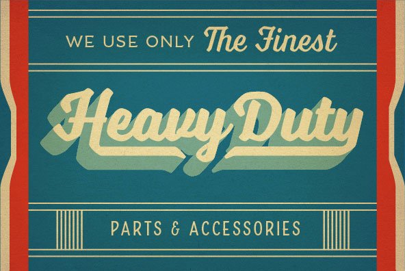
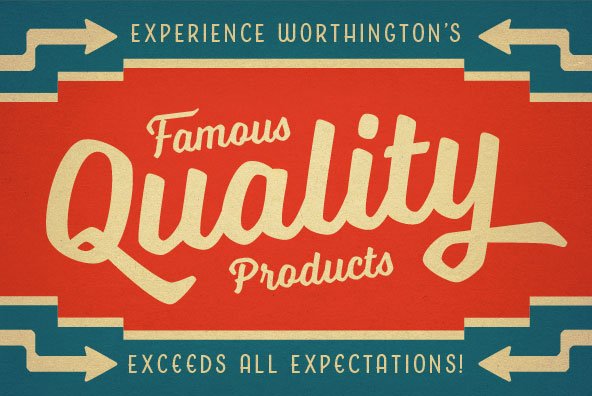
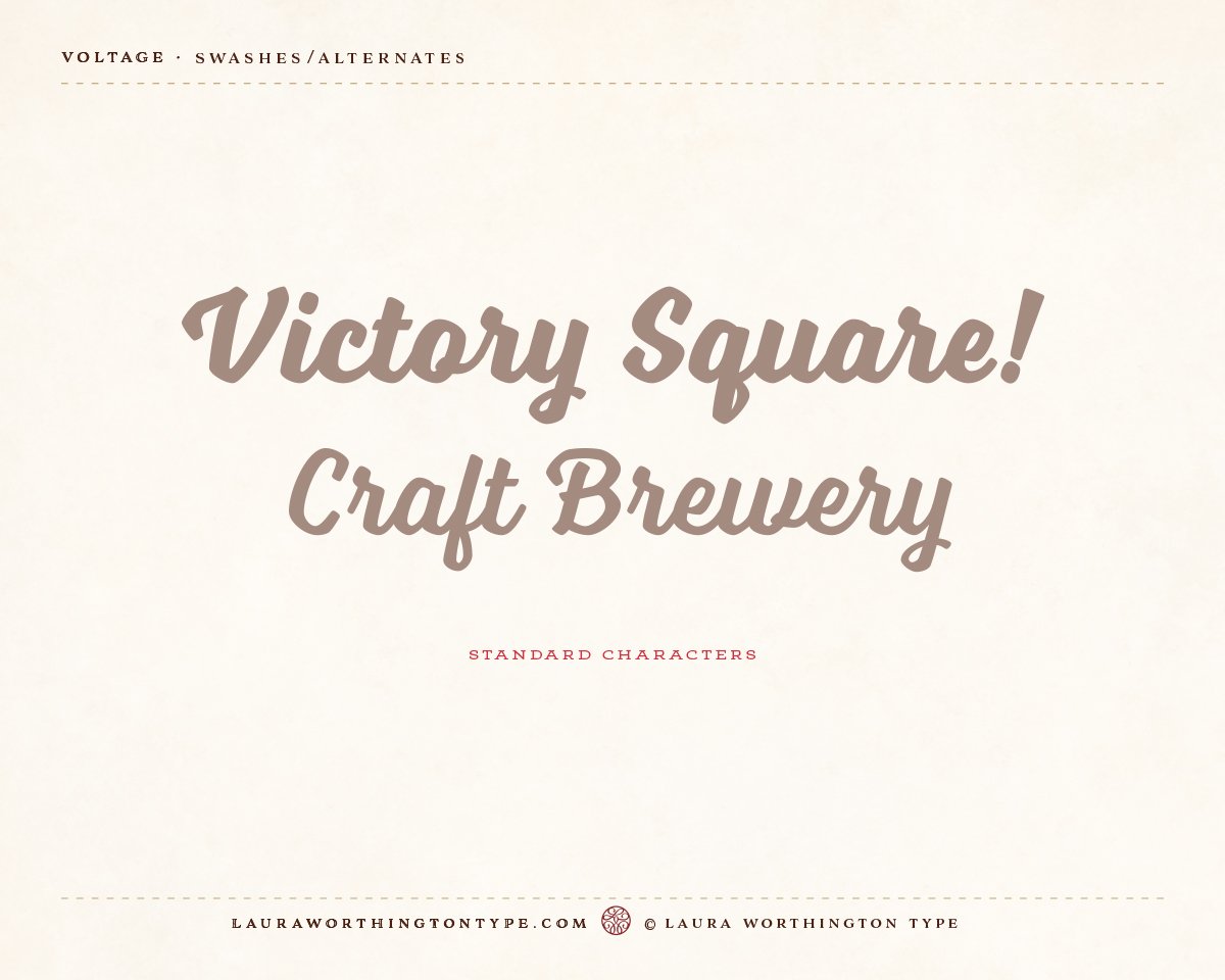
It is not based on naturally-occurring handwriting; it’s clearly a structured lettering form based on balance, a solid rhythm, and uniformity. Script fonts often are quirky. In contrast, this is a workhorse, almost a text version of a script font. Voltage is ideal for headlines, logos, subheads, short sentences, phrases, a short paragraph, and pull quotes. The default setting (without swashes and alternates) is best for phrases and subheads.
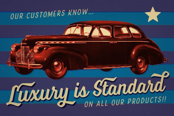
Like many of Worthington’s typefaces, Voltage is evocative of a milieu or era. Here, we see the metal lettering on automobiles of the past—with their retro takes on a bright future–and those emblems of an optimistic, hardworking period. Its overall regularity references a time when the machine was king—the late days of the Industrial Age. Imagine vintage instructions on signs or paper; they may be created by machinery or by hand, yet both have that industrial sensibility. We sense visions in the 1950s—and earlier—of what the Nuclear Age would look like. Voltage calls to mind gas stations, machinists, receipts at machine shops, trips to the soda fountain at the drugstore, shopping at the five and dime. Yet, in its twists and small irregularities, we see vestiges of hand-painted signage, the rivets in beloved, old, worn blue jeans, the touch of the ”common man” who, alongside women, built America.
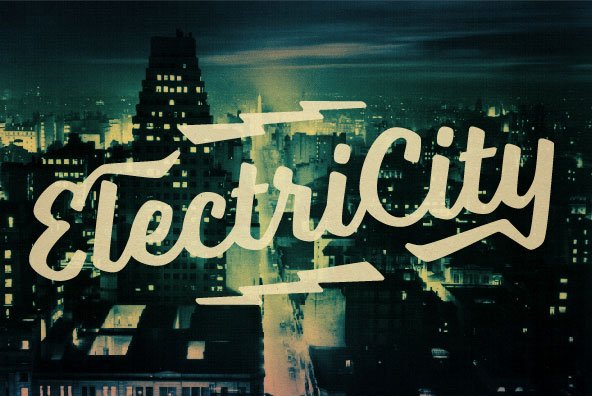
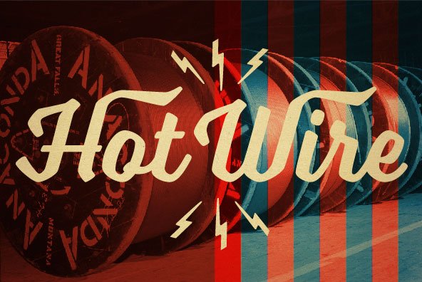
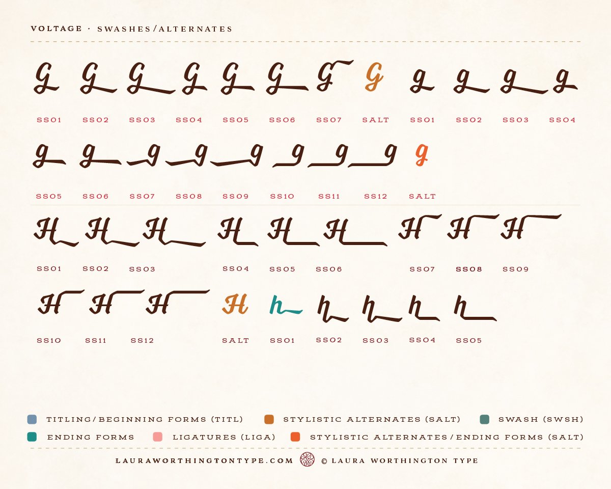
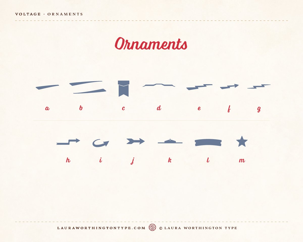
Voltage is versatile. Like those old jeans, the look depends on how and where you use it. You can dress up a good pair of jeans by choosing high heels; you can dress down with sturdy work boots. Because Worthington assigned unicode values to the swashes and alternates, anyone can use their operating system’s Character Map to access them. The options become endless. It can have the spirit of a picnic—casual, fun, and friendly, yet, in other contexts, convey tough mountain-biking. So, use this font for small areas of text and it makes a statement without overpowering the main body text. Or, dig into Voltage swashes and alternates for much larger titles to capture the attention of the reader and create a dramatic presence, such as using the powerful lightning bolt swash that shoots out from the descender of the lowercase g. Electrifying!
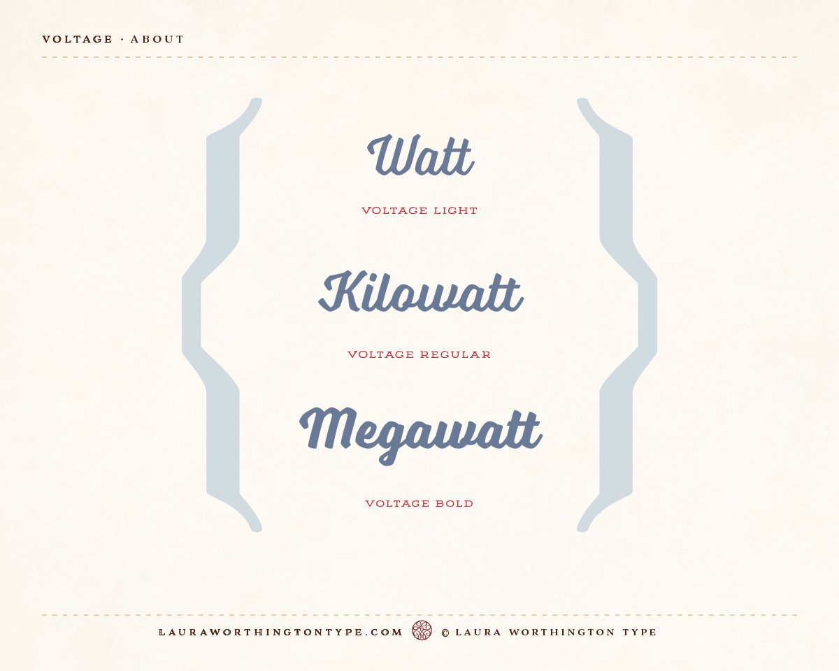
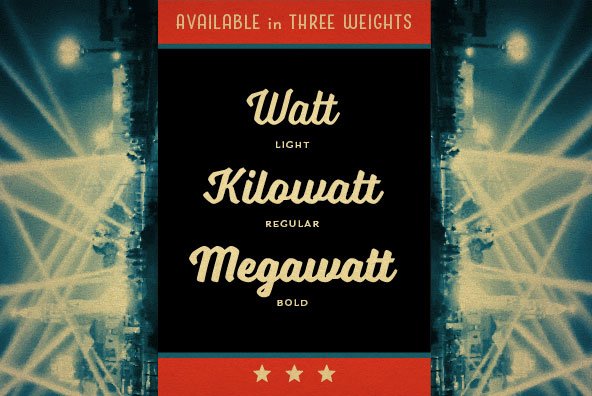
The challenge, as Worthington worked on Voltage, was noting that script fonts are almost always notoriously difficult to read. How could she strive for clarity, readability, and uniformity, yet retain the vivid personality that Voltage (and its designers and readers) deserve? She used a tall x-height, minimal detailing in the lowercase ascenders and descenders, worked on low contrast, and amped it up to make it heavier and add substance. It comes in 3 weights—light, regular, and bold—and even the regular weight is as substantial as many bolds in other fonts. In fact, it is one of the few script fonts that you can use with confidence at a relatively small size (e.g., 18 pt) in a short paragraph. No one letter dominates the others. Stems have a weighty base but have light strokes in many letters for clarity and distinctiveness. The looped descenders of the lowercase g and other letters use a thin stroke that curves and thickens as it rises up to meet the next letter, making the loop lighter and therefore more legible than a large uniform loop.
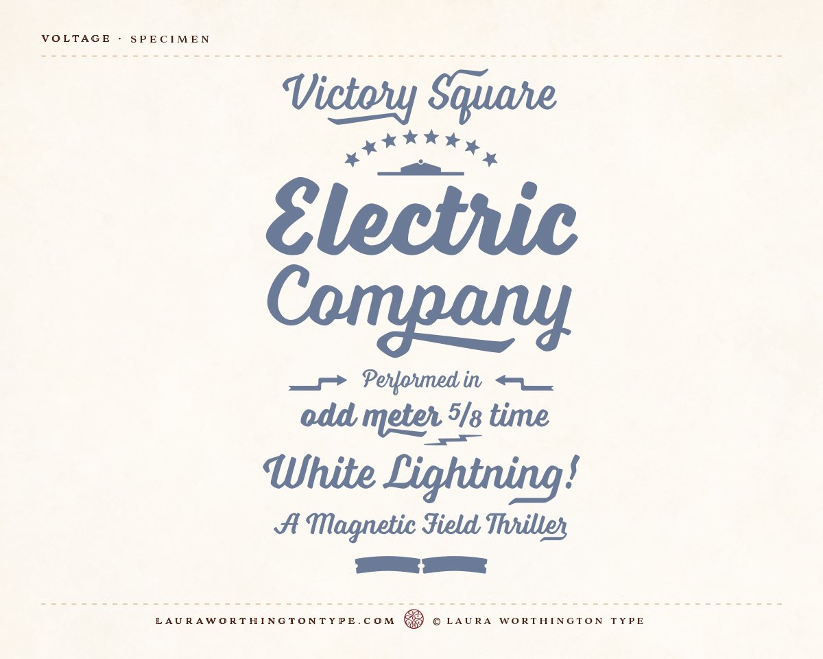
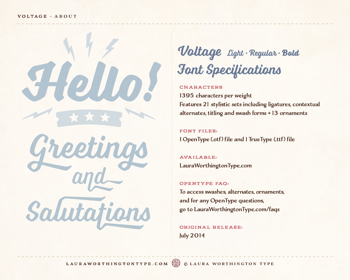
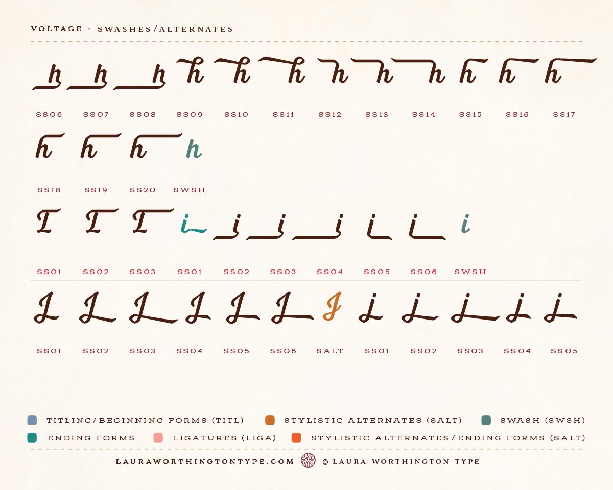
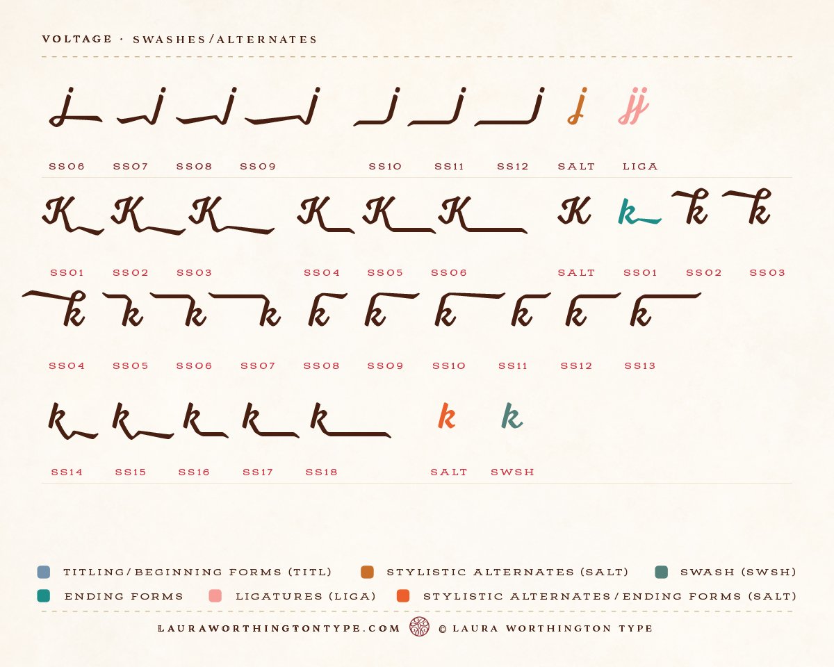
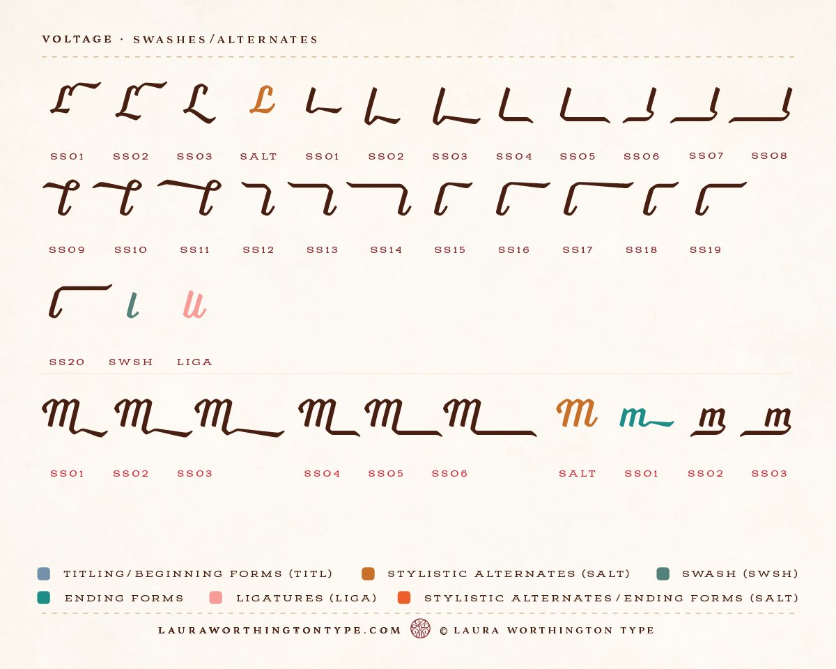
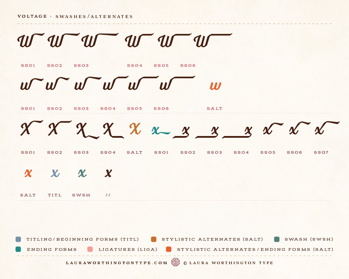
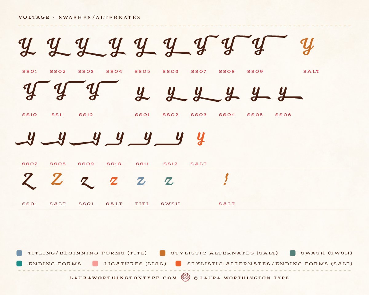
This most magnetic typeface provides 154 unique swash designs (that yield a total of 348 swash variations), 39 alternates, and 15 ligatures.
