10+ Best Real Estate Logos in 2021: Free and Premium
Real Estate Logos. How you introduce your company in the market and how quickly you hit your target audience depends on many factors. If you have just recently burst into the competitive environment, and only few people know about you yet, then you should not rely on word of mouth and a quick take-off. In this case, all hope relies on marketing strategy and quality advertising.
The most important part of PR for a company is visual impact. This concept includes the logo as well. Your earnings and the number of orders directly depend on how bright, attractive and high-quality logo you create.
In real estate most logos are nearly identical. All use a silhouette structure, the image of buildings or construction, ready-made structures or associative rows. To some extent, there is logic in this, because looking at the logo, any person immediately understands that we are talking about real estate.
We will offer you our selection of Real Estate Logos, both standard and completely original and fresh. The choice will be yours. But we can definitely say that there is absolutely no equal among Real Estate Logos.
Best Premium Real Estate Logos
Real Estate Logo
![]()

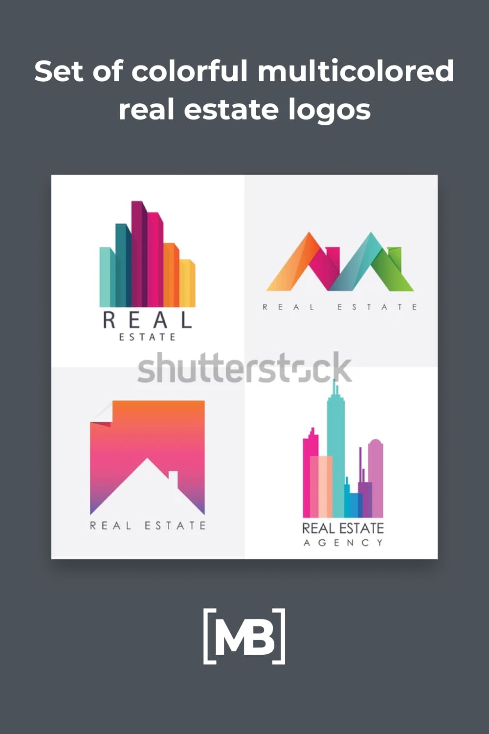
Set of Colorful Multicolored Real Estate Logos
Real Estate Logo
![]()
House Shape for Real Estate Logo
![]()
Real Estate House Mortgage Outline Logo
![]()
Best Free Real Estate Logos
Logo With the House and Wave
![]()
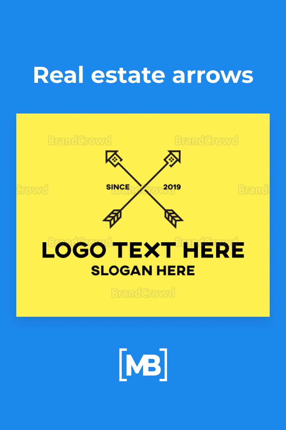
Real Estate Arrows
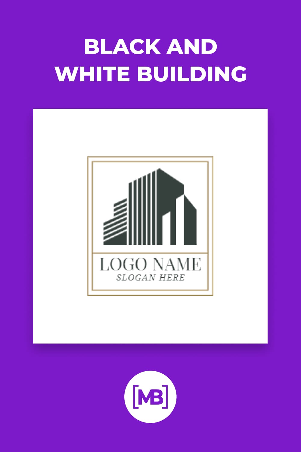
Black and White Building
Modern Real Estate Logo Collection
![]()
Logo with Geometric Arcs
![]()
Real Estate Logo Design
![]()
Please take a moment to pin this post to Pinterest
What are your concerns?
Thanks for your response!
Disclosure: MasterBundles website page may contain advertising materials that may lead to us receiving a commission fee if you purchase a product. However, this does not affect our opinion of the product in any way and we do not receive any bonuses for positive or negative ratings.