Heavy Music Fan Bundle! 75% OFF
$29
| Created by | Stefan Chirila |
|---|---|
| File type | OTF |
| File size | 105.4KB |
| Date of Creation | February 24 2023 |
| Color | black green red |
| Rating | 5 (10) |
| Category |
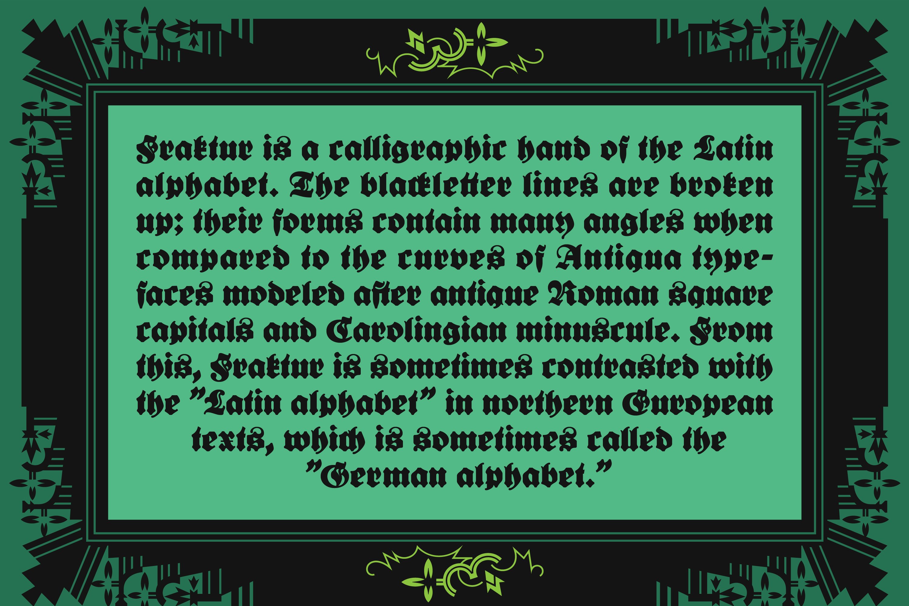
The term “Fraktur” comes from the Latin for “broken” or “fractured” as a reference to the fact that the letters are broken into sharp angles by comparison with the more flowing form of Roman letters or Antiqua. In most European countries, Fraktur was being slowly replaced by the Antiqua typefaces created in the 15th and 16th centuries but in Germany both typefaces coexisted until the the end of the war.
Besides creating a “typeface divide” in Europe, this split between Humanistic, Catholic Antiqua and Germanic, Protestant Fraktur was also reflected within the German-speaking region. Literary works in German were most often published in Fraktur, while scientific and learned works were set in Antiqua (Latin) type.
This exactly a century old fraktur typeface was originally created by Lucian Bernhard in 1921 under the name of Extrafette Bernhard-Fraktur and it was used in various posters and newspapers of the time. Lucian Bernhard was a famous graphic designer, type designer, and artist during the first half of the twentieth century. He is well known for helping create the design style known as Plakatstil (better said Poster Style) which used minimalist and flat colored imagery to convey the objects being advertised alongside the brand name.
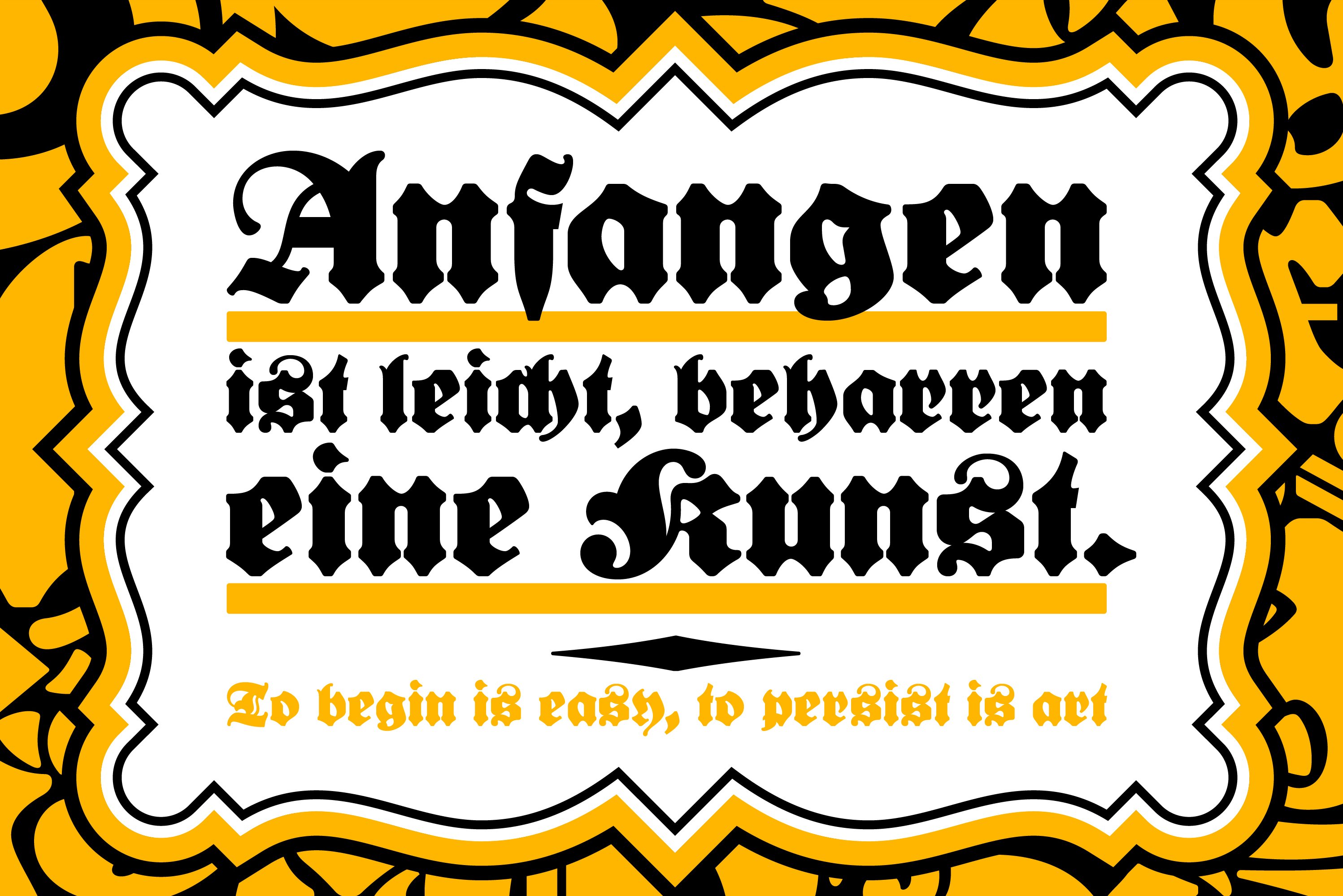
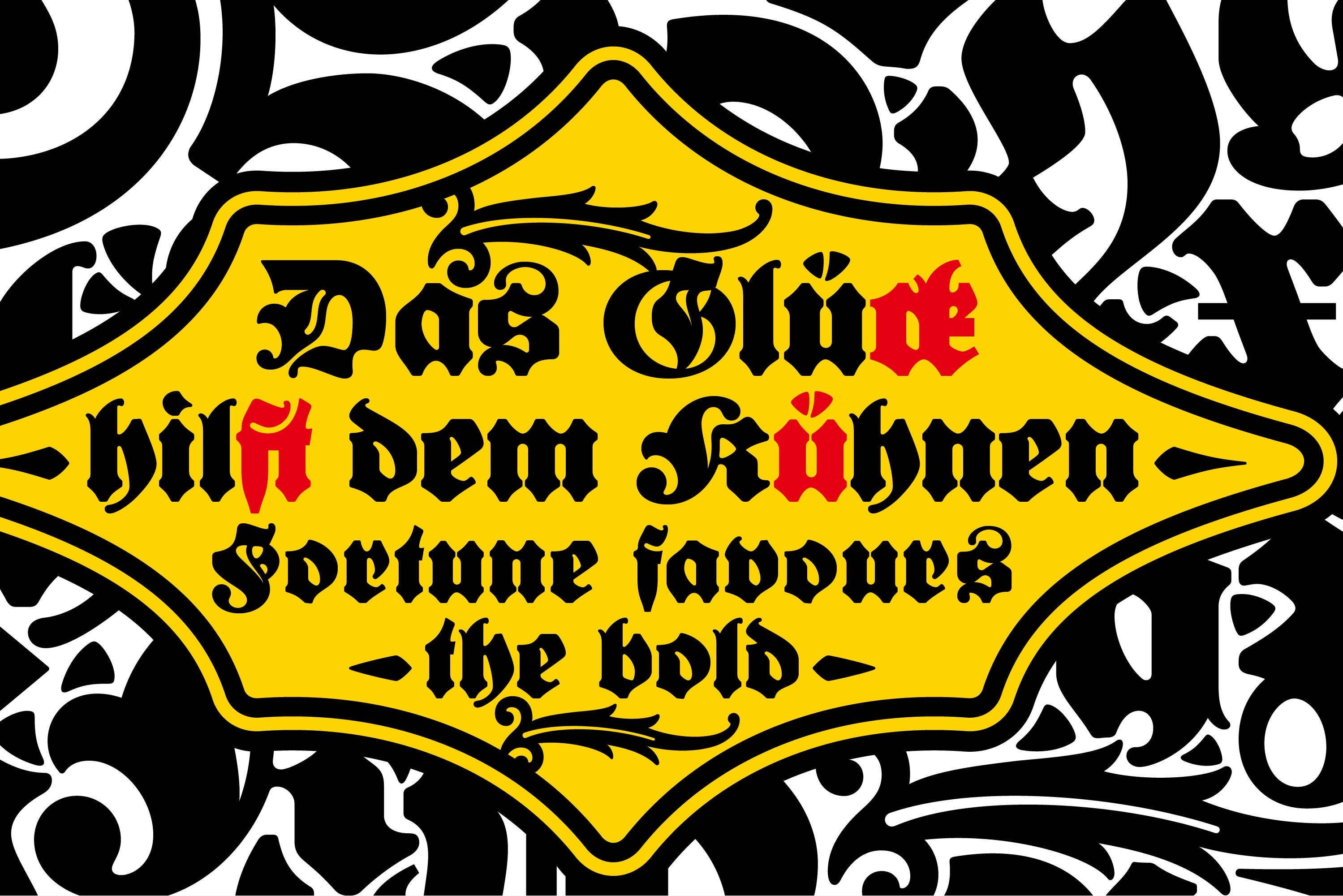
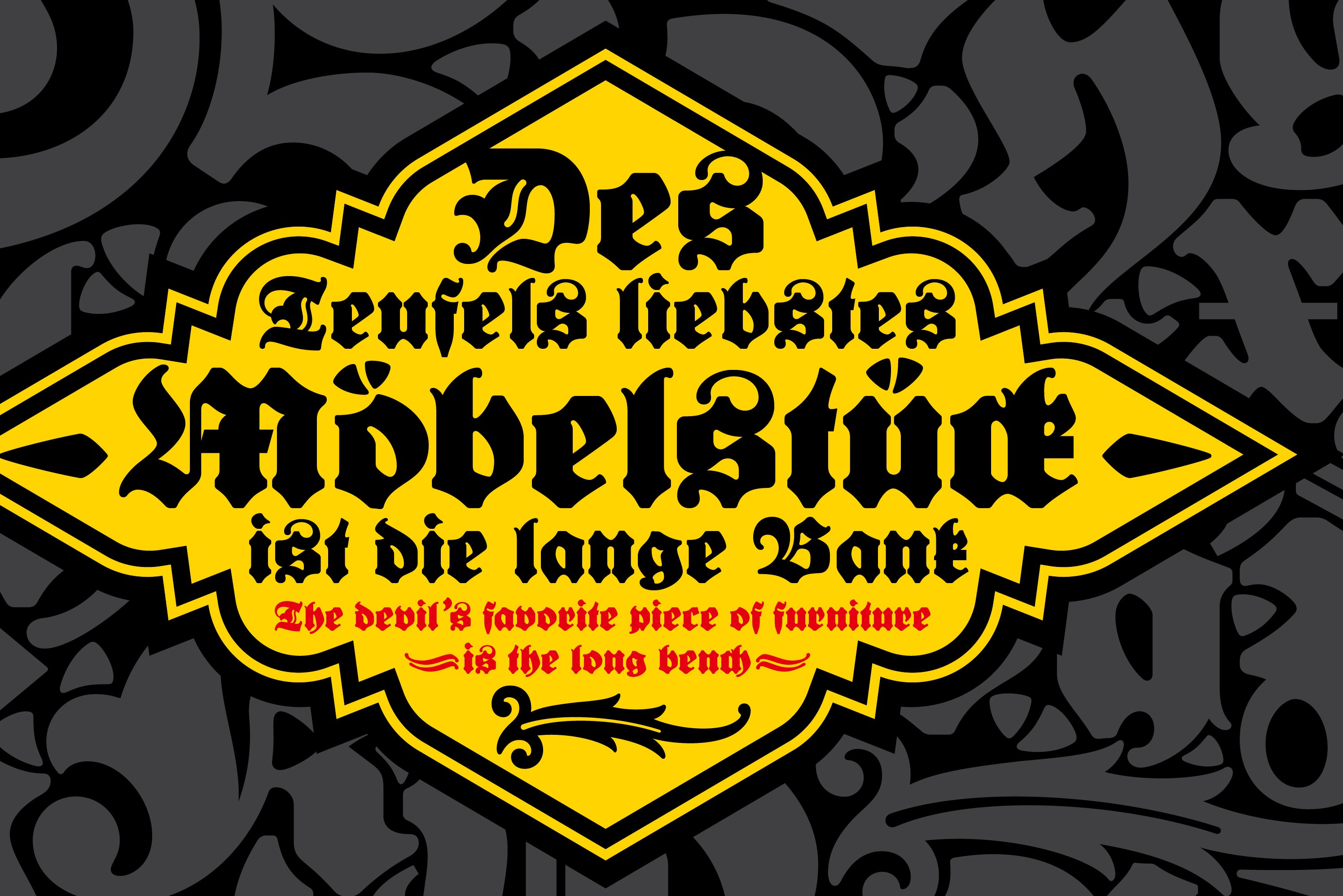
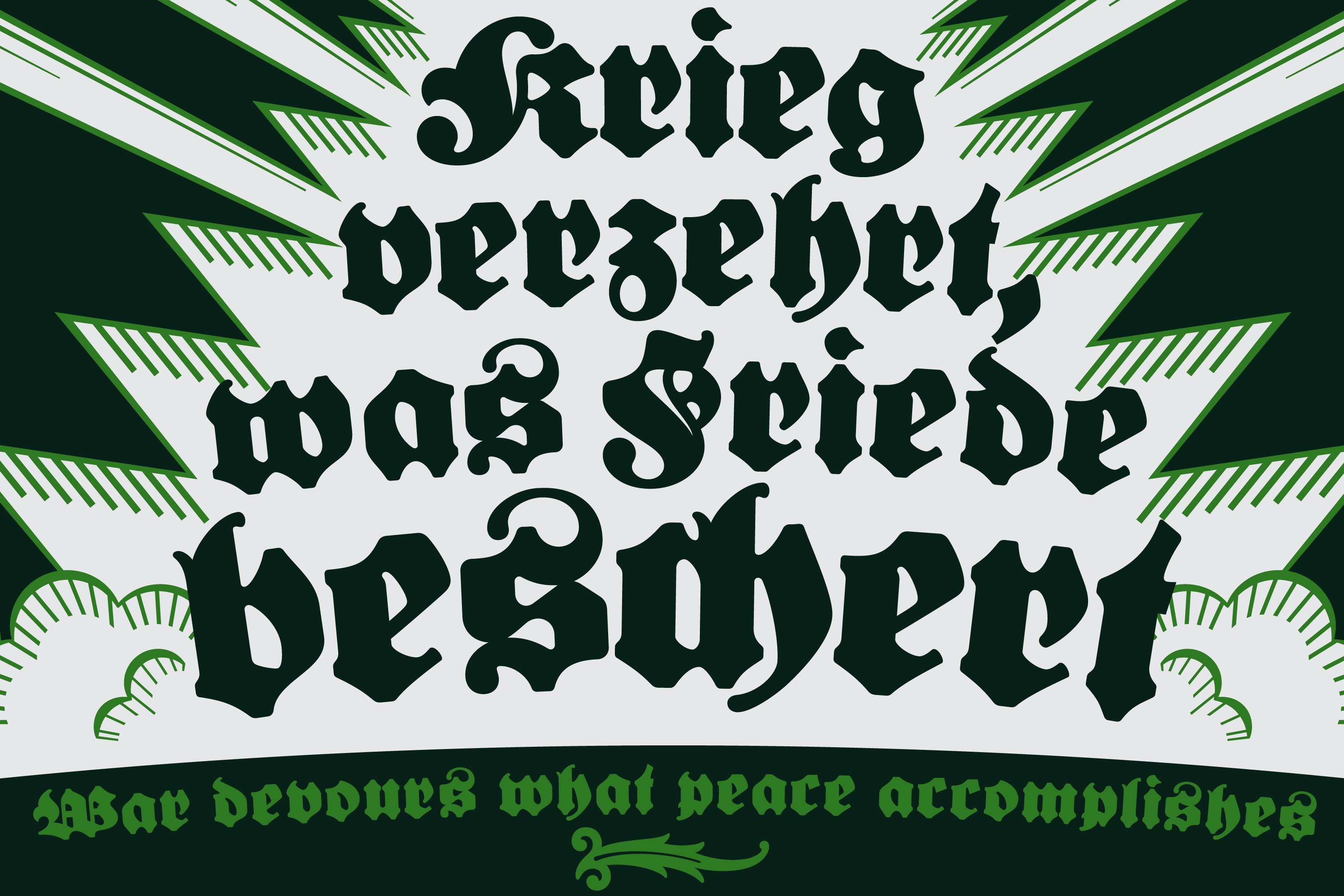
This unique typeface comes to life after almost a century after its creation as a revival. Created by a master craftsman and released merely two decades before the demise of the Frakturs, this typeface is both beautiful and bold. And is this boldness that makes it unique and memorable.