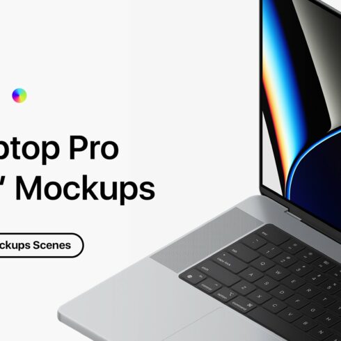
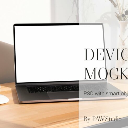
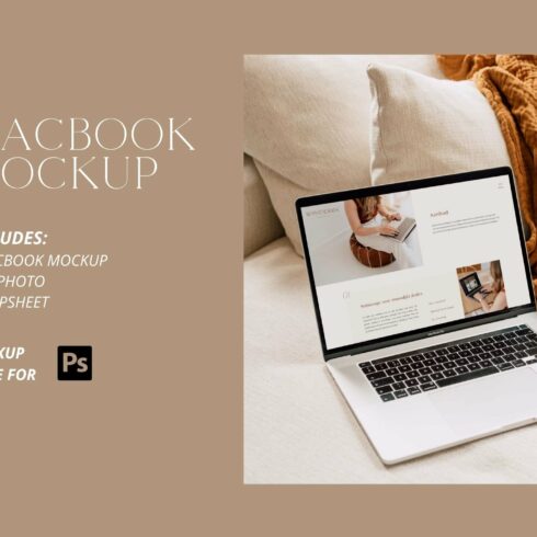
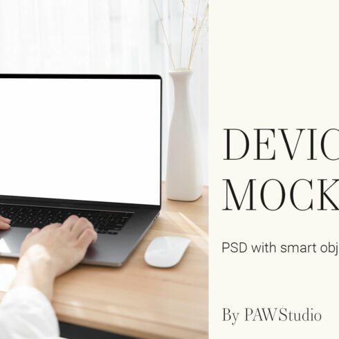
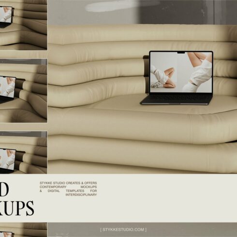
Laptop Pro 16″ – 10 Mockups Scenes
$9
| Created by | RSplaneta |
|---|---|
| File type | PDF, PSD |
| File size | 418.23MB |
| Date of Creation | April 24 2023 |
| Color | black green |
| Rating | 5 (15) |
| Category |
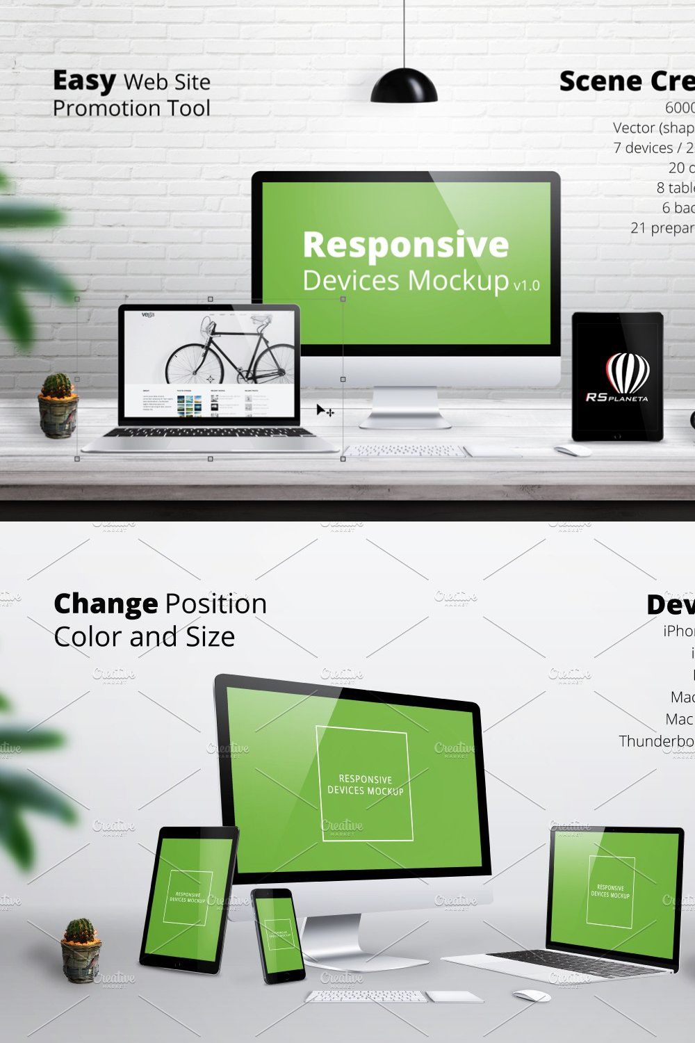
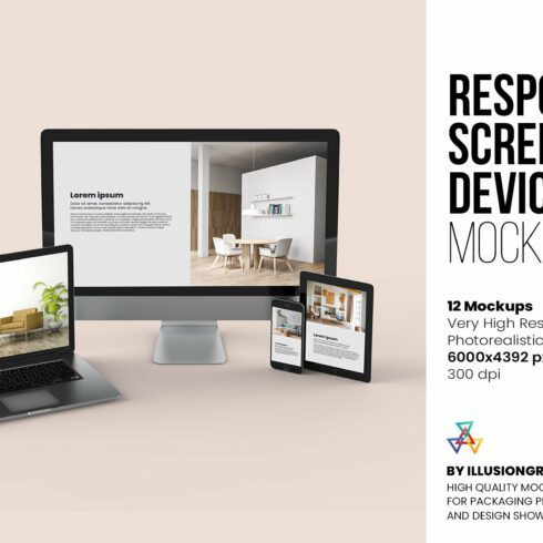
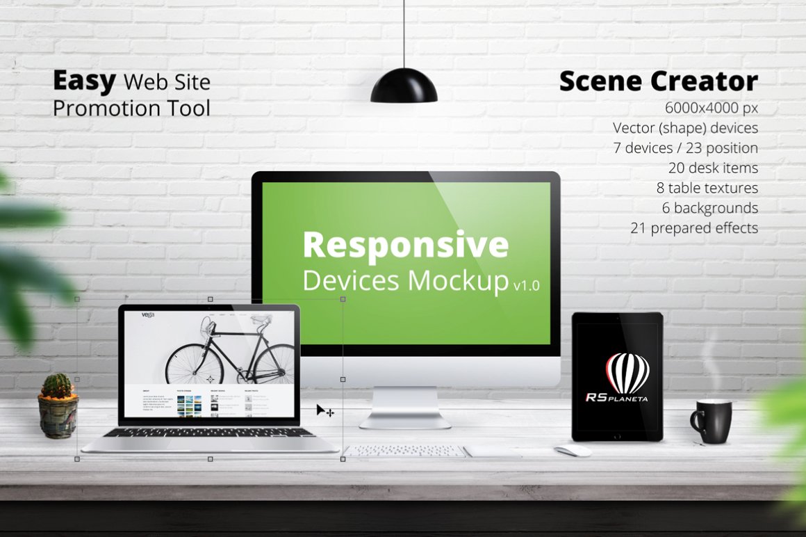
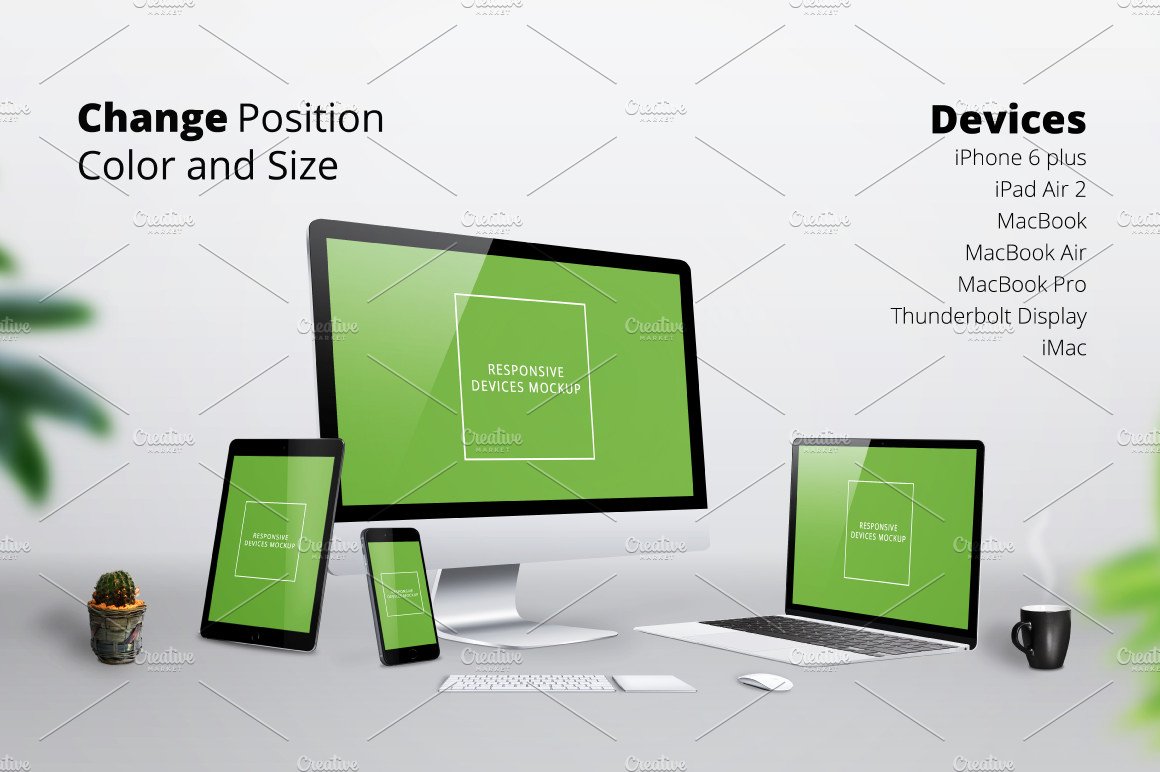
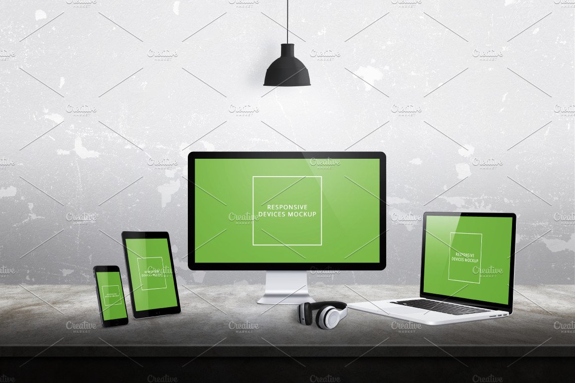
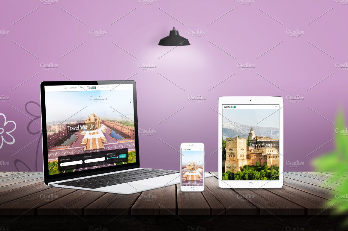
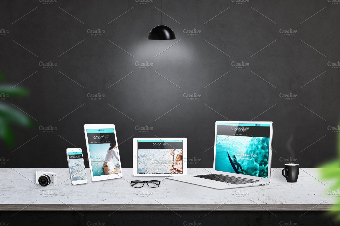
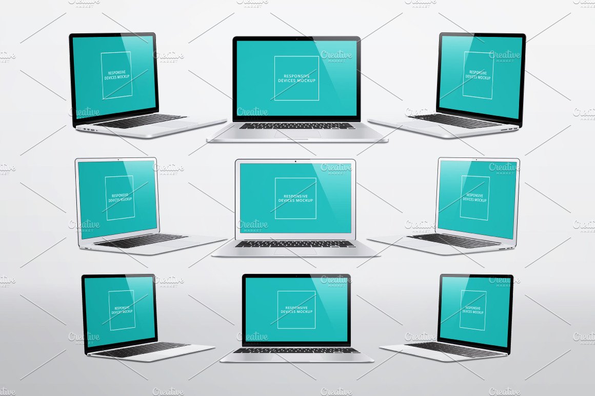
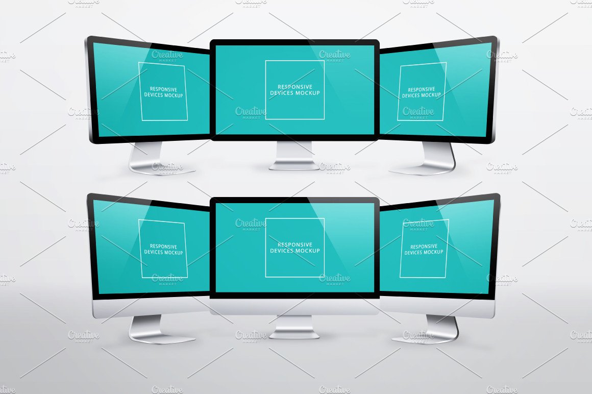
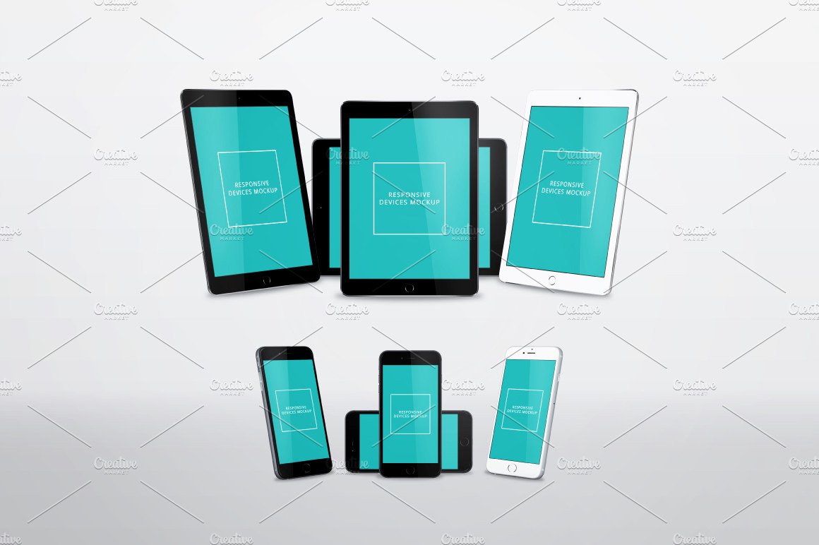
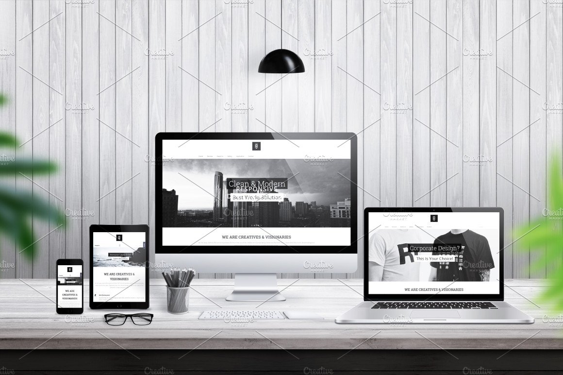
Responsive Devices Mockup PSD Photoshop creative file is created for easier and better responsive web design promotion with modern devices display. You can use this file to create a hero, header images, and for making a brilliant illustration for your web sites.
Video: https://www.youtube.com/watch?v=_N_J-BiusB0
Today, websites adapt to different sizes of devices and if you want to demonstrate this to your clients, use this creation. Easily sort the devices in the scene and using Photoshop smart objects (see readme) add your design on screens with just a few clicks.
File contains 7 different vectors (Photoshop shape) devices with 23 position: Apple iPhone 6 Plus, iPad Air 2, MacBook, MacBook Air, MacBook Pro, Thunderbolt Display, iMac. All devices have a central, left and right curved position while the smart phone and tablet have a horizontal position. You can increase size of devices, without losing sharpness.
You can create desk scene with 20 desk items: keyboard, mouse, speakers, camera, headphones, glasses, pens, plant, coffee, lamps, book… Easily move the items around the scene and make it more beautiful.
This file contains 8 diferent tables, and 6 background wall textures. You can also use 5 one color backgrounds.
There are 21 prepared effects, vignette, ambient light, gradient, noise waiting to help you make a better scene ambient. High resolution of this file allows you to print images on large format such as posters and billboards.
What you can do
Increase size of devices
Move devices and items on scene
Change color of some devices
Put your background and turn off table and wall texture
Responsive Devices Mockup Features
Size 6000×4000 px, 300dpi
RGB color
Vector (shape) devices
7 devices
23 position
20 desk items
8 table textures
6 backgrounds
21 prepared effect
Full layered