200+ Pastel Background Images, Pastel Vectors, Photos and PSD files 2021 : Hidden Benefits and How To Implement
Pastel colors are one of the top 2021 trends that will carry on in 2021. We’ve seen the washed-out pastel palette successfully used for websites, corporate identity, fashion industry, interior design and social media. If you create a website this year, it’s quite smart to use pastel backgrounds for it. In today’s article, I’ll cover what effects pastel backgrounds have on those visiting your website and how you can make every background image pastel in Photoshop.
What Determines A Color As Pastel?
A pastel color is a color of low to medium saturation. Any pastel color is a subdued shade, which lacks chromatic content. Think of pastel colors as of hues with enough white added to them to look soft and pale, yet still retaining a certain degree of its main color.
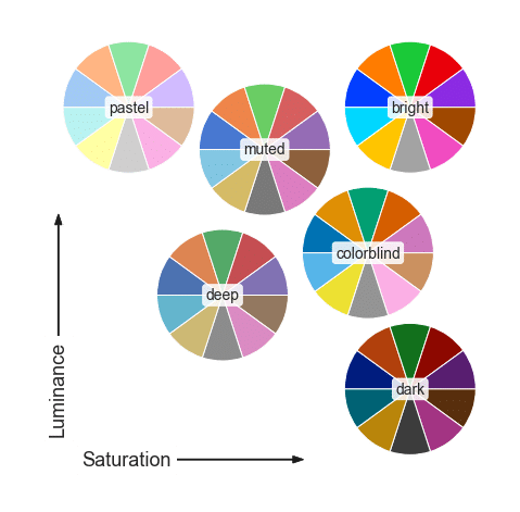
All the pastel shades can be characterized as soft, eye-pleasing, soothing, milky, washed out, etc. The most popular pastel hues are currently millennial pink, milky mint, fresh azure, whimsical yellow, etc. However, there are hundreds of pastel shades that you can create. Take every hue that you can think of, desaturate it and you’ll get a pastel version of this color.
How Pastel Colors Influence Your Website
Pastel colors are not just a modern fad of web design. They are popular for a number of effects they have on the viewers. Check out the list of these effects below. It will help you determine whether you need pastel colors Photoshop and pastel backgrounds on your website.
- Among all the palettes used for web design, pastels are, perhaps, the most elegant and clean ones. These colors easily fall in line with the minimalist and clean design trends. At the same time, they don’t deprive your website of color identity completely. They just make the colors more eye-friendly and affecting the user implicitly.
- Pastel colors influence website users in a calming and welcoming manner. These hues look light and fun, encouraging users to relax and enjoy your website.
- Pastel colors should be your priority if you create a feminine website. Pastels work great for fashion and beauty websites, as well as for feminine lifestyle blogs.
- However, the feminine look of pastels is not mandatory. Opting for colder shades and neutral colors, you can turn pastels into an ideal coloring for a gender-neutral minimal business or corporate website.
- If you combine pastel colors with one bright color, this creates good contrast and an interface that is visually appealing. In this case, make sure that you create contrast the right way, driving attention to conversion points and best content.
- Pastel colors can be applied to foster a vintage feel on your website. For a stronger effect, combine pastel backgrounds with retro pastel photography and watercolor graphics.
- Finally, pastel colors work great with any flat and material design elements, making minimal designs more impressive and visually pleasing.
Pastel colors definitely provide for a more pleasant and modern experience of users on your website. And the simplest way to incorporate pastel colors Photoshop to your website is by using pastel backgrounds. Let me now tell you about them.
Where and How To Use Pastel Backgrounds
Pastel colors are a good match for every modern and minimalist website. You can choose a pastel shade or color combination that matches your brand, without straining the users’ eyes with saturated shades.
There are several places where you can implement pastel colors on your website: backgrounds (textures, patterns and pastel photography), logos, icons, fonts, etc. It doesn’t really make a big difference where you’ve applied pastel colors. Most importantly, you should achieve the effect of your website looking elegant, vibrant, clean and polished.
You can use pastel colors for website backgrounds or background sections. In this case, pastel tones will easily grab attention without being harsh on the users’ eyes. Pastel backgrounds feel transparent, lightweight, comforting and engaging. At the same time, they give a sense of vibrancy to your website layouts and create a good contrast with the more saturated colors used for text and other content.
You can use pastel backgrounds for all pages of your website. It can be a texture, pattern or pastel gradient Photoshop. With such a minimal background it will be easy to keep your user focused on website content.
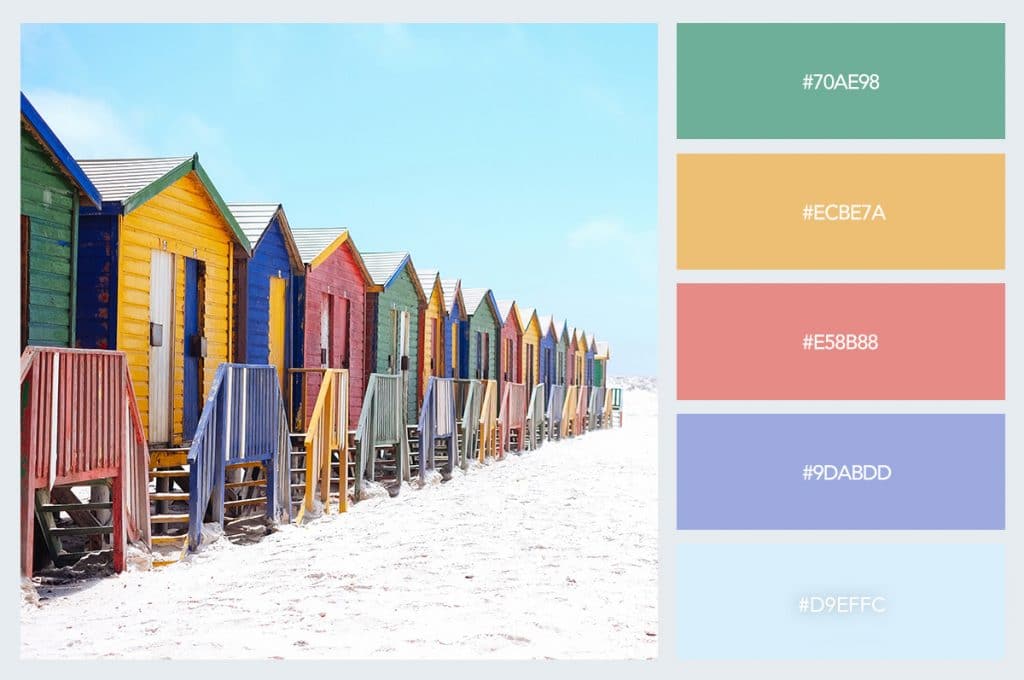
Moreover, pastel photography, colors, graphics work particularly well in the website’s header. You can choose a pastel hero image and background to create a unique and engaging above the fold section, which looks modern and engaging. See an example below:
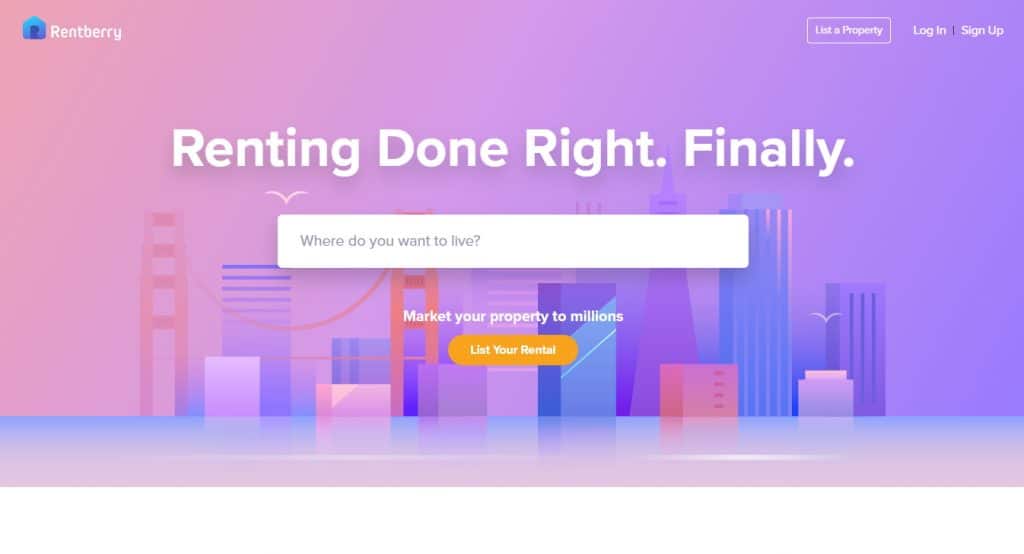
Source: Rentberry
Rentberry is an apartment rental service, the website of which looks usable and modern thanks to pastel gradient Photoshop, material imagery, bold fonts and usable forms and appealing CTAs. A pastel background, in this case, creates a vibrant and refreshing atmosphere, without distracting the users’ from the search form and ‘List Your Rental’ CTA button.
How to Make Pastel Background in Photoshop
If you want to use a pastel photography background for your website, you can easily create it using color overlays Photoshop. Below, I’ll show you how to add a color overlay in Photoshop and create an awesome pastel background for your website.
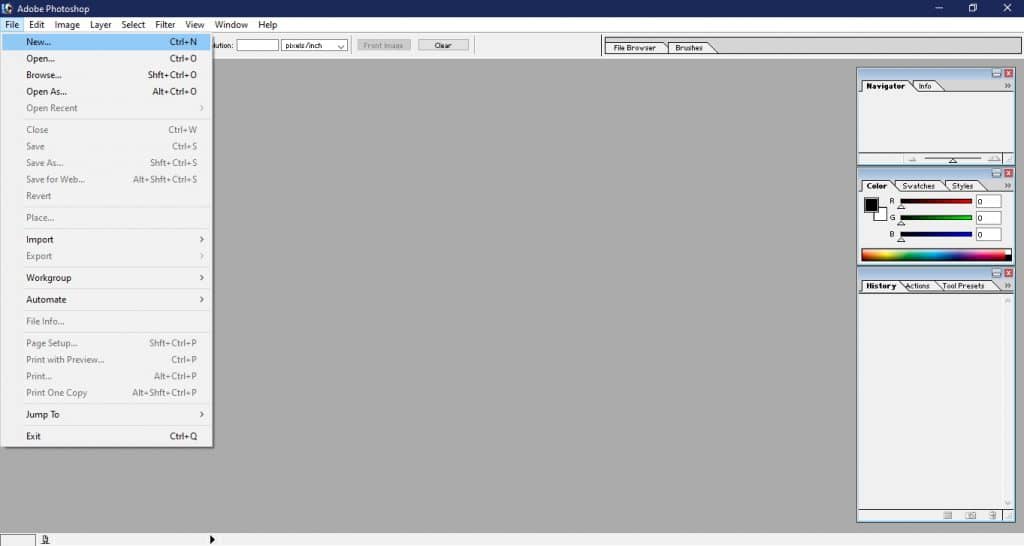
1. Double click on your Photoshop icon to launch the program. Click on the “File” menu situated on the top left-hand corner of the menu bar and select the “Open” (“Control + O” short-cut key) option.
2. Select one of the files available on your PC. Keep in mind that applying a Photoshop color filter will work best for images full of natural light and exposure. Pastel Photoshop color filters work for all images, but they work best for airy and breathing images.

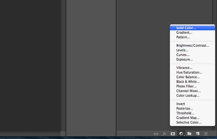
3. Go to the bottom where it says “Layers” and click on the “Solid Color” adjustment layer. Using this tool you can create color overlays Photoshop. Create an overlay.
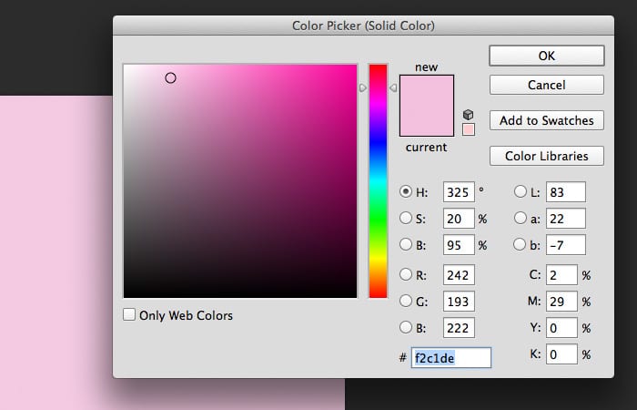
4. Now, you’ll see the Color Picker tool inside the pastel photo editor. You’ve got to pick a nice pastel shade for the overlay. The shades that you select should be towards the left (lighter spectrum) of the Color Picker. I’ll use pastel rose pink hex code #f2c1de. Once you have found a color you are pleased with click on the “OK” button to close the color picker menu and return to the main Photoshop screen.
5. Now, you’ve got to change the Layer Blend Mode to Hue. As a result, the new layer will blend with other layers to create a pastel effect Photoshop. Then, take the opacity down to 20%. This will ensure the optimal amount of the pastel tones.
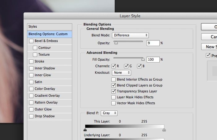
6. You may want to experiment with the Blend Mode and different opacities to achieve the most attractively looking pastel effect Photoshop. Make sure that the pastel overlay blends well with the image. You may also want to experiment with image depth and vibrancy. Here’s the image without and with pastel Photoshop color effects.

7. Click on the “File” menu and select “Save” to save your pastel background if you are happy with it. Simply type in a name for your document in the “File Name” input box and on the “Format” options just underneath the name input box select the “JPEG” option. This will make sure that your pastel background is saved in a suitable format for it to be used as a background image.
Congrats! Now you know how to add a color overlay in Photoshop pastel photo editor. To create pastel effect Photoshop, I used pastel rose pink hex code #f2c1de color overlay. By setting it to be only partially opaque and choosing that right ‘Blend Mode’, I was able to create an eye-friendly pastel image that tunes for a more positive interaction than the initial one.
If you’d like to learn how to make photos look professional in Photoshop CC, check out the 4 Easy Photoshop Techniques to Make Your Pictures Pop article. It’s a good explanation of how to make photos look professional in Photoshop CC using four distinct methods such as image blur, background filtering, neon glow and gaussian blur. Do not hesitate to use these techniques to make your pastel background even more appealing.
Useful Pastel Background Pattern Vectors
If you want your Photoshop overlays and pastel backgrounds look really professional, you can use the inexpensive resources available on the web. Here are the examples of three types of pastel background elements that you can find on the web:
60 Pastel Sky Overlays
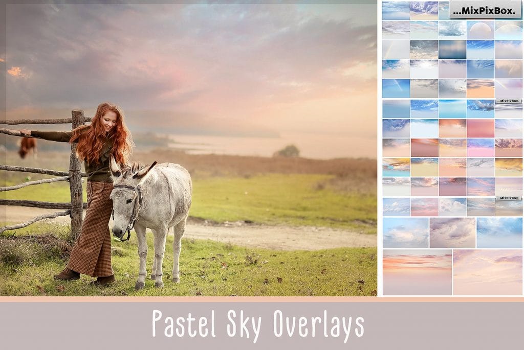
Of course, you can create pastel pics with a single-color overlay as I described above. However, your pastel pics will look more awesome if you use the professional multi-color overlays for them. This digital product includes 60 amazing overlays that turn your photos into pastel and atmospheric. The overlays will brighten your pictures and add such effects as color gradients, neon radiance and chiaroscuro, etc.
Soft Lights Backgrounds
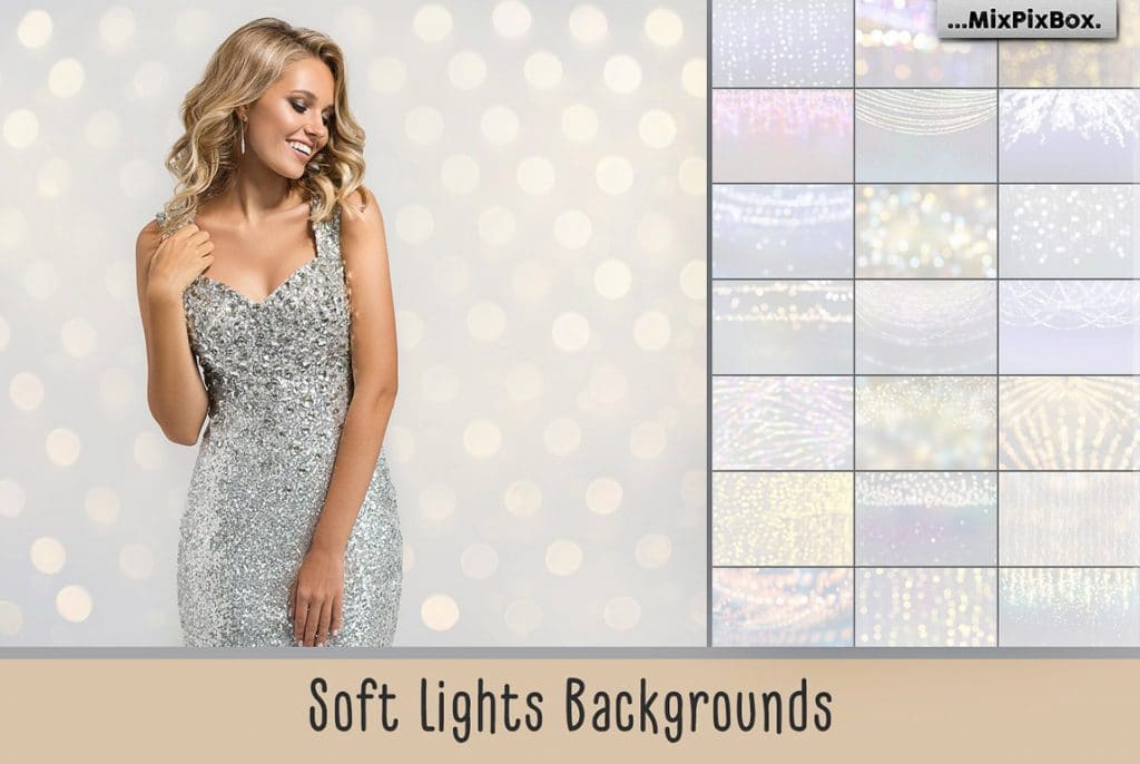
If you don’t want to spend your time on adding pastel overlays, you can get yourself a pack of ready-made pastel backgrounds. Soft Lights Backgrounds offer you 33 JPG textures with cozy lighting. These backgrounds engage with the interplay of pastel colors and specks of light for the ideal homely or festive atmosphere of your website.
Pastel Fine Art Textures
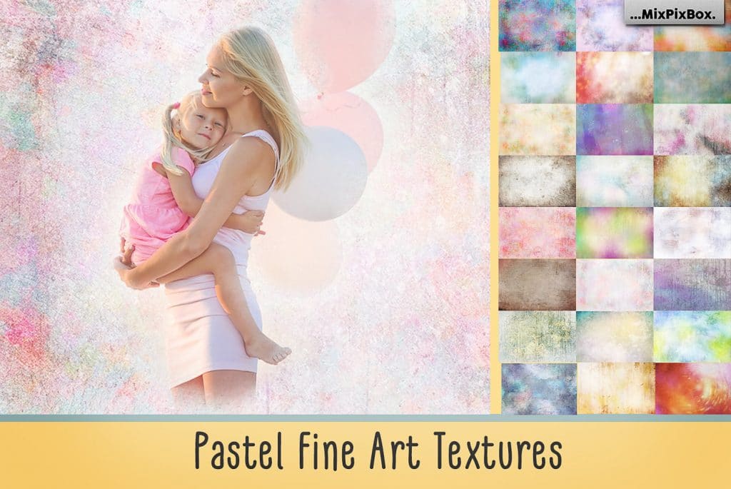
The third way to make your backgrounds muted and attractive is by using the professional overlay textures. Texture overlays will help you make your background imagery more ambient and washed-out so that it doesn’t distract your users from the main website content. This set of pastel texture overlays offers you over 50 soft and delicate textures inspired by the best of the world’s art.
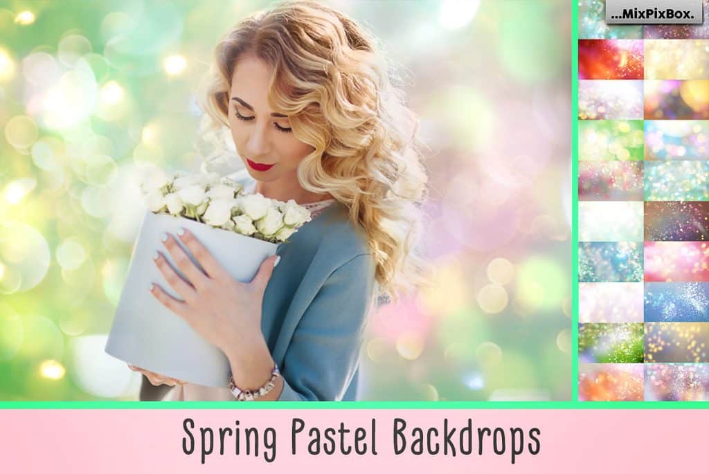
Spring Backdrops Photo Editing Tool
Holographic Pastel & Neon Spheres

10 Free Pastel Background Images: Download HD Backgrounds

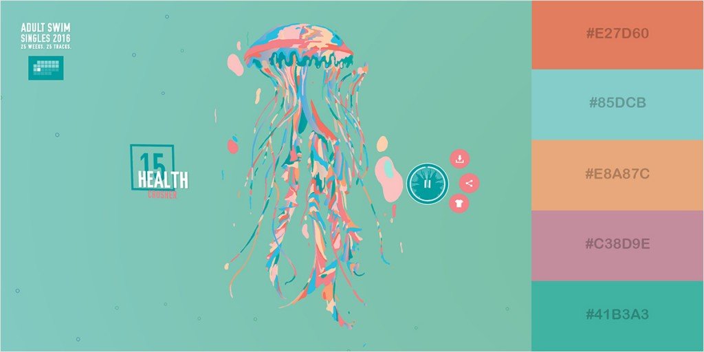
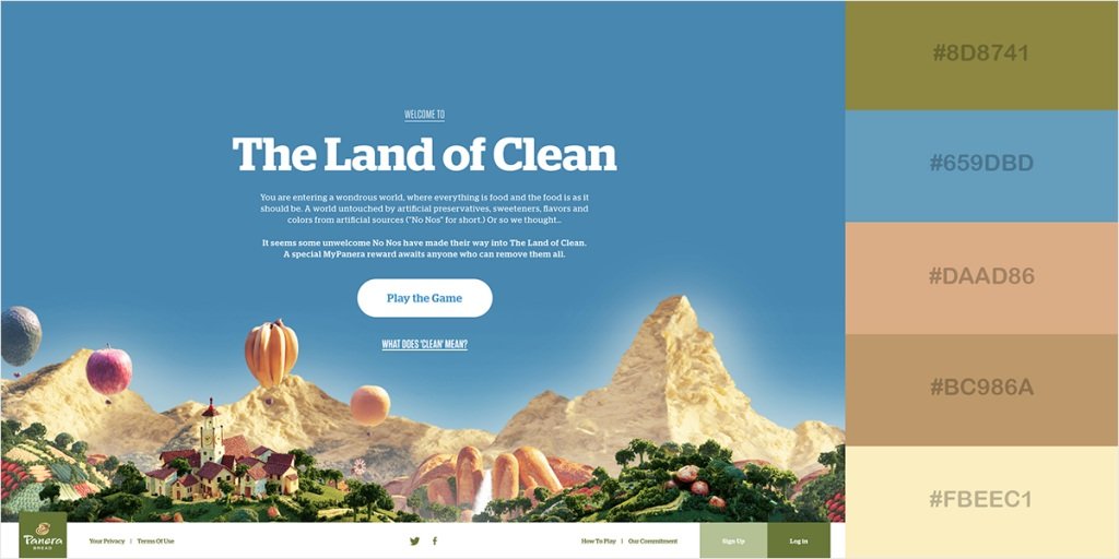
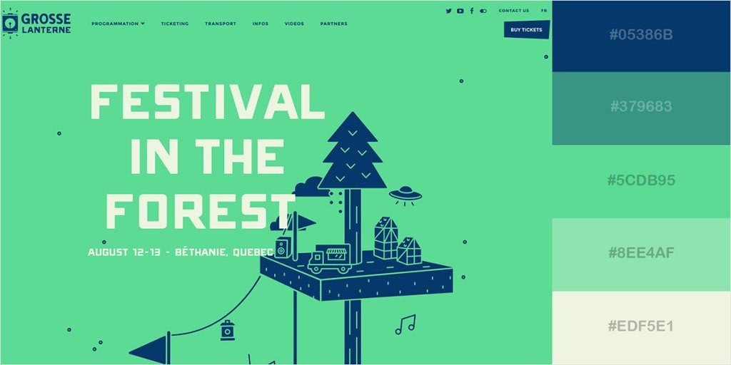
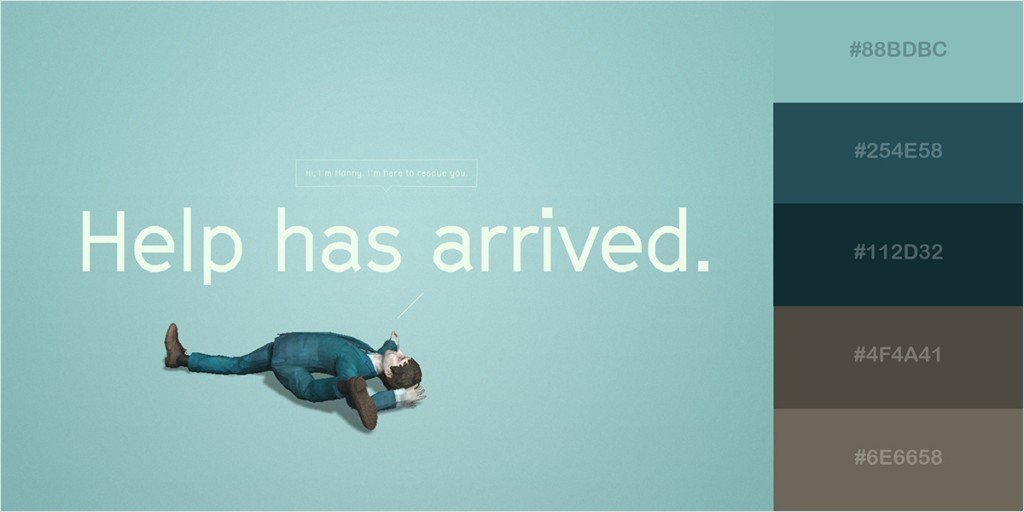
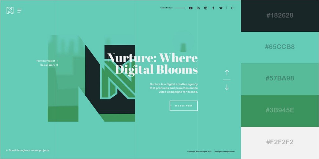
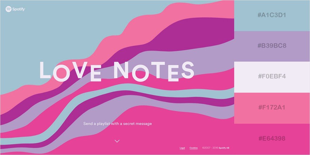
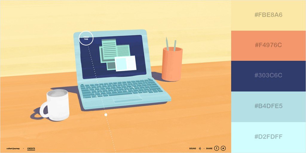
Best Websites Using Pastel Backgrounds
To get you inspired to use a pastel background for our website, let me show you the best websites that are already doing so and rocking. Enjoy these eye-candy examples of pastel backgrounds used to great advantage.
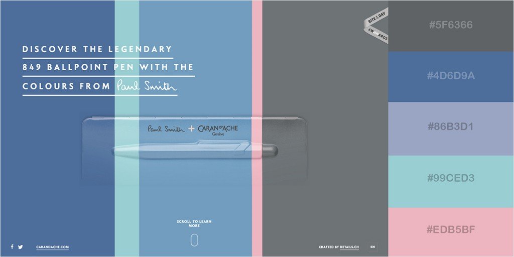
Creative Hack Award 2019 Website

This pastel website, created by Wired Japan web design studio, features a cool pastel gradient Photoshop as a background. The rotating pastel shape atop of it, hand-crafted typography and diamond icons make this pastel website even more attractive.
Autonomy
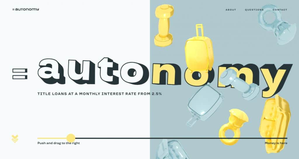
Autonomy is a pastel blue-and-yellow website, the interactive design of which will make your jaw drop. Using the animated light azure and pastel yellow objects, the website immediately engages its guests and makes them interested in how Autonomy microloans work.
Daniella & Gemma
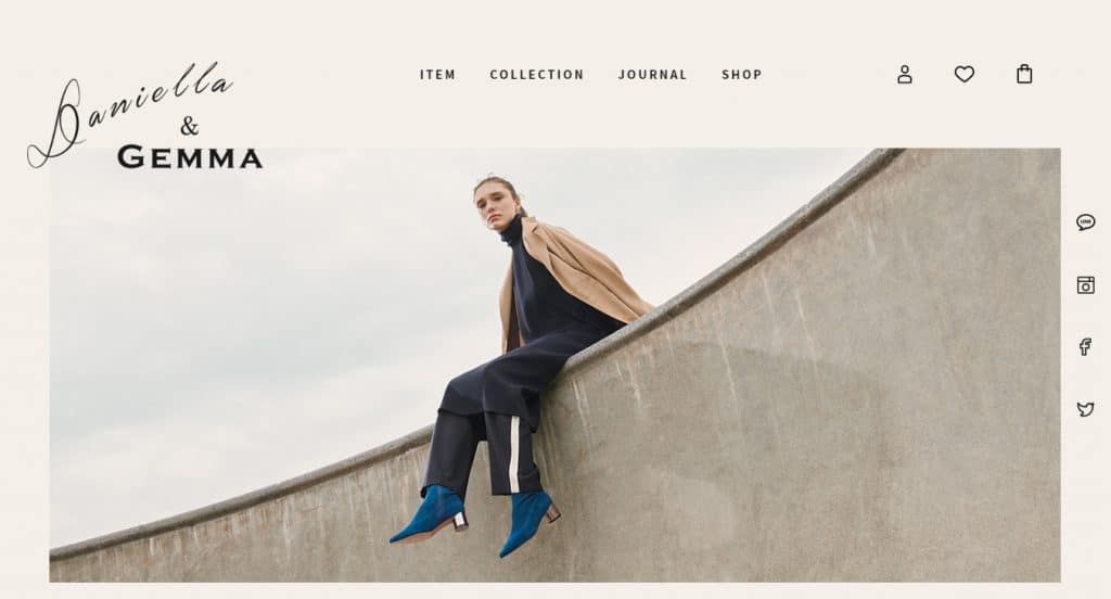
Daniella & Gemma website is a great example of how the softest pastels can be used to shade off the elegance and uniqueness of the products you sell.
Affirm
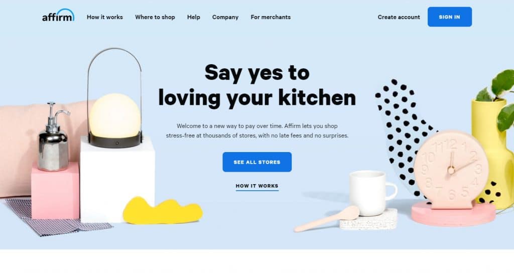
Affirm website looks extremely friendly and cute, with a welcoming pastel slider. The slider demonstrates cute pastel goods you can buy featured over the contrasting pastel backgrounds. With such a sweet introduction, it’s hard not to turn into an Affirm shopper.
Your Shades Of Paradise
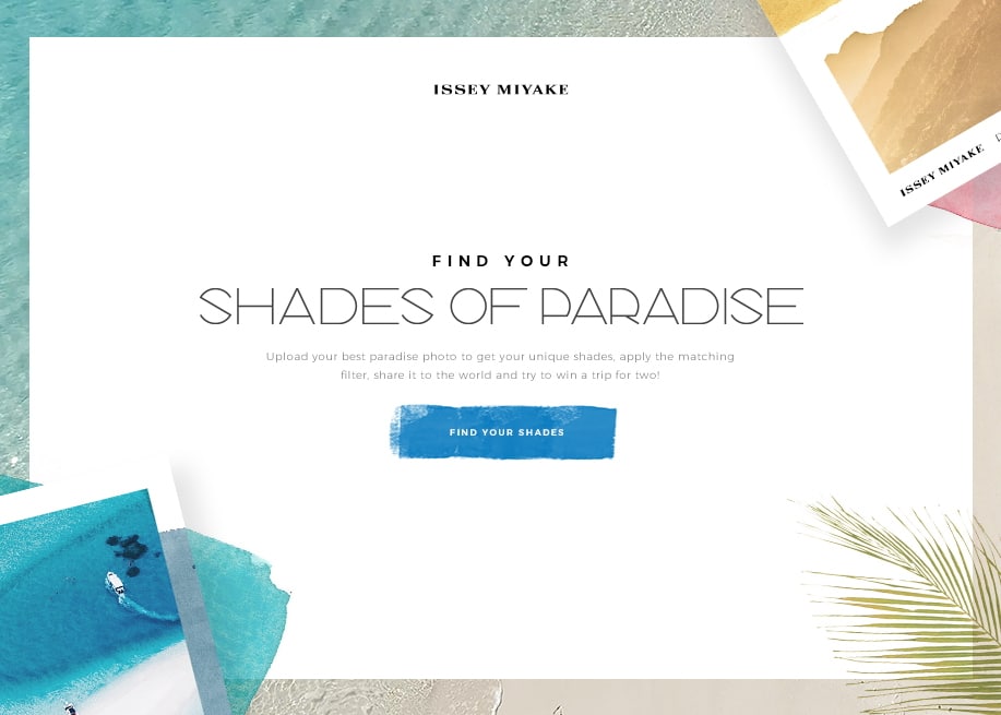
This website is full of pastel backgrounds with water textures that perfectly frame the main website content. Thanks to well-though pastel tones and backgrounds, Shades of Parasize website finetunes its users for a positive interaction.
How to combine pastel colors?
If your choice has already been made for some pastel colors, now you need to learn how to combine them better. The main colors in the spectrum are blue, yellow and red. The colors obtained by mixing the two main ones are green, orange and purple.
A good effect will be a web page which is designed in combination black with pastel grey, light pink, and especially pastel yellow. It is also possible to reduce the contrast of black. And in this case the combination will be amazing.
When developing a web design you need to perform the headings and subtitles in the same color palette as the whole page, combining them with other elements such as buttons. If you ignore this rule, the header or content under it can simply “get lost” on the rest of the background. For example, a green title will not be strongly visible on a eye-catching page, or, vice versa, if the page is made in a smooth pastel range, a bright green headline will draw attention intended for other moments.
It is better to design and develop a web site, focusing on a specific target audience. But if it is not yet well-defined, you can apply a universal range of design. Combine black, white, gray, blue, purple or green in different versions. Also don’t be afraid to experiment with the combination of bright and pastel colors. This will have a 100 percent effect on your audience. Given the condition that the bright colors will be exactly certain elements of the site (footers, buttons, menus, and so forth).
Color scheme for the site: how to choose?
The essence is clear – the colors combination on the site must match the target audience. Consequently, before you finally choose a color scheme, you need to study in detail your potential buyer. But what color scheme to choose for each target audience?
If it speaks in general about color solutions, it is recommended to rely on the following recommendations:
- For sites on children’s topics the best colors for the site are bright, contrasting and positive;
- For resources where the target audience is girls and women, choose delicate, light, pastel colors;
- For sites where the target audience is men, the most suitable are dark or neutral.
Of course, every nuance has to be carefully considered. If the site has a target audience of both men and women (for example, the company sells consumer goods), in such cases, you should rely on neutrality. The corporate identity of the company is also of great importance. If it already exists and is strengthened in the market (e.g., a logo or brand that is well-known to everyone), then the prevailing colors on the site should be “branded”. But still, the rules of contrast and motivation to act by using color should not be forgotten.
The best combination of bright and pastel colors
Colorful and balanced. Warm and cold shades are combined in this eye-catching, but not suppressing palette. This color scheme is good for youth and modern websites. It looks rich, but not overloaded.
Natural and earthly colors. This pleasant color combination is ideal for projects related to nature, and can be useful for projects that emphasize environmental consciousness.
Fresh and concise colors. This combination, which reminds you of the ocean or any environment connected with water, is perfect for projects designed to convey calm and reliability. They calm you down and put yourselves at ease as well.
Stylish and sophisticated. This elegant color scheme combines dark muted tones to create a pure and refined look. Shades of grey and blue are ideal for more conservative designs.
Shades of red-brown. These colors create a unique palette that attracts with its warmth and depth. This scheme is ideal for elegant things that reflect energy and wealth.
Bright and attractive colors. This wonderful combination of pink, green-yellow, lavender and pastel brown is ideal for a design that seeks to create a bright, attractive but gentle appearance at the same time.
Warm shades and minimalism. The provided shades combine well in a minimalist but warm and concise design. The flash of an energetic color in this design makes it elegant and at the same time attractive.
Pure and vibrant. The shades of pale-blue, blue and violet on this site are particularly pleasing to the eye and evoke energy and peace at the same time. This combination is suitable for any design that tends to evoke positive emotions.
Traditional business style. If you are looking for a faded design, this color scheme combines shades that convey professionalism and reliability. This discreet palette uses shades of colors that are good for corporate style.
Modern and relevant colors. This combination conveys the concept of modernity and is an excellent solution to projects combining technology, modernity and naturalness.
Bright pink and pastel. The result of combining these colors is a surprisingly fresh and care-free color scheme, which creates a feeling of lightness and freshness.
Fun and energetic. Shades of blue and orange make this website design especially attractive and energetic, and it can be applied to projects with an optimistic and inspiring message.
Classic and traditional. This combination of pink, blue and grey colors is very refined and will perfectly emphasize the seriousness and relevance of the project. This scheme can be used in any design that requires both seriousness and a little excitement.
The popular services for the selection of the site’s color palette
Choose a color palette, including a suitable combination of pastel colors is not an easy task. All this is explained by the fact that despite its simplicity, a combination of pastel shades is not always possible.
Coolors
Online, you can select or generate one or more combinations of not only pastel tones, but also bright colors. The service allows you to combine colors by complementing each other and contrasting. Just choose one or more colors that you want to see in the design of your site, and the service automatically selects the shades suitable for your choice, with their codes.
Color Palettes
The service has absorbed all possible color combinations and demonstrates their examples. You can sort the examples by cold and pastel tones, select them by certain colors as well as by contrast.
Paletton
Easy operation allows you to quickly find the best color solution for yourself. Just choose the main color and move around in the color scheme to choose additional colors. This site helps you quickly create the right pastel color. And it will definitely be unique.
What is the purpose of pastel colors?
Up to 85% of online customers make their choice based on color! Now the prevailing number of customers choose flat web designs with bright accents, in black and white tones or with a predominance of gray. At the same time for some reason forgetting about the benefits of design in pastel colors. Professional marketers know that color is an effective tool to increase the conversion of the site, which helps to manage the attention of the visitor and encourage him to a certain behavior (buying, booking a table or registering on the site).
Pastel colors in web design help the visitor to feel the special atmosphere of the brand, which is especially important for jewelry brands, sites of coffee shops, restaurants, coffee shops or interior studios – especially if the design of their premises uses pastel colors. Such shades not only create a relaxing atmosphere, but also combine perfectly with each other, and allow to easily add bright accents!
Rare use of pastels in the design of modern landings and image sites due to the fact that such design is not so easy to implement at a high level, so that the site turned out not faded, but warm, cozy and attractive, and most importantly – catchy. Often, for the desired effect, pastel tones need to be added with bright accents.
Wrapping Up
Using pastel backgrounds is a great way to make your website more minimal and stylish, still preserving the sensual appeal to the audience by means of color. Pastel backgrounds are not a fad of modern web design. They strongly enhance the visual aesthetics of every modern website and help you craft a unique and elegant web presence.
Have you ever created a website using pastel backgrounds or elements? Share your experience and questions in the comments below.
Stay tuned for more!
Pastel Background Images FAQ
Is it possible to get pastel-colored elements on a discount on Master Bundles?
Yes, of course, it’s possible. Master Bundles often offers discounts on different kinds of products. Subscribe to the newsletter to know first about the discounts.
What should I know using pastel elements on my website?
What’s important is not overusing them. Don’t put too much pastel elements on a single post or page.
Is it better to use premium pastel items instead of free ones?
If you want to have good and quality content, use premium elements, and if you’re on a shoestring budget, use free items but download them from trusted sources.
How many colors do I have to choose for the website design?
A website with a wide range of colors is perceived as hard and even repulsive: when the user gets to it, he/she will want to click on a cross in this tab as soon as possible. If there are few colors – the site may look monotonous, and the user’s attention will be dispersed. Optimal work palette for the designer is 3-4 colors, among which:
- The main one. The basic color in the design, which is highlighted the main content on the pages.
- Additional. Color to highlight secondary information, which is combined with the main one, and complements it.
- Background. A smooth shade, which does not lose the main and additional colors.
- Accentuating. The contrasting to the main color, and draws the visitor’s attention to key elements of the site.
Where can I find pastel backgrounds and textures?
Firstly, use MasterBundles. After all, it is much better to buy a extraordinary bundle with a lot of different and creative elements than to be satisfied with ordinary ones.
Secondly, if you want to find only one background or texture, then you can safely use Freepik, Vecteezy, ShutterStock, Pinterest.
Is it true that pastel colors are more female?
That’s partly true. Of course, different shades of soft pink, yellow, and cream are more suitable for sites with a female audience. But that doesn’t mean that pastel colors can’t be used on business websites, different men’s magazines, and so forth. If you want to add pastel colors to a site with a male audience, then use pastel gray, brown, and blue tones.
Please take a moment to pin this post to Pinterest
- Pastel Color Palette
What are your concerns?
Thanks for your response!
The theme of color matching, choosing a palette for the site is very interesting. Especially for those who are good at different color schemes and combinations. Pastel color is a soft shade obtained by diluting the pure tone with white. The palette of pastel shades varies from semi-transparent to sufficiently saturated. Articles and books, about the use of pastel colors in web design and many other areas became inspiration for writing this post.
- How to Use Pastel Colors in Web Design Projects.
(https://designmodo.com/pastel-colors/) - What is pastel color? (https://en.wikipedia.org/wiki/Pastel_(color))
- How Pastels Became A Cultural Obsession.
(https://www.fastcompany.com/3063771/how-pastels-became-a-cultural-obsession) - Harness the power of pastel colors.
(https://99designs.com/blog/trends/power-of-pastel-color/) - Johannes Itten. The Art of Color: The Subjective Experience and Objective Rationale of Color. John Wiley & Sons; 1997.
- Kassia St Clair. The Secret Lives of Color. Penguin Books; 2017.
- Lauren Wager. Color Collective’s Palette Perfect: Color Combinations Inspired by Fashion, Art and Style. Promopress; 2018.