Krupa 2019 UI/UX Design Conference Retrospect
- Who Organized Krupa 2019?
- Krupa 2019 Curiosities
- Krupa 2019 Speakers
- Krupa 2019 Speeches
- Bottom Line
Last weekend was marked by Krupa 2019, the biggest interface design conference in Eastern Europe, curated by the Projector School. What started as a local product design conference back in 2016, has grown into a huge event for UI/UX designers in just three years!
On April 6, 2019, Krupa 2019 hosted about 3000 attendees in the Palace of Sports, Kyiv. 13 local and international speakers shared insights on the latest interface design trends. But not only that! The MasterBundles team is sharing the Krupa 2019 experiences, so read on.
Located in Kyiv, Ukraine, the Projector School is highly recognized within the Ukrainian IT community as well as outside of it. Over the past several years, the Projector School of design and programming not only provided its students with high-quality education materials but also hosted a number of IT events. It won’t be an understatement to say that the Projector-curated Krupa showed what an impressive IT hub Ukraine has become.
Krupa 2019 presented its attendees with a bunch of curiosities that need a separate mention.
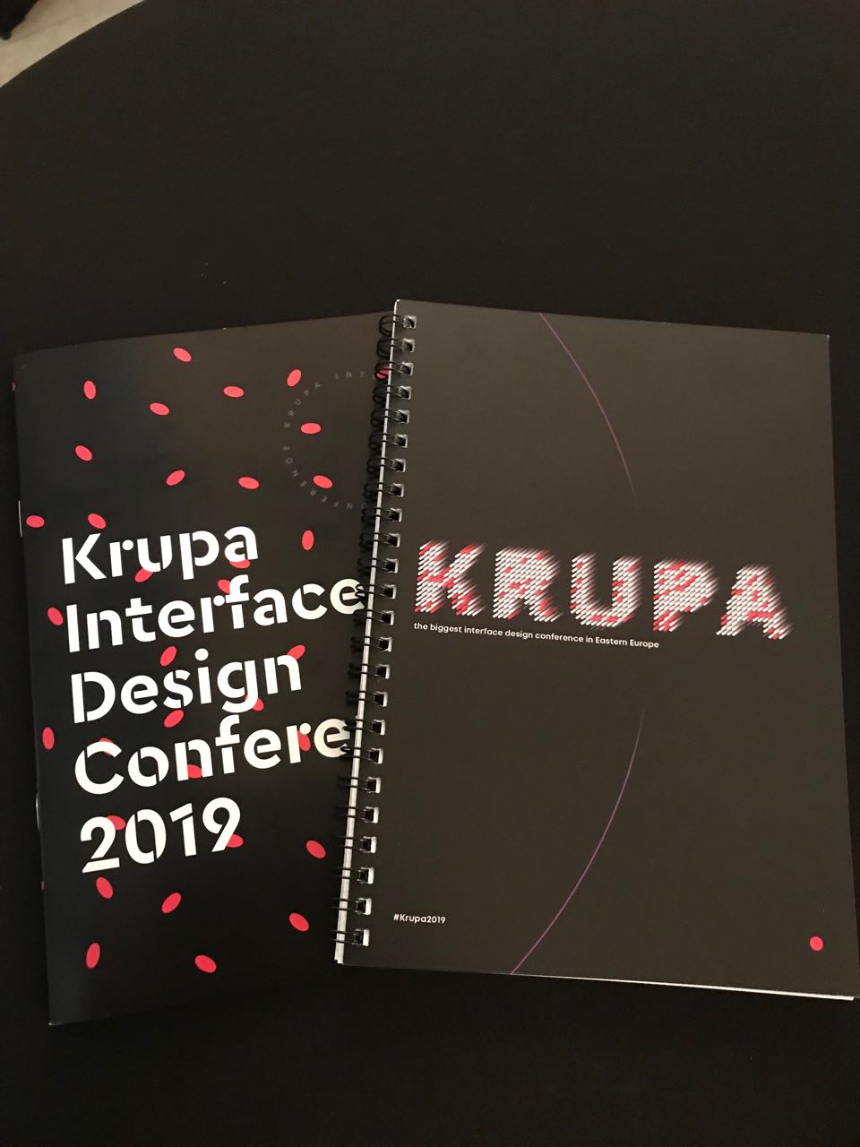
First of all, designer merchandise is really amazing! Branded notebooks, brochures, and eco bags look absolutely adorable.
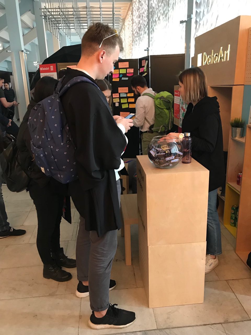
In the lobby, the visitors could talk to representatives of the IT companies that sponsored the event. Everyone felt free to ask questions, engage in networking and even participate in the lottery.
As for networking, it was supported by the Attendify app that followed what was going on during the conference in real time. Attendify placed a photo booth in the lobby, so the visitors could take a kaleidoscopic photo and print it out right away. That was a really cool experience!
WIX placed their panoramic stand where visitors could take pictures and talk to the company representatives.
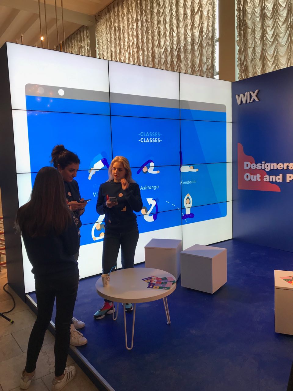
WIX stand
Designers from Carbon Residence created a visual installation using projectors. All in all, there was plenty of things to feast one’s eyes upon.
Oh, did we mention free tea, coffee, and snacks? Oh, and the delicious food served for lunch in the food court?
This year, Krupa presented a truly mind-blowing speaker line-up. Speakers from 6 countries (Ukraine, the USA, Switzerland, Germany, Japan, and Israel) took part in Krupa. The speeches were held in two parallel streams and finalized with the lecture by Don Norman on 21st century design. Take a look at the list of Krupa 2019 speakers:
- Don Norman (Nielsen Norman Group)
- Vitaly Friedman (Smashing Magazine)
- Jiří Tvrdek (Kiwi.com)
- Alexander Ivanov (Lun.ua)
- Albina Cholak (Octopus Labs)
- Anna Kuntsman Rozenberg and Lior Pinco (WIX.com)
- Max Shirko (The23.design)
- Takeshi Horiuchi (Age of Learning)
- Dmitry Starkov (CloudMade)
- Sergey Valiukh (Tubik Agency)
- Cole Mercer (ex-product manager at Soundcloud.com)
- Guillermo Torres (AirBnb)
- Visual design is the most important thing today when we talk about products and services. Still, it is a grave misconception to believe that form follows function, as form equals function.
- It’s crucial for a design company to “cultivate the work environment that allows tech designers to grow professionally.” Mastering hard skills is important to become a tech design professional.
- In terms of professional growth, soft skills are sometimes even more important than hard skills.
- “Numbers don’t lie.” At WIX, they believe in self-taught and data-driven professionals whose work is based purely on data and research.
- Web design templates are called “design suggestions” for a reason. The web layouts offered to a client aren’t a final product. At WIX, they’re only suggesting the designs that turn into a final product in collaboration with people.
- In 2019, a tech designer is a trendsetter who’s not afraid of breaking the rules by challenging classical photography and composition.
- Cinema 4d
- VR (glitch effect)
- Website navigation that creates immersive experience but in a flat environment
- Using politics as a source of inspiration
- The culture of rule breaking
- 3.5 billion people in the world use smartphones, with some 35% of them using Apple devices.
- Adults spend about 3.3 hours a day using their mobile phones.
- About 60% of sessions last less than 30 seconds.
- There are not enough designers on the decision-making levels.
- Things don’t last nowadays otherwise it’s bad for business.
- Focus on people
- Solve the underlying problem, not the symptom.
- Treating everything as a system.
- Change for the sake of improvement.
And now, to the most exciting part of the Krupa 2019 review – the speeches retrospect. The MasterBundles team can’t wait to share the valuable insights and thoughts from the top influencers in the realm of modern UX/UI design.
Lior Pinco, Design Director (Wix.com)
Anna Kuntsman Rozenberg, Creative Director (Wix.com)
Speech: “The Tech Designer”
Not only did Lior Pinco and Anna Kuntsman Rosenberg shake the audience with a strongly-worded speech, but also shared their vision of tech designer as a professional. And we must admit, the advice is more timely than ever. Here are the key takeaways from the speech:
WIX: Design Trends For 2019
Lior Pinco and Anna Kuntsman Rosenberg also shared their view of the design trends for 2019. At WIX, they believe the designers should be on top of the game. “Don’t google the trends for 2019 you’re the one who’s supposed to be creating these trends,” commented Lior Pinco.
The main visual trends that will be dominating in 2019, according to WIX:
Vitaly Friedman, co-founder of Smashing Magazine, creative lead and UX consultant
Speech: “Advanced Interface Challenges From The Dark Corners Of The Web”
Vitaly Friedman literally sweetened up the whole event. Throwing candies into the audience at a design conference? No problem! Even those who felt sleepy after the lunch break immediately lightened up. What can we say, Vitaly’s amazing charisma and audience engagement are off the charts!
Before the beginning of Mr. Friedman’s speech, hundreds of colorful balloons were distributed to the audience. And so, the speech started with a balloon blowing session in honor of Krupa 2019.

Surprisingly, most guests managed to inflate their balloons and set them in the air on Vitaly’s count. It was not all fun and games, however, as Vitaly shared lots of precious info illustrated with absolutely hilarious examples. Just take a look:
1.Mobile technology is taking over the world:
2. As a result, the concept of thumb-driven design must be used to create better user interfaces for mobile apps. As people tend to use specific areas of the phone screen more often, the design must prioritize those areas.
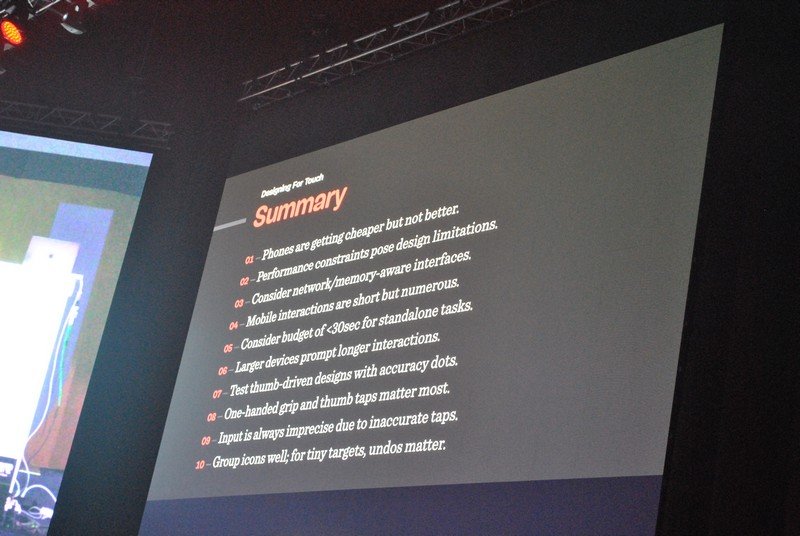
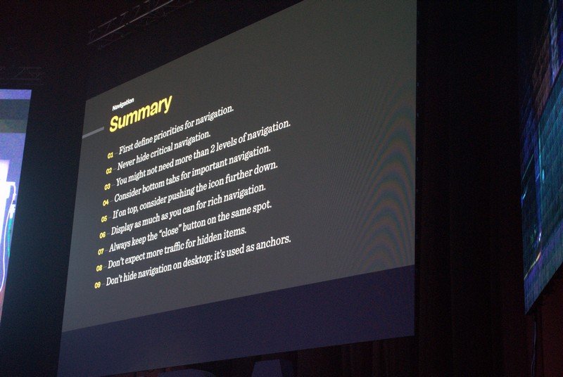
3. Navigation must be visible and easy to understand. Having more than 2 levels of navigation is often unnecessary. Don’t hide the navigation and expect to get more traffic.
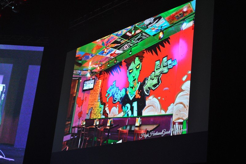
4. Design should fit in with the business story. Don’t be afraid to break out of the box, but keep the design consistent. For instance, using similar design elements and illustration in the interior, menu, and website design would be beneficial for a restaurant to create a consistent image.
Privacy UX
Vitaly Friedman is currently working on the series of articles on privacy UX, so he dedicated a part of his speech to the privacy issues in 2019. Feel free to read the first part called Privacy UX: Common Concerns And Privacy In Web Forms. Mr. Friedman analyzed user behavior in 2019 and revealed sensitive privacy issues faced by internet users.
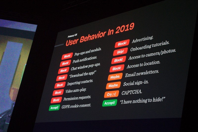
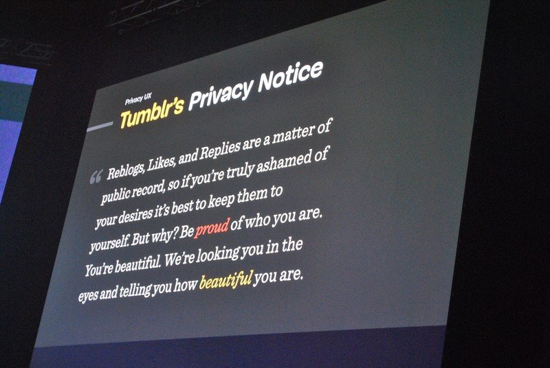
He also asked how many people in the audience actually read the privacy policies and terms. For those who pay them no mind (most of us really), he showed curious examples of privacy notices found on social media like Twitter, Tumblr, and Instagram. Lots of interesting stuff there!
Guillermo Torres, product designer at Airbnb
Speech: “Relationship advice from our users”
@g1sh on stage of @krupaconference pic.twitter.com/nnCukQXFyo
— Sergiy Voronov 🇺🇦 (@mamezito) April 6, 2019
It’s a pity Guillermo Torres had to size down his amazing speech due to technical problems. Still, the former UX designer at Google, now a UX designer at Airbnb, shared lots of valuable insights. Mr. Torres’ speech focused on building lasting relationships between users, products, and businesses.
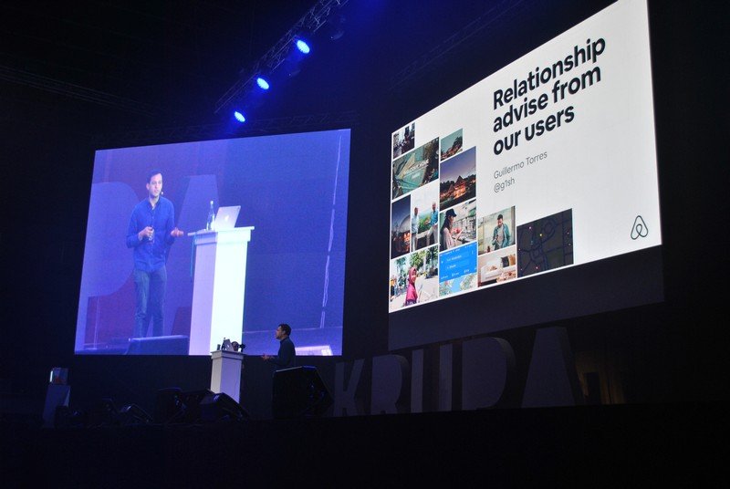
Here are the key takeaways from his speech:
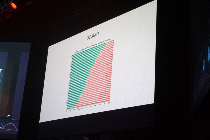
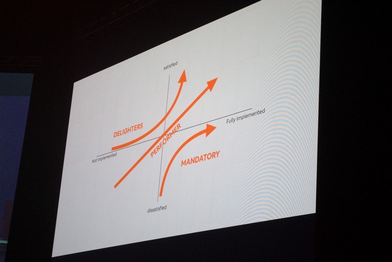
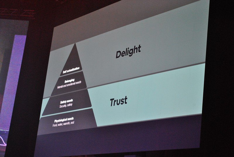
At Airbnb, designers operate the three principles: “Align”, “Implement” and “Measure.” Users are directly involved in the design process, their habits are studied to maximize the feeling of delight.
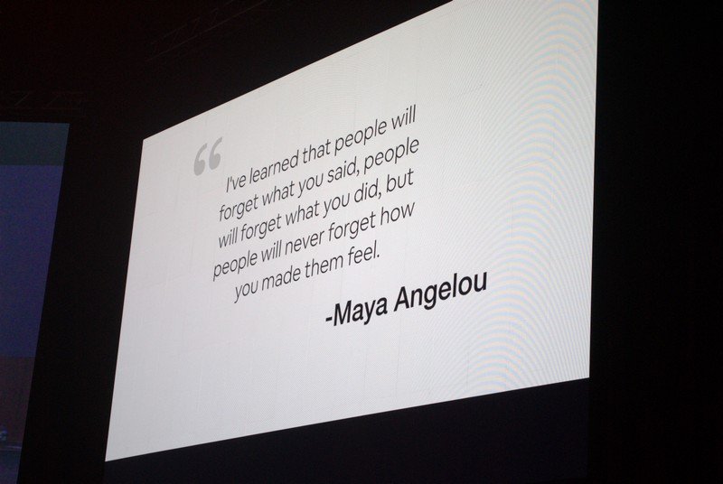
UX designers must focus on the feelings their products provoke in users. Mr. Torres used a quote from Maya Angelou to illustrate this point: “…people will never forget how you made them feel.”
To implement the ideas provided by the users, designers often have to brainstorm and illustrate 30 best ideas they’re given.
Measuring the outcome is hard as there’s no relevant method or tool. Still, Mr. Torres suggests using the Kano evaluation table and survey to learn how users feel about specific features present or absent in the UI.
Don Norman, co-founder and consultant at Nielsen Norman Group
Speech: 21st Century Design
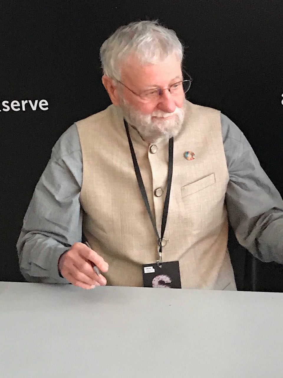
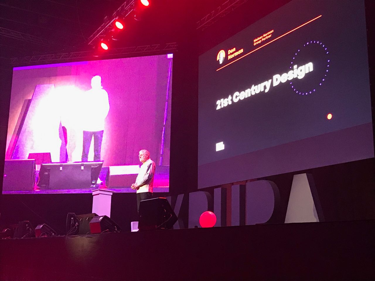
Krupa 2019 was headlined by the legendary Don Norman, the father of the design, best-known for his “The Design of Everyday Things” bestseller. During the conference, Mr. Norman engaged in several lengthy book signing sessions. With great patience, he took pictures with almost every attendee of the event, and this is truly admirable.
Don Norman delivered his speech with a twinkle in his eye and won over the audience with his immense wisdom. His “21st Century Design” speech felt very much like a pep talk to the aspiring and professional designers likewise. Extremely inspirational to those who only treading the path of UI/UX design. Here are the key takeaways from Don Norman’s speech:
Modern design is centered around things that aren’t meant to last. In most companies, designers are in the middle level. The companies that have designers at the top level do better over time (Apple). Hence, two conclusions can be made:
Human-centered design must follow 4 key principles:
In his speech, Mr. Norman also told the audience he plans to retire from design and devote his time to tackling climate change issues and environmental problems. Norman believes designers are best-fitted to deal with environmental issues if they design for the real world.
Norman’s favorite book is “The Tyranny of Experts” by William Easterly. The problem of expert knowledge is that it’s very general and abstract, as the solution may not work for the local community.
Undeniably, Krupa 2019 hit two targets at the same time:
The biggest design conference in Eastern Europe managed to show how big the designer community in Ukraine is. This, of course, increases the chance of foreign investment in the Ukrainian IT sphere and improves the networking possibilities for Ukrainian professionals.
Unprecedented in its scale, Krupa 2019 got thousands of UI/UX professionals involved in a conversation about the realities of interface design. Provoking thoughts and new ideas, isn’t it what everyone came for?
The MasterBundles team is looking forward to the next year’s conference, as there is still so much to talk about!
