How to Design a Logo: The Ultimate Guide for Businesses and Entrepreneurs
Table of contents
- Is Illustrator the Best Software for Logo Creation?
- Creating a Logo: Where To Start?
- How to Design Your Own Logo?
- How to Become a Professional Logo Designer?
- How to Design a Logo in Photoshop?
- How To Design A Business Logo?
- Popular logo design mistakes
- Get yourself a Logo bundle
Living in the modern age of brands and trademarks, you can see logos everywhere! Thinking of a particular place you go to eat or a piece of clothing you wear daily, chances are the first thing that comes to your mind would be a symbol used as a company logo. Indeed, most brands have long become household names due to their immense popularity.
A logo is a graphical element associated with a brand. Obviously, it isn’t that easy to create a self-explanatory symbol used to present a company’s core values. There are two aspects of a logo: the logotype and logomark.
– The logomark is the graphic part represented by a symbol or an image.
– The logotype is the effective textual representation of a phrase or motto used by a brand.
It goes without saying that the brand logo has to be recognizable, so the design process involves many things. Finding a suitable font or creating one from scratch is only a half of the problem. A logo should look good whether it’s used as a watermark to protect an image or on the corporate letterhead. But how to decide which elements should be a part of a logo? How to choose a color for a logo? Read on to find out more about all of that.
Is Illustrator the Best Software for Logo Creation?
Adobe Illustrator isn’t the only software one can use to make a logo. A designer can prepare a rough logo sketch in Paint, Corel Draw, or any other graphics suite. Still, Illustrator has proven to be the most convenient in use for both Mac and Windows computer owners. The Illustrator app works with vectors instead of raster graphics, meaning all details of your project will be preserved irrespective of the changes made.
Even if you have a vague idea about what a bezier curve is, the software will do the math for you. Vectors are used for logo creation mainly because they provide precision and the possibility to resize a vector image keeping its details intact. Whether you downsize or enlarge the graphic, it’s quality won’t suffer. In other words, Adobe Illustrator provides professional designers with full control of typography, line weights, corners, perfect curves, etc.
Corel graphics suite is also used by many designers as an alternative to Adobe products. Which one to use if more about your personal taste and habit. Most designers agree both packages have a steep learning curve. On the one hand, Corel Draw supports 100+ graphic formats, including AI and PSD files, while Illustrator offers 40+ million royalty-free images from its official database.
The NNPC Coreldraw logo is one of the most popular tutorial examples one may find online.
Creating a Logo: Where To Start?
Believe it or not, there is no universal recipe for logo creation. The explanation is obvious: as many men as many ways to do the same task. Some designers would plunge headlong into the graphics program and do a rough mockup. Others would do a sketch on the paper first drawing an outline of the concept, then mixing and matching the elements before getting to the final mockup.
As cool as some designers are, some of them most likely resort to black magic to get THE logo they need.
All jokes aside, there are still aspects to keep in mind while doing the job of making a modern, yet simple logo design. It’s easy to get carried away in the process of creation, so try keeping the brand message in mind. Also, try being as organized as possible and keep track of your work. Here is a step-by-step guide that most creative professionals would find optimal to organize their workflow:
1. Research the Market
Indeed, research is a great way to work out a logo creation strategy and prevent unfortunate things like plagiarism. So, before inspiration hits you, go online and research the logos used by your client’s competition, analyze the design trends. Minimalist and concise logos prove to be more effective compared to the ones overloaded with imagery and typography. Remember, your task is to create a design that won’t look the same to everybody else’s but also wouldn’t stand out that much.
2. Understand the Mission
Believe it or not, a designer MUST know the message behind the logo. Whether its a blog, a clothing brand, or a YouTube channel – all of them have a mission statement. If you do a logo for a DJ or a band, you will obviously come up with a set of music related images and photography references. An organization logo for a school or a church will require a completely different approach. The point is, do you know what your client aims to express through the logo?
Think if you fully understand the client’s brand. An award ceremony and a fashion show may look the same in the public eye’s perception, but the message behind both events may be so different!
Not to mention if you need to create official brand elements like a stamp, monogram or website logo. Make a checklist to see if you know the following aspects of your client’s work:
– A product/service offered by the company;
– Target audience;
– Key competitors;
– Client’s team.
The same applies if it’s a logo for self-representation. Whether you’re a hipster or a corporate designer, try conveying the essence through your logo.
3. Agree on the Deliverables
Putting all philosophy aside, let’s proceed to the logistics. See if you have agreed on the deliverables with your client:
– specify the file formats;
– sizes to use on social media;
– number revisions you’re willing to make;
– set the deadline.
Make sure to discuss all of the above before getting to work.
How to Design Your Own Logo?
Designing your personal logo may be challenging, since describing your own venture and finding specific symbolism for yourself is the hardest. Different people ask around the internet: “How to make a logo to reflect the peculiarities of my business?” In a nutshell, here is a step-by-step guide to follow:
– Summarize your brand in a creative brief. List the target audience, the desirable image, budget you have and a competitors’ overview. This way, you will get an idea of the message you aim to convey with your logo.
– Decide on which variation of your name you’d like to use for the logotype. Is it just your first name, a full name, initials, or maybe it’s a nickname you’re known by? Making your name a brand name is a serious personal investment.
– When choosing a logo, try drawing inspiration from your own name. What if your first name has a hidden meaning or a not-very-obvious translation you could play with? You could also look from a different perspective by making a logo look based on what you do. Or maybe, draw some inspiration from what other people think of you?
– If your imagination fails you, try turning your appearance into a vector graphic to see if the concept fits the brand. Having unusual appearance or feature could play to your benefit!
– What colors do you think will suit you best? Once you’ve decided on the logomark and logotype, make several color variations of the same logo to decide which one is the best.
How to Become a Professional Logo Designer?
One does not become a designer who specializes in logos and branding out of the blue. Prior experience in graphic design as well as an ability to work in graphic software are extremely beneficial. And, that is not nearly all one must learn to find the right way! Here’s a short list of job requirements for someone who has made up their mind to be a logo designer.
– Strong working knowledge of Adobe Illustrator and Photoshop, Corel Draw, Jeta Logo Designer, Apple Motion, and other graphic /logo software.
– Knowledge of the formal design concepts, which includes theory and technique.
– Versatile portfolio to build your personal brand as a logo designer;
And, that is not to mention getting formal credentials, industry connections, immense effort and time spent on refining the designer skills and practice. So, next time someone tells you being a designer is as easy as ABC, you know what to respond.
How to Design a Logo in Photoshop?
As you already know, Illustrator isn’t the only graphics software for logo creation. Photoshop is one of the most popular programs used by designers as well. Below you will find a short tutorial on how to design a Volkswagen logo without text using Adobe Photoshop CS6. The tutorial is adaptive, use any available Photoshop CS version.
#1 Create a New Document
Source: instructables.com
After you’ve started Photoshop, go to File -> New (CTRL+N key combination). Next, set the width and height for your design. For this tutorial, set the canvas dimensions to 500px width and 500px height. It is always possible to change canvas size later.
#2 Draw a Basic Form Using Pen Tool
Source: instructables.com
1. Use a pen tool (“P” shortcut) to draw a line with it.
2. Grab the point at the end of the line and slightly drag it forth.
3. Fill the shape with black, or any dark color that goes with your chosen color scheme.
#3 Start Layering Up the Logo
Source: instructables.com
1. Go to the layer with the shape on it -> Select All (“Ctrl+A”).
2. Copy and Paste (“Ctrl+C”, “Ctrl+V”) to the New Layer.
3. Use “Ctrl+T” shortcut to transform that newly copied shape and make it smaller than the original. NOTE: To keep the dimensions proportional, hold down the Shift while transforming the shape.
4. Load the selection (Select -> Load Selection)
5. Fill the selection with a lighter color using the paint bucket tool. NOTE: Load the selection, not fill it. Otherwise, you’ll have jagged edges.
#4 Add a Few Touch Ups
Source: instructables.com
See, if your design looks something like this. If it does, layer up the logo once more. Add a few touch-ups to the final design using the Blending Options. Here you go, a simple logo is finished!
How To Design A Business Logo?
Are the any of the above tips and advice applicable to corporate logo design? Let us take a construction company as an example to find out. Big or small, a construction company logo must be supportive of the trademark!
Choosing the logo image
It’s no secret that certain industries are associated with particular images. What’s the first association that comes to your mind when thinking about building and construction? A house, a crane, a brick wall? To avoid being generic, analyze competitors’ logos and try a different approach to familiar images. Places where a person lives and works are associated with stability and responsibility.
Source: logaster.com
Picking the color to convey the brand message
Colors play an important role in brand perception, so choosing appropriate colors for a logo is 50% of your success. A professional-looking color scheme can play to your logos benefit, while wrong colors will drive the prospects away. Which colors will work best for a construction business?
– Think blue, green, red or brown.
– Don’t use several colors in one logo. Using the hues of a particular color will look more favorable instead,
– Selecting the right font
Not only color but also font will make your logo truly memorable. Choosing legible font will enhance the visual representation of your brand.
– The text must look legible in different formats (website header, social media, business card, etc.)
– The font must go with the logomark to make the logo look as a wholesome system.
Source: logaster.com
– Refrain from using fonts that are hard to read, scrolls and serifs, or handwritten fonts. Instead, use clean sans-serif, serif and monospaced typefaces (Arial, Helvetica, Droid Sans, etc.)
Popular logo design mistakes
It is always better to learn on other people’s mistakes, isn’t it? Having some milestones that will keep you from going the wrong road is a great advantage. Beginners tend to similar mistakes, so it is rather simple to list all the “don’ts”, so you will never fall into those traps. Here are the six most crucial warnings the logo creators can receive – check your logo according to the list before presenting it to your audience.
1. No stealing
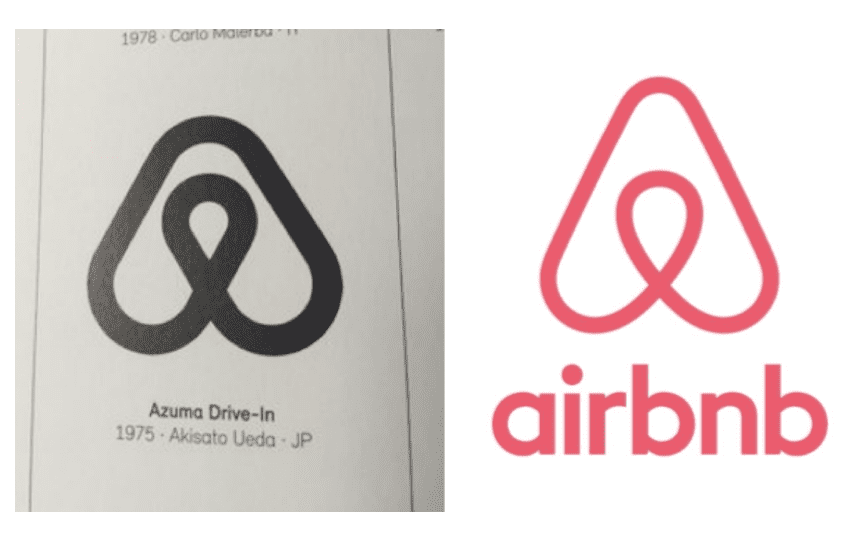
It is the most important rule you can never violate. Go through the famous logos of big and efficient companies, but take inspiration from them, not their intellectual property. First of all – it could be (and it is almost sure – is) secured by patents. Using pictures or fonts that were created for another firm is illegal. Besides that, doing so is simply rude. It is much simpler to use the look the people already liked, of course, but if you want to become an independent and profitable company sometimes – avoid plagiarism.
2. Getting rid of the mess

The mess in defining the main idea of your company leads to the mess in the logotype. How can you create a simple and clear logo if you don’t understand what the main idea it should radiate? That uncertainty makes you create either too complicated or too boring and vague logo. Both of those extremes are bad for your company – such a logo won’t help you to achieve any of the goals it is supposed to. That’s why you should once more sit and define the essence of your firm and only then start creating the logo.
3. Attention to color
Did you know that there is a whole separate discipline about colors and their meaning in the designer learning course? Yeah, that is not just about mixing all the colors you like – the result could be awful. It will be ideal if your logo design looks perfectly even in black and white and colors only spice it up. That will mean you created an expressive and self-contained logo. If you can’t think of a nice color scheme – there are lots of instruments on the web that could help you (for example Colors or Colormind).
4. Wrong font
The typeface could seem irrelevant if the picture is fine, but that is a sufficient mistake. If the font doesn’t fit – it could ruin the whole impression from the logo. Seeking the right typeface is a problem sooner or later every designer meets. Here’s a checklist you should go through when looking for a font:
- Check the spacing – the balance is essential.
- Avoid overused fonts (for God’s sake, don’t use Times New Roman!).
- The typeface should be perfectly readable.
- Super-heavy fonts don’t look good for most of the logos.
- Don’t use more than two fonts for a single logo, otherwise, it will look messy.
5. Using stock images
Oh, come on, are you serious? How many people have already used those pictures for their logos, how do you think? Choosing a ready-made clip art is like taking Courier New font. Those images, drawn in hundreds are vague, empty and very boring. Nobody will remember such a logo and you will get no use of it. Simple and small, but the original image is much better than the best stock examples. Look at the Apple logo – it is pretty straightforward and it is hard to imagine someone who wouldn’t recognize it.
6. Cutting off the unnecessary

On every stage of your work ask yourself: “Is this element really necessary for the idea I want to express?”. All the unnecessary details should be removed, the simpler your logo is – the better. You don’t really need even the inclusions like “Co.”, “L.L.C”, copyright, trademark, etc. Only if your client insists on it – then you should add it. However, the cases when some symbol is demanded on the logo by law are very rare. So – cut off everything that is nor crucial for this logo.
Get yourself a bundle
According to the warning you received previously, you shouldn’t take some ready-made logos. However, it doesn’t mean you can’t use the parts of pre-designed logos. In fact, creating any graphics will become faster if you will have some elements you can combine it from. Buying every picture separately will be too expensive, so the solution is to find a nice bundle. The bundle is a set of items sold together, as a single product. The price for it is lower than the sum you otherwise would have to give for all those items separately. The bundles are combined according to some certain theme or feature. Here are a few examples of logo bundles you can find on MasterBundles.
Royal Creation Kit
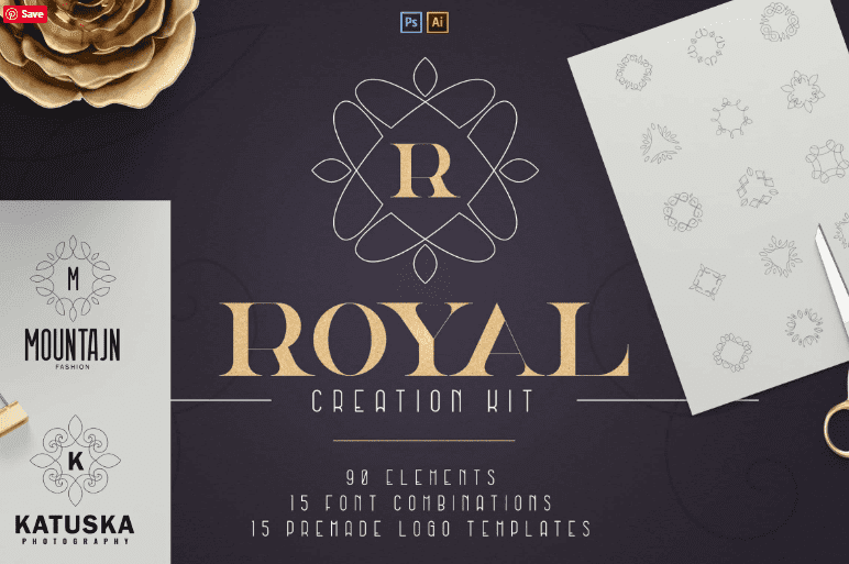
This bundle contains 120 elements that could be used both for Photoshop and Adobe Illustrator works. Besides, actually, logos, there are also about 15 fonts combinations. Sophisticated forms, drawn in thin lines, could become a perfect frame for the main part of the logo. The pictures are abstract and symmetrical, so could fit for a wide variety of companies.
Huge Font & Logo Bundle
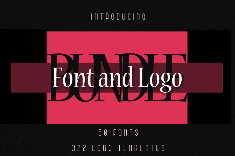
Lots of bundles contain not only the images but fonts and icons too. For example, this bundle includes 50 fonts and 322 logo elements. You can combine them any way you like to create something really stunning. There are elements in the shape of geometrical animals, mandalas and abstract pictures that allows you to build lots of logo variants for different types of business.
144 Hand Drawn Logo Elements
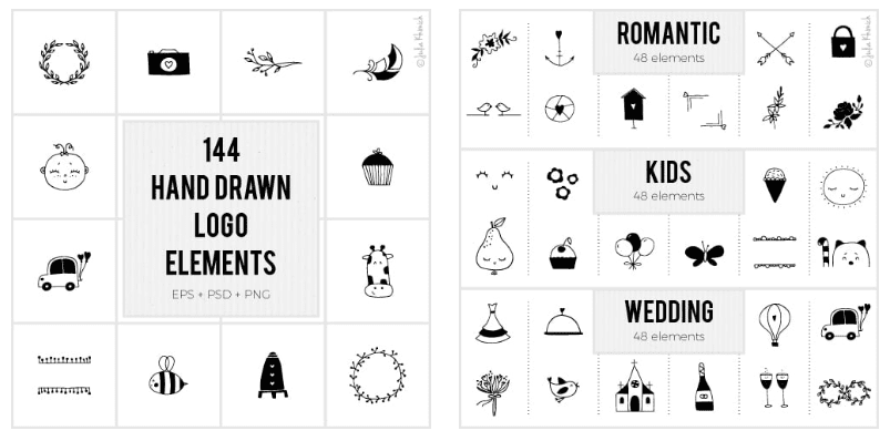
Hand-drawn fonts and icons will be extremely popular in 2019. Hand-made items are, in general, very popular now. The trends reach the internet really fast, and hand-drawn design becomes one of the most popular nowadays. As it is said in the title, the bundle contains 144 images you can use to make your logo a little cuter.
Animals Creation Kit
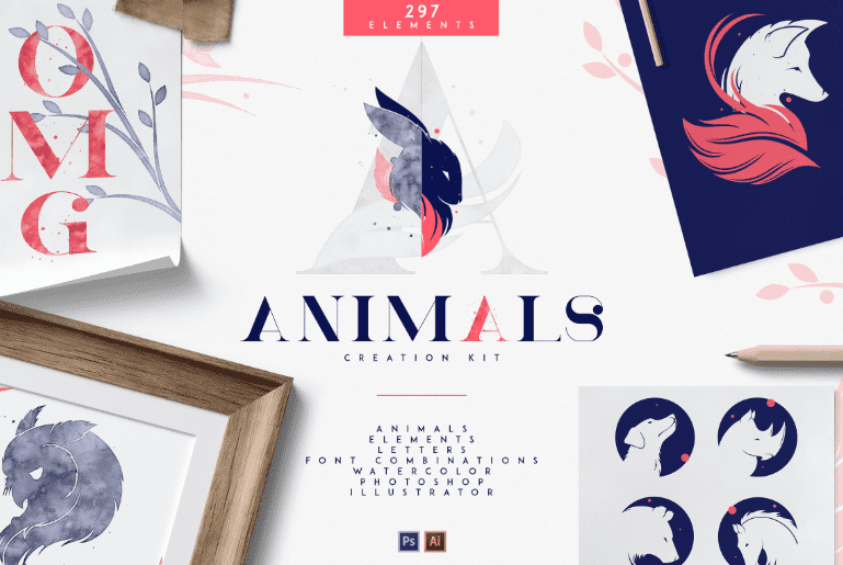
Animals added to the logo (of course that is if your company is somehow connected with those animals) automatically add a few points to its attractiveness. There are more than 60 animal pictures drawn in three different styles. Some of them are even drawn in watercolors and such way of designing pictures is also extremely popular now.
520 Premade Branding
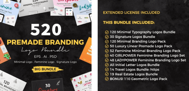
Lots of people love the minimalistic design – little pictures on the vast empty field. The minimalistic logo means that it has no complicated elements that mess the look. This bundle has dozens of minimalistic logo elements, divided into understandable categories which make searching and usage more convenient.
Bottom Line
Hopefully, this guide has helped you understand the key principles of logo design. Try your hand in different graphics software to see which one you’re comfortable to work with. Also, use free video tutorials on YouTube to learn some cool designer tricks and hacks. And, good luck with your logo!
- Logos
- Graphic Bundles
- Design thinking principles