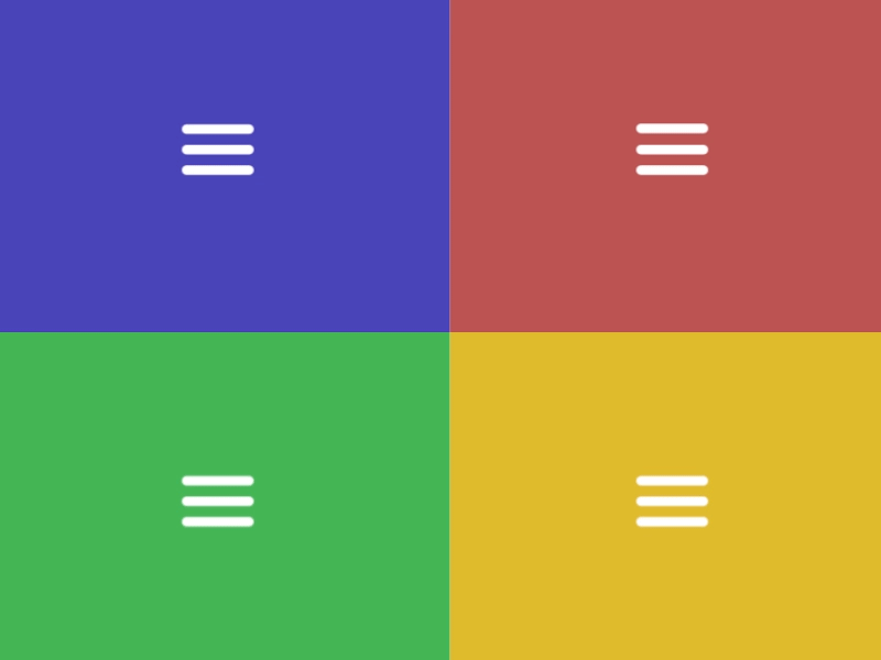
Hamburger Menu: Use In Web and Mobile User Interfaces
In the era of Google material design, very few people ask “what is a hamburger menu?” Bet, you’ve seen it: three parallel lines placed on top of each other slightly resembling a hamburger by form. So, it wouldn’t be an understatement to say that the “hamburger menu” icon is one of the most recognizable UI elements.
Whether you look at mobile examples or desktop examples of the hamburger menu, you will unmistakably know it serves to condense information. Used in Android and iOS apps, it greatly improved the UX. No wonder, it took little time to introduce the new menu style into website making. Today, it’s no longer an issue for designers to create a website with a drop down menu hiding behind the three vector lines.
Source: tsagaandarium.org
Hamburger Menu as a Universal UI Element
Without a doubt, hamburger menu is a versatile UI element used in different types of projects. It is possible to create and incorporate a hamburger menu into a website in different ways. If you’re using WordPress as your default CMS, then installing a customizable WordPress plugin like Responsive Menu or Storefront Hamburger Menu will save the day.
If you aren’t great at coding, try using online hamburger menu generators or Adobe Muse widgets. With their help you will easily enhance a basic menu with intricate fonts, animation or a submenu, no coding involved. And, if you’re dealing with an html5 website, most certainly you will have to use JavaScript alongside html and css code.
To see the examples of animated menus that slide out, changing their look to an arrow or another graphic element, etc., go to Codepen. The site allows testing the html, css, and JavaScript code to make sure they work together. Pure CSS Hamburger fold-out menu is one of such examples.
<p data-height=”265″ data-theme-id=”light” data-slug-hash=”EVzeRP” data-default-tab=”css,result” data-user=”erikterwan” data-pen-title=”Pure CSS Hamburger fold-out menu” class=”codepen”>See the Pen <a href=”https://codepen.io/erikterwan/pen/EVzeRP/”>Pure CSS Hamburger fold-out menu</a> by Erik Terwan (<a href=”https://codepen.io/erikterwan”>@erikterwan</a>) on <a href=”https://codepen.io”>CodePen</a>.</p>
<script async src=”https://static.codepen.io/assets/embed/ei.js”></script>
How to Create Hamburger Menu in Flexbox
Specific online projects are now less reliant on Bootstrap framework, tending to transition to Flexbox. The Flexbox Layout (Flexible Box) module is meant to provide a more efficient way to lay out, align, and distribute space among items in a container. Flexbox comes in handy even when the size of these items is unknown and/or dynamic.
In other words, the “flex layout” aims to give the container the ability to adapt the width, height, and order of the items to use the available space at best. Flexbox is becoming more used in responsive menu designs, as it accommodates to different screen sizes and resolutions. A flex container will expand or shrink its items in order to fill the available free space.
See the below example of the hamburger menu using CSS flex:
<p data-height=”265″ data-theme-id=”light” data-slug-hash=”YqaKYR” data-default-tab=”css,result” data-user=”css-tricks” data-pen-title=”Demo Flexbox 2″ class=”codepen”>See the Pen <a href=”https://codepen.io/team/css-tricks/pen/YqaKYR/”>Demo Flexbox 2</a> by CSS-Tricks (<a href=”https://codepen.io/css-tricks”>@css-tricks</a>) on <a href=”https://codepen.io”>CodePen</a>.</p>
<script async src=”https://static.codepen.io/assets/embed/ei.js”></script>
Hamburger Menu Examples in App User Interfaces
Hamburger menus serve as a user interface element in software design and development. The WPF Windows architecture being one of the most vivid examples. Developers can learn how to integrate a hamburger menu into software interface by installing WPF demos application in Telerik UI.
Creating a hamburger menu in Xamarin forms is widely used in Android and iOS mobile development. To learn more about that aspect, check out Microsoft’s Xamarin.Forms Master-Detail Page tutorial.
Speaking of hamburger menu in user interfaces, it’s impossible to overlook its widespread use in the navigation of React Native mobile apps. For instance, “hamburgers” are used to build the nested drawer menus.
Hamburger Menu Examples in Web Design
Web design UI turns out to be a fruitful field for using hamburger menus, for it provides multiple possibilities to experiment with the look and feel of the menu. For instance, in this tutorial, Divi Hamburger Menu Styles Extension provides users with over 20 different styles and variations of hamburger svg icon looks and the coding behind it.
<p data-height=”265″ data-theme-id=”light” data-slug-hash=”adVxNg” data-default-tab=”css,result” data-user=”elegantthemes” data-pen-title=”Custom Hamburger Menu” class=”codepen”>See the Pen <a href=”https://codepen.io/team/elegantthemes/pen/adVxNg/”>Custom Hamburger Menu</a> by Elegant Themes (<a href=”https://codepen.io/elegantthemes”>@elegantthemes</a>) on <a href=”https://codepen.io”>CodePen</a>.</p>
<script async src=”https://static.codepen.io/assets/embed/ei.js”></script>
Adobe Muse allows creating any web design elements without deep knowledge of coding. So, using a special widget for Muse, it is possible to create a hamburger menu of any complexity in the WYSIWYG (what-you-see-is-what-you-get) editor. For instance, you can create an animated hamburger menu following the steps shown in the video tutorial below:
Hamburger Menu in CSS
Whether it’s a matter of convenience or personal taste, web designers choose different ways to create hamburger menus. Some believe, using css only in most cases is handier to put together a responsive menu to incorporate into any web project. Follow the steps described in CSS Only Hamburger Toggle Menu to practice hamburger menu creation in css and see the results in Codepen:
<p data-height=”265″ data-theme-id=”light” data-slug-hash=”qomrMw” data-default-tab=”css,result” data-user=”plavookac” data-pen-title=”PURE CSS SIDEBAR TOGGLE MENU” class=”codepen”>See the Pen <a href=”https://codepen.io/plavookac/pen/qomrMw/”>PURE CSS SIDEBAR TOGGLE MENU</a> by Jelena Jovanovic (<a href=”https://codepen.io/plavookac”>@plavookac</a>) on <a href=”https://codepen.io”>CodePen</a>.</p>
<script async src=”https://static.codepen.io/assets/embed/ei.js“></script>
jQuery Hamburger Menu
jQuery is a cross-platform JavaScript library used to facilitate the client-side html scripting. Typically, jQuery is used in web development to animate web UI elements, but also traversing, event handling, and simplify Ajax interactions. jQuery plugins can come in handy when creating animated hamburger menus with slide-outs, etc. Check the animated hamburger tutorial to practice using jQuery to animate menus:
- Pick any of the animated hamburger icons and download the css. Prepare basic html as shown below:
<button id=”my-icon” class=”hamburger hamburger–collapse” type=”button”>
<span class=”hamburger-box”>
<span class=”hamburger-inner”></span>
</span>
</button>:
- To make your hamburger icon fixed, wrap it in a DIV and use the fixedElements add-on.
<div class=”Fixed”>
<button id=”my-icon” class=”hamburger hamburger–collapse” type=”button”>
<span class=”hamburger-box”>
<span class=”hamburger-inner”></span>
</span>
</button>
</div>
- Сreate the menu and use the API to open the menu and to animate the icon. Add a small timeout to ensure the rest of the page is finished animating for a smoother animation.
var $menu = $(“#my-menu”).mmenu({
// options
});
var $icon = $(“#my-icon”);
var API = $menu.data( “mmenu” );
$icon.on( “click”, function() {
API.open();
});
API.bind( “open:finish”, function() {
setTimeout(function() {
$icon.addClass( “is-active” );
}, 100);
});
API.bind( “close:finish”, function() {
setTimeout(function() {
$icon.removeClass( “is-active” );
}, 100);
});
Is Your Hamburger Menu Bootstrap Not Working?
In case you’re using Bootstrap instead of Flexbox, there may be an issue with the framework not working the right way. The solution to this common problem is loading jQuery before Bootstrap. Follow the steps below:
- Go to the JavaScript section of your pen.
– add jQuery from ‘quick-add’ under the ‘add external javascript’ setting;
– add Bootstrap from ‘quick-add’;
– add optional things (Font Awesome, etc).
- Go to the CSS section to ‘quick-add’ Bootstrap (in case Bootstrap css is used for the layout).
5 Templates With Hamburger Menu
Intense Multipurpose Website Template
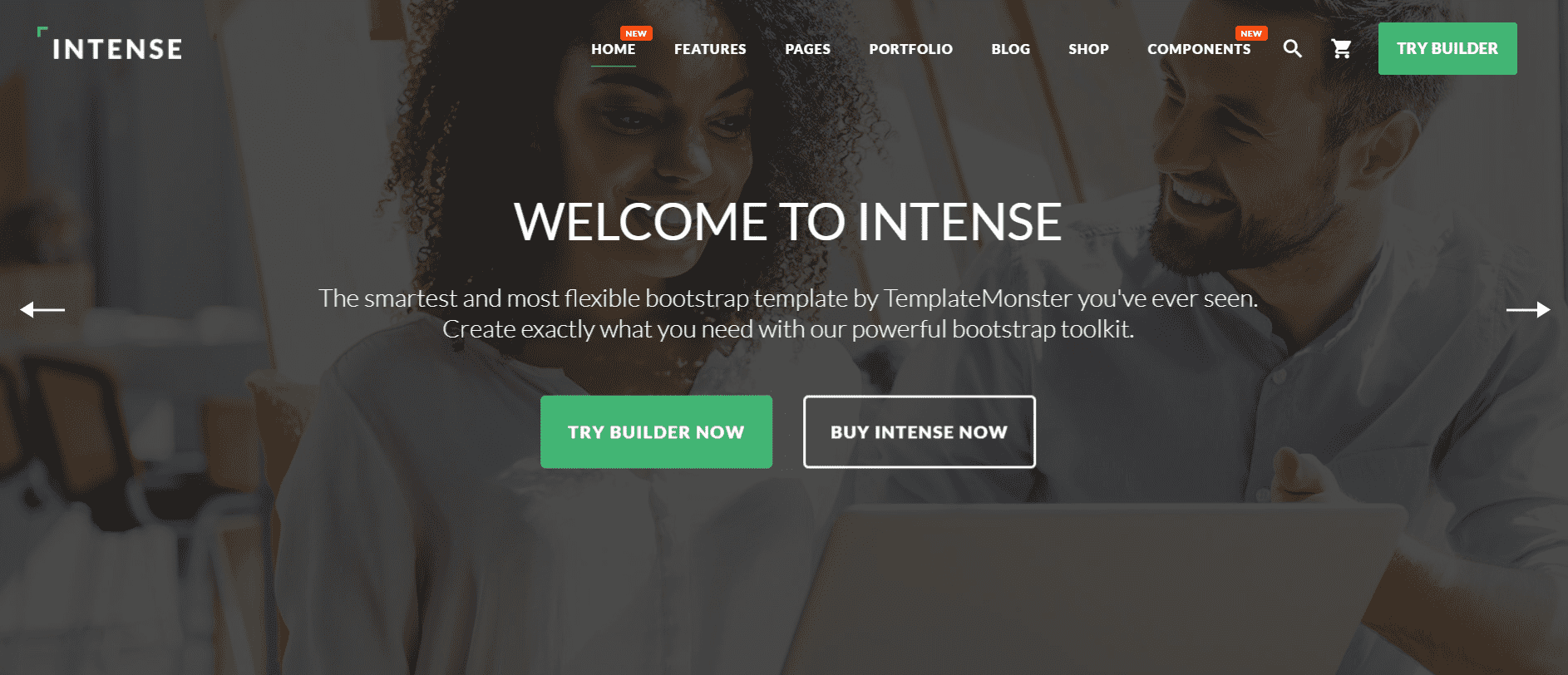
Details | Demo
This responsive template Intense supports work on any device: PC, laptop, tablet, and mobile phone. There are 25+ niche ready-made templates. With the help of Novi Builder, which is provided with the template for free, you will get rid of the problems with manually building your future website. The template supports excellent sharing features in the social network. There is also a handy site header and a mega menu with categories, subcategories and tags. More features:
- Valid Coding;
- Bootstrap 4.0;
- Landing Page Builder;
- Retina Ready;
- Revolution Slider;
- Search Engine Friendly;
- Visual Editor;
- Well Documented.
Monstroid2 Multipurpose Website Template

Details | Demo
Monstroid2 is a multipurpose template for any project. This template is ready for most online niches thanks to 500+ prepared pages and blocks layouts. Monstroid2 was made by leading developers, it focused on flexibility and functionality. You can develop each page of the site using the powerful Elementor Page Builder. All elements of the site can be customized: change the size, color and shape, select the lines, indents, and much more. Other features:
- 80+ Multi and One Page Demos;
- 400+ HTML Files;
- Working Ajax Forms;
- 180+ PSD Files;
- Customizable Video and Audio Players;
- 24/7 Premium Support.
Brave Theme – Multipurpose HTML Website Template
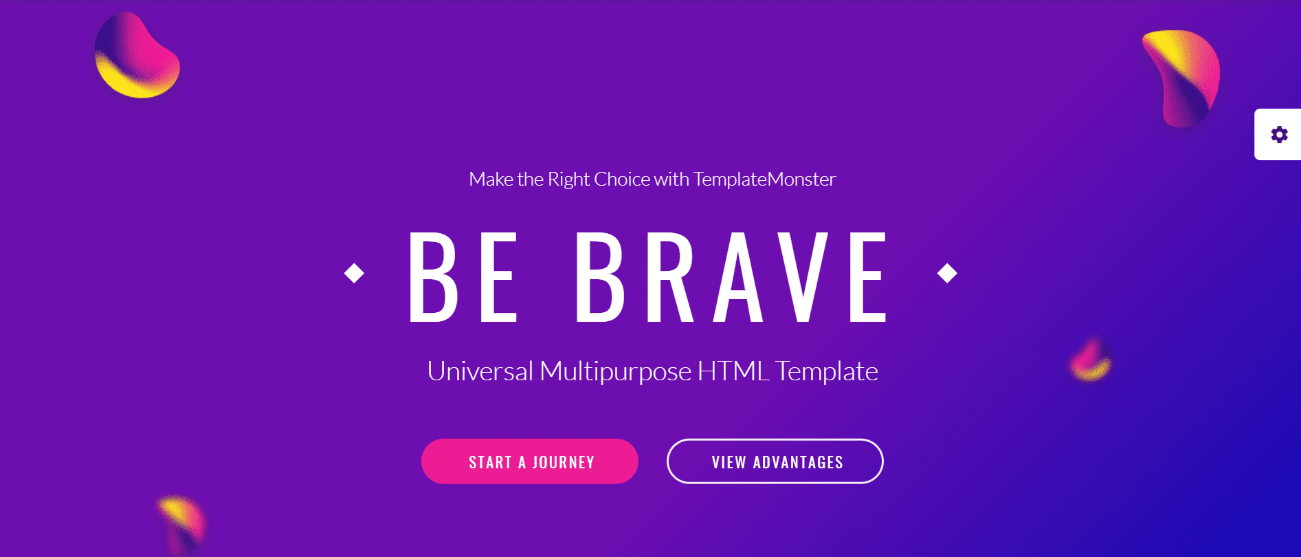
Details | Demo
Here we have one more beautiful and functional theme for creating a site on various subjects. Excellent navigation, great animation, various Google fonts and beautiful icons. Yes, this HTML theme is really a great solution, using which you can avoid steps of drawing design concept and annoying layout. The theme was created using modern approaches to web development. Premium design, Bootstrap frame, 10+ template layouts and responsiveness with lightweight code – all this is gathered in one powerful Brave theme. Additional features:
- Crossbrowser Compatibility;
- Dropdown Menu;
- Parallax;
- Background Video;
- Novi Builder;
- Visual Editor;
- Contact Form.
Quick Food – Fast Food Restaurant Responsive Multipage Website Template
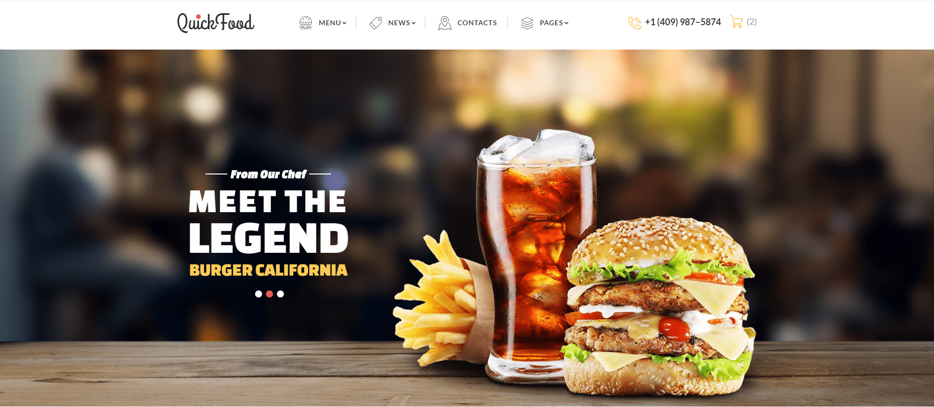
Details | Demo
The stunning design of Quick Food template will allow visitors to plunge into the atmosphere of your restaurant in advance. The theme is easily customizable for any requirements. All design elements are focused on attracting customers. Also, Quick Food works great on all major browsers, has a responsive layout and therefore looks great on all devices. Slider, parallax effect, smooth transitions and icons supported. Other features:
- Sliced PSD;
- Dropdown Menu;
- Favicon;
- Google Map;
- Google Web Fonts;
- Grid System;
- Valid Coding;
- Contact Form;
- Newsletter Subscription.
The Future – Web Design Multipurpose HTML5 Website Template
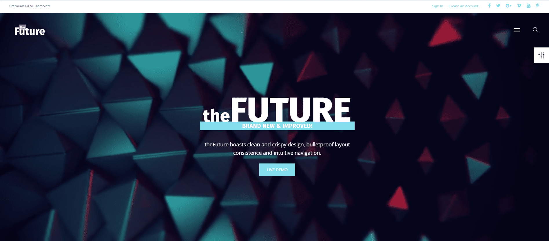
Details | Demo
The Future will serve as an excellent solution for the presentation of projects related to web design, marketing and graphic design. Depending on the purpose of your business, it provides a full set of supporting options and settings for the implementation of individual needs. Also, pay attention to the trendy and flexible design that will look great on all modern screen resolutions. Knowing who your potential customers are, your goal and the subtleties of your business, you can promote a website and get high revenue. Main features:
- Calendar;
- Crossbrowser Compatibility;
- Google Map;
- Parallax;
- Bootstrap;
- Audio Player;
- Contact Form.
Bottom Line
Despite you may come across opinions that hamburger menu is becoming an obsolete UI element, it’s not exactly true. Due to its versatility and adaptability, it is still used in web and mobile app design. Hopefully, the above insights will help you incorporate it in your project and make it truly your own.