Facebook Logo History, Meaning and Evolution
Facebook (or nowadays Meta) is currently one of the five most visited websites worldwide.
The Facebook logo and icon are quite eye-catching but do you know the interesting story behind their creation? Are you curious to find out? Let’s go!
Facebook Logo History & Evolution
Facebook history is quite interesting, so we couldn’t skip this part. It all began from Mark Zuckerberg’s idea of creating a platform with information about the people around him back in his youth. Every year, the school where he studied published a directory with contact information and photos of students. This collection was named the “Book of Faces.”
In 2003, Zuckerberg developed Facemash, a website where pictures of people’s faces were published (pictures were sorted according to the criterion of attractiveness). For this purpose, the young man hacked into secure segments of Harvard’s online network. In 2004, Thefacebook.com (later refined and renamed Facebook) was created similar to Facemash.
The brand’s headquarters were opened in October 2008 in Dublin. The popularity of the company grew so that by 2010 Facebook was already the third-largest Internet company in the United States (after Google and Amazon).
In 2012, the company expanded by buying Instagram. Just one year later, Mark Zuckerberg announced the launch of a new platform for Android smartphones called Facebook Home.
Who designed the Facebook logo?
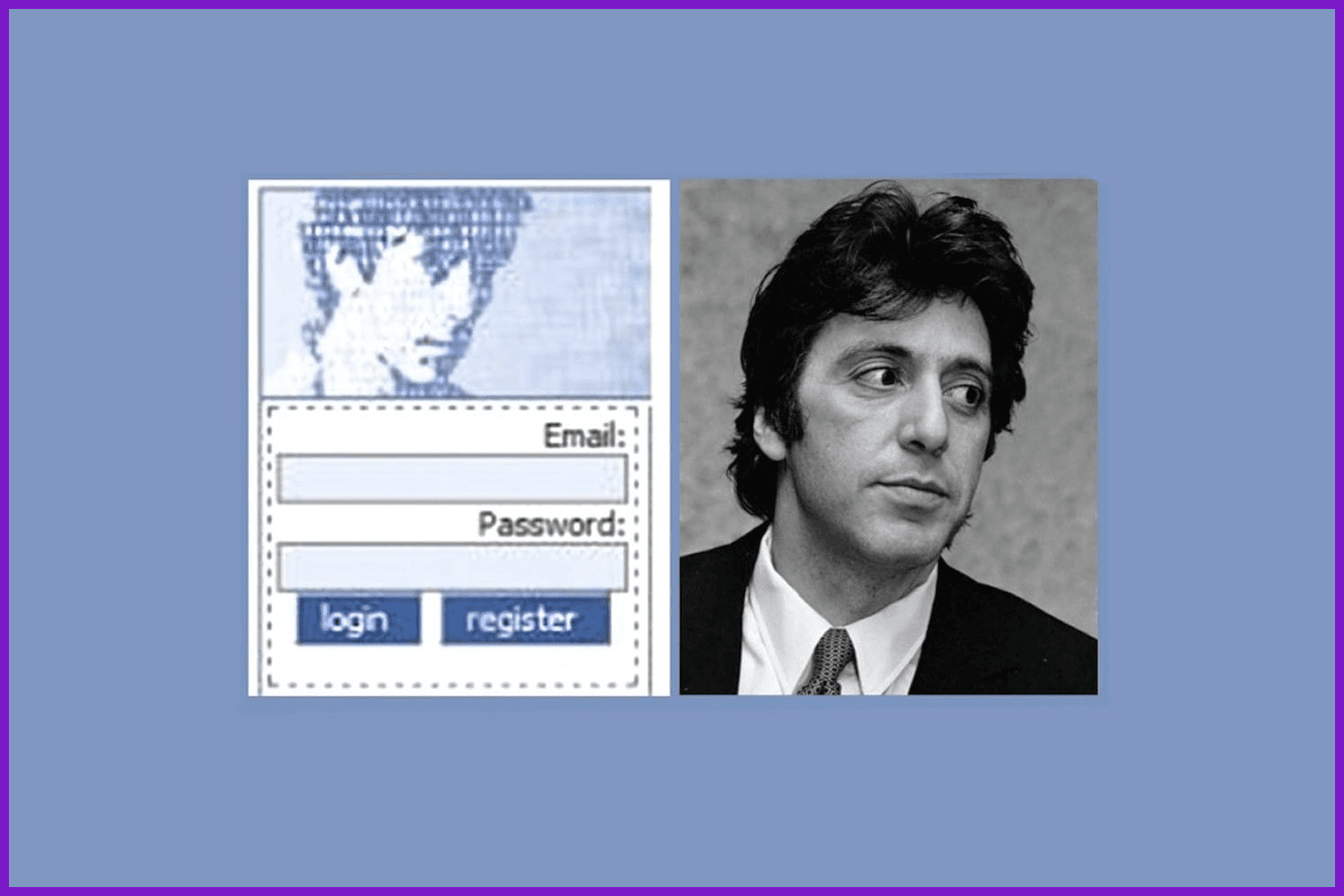
Image by MasterBundles
The first Facebook logo was very strange. The Facebook logo in png format was designed in 2005 by a classmate of Mark Zuckerberg’s. It was Al Pacino’s blue pixel face. Yes, exactly that. We think it was a nice geek joke 😀
Besides the portrait, it included light lettering “The Facebook” on a bright blue backing. The first FB logo was located in the header of the page.
Let’s take a look at the evolution of the Facebook emblem we now know.
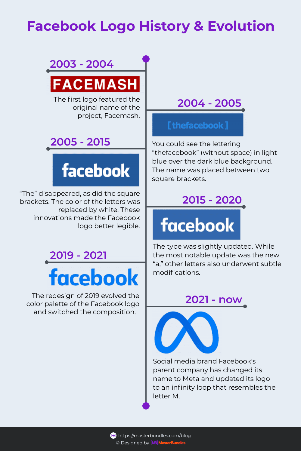
Image by MasterBundles
2005 – the first original Facebook logo. It looks like a contrasting light-colored inscription “The Facebook” on a blue background. Also, the Facebook logo wasn’t transparent but has a simplified “short” version of the emblem featuring the letter “F” and a light blue stripe at the bottom.
2006 – the style and lettering remain the same. The only thing that changes: “The Facebook” is simplified to just “Facebook.” At the same time, the world-famous “thumbs up” icon appears.
2013 – the composition remains unchanged (brand designers decided to improve the old symbol rather than create a completely new one). Only the font has changed: the current Facebook logo has a special author’s lettering. Transformations have touched the letter “F” as well – now the emblem is even more minimalistic.

Image by MasterBundles
In October 2021 Mark Zukerberg announced a Facebook rebranding to the parent company, Meta, which includes the social networks Facebook and Instagram, messenger WhatsApp, VR headset developer Oculus, and other assets. The new logo of the company Meta is a blue Mobius ribbon, which resembles a curved infinity sign. This is how the company demonstrates its commitment to the idea of a metauniverse—a social three-dimensional virtual space. In this meta-world users will do without screens and communicate in virtual reality.
By the way, you may find many interesting logo designs at MasterBundles!

Image by MasterBundles
We should also identify the Facebook Inc. logo. That logo version was changed in 2019 to make it different from the one that the social network has. The new logo united all of the company’s key products. The logo represents the inscription “FACEBOOK” as not a particularly remarkable font, but which is more suitable for documents. For decoration, the designers added a shifting gradient reflecting a number of the company’s products.
What Is the Facebook Symbol’s Meaning?
Such a simple Facebook symbol expresses the brevity and simplicity of using the social network and company’s products, and the accessibility and comprehensibility of the social network’s functionality.
There is a theory that the blue color of the logo was chosen because of Mark Zuckerburg’s disease, deuteranopia. This disease affects the perception of colors. Mark suffers from red-green color-blindness, but he can distinguish shades of blue very well. That’s probably why the logo was painted blue.
What Font Is Used on The Facebook Logo?
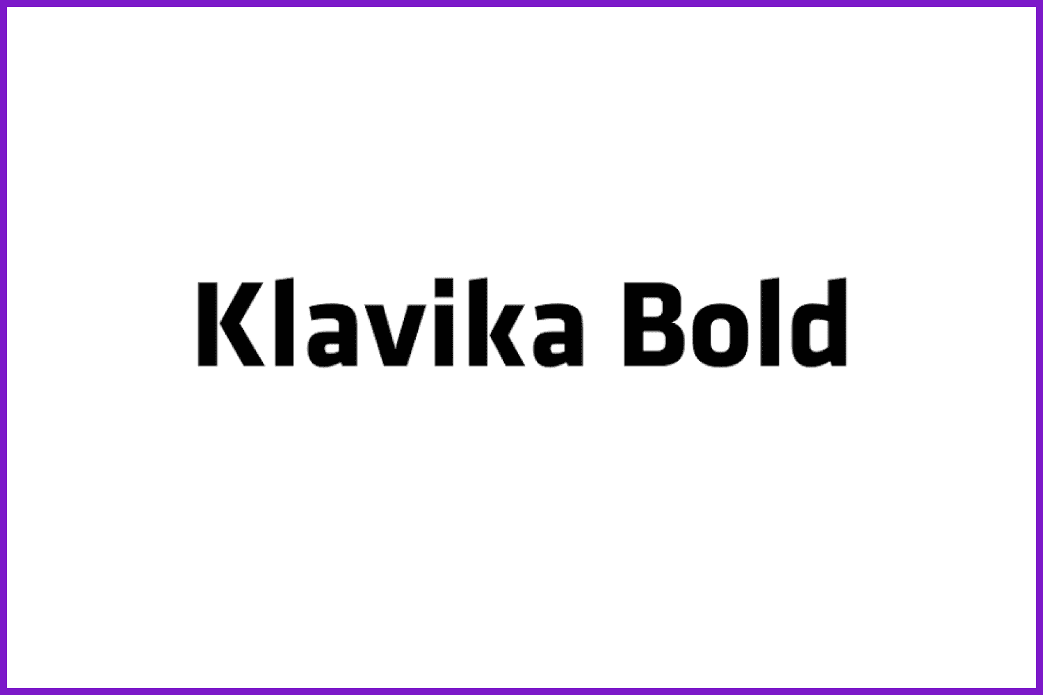
Image by MasterBundles
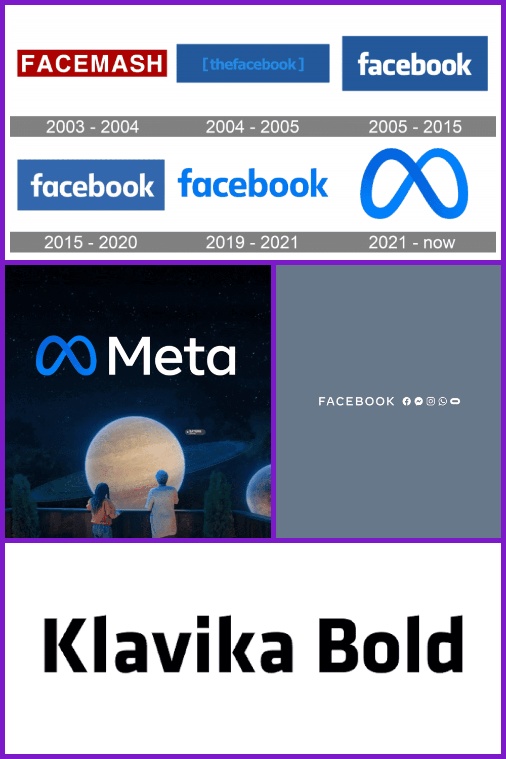
The modern design of the Facebook icon uses the Klavika font designed by Eric Olson. However, the lettering style was finalized by typographer and graphic designer Joe Kral. Officially, the font in the logo and FB icon has no name. Eric Olson of Process Type Foundry designed the in-house version.
Upload Your Logo to MasterBundles
Facebook (Meta) is one of the biggest companies in the world. Almost everyone uses Messenger, Instagram, WhatsApp, and other products owned by this brand every single day. Its icon is quite simple and has been stable for a long time. The blue and white color combination is immediately associated with this company.
The author of the first Facebook logo remains unknown, but who knows, maybe it will be you who will create a new logo for Meta in a few years! It is better to start practicing logo creation right now and sell your creative attempts through this convenient SELL YOUR DEAL form from MasterBundles!
Please take a moment to pin this post to Pinterest

What are your concerns?
Thanks for your response!
Disclosure: MasterBundles website page may contain advertising materials that may lead to us receiving a commission fee if you purchase a product. However, this does not affect our opinion of the product in any way and we do not receive any bonuses for positive or negative ratings.
