Creative Logo Design Ideas for Your Inspiration
Show me your logo, and I’ll tell you everything about your company. A logo is the face of a company, or a business. It represents your brand identity, tells who you are and what you do. It can tell about your taste, design preferences, about the time when it was created.
This post will show you the most creative logo design ideas for your inspiration and will tell you smart tips about how to make your own noticeable logo.
Let’s start.
Logo Basic Principles
A logo is all about the identity of your company. It creates your clients’ first impression and tells them the main idea of your company/business. When it is professionally done, it communicates the message to customers about the company’s values, creates brand loyalty. Along with the name of your company, its logo makes it memorable. There are certain characteristics that a well-done logo should possess.
Check them out:
- Simple. Less is more, the best design solutions are quite simple in their form. Moreover, clients can easily recognize such logos.
- Scalable. It’s a must-have of a good logo. It should look equally well in various resolutions. Here comes the importance of simplicity. A logo with a lot of extra elements is hardly ever scalable.
- Memorable and impactful. It should be effective enough, to be remembered at once.
- Relevant. It goes without saying that a logo is a visual expression of the company’s idea.
Tips for Creating Logos
As it’s stated above, a well-done logo is simple, distinctive, relevant, practical, and it conveys the owner’s intended message. Behind each logo, there’s a message of a company it belongs to.
The logo is intended to evoke some memory or emotion from the viewers, and thus create a strong association with the brand.
- Understand the brand. What is the company’s ideology? Does it express traditional or contemporary views? What is its audience? Taking into consideration all these points, it’s possible to create the logo which perfectly represents the brand’s idea.
- Choose colors. Each color communicates a certain idea, calls certain emotions and is pointed at a certain response. Color psychology shows a vital importance of examining this issue.
- Avoid cliche. Of course, there is a variety of cool design trends that appear every year, but it doesn’t mean that you should take the most popular ones and repeat them a thousand times in your logo. You can take any trend you want, but make sure that your logo looks different and doesn’t remind of something you’ve seen before.
- Proportion & symmetry. These are two points to be considered. People prefer images with a harmonious proportions where all parts play well together and are in proportion to each other.
- Negative space. Cluttered images are not a good idea. Wise use of negative space makes the image look clean and classy.
- Passive/active. Actually, there are 2 types of logos: with a sense of motion and without it. It depends on your company which one to choose. They both work quite well and are appropriate in particular cases. Logos showing some objects are usually static, while logos with mascots look better when they are in motion.
- Typography. Custom fonts make logos different and memorable as it happened with Coca-Cola. Such logos are always recognizable. If you’re not sure if your font looks great or not, don’t take a risk, use existing neat fonts (like Montserrat). A lot of well-known brands like Crate & Barrel, American Apparel use Helvetica.
- Fun. Make people smile, and they will return the favor. When you make somebody happy, it’s always rewarding. In terms of a logo, it can be a funny mascot or a hidden message. Look attentively at the Amazon logo, there’s a little smile below the brand name. Subconsciously it affects people and turns on positive emotions.

- Symbols. Try not to use overly symbolic logos. Less is more is the best rule here. Most logos are symbols, and most creative of them contain subliminal meaning. It’s like a play when you offer people to guess something. A visual metaphor is the best choice here, but make sure that it is understandable.
- Learn from others. It’s a good idea to find inspiration somewhere. Look through the best examples of logos and visit sites with tons of cool items (Dribbble, Deviant Art, Behance, Logo Gala, etc). And go on reading this post to see the best inspirational logos.
Logos fall under certain trends today. The most powerful of them are presented below with short descriptions. Let’s start, and admire the most effective examples of logo design.
Architectural Elements
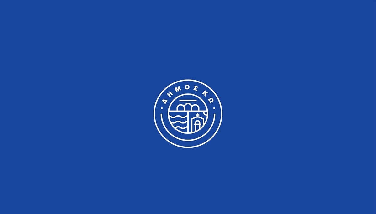
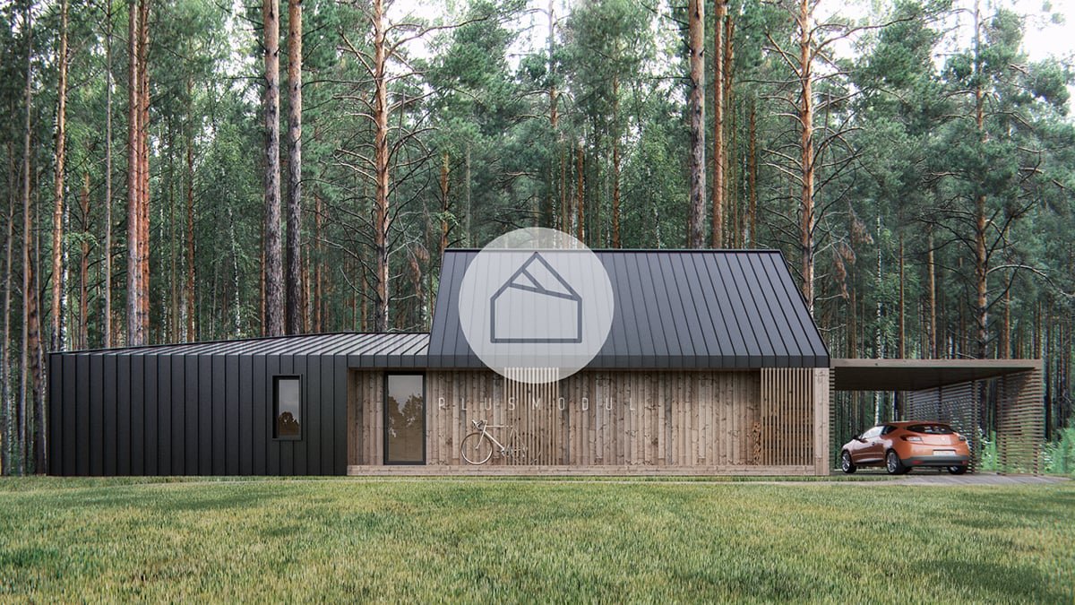
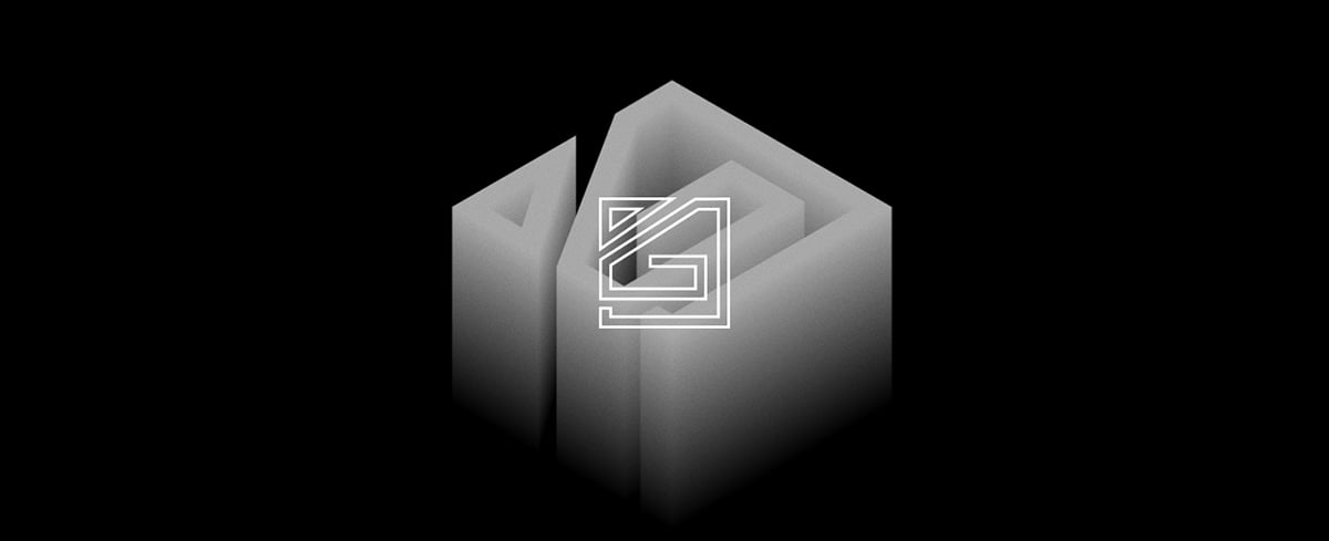
Architectural and graphic design have much in common, and it’s no wonder that they interpenetrate and enrich each other. Most logos show a visual interpretation of architectural pieces and look extremely catchy. Playing with physical space in the digital world can give interesting results.
source
***
source
***
source
Contextual Logos
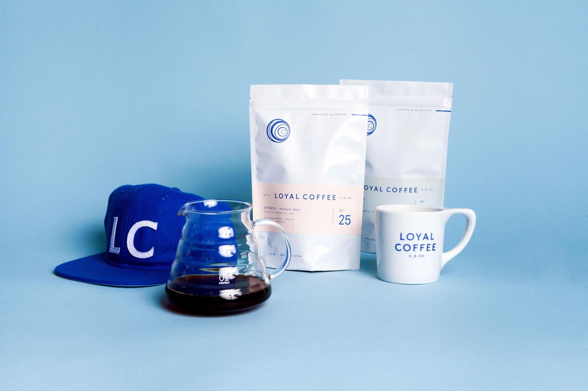
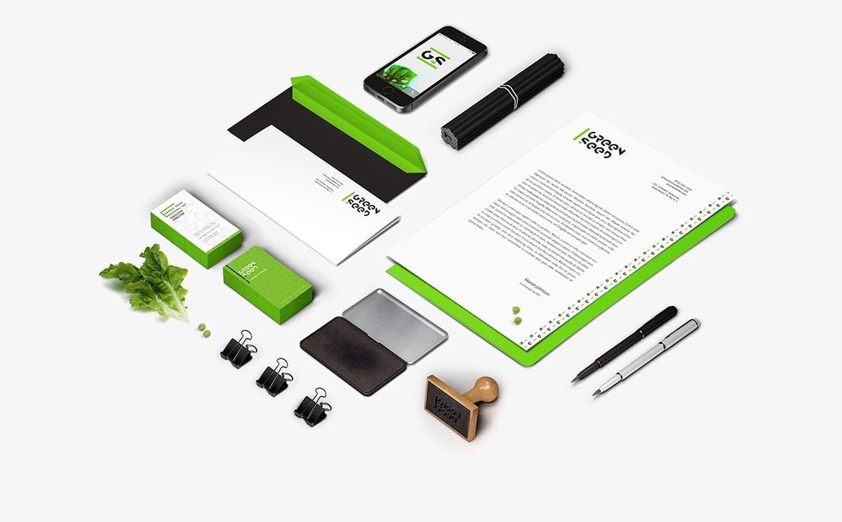
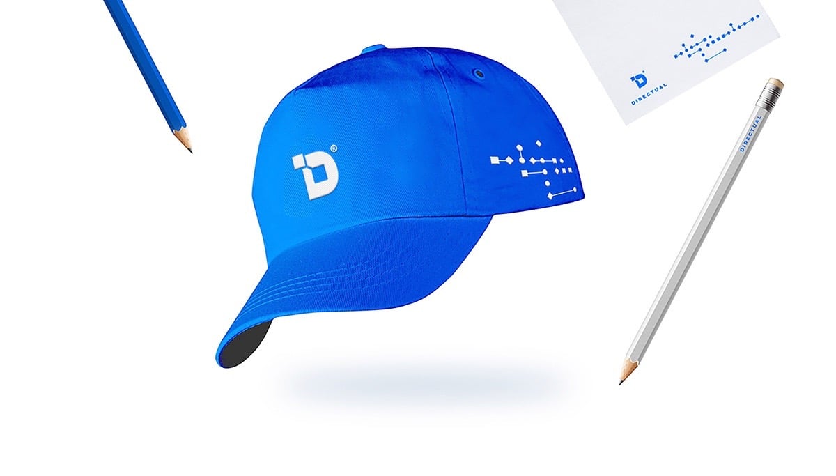
2018-2019 brings awareness to context. You should always remember the context where your logos will be applied. And it can be a variety of them: paper, business cards, pens, cups, t-shirts, packages, windows, etc.
source
***
source
***
source
Metaphorical Logos
Today most logos strive not only for visual perfection but also for maximizing metaphors. Such smart concepts give more depth to a logo, encourage the viewers to think.
source
***
source
***
source
Grid-Based Logos
This is a perfect visual for all those who strive for perfection. Such logos are real masterpieces in terms of wise symmetry, cleanliness and most often minimalism.
source
***
source
***

source
Monograms
Here is a trend for classical art lovers. Monograms never go out of style, and always look classy.
source
***
source
***
source
Original Typography
Feel free to experiment with the existing types, or try the custom ones to create a piece of art. Don’t be afraid to use bold solutions. Your aim is to create a memorable image that perfectly communicates your business idea. Custom handwritten fonts, original elements, an optical illusion will push your creativity.
source
***
source
***

source
Patterns and Color
As opposed to minimalism, this trend offers layering and masking of patterns and colors to create a sophisticated look. Various experiments and abstract visuals are welcomed here. When everything is accurately done, the logo looks extremely stylish and unusual.


source
***

source
Geometric Shapes
Minimalism dictates its rules today, and more often designers get back to basics. You can notice a great number of logos utilizing simple geometric shapes.
source
***
source
***

source
Fun
Don’t be afraid of making your logo look funny. It will make people smile, create energy and vibe, and for sure will communicate positive feelings. What else do you need to be attractive and interesting for your potential customers?

source
***

source
***

source
Over to You
While you try to develop the best logo for your company you’ll be able to improve your intuition so you’ll be able to recognize non-obvious, but effective solutions. For sure logo design process will teach you to find non-obvious connections.
As the British sculptor, photographer and artist Andy Goldsworthy said, “People also leave a presence in a place even when they are no longer there”. This means that a good logo can leave a trace in one’s mind for quite a long time.
May the inspiration be with you.
- Graphic Bundles
- Logos
