Product Specs
| Created by | codesupplyco |
|---|---|
| File type | HTML, JS, PHP |
| Date of Creation | December 9 2022 |
| Color | black blue brown orange |
| Rating | 5 (10) |
| Category |
Blueprint – Next-Generation Blog & Magazine Theme Description
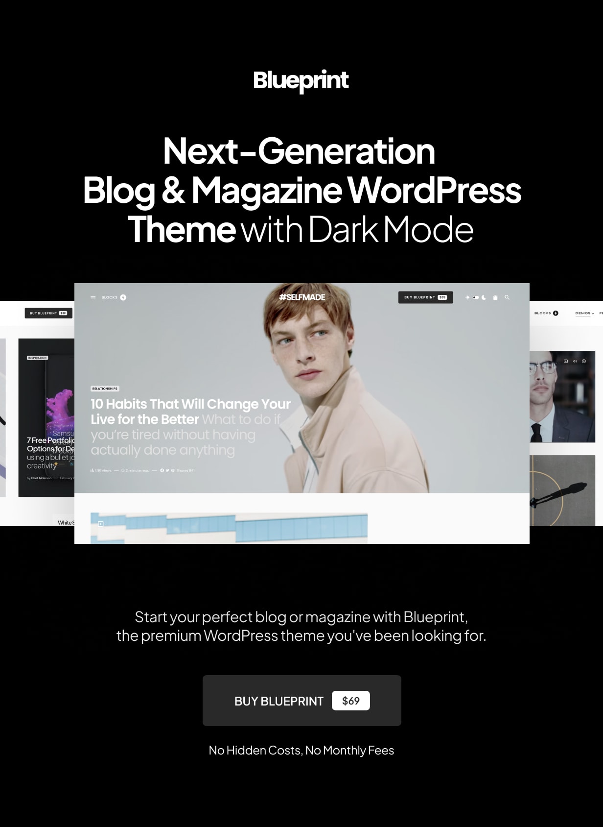
Blueprint – Next-Generation Blog & Magazine Theme
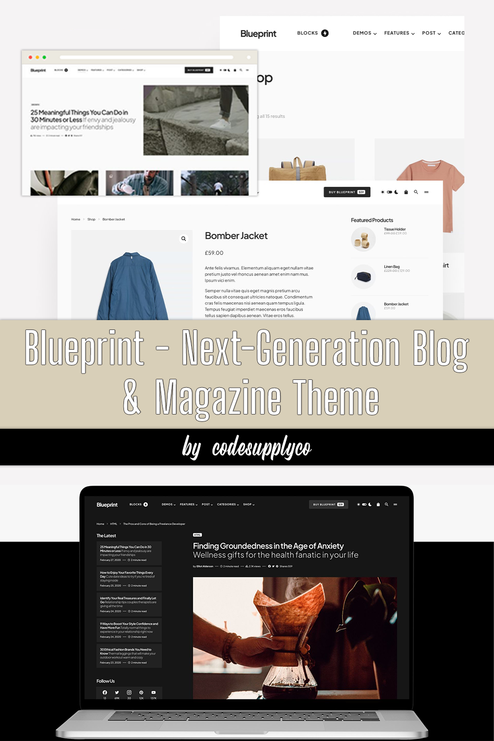
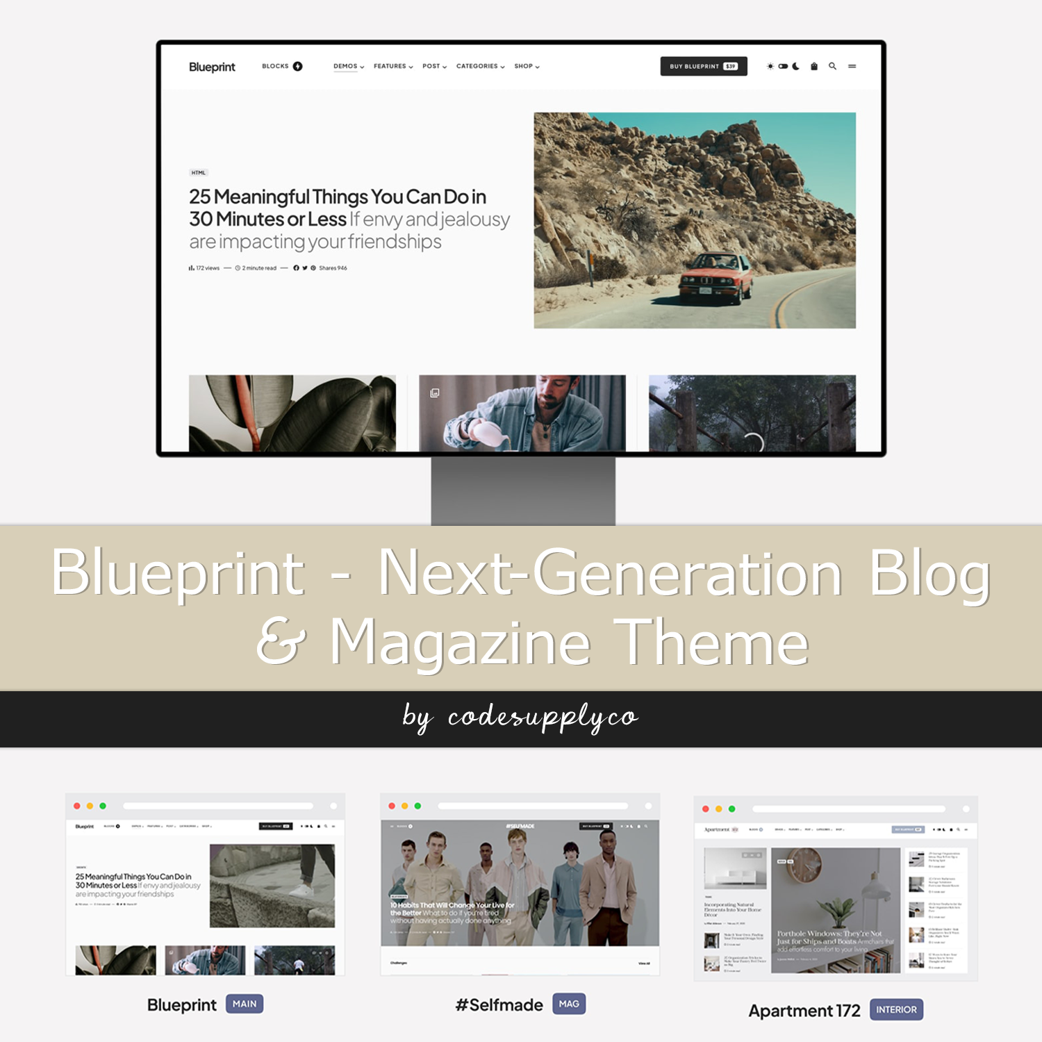
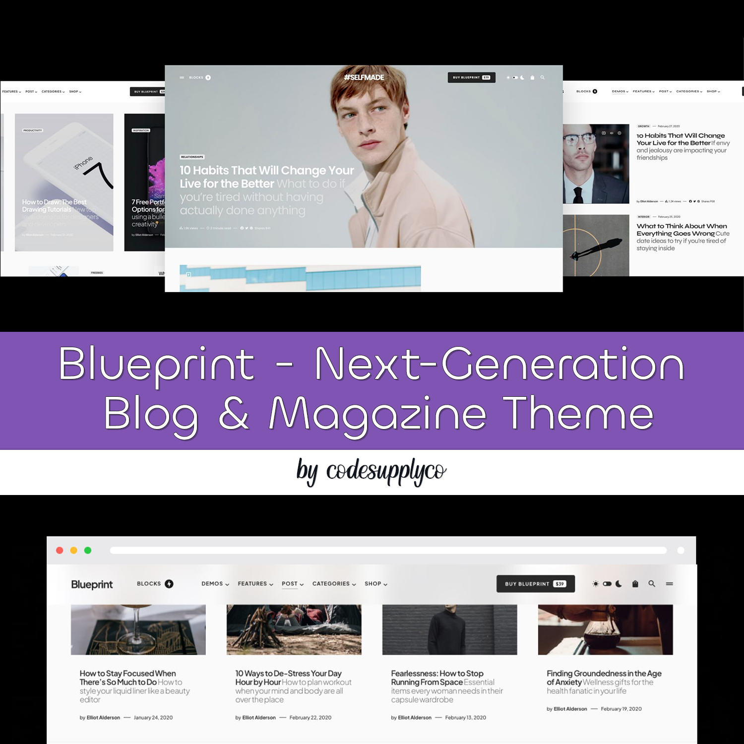
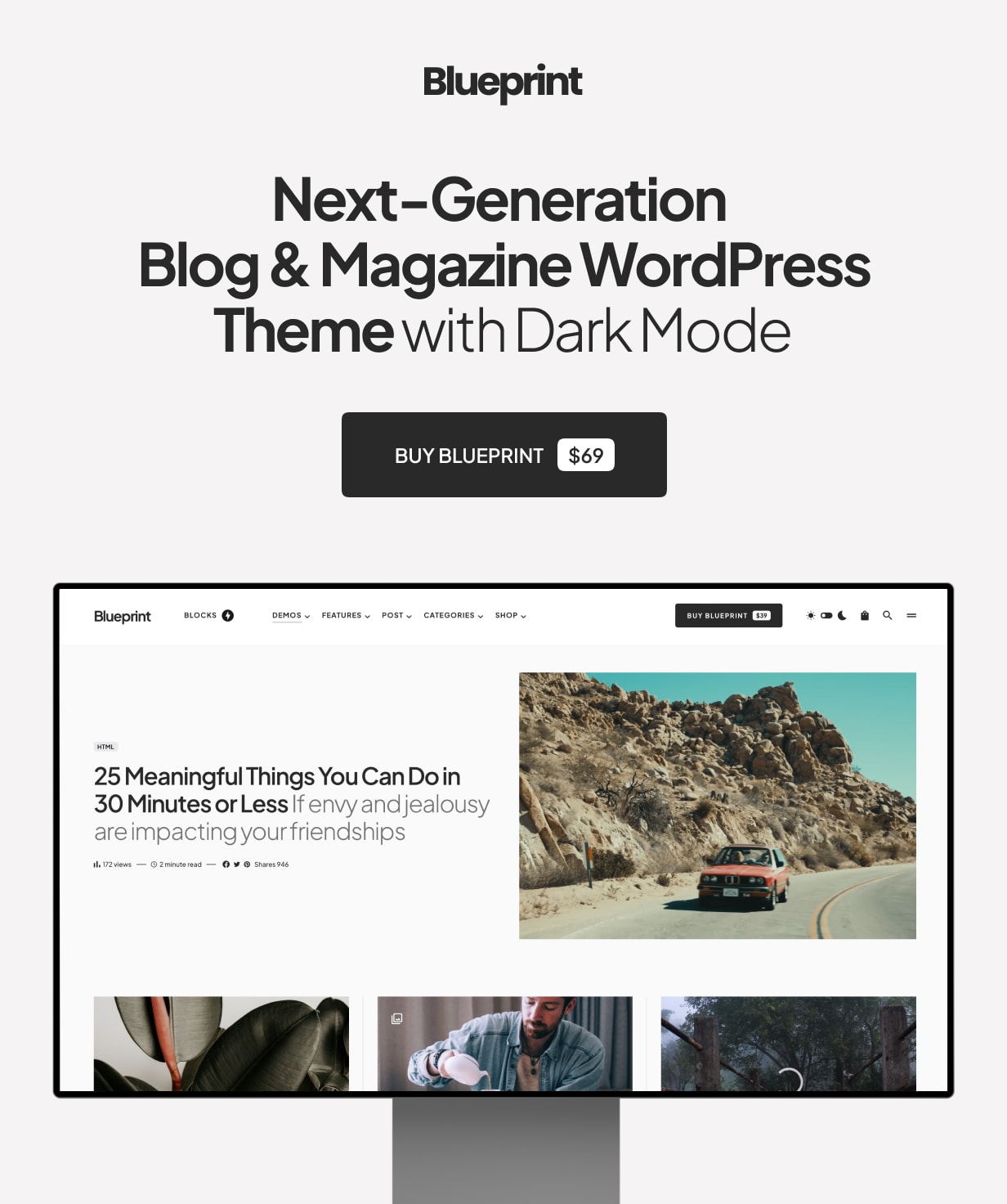
Blueprint is a modern and clean blog & magazine WordPress theme for modern publishers and bloggers.
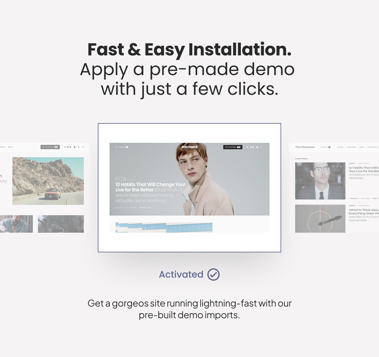
9 Importable Demo Sites in One Theme
Jump start your blog with 9 premaid starter sites, including all posts and images.
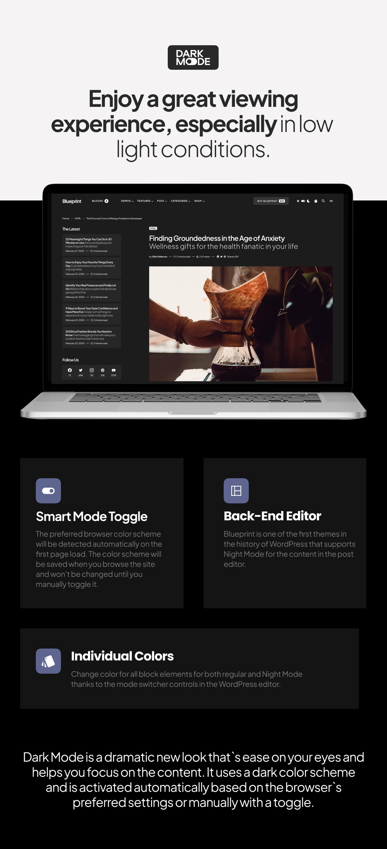
Dark Mode
Turn on Dark Mode for a great viewing experience especially in low-light environments.
Dark Mode is a dramatic new look that’s easy on your eyes and helps you focus on the content. It uses a dark color scheme and is activated automatically based on the browser’s preferred settings or manually with a toggle.
Turn on Dark Mode to give your eyes a break.
Multiple Page Header Types
There are three different page header types for your posts and pages. Display your featured posts’ header with an image overlay or a smaller page header.
Smart Colors
When you select a dark background color for your header or footer, the text and links color will automatically change to white. You don’t need to set up a lot of color option, as most of them will work automatically based on your selection.
Customize with Instant Live Preview
All theme options can be configured with the native WordPress customize feature. Forget the outdated settings pages and manually refreshing your page to see the changes. Preview all the changes live while configuring your perfect online media.
Multiple Archive Layouts for Homepage and Archive Pages
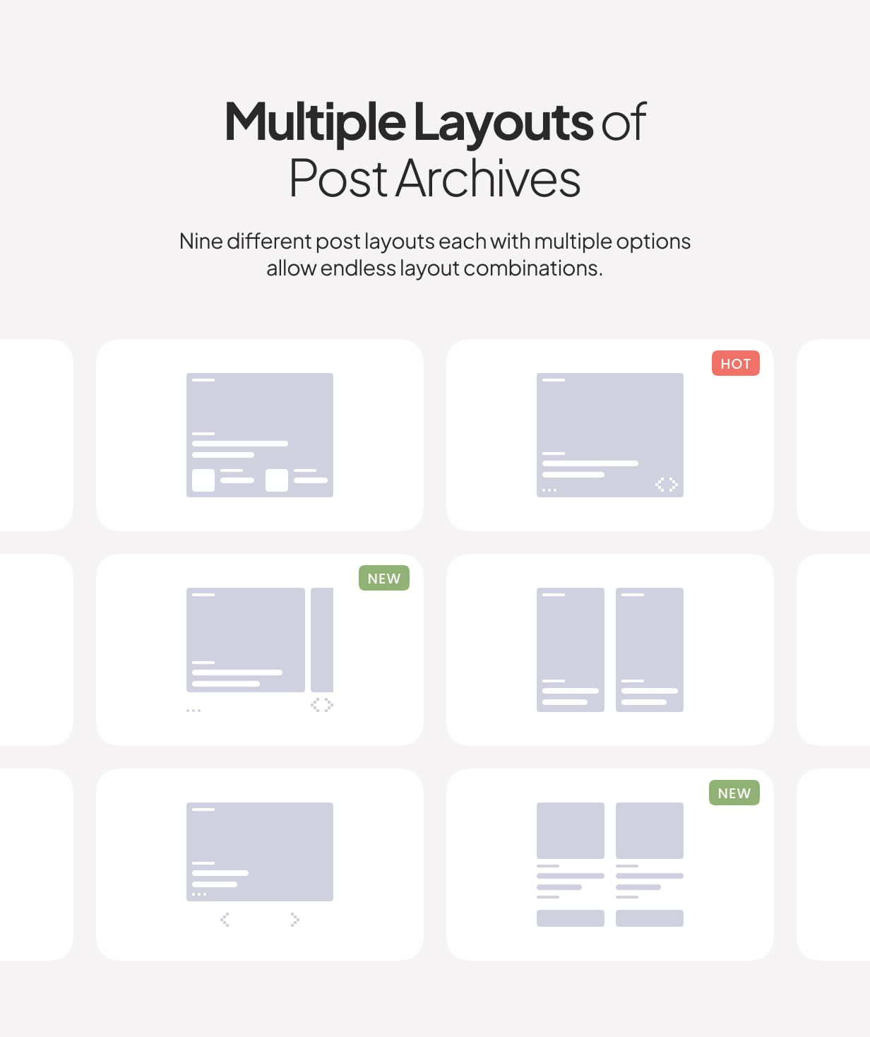
Choose from different post archive layouts for your homepage and archive pages. Display your posts in grid, list, or full layouts.
Multiple Page Layouts
Select the matching page layout for your homepage, archives, posts, and pages. Display a sidebar on either the left or right side or use the full-width page layout for your content.
Super-Fast Mega-Menu
Showcase your recent posts with a thumbnail right in the menu dropdown. Don’t worry, the menu will not slow down your website, as the content is requested dynamically, only when a user hovers over the parent menu item.
AMP Support
We have added styles for the AMP pages to match the main styles of your website. Simply activate the official WordPress AMP plugin to enable Google Accelerated Mobile Pages on your website.
Exclude Duplicate Posts
Everybody knows, and Google, in particular, that duplicate content is bad. Avoid having duplicate content on your homepage by excluding featured posts from the main archive with a single click.
Google Fonts
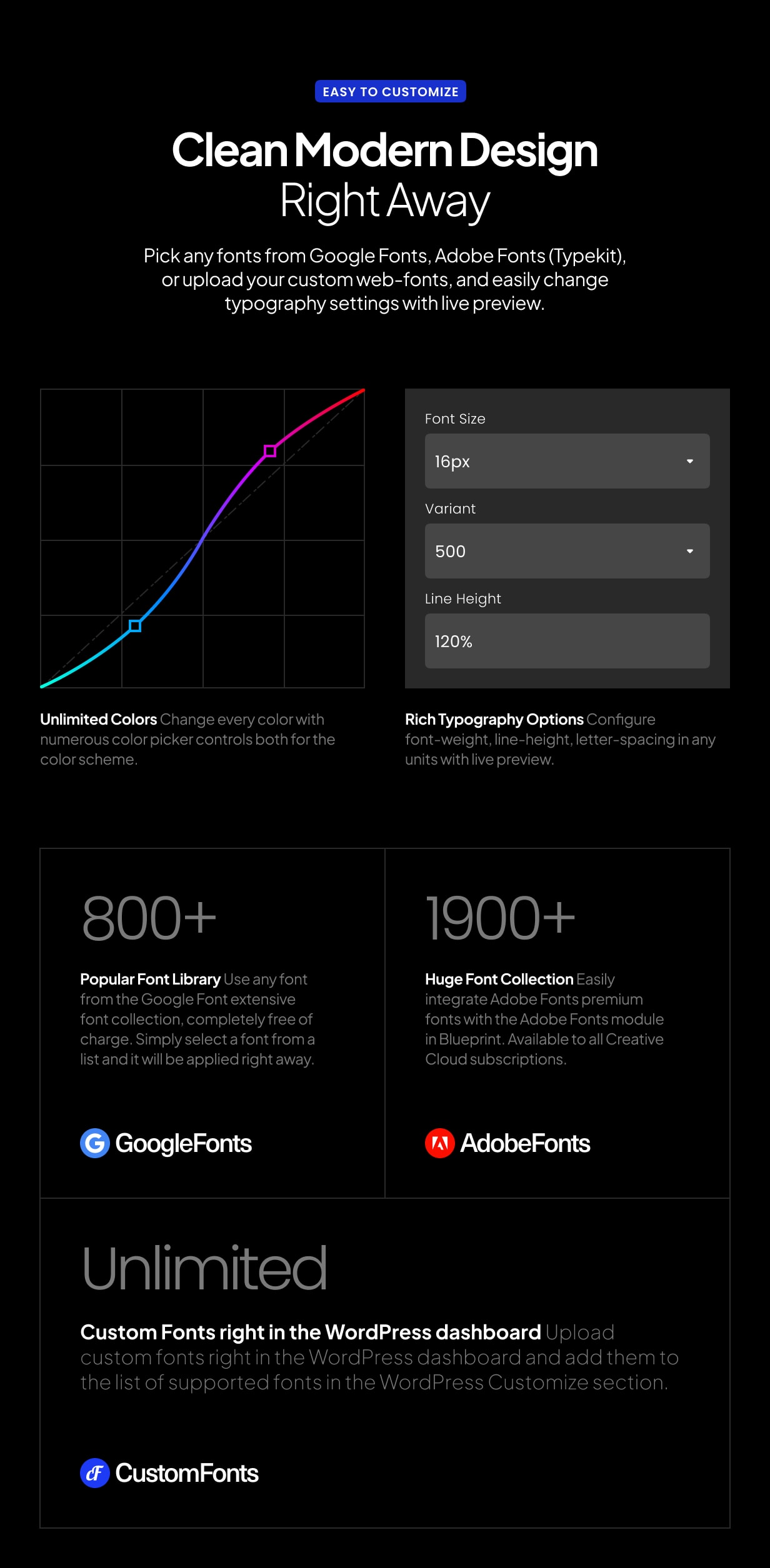
Create different styles with 800+ Google Fonts supported. Simply select the desired font from the dropdown and preview it instantly on your website – no more confusing CSS rules or code snippets.
Additional Content
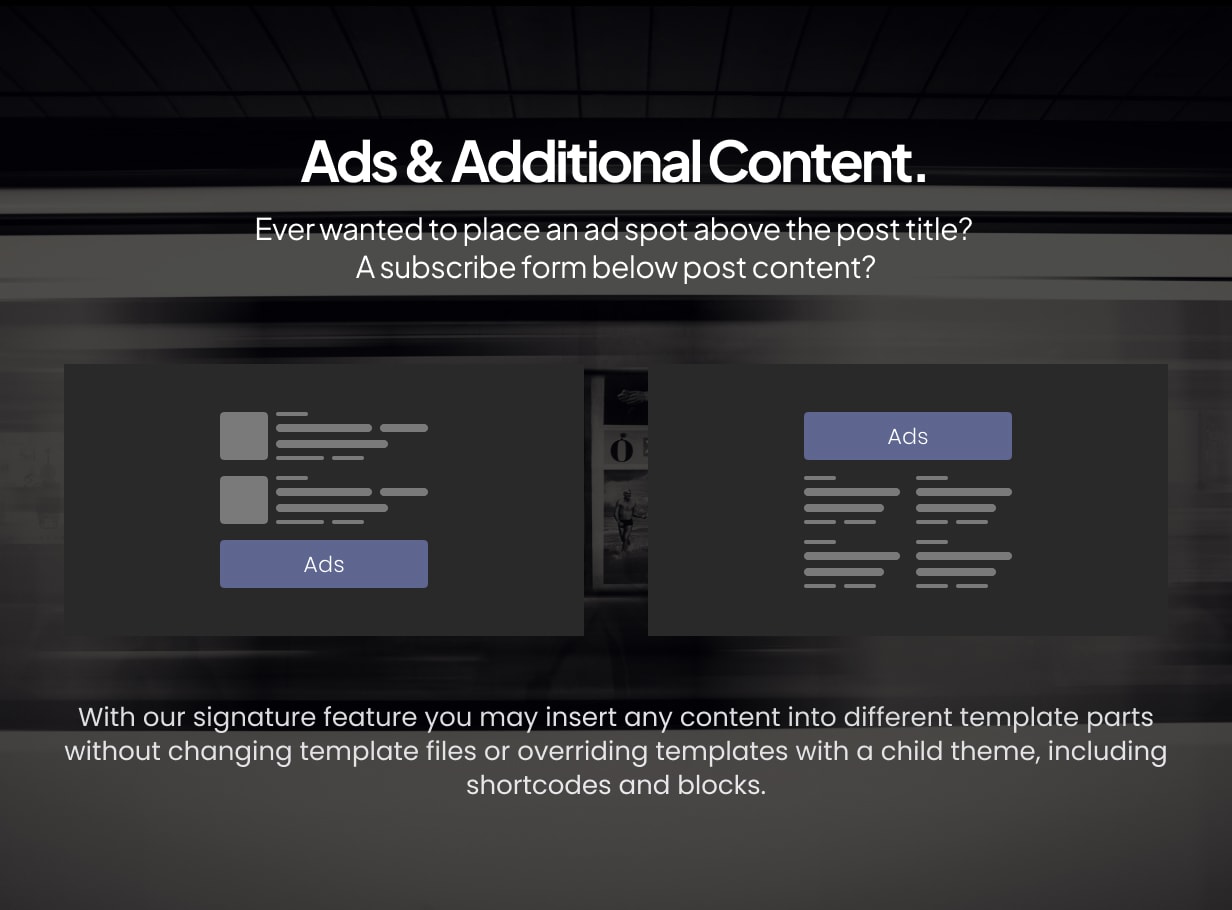
Ever wanted to place an ad spot underneath your header? Or a short description before the featured posts section on your homepage? A subscribe form below post content? With our signature feature you may insert any content into different template parts without changing template files or overriding templates with a child theme.
Smart Sticky Navigation
Increase mobile users’ viewport by displaying the main navigation only when they scroll up. Or force the menu to stay sticky all the time. Or disable the feature completely, it’s up to you! Enable either of the three options in theme settings with a single click.
Sticky Sidebar
Make your widgets sticky when scrolling the page. Select from two options: either stick to the bottom edge of your sidebar or the top edge of the last widget. Increase your ad’s conversion by setting the ad as your last widget and selecting the latter option. Unlike other theme’s sticky sidebars, ours is enabled and doesn’t flicker on tablets or mobiles. By using the native browser’s sticky positioning, we created a sticky sidebar that animates gorgeously not only on desktops but mobiles too.
Smart Multi-Level Menu
It’s you who decides how to structure your content. Our theme supports unlimited levels in your main menu. If there’s not enough space in the viewport to display a dropdown submenu, it will appear on the opposite side instead. And it supports mobile touch devices, too.
Mobile Slide-Out Menu with Widgets
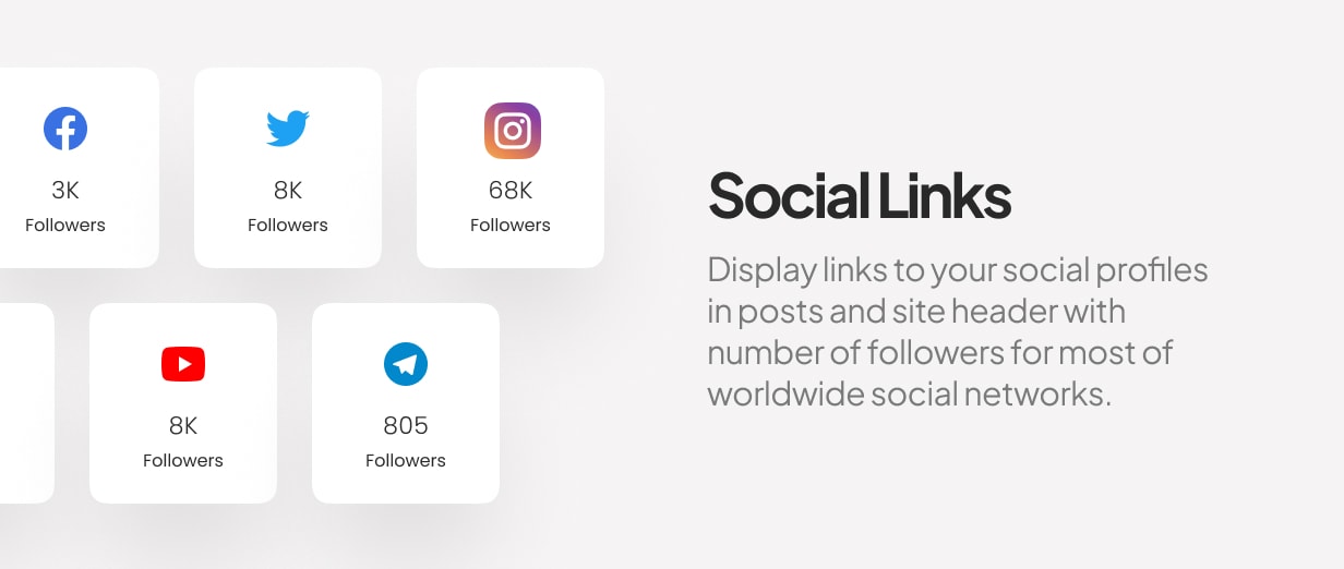
Display the mobile menu upon clicking the hamburger icon on mobile devices. You may also place social links, subscription form, Facebook fan page or any other widget on your mobile menu, just as in a regular sidebar.
Paginated Posts
Divide your posts into multiple pages and add properly styled pagination at the bottom of your posts.
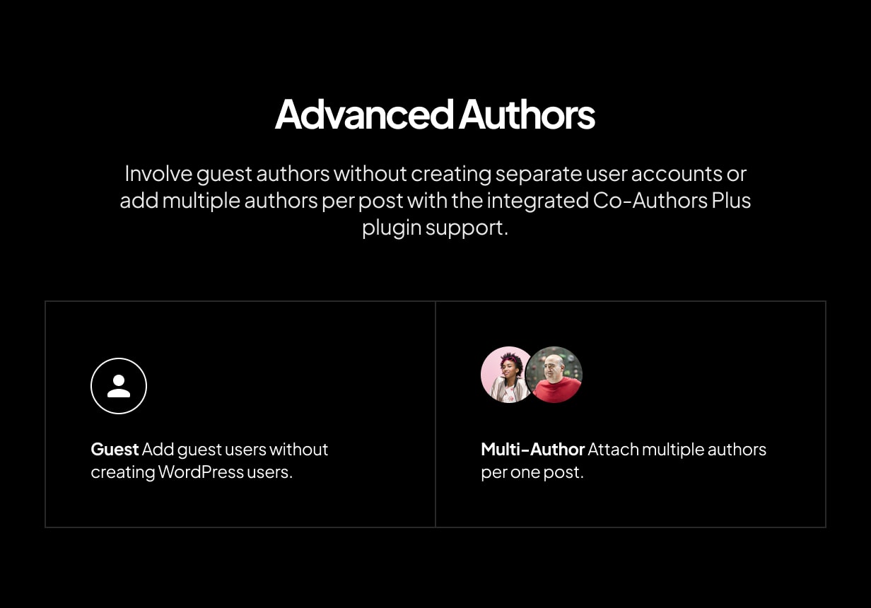
Guest Authors and Multi-Author Posts with Co-Authors Plus Support
Involve guest authors without creating separate user accounts or add multiple authors per post with the integrated Co-Authors Plus plugin support. All post authors, including contributors and guest authors, can have social accounts and a bio too.
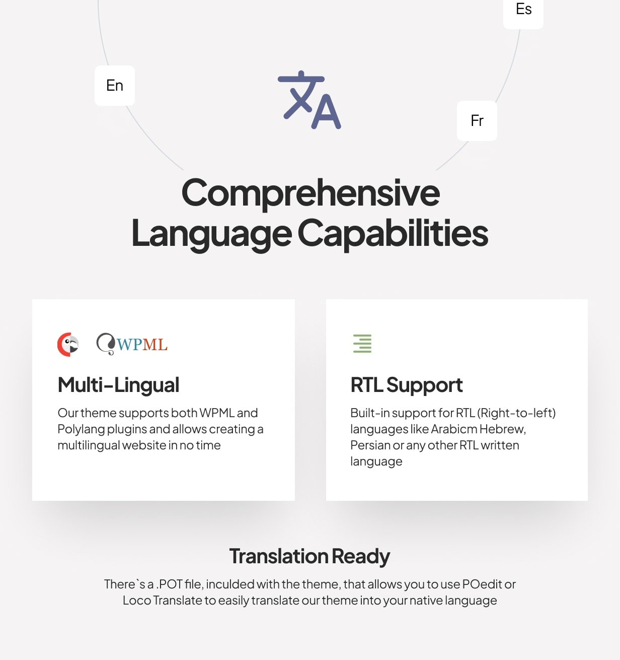
RTL
Built-in support for RTL (right-to-left) languages like Arabic, Hebrew, Persian or any other RTL written language.
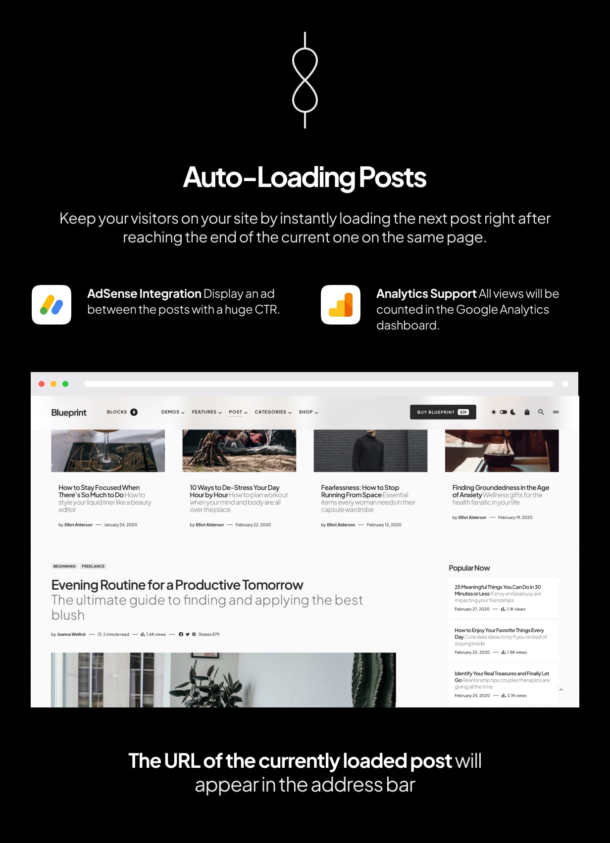
Numbered Pagination, Load More, and Infinite Load
The “Load More” button and the Infinite Load feature will encourage your users to stay on your website longer by browsing through your post archives without refreshing the browser page.
We use the new REST API for instantly fetching posts, which is the fastest way to dynamically load posts in WordPress.
Post Views with Google Analytics synchronization
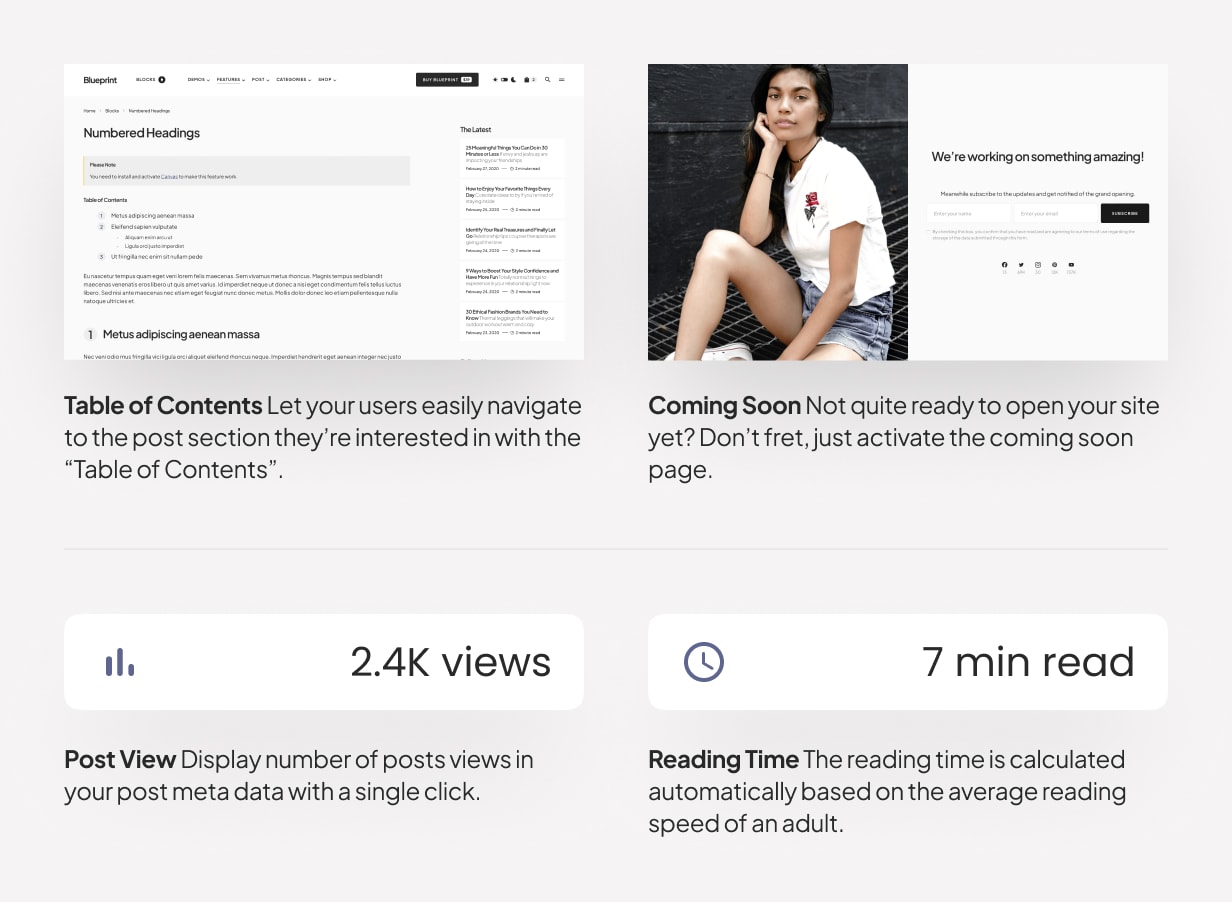
Display number of post views among other post meta with the integrated post views support.
Post Reading Time
Easily add post reading time to encourage your users. The reading time is calculated automatically based on the average reading speed of an adult.
Retina-Ready
Your website will look amazing on Retina screens thanks to vector scalable elements, clear Retina-ready images, and typography.
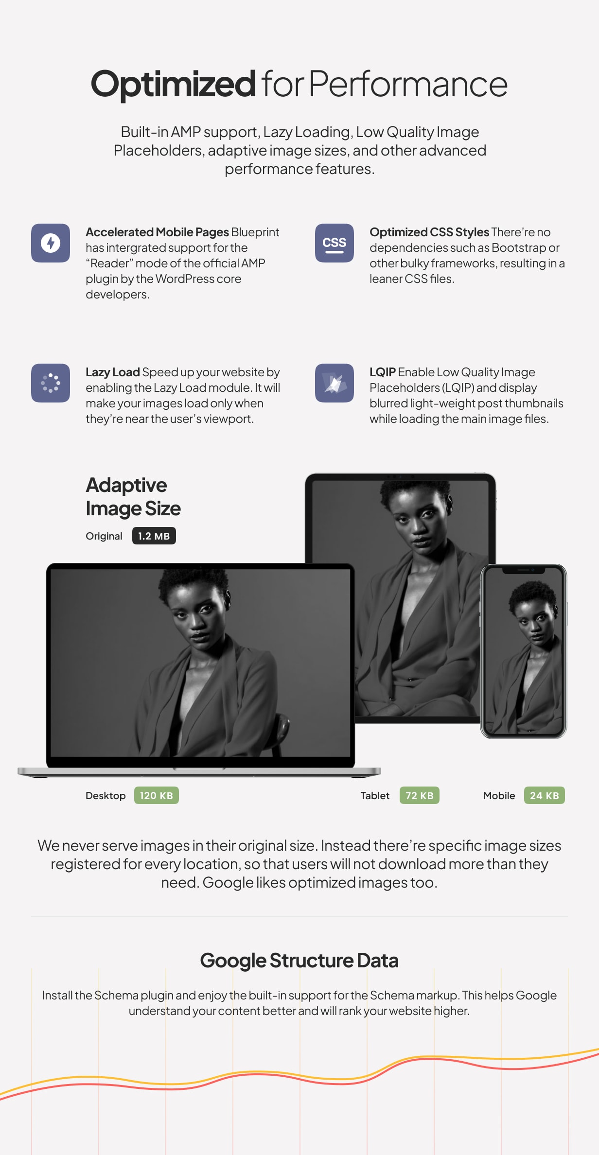
Adaptive Optimized Image Sizes
A small number of generated thumbnails will save your disk storage space on your hosting provider and make the thumbnail regeneration process quick.
We never downscale images and serve them in the original size or close to it, so that users will not download more than they need. Google likes optimized image sizes too.
Ultra Responsive
We tested our theme on multiple physical devices and emulators to make sure we deliver the best quality.
Feature-Rich, yet Simple
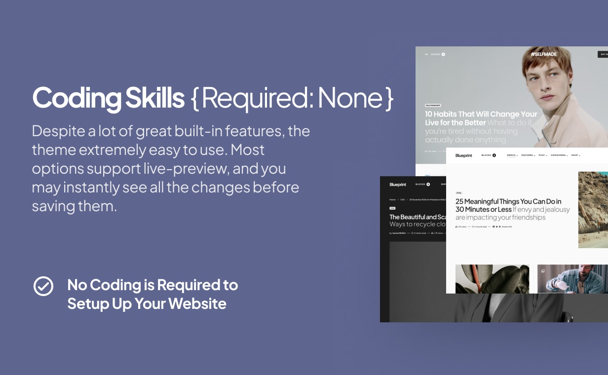
Despite a lot of great built-in features, it’s extremely easy to use. All options support live-preview, and you may instantly see all the changes before saving them.
We made sure that all theme options and features are seamlessly blended into the WordPress user interface and feel very natural and intuitive.
Of course, no coding is required to setup up your website.
SEO by Yoast Support including Breadcrumbs Styles
Activate breadcrumbs, a powerful SEO addition to your website, with a single click in SEO using Yoast plugin and it will automatically appear in the right place with the right styles.
And more..
