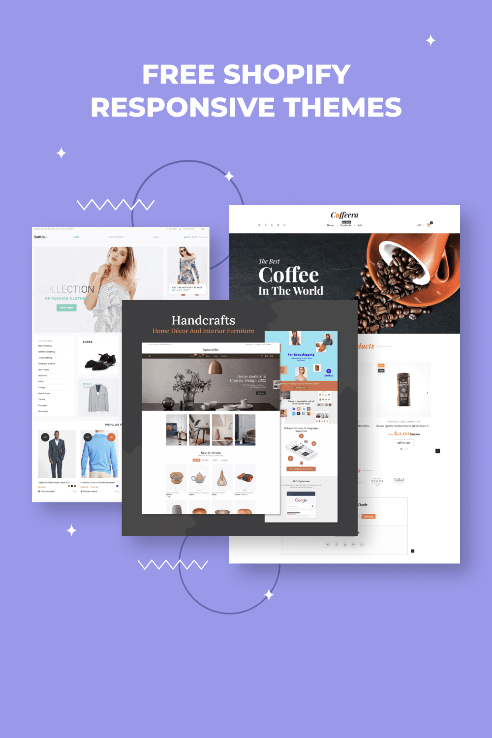
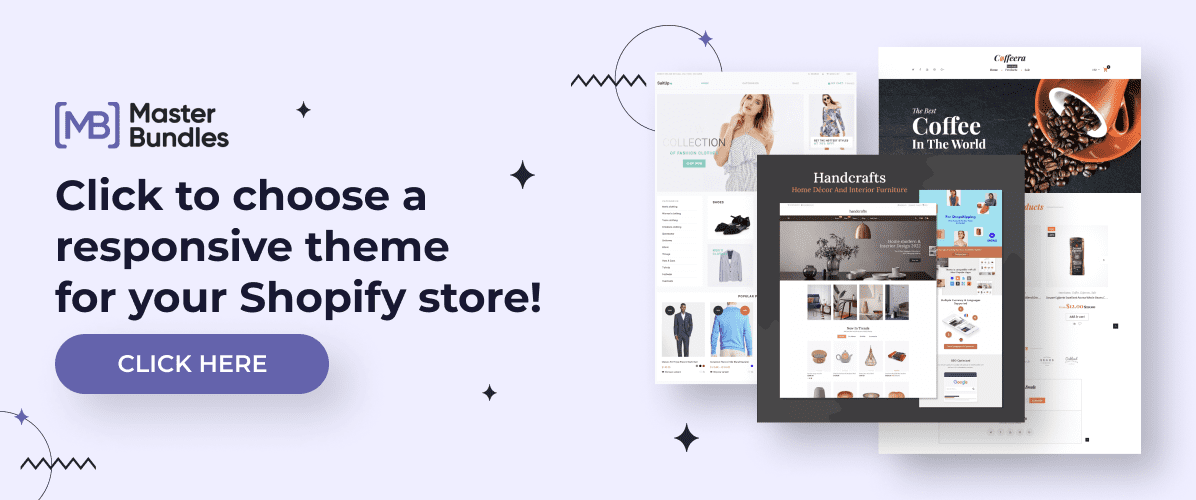
10+ Best Free Shopify Responsive Themes 2023
There’s one important design rule every professional seller on Shopify knows — always use a responsive design.
You may create a beautiful store page, but what happens if you forget to make it user-friendly from any device? Then, potential customers who are ready to buy your product can change their opinion because whenever one opens your website from a phone, the content is all bunched up.
That’s why you need to use responsive themes that will give your customers a flawless shopping experience and ensure the users complete the desired action. Here’re 10+ high-quality, Shopify responsive themes that will make your page easy to navigate from any device.
Best Free Responsive Shopify Themes 2023
You can find more templates specifically designed for Shopify to revamp your shop and turn it into an outstanding page and lead-generation resource.


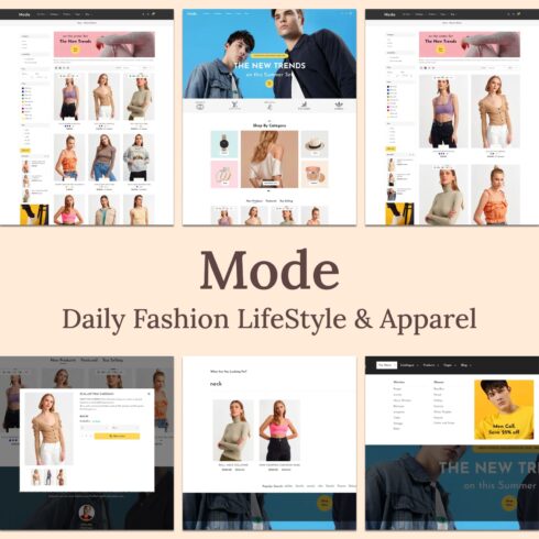
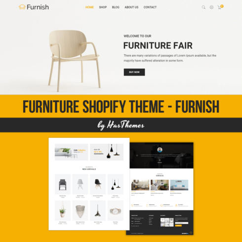
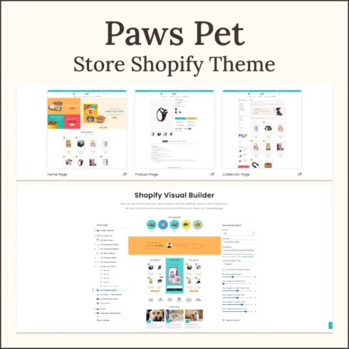
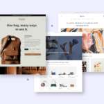
Fashion Store Elegant Shopify Responsive Theme

This fully responsive minimalist white theme with mint accent is perfect for fashion stores. Thanks to clean style you can draw attention to your products and important information. Make users get the best shopping experience from any device.
Another feature that will help users make decisions is product reviews. They are a powerful tool to use in your upselling and cross-selling strategy. Want to learn more? Check out this guide!
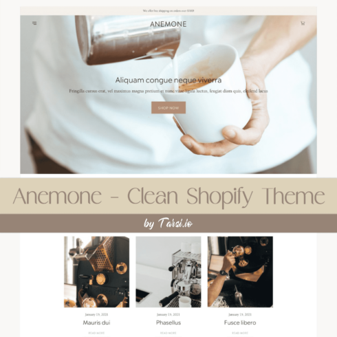
Coffee Shop Ready-to-Use Clean Shopify Responsive Theme
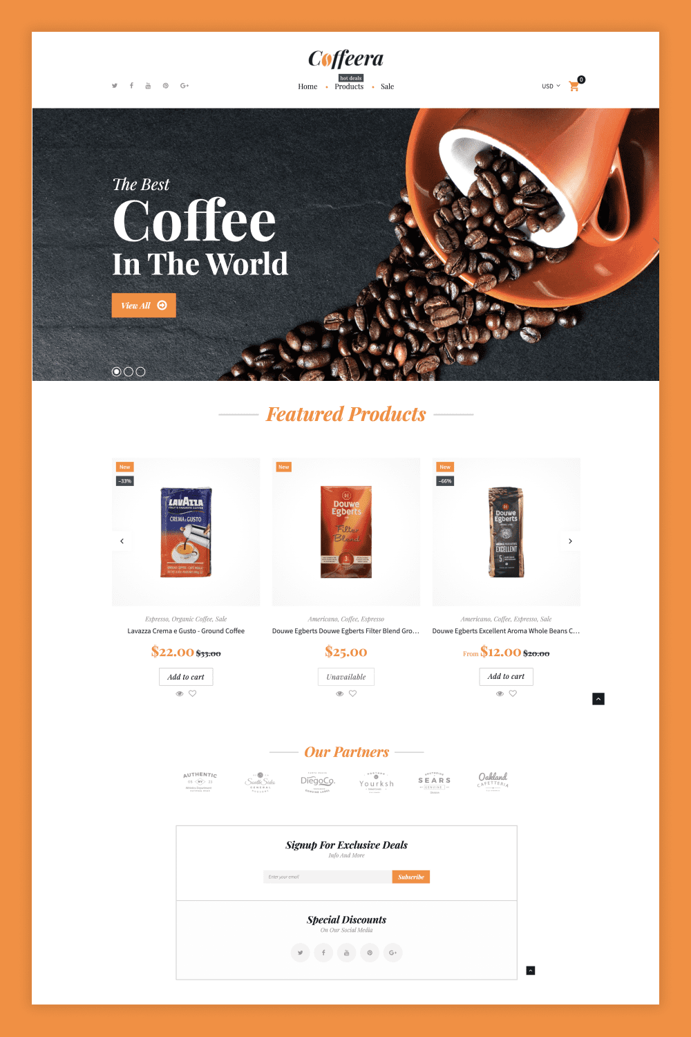
If you are a coffe shop owner, don’t look any further. This responsive Coffeera Shopify theme is developed to perfectly showcase your drinks. Either users are scrolling from their laptop or mobile gadgets, they will enjoy the flawless experience.
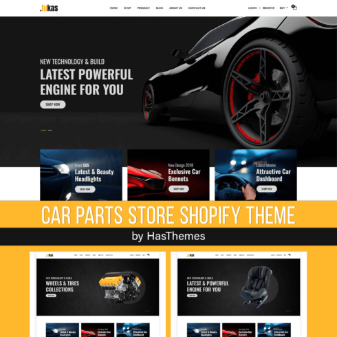
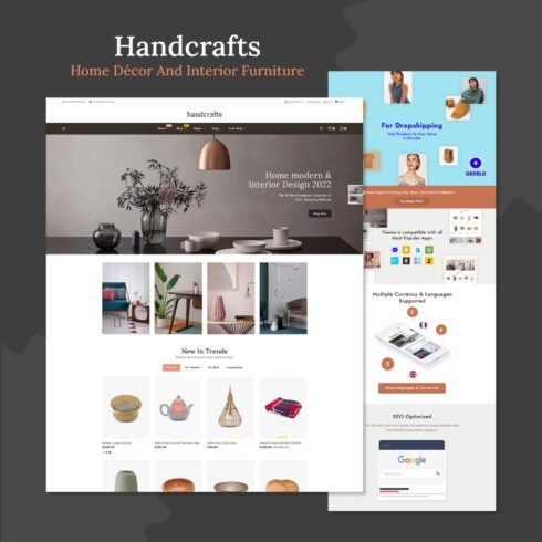
Tools & Equipment Free Clean Shopify Responsive Theme
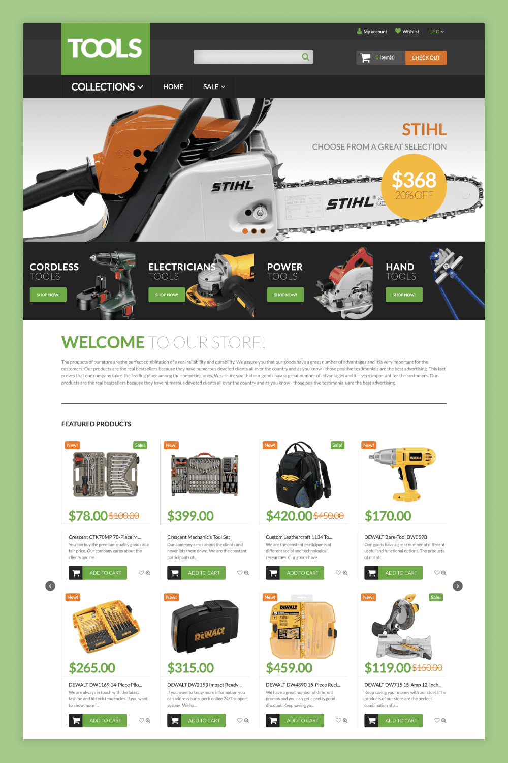
If you’re running an equipment store, the fully responsive Tools Shopify theme is the perfect option. A lot of design features and visual effects are included in this theme. Also it’s a great choice for electronic equipment or mobile devices stores.
Wrap Up
In the modern market, a flawless user experience is everything. With responsive Shopify themes presented above, you can stay among top sellers and ensure customers can quickly buy your products in a convenient way from any device.
Do you have your own templates for Shopify? Become our vendor and start making money by selling your deals on MasterBundles. You’ll like the easy navigation and onboarding and definitely will enjoy the extra income.
Best Related Articles
Some Awesome Videos about Responsive Shopify Themes
10+ Free Shopify Responsive Themes – MasterBundles
Graphic design bundles: https://masterbundles.com/
FAQ
Here are a few frequently asked questions about the best responsive Shopify themes.
Are Shopify themes responsive?
Yes, the presented Shopify themes are 100% responsive, meaning they can adjust to fit different screen sizes. Stay assured that your chosen design will look great on any device.
What is the most flexible Shopify theme?
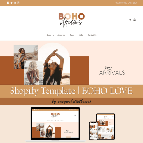
Usually, the most flexible themes are the premium ones (like Daily Fashion LifeStyle & Apparel Shopify Responsive Theme).
How do I make Shopify more mobile-friendly?
Using ready-to-go Shopify responsive themes will help to ensure a user-friendly interface for users scrolling through your store via their mobiles. What is more, it’s proven that mobile-friendly themes are also more likely to make your shop page rank well.
What is a responsive theme?
A responsive theme changes automatically to fit different screen devices. If you view a website on a desktop computer, it will look different than if you were scrolling through your mobile phone. The content adjusts so that everything fits perfectly into whatever space is available for viewing.
What are your concerns?
Thanks for your response!
Disclosure: MasterBundles website page may contain advertising materials that may lead to us receiving a commission fee if you purchase a product. However, this does not affect our opinion of the product in any way and we do not receive any bonuses for positive or negative ratings.