10 Basic Elements and Principles of Design
The fundamentals of graphic design is the visual, and this is inevitable. In order to make it cohesive and engaging, we require certain elements including shape, scale, and emphasis. This is only a small part of what we will talk about today. Let’s figure out what the design base is and how to implement it in a work.
Line
The first basic element of design is the line. It is difficult to find a design that does not contain lines. They are everywhere and are used to direct the eye to a certain spot or used simply as a decor element. Their variety is huge. Lines differ in the following ways:
- shape: you can put a line in a funny shape or make it straight (we can draw with the help of lines after all;
- color: they can be light or dark, any shade of any color;
- size: whether they are long or short, is only a matter of your choice;
- hickness: thin lines won’t draw much attention while bold and thick lines will do quite the opposite;
- visibility: they can be visible or invisible;
- solidity: line can be solid, dashed, or dotted.
Most layouts are made with lines, as well as tables, grinds, sections, and so on. All designs contain lines, yet we might not see them, since they are sometimes invisible.
Color
Color is surely a huge element when creating a stunning design. Color helps with categorization and organization. It is especially helpful if an emphasis is needed. Coloring might play a crucial part, yet it is not a necessary visual design element. It is not vital to use a palette of all existing colors—you can keep it minimalistic—but still it is recommended to apply a dominant color and a supporting color.
The properties of color are:
- saturation;
- lightness;
- hue.
One of the delights of working with colors is their incredible number. After all, we take into account not only the colors themselves and their multiple hues, but also lightness, darkness, and bright or dull saturation.
Despite the fact that this is an easy-to-use element of art design, there is still a catch. We must not forget about the psychological and cultural component of color. Colors tend to have sub-meanings and evoke different emotions, and depending on the culture, colors can carry a completely diverse message.
Shape
As was mentioned earlier, shapes are formed from lines: they close and form boundaries. They can be closed in multiple ways, which is extremely useful in terms of graphic design concepts. There are three types of shapes: abstract, organic, and geometric.
Abstract shapes are graphical representations of real objects, creatures, or situations (thus, a human figurine is an abstract shape). Companies often use this element of shape in their logos. This is done in order to convey the essence of the business and appeal to a potential client.
Organic shapes are asymmetrical, imperfective, rather circular in nature, and flowing. They are quite alike yet still different from each other. Such elements of drawing will add a more natural and realistic look to your design.
Geometric shapes are used in the most basic design (squares, circles, triangles, etc.). They provide a certain definition and clarity.
Space
The next principle of graphic designing is space. It is an element that refers to the distance around, above, below, behind, and the area between design objects. Here, a lot of additional tools come into play: shading, shadowing, sizing, overlap, etc. As in the case with color, space shouldn’t necessarily be used if it isn’t beneficial to the design.
Also, there is a term called “white space.” It is an empty space that does not include any elements. The trick is to create some room and discern other parts of the design.
Texture
Texture adds depth to a 2D surface, allowing for the illusion of tactility. We have the opportunity to touch everything that happens in the image. To add texture to your design, you can use a geometric or natural pattern, such as a rough wood effect or a crumpled paper effect. The more textured the pattern is the more it supplements to its visual perception. In basic graphic design, texture can also be achieved by layering the objects or text.
Typography
Typography is one of the most important elements of graphic design. Typography sets the tone for the project and adds a certain mood to it. Yes, with the help of text formatting, you can add one or another tone, which in turn will lead to a certain feel of the written information. Serif fonts (e.g., Times New Roman) tend to have a more traditional and significant perception, and are used in official documents and academic work. Sans serif fonts (e.g., Open Sans) are considered more modern.
Scale (Size)
Should it be large or small? That is the question. Here we talk about the principles of balance and harmony (read more about those below). Some might think that the bigger something is the better, yet this is not quite true in visual design. It can appear that tiny elements will look nicer and be more useful. It depends on the specific features of your design and the goals you have for it.
Dominance and Emphasis
The most valuable objects have to be distinguished and separated. This can be achieved by movement, contrast, and so on. This is exactly how we add emphasis. It draws the viewer’s attention right where it is needed, in such a way that it transmits a message, which obviously has its importance. The separation of dominant and subordinate objects is substantial.
Balance
Balance is the essence of life, they say. So it is in graphic design. Some elements are big, some are small; some of them are heavy, and some are light. The way those are located should create that sense of satisfaction, of balance. If there are too many heavy elements, it will be difficult to concentrate. And the opposite, if all of them are way too light, it won’t be catchy enough.
Harmony
Harmony is probably the most important of all principles and elements of design. Harmony is not about individual sections of the design, but about the visual perception of it as a whole. Harmony can be achieved by using the repetition technique, coordinating the continuation of the elements, their proximity, and similarity.
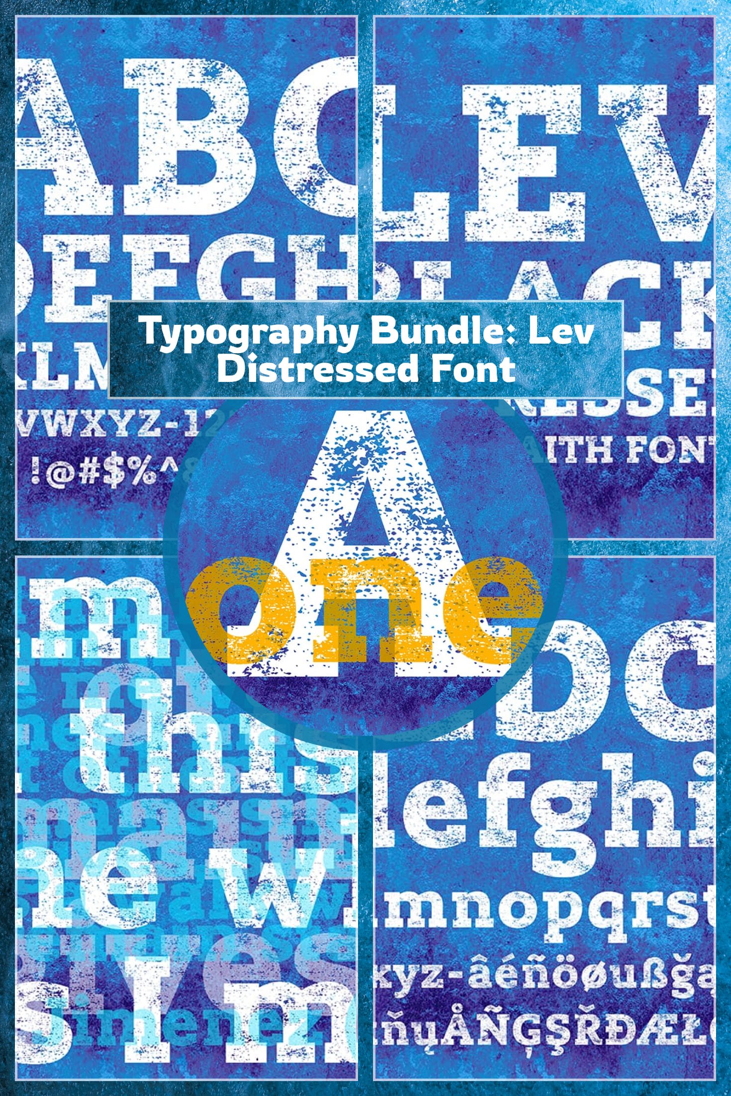
Typography Bundle
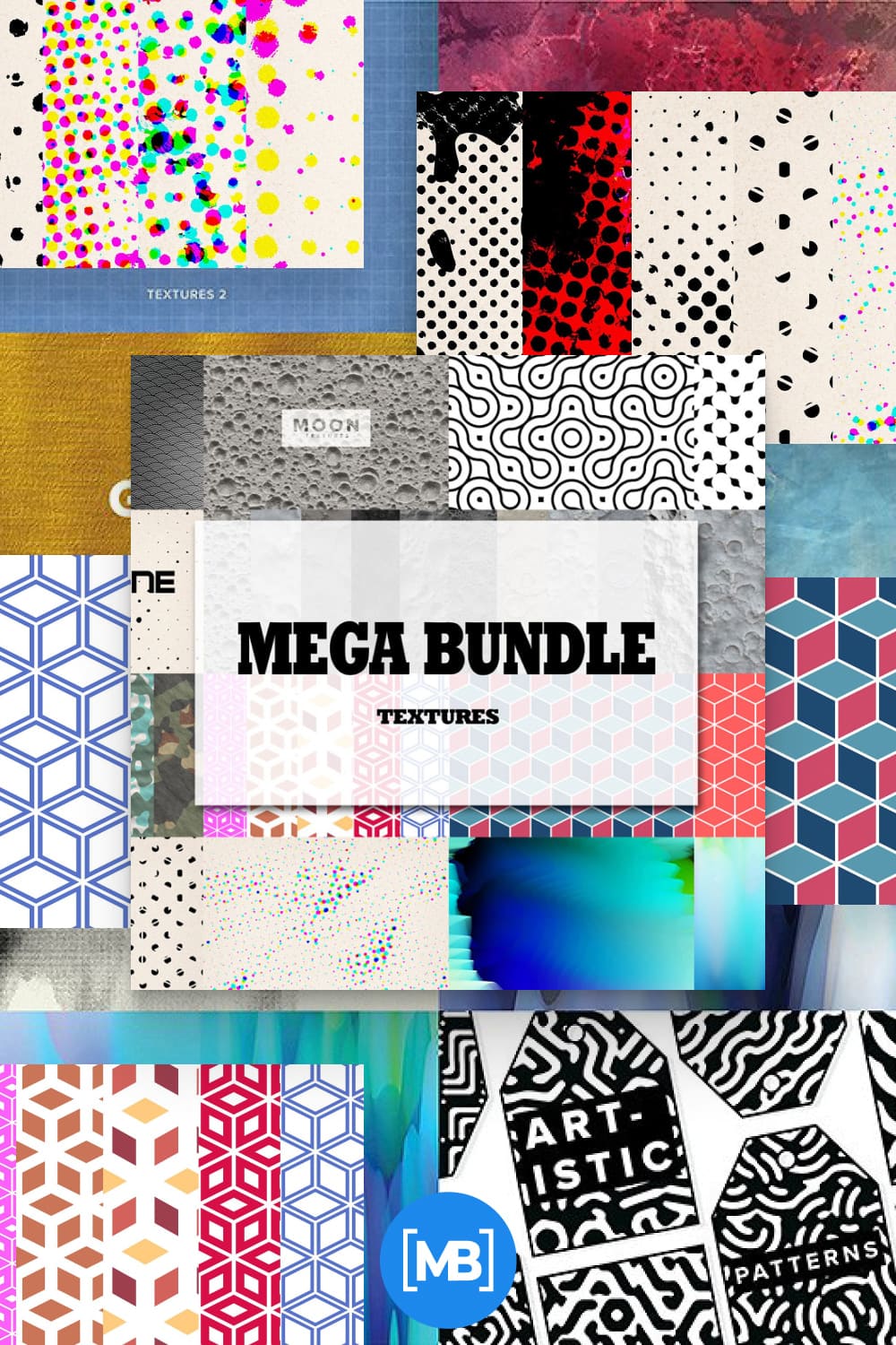
Big Texture Pack
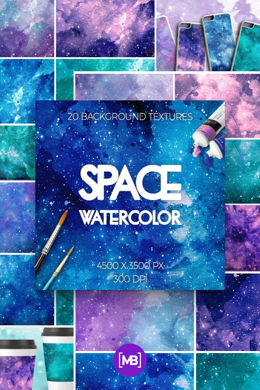
Watercolor Space Textures
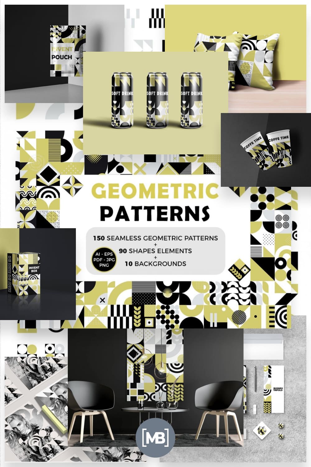
Eye-catching Seamless Geometric Backgrounds, Shapes & Patterns
Line Art Business Icons
![]()
Summary
Of course these are not all of the design principles but they do provide a basis for it. Each of the elements—line, color, shape, texture, balance, etc.—must be second-nature if you are a designer. By adding movement and contrast, they direct the viewer’s eye; and if the viewer’s eye is guided in the right way, well, that is the success of a design.
- Infographics
- Graphic Bundles
Some Awesome Video About Basic Elements and Principles of Design
Principles and Elements of Design
This video will cover the principles of design and elements of design. This is a quick overview of how you apply principles and elements of design in dressmaking.
Graphic Design for Beginners: The Basics
This video is about the main elements used in art and design.
What are your concerns?
Thanks for your response!
Disclosure: MasterBundles website page may contain advertising materials that may lead to us receiving a commission fee if you purchase a product. However, this does not affect our opinion of the product in any way and we do not receive any bonuses for positive or negative ratings.


