Amazon Logo History, Meaning, and Evolution
Amazon has grown from a small bookstore to one of the biggest players in online retailing. Every day the company communicates with thousands of customers, all of which use the Amazon logo. Let’s find out what history hides under the smiling arrow.
Amazon Logo History & Evolution
Before diving into the evolution of the famous logo, let’s go through the Amazon history briefly. The company was founded in 1994 by Jeff Bezos as an online bookstore. The name was chosen because Bezos wanted to see the website at the top of the alphabetical list of resources. The company’s creator also dreamed that his site could be as big as the Amazon River.

Image by MasterBundles
The company went public in 1997, became profitable in 2001, and grew steadily since that time, eventually becoming one of the world’s leading businesses.
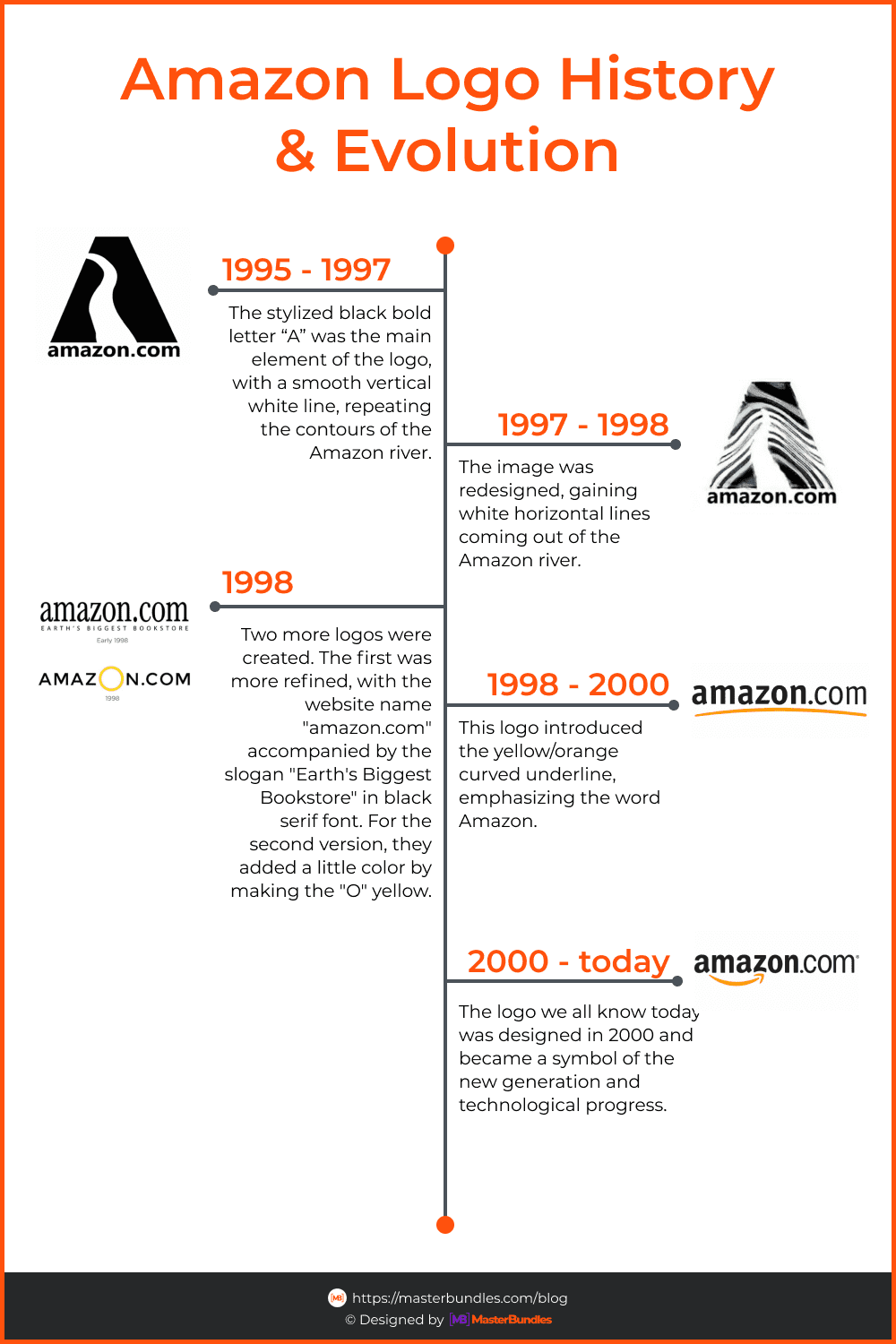
Image by MasterBundles
Amazon logo change occured several times, although its most recent version has remained relatively stable for many years. Let’s take a look at how the Amazon emblem has changed since its creation.
The First Amazon Icon
![]()
Image by MasterBundles
As we already mentioned, in the beginning, Amazon positioned itself only as a site geared toward bookselling. For that purpose, the first logo was created, which advertised its bookish focus. Under the translucent “A” are the words: “Amazon.com, Earth’s biggest bookstore.” The background was created as a lovely texture of water that turned the entire logo into a soothing image that sought to make the store stand out in a crowded web marketplace as something special.
The “A”-Logo Adjustment
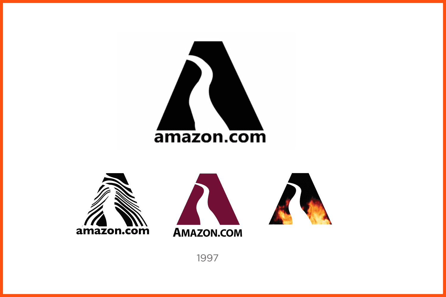
Image by MasterBundles
By 1997, the company decided to adjust the logo. They kept the capital letter “A” like in old Amazon logo but the redesign was attended by different colors and fillings, from zebra stripes to flames. However, none of them caught on.
New Directions
Along with a site renovation (they included a big audio library) the Amazon logo was changed.

Image by MasterBundles
The appearance of the inscription “Books, Music & More” in one version of the Amazon logo, provoked massive plagiarism from other companies. At the time it was easier to name the companies that did not use this type of signature with the logo than those that did.

Image by MasterBundles
In 1997 a series of experiments began. At first, the logo became more modern and laconic in the form of a large black inscription ‘amazon.com’ and the slogan on a white background. But after a year, the company began to expand its product line, and the slogan eventually disappeared from the logo. The next version showed the name of the brand written in capital letters with a large golden O in the middle. However, this variant was not very successful, and it was used for only a short time.
Who Designed the Modern Amazon Logo?
The new Amazon logo should be more than just an emblem; it should be created according to the philosophy of Bezos, who dreamed that his online store should have a huge range of products, as we used to say “from A to Z.”
For this purpose, he turned to the Turner Duckworth creative agency. The team led by creative designers Joanne Chan and David Turner worked on the Amazon project for weeks. As a result, they presented an idea and a design for the Amazon logo in PNG format that Jeff Bezos immediately liked.
“Bezos was just glowing, really glowing, saying how much he liked the logo,” Johan Chan remembers. At one point, he said the head of Amazon slapped his palm on the table and said: “This is it.” When the company’s senior vice president asked if he wanted to do research first, Bezos laughed and said, “Only people who don’t like puppies would dislike this logo.”
What is the Amazon Symbol’s Meaning?

Image by MasterBundles
Well, we already know the history of Amazon’s logo creation and now it is time to figure out Amazon’s symbols’ meaning.
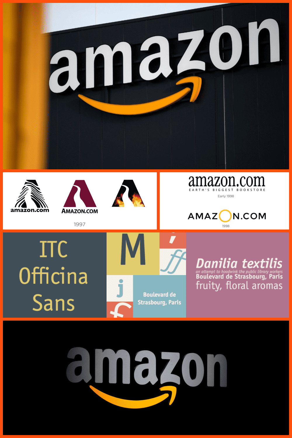
The orange arrow below amazon.com, which joins the letters “a” and “z” in the new logo, symbolizes that literally everything from “a” to “z” can be found on the site. The arrow itself has a rounded shape, and its right side actually curves the bottom bar of the “z” upwards, hinting at a smile, which shows the mood of customers after visiting the Amazon shopping site. The overall styling of the logo proved so effective that it became recognizable, even if the company name was omitted for the benefit of the amazon symbol.
What Font Is Used on the Amazon Logo?
MasterBundles
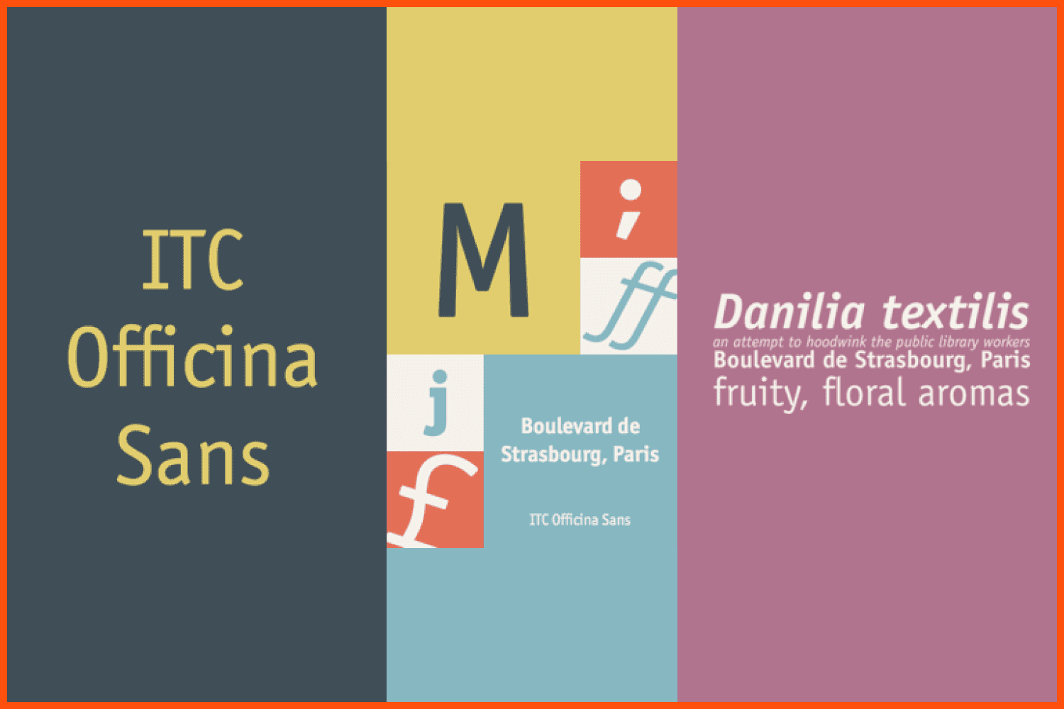
Amazon uses a very good, bold font – a modified version of Officina Sans Bold by Eric Spiekermann. It is neither too professional nor too casual, but creates the perfect balance for an online store. This typeface allows the company to display its personality while staying in tune with current trends.
The use of black demonstrates the company’s superiority and dominance in the online retail market, as it has repeatedly demonstrated with its financial performance. Bright splashes of orange pull the logo away from the gloomy black background and add energy and attractiveness. The bright color also symbolizes pride and happiness, showing how Amazon works and thinks.
To find more inspiring designs, you may visit our rich collection of logo designs. They are available to use for your own company or brand logo.
Upload Your Logo to MasterBundles
Under this brand, Amazon continues to expand online retail opportunities, offering everything from e-book reading devices to drone delivery. This is a company that has never been tied to stereotypical and trivial thinking, and its path to progress and innovation is based on the collective spirit and inspiration of its founder.
If this story has inspired you on new amazing logo creation ideas, you have many opportunities to become a new high-rocket designer and start making money from your favorite activity.
All you need to do is to fill in this SELL YOUR DEAL form! Don’t hesitate any longer and start creating something unique and powerful right now with MasterBundles 🙂
Please take a moment to pin this post to Pinterest

What are your concerns?
Thanks for your response!
Disclosure: MasterBundles website page may contain advertising materials that may lead to us receiving a commission fee if you purchase a product. However, this does not affect our opinion of the product in any way and we do not receive any bonuses for positive or negative ratings.
