YouTube Logo: History & Evolution
YouTube is the most popular video hosting site in the world and one of the most popular resources on the entire Internet. YouTube is a website for watching, uploading, and promoting videos on a variety of topics, from product reviews to self-produced TV shows. It has an audience of over 2 billion and is used in almost every country in the world. However, many people wonder what the meaning is behind the YouTube logo.
Let’s figure it out together!
YouTube Logo History & Evolution
First, let’s delve into the history of the world’s biggest video hosting site. In short, the current owner of YouTube is Google Corporation, but this was not always the case.
The founders are three former employees of the PayPal payment system. Their names are Jawed Karim, Chad Hurley, and Steve Chen.
Karim is called the main creator: it was he who, according to USA Today, came up with the idea for the project. It is believed that he was inspired by the idea of creating a video hosting site when he could not find a video with Justin Timberlake and Janet Jackson on the network. He was also searching for a video with a recording of the big tsunami in the Indian Ocean. At the same time, Time magazine says the idea was conceived together in January 2005.
Article is reviewed by

Designers can collaborate with progressively larger brands by developing a thorough portfolio. Most big brands have a worldwide reputation, which means they won't work with just anyone. Before they feel comfortable working with you, they'll want to see a track record of success in a similar niche or industry. This demonstrates that you're skilled enough to do the job without causing PR issues, financial setbacks, or delays. However, this alone is not always enough.
Big brands look for designers with strong personal brands on social media. Those with large followings tend to be selected first when brands look for design partnerships. This is not only a vanity metric; it's a form of social proof which gives big brands the confidence to work with you. After all, if thousands of people are interested in what you produce, it must mean that you're doing something right. The bottom line is this: big brands look for strong portfolios and big personalities. Work on your personal branding and focus on expanding your reach online to attract the major players in any industry.
The future creators of YouTube were unable to send their friends the recordings from the party because they were too voluminous to send them by email. Colleagues decided to start a new project—a site where you could upload videos and easily share them with others.
The name of the YouTube project was born from a pun: “Boob Tube” is a slang term for TV.
In 2006, Google acquired YouTube. That’s where modern YouTube history begins.
YouTube Logo Design – History, Meaning, and Evolution
YouTube is the most popular video hosting site in the world and one of the most popular resources on the entire Internet.
First YouTube Logo
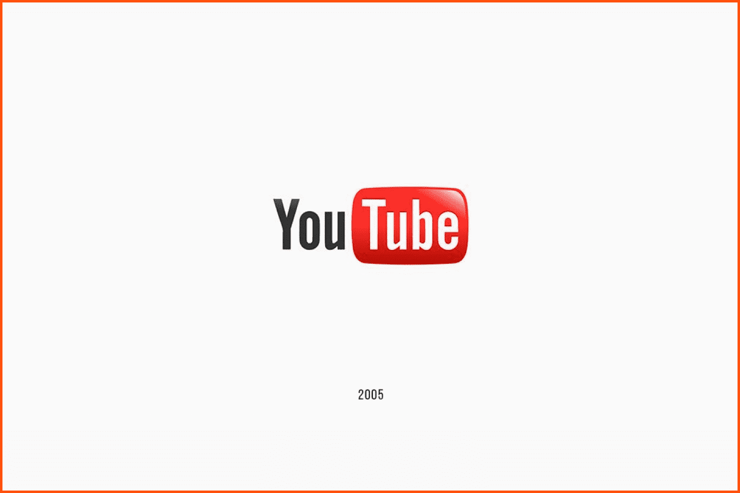
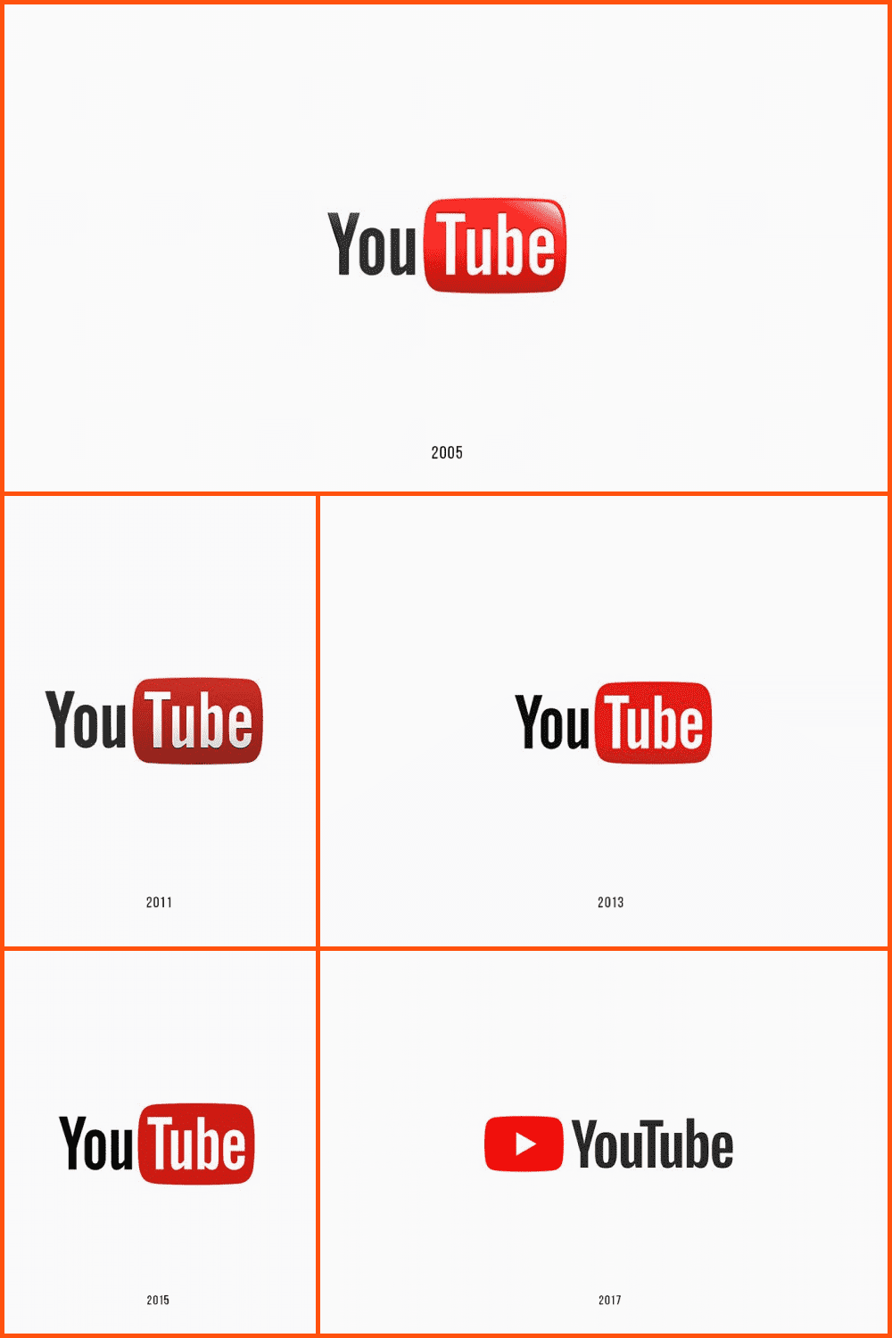
Just like the website’s domain, the YouTube logo appeared back in 2005. Since then, it hasn’t changed much. In fact, you won’t even be able to tell the difference at first glance. However, some meticulous graphic designers will say that these are two different emblems.
Anyway, the YouTube logo of the 2005-2011 era was a masterclass design. It showed how simplicity works in promoting a really decent product.
Talking about its look, the old YouTube logo design was separated into two parts:
- The “You” part. It was depicted in black letters.
- The “Tube” part. This was placed inside what looked like a vintage-style TV screen with rounded corners.
The “screen” of the TV features a bright red color. The “Tube” letters are white to improve visibility. Sometimes the image below was accompanied by the slogan “Broadcast Yourself” but this was later abandoned.
YouTube Logo: 2011-2013
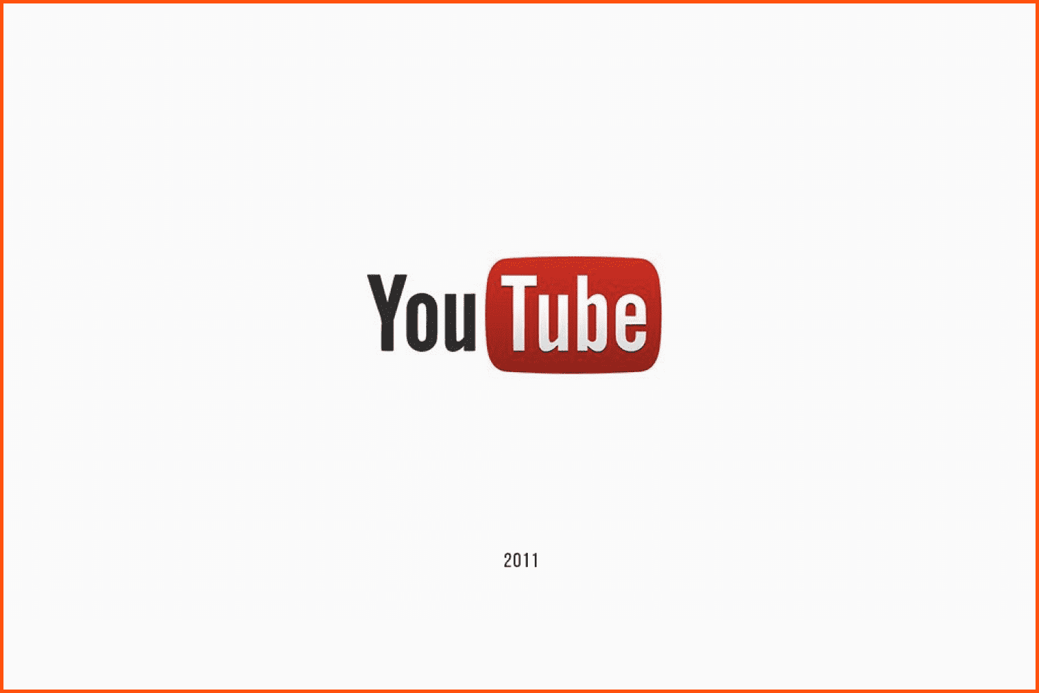
The logo design of 2011-2013 is similar to its predecessor. The only modified thing is the rectangle. Now it is darker and more credible. The “Broadcast Yourself” slogan was removed around 2012.
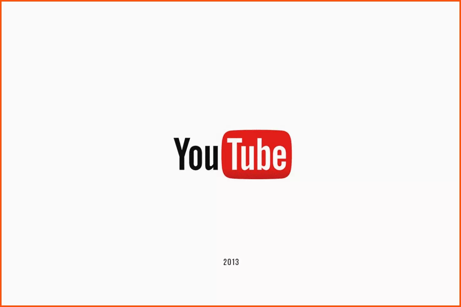
The follow-up design appeared in 2013 and was used until 2015. The rectangular part of “Tube” became slightly lighter and brighter, while the “You” part became a darker shade of black.
2015 YouTube Logo Change
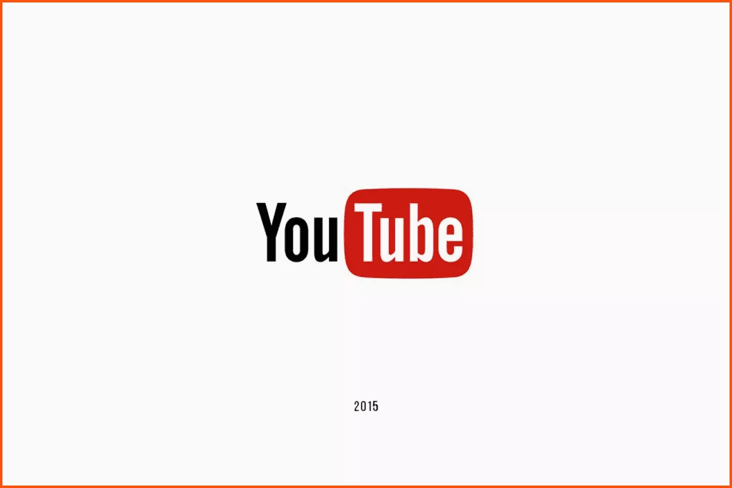
The changes to the YouTube logo design are minor, with the red “play” button placed on top of the “Tube” part moved to the front of the entire word.
Not everyone welcomed this change positively. Many YouTube users, and creators of video content, ridiculed Google for imaginary logo changes that do not carry anything fundamentally new.
Article is reviewed by

How and where can designers reach out to the big brands?
It isn’t easy for logo designers to catch the attention of big brands even if they have perfect ideas for said brands. These brands tend to work with distinguished designers who’ve made their name in the industry or work with big-name agencies. But all hope isn’t lost just yet. There’s a way out!
Social media is one channel that every big brand keeps an eye on constantly. Logo designers can use this fact to reach out. But first, they have to build their identity over social media. This means curating their portfolio to appease those brands, amassing enough followers to make a difference and connect with the community. Designers can also connect with influencers who have worked with big brands and ask for a recommendation.
What background should the designer have to grab the attention of the big brands?
A bachelor’s degree in graphic design is the best kind of background to have for a logo designer. They can also have a similar or relevant degree, such as visual communication or color science.
Additionally, they should also have some experience with small brands that will help build their portfolio. The portfolio is what matters the most for a designer. It goes on to show their style of work, their comprehension of different design techniques and their past experience.
Modern YouTube Logo
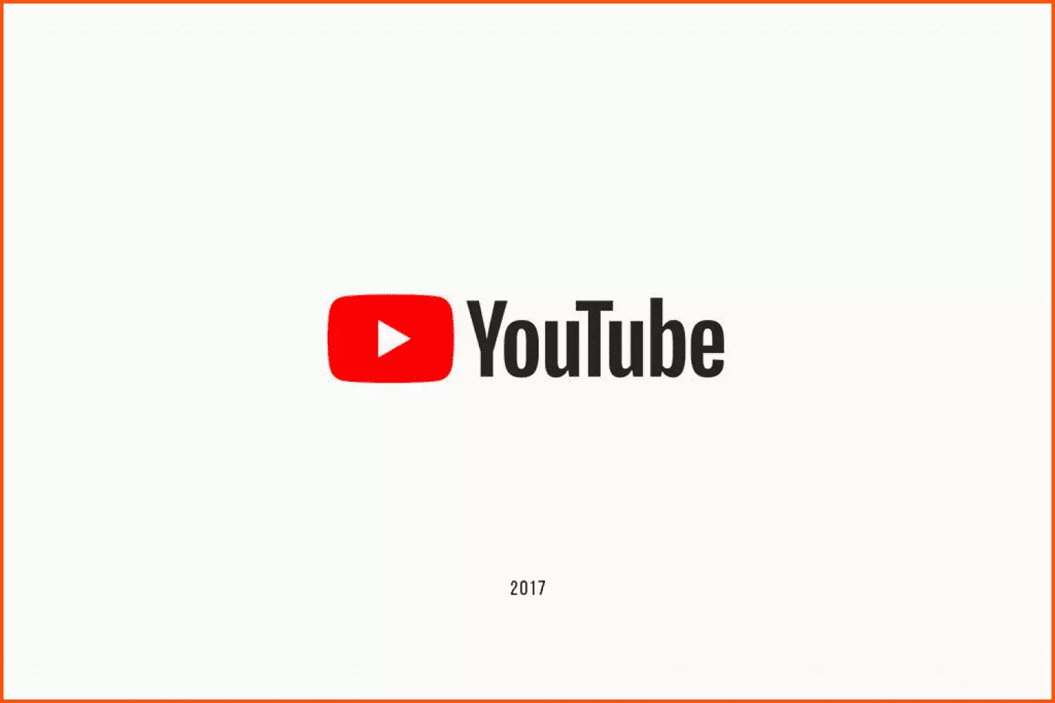
In 2017, YouTube launched its most significant logo update, consisting of an “almost black” wordmark and a slightly modified font (named “YouTube New”) placed to the right of the previously changed generic YouTube icon, the play button, which is now lit red.
The logo change is based on the play button logo.
YouTube has also created a design language called “Polymer” mixed with Material Design followed by a logo.
Who Designed the YouTube Logo?
Going back to the three YouTube founders, we can say that all of them took part in the creation of the YouTube emblem.
Jawed Karim became the main ideologist for the project and a generator of ideas. He and Steve Chen programmed and made up the future site. Chad Hurley, in turn, was involved in the design of the project. He is credited with drawing up the YouTube logo, its design, and interface.
Later, after Google’s purchase, work on the video hosting’s emblem was transferred into no less talented hands. Now it’s Christopher Bettig, the head of YouTube’s art department.
Here is what he says about the logo’s recent updates:
We wanted to keep the history, and the tension of a media typeface that was made in 1903 to be typeset manually with a digital platform that reaches farther than any newspaper of the time could ever conceive of.
YouTube Symbols Meaning
The main YouTube symbol (with play button) depicts the platform’s main approach—playing videos. First attempts to show new visitors of the website what was inside were far from what we have now.
By looking at the YouTube icon today, we know exactly what our journey will be about.
What Font and Colors are used on the YouTube Logo?
Undoubtedly, YouTube’s emblem is very successful. The world’s greatest graphic designers admit that these heights wouldn’t have been reached without a proper color combination.
As you may have noticed, we have red, black, and white. It is believed that these colors symbolize optimism, perseverance, elegance, passion, and purity.
It is quite recognizable and distinctive, the Helvetica font. Helvetica was very popular back in the 50s of the 20th century. So this font reminds us of the roots of television and gives us that very retro feel of tv tubes.
Reminder: Tube is a slang term for television. A long time ago, TVs used to be powered by vacuum tubes.
Summary
The YouTube logo is a pure masterpiece. It depicts everything that is concerned with the company’s business, while at the same time giving simplicity and straightforwardness of thoughts.
This particular story teaches future businessmen the importance of having a top-notch graphic designer at hand. However, young artists should also remember that their talent won’t be recognized unless they show it to the whole world.
If you need some inspiration, check out this fantastic selection with logo design ideas and don’t forget to repeat this ritual regularly – visit communities, design blogs, Behance, Dribbble, and Pinterest for inspo.
Here is where MasterBundles steps in. Upload your creative YouTube logo png files and have a chance to be spotted from the variety of our Logo Designs.
You will do it in a matter of a few minutes with a super convenient Sell Your Deal Form and get your remuneration!
Please Take a Moment to Pin this Post to Pinterest

- Gucci logo
What are your concerns?
Thanks for your response!
Disclosure: MasterBundles website page may contain advertising materials that may lead to us receiving a commission fee if you purchase a product. However, this does not affect our opinion of the product in any way and we do not receive any bonuses for positive or negative ratings.
