- All Deals
- Fonts
- Graphics Bundles
- WordPress Themes
- Icons
- Courses and eBooks
- Stock Photos
- Website Templates
- Under $5 Deals
- Halloween
- Christmas
- Valentine's Day
- Logo Templates
- Resume Templates
- Presentations
- Photo Deals
- Patterns & Textures
- Instagram Templates
- Mockups
- Illustrations
- Graphics
- Illustrator Add-ons
- InDesign
- PostCards
- T-shirt Designs
420+ Font Bundles in 2021. The Best Premium and Free Font Bundles – Buy Online!
Best Font Bundles. If to look closer, an alphabet is a set of weird pictures we use to express sounds that have no visual match. Really, think about it, do the letter “A” could help a deaf person or some alien to understand how the “A” sounds? Nope. However, letters do much more than that – they help people to contact each other not only through space but even through time. Homer or Shakespeare are long gone by now, but we can still read “Iliad” and “Macbeth”. And the instrument that delivers the words to us is a font. Fonts and typefaces are popular in the mass culture not only as a tool of expression but also as a separate art object. There are lots of designs, decorated with letters that are not forming words or words that are not forming a text.
The typeface idea was even used to create a super-villain. He was one of the Spider-man’s antagonists and his name was, like literally, “Typeface”.
So, you are surrounded by fonts and typefaces all the time and everywhere. This is an inseparable part of our everyday life, so let’s talk about them for a little.
Fonts and typefaces are popular in the mass culture not only as a tool of expression but also as a separate art object. There are lots of designs, decorated with letters that are not forming words or words that are not forming a text.
The typeface idea was even used to create a super-villain. He was one of the Spider-man’s antagonists and his name was, like literally, “Typeface”.
So, you are surrounded by fonts and typefaces all the time and everywhere. This is an inseparable part of our everyday life, so let’s talk about them for a little.The origin of modern fonts
Firstly, let’s define what is the difference between the font and the typeface. The typeface is a collection of pictures, defining the general look of the letters. Typefaces are also often called the font families because there could be dozens of fonts within one typeface. The font is a set of characteristics of the letters shape, defined by typeface. For example, there is the Arial typeface in every Microsoft Word “Font” section. Arial Black and Arial Narrow that you can see in the same list are different fonts of the “Arial” typeface.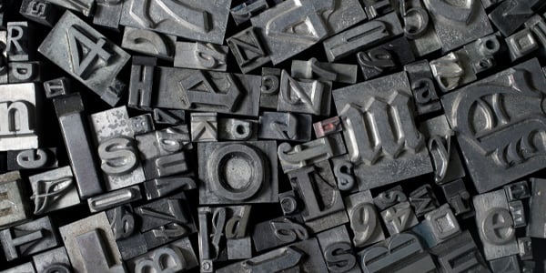 When printing machines were invented, every printed word was collected from the small metallic or wooden letters. The set of letter’s shape, size, weight and other features was called “font”. This word origin comes from French word “fonte”, which means “casting”. Every type foundry had a specimen, where the samples of every available font were presented. It is a little bit easier now, huh? The designer doesn’t need to make a metallic casting of every letter he draws. He just gathers the files into a set and so the new font is ready (it is easier to say that do, I know). However, don’t forget that every letter you type is a separate little file. Its creator not only had to draw every letter in lower and upper cases, but he also created every character, the bold and italic versions of the font and thought about sizing. That was a really big piece of work.
Characteristics of web fonts
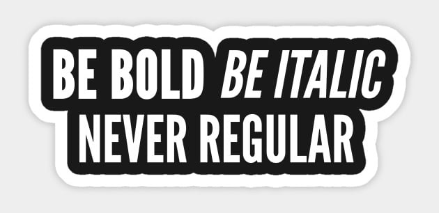 Before talking about features let’s define a little terminology. There are a lot of variations of every font: bold, italic, thin and so on. That’s why it was necessary to pick a word for original, “normal” state of the created font. That word is “roman”. It also means that the font is created for Western European languages (there are also Cyrillic and Greek fonts for that part of the world). Now we can talk about the specification.
Height
If you thought the font has only one height you were wrong. In fact, every font has at least three heights. The first one is called the “x-height” and it is measured between the baseline (that is a line all the letters “sit” on) and the top of such letters as “n” or “o” that have no exposed parts. The second is “ascender height” which is the distance between the baseline and the top of the exposed parts of the letters (like “h” or “l”). And the third one is “cap height” which is measured between the baseline and the “cap” of the capital letters. Ascender height and cap height could be different for a single font; it depends on the font creator’s taste.Size
This characteristic comes from the height of the font and the proportional change of all the parameters according to it. Size is measured in points, the smallest typography measurement unit. The actual size of the point changed through time and from 18 centuries varies from 0.18 to 0.4 millimetres. When fonts become digital, the new measurement unit was set – DTP point, or desktop publishing point. The size of DTP point is 1/72 of an inch which is equal to about 0.353 millimetres. So, when you choose the size of 12 for the modern font, it means every letter will be 12 DTP points high.Weight
 The thickness of the lines which the letters consist of can vary in a very wide range.
Even in the “normal” state, the weight of the font could be different – there are lots of poster fonts that need to be big and thick.
The first font weight classification was made by Adrian Frutiger for the Univers typeface.
He divided the range to 7 positions from extra light to ultra-bold.
After that was created a number of other classifications.
However, the web fonts use the CSS formal (originally invented be TrueType), where weights have numeric values from 100 to 900.
The regular, roman weight in this classification is 400.
Slope
Everyone knows how the italic font looks like. Every modern person uses it to create some formatting in the text. However, the font could be slant not only to the right but also to the left. The left-slope font is called oblique. It is not very popular in the roman fonts – designers usually prefer to create an italic variant of their font, because it is used more often. But if you still want to use an oblique variant of the modern font – the algorithm could slant it for you (it may not look really pretty, you know, but if you really want it – you can have it).Width
Some web fonts allow the user to change the width of the letters. Obviously, this option is available only of font doesn’t have proportional or monospaced width, set by the font creator. In that case, letters will change their size according to the chosen proportion or fill the space of equal for each letter size. Be careful playing with the letters width – it could drastically change the general look.The most common web fonts styles
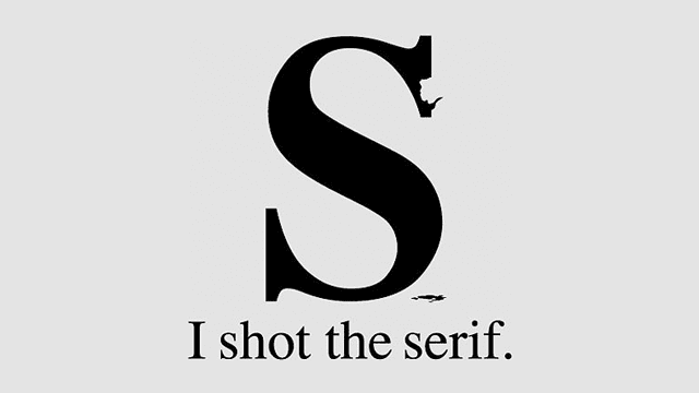 To make searching simpler all the modern fonts are divided into a number of styles. The look of every letter could be evaluated and then categorized according to the language, features and specific details. If you go through that styles you will be able to find the font you need much easier and faster.
Serif creative fonts
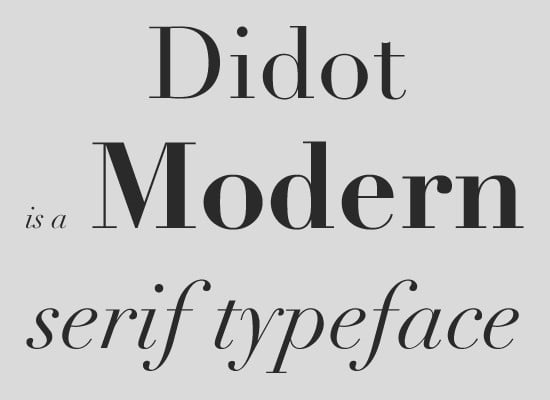 It’s funny how a tiny detail could change the general look of the object.
Letters are drawn with lines and when those lines end up with tiny dashes – it is called “serif”.
That little detail changes the appearance of the word and the text drastically. The web fonts that use serifs are called “serif typefaces”.
Such popular fonts as Garamond, Baskerville, Times New Roman and Bodoni are serif typefaces.
Sans-serif modern fonts
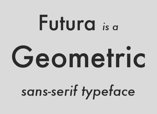 In French “sans” means “without”, so sans-serif font family consists of fonts that have no serifs in the letters shape.
The absence of any decorative details makes the font look stricter and more up-to-date.
Most of the websites use sans-serif fonts for the plain text because it has better readability. Besides that, the minimalistic look is a kind of modern trend, so sans-serif typefaces are truly modern fonts.
Arial, Century Gothic, Futura and Gill Sans popular fonts belong to sans-serif family.
Script unique fonts
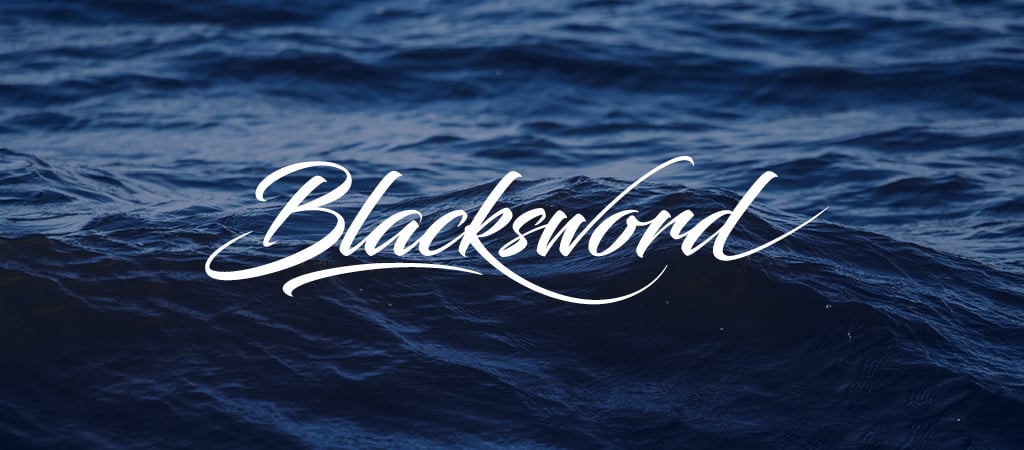 Handwriting and calligraphy – that’s what script fonts look like. The fonts of this type are very detailed, have lots of curly decorative lines and sometimes are mistaken for italic fonts. Script fonts creators are often inspired by middle ages manuscripts and that’s where all those gothic fonts come from. Every Microsoft Word font list contains a few script typefaces, such as Embassy BT, French Script MT, Monotype Corsiva and Old English Text MT.
Decorative creative fonts
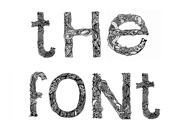 When the font looks like an art object by itself or is so original you can’t put it to any other style – it is decorative typeface.
Obviously, they are not used for the body of the text, but titles and short phrases written with such creative font will be a decoration by itself.
Of course, the most original and interesting fonts you can find only on specialized platforms like MasterBundle, but a couple of decorative fonts are available even in Word fonts list, like Algerian, Chiller, Jockerman and Showcard Gothic.
| Font style | Where to use? | Examples |
| Serif | Text body Solid and serious companies, books, documents, historical essays | Caslon, Garamond, Times New Roman, Freight Text |
| Sans-serif | Text body Futuristic and modern agencies, web articles, instructions, technical literature | Franklin Gothic, Arial, Gill Sans, Futura |
| Script | Headlines Romantic and sophisticated websites, wedding invitations, poems, tourism projects | Caveat, French Script MT, Monotype Corsiva, Old English Text MT |
| Decorative | Headlines Creative agencies, designer companies, children literature, video games content | Lobster, Chiller, Jockerman, Showcard Gothic |
5 fonts that left a mark in history
History of fonts and what they were used for is marvellous and surprising. You could compare it to the history of costumes – both clothes and style of written language has a huge influence on the way people feel themselves and saw the world around them. Here are five fonts that left the most sufficient mark in humanity’s history.Caslon
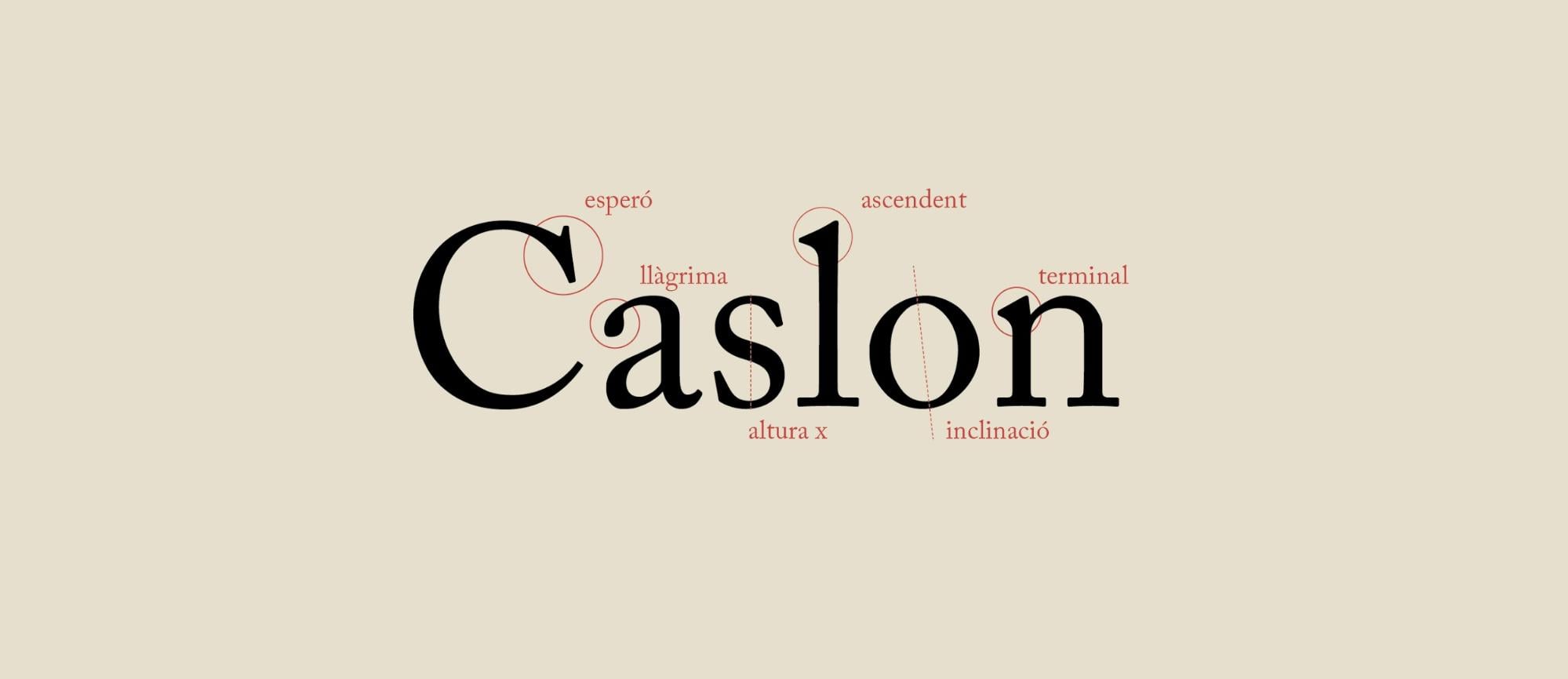
William Caslon, a creator of one of the most popular typefaces in the world, at first was an engraver. At the beginning of his career, he engraved gun locks and barrels and after some time decided to change gunpowder weapons to something more dangerous – words. He created a few unique fonts (unique and exotic for his time, of course) that were extremely popular during his life. They were good-looking, easy-readable and accurate, so a huge amount of literature was printed in his typefaces, for example, the United States Declaration of Independence. It was so popular, that a kind of proverb appeared – “when in doubt, choose Caslon”. This font gave inspiration to the big family of “old-style” typefaces like Baskerville and Didot.
Grotesque
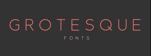
The first sans-serif font was created in 1816 by William Caslon IV. Inspired by Didone typeface, this creative font was a real break-through. It was very simple, practical and clear, which made it a perfect typeface for technical inscriptions, instructions and all the long texts. It was even called “realist” for its excellent practical efficiency. At first, Grotesque was called “Two Lines English Egyptian”, but the modern name spread quickly. It may be surprising, but for its time, the Grotesque font was really grotesque and ugly for people. Comparing to other serif fonts it was like a tin can near the porcelain Chinese vase. However, for you and me, Grotesque web font is quite cool.
French Clarendon
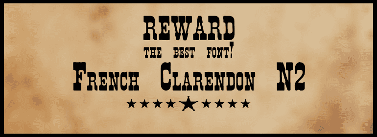
You have seen those in every wild west movie. In the late 19 century, regular Clarendon typeface was drastically changed in the United States. This typeface falls within slab serif font style, which is known for its big and very accented serifs, that look more like dots. In the US the upper and bottom serifs of Clarendon were enlarged. The mass culture showed the audience circus posters and “wanted” lists in westerns, but in fact, that unique font was used, literally, everywhere. However, the movies influence is so big, that you cowboys and revolvers appear in your mind immediately when you see that art font.
Futura
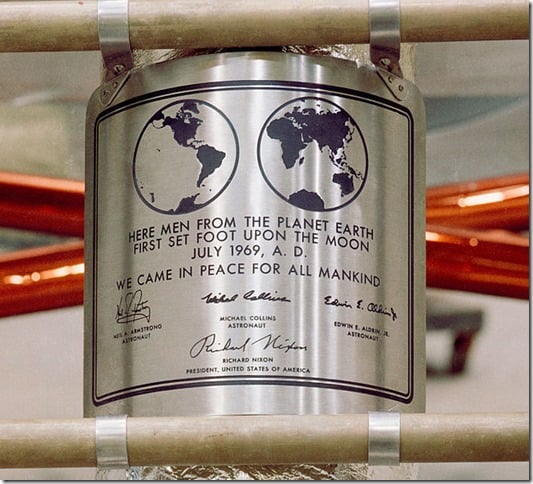 Neil Armstrong’s flight to the moon was a world-scale event. Not only America, but people in all countries were watching it with bated breath.
When the crew left the moon it left behind a landing module which has a plaque on it.
A memorable inscription on it is engraved in Futura font and proclaims: “HERE MEN FROM THE PLANET EARTH FIRST SET FOOT UPON THE MOON JULY 1969, A. D. WE CAME IN PEACE FOR ALL MANKIND”.
So, the first font to travel to the moon is Futura. By the way, it looks futuristic and modern even now, almost 60 years after mankind’s giant leap.
Minimalism always looks sophisticated and elegant.
Chicago
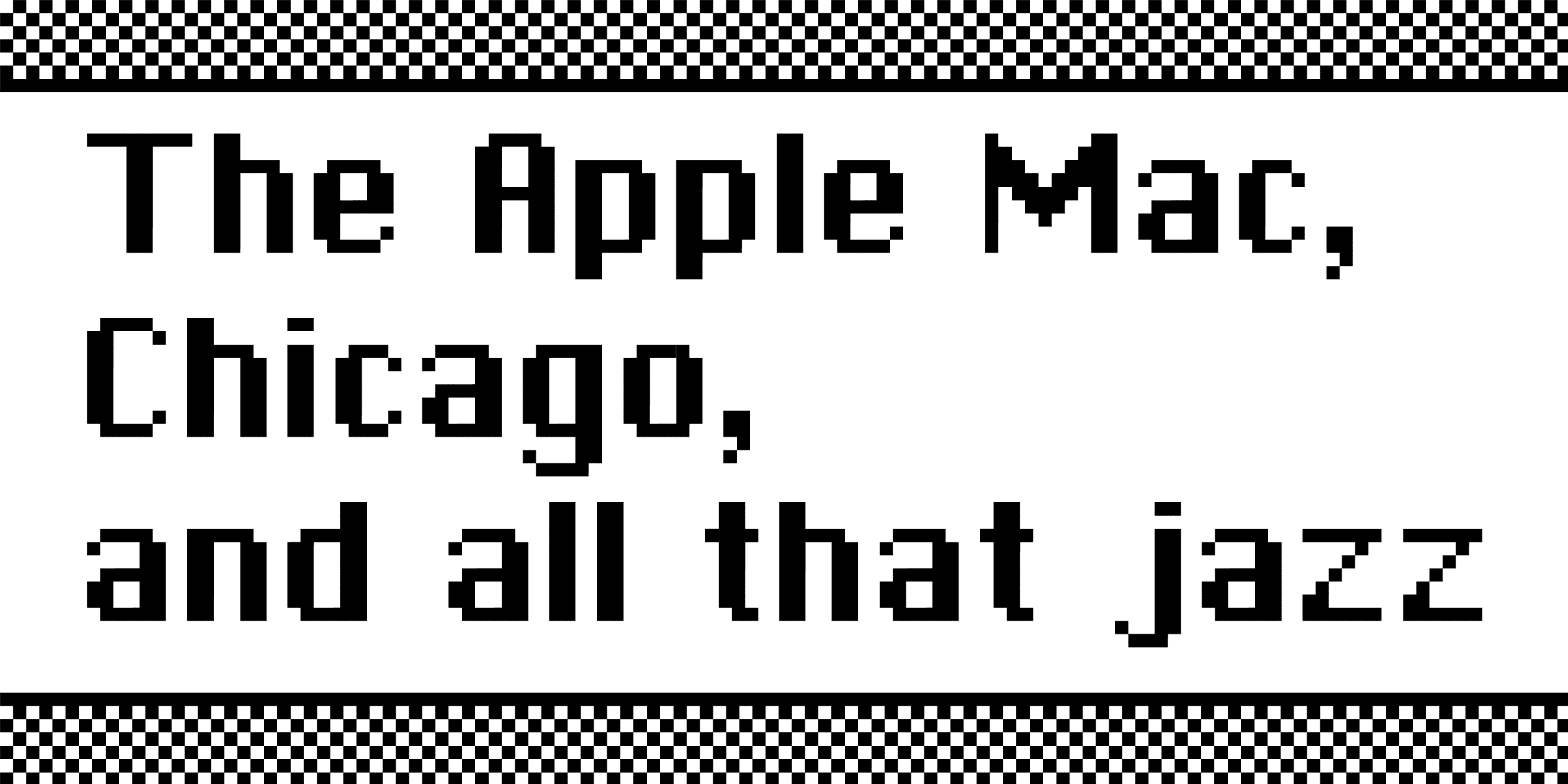 Susan Kare, an art historian and designer, hired by Steve Jobs to create icons and fonts for the first Apple Macintosh, was extremely talented. She draws for Mac’s interface a number of creative fonts, named after cities. One of them was Chicago and that was a real typeface masterpiece. She had only 12 pixels of height, but she managed to create a clear, accurate font that was easy to read and pleasant to the eye. Nowadays we don’t use it, smoother Adobe fonts replaced them, but the truth is, that Apple won’t have such a cool design without those typefaces.
Why the font pack is so important for design?
If to compare your project’s design to the person’s appearance, pictures, colours and structure will be a person’s clothes and web fonts – her accessory. Now imagine you come to the luxury party, wearing a stylish black dress and holding a bucket. And with Christmas tree string wrapped around your neck. And wearing plastic bottles instead of shoes. It would look ridiculous, won’t it?
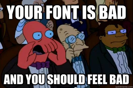 The situation with an inappropriate font pack is the same.
The typeface you use in the project has to express some general idea, underline your goals and mission and if you make a wrong choice – it could ruin the whole impression from your business.
Not a single business can afford to make the wrong impression, so you have to pay attention to every detail.
All typefaces have their own style, purpose and even mood, so choose wisely.
How to choose a font pack of your dream?
 The good project’s design lies on two elephants – well-thought-out idea and planning.
If those two things are done right you will have lesser problems with going through the design creation process.
And as for the font, there is a set of questions you have to answer to yourself before starting the font search.
The answers will sculpt the typeface you need in your head, so it will be simple to find. Let’s go.
- What mood should your design and web font radiate? Does the client have to feel solidity? Or reliability? Does he have to laugh or concentrate? The business will be efficient if its clients will feel some concrete emotions, encouraging them to order the product or service. The babies’ clothes shop would need cute font and marketing agency demands creative font, so define which one your business needs.
- Who are you speaking to? Define your audience. Yep, the font also depends on the audience. Come on, everything depends on the audience, man! Repro-futuristic art font will be suitable only for an audience of a specific age, just and super-modern decorative font. Give people what they will be pleased to see.
- Where are you speaking from? Business card, billboard and an article are very different means of communication that need very different fonts. For a business card, you will need a very clear font that will fit the space and be perfectly readable. A billboard needs the eye-catching decorative font to attract trespassers attention. And for the article, you will need a neutral web font that won’t tire reader’s eyes.
Font bundles and why they are so profitable
There are thousands of free fonts, but sometimes it is not enough. If you want to have a premium quality design – you will need some premium quality web fonts. If you are a designer it means you need to spend lots of money on creative fonts, isn’t it? And my answer is “no”, you don’t have to spend loads of money. You just have to find a few cool bundles. Bundle is a kind of a box, filled with different items. Customers purchase the whole bundle and get all those goodies for a sufficiently reduced price. If to add the cost of separately bought products it will reach hundreds of dollars, but a bundle usual price is about from $2 to $20. You can say it is ridiculous and there must be some mistake, but that’s correct. You can buy a set of great products for a very low price, but the offer is available for only a few days. Bundles are extremely profitable for designers and web developers because it allows them to save money. And now let’s get back to fonts. MasterBundle will help you to get lots of trending fonts for a ridiculous price. Bundles usually contain from two to fifteen best fonts for designers, but their average “life cycle” lasts less than 5 days. It is obvious you can’t monitor the MasterBundles website all the time, so not to miss a profitable bundle you should subscribe for our newsletter. We will keep you informed about the latest arrivals and you will be able not to miss the font bundle of your dream.Fun Fonts
Among all the font styles, fun fonts definitely belong to an underestimated category. Many designers think that these fonts do not work for such serious projects as various types of websites, brochures, banners, logos, etc. Well, they are very wrong because using unconventional details like fun fonts is the very thing that has this magic power to make your project truly unique and eye-catching. In fact, using something unusual that nobody has come up with yet is the key factor of your project’s success. So feel free to experiment and express your creativity by means of fun fonts and soon you’ll see the benefits from it.Number Fonts
Every self-respecting graphic designer knows that he or she just cannot do without some number fonts in their library. Naturally, these fonts are extremely useful because you would need those perhaps for every project you would ever be involved in. You might wonder why do we put such an emphasis on the number fonts. Well, simply because some fonts are made solely for letters, which means that your numbers would remain standard and, as a result, your entire project would look odd. In order to avoid such a problem, you want to have some number fonts in your graphic elements collection since they will no doubt back you up in any situation or emergency.Hand Lettering Fonts
Hand lettering fonts are among the most popular ones all over the world. The reason for such tremendous popularity is very simple – these fonts look adorable and lovely. Hand lettering fonts can be hardly called multipurpose, yet there is a huge amount of projects you can use those in. For instance, these cute fonts will be perfect for various types of blogs, personal websites, online fashion or makeup stores, restaurants, food delivery services, and many more. These cuties can add an adorable vibe to your website, advertisement banner, logo, or any other thing you are currently working on. So if you would like to create something adorable and exceptionally beautiful, hand lettering fonts is no doubt the way to go for you.Letterings Fonts
Letterings fonts are perhaps the most personal ones since they add this sensation of something hand-made, warm, and cozy. Such a font will make your Italian restaurant’s website cozy, your personal blog intimate, your store’s advertising banner trustworthy, and your company’s logo cute. As a matter of fact, these fonts are indeed unbelievably cute and breathtakingly beautiful, which means that they can bring any project to the top. So if your goal is to create something exceptionally lovely, memorable, personal, and simply magical, lettering fonts would surely help you achieve that goal.Pretty Fonts
Well, nobody likes ugly fonts and that is why pretty fonts are among the ones you just cannot afford not to have in your library. Speaking about these fonts, we cannot omit the fact that they are rather multifunctional. In other words, a pretty font will surely work great for pretty much any sort of site, logo, ad banner, or anything else you will use it on. These fonts vary is styles, which means that you will no doubt find exactly what you need. So whether you are currently working on a website or a brochure, find some time to look at the pretty fonts and experiment with them, you will not regret it at all.How to Add Fonts to Photoshop
Once you’ve chosen the very font you have been dreaming of for all this time, you might want to start working with it. However, how do you do that? Well, if you are working on a logo or advertisement banner, you are probably using Photoshop because it is perhaps the most common way to create these graphics. So here is how you add fonts to Photoshop.- Download the font you need to your computer
- Find the file with your font, right-click on it, and choose ‘install’
- If there is no such option in the right-click menu, head to the Control Panel > Appearance and Personalization > Fonts > Install New Font > OK
Art Deco Fonts
Using an Art Deco font is perhaps the best solution for those of you who are currently working on an elaborate, stylish, elegant, sophisticated, old-fashioned project. Stunning and simply magnificent The Great Gatsby vibe that these fonts convey will mesmerize you with their elaborate beauty. These fonts’ Sophisticated curls will hypnotize anyone as well as make you feel like you are a part of that luxurious era. Art Deco fonts are certainly among the most luxurious and fancy ones, so if you are looking for something like that, download some of these elaborate beauties, they are no doubt worth it.Bullet Journal Fonts
Bullet journal fonts are among the most popular ones as well. These fonts look elegant and fancy, besides, they are quite multipurpose, which means that they would perfectly work for a vast variety of projects. No matter if it is a blog, a corporate website, a portfolio site, an online shop, an ad banner, a logo, or any other kind of project you will ever work on, such a font will no doubt become handy. So if you still do not have any bullet journal fonts in your library (which is very odd and unlikely), go ahead and get some, you will not regret that.Urban Fonts
If you are that kind of web designer who is always looking for something truly dope and unconventional, you might want to consider looking at some of the urban fonts. These extraordinary babies have the ultimate power to make anything you’ll ever work on simply stunning and mesmerizing. Such fonts are rather multifunctional and would no doubt fit various websites or graphic elements. Well, if you feel like you need something up-to-date, eye-catching, as well as minimalistic and flawless, you surely want to take a good hard look at urban fonts.Fonts FAQ
Free or premium?
When it comes to choosing between a free and premium font, you have to consider the type of project you need a font for. Keep in mind that some fonts are free for personal use only, which means that you might want to get a premium font if you are working on a commercial project.
Where can I get decent free fonts?
There is a lot of digital platforms that offer excellent free options, just check out such popular ones as Dafont, Urban Fonts, MasterBundles or Font Squirrel.
Can I sell my own fonts?
Yes, you totally can, visit MasterBundles Sell Your Deal section to find out more about it.
